

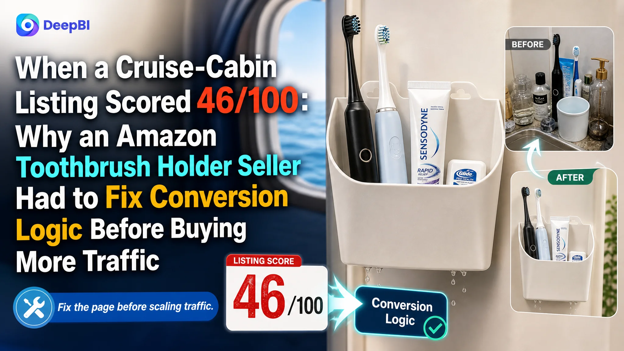
An Amazon seller offering a magnetic toothbrush holder for cruise cabins was not facing a simple traffic problem. The product page had a clear use case, but its Amazon Listing was not communicating that value in the order shoppers needed to understand it: what the product holds, where it works, why it is hygienic, and whether it will stay in place.
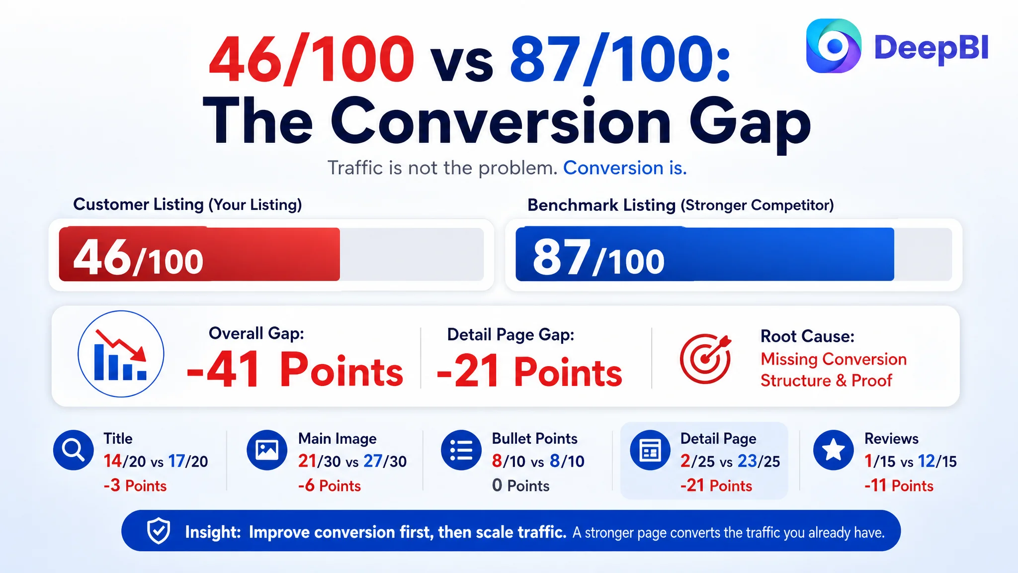
The seller’s initial instinct was to improve individual features and add more functional information. DeepBI’s comparison with a stronger category listing showed a different issue. The product page scored 46 out of 100, while the benchmark reached 87. The largest gap was not in the bullet points or even the title. It was the missing conversion structure in the detail page, combined with weak visual proof and no review foundation.
The later direction therefore focused on rebuilding the Amazon product page around a clear buying sequence: show the cramped cruise-bathroom problem, prove the magnetic use case, demonstrate capacity and drainage, explain surface compatibility, and use A+ content to remove hesitation. The lesson for other Amazon sellers is direct: before scaling ads or repeatedly changing keywords, determine whether the Listing can convert the traffic it already receives.
The Seller Saw a Product With Several Selling Points
The product was designed for a specific environment: small cruise-ship bathrooms with limited counter space and metal walls or doors.
Its potential selling points were not difficult to identify:
- Magnetic wall mounting
- Space-saving storage
- Built-in drainage holes
- Capacity for toothbrushes, toothpaste, and other toiletries
- Pack-flat portability
- Use on other iron or steel surfaces
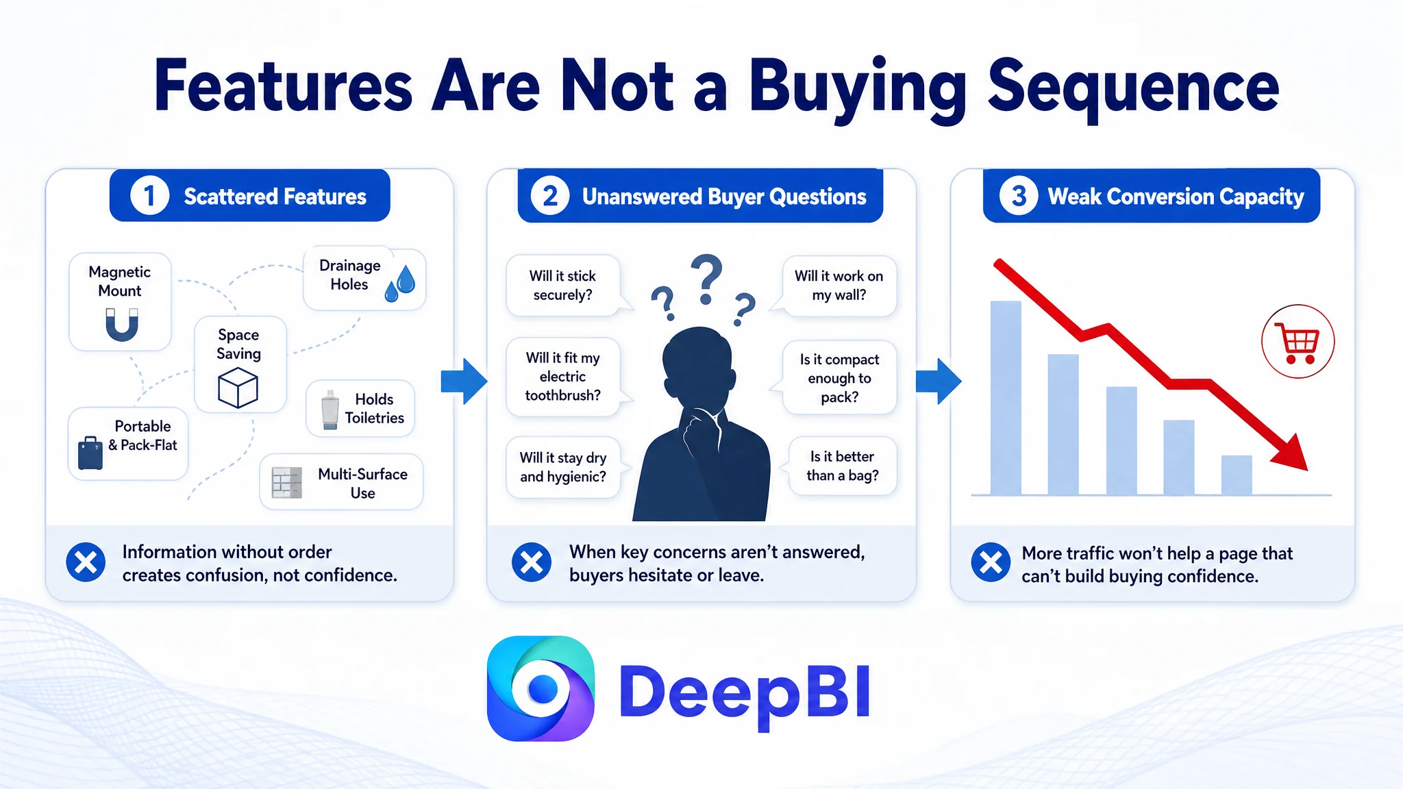
The seller’s existing Listing mentioned many of these functions. The problem was that the page presented them as separate facts rather than as one persuasive product story.
For an Amazon shopper, the decision was not simply whether the holder had drainage holes or whether it could store toiletries. The real questions were more practical:
- Will it attach securely to a cruise-cabin wall?
- Will it fit an electric toothbrush and full-size toothpaste?
- Will it keep items away from wet counters and toilet splashes?
- Will it work on the surface in the buyer’s bathroom?
- Is it compact enough to pack?
- Does it solve a real problem better than a standard toiletry bag?
The Listing did not answer these questions in a strong visual and logical sequence.
The product had usable features. The page did not turn those features into enough buying confidence.
The Original Diagnosis Focused on Features, Not Conversion Capacity
The seller’s page was not empty. Its title covered several functional terms, and the five bullet points described storage, drainage, magnetic mounting, portability, and multiple applications.
That created a familiar Amazon optimization trap: when a Listing contains many relevant details, the team may assume it only needs more keywords, clearer wording, or additional feature emphasis.
The title began with a broad phrase equivalent to “Magnetic Cruise Cabin Organizer,” while the benchmark led with the more precise category phrase “Magnetic Toothbrush Holder for Cruise Ship Cabins.” The seller’s title also placed several functions side by side, including drainage, toiletries, and toothbrush storage. The result was broader coverage, but weaker focus.
The five bullet points followed a similar pattern. They described what the product could do, but they did not consistently prioritize the buyer’s most important concerns. Space maximization appeared before magnetic reliability. General expansion scenarios appeared before a concrete explanation of surface compatibility. The copy had information, but the order did not fully reflect the shopper’s decision path.
This distinction matters because Amazon ads can bring a shopper to a product page, but they cannot answer a product-page question that the Listing itself leaves unresolved.
If the shopper is unsure whether the holder will stick to a cruise-cabin wall, more traffic does not solve the uncertainty. It only exposes more shoppers to it.
The Comparison Made the Bottleneck Visible
DeepBI’s Listing comparison gave the customer a clearer view of where the page was losing persuasive power.
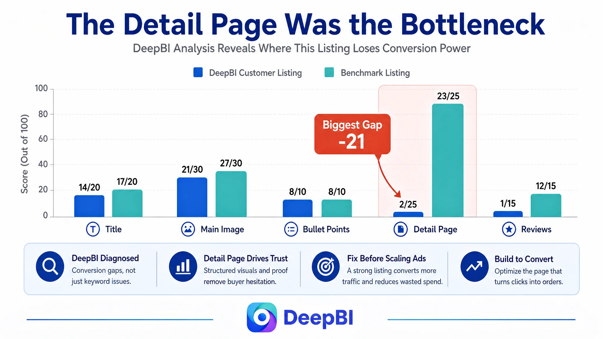
- Title: Customer Listing: 14/20, Benchmark Listing: 17/20, Gap: -3
- Main image: Customer Listing: 21/30, Benchmark Listing: 27/30, Gap: -6
- Bullet points: Customer Listing: 8/10, Benchmark Listing: 8/10, Gap: 0
- Detail page: Customer Listing: 2/25, Benchmark Listing: 23/25, Gap: -21
- Reviews: Customer Listing: 1/15, Benchmark Listing: 12/15, Gap: -11
- Total: Customer Listing: 46/100, Benchmark Listing: 87/100, Gap: -41
The score did not merely show that the Listing was weaker. It showed that the weakness was concentrated.
The title was behind, but not disastrously. The main images needed a clearer visual hierarchy. The bullet points were comparable in score, although their order and specificity still needed refinement.
The decisive gap was the detail page.
The customer’s A+ area contained no meaningful visual content and largely repeated the product name. The benchmark Listing used structured modules to show:
- The problem before and after using the product
- Surface compatibility
- Multiple usage environments
- Installation benefits
- Functional details
- A more complete product story
This was not a cosmetic difference. It changed how much evidence the shopper received before making a decision.
The review gap added another layer of risk. The customer Listing had no review data, while the benchmark had a healthy review base and a visible history of positive customer feedback. The seller could not immediately close that gap through copy or image changes, but it had to recognize the commercial implication: a new or unproven product requires stronger product-page evidence to compensate for the lack of social proof.
The Real Constraint Was Listing Conversion Capacity
The central business judgment was not that the title, images, or reviews were irrelevant. It was that the page lacked enough conversion capacity to justify making traffic the first priority.
The Listing had a 41-point overall gap, and more than half of that difference came from the detail-page dimension alone. That suggested a specific operating risk:
The page was asking shoppers to trust the product without giving them enough proof.
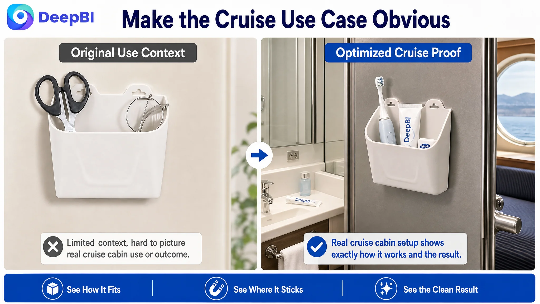
For this product category, trust depends on concrete details rather than broad claims. A shopper needs to see the holder in a cramped cruise bathroom, understand which surfaces it can attach to, recognize the items it can hold, and see how drainage supports cleanliness.
Without those signals, the shopper must fill in the gaps personally. That is where hesitation, abandonment, or an eventual return can occur.
DeepBI’s role in this diagnosis was to connect the score difference to the buying logic behind it. The issue was not simply that the customer had “less A+ content.” The issue was that the page had not established:
1. A clear problem — limited counter space in a small cruise bathroom
2. A visible solution — move daily essentials onto the wall
3. A reliability proof — magnetic attachment to compatible metal surfaces
4. A hygiene proof — drainage and air circulation
5. A capacity proof — room for electric toothbrushes and full-size toiletries
6. A risk explanation — not suitable for glass, tile, or wood
7. A value extension — useful beyond one cruise trip
That is the difference between adding content and repairing a conversion path.
The Main Image Needed One Primary Message
The existing visual direction attempted to communicate several functions at the same time: the product, items placed inside it, magnetic mounting, and drainage-related details.
The result was a crowded first impression.
On Amazon search results, the shopper should not have to decode the image before understanding the product category and its main use. The first visual should quickly establish that this is a magnetic toothbrush and toiletry holder with meaningful storage capacity.
The recommended image sequence therefore moved from basic recognition to proof:
Show the capacity first
The opening product view should clearly display common items such as manual or electric toothbrushes and toothpaste. This makes the product’s size and purpose easier to understand than an isolated product shot.
Connect the product to the cruise-cabin problem
The next image should place the holder in a realistic, compact cruise bathroom, with the limited sink area and cabin context visible. This gives the buyer an immediate reason to care about the product.
Make the result visible
A before-and-after comparison should show a cluttered sink and the same space reorganized with the wall-mounted holder. The purpose is not visual decoration. It is to demonstrate the outcome the buyer is purchasing.
Explain the drainage feature
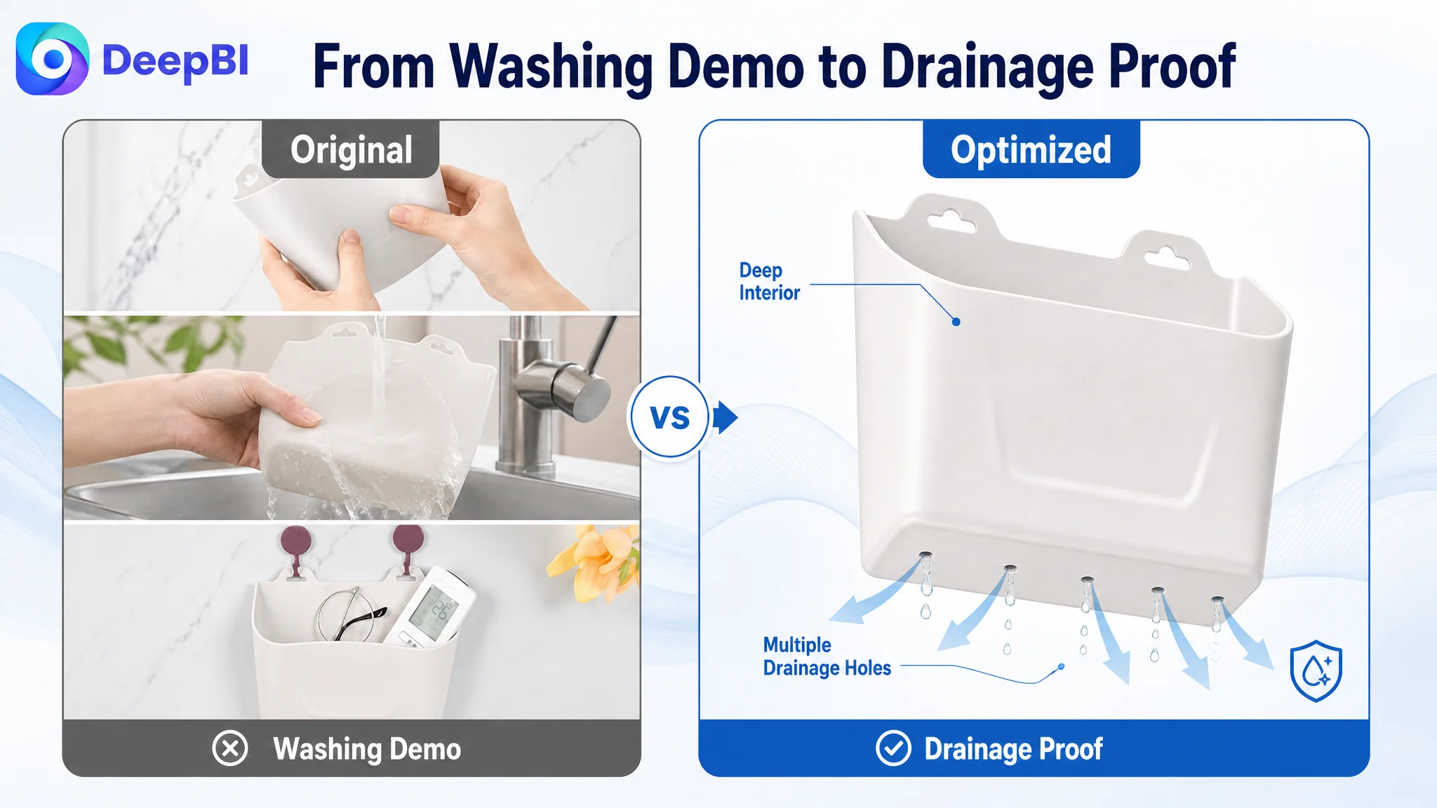
A close-up should show the built-in drainage holes and the way water can escape. This addresses the concern that toothbrushes and toiletries may remain wet or sit in stagnant water.
Move broader applications later
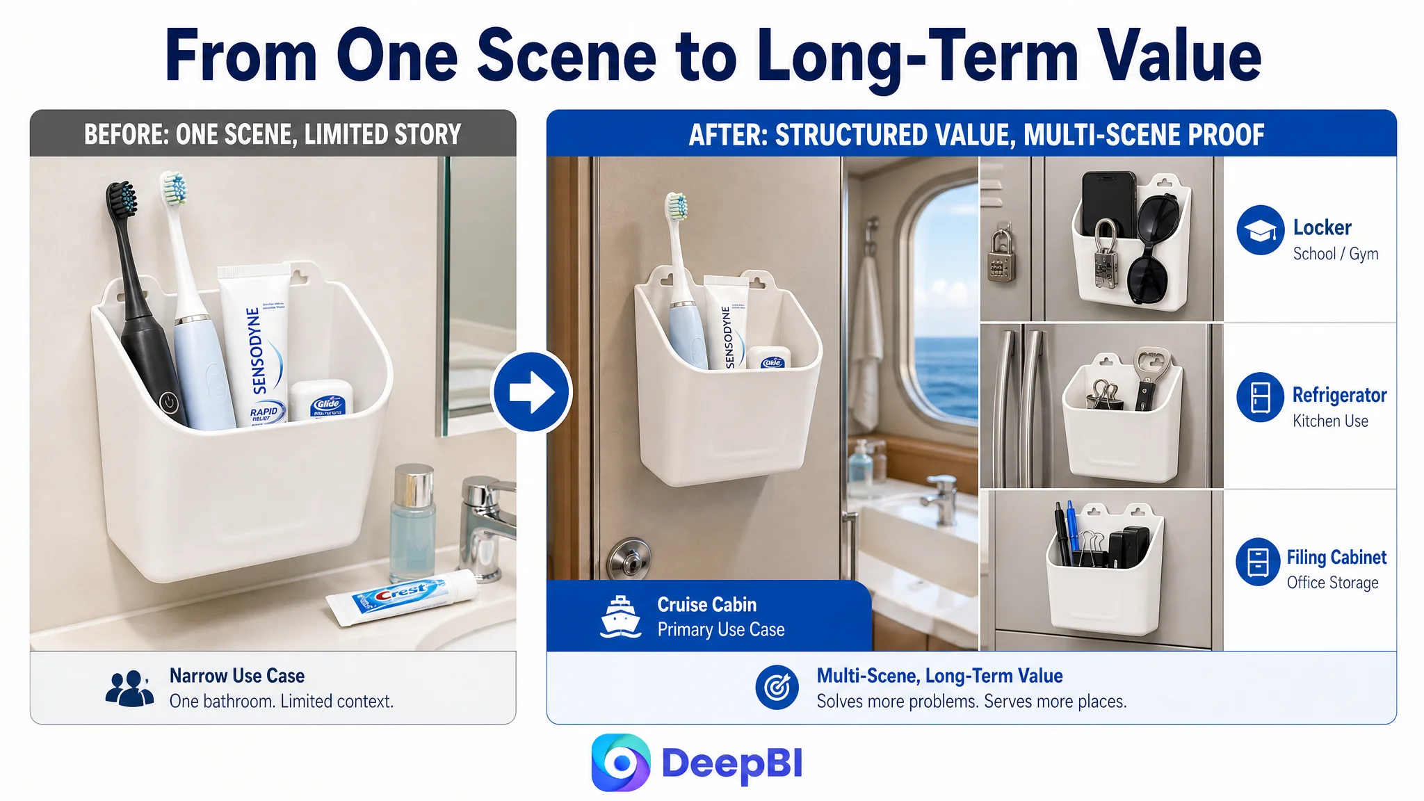
Uses on refrigerators, lockers, filing cabinets, or RV metal cabinets can support the value proposition, but they should not displace the primary cruise-cabin story at the beginning of the image sequence.
The first image should identify the product. The following images should remove the reasons not to buy it.
The Detail Page Had to Resolve the Highest-Risk Question First
For a magnetic organizer, the most important hesitation was not whether it looked attractive. It was whether it would work on the buyer’s intended surface.
The benchmark Listing handled this concern directly. The customer’s page did not.
The recommended A+ structure placed compatibility and installation near the beginning:
- Cruise-ship metal walls and doors: compatible
- Iron or steel surfaces: suitable
- Glass, tile, marble, or wood: not suitable
- No drilling required
- No adhesive or residue where supported by the actual product capability
This kind of explanation does two things at once. It builds trust with qualified buyers and reduces the risk of buyers applying the product in an unsuitable location.
For an Amazon Listing, clarity about limitations is not a weakness. It can be a conversion asset because it makes the product promise more credible.
The page also needed to show the product holding relevant items, especially an electric toothbrush, full-size toothpaste, razors, or other personal-care essentials. These objects serve as visual scale and evidence of practical use.
The buyer should not have to guess whether the storage pocket is large enough or whether the magnetic backing can support the intended load.
The Bullet Points Needed Better Decision Order
The bullet points were not fundamentally missing information. Their main weakness was the sequence and specificity of the argument.
The recommended order began with the most important technical and situational concern:
Strong magnetic hold for cruise cabins
The first point should explain that the holder is designed for smooth metal stateroom walls and doors, without drilling or adhesive installation. This establishes the product’s core reason for existing.
Hygiene and quick-dry design
The second point should connect the drainage holes to a recognizable problem: wet counters, toilet splashes, and damp personal-care items in a cramped bathroom.
Storage for daily essentials
The third point should show compatibility with electric toothbrushes, full-size toothpaste, razors, or similar items. Specific objects are more persuasive than a general statement about “large capacity.”
Pack-flat portability
The fourth point should address the travel concern that the organizer itself may become bulky luggage. Its slim, lightweight form should be connected to carry-on and suitcase use.
Durable and versatile utility
The final point can extend the use case to lockers, refrigerators, filing cabinets, or RV metal cabinets, while preserving the primary cruise application as the main story.
This is not about copying a competitor’s wording. It is about recognizing that each bullet should perform a distinct job in the buying process.
The strongest structure follows:
Buyer concern → product evidence → practical outcome
For example, “small, wet cruise bathroom” should lead to “built-in drainage holes,” which should lead to “cleaner and drier storage.” That is stronger than listing “drainage” as an isolated specification.
A+ Content Was Not an Optional Enhancement
The largest gap in the comparison was the A+ detail page, and that gap had a direct effect on the page’s ability to convert.
The customer’s existing A+ content offered no meaningful visual explanation beyond repeated product naming. As a result, the Listing had no place to demonstrate the product’s broader logic after the shopper had already clicked through the main images and bullet points.
The recommended A+ sequence was designed to continue the argument rather than repeat it.
Module 1: The cramped bathroom problem
Open with a realistic before-and-after scene. The shopper should immediately recognize the clutter and understand how the holder creates usable vertical storage.
Module 2: Surface compatibility and installation
Show where the product works and where it does not. This is the highest-priority hesitation point and should not be buried near the end.
Module 3: Drainage and hygiene
Use a close-up of the drainage holes and the product’s external design to explain water release and air circulation without inventing unsupported performance claims.
Module 4: Capacity and hold security
Show the organizer containing relevant daily essentials, including an electric toothbrush and larger toiletries. This turns an abstract capacity claim into visible evidence.
Module 5: Pack-flat travel design
Place the slim organizer inside a carry-on or suitcase to answer the concern that a space-saving product may consume too much packing space.
Module 6: Utility beyond the cruise
Show realistic uses on suitable metal surfaces such as lockers, filing cabinets, refrigerators, or RV cabinets. This helps the buyer see value beyond a single trip.
Module 7: A rational closing reassurance
End with a concise summary of drill-free installation, compatible surfaces, drainage, portability, and practical use. The closing should reinforce confirmed capabilities rather than introduce new promises.
This structure gives every module a purpose. It also prevents the A+ page from becoming a collection of attractive but disconnected lifestyle scenes.
Why DeepBI Did Not Prioritize More Ad Tuning
The case did not indicate that the seller had no advertising opportunities. It showed that the Listing itself was not ready to make the most of additional traffic.
That distinction is important for Amazon operators. Advertising can help generate impressions and clicks, but paid traffic still lands on the same title, images, bullet points, A+ content, and review environment.
If the product page has a weak conversion path, ad optimization may create the appearance of activity without resolving the underlying constraint. The seller may continue changing bids, search terms, or campaign structures while the page remains unable to answer the buyer’s core questions.
The better decision order was:
1. Repair the page’s primary sales logic
2. Clarify compatibility and practical use
3. Improve visual proof and image sequencing
4. Strengthen A+ content around the biggest hesitation points
5. Then evaluate how paid and organic traffic respond
This order also reduces the risk of using advertising to amplify page-level defects.
Advertising can amplify visibility. It cannot substitute for product-page proof.
The Seller’s Understanding Had to Change
The most valuable outcome of the diagnosis was not a list of revised phrases or image concepts. It was a change in how the seller understood the problem.
The original view treated the Listing as a product information container that needed more complete feature coverage.
The revised view treated the Listing as a decision system.
In that system:
- The title establishes search relevance and category clarity
- The main image creates recognition and click motivation
- The secondary images demonstrate the product’s outcome
- The bullet points organize concerns and solutions
- The A+ page resolves hesitation with visual evidence
- Reviews reinforce trust after the product promise has been understood
- Ads bring traffic into the system, but do not replace its logic
The score comparison made this system visible. The title and bullet points needed refinement, but the detail-page gap was the constraint that had to be addressed first. The page did not primarily lack more claims. It lacked a coherent sequence of proof.
The Business Change Was a More Controllable Operating Path
The source case does not provide post-optimization CVR, ACOS, TACOS, ranking, or order data, so no numerical performance improvement can be claimed.
What changed was the operating decision.
Instead of continuing to treat the challenge as a keyword or feature-description problem, the team had a more specific path:
- Rebuild the page around the cruise-cabin use case
- Make capacity visible
- Show the before-and-after result
- Explain magnetic-surface compatibility
- Bring drainage and hygiene into the main product story
- Improve the order of the bullet points
- Replace empty A+ content with structured proof
- Keep broader applications secondary to the primary buying scenario
- Address review weakness as a trust risk rather than trying to hide it with more copy
That makes future testing more meaningful. When the Listing has a clear conversion structure, changes in advertising performance can be interpreted with greater confidence. When the page is incomplete, every ad result is harder to diagnose.
The Lesson for Amazon Sellers
A weak Amazon Listing is not always a traffic problem, and a high-effort Listing is not always a persuasive one.
This cruise-cabin organizer had relevant keywords, several functional benefits, and a defined target scenario. Yet the page still scored only 46 out of 100 because its most important proof was missing or poorly sequenced.
The case shows why Amazon sellers should ask a more useful question before increasing traffic:
Can this product page make a qualified shopper confident enough to buy?
For this Listing, the answer depended on more than a better title or additional feature language. It depended on whether the page could prove the product’s fit, hold, hygiene, capacity, portability, and practical value in the order the shopper needed to see them.
That is where the diagnosis moved from surface optimization to business judgment. The seller did not need to keep making the ads work harder first. The product page needed to become capable of converting the traffic.