

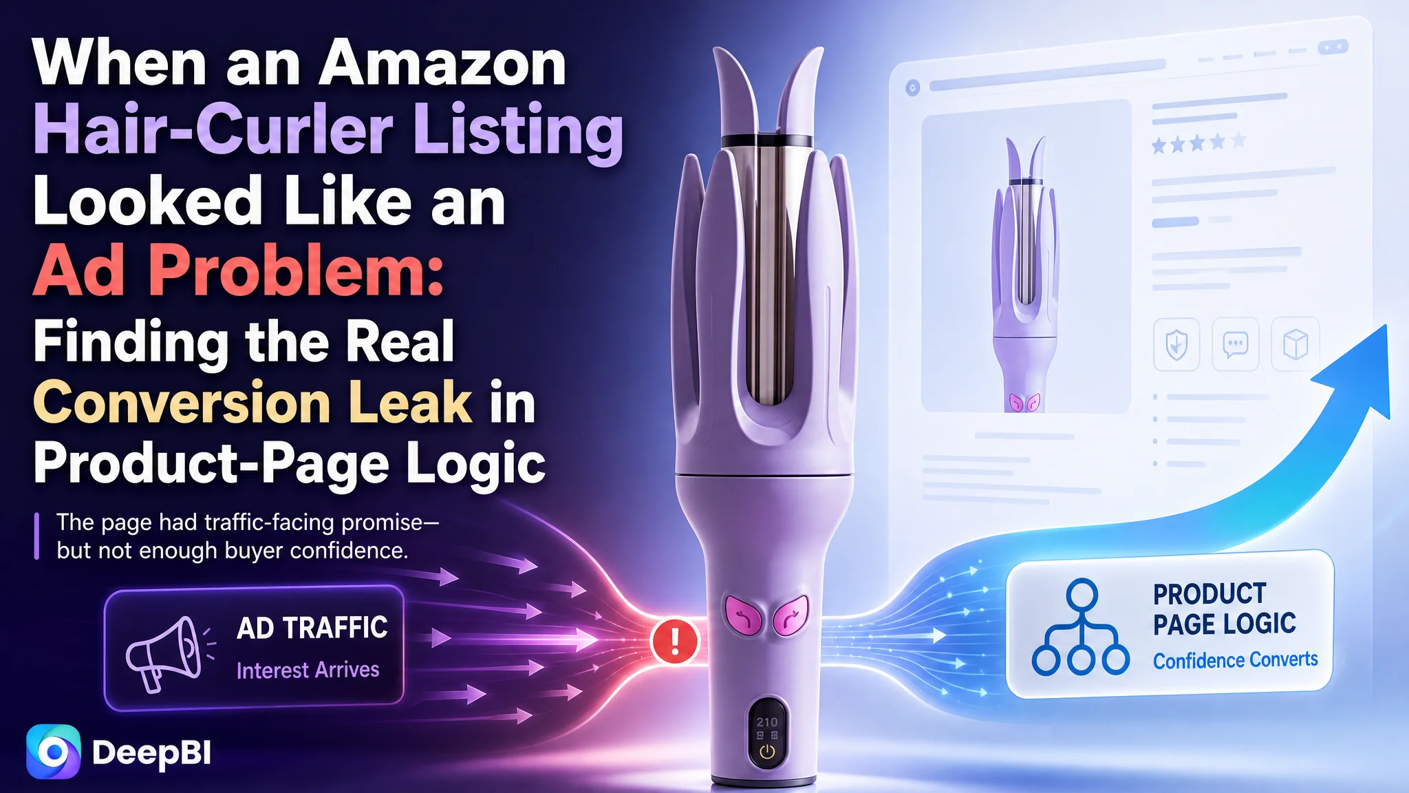
The customer was an Amazon seller in the US beauty and haircare category, operating an automatic rotating curling iron Listing. The product had relevant features, usable visual assets, and a clear category position, yet the Amazon product page was not giving shoppers enough confidence to move from interest to purchase.
The initial instinct was to treat the weakness as a collection of isolated content issues: add more keywords, explain more functions, show more operating steps, and make the product images more attractive. DeepBI found a more fundamental problem. The Listing was presenting information, but it was not guiding the buyer through the decisions that matter most: Is it truly automatic? Is it safe? Will it work for my hair? Can I achieve a lasting result without much skill?
That changed the optimization direction. Instead of continuing to polish individual elements or pushing more traffic toward the same page, the team needed to rebuild the Listing's sales logic—starting with trust, safety, suitability, and visible results. For other Amazon sellers, the case offers a practical reminder: when traffic does not convert, the first question should not always be how to acquire more traffic. It should be whether the product page deserves more of it.
The Amazon Listing Was Not Short of Information. It Was Short of Decision Logic.
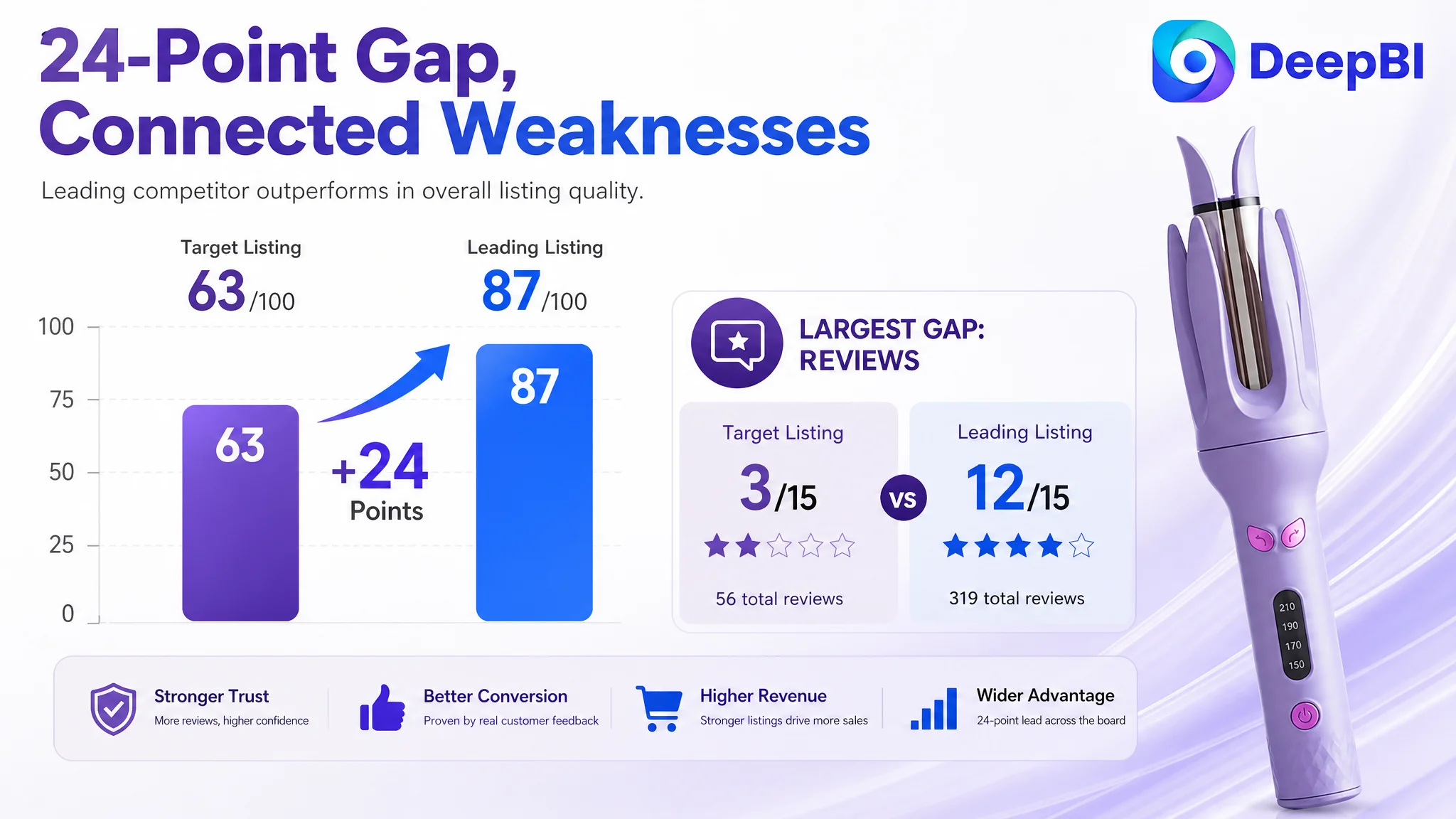
The target Listing received an overall score of 63 out of 100, compared with 87 out of 100 for a closely matched category-leading competitor.
The gap was not limited to one image or one line of copy.
- Title: Target Listing: 13/20, Comparable leading Listing: 18/20
- Main image: Target Listing: 24/30, Comparable leading Listing: 26/30
- Bullet points: Target Listing: 6/10, Comparable leading Listing: 8/10
- Detail page and A+ content: Target Listing: 17/25, Comparable leading Listing: 23/25
- Reviews: Target Listing: 3/15, Comparable leading Listing: 12/15
- Total: Target Listing: 63/100, Comparable leading Listing: 87/100
At first glance, this could look like a standard Listing quality problem. Improve the title, revise the bullets, replace several images, and strengthen A+ content.
But the score pattern revealed something more important: the weak elements were connected.
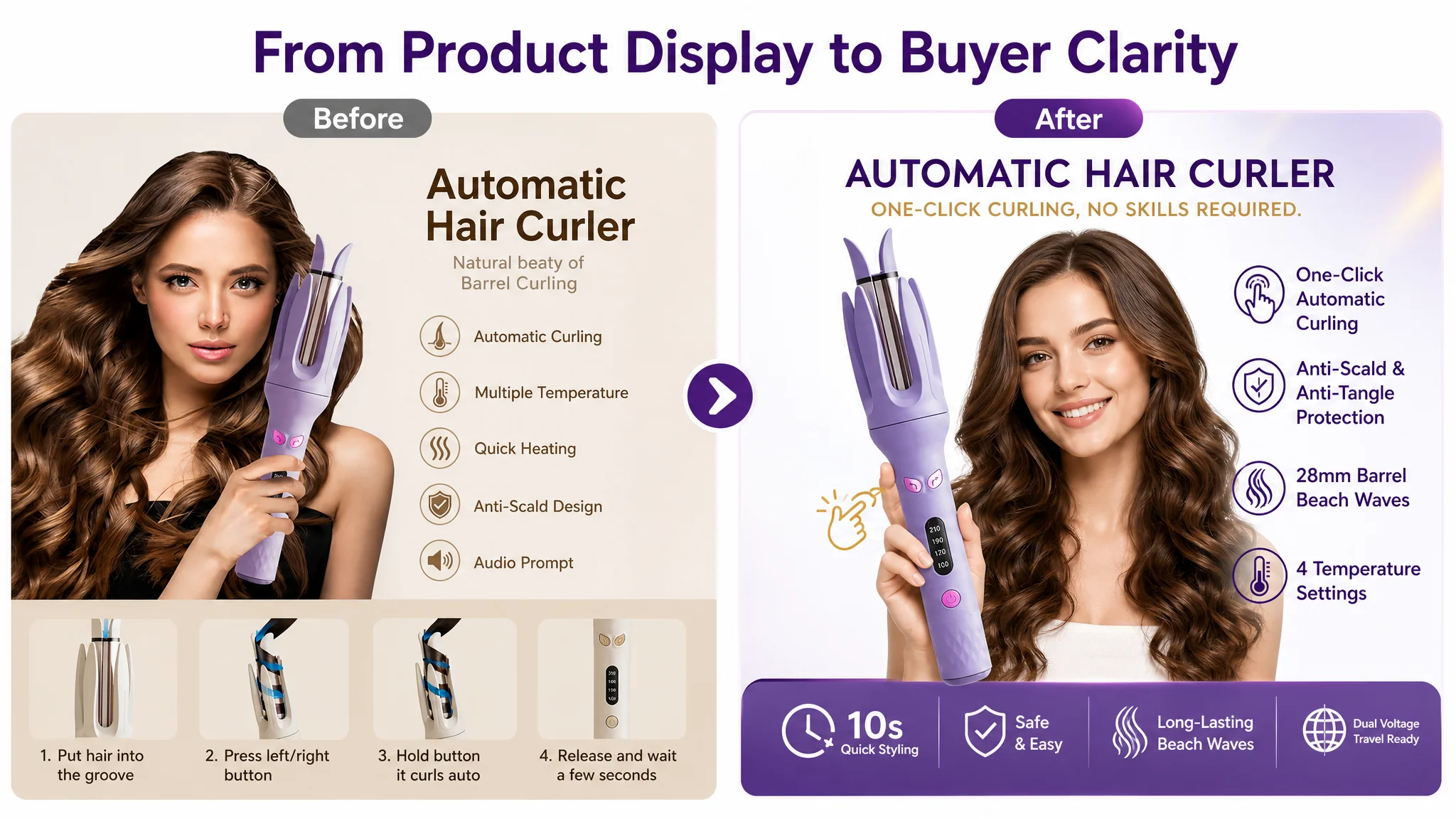
The title did not clearly communicate the product's strongest buying reasons. The images showed functions without fully resolving buyer uncertainty. The bullet points described features but did not build a persuasive sequence. The A+ content explained operation before establishing why the product was easier, safer, or more suitable than a traditional curling iron.
The problem was not a lack of content. It was a weak order of persuasion.
"The page was explaining how the product worked before giving shoppers enough reason to believe it would work for them."
The Original Misdiagnosis: Treating Each Weak Element as a Separate Fix
The practical misdiagnosis was to view the Listing as a series of disconnected defects.
The title needed more keywords. The images needed more instructions. The product details needed more feature icons. The A+ content needed to show the operating process.
Each action sounded reasonable in isolation. Together, however, they risked adding more information without improving the buyer's decision path.
The original title placed the core keyword “Automatic Curling Iron” early, but then continued with several overlapping variations, including “Hair Curler,” “Automatic,” “Rotating,” and “Wand.” This created keyword repetition without adding much clarity.
It also gave too little space to the information that helps a shopper decide:
- The 1.1-inch, or 28mm, barrel size
- The beach-wave use case
- Anti-scald and anti-tangle benefits
- Ceramic coating
- Four temperature settings
- Suitability for different users and hair types
Ending with a color reference such as “Purple” used valuable title space without strengthening the purchase argument.
The bullet points followed a similar pattern. They mentioned ease of use, temperature adjustment, anti-tangle protection, heating, audio prompts, appearance, and gifting. But they did not lead the buyer through a clear sequence from concern to solution to result.
A shopper considering an automatic curling iron is rarely asking only, “What features does this product have?”
They are more likely asking:
- Can I use it without much experience?
- Will it pull or tangle my hair?
- Is it safe around my hands and face?
- How long will the style last?
- Which temperature is right for my hair?
- Can I see evidence of the result?
The page needed to answer those questions in that order.
DeepBI Found the Real Constraint: Listing Conversion Capacity
DeepBI's diagnosis was not based on visual preference alone. It came from comparing the target Listing with a closely matched market benchmark across title, main image, bullets, A+ content, and reviews.
The key finding was that the Listing's conversion capacity was weaker than its traffic-facing promise.
The page could attract shoppers who were interested in automatic curling, but it did not consistently provide the reassurance needed to convert that interest into an order.
Three gaps were especially important.
The title described functions but did not lead with outcomes
The title included the main product category, but its structure was loose and repetitive. It did not make the product's use case immediately concrete.
A stronger structure would connect:
Product type → size and result → safety and ease → temperature control → material or suitability
For this Listing, that meant giving greater emphasis to “1.1 Inch (28mm),” “Beach Waves,” “Anti-Scald,” “Anti-Tangle,” “Four Temperature Settings,” and “Ceramic Coating,” while reducing repetitive keyword variations.
The improvement was not simply about adding more search terms. It was about making the title easier to process on Amazon search results and more relevant to the buyer's intended result.
The main images showed the product, but not enough proof
The first image created an attractive impression through the model and finished hairstyle. However, it did not immediately make the automatic function and one-click simplicity clear enough.
For a product aimed partly at shoppers who may lack styling experience, that creates an early uncertainty:
Is this genuinely easy to use, or does it still require the same manual technique as a traditional curling iron?
Other image roles were also out of sequence.
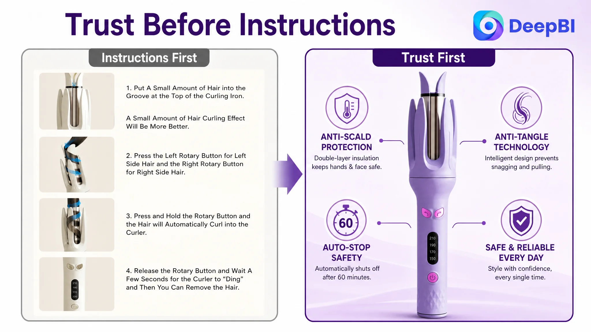
The Listing introduced operating instructions too early, while safety information appeared later. A detailed explanation of the timer and sound prompt occupied attention before the page had established suitability and trust. A color chart treated the product more like a catalog item than a tool promising a visible styling result.
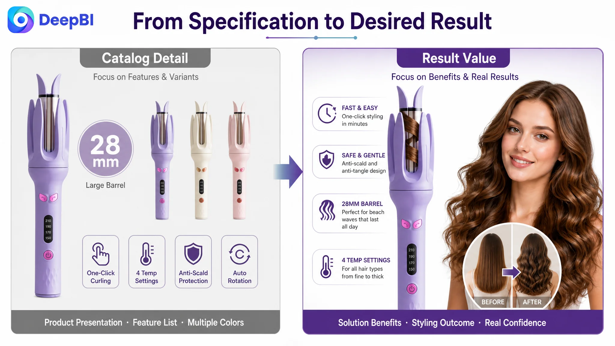
DeepBI therefore reframed the image sequence around buyer concerns:
1. Make one-click automatic styling immediately understandable
2. Address anti-tangle and anti-scald protection early
3. Show suitability and hair-care considerations
4. Quantify heating speed and time savings
5. Demonstrate lasting results and the value of the 28mm barrel
This was not a request to make the images more decorative. It was a change in the job each image was expected to perform.
The A+ content explained operation before building desire
The existing A+ structure relied heavily on usage steps, feature icons, and labeled product details.
That approach assumes the shopper is already convinced and only needs an instruction manual.
The benchmark Listing used a different sequence. It introduced common frustrations, explained the technology behind the product, demonstrated outcomes, clarified suitability, and only then showed the operating process in detail.
That order matters.
A shopper is more willing to study the steps after understanding why the product is safer, simpler, and more suitable than the alternatives.
"Instruction is a conversion closer, not necessarily a conversion opener."
The Review Gap Made Every Content Weakness More Expensive
The review dimension was the largest numerical gap.
The target Listing had:
- 3.8 stars
- 56 total reviews
- No effective review content visible on the first page
- A reported 24% share of one- and two-star reviews
The comparable leading Listing had:
- 4.2 stars
- 319 total reviews
- Eight visible, high-quality reviews on the first page
- No reported one- or two-star review share in the comparison
This difference matters because content claims are evaluated through the lens of trust.
When a page has a stronger review base, shoppers may accept claims about ease, safety, or results with less hesitation. When the rating is lower and the review volume is smaller, the page must work harder to prove each promise through clear visuals, specific explanations, and credible product-use logic.
The review gap was not something that could be solved by rewriting a bullet point. But it changed the priority of the Listing work.
The page could not rely on brand familiarity or accumulated social proof to carry the conversion. It needed to reduce uncertainty more deliberately through the content it controlled.
That meant showing:
- How the automatic rotation works
- How the anti-tangle protection addresses a real concern
- How the anti-scald design protects the user
- How temperature settings relate to different hair types
- What kind of result the 28mm barrel is intended to create
- What the complete styling process looks like

Why DeepBI Did Not Prioritize More Ad Tuning First
The case material does not provide a before-and-after advertising dataset, so it would be inappropriate to claim a specific ACOS reduction, CVR increase, or organic-order recovery.
The business judgment, however, is clear.
If paid traffic is directed to a product page with weak trust signals and an unclear sales sequence, additional ad optimization may only send more shoppers into the same conversion bottleneck.
Keyword refinement and bid adjustments can improve traffic quality. They cannot, by themselves, make a shopper believe that an automatic curling iron is safe, easy to control, suitable for their hair, and capable of producing a lasting result.
Advertising can amplify a strong page, but it can also amplify a page's unresolved defects.
That is why the Listing had to be repaired before the team treated more traffic as the primary answer.
The correct decision order was:
1. Identify whether the page could convert the traffic it already attracted
2. Compare its promise and trust structure with a relevant benchmark
3. Rebuild the information sequence around buyer concerns
4. Make the product's safety, simplicity, suitability, and results visible
5. Only then evaluate how advertising traffic responds to the revised page
This is the difference between optimizing activity and addressing a constraint.
The New Content Logic Started With the Buyer's First Fear
The revised main-image and A+ direction placed the most important concerns earlier.
First: make automatic styling obvious
The first visual should answer “Is it automatic?” and “Is it easy for me?” without requiring the shopper to inspect small details.
The focus should be the one-click curling design, no-skills positioning, and quick, simple styling process—provided these claims remain consistent with the actual product.
Second: resolve safety and tangling concerns
Anti-scald and anti-tangle information needed to move forward in the image sequence.
The recommended direction was to show the double-layer heat-insulating shell and the mechanism intended to prevent excessive hair insertion or pulling. The point was not to add technical language for its own sake. It was to address the fear that prevents a shopper from trusting an automatic rotating device.
Third: connect temperature control with suitability
“Four temperature settings” is a feature statement. It becomes more persuasive when connected to different hair textures and styling needs.
The revised content should map the available temperature levels to appropriate hair types only where the product's actual specifications support those claims. This turns a control panel into a decision aid.
Fourth: quantify time without allowing it to dominate
Rapid heating and the audio prompt are useful differentiators. The reported 15-second prompt and heating-speed claims can support the efficiency story, but they should appear after the page has established safety and suitability.
The shopper first needs to believe the tool is appropriate. Then speed becomes a reason to choose it.
Fifth: show the result
The 28mm barrel should not appear only as a technical specification or color-chart detail.
It should be connected to the intended outcome: beach waves, volume, and a polished style that can last through the day where the product's substantiated performance supports that claim.
A visible result gives the buyer a reason to imagine using the product—not merely a reason to understand its dimensions.
The Bullet Points Needed a Buying Sequence, Not a Feature Inventory
The recommended bullet structure followed a clearer conversion path.
One-click styling and accessible results
Lead with the problem of complicated manual twisting and position the product around easy, repeatable styling.
Tangle-free operation and anti-scald protection
Address the two strongest safety concerns before moving into technical detail.
Four temperature settings for different hair types
Connect control with suitability and hair protection, without making unsupported damage-free promises.
Fast heating and the intelligent audio prompt
Use the heating time and 15-second reminder as practical benefits for busy routines.
Ergonomic design and gifting value
Keep appearance and gifting as supporting benefits rather than the main conversion argument. The final bullet should reinforce handling, portability, or service support only where those claims are accurate and available.
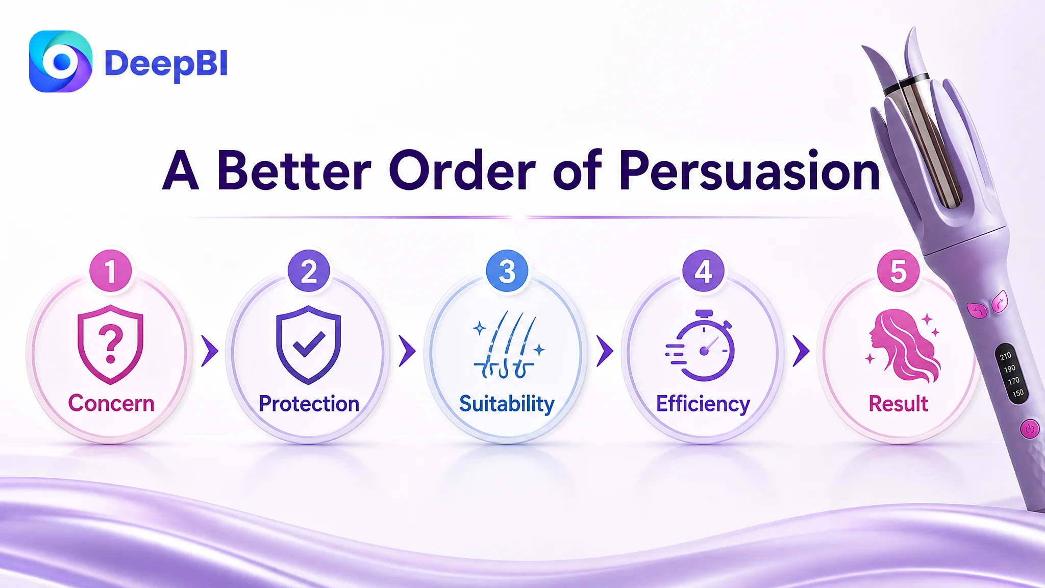
This structure helps the page move from anxiety to confidence:
Concern → protection → suitability → efficiency → added value
That is much stronger than placing ease of use, temperature, safety, heating, and appearance in an arbitrary list.
A+ Content Had to Become the Final Proof Layer
The A+ redesign was not about filling more modules. It was about assigning each module a specific role in the decision.
A stronger sequence would include:
- A problem-and-solution opening contrasting traditional curling difficulties with easier automatic styling
- A simplified control explanation linking temperature levels to hair types
- A visual explanation of anti-scald construction and ceramic-coating benefits
- A 28mm barrel and ergonomic-use section clarifying suitability
- A quick feature matrix for one-click styling, protection, heating, temperature control, and prompts
- A result demonstration showing the intended wave or curl outcome
- A precise operating guide placed last
The final operating guide could show:
Insert a small section of hair → press the rotation button → wait for the prompt → gently release the curl
Placed at the end, this guide works as reassurance rather than interruption. It answers the last question in the shopper's mind:
If I buy it, will I know exactly what to do?
What Changed Was the Store's Operating Understanding
Because the source material does not include post-optimization performance data, the case cannot claim a confirmed lift in CVR, lower ACOS, stronger organic ranking, or increased organic-order share.
What did change was the diagnosis and the decision path.
The Listing was no longer treated as a set of isolated assets requiring cosmetic refinement. It was understood as a conversion system in which the title, images, bullets, A+ content, and reviews all influence how much confidence paid and organic traffic can produce.
The customer could now separate three different questions:
- Traffic question: Are the right shoppers reaching the page?
- Click question: Does the main image create a clear reason to enter?
- Conversion question: Does the page remove enough doubt to earn the order?
For this automatic curling iron Listing, the most urgent constraint was the third question.
"Before asking Amazon ads to scale the product, the team had to make the product page capable of carrying that traffic."
The Broader Lesson for Amazon Sellers
A low-converting Amazon Listing is not always suffering from a lack of traffic, weak bids, or insufficient keyword coverage.
Sometimes the page has already attracted the shopper. The failure happens afterward, when the shopper cannot quickly understand:
- What the product does differently
- Whether it is safe to use
- Whether it suits their specific needs
- What result they can realistically expect
- Why they should trust the claim
DeepBI's role in this case was not to produce a longer list of edits. It was to identify the constraint behind the edits and establish the order in which the Listing needed to be repaired.
For this Amazon haircare Listing, that meant moving from function to buyer concern, from instruction to reassurance, and from isolated features to a connected promise:
easy to use, safe to handle, suitable for different hair needs, fast enough for daily routines, and capable of producing a clear styling result.
Only after that logic was in place could Amazon ads become a more reliable amplifier rather than a source of additional pressure on a weak product page.