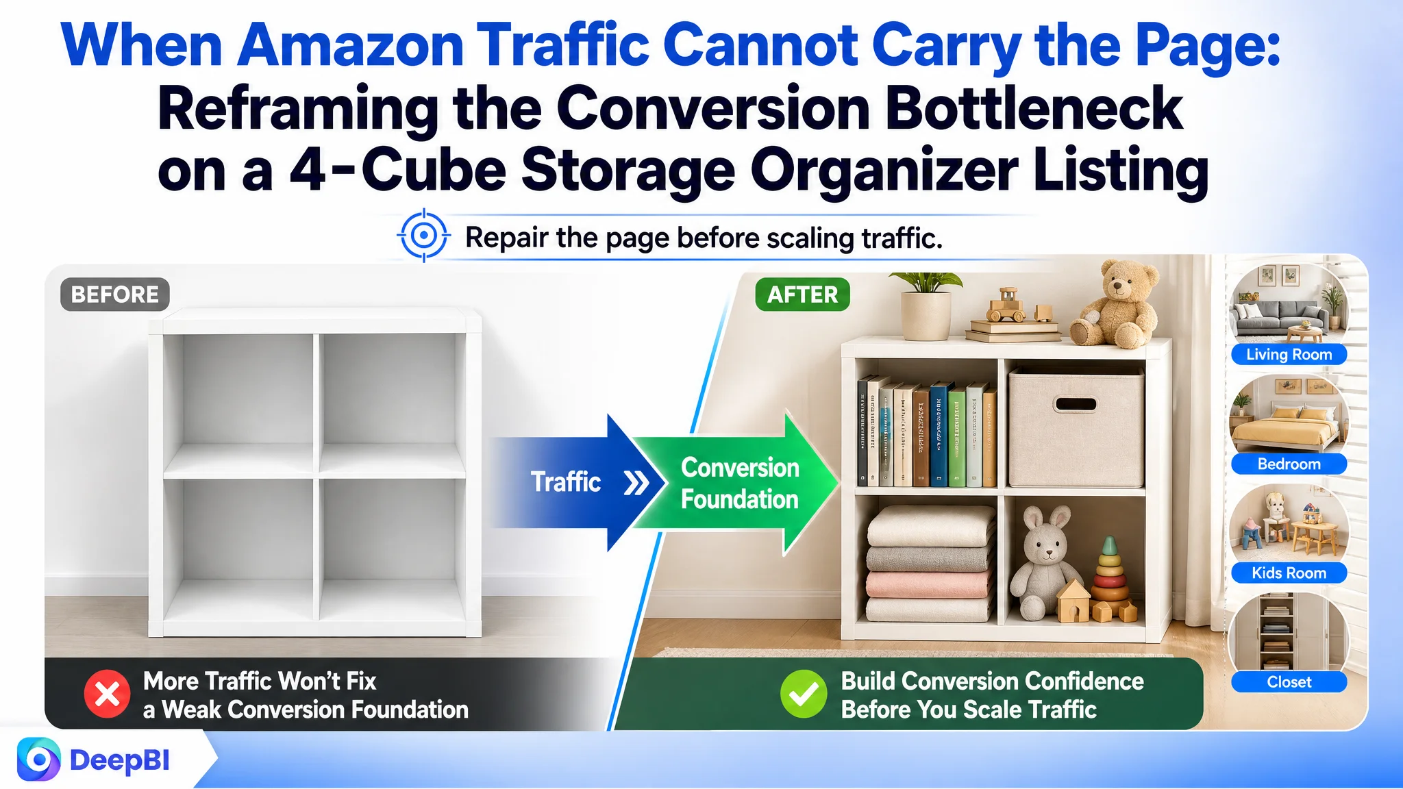
An Amazon seller in the home-storage category was trying to strengthen a US marketplace Listing for a four-cube organizer. The initial attention naturally went toward discoverability: the title led with “Closet Organizers,” the product specifications were clearly stated, and the page appeared to contain the information needed for a purchase decision. But the Listing was still operating from a weak conversion position.
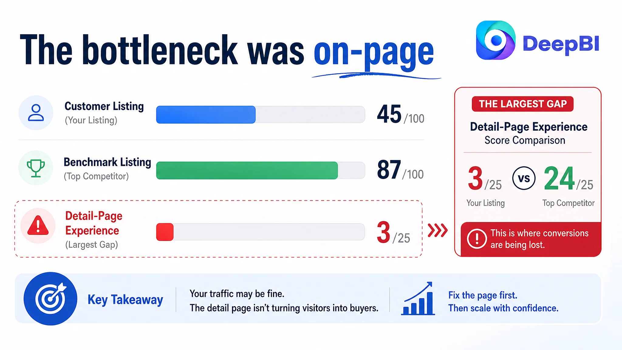
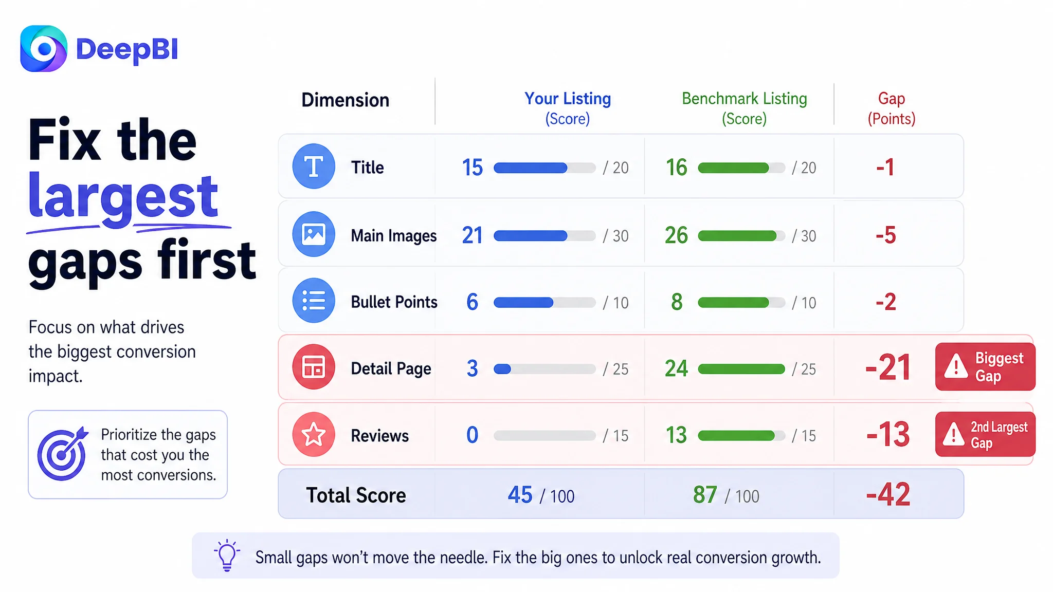
The deeper issue was not simply whether Amazon ads could bring more shoppers to the product page. The page itself was not giving those shoppers enough reasons to click, trust the product, or imagine it in their own homes. DeepBI’s comparison showed a 45/100 Listing against an 87/100 benchmark, with the largest gap concentrated in the detail-page experience rather than the title.
The score distribution made the priority visible: the title gap was limited, while the detail-page gap represented the largest structural weakness.
That changed the optimization order. Instead of treating keywords, ad traffic, or isolated image adjustments as the first answer, the later direction focused on rebuilding the Amazon product page’s sales logic: show the product in real spaces, address stability and safety concerns, clarify dimensions and storage capacity, and use the title and bullet points to connect features with everyday use. Other Amazon sellers can take away a practical lesson: before sending more paid traffic, determine whether the Listing is ready to convert it.
The seller saw an information problem. The page had a persuasion problem.
At first glance, this Listing did not look empty.
The title included a relevant core term. The bullet points contained dimensions, load capacity, material information, assembly time, and usage scenarios. The image set showed the product from several angles. On paper, the page had many of the elements an Amazon seller would expect to see.
But Amazon conversion is not created by information volume alone.
A shopper evaluating a storage organizer is not only asking:
- What is the product?
- How large is it?
- How much weight can it hold?
- How long does assembly take?
They are also asking:
- Will this look right in my room?
- What can I actually store in it?
- Is it stable enough for everyday use?
- Can it fit standard bins or folded clothing?
- Will the product feel substantial rather than flimsy?
- What happens if I place it in a home with children or pets?
- Can I trust this Listing when there are no customer reviews?
The customer’s page answered some functional questions, but it did not guide the shopper through those concerns in a convincing order.
The Listing contained product facts, but it did not yet turn those facts into a confident buying decision.
That distinction explains why the first diagnosis was incomplete. When a product page has relevant keywords and specifications, it is easy to assume the remaining problem is traffic: improve search coverage, adjust bids, refine campaigns, or generate more clicks.
But if the page cannot convert the traffic it receives, additional traffic only increases exposure to the same weakness.
The first instinct was to improve visibility before proving conversion capacity
The title was already search-oriented. It placed “Closet Organizers” near the front and clearly described the product’s form and use. That made discoverability a reasonable starting point.
The problem was that the title was optimized more narrowly around one usage context.
The benchmark title led with a more general product structure: a four-cube storage organizer, a low bookcase, an open shelf, and a freestanding display organizer. It covered more search situations without abandoning the core product category.
The customer’s title, by contrast, emphasized the closet and bedroom direction. Its stronger product attributes, including the extra-thick frame and closed back, appeared later. Terms such as bookcase, bookshelf, and display organizer were not used to expand the product’s search context.
This did not mean the title was the main problem. Its score was 15/20, compared with 16/20 for the benchmark. The gap was real, but limited.
That was an important judgment.
A small title gap did not justify treating keyword expansion as the primary fix. The title could be improved to balance search coverage and click appeal, but the page had a much larger constraint elsewhere.
The more consequential question was:
If the Listing attracted more relevant shoppers, would the rest of the page give them enough confidence to buy?
The score comparison suggested that the answer was not yet strong enough.
The score difference revealed where the conversion leak was concentrated
The overall comparison was clear:
- Title: Customer Listing: 15/20, Benchmark Listing: 16/20, Gap: -1
- Main images: Customer Listing: 21/30, Benchmark Listing: 26/30, Gap: -5
- Bullet points: Customer Listing: 6/10, Benchmark Listing: 8/10, Gap: -2
- Detail page: Customer Listing: 3/25, Benchmark Listing: 24/25, Gap: -21
- Reviews: Customer Listing: 0/15, Benchmark Listing: 13/15, Gap: -13
- Total: Customer Listing: 45/100, Benchmark Listing: 87/100, Gap: -42
The largest difference was not in the title, and not even in the main image.
It was the detail-page score: 3 versus 24 out of 25.
The review position added another serious constraint. The customer Listing had no rating data and no customer reviews, while the benchmark had a 4.6-star rating and 159 reviews. That trust gap could not be solved through copywriting alone.
DeepBI’s role in this case was not to treat every weak dimension as equally urgent. The value came from separating small gaps from structural ones.
The title needed refinement.
The bullet points needed a more persuasive order.
The image sequence needed stronger context and utility.
But the detail page lacked the visual and logical structure required to compensate for uncertainty elsewhere. And with no review history available, the page had even more responsibility to prove quality, safety, fit, and real-world use through its own content.
The decisive gap was not “the page needs more content.” It was “the page lacks a complete trust-building sequence.”
The detail page was not supporting the ad funnel
The customer’s detail content was primarily text-based, with repeated explanations and no meaningful visual module structure.
The benchmark used a broader sequence:
- Lifestyle scenes
- Product detail close-ups
- Size comparisons
- Color and lighting references
- Safety information
- Multiple placement and use cases
This difference mattered because shoppers do not process a storage product as a specification sheet.
A four-cube organizer is a spatial product. Its value depends on how it occupies a room, what it stores, how stable it appears, and whether its dimensions feel practical. Text can state those points, but visual proof makes them easier to understand.
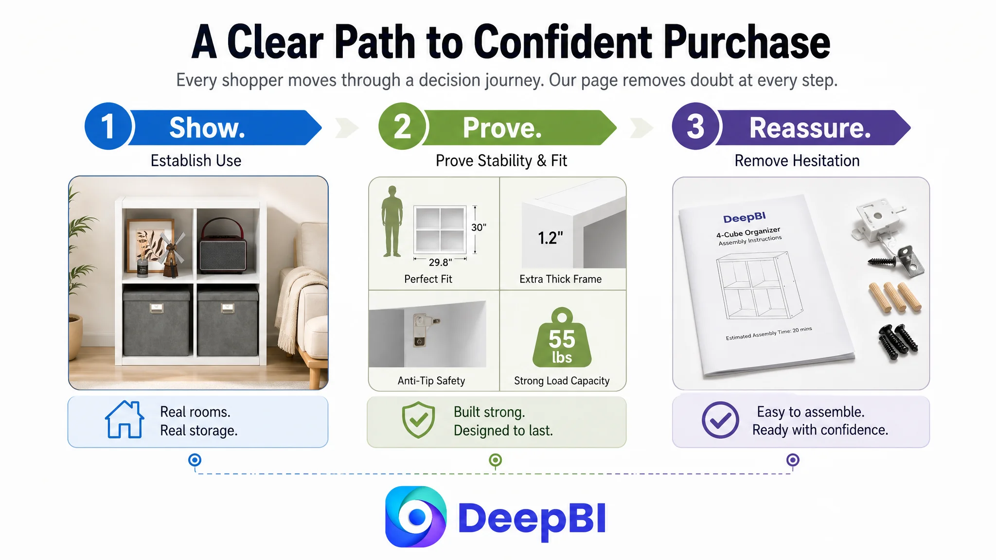
The benchmark’s page moved through a recognizable decision path:
1. Establish the product’s role in the home.
2. Show why the structure is stable.
3. Demonstrate what the compartments can hold.
4. Confirm the physical dimensions.
5. Expand the use cases beyond one room.
6. Reinforce material and construction quality.
7. Reduce assembly hesitation.
The customer page did not build that sequence. It described the product, but it did not stage the shopper’s decision.
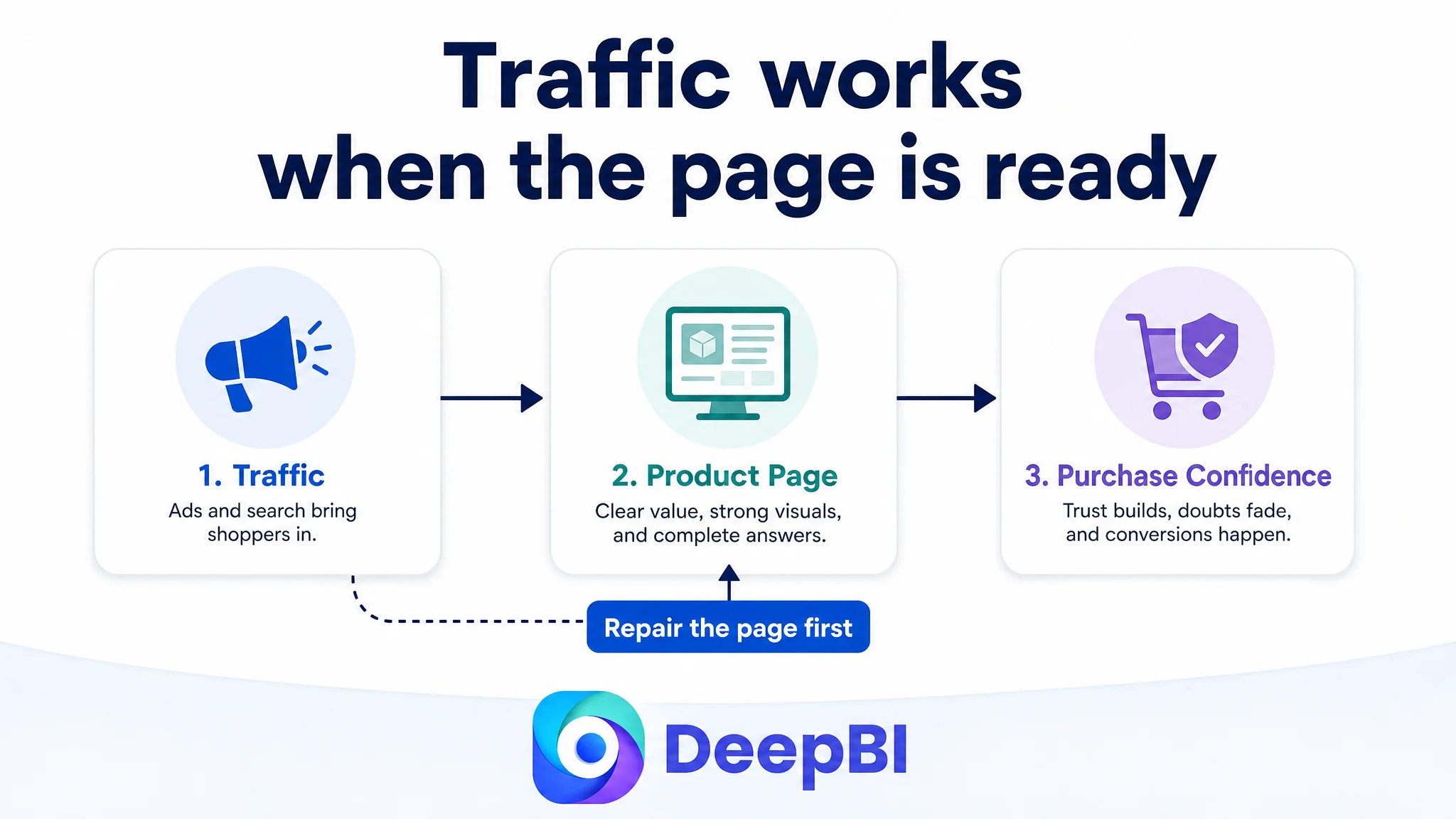
This is where Amazon Listing conversion had to be addressed before further ad expansion. If shoppers arriving from Amazon ads encountered the same text-heavy page, the ads would be doing their job mechanically while the product page failed commercially.
Advertising does not repair an incomplete buying argument.
It increases the number of people exposed to it.
The main image problem was not simply that it looked plain
The customer’s main image set had several useful assets, especially the dimensions and capacity image. That image carried strong decision value and did not need to be discarded.
The weakness was the overall sequence.
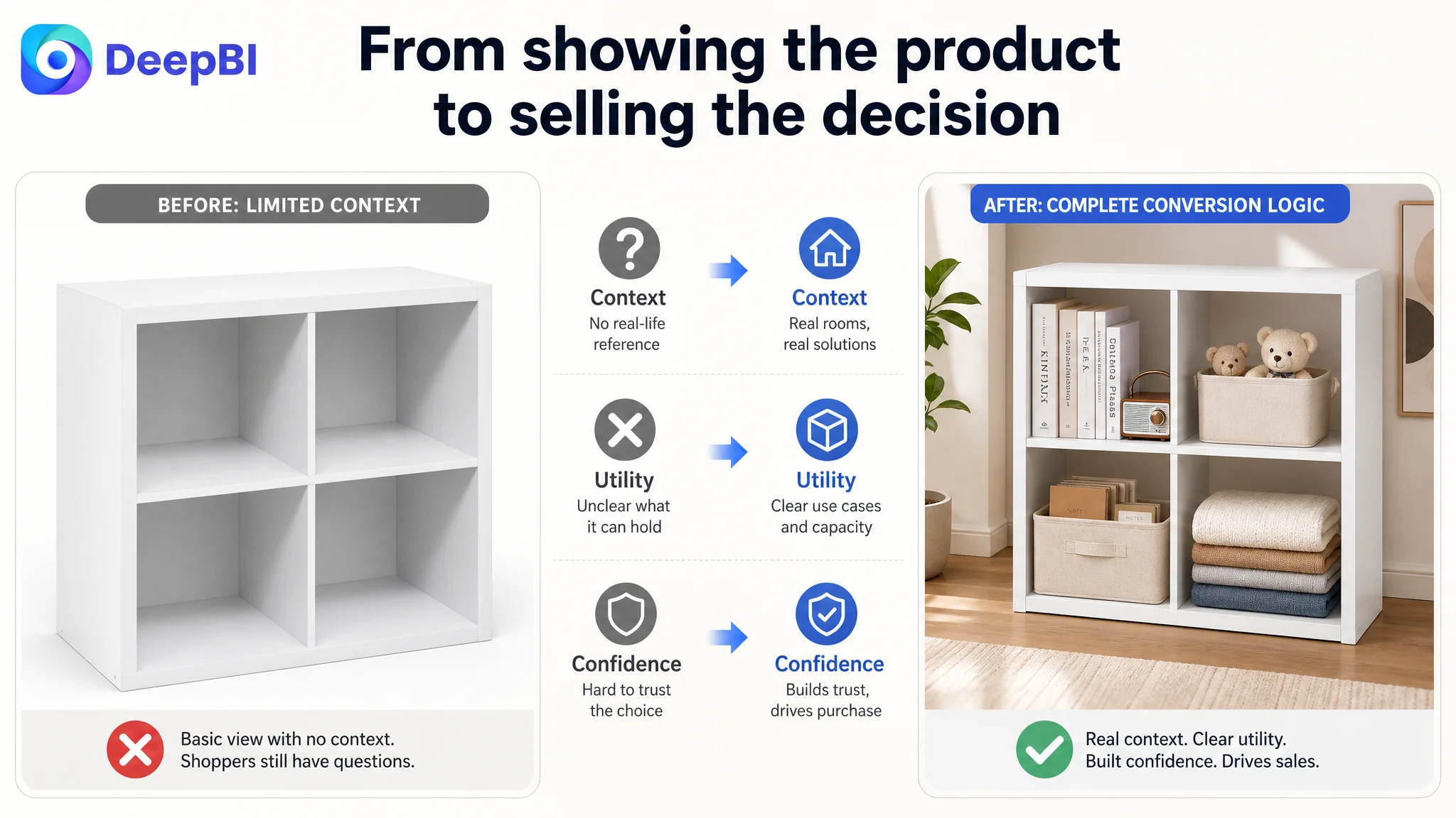
Some later images showed the organizer as a plain white unit with limited visual context. The product was visible, but the shopper had little help understanding how it would function in a home or why its structure mattered.
DeepBI therefore did not treat every image as a creative problem requiring a completely new concept. It examined the role each image played in the funnel.
The first image needed broader category recognition
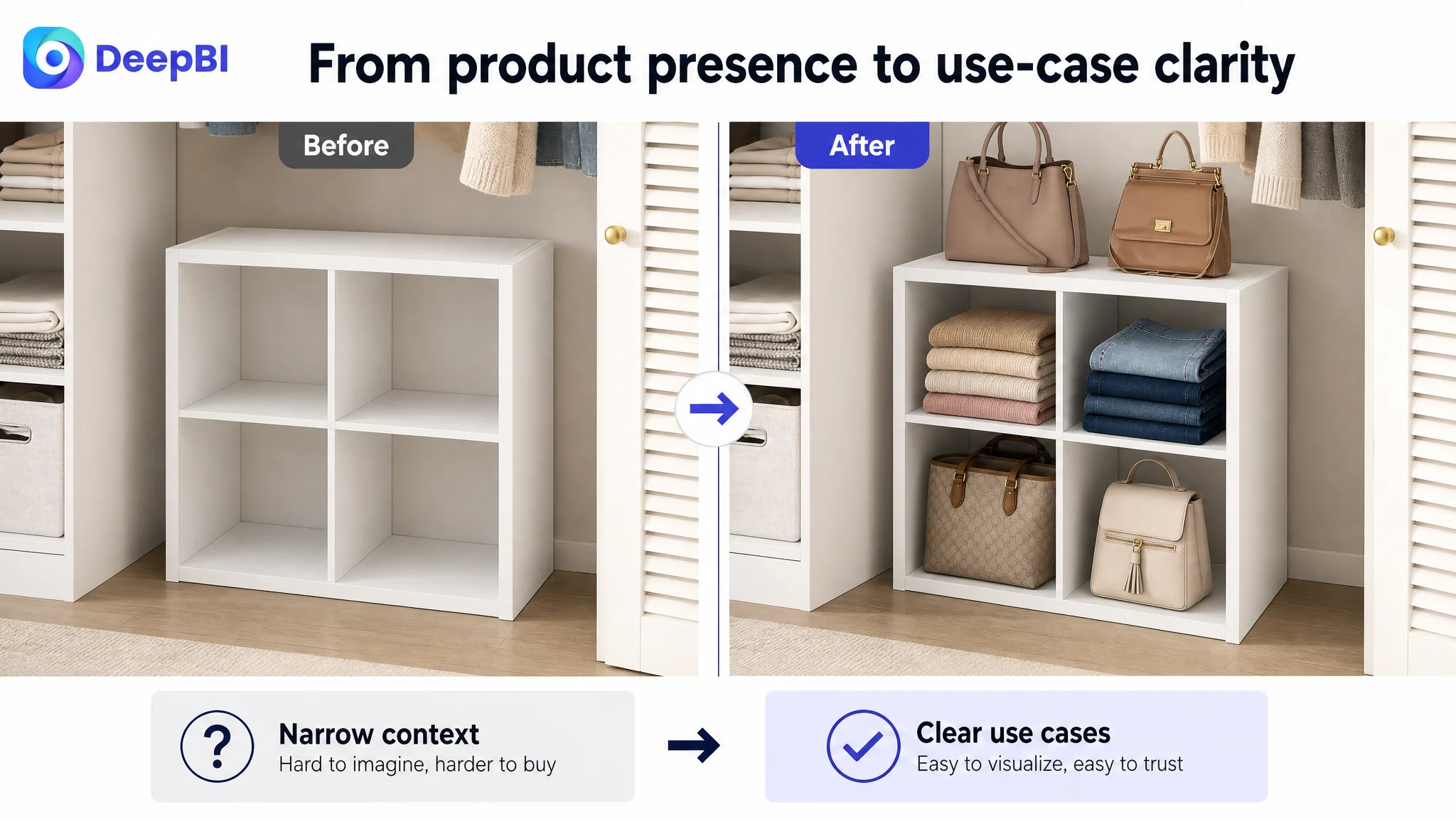
The product could serve a closet, but its relevance extended to a study, hallway, living room, or dining area.
The first impression should retain the clean 2x2 cube structure while making the product feel useful beyond one narrow context. The goal was not to misrepresent the product through a stacked configuration or an exaggerated lifestyle scene. It was to clarify the range of legitimate use cases.
The specification image was already valuable
The image showing dimensions, shelf capacity, top-panel capacity, cube size, and assembly information was one of the stronger assets.
It answered practical questions that shoppers often ask before purchasing furniture. The decision was therefore to preserve its role rather than replace it for cosmetic reasons.
Structural quality needed to lead toward safety
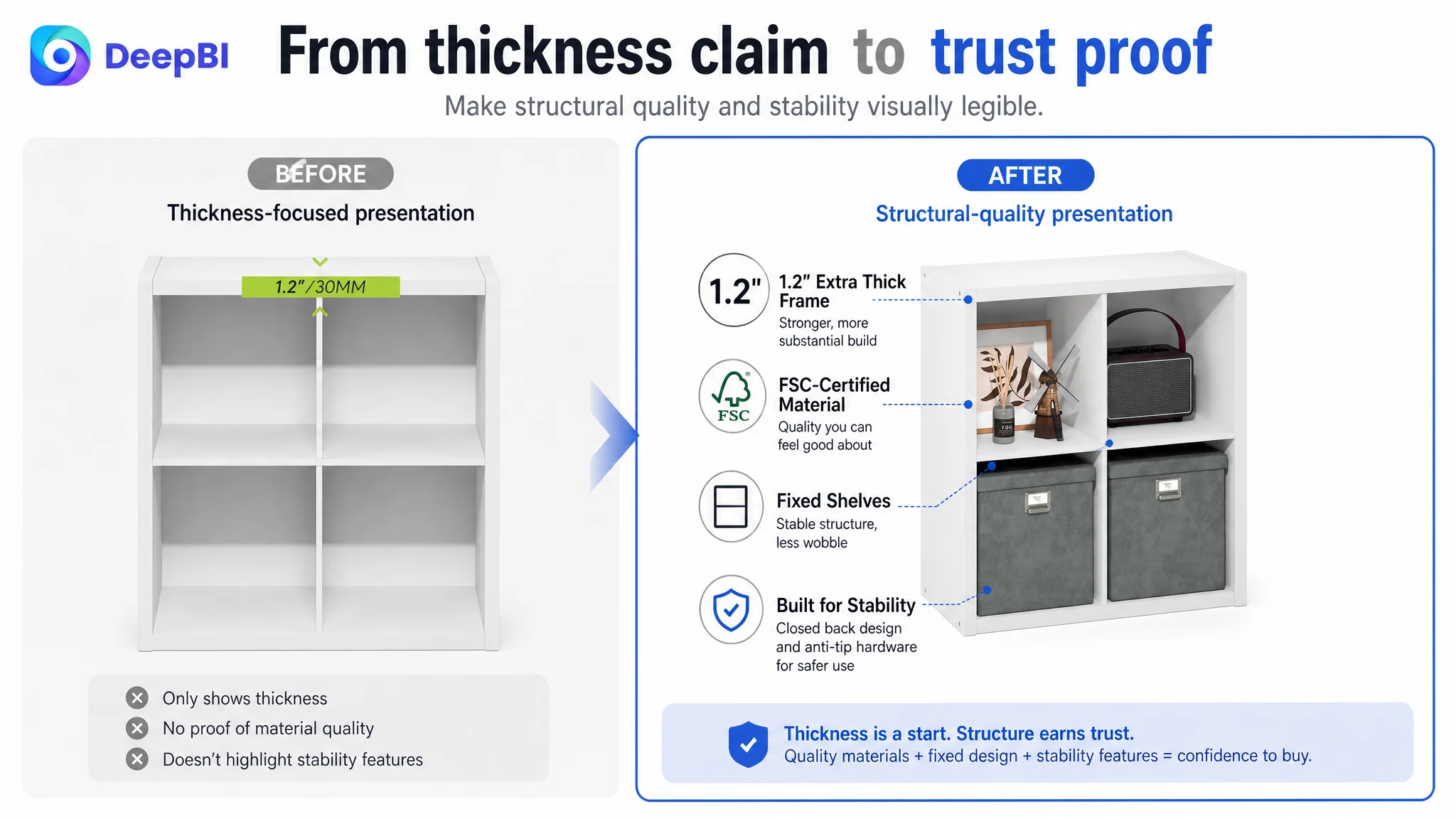
The extra-thick frame and FSC-certified particle board were meaningful strengths. But at this stage, a thickness claim by itself was less persuasive than showing how the product remains secure in use.
The next image logic needed to connect the thick frame and closed-back structure with wall-mounting hardware and an anti-tip kit. This addressed the concern more directly:
Is this organizer only visually substantial, or does it feel stable in a real household?
Repeated product angles were using valuable image space
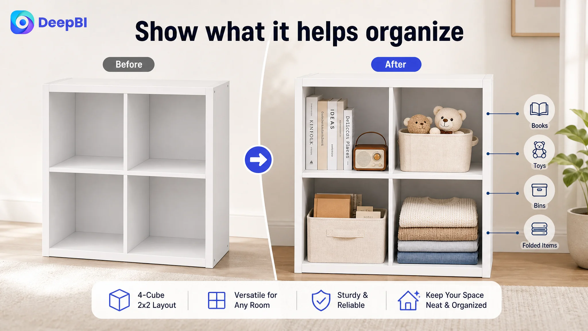
One of the later images mainly presented another product angle. That had lower conversion value than a scene showing the organizer holding folded clothing, bins, books, or daily essentials.
The recommendation was not to add decoration for its own sake. It was to use the image sequence to answer the shopper’s practical question: What will this actually help me organize?
The bullet points had specifications, but not enough buying logic
The customer’s bullet points leaned toward functional description and numerical detail.
Those details were not wrong. In fact, the load capacity and dimensions were useful advantages. The issue was how the information was ordered and connected to customer concerns.
The benchmark opened with style and everyday versatility, then addressed safety, flexible use, installation, and spatial efficiency. Its language connected the product to children, pets, cables, rooms, and real household behavior.
The later content direction kept the customer’s factual strengths but gave them a stronger sequence.
The product needed to be positioned as more than closet storage
The first bullet could lead with the clean white finish, symmetrical 2x2 layout, and extra-thick frame, then connect those attributes to closets, studies, hallways, and other rooms.
This gives the shopper both a visual impression and a clear use context.
Capacity needed to be tied to recognizable items
“13.5 by 13.5 inches” is useful, but it becomes more meaningful when connected to standard storage bins, folded clothes, large books, and daily essentials.
The goal is not to add more numbers. It is to help the shopper determine whether the product fits an actual storage problem.
Safety needed to be expressed as household reassurance
The Listing already had structural and material information. The improvement was to connect the 55-pound top-panel capacity, 30-pound shelf capacity, 175-pound total capacity, closed-back structure, wall-mounting hardware, and anti-tip kit to long-term household use.
That is more persuasive than presenting capacity as an isolated specification.
Installation needed to remove hesitation
The customer Listing stated that assembly could take about 20 minutes, but the page did not give that claim enough supporting context.
A clearer description of labeled parts, instructions, a safety nail holder, and mounting hardware would reduce the uncertainty of buyers who are concerned about furniture assembly.
The important shift was from “the product has these features” to “these features remove specific reasons to hesitate.”
The missing A+ story was a business problem, not a design detail
The most important page-level change was to rebuild the A+ content around a complete visual narrative.
The recommended sequence began with a clean lifestyle scene showing the single four-cube unit in a study or hallway. Icons or simple visual labels could show books, folded clothing, bins, and decorative items without creating a misleading impression of multiple units.
The next section needed to address stability early, not near the end. A close-up of the extra-thick frame, closed back, wall-mounting hardware, and anti-tip installation would answer a high-concern question before the shopper had to search for it.
From there, the page could move into practical bedroom storage. Showing folded sweaters, pants, or bins inside the 13.5-inch cubes would make the capacity tangible.
A dedicated size graphic would then confirm:
- Overall dimensions of 14.6 inches deep by 29.8 inches wide by 30 inches high
- Individual cube dimensions of 13.5 by 13.5 inches
- Weight capacity for the shelves and top panel
The page could then broaden the use case to a closet nook, hallway, or dining area, proving that the organizer is not limited to one room. Material and construction information could follow, emphasizing the 1.2-inch frame, FSC-certified particle board, closed-back structure, and durable solid-color finish.
The final module should address assembly with a visual of the instruction manual, labeled parts, safety nail holder, and mounting hardware.
This is not a list of decorative modules.
It is a sequence designed to answer the shopper’s questions in the order they become commercially important.
Why DeepBI did not recommend continuing to tune ads first
The case did not provide a post-optimization ad report or a confirmed change in ACOS, CVR, TACOS, or organic-order share. That makes it inappropriate to claim that the Listing changes produced a specific numerical result.
But the diagnosis still supports a clear operating decision.
With a 45/100 Listing, a 3/25 detail-page score, and no usable review history, the primary risk was not a lack of available optimization ideas. It was allowing more traffic to reach a page that had not yet built sufficient trust.
The order of operations therefore mattered:
1. Improve the page’s ability to explain the product.
2. Make stability, safety, size, capacity, and use cases visible.
3. Rework the title and bullets to support both search coverage and purchase reasoning.
4. Preserve factual strengths rather than replacing useful assets for appearance alone.
5. Test paid traffic only after the page can better receive and convert it.
This does not mean Amazon ads are unimportant. Ads remain a source of traffic and market feedback. But they should not be asked to compensate for a page-level conversion deficit.
Before scaling traffic, the seller needed to establish that the product page deserved more traffic.
That was the central decision DeepBI surfaced through the score distribution and competitor comparison.
The operating lesson: Listing quality determines whether traffic becomes useful
This case was not about making a four-cube organizer look more attractive in isolation.
It was about recognizing that Amazon conversion happens across connected layers:
- The title determines whether the product enters relevant search consideration.
- The main image determines whether the shopper pauses and clicks.
- The bullet points connect product capabilities with household problems.
- The A+ page demonstrates how the product works in real spaces.
- Reviews provide independent trust.
- Advertising determines how much traffic reaches the page.
A weakness in one layer can reduce the value of the others. In this Listing, the title gap was relatively small, while the detail-page and review gaps were much larger. That evidence changed the priority from “keep improving discoverability” to “repair the conversion foundation.”
The customer’s product had credible strengths: a 2x2 four-cube layout, an extra-thick frame, closed-back construction, meaningful load capacity, standard-sized compartments, FSC-certified material, safety hardware, and a straightforward assembly path.
The problem was that those strengths were not arranged into a persuasive Amazon product-page experience.
Once that distinction is understood, the optimization direction becomes more disciplined. The task is no longer to add more text, generate more images, or increase ad activity simply because those actions are available.
The task is to remove the biggest reason shoppers hesitate.
For this Amazon storage organizer Listing, that reason was not a missing keyword alone. It was the absence of a complete visual and informational path from first impression to purchase confidence.