

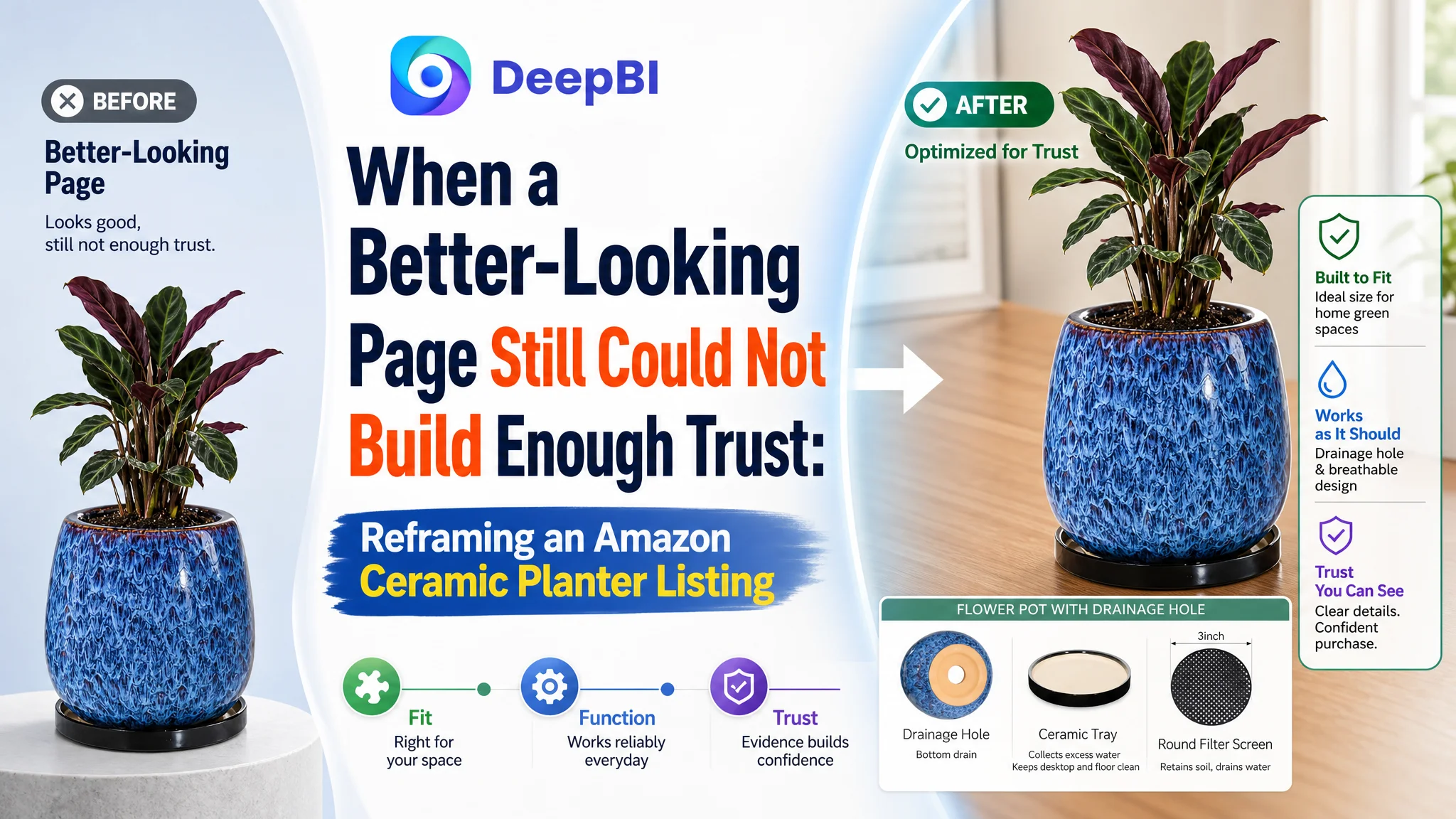
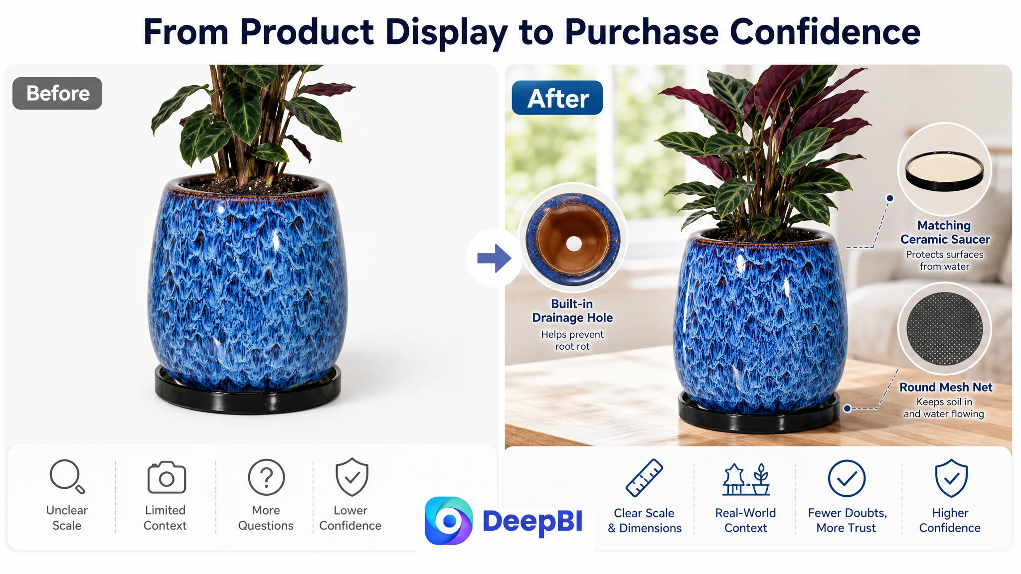
The customer was an Amazon seller operating a ceramic planter listing in the US marketplace. The product page had the basic ingredients of a viable offer: a glossy ceramic body, a matching saucer, a drainage hole, and a mesh net. Yet its Listing score was 65, compared with 88 for a closely matched high-performing competitor.
The initial direction could easily have been treated as a collection of isolated content problems: adjust the title, improve the images, add more plant-use scenarios, or make the page look more premium. DeepBI’s diagnosis pointed to a deeper issue. The Listing was not consistently answering the buyer’s main questions about fit, durability, drainage, placement safety, and product authenticity.
The later optimization therefore focused less on adding decoration and more on rebuilding the Amazon product page’s decision logic. The title had to widen search coverage, the images had to clarify scale and expectations, the bullet points had to connect features with buyer concerns, and the A+ content had to establish functional trust before repeating lifestyle imagery.
For other Amazon sellers, the lesson is important: when a Listing trails its category benchmark, the problem may not be a single weak image or missing keyword. It may be that the page is showing the product without giving shoppers enough evidence to feel confident buying it.
The Listing Had a Product. The Page Did Not Yet Have a Complete Argument.
At first glance, this ceramic planter Listing did not appear empty or neglected.
It showed a polished product, a matching saucer, a drainage structure, lifestyle scenes, and brand-oriented content. The product itself had several usable selling points:
- A 10.3-inch ceramic planter
- A coordinating ceramic saucer
- A drainage hole
- A round mesh net
- A glossy glazed finish
- Indoor and covered outdoor use
- Compatibility with common plants and home settings
The problem was not a lack of raw material.
The problem was how that material was arranged across the Amazon product page.
The Listing introduced atmosphere before fully resolving practical concerns. It described features without always connecting them to buyer outcomes. It used lifestyle content, but did not provide enough concrete evidence about size, plant compatibility, glaze appearance, or placement safety.
The page was communicating what the product was. It was not yet communicating why a buyer could confidently choose it.
That distinction became clearer through the comparison with a relevant category benchmark.
The Score Gap Was Not Concentrated in One Asset
DeepBI’s Listing assessment gave the customer’s page a total score of 65 out of 100, while the comparable high-performing Listing scored 88.
The individual dimensions showed a broad but uneven gap:
- Title: Customer Listing: 14/20, Category benchmark: 17/20, Gap: -3
- Main images: Customer Listing: 23/30, Category benchmark: 27/30, Gap: -4
- Bullet points: Customer Listing: 7/10, Category benchmark: 8/10, Gap: -1
- A+ content: Customer Listing: 21/25, Category benchmark: 23/25, Gap: -2
- Reviews: Customer Listing: 0/15, Category benchmark: 13/15, Gap: -13
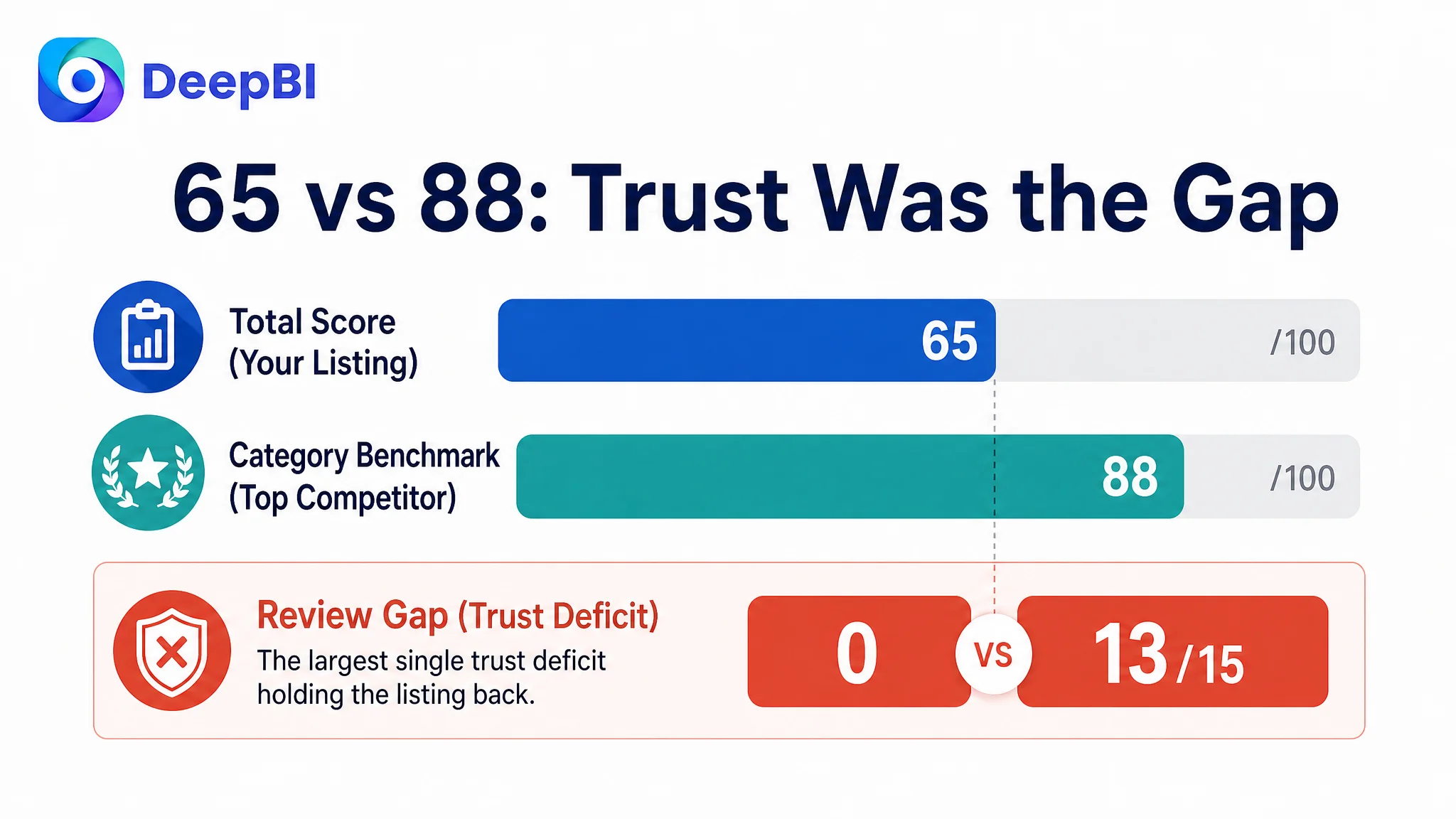
The largest numerical gap came from reviews. The customer Listing had no rating or review content, while the benchmark had a 4.7-star rating and 916 reviews, including detailed customer-generated images and videos.
That gap could not be repaired through copywriting alone.
It represented a structural trust disadvantage. Shoppers visiting the benchmark Listing could rely on years of accumulated social proof. The customer’s page had to work much harder through its own content to answer questions that reviews would normally help resolve.
This changed the priority.
The goal was not to make every asset look marginally better. It was to make the page more reliable at the exact moments when a buyer might hesitate.
The Initial Diagnosis Was Too Close to “Improve the Content”
The customer’s page contained several visible weaknesses, which made it tempting to optimize them independently.
The title could include broader category language. The main images could feel more premium. The bullet points could mention more plants. The A+ section could include more attractive scenes.
Each of those observations was valid, but treating them as separate improvements would have produced a fragmented result.
A better title would not solve uncertainty about whether the planter was suitable for a buyer’s space. A more polished image would not automatically prove that the glaze would look as expected under different lighting. More plant names would not, by themselves, clarify whether the pot size matched a Monstera, succulent, herb, or peace lily.
The underlying misdiagnosis was to view the page primarily as a presentation problem.
DeepBI reframed it as a Listing conversion-capacity problem.
The question became:
Can this Amazon product page move a shopper from visual interest to purchase confidence without relying on reviews that are not yet available?
That question brought the title, images, bullets, and A+ content into one decision sequence.
The Title Had Keywords, but Not Enough Search and Use-Case Coverage
The existing title placed the core phrase “10.3 Inch Ceramic Glaze Plant Pot” near the front. That was useful, but the wording did not fully match the language shoppers use when searching for this product category.
The phrase “Ceramic Glaze” described the finish, but “Ceramic Planter Pot” was more natural and more broadly aligned with category search behavior. The title also lacked important use-case language such as “Indoor Outdoor” and “Decorative.”
The benchmark title created a more complete product picture by combining:
- Product type
- Size
- Drainage and saucer
- Decorative purpose
- Indoor and outdoor use
- Shape
- Color
The customer’s title also placed “Mesh Net” in parentheses toward the end. That preserved a useful feature, but did not give it enough context. The product’s differentiating accessory should support the core offer rather than appear as an afterthought.
The recommended direction followed a clearer structure:
Size + material + functional components + use case + product form + color
The proposed title emphasized:
- 10.3-inch size
- Ceramic planter construction
- Saucer and drainage hole
- Mesh net
- Indoor and outdoor plant use
- Round planter form
- Blue color
This was not keyword stuffing. It was an attempt to help both Amazon search relevance and human comprehension.
A shopper should be able to understand the product category, approximate scale, key included components, and intended use before opening the rest of the page.
The Main Image Was Clear, but It Did Not Create Enough Visual Confidence
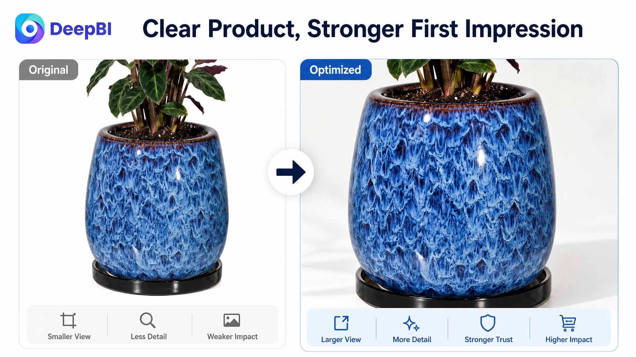
The main image did its basic job. The ceramic pot and saucer were visible, and the product had a clean, polished appearance.
But the comparison showed that visual clarity and visual persuasion were not the same thing.
The benchmark created a stronger premium impression through the reflective quality of its glaze. Its image path also provided more useful evidence later in the sequence:
- Different lighting conditions
- Multiple placement environments
- Size comparisons
- Product combinations
- More specific plant applications
- A stronger sense of how the item would look in a real home
The customer’s image set leaned more heavily toward general lifestyle presentation. The scenes were attractive, but some of them repeated the same decorative message without reducing a specific buyer concern.
DeepBI’s recommendations therefore gave each image a clearer role.
The first image needed to strengthen the product impression
The existing position could remain, but the framing should place more emphasis on the high-shine ceramic glaze and make the saucer clearly visible.
This was a refinement, not a complete replacement. The product already had a usable visual foundation. The opportunity was to make its material quality more legible at thumbnail size.
The second image needed to define scale
A 10.3-inch planter can be interpreted differently depending on whether a shopper imagines it on a shelf, desk, windowsill, patio table, or floor.
The second image should therefore establish scale more directly, especially for larger plants and floor-standing use. It should show how the thick ceramic body relates to its surroundings rather than simply placing the product in another decorative scene.
The third image needed to combine dimensions and components
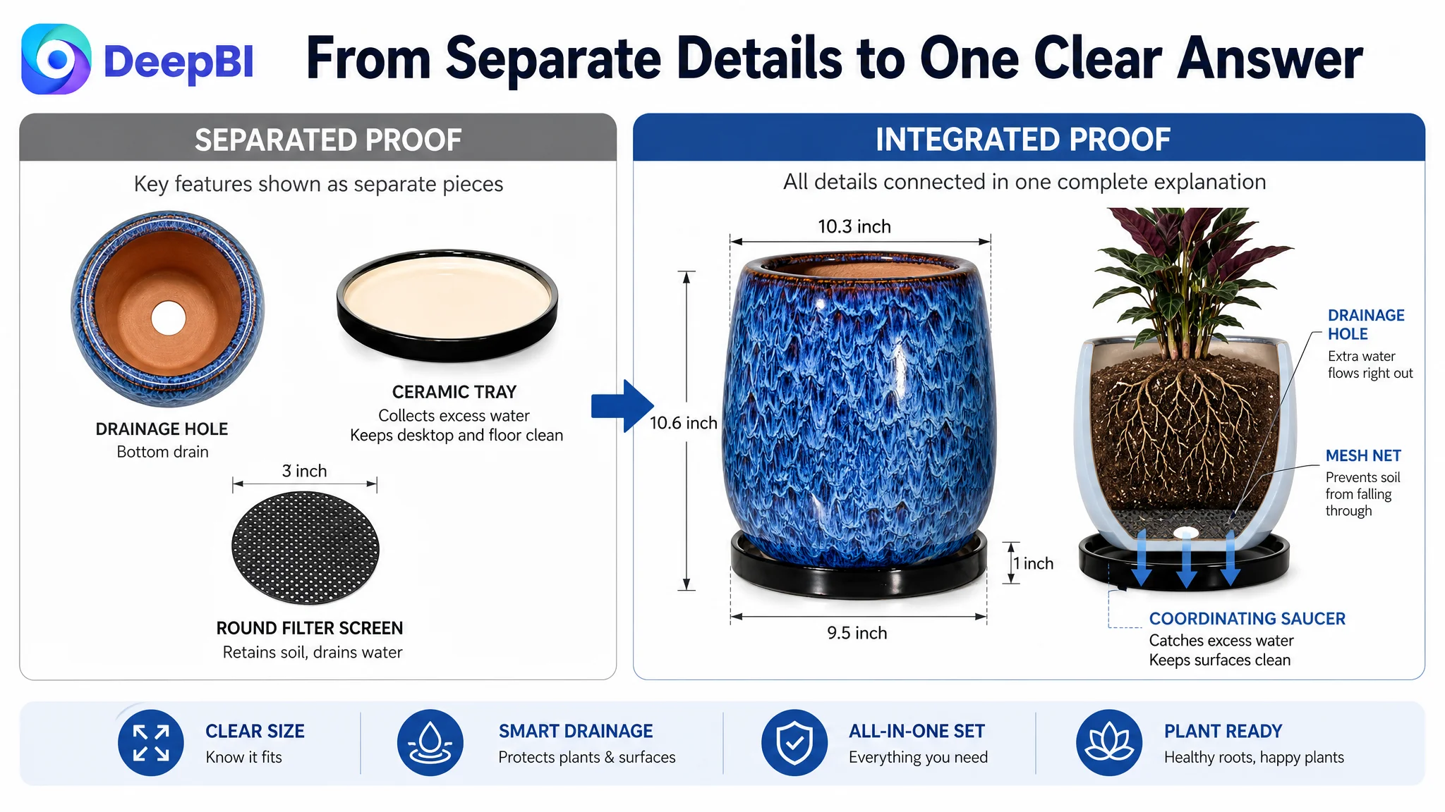
The original content separated dimension information from the component breakdown. That forced the shopper to assemble the answer independently.
A stronger third image would combine:
- Planter dimensions
- Saucer dimensions
- Drainage hole
- Coordinating saucer
- Round mesh net
This addresses two practical questions at once:
Will it fit my intended plant or space?
What exactly is included in the set?
The fifth image needed to manage glaze expectations
Ceramic glaze can appear different under natural light, indoor light, backlighting, or strong reflection. The existing image sequence did not adequately prepare shoppers for that possibility.
A dedicated visual showing the finish under different real-world lighting conditions could reduce uncertainty about color and surface appearance. This is particularly important for a product whose perceived value depends heavily on its glossy finish.
The main-image problem was not that the product looked unattractive. It was that the image sequence left too much of the buying decision to guesswork.
The Bullet Points Described Features, but Did Not Always Complete the Logic
The bullet points contained relevant information, but their order and framing did not consistently follow the buyer’s decision path.
The benchmark began with practical confirmation: size, included components, and product limitations. It then moved into durability, drainage benefits, design suitability, plant compatibility, gifting, and after-sales support.
The customer’s bullets leaned more toward appearance and general description. That made the product sound pleasant, but it did not provide enough technical or functional reassurance early enough.
DeepBI’s recommended order was designed to turn isolated features into a sequence of answers.
Start with what the buyer receives
The first bullet should confirm:
- The 10.3-inch planter
- The matching ceramic saucer
- The drainage mesh net
- The fact that plants are not included
This prevents avoidable uncertainty and immediately communicates the completeness of the set.
Use material and manufacturing language to support durability
The second bullet should explain the value of high-fire ceramic, including resistance to cracking, weathering, and general wear where supported by the product information.
This gives the glossy appearance a more credible foundation. The page should not ask shoppers to interpret a premium-looking surface as proof of quality. It should connect the appearance with a specific material and production story.
Turn drainage into a plant-health and placement benefit
The third bullet is especially important.
“Has a drainage hole” is a feature statement. It does not fully explain why the feature matters.
A stronger structure connects:
- Drainage hole
- Excess water removal
- Soil retention through the mesh net
- Saucer overflow collection
- More confident placement on desks, shelves, and other indoor surfaces
This creates a clear path from feature to problem to benefit.
The concern is not simply whether the pot has a hole. The concern is whether watering will create a messy, risky experience.
Make compatibility concrete
The page should name relevant plants such as Monstera, snake plants, peace lilies, succulents, herbs, bonsai, orchids, aloe, or similar use cases supported by the product positioning.
Specific examples give the shopper something to compare against. They also make the product feel more applicable than a broad statement such as “suitable for many plants.”
Preserve gifting and support as risk-reduction elements
The gifting message can remain, but it should come after the functional and compatibility questions are addressed.
After-sales support also matters more when the product is ceramic. The customer page lacked an explicit reassurance path for damaged delivery or product concerns, while the benchmark used this as a purchase-risk reducer.
This does not replace reviews, but it gives the shopper another reason to believe that the purchase is being managed responsibly.
The A+ Content Was Too Decorative for a Review-Free Listing
The customer’s A+ content already included several useful modules:
- A primary lifestyle image and brand statement
- Craftsmanship messaging
- A structural breakdown
- Indoor home scenes
- Multi-scene placement imagery
The issue was not insufficient design effort.
The issue was sequence and information density.
The first modules used broad aesthetic communication before addressing the practical concerns most likely to delay conversion. Meanwhile, some later lifestyle modules repeated ideas that had already been established.
For a Listing with no reviews, this is a costly trade-off. The page needs to use its available space to create evidence.
Open with reassurance and product completeness
The first A+ module should answer “What am I getting?” and “How substantial is it?”
It can show the 10.3-inch planter, the thick ceramic body, the saucer, and the mesh net. The product’s indoor and covered outdoor positioning can be introduced here, but the message should remain concrete.
Move drainage and saucer functionality forward
The structural breakdown that previously appeared later should move closer to the beginning.
This is one of the clearest decision changes in the case.
Drainage, soil retention, and overflow collection are not secondary details. They affect plant health, cleanliness, and where the planter can be placed. These concerns should be resolved before the page spends more space on decorative atmosphere.
Replace repeated lifestyle scenes with specific validation
The page already showed the product in home and outdoor settings. Additional generic scenes would provide limited incremental value.
A stronger A+ path would add:
- Specific plant-type compatibility
- A desk, shelf, or nightstand placement scene
- Visible saucer use near furniture
- A covered patio or balcony setting
- Dimension confirmation
- Final package-content confirmation
Each module should perform a different job.
Prove protection, not just appearance
A bedside table, desk, or shelf scene can show more than decor. It can demonstrate why the saucer matters and how the planter is intended to be used around indoor furniture.
The message should remain within verifiable product claims. The page does not need to promise that every surface is fully protected under every condition. It needs to show the intended function of the saucer and explain how it helps contain excess water.
End with a rational purchase confirmation
The final module should confirm:
- The planter
- The saucer
- The mesh net
- The dimensions
- Basic care guidance related to the smooth glazed surface
This gives the shopper a concise final check before returning to the purchase decision.
Why DeepBI Did Not Recommend Chasing More Traffic First
The case material does not include post-optimization advertising metrics such as CTR, CVR, ACOS, or TACOS. It would therefore be inaccurate to claim that ad costs declined or that conversion rate recovered.
But the Listing diagnosis still establishes an important operating principle.
When a page has a 23-point gap against a comparable benchmark and no review foundation, increasing traffic before repairing the page can create an inefficient test. More shoppers may arrive, but the page would still leave the same questions unresolved:
- Is the planter really the right size?
- What is included?
- Will the glaze look like the image?
- Is it durable enough for the intended setting?
- How does the drainage system work?
- Can it be placed safely on furniture?
- Which plants fit the pot?
- What happens if the ceramic arrives damaged?
Advertising can bring attention to a Listing. It cannot supply missing evidence on the product page.
Before scaling traffic, the page has to earn the opportunity to receive more of it.
That does not mean advertising is irrelevant. Paid traffic can be useful once the Listing has a clearer conversion path. But in this case, the immediate decision was to repair the page’s ability to receive and convert intent rather than treat traffic acquisition as the first answer.
The Real Optimization Was a Change in Order
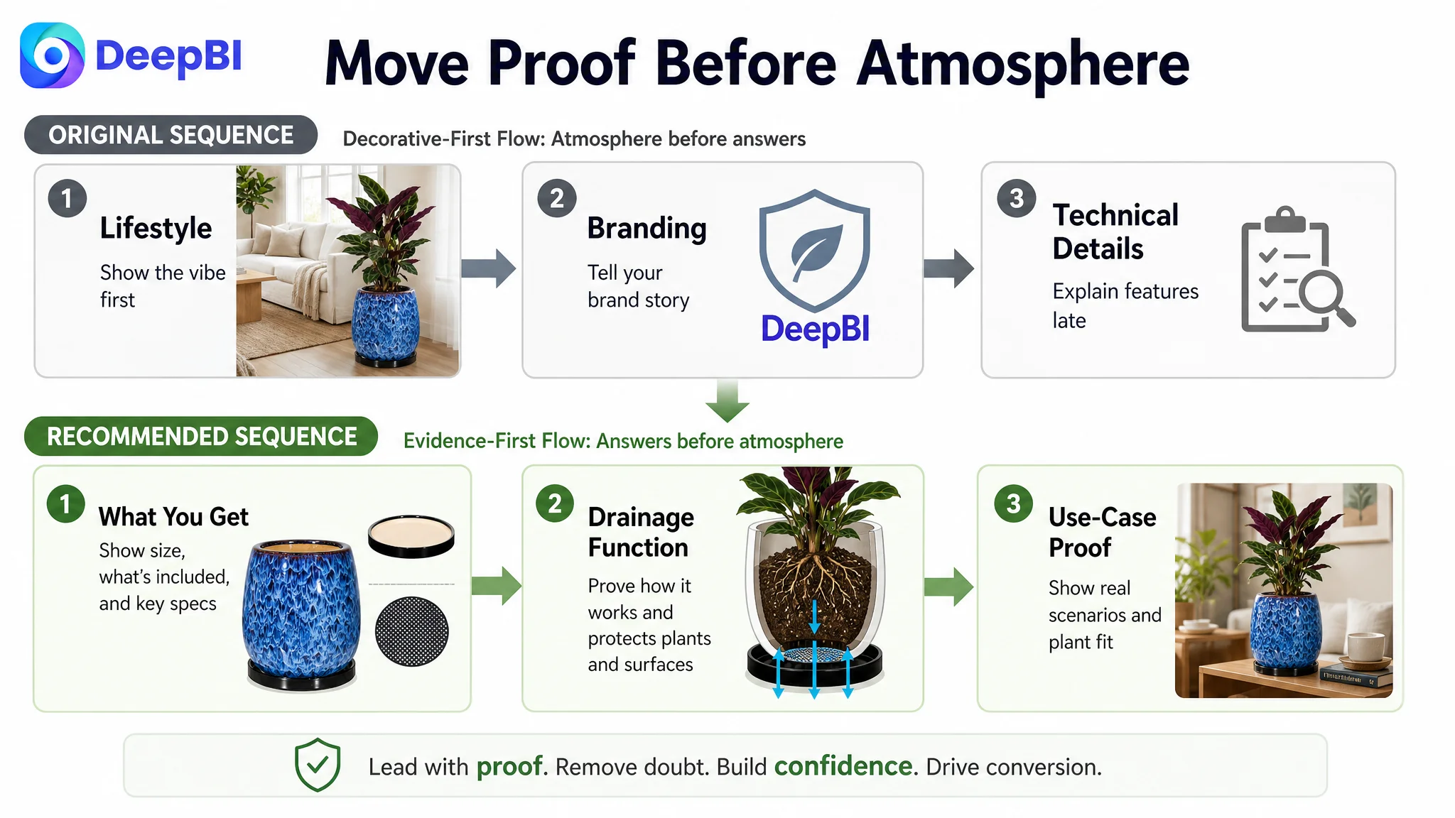
The most important change was not one new title or one replacement image.
It was the order in which the Listing communicated value.
The original path was closer to:
Product appearance → brand atmosphere → general lifestyle → structural details → additional scenes
The recommended path became:
What the buyer receives → size and fit → drainage and saucer function → placement confidence → plant compatibility → covered outdoor use → final purchase confirmation
This new sequence reflects how a shopper evaluates a ceramic planter.
First, they confirm the basic product. Then they assess whether it fits their plant and space. Next, they look for signs that watering and placement will be manageable. Only after those concerns are reduced does decorative appeal become a stronger purchase driver.
That is why the page needed a coordinated update across the title, main-image sequence, bullet points, and A+ content. Improving one element in isolation would not repair the underlying logic.
What This Amazon Case Changes About the Business Judgment
The case did not end with a claim of guaranteed performance improvement. No post-change business metrics were provided.
What it did provide was a clearer operating state and a more defensible optimization path.
The customer’s Amazon Listing could move from:
- Broad decorative presentation to specific decision support
- Feature listing to feature-to-benefit communication
- Repeated lifestyle imagery to differentiated image roles
- Late technical explanation to early trust building
- General plant suitability to concrete compatibility evidence
- Review dependence to stronger on-page proof
- Isolated asset editing to coordinated Listing conversion work
The review gap would still require time and legitimate customer experience to address. Content cannot manufacture social proof. But a more complete page can make better use of every available trust signal while that foundation develops.
This is the central lesson for Amazon sellers:
A Listing does not convert because every element looks polished. It converts when the elements work together to remove the buyer’s next doubt.
For this ceramic planter, the next doubt was rarely just “Does it look nice?”
It was more often:
- Will it fit?
- Will it work?
- What comes with it?
- Can I trust the finish?
- Can I place it without creating a mess?
- Is it suitable for my plant?
- What support exists if the product arrives damaged?
DeepBI’s role in the case was to identify that sequence, compare it against a relevant category benchmark, and turn the gap into a prioritized Amazon Listing plan.
The result was not a feature checklist. It was a change in judgment: the page did not primarily need more decoration. It needed stronger evidence, delivered earlier, in the order shoppers use to make the decision.