

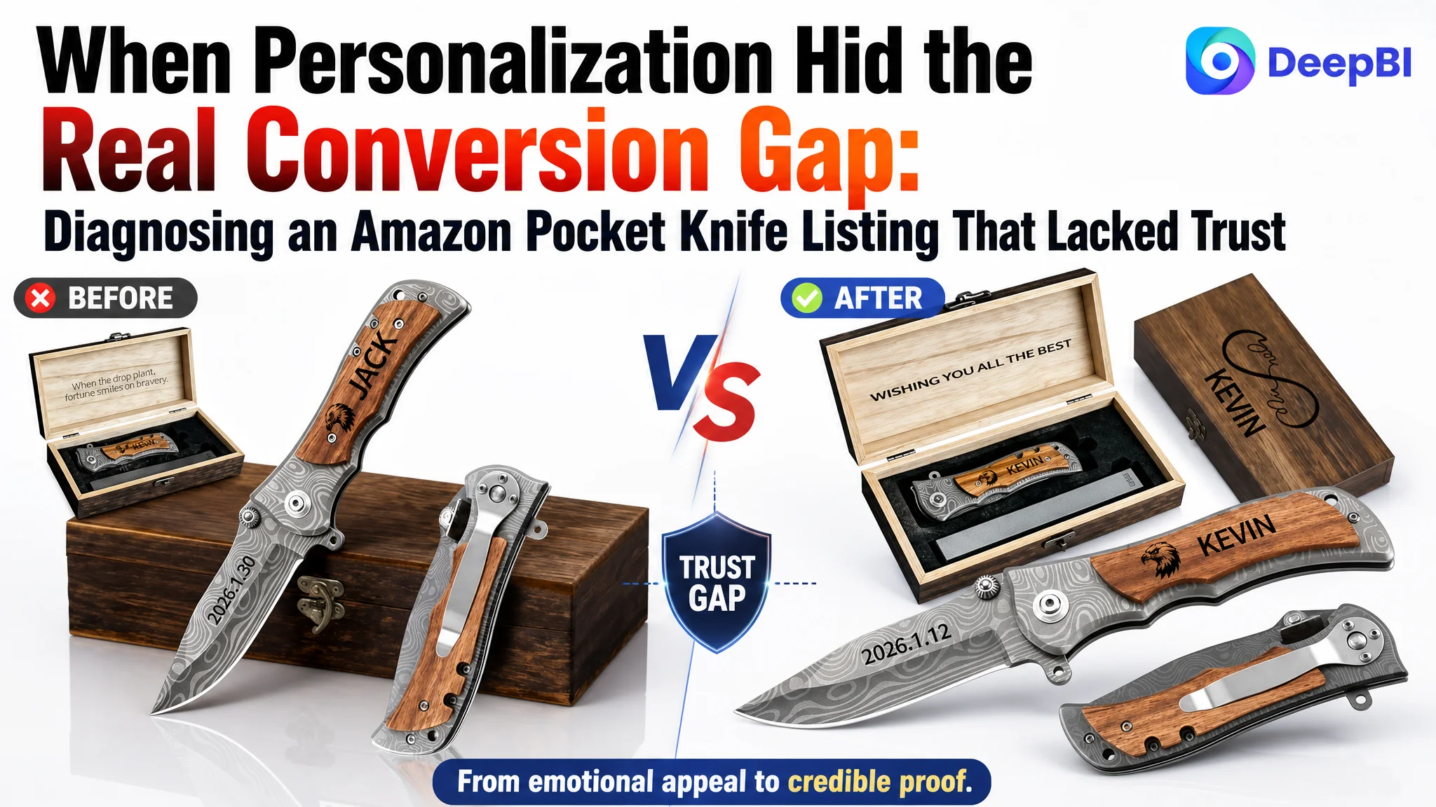
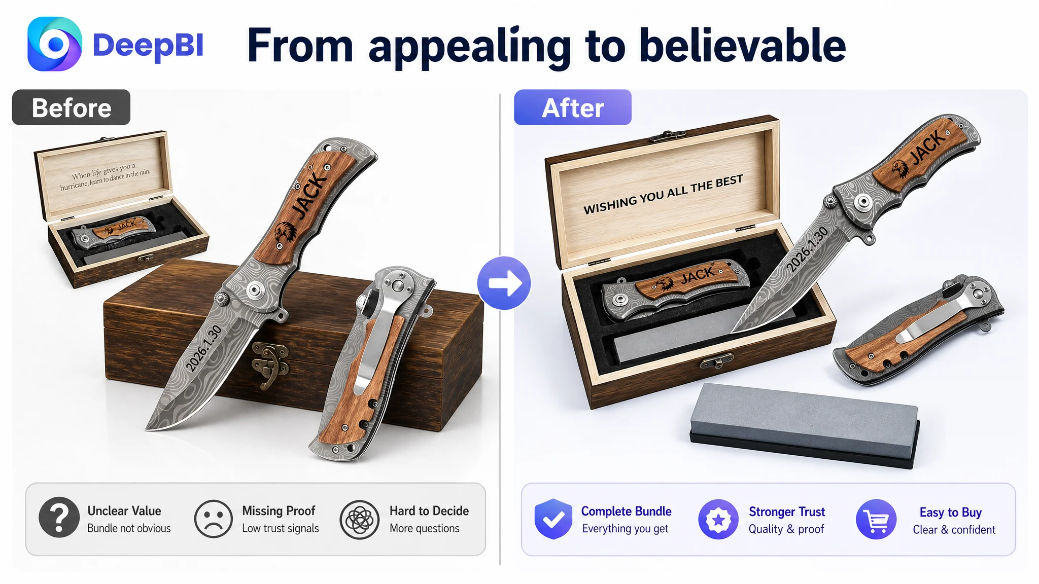
 This case involved an Amazon US seller whose personalized pocket knife Listing was built around gifting, engraving, and emotional value. The customer initially believed the main opportunity was to make the product feel more distinctive: emphasize personalization, present the wooden box more attractively, and add more gift-oriented messaging.
The deeper diagnosis pointed somewhere else. The Listing was not only competing on how meaningful the gift appeared. It was asking shoppers to trust the knife, its materials, its customization process, and its quality with very little supporting evidence. The product page scored 74 out of 100 against 87 for a comparable high-performing Listing, with the largest gap in customer reviews.
That changed the optimization direction. Instead of adding more decorative messaging first, the work focused on rebuilding the Amazon product page as a clearer sales argument: show the complete bundle, make customization easier to understand, introduce material and usability proof earlier, strengthen the gifting story, and reduce uncertainty at each decision point.
For other Amazon sellers, the lesson is direct: when a Listing has a strong emotional proposition but weak trust signals, more advertising or more attractive copy may only send additional shoppers into the same conversion gap.
The product had a clear appeal, but the page did not fully prove it
A personalized pocket knife with a wooden handle, engraved details, a wooden box, and a whetstone has a natural gifting proposition.
It can serve as a Father’s Day gift, anniversary gift, birthday gift, groomsmen gift, or keepsake for a husband, dad, boyfriend, or best man. The product does not need to create demand from nothing. The demand already exists in the combination of personalization, utility, and presentation.
The problem was that the Amazon Listing did not make those three elements work together with enough confidence.
The page communicated that the product was personal and giftable. It was less effective at proving:
- What the buyer would receive in the complete set
- How the engraving process worked
- Whether the knife was practical for everyday use
- What materials supported its quality
- Whether the product was reliable enough to give as a meaningful gift
- Why the product deserved trust despite having very little review history
This distinction mattered because shoppers were not evaluating a simple novelty gift. They were being asked to purchase a functional object that also carried emotional meaning.
A personalized product needs more than emotional appeal. It needs enough proof to make the buyer comfortable giving it to someone else.
The initial direction focused on differentiation, not reassurance
The customer’s original optimization direction was understandable.
The Listing already had several potentially attractive elements: custom engraving, a wooden handle, a wood box, a textured Damascus-style pattern, a pocket clip, and a lanyard hole. The natural response was to highlight these differences more strongly and make the page feel more memorable as a gift.
That led to an emphasis on:
- Meaningful keepsake language
- Personalization and emotional value
- Gift-box presentation
- Multiple engraving options
- Special occasions and recipient groups
- More visual expression around customization
These were not irrelevant improvements. But they did not address the most serious barrier.
The customer’s page was trying to persuade shoppers that the knife was special before fully convincing them that it was dependable, clearly presented, and safe to purchase. The optimization question therefore had to move from “How can this product look more unique?” to “What still makes a shopper hesitate after they understand the gift idea?”
That was the point at which the Listing score comparison became useful.
The score gap was concentrated in trust, not in the product concept
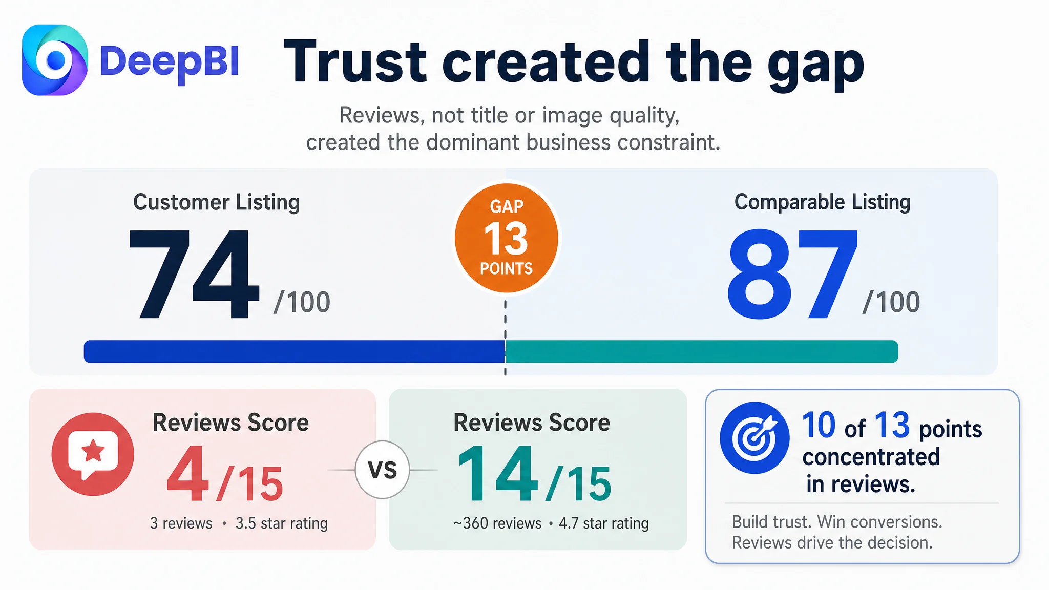 The overall comparison showed a 13-point difference:
- Title: Customer Listing: 16/20, Comparable Listing: 17/20, Gap: -1
- Main images: Customer Listing: 25/30, Comparable Listing: 26/30, Gap: -1
- Bullet points: Customer Listing: 8/10, Comparable Listing: 7/10, Gap: +1
- Product-page content: Customer Listing: 21/25, Comparable Listing: 23/25, Gap: -2
- Reviews: Customer Listing: 4/15, Comparable Listing: 14/15, Gap: -10
- Total: Customer Listing: 74/100, Comparable Listing: 87/100, Gap: -13
The most important finding was not that the title was slightly weaker or that the images needed refinement.
It was that the review dimension accounted for 10 of the 13 points separating the two Listings.
The customer Listing had:
- A 3.5-star rating
- Three total reviews
- Three reviews visible on the first page
- A negative review involving a damaged screw
- No customer photos or videos visible in the first-page review content
The comparable Listing had:
- A 4.7-star rating
- Approximately 360 reviews
- Eight reviews visible on the first page
- A much stronger body of customer-generated proof
This created a trust problem that better wording alone could not remove.
A shopper could understand the personalization offer and still ask:
- Will the engraving arrive correctly?
- Does the knife feel durable?
- Is the wooden handle well made?
- Is the box presentable enough to give as a gift?
- Will the hardware hold up?
- Is the product worth the risk when there are so few reviews?
The page was not missing a reason to consider the product. It was missing enough evidence to complete the decision.
The title had relevant keywords, but the entry point was too generic
The title difference was relatively small, but its structure revealed an important search and click issue.
The customer title led with “Gifts for Men.” That phrase is relevant, but broad. The comparable Listing led with a more specific combination of product type and personalization intent, such as “Custom Pocket Knife for Men” and “Gifts to Engrave.”
The recommended direction placed the product and its key differentiators earlier:
Personalized Pocket Knife with Wooden Handle and Wood Box, Engraved Hunting Knife, Custom Gifts for Men, Groomsmen, Best Man, Husband, Dad, Birthday, Anniversary, Father’s Day
The purpose was not to fill the title with more occasions. It was to make the product identity, personalization, and physical configuration clear sooner.
The revised structure also expanded the use-case coverage to include “Groomsmen” and “Best Man,” while retaining recipient and occasion terms already relevant to the product.
This was a better balance between Amazon search visibility and shopper comprehension. A buyer should not have to read through several descriptive phrases before understanding that the item is a personalized pocket knife presented as a gift.
The image sequence answered isolated questions, but not the buying sequence
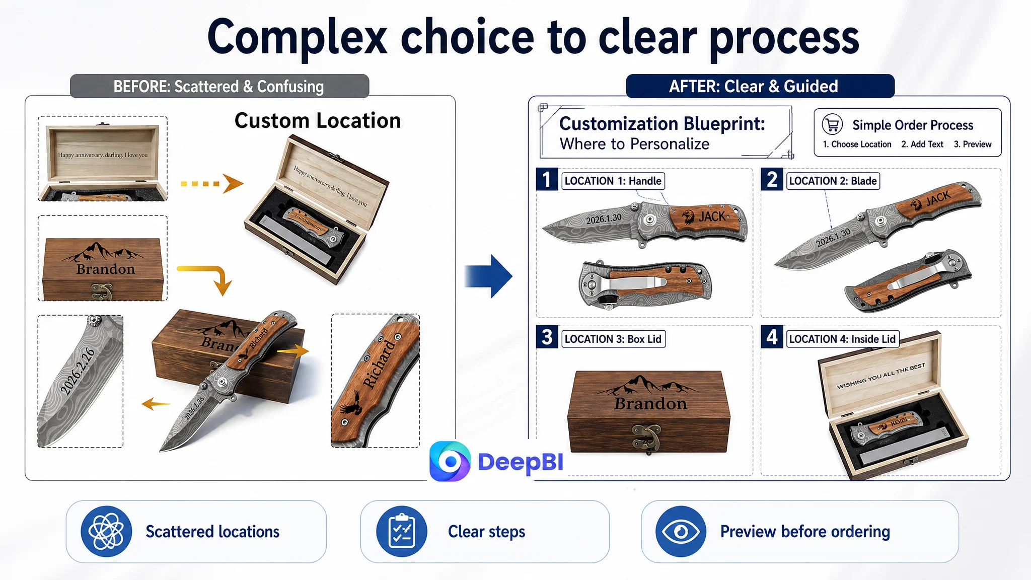 The customer Listing had useful visual material, but the images did not always perform distinct roles.
One image showed the knife and box, while another repeated the bundle content without adding enough new information. A separate image presented customization locations, but the smaller product views made the process feel more complicated than it needed to be. Another image combined engraving icons with a large box image, reducing the impact of the available design choices.
The issue was not simply that the images were less attractive.
The issue was that the sequence did not consistently answer the buyer’s questions in order:
1. What exactly is included?
2. What will the personalized product look like?
3. How do I customize it?
4. Is it suitable as a gift?
5. Is it useful and durable beyond its appearance?
The revised visual direction gave each image a clearer commercial role.
The first visual needed to verify the complete bundle
The opening product presentation needed to show the knife, wooden box, and whetstone as a complete value proposition, without wasting space on redundant views.
The customer should be able to understand the offer at a glance rather than reconstructing it from separate images.
At the same time, the product’s actual engraving and materials needed to remain visible. The goal was not to make the bundle look larger than it is, but to remove uncertainty about what the buyer receives.
The next image needed to establish gift readiness
The product page already emphasized the box, but it did not fully connect the box with the moment of giving.
A clean, gifting-oriented presentation could help the shopper imagine the product as a finished present for a husband, dad, boyfriend, son, or member of a wedding party.
This was not a call to replace product proof with lifestyle decoration. It was a way to make the existing gift proposition easier to evaluate.
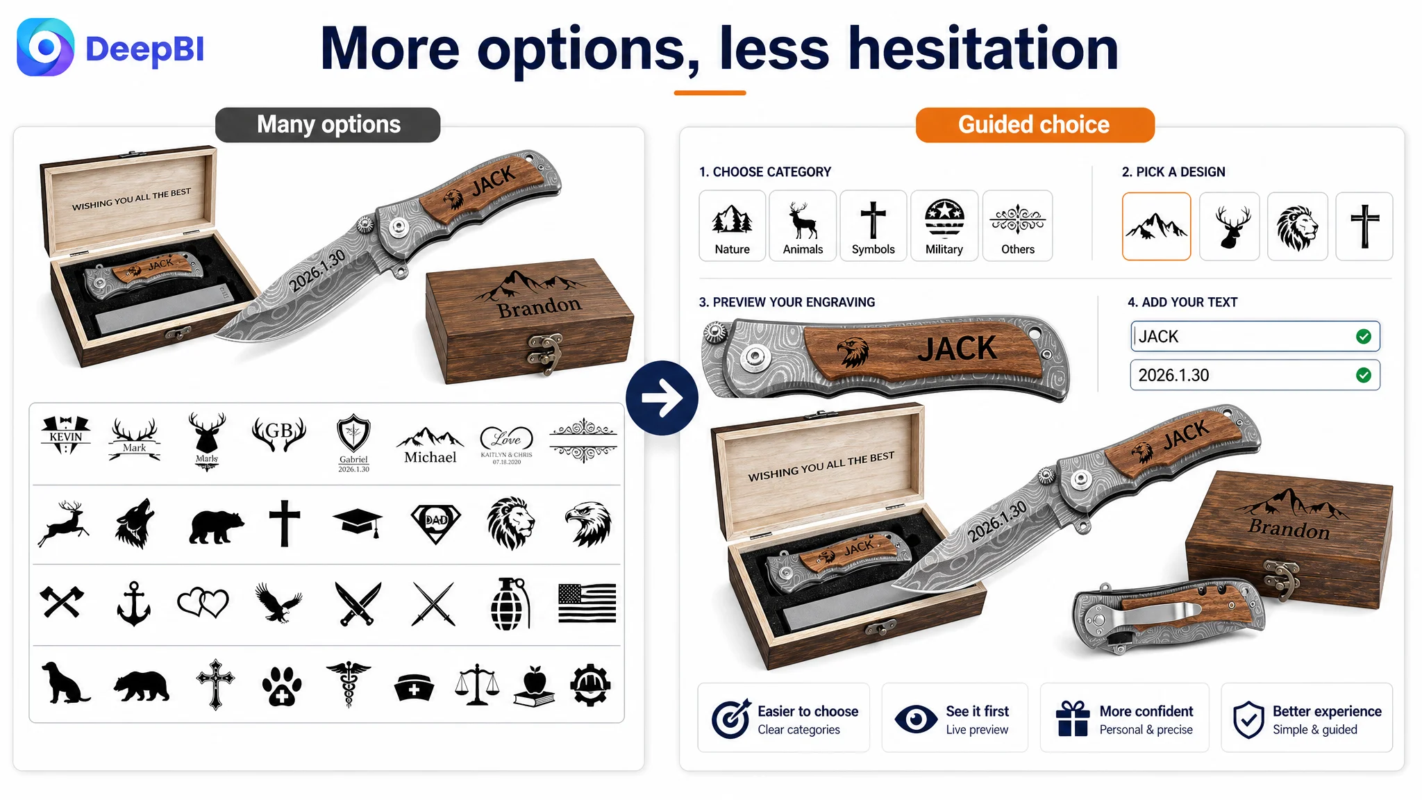
The customization image needed to become a simple ordering guide
The customer’s customization information was present, but the visual structure made it feel like a breakdown of product parts rather than a straightforward customer process.
The improved direction clarified where a name, initials, date, or message could be added and connected that information to the “Customize Now” action.
That matters because customization creates a special form of hesitation. The buyer is not only deciding whether to buy the product. They are also deciding whether they can successfully complete the personalization without making an error.
The design options needed to function as a visual menu
The engraving icons and templates were a potential advantage, especially for buyers who wanted the gift to reflect the recipient’s personality or interests.
But the presentation diluted that advantage by giving too much space to a repeated box image.
A structured grid of available themes could reduce cognitive effort and make the range of choices feel more manageable. The purpose was not to show more options for their own sake. It was to help shoppers move from “Can this be personalized?” to “Which design fits him?”
The final functional image needed to support trust
The product’s durable metal construction, textured Damascus-style pattern, wooden handle, pocket clip, and lanyard hole were useful proof points.
They needed to be shown as practical product attributes rather than as vague quality language. Clear labels such as durable metal construction, natural wood, secure pocket carry, and daily utility could connect the visual design with real use.
The A+ content had emotion, but not enough hard proof
The A+ content was centered on the product series, gift-box presentation, use scenes, and emotional gifting moments.
That gave the page a recognizable story, but the story was weighted toward feeling rather than verification.
The comparable Listing used more concrete reassurance:
- Material references
- Construction details
- Accessory value
- Feature icons
- Maintenance-related information
- Stronger trust-oriented content
The customer Listing needed to preserve its emotional strengths while adding rational anchors.
Personalization had to appear earlier
The first A+ module should establish the product’s primary reason to exist: a personalized engraved pocket knife with customization visible on the knife and wooden handle.
If the main selling point only becomes clear after several modules, the page spends its strongest attention on secondary information.
Feature information needed to be easier to scan
The customer content relied more heavily on written descriptions. A compact icon-led feature overview could communicate the verified attributes faster:
- Textured Damascus-style pattern
- Durable metal construction
- Wooden handle
- Pocket clip
- Lanyard hole
- Wooden box
This was especially relevant for mobile shoppers, who often scan before reading in depth.
Material claims had to be factual and visible
The customer page showed the look of the materials, but did not provide enough explicit validation of what shoppers were seeing.
The correct direction was to present confirmed construction and material information clearly, without borrowing unsupported claims such as a specific steel grade, country of origin, or manufacturing standard.
That boundary mattered. Trust cannot be strengthened by adding claims the product cannot verify.
The gift story needed to become one complete module
Gift-box images, personalization details, and recipient scenarios were distributed across the page. Bringing them together into a single, complete gifting module would create a stronger decision point.
The buyer should be able to see:
- The personalized knife
- The wooden box
- The engraving
- The ready-to-give presentation
- The relevant occasions
This would make the gift proposition feel finished rather than assembled from separate page sections.
Practical use should support, not compete with, the gift proposition
Daily carry, small fixes, opening packages, and casual outdoor moments were valid supporting scenarios.
But they should appear after the page has established personalization, product quality, and gift readiness. In this case, utility was an important reassurance layer, not the primary reason the buyer arrived.
Why DeepBI did not recommend adjusting advertising first
No advertising adjustment can remove a low rating, a thin review base, or unclear product-page proof.
Ads can bring a product in front of more shoppers. They cannot decide whether those shoppers will trust the product after arriving on the page.
That is the central operating risk in this case:
Advertising can amplify a Listing’s strengths, but it can also amplify the consequences of weak trust and incomplete product-page logic.
The page therefore needed to be repaired before any aggressive traffic expansion could be judged fairly.
The correct sequence was:
1. Identify the largest conversion constraint through competitive comparison.
2. Separate the review problem from the content problems that the seller could control immediately.
3. Improve the page’s explanation of the product, bundle, customization process, materials, and gifting value.
4. Preserve factual boundaries and avoid inventing unsupported quality or origin claims.
5. Apply the revised assets selectively and observe how the Listing’s operating state changes before drawing conclusions about advertising efficiency.
This was not a decision to ignore Amazon ads. It was a decision not to use ads as a substitute for product-page credibility.
The change was from “more appealing” to “more believable”
 The customer’s Listing did not need to abandon personalization or emotional gifting. Those were legitimate strengths.
It needed to make those strengths credible.
The new logic connected each message to a specific buyer concern:
- What am I receiving?: Page response: Show the knife, box, and whetstone as a complete bundle
- Will the gift feel personal?: Page response: Lead with engraving quality and customization options
- Can I complete the order correctly?: Page response: Present a clear customization blueprint and preview path
- Is the knife useful?: Page response: Show verified construction, carry features, and daily-use scenarios
- Is it gift-ready?: Page response: Consolidate the box, engraving, and occasion story
- Can I trust the quality?: Page response: Add factual material and craftsmanship signals
- What happens if I hesitate?: Page response: Improve clarity and provide more complete purchase reassurance
This is where the Listing score became more than a ranking exercise. It helped determine the order of operations.
The title and main images needed refinement, but their gaps were modest. The most urgent business issue was the broader trust deficit created by reviews, limited proof, and a page that leaned more heavily on emotional presentation than on verifiable reassurance.
The operating lesson for Amazon sellers
This case did not establish that a new title or new image set alone would produce a specific CTR, CVR, or ACOS result. The source material does not provide post-optimization performance data, so the outcome should not be overstated.
What changed was the business understanding.
The customer moved from treating the Listing primarily as a personalization and gift-presentation problem to treating it as a conversion-capacity problem shaped by trust.
That change affects how future decisions should be made:
- A strong product concept does not guarantee a strong Amazon product page.
- Emotional value cannot replace quality reassurance.
- A low review base is not a minor Listing detail when the product is intended as a gift.
- The title should identify the product and its core buying intent early.
- Each image should answer a different question rather than repeat the same product view.
- A+ content should combine emotion with material, feature, and use-case proof.
- Customization must be simple enough to complete without hesitation.
- Advertising should not be asked to solve defects that exist below the traffic layer.
The deeper lesson is that Amazon Listing optimization is not a sequence of isolated edits.
It is a decision about what the shopper must believe before placing the order—and whether the page provides enough evidence to support that belief.