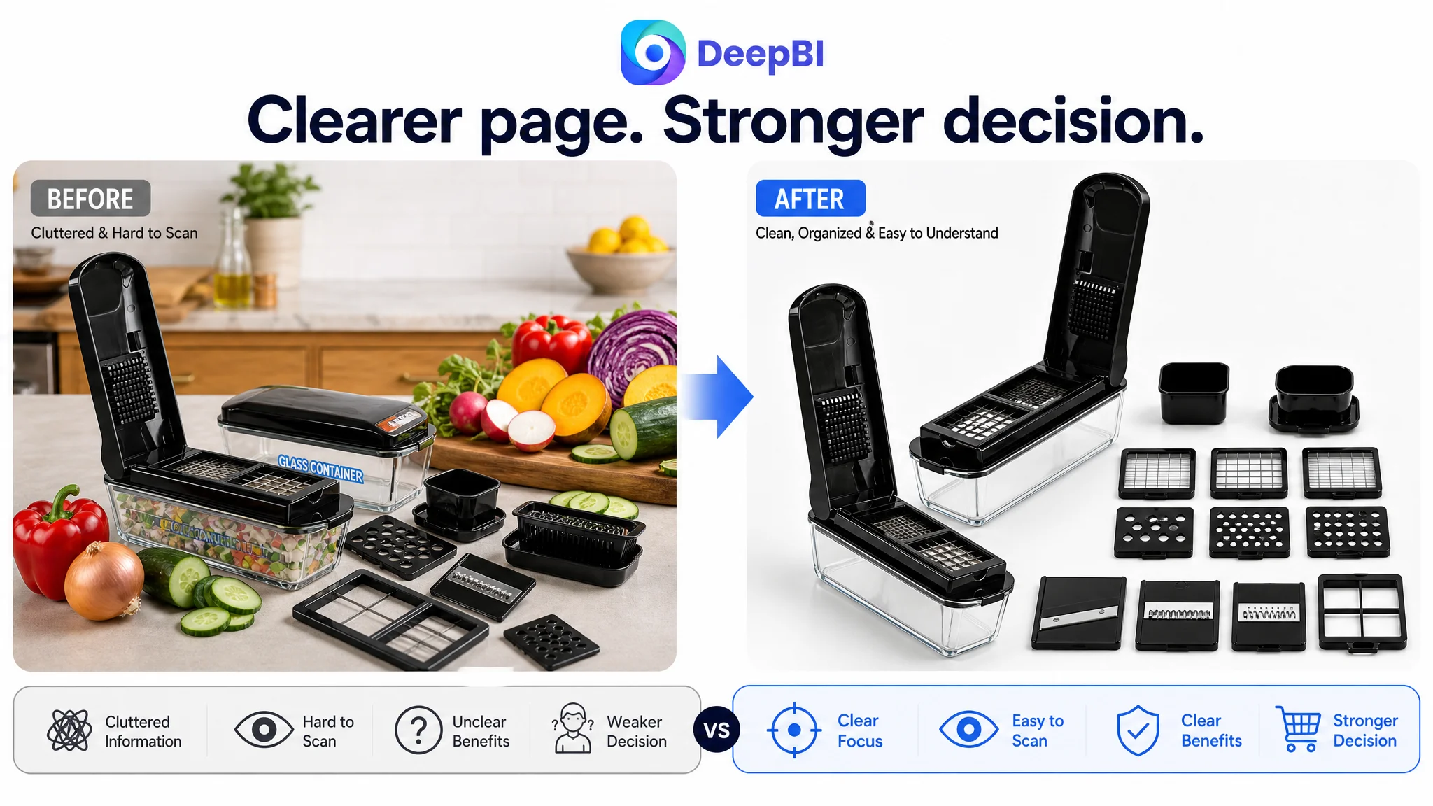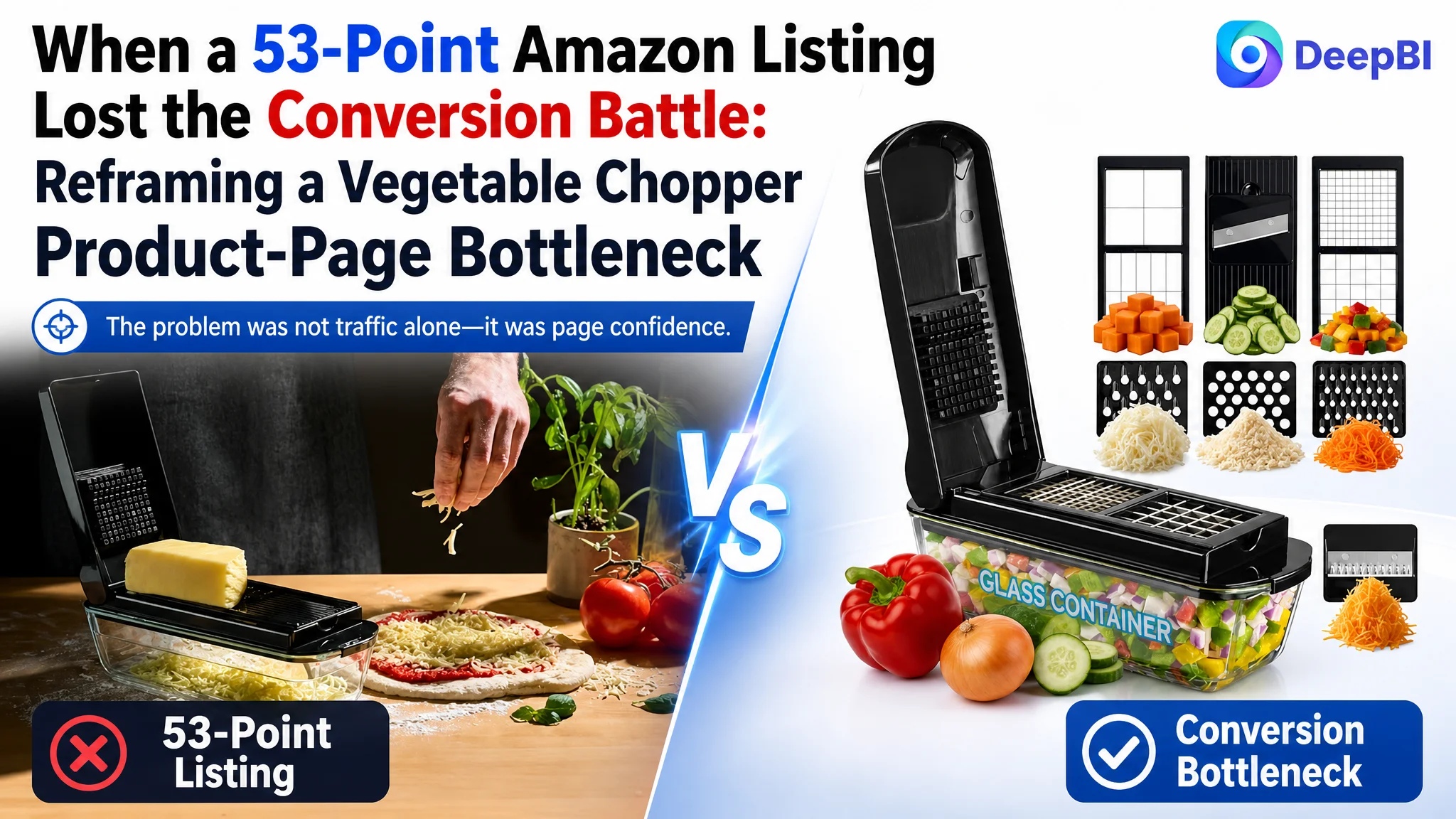
This case involved an Amazon US seller whose vegetable chopper Listing appeared to have a basic visibility and presentation problem. The title contained relevant keywords, the product offered multiple functions, and the main images showed the product in use. Yet the product page remained far behind a comparable high-performing Amazon Listing in the areas that most directly influence purchase confidence.
The initial optimization direction focused naturally on the visible elements: keyword placement, product imagery, functional claims, and the way the 13-in-1 configuration was presented. Those elements mattered, but they did not explain the size of the gap. DeepBI’s comparison showed that the deeper issue was not a single weak image or an incomplete keyword set. The page lacked a complete conversion path.
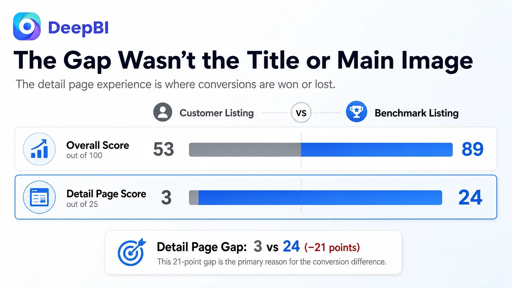
The most serious weakness was in the detail-page experience. The Listing scored only 3 out of 25 in the detail-page dimension, while the benchmark Listing scored 24. The customer’s page relied largely on text, while the competing page used structured visual modules to explain materials, blade functions, operating steps, cleaning, use cases, and product value.
That changed the optimization priority. Instead of sending more traffic toward a page with weak trust and incomplete product explanation, the later strategy focused on rebuilding the Amazon product page around rational reassurance: glass-container quality, stainless-steel blade performance, clear function mapping, easier decision-making, and a more complete A+ story. The case offers a practical lesson for Amazon sellers: when a Listing cannot convert traffic, better targeting and more aggressive ad tuning may only expose the page’s weaknesses faster.
The Amazon Listing Was Not Short on Features. It Was Short on Persuasion
The customer’s Listing received an overall score of 53 out of 100, compared with 89 for the benchmark Listing.
That 36-point gap was not evenly distributed:
- Title: Customer Listing: 14/20, Benchmark Listing: 16/20, Gap: -2
- Main image: Customer Listing: 24/30, Benchmark Listing: 27/30, Gap: -3
- Bullet points: Customer Listing: 6/10, Benchmark Listing: 8/10, Gap: -2
- Detail page: Customer Listing: 3/25, Benchmark Listing: 24/25, Gap: -21
- Reviews: Customer Listing: 6/15, Benchmark Listing: 14/15, Gap: -8
The first three dimensions showed room for improvement, but none represented the central constraint. The real break occurred after the click.
The Listing had enough information to describe the product. It did not have enough structure to help a shopper answer the questions that determine whether a purchase feels safe:
- Why choose this chopper over a standard plastic-container alternative?
- What exactly does the 13-in-1 system do?
- Which blade produces which result?
- How much time or effort does it save?
- How does the product work from assembly to serving?
- What happens after use?
- Why should a shopper trust a product with only 72 reviews and a 3.9-star rating?
The page was presenting product facts, but it was not building decision confidence.
The Initial Direction Was Too Close to “Make the Listing Look Better”
The customer’s product had several defensible selling points: a glass container, stainless-steel blades, BPA-free construction, manual operation, and multiple cutting functions.
That made the initial direction understandable. The focus was on improving keyword coverage, making the 13-in-1 value clearer, presenting more product functions, and creating stronger images. These are reasonable Listing tasks, especially when a title and image set appear less competitive than those of a category leader.
But this approach risked treating the problem as a collection of isolated content defects:
- Add more keywords to the title.
- Show more components in the images.
- Mention more functions in the bullet points.
- Add lifestyle scenes.
- Make the product look more attractive.
Those changes could improve surface communication without fixing the underlying buying logic.
The benchmark Listing was not simply more polished. It was more deliberate in how it moved the shopper from attention to confidence. Its content sequence connected brand trust, function comparison, speed, safety, cleaning, use cases, and support. The customer’s Listing was more fragmented: a function list in the bullets, repeated product descriptions, and limited visual explanation.
This was the important reframing: the problem was not only that individual assets were weaker. The Listing lacked a coordinated sales narrative.
The Biggest Gap Was Hidden in the Detail Page
The customer’s detail page was essentially text-led. The benchmark Listing used a modular visual structure that answered different purchase questions in sequence:
- Product and brand credibility
- Functional benefits
- Blade and component details
- Time-saving use cases
- Operating steps
- Cleaning and storage
- Finished food-preparation results
- Broader household applications
This difference explains why the detail-page scores were so far apart: 3 versus 24.
A+ content is not just additional space for repeating bullet points. On an Amazon product page, it can serve as the layer that turns a claim into something a shopper can understand and believe.
For this vegetable chopper, the missing modules had clear commercial consequences.
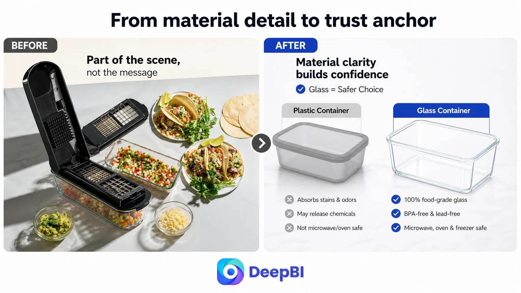
The glass container was not being used as a trust anchor
The glass container was one of the product’s most meaningful differentiators, particularly against common plastic-container alternatives. But the existing page did not make its value sufficiently visible or early enough in the decision path.
The improved direction placed more weight on:
- Food-grade glass
- BPA-free and lead-free construction
- A healthier alternative to plastic for food preparation
- Storage and organization after chopping
- Confirmed oven, microwave, and freezer use where applicable
The point was not to add more material terminology. It was to answer a rational concern: what comes into contact with the food, and why should the shopper feel confident using it regularly?
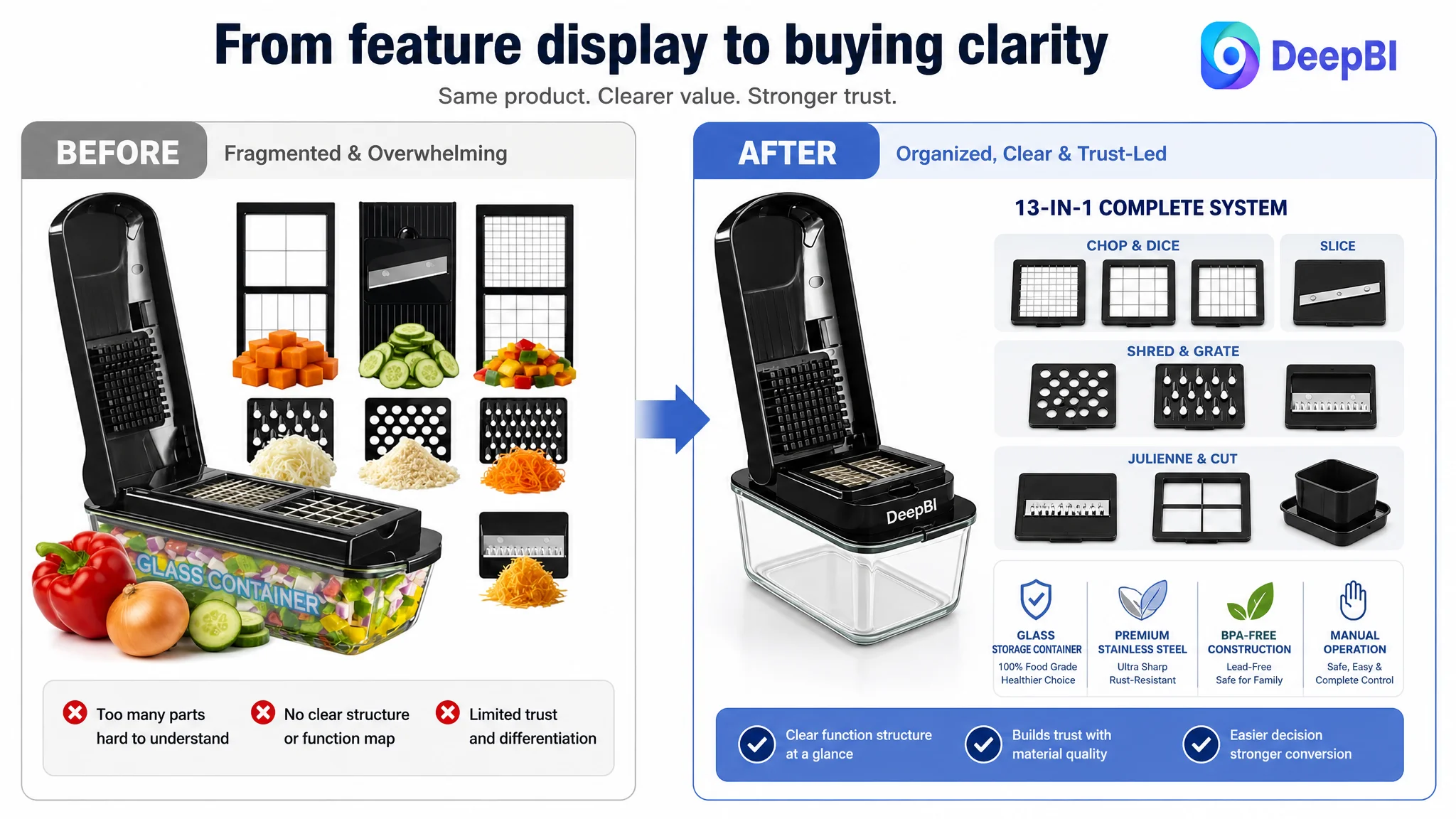
The 13-in-1 claim needed proof, not repetition
The Listing used “13-in-1,” but the visible components and written descriptions did not consistently explain what the number represented. Some materials appeared to show fewer distinct parts or functions.
That creates a credibility problem. A large number can attract attention, but if the shopper cannot map the number to actual outputs, it may create doubt instead of value.
The revised logic therefore prioritized function certainty:
- Which inserts are used for slicing?
- Which are used for dicing?
- Which support chopping or grating?
- What results can shoppers expect with onions, carrots, cucumbers, cheese, and similar ingredients?
- Are all 13 functions visibly confirmed, or should the count be aligned with the actual configuration?
A multifunction claim becomes persuasive only when the shopper can see how the functions translate into meals.
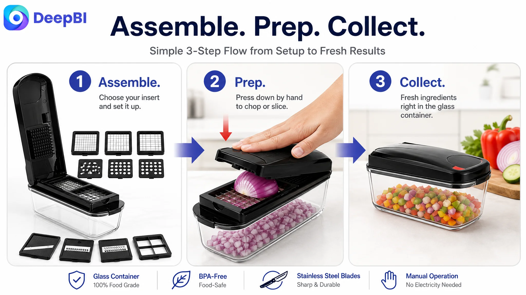
The page did not show a complete operating sequence
The customer’s Listing showed product components and use scenes, but it did not clearly guide the shopper through the experience.
A stronger A+ structure would make the process easy to follow:
1. Assemble the selected blade and components.
2. Prepare ingredients with the hand-powered mechanism.
3. Collect and store the result in the glass container.
This sequence matters because manual kitchen tools can trigger practical concerns before purchase. Shoppers may wonder whether assembly is complicated, whether the cutting results will be consistent, and whether the process will create more mess than it saves.
Showing the operating logic reduces that uncertainty more effectively than another generic lifestyle image.
The Main Image Was a Functional Problem, Not Just a Design Problem
The customer’s main-image set was not empty. The score of 24 out of 30 indicates that the product was reasonably visible and that the image assets had a usable foundation.
The issue was that the images did not always answer the next question a high-intent shopper would ask.
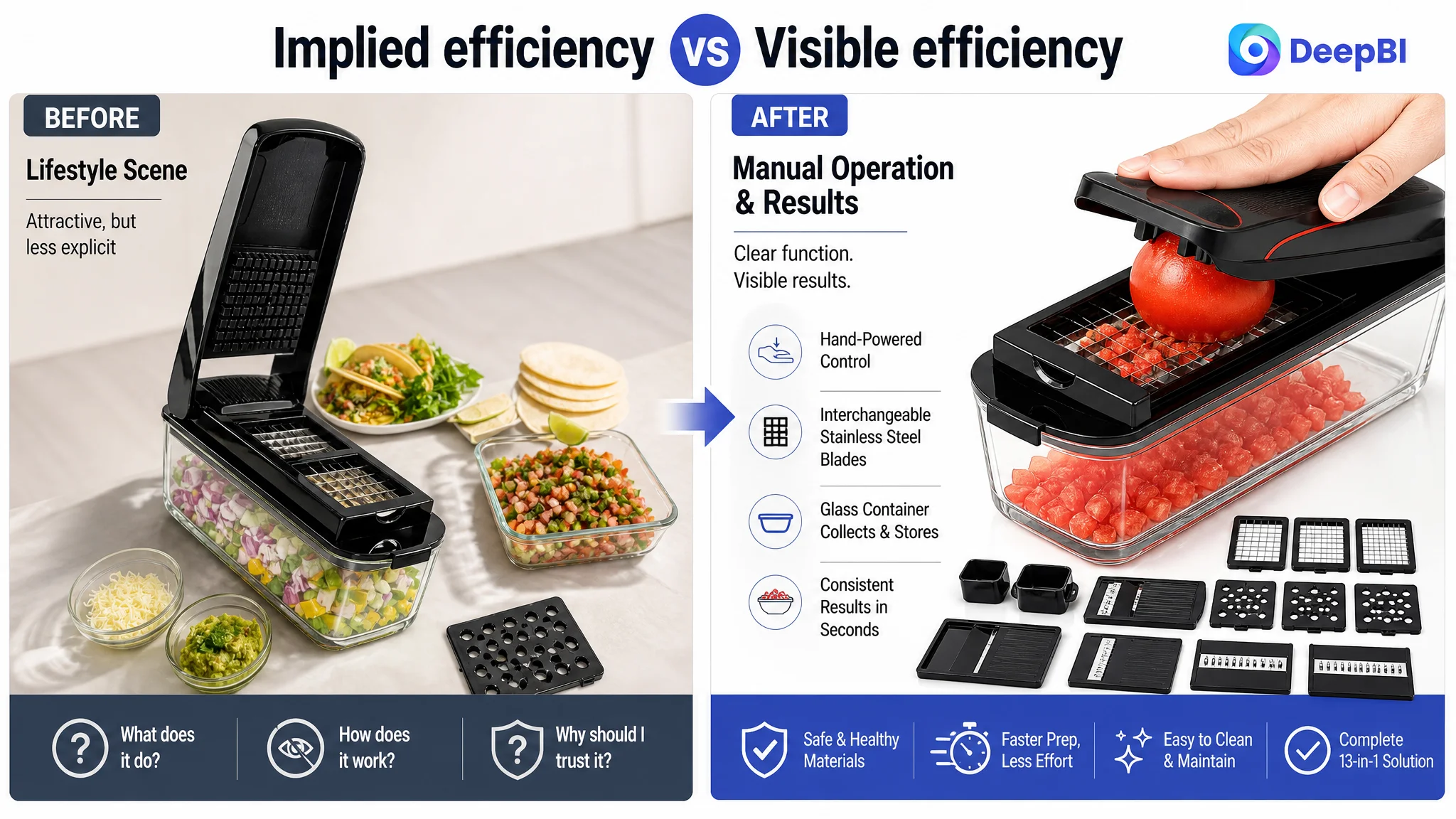
The first image presented a functional overview, but the “13-in-1” claim was not fully clarified visually. The next images introduced safety and lifestyle elements, yet the most important material distinction—the glass container—was not given enough rational emphasis. Other images showed grating or food preparation, but the efficiency message remained implied rather than explicit.
The optimization direction therefore shifted from adding more attractive scenes to assigning each image a distinct decision role.
The product set needed clearer completeness
The first image should make the complete bundle easy to understand. If all 13 functions can be accurately confirmed, the visual presentation should map them clearly. If the visible configuration does not support that count, the title, bullets, and images should be brought into alignment.
This is more important than simply arranging more parts in a cleaner composition. The goal is to remove functionality doubt.
The material story needed to appear earlier
The glass container, food-safe construction, and stainless-steel blade quality should be communicated before the image sequence moves into lifestyle use.
That order reflects the current trust barrier. The customer’s page did not first need more aspirational cooking scenes. It needed to establish why the product was a credible, durable, and safe tool for repeated food preparation.
The efficiency benefit needed a visible outcome
The product’s hand-powered design should not be presented only as a technical operating detail. It should be connected to the practical result: faster preparation, controlled cutting, and less scattered food preparation on the counter.
The case material did not establish a verified numerical time-saving result for this product, so the safer direction was to communicate quick preparation without inventing a “10x faster” claim.
Each image needed a separate job
Several images repeated broad product or lifestyle information. That used valuable visual space without resolving new objections.
A more effective sequence would separate:
- Complete set and confirmed functions
- Glass-container and safety value
- Manual operation and preparation efficiency
- Blade-to-result mapping
- Storage, blade organization, and post-use order
- Meal-preparation outcomes
The issue was not a lack of images. It was a lack of information progression.
The Bullet Points Had Information, but Not a Buying Logic
The customer’s bullet points described functions and materials, but they were mostly organized as a list of specifications.
The benchmark Listing used a more persuasive structure:
- Trust and everyday reliability
- Functional comparison and value
- Product quality and use convenience
- Time savings and healthier meal preparation
- Customer support and purchase reassurance
The customer’s bullet points needed to connect every major feature to a shopper concern.
From “13-in-1” to less kitchen clutter
Instead of presenting multiple blades as a standalone fact, the first bullet should connect the configuration to a practical benefit: one tool can support slicing, dicing, chopping, and grating without requiring several separate gadgets.
From “glass container” to safer food preparation and storage
The glass container should be treated as a central product benefit, not a secondary material detail. The copy should explain its role in collecting, organizing, and storing chopped ingredients while remaining within confirmed product specifications.
From “stainless steel” to consistent cutting performance
The blade description should focus on durability, rust resistance, sharpness, and consistent cuts, but only where those attributes are supported by the product information. The purpose is to translate material into expected use—not to make unsupported professional-grade promises.
From “BPA-free” to a household health concern
The safety point becomes stronger when connected to everyday meal preparation and family use. It should remain precise and avoid expanding into unsupported certifications or claims.
From manual operation to control and convenience
The hand-powered design can be positioned as a way to control cutting thickness without relying on electricity. Its value is not merely that it has no motor; it is that the shopper can understand how the product behaves in the kitchen.
Reviews Confirmed That Trust Was Already a Business Risk
The review dimension added another layer to the diagnosis.
The customer Listing had:
- 3.9 stars
- 72 total reviews
- 8 reviews visible on the first page
The benchmark Listing had:
- 4.5 stars
- 39,862 total reviews
- 15 reviews visible on the first page
The customer Listing also had a higher proportion of negative visible feedback, while the benchmark had a much stronger base of detailed and image-supported reviews.
This gap could not be solved through copywriting alone. A new A+ module cannot erase a 3.9-star rating or create years of accumulated review volume.
But the review weakness made the missing product-page explanation more serious. When social proof is limited, the remaining content has to work harder to provide clarity and reassurance.
That is why the strategy emphasized evidence the Listing could control:
- Transparent material presentation
- Clear component explanations
- Realistic blade-result demonstrations
- A simple operating guide
- Cleaning and storage logic
- Use cases tied to actual product functions
When review authority is weak, unclear content becomes even more expensive.
Why DeepBI Did Not Recommend Tuning Ads First
The case material does not provide a before-and-after advertising dataset, so it would be misleading to claim a specific ACOS decline, CVR increase, or organic-order recovery.
The decision logic is still clear.
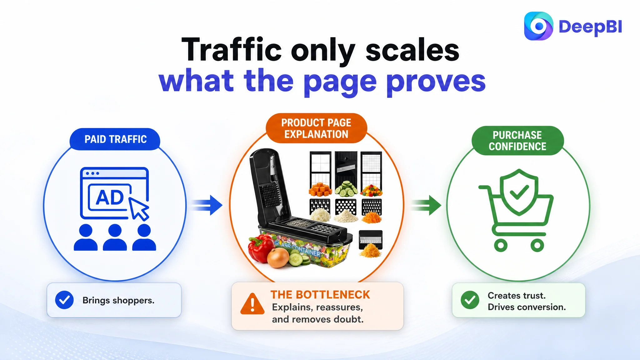
If Amazon ads drive more shoppers to a page with incomplete trust signals, unclear function mapping, weak A+ content, and limited social proof, the additional traffic may not produce a proportional increase in orders. The advertising system can deliver exposure and clicks, but it cannot independently repair a product page that fails to explain why the product deserves consideration.
That creates two risks:
1. Paid traffic is sent into a weak conversion environment.
2. Advertising performance is misread as a targeting or bidding problem.
The seller may respond by changing keywords, adjusting bids, restructuring campaigns, or expanding targeting. Those actions can be necessary later, but they should not be treated as the first answer when the Listing’s largest competitive gap is a 21-point detail-page deficit.
The better sequence was:
First repair the page’s ability to explain and reassure. Then judge whether the traffic is being converted efficiently.
This does not mean ads are unimportant. It means Amazon advertising and Listing conversion must be diagnosed together. Advertising is the mechanism that brings demand into the funnel; the product page determines whether that demand can move forward.
The Reframed Optimization Path
The later strategy was organized around the page’s conversion logic rather than around isolated creative edits.
Establish credibility before adding more lifestyle appeal
The opening visual and A+ modules should lead with confirmed product strengths: the glass container, food-safe construction, BPA-free and lead-free materials, and stainless-steel blades.
This addresses the most rational concerns first.
Make the product’s functions easy to verify
The 13-in-1 configuration should be shown through a component-to-utility structure. Every blade or insert should be connected to a clear output wherever the product information supports it.
This prevents a high-number claim from becoming a source of uncertainty.
Demonstrate efficiency through process and result
The page should show how ingredients move from preparation to collection, with finished cuts visible in the glass container. The focus is not on an unsupported speed promise. It is on making the time-saving experience tangible.
Use A+ content to complete the purchase path
The A+ structure should move through:
- Foundational product credibility
- Component and material details
- Food-preparation efficiency
- Blade-to-result mapping
- Three-step operation
- Cleaning, storage, and broader container use
- Meal-preparation scenarios
Each module should resolve a different concern instead of repeating the same product overview.
Keep the product representation accurate
The case also highlights an important operational boundary. Visual improvement should not mean changing the product’s physical identity or adding unconfirmed functions.
The images should not imply dishwasher safety unless verified. They should not show components that are not included. They should not claim a number of functions that the visual configuration cannot support.
For Amazon sellers, accuracy is part of conversion quality. A more persuasive page that creates an expectation the product cannot meet may generate returns, negative reviews, and greater long-term damage.
The Business Lesson Was a Change in Operating Judgment
The customer’s Listing did not fail because it had no features or because every image was unusable. It failed to turn those features into a credible, easy-to-follow purchase decision.
DeepBI’s diagnosis shifted the discussion from:
- “Which keyword should be added?”
- “Which image should look more attractive?”
- “Should we keep adjusting the ads?”
to:
- “What does the shopper still not understand?”
- “Which trust concern is preventing conversion?”
- “Can the page prove what 13-in-1 actually means?”
- “Does the A+ content support the traffic we are paying to acquire?”
- “Is the product page ready for more demand?”
That is the more important change in business understanding.
The Amazon seller did not simply need more Listing content. The seller needed a stronger order of decisions: identify the largest conversion constraint, repair the page’s sales logic, and only then evaluate how efficiently Amazon ads can scale the result.
Advertising can amplify a strong Listing, but it can also amplify the weaknesses of a page that is not ready to convert.
For this vegetable chopper Listing, the next stage was therefore not defined by more aggressive traffic expansion. It was defined by making the product page clearer, more credible, and more useful at the moment of purchase. That is where the 53-point Listing had the greatest room to recover—and where Amazon sellers should look when traffic exists but conversion does not follow.