

An Amazon seller of a portable pen-style tire pressure gauge was facing a product-page conversion problem. The Listing looked functional on the surface, but its title, images, bullet points, detail content, and review foundation were not giving shoppers enough evidence to trust the product or understand how it worked.
The initial instinct was to treat the page as a basic specification problem: describe the gauge, show the product, and include its pressure range. DeepBI’s diagnosis pointed in a different direction. The issue was not simply missing information. The Amazon Listing lacked a clear buying logic—from recognizing the product in search to understanding its operation, reliability, portability, and practical value.
The later optimization therefore focused on rebuilding the product page around visible proof: a main image that showed how the gauge worked, a clearer title, benefit-led bullet points, and A+ content centered on simple, battery-free, reliable use. The case offers a useful reminder for Amazon sellers: before increasing traffic or adjusting campaigns, determine whether the product page has enough conversion capacity to deserve more traffic.
The Amazon Listing Did Not Look Broken at First
A pen tire pressure gauge is easy to underestimate.
It is small, familiar, and less visually complex than a digital automotive tool. A seller may reasonably assume that shoppers only need a few facts:
- It measures tire pressure.
- It covers a specified PSI range.
- It is lightweight.
- It fits in a vehicle or tool kit.
That assumption shaped the original Amazon Listing. The product was presented mainly as an object with basic functions and specifications. The page explained what the gauge was, but it did not sufficiently communicate why a shopper should trust it, how quickly it could be used, or what problem its simple design solved.
That distinction became visible through a structured comparison with a high-performing category listing.
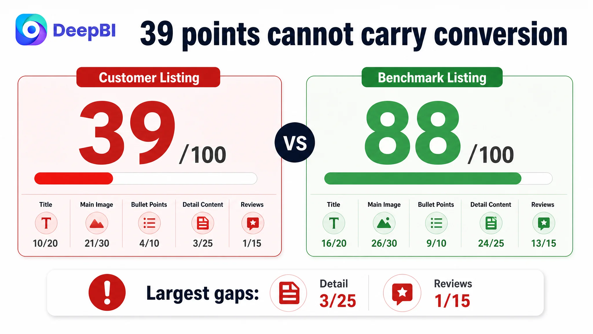
The customer’s Listing scored 39 out of 100. The comparable benchmark scored 88.
This was not a small creative gap. It was a broad weakness across the full Amazon product page.
- Title: Customer Listing: 10/20, Benchmark Listing: 16/20, Gap: -6
- Main image: Customer Listing: 21/30, Benchmark Listing: 26/30, Gap: -5
- Bullet points: Customer Listing: 4/10, Benchmark Listing: 9/10, Gap: -5
- Detail content: Customer Listing: 3/25, Benchmark Listing: 24/25, Gap: -21
- Reviews: Customer Listing: 1/15, Benchmark Listing: 13/15, Gap: -12
- Total: Customer Listing: 39/100, Benchmark Listing: 88/100, Gap: -49
The most important signal was not that every section needed improvement. It was that the detail content and review foundation were creating a serious trust deficit, while the title, main image, and bullet points were failing to compensate for it.
The page did not merely lack polish. It lacked enough evidence for a shopper to move from recognition to confidence.
The Original Misdiagnosis: Treating the Product as Self-Explanatory
The customer’s Listing approach reflected a common Amazon assumption: for a simple tool, basic function descriptions should be enough.
The product was described through phrases related to measuring tire pressure, portability, and physical design. But the content remained close to a product manual. It did not consistently answer the questions that influence purchase decisions:
- How does the measurement mechanism work?
- Can the reading be understood quickly?
- Does the gauge require batteries?
- Will it be usable in everyday vehicle maintenance?
- Is the product reliable in different conditions?
- Why choose this simple pen design instead of a digital gauge?
- What practical benefit comes from checking pressure regularly?
This was the central misdiagnosis.
The page was not suffering only from weak wording or insufficient keyword coverage. It was failing to convert product attributes into a coherent reason to buy.
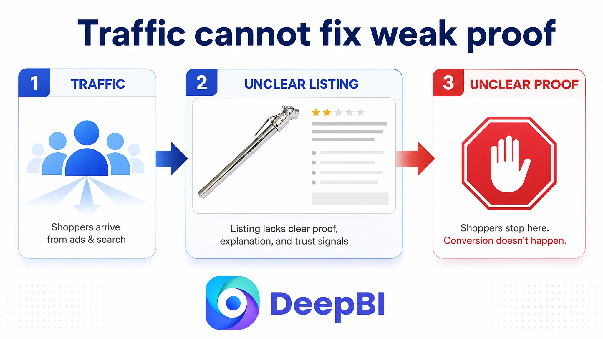
That difference matters for Amazon advertising as well. When a product page does not establish trust or explain value, additional paid traffic does not repair the problem. It exposes more shoppers to the same uncertainty. Advertising can increase visits, but the Listing must still complete the decision.
The customer’s original content direction focused on what the gauge is. DeepBI reframed the problem around what the shopper needs to believe before purchasing it.
The Largest Leak Was in the Detail Page
The detail-page score was 3 out of 25, compared with 24 out of 25 for the benchmark.
The customer’s page relied on a text-heavy product description with repeated content, specifications, and usage notes. There was no meaningful image-led A+ structure to demonstrate the product in use or reinforce its reliability.
The benchmark Listing used its detail section as a complete persuasion path. It included:
- Real tire-use scenes
- Operating demonstrations
- Professional automotive environments
- Product close-ups
- Specification comparisons
- Digital and analog model comparisons
- Brand and quality cues
- Structured guidance for use
The difference was not simply that one page had more images.
The benchmark used each module to answer a different buyer question. It moved from professional credibility to measurable performance, then to practical benefits, operation, model selection, and purchase reassurance.
The customer’s page remained closer to a written specification sheet.
The product was not shown explaining itself
A simple mechanical gauge has a particular communication challenge. Unlike a digital gauge, it does not present an obvious screen or large numeric interface in the first visual impression.
The customer’s first image primarily showed the product body on a white background. That established product identity, but not product capability. A shopper could see a pen-shaped object without immediately understanding how the measurement stick appeared or how the pressure reading was interpreted.
For a compact tool, that creates unnecessary hesitation.
The first image needed to shift from:
“This is the product.”
to:
“This is how the product works.”
The recommended direction was to show the measurement stick slightly extended, making the reading mechanism visible at the earliest stage. The goal was not to make the image more decorative. It was to reduce the time required for a shopper to understand the product.
The visual sequence repeated information instead of building confidence
The existing image sequence contained several inefficient slots:
- A basic product shot without a clear functional hook
- An in-use image where the measurement scale was difficult to read
- A text-heavy conceptual safety message
- A redundant nozzle close-up
- A repetitive product image with limited decision value
The result was a long path from curiosity to understanding.
The optimized sequence was intended to progress through a clearer buyer journey:
1. Show the measuring mechanism.
2. Make the PSI and KG scales readable.
3. Prove battery-free reliability.
4. Demonstrate straightforward connection to a standard tire valve.
5. Reinforce portability, storage, and everyday usability.
This is a conversion decision, not only a design decision. Each image must remove a specific doubt or strengthen a specific reason to continue.
The Main Image Was Not Just a Visual Issue
The customer’s main-image score was 21 out of 30, only five points behind the benchmark. That gap might appear less urgent than the detail-page gap, but the main image had an important role because it controlled the first interpretation of the product.
The benchmark’s leading image immediately communicated a recognizable benefit through a prominent display and a strong visual identity. The customer’s white-background product image was clean, but it did not create the same functional recognition.
For a mechanical pen gauge, the challenge is different. The product cannot rely on a bright digital screen to signal precision. Its visual communication must make the measuring bar and scale easy to understand.
The optimization direction therefore focused on readability and capability confirmation:
- Show the gauge in a measurement-ready state.
- Make the extended scale visible.
- Use clear PSI and KG references.
- Bring the reading mechanism closer to the shopper’s attention.
- Avoid relying on vague claims about safety or convenience.
The purpose was to give the product a visual hook without changing its physical design or suggesting capabilities it does not have.
A simple product does not need to look complicated. It needs to make its usefulness immediately legible.
The Title Was Carrying Too Much Noise
The title score was 10 out of 20.
The original title contained repeated and scattered terms, including variations of “Tire,” “Tyre,” “Motor,” and related product descriptors. The structure was long and lacked a clear hierarchy. The core product term and key pressure range were not positioned strongly enough for mobile shoppers.
This created two problems at once.
First, the title was less readable. Repetition made the product sound less deliberate and less professional.
Second, the title did not quickly communicate the product’s identity and use case. A shopper needed to work through several terms before understanding that this was a portable pen-style tire pressure gauge for common vehicles.
The recommended title direction placed the product identity and usable range earlier:
Pen Tire Pressure Gauge (5-50 PSI) for Car, Motor, and Vehicle - Portable Tire Air Pressure Test Meter and Monitoring System
The key change was not adding more keywords. It was creating a clearer order:
- Product type
- Measurement range
- Relevant vehicle applications
- Portable form factor
- Functional description
This reflects a broader Amazon Listing principle: keyword coverage cannot compensate for weak information hierarchy. Search visibility brings the shopper to the page, but clarity helps the shopper stay.
The Bullet Points Described Functions Without Building a Buying Logic
The bullet-point score was 4 out of 10.
The customer’s bullets mainly explained product characteristics. The benchmark’s bullets were organized around a sequence of buyer concerns:
- Accuracy
- Durability
- Engineering and operation
- Display and usability
- Long-term value
The benchmark also connected specifications to outcomes. It did not stop at numbers. It explained why those numbers mattered for tire maintenance, driving performance, fuel economy, or tire life.
The customer’s revised direction needed to make the same shift without claiming unsupported specifications.
From “what it measures” to “why the measurement matters”
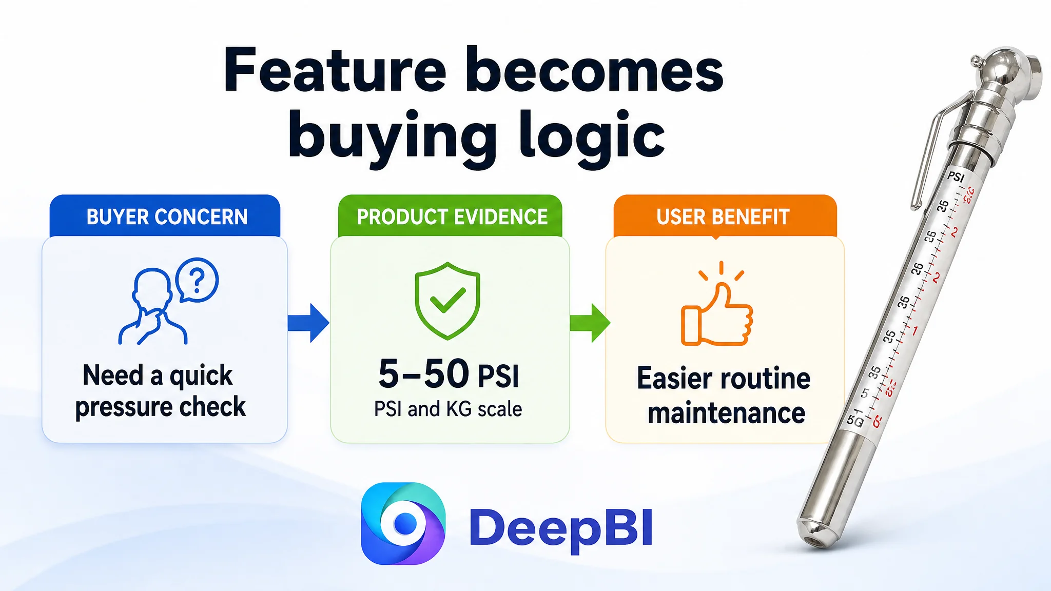
The first bullet was reframed around the 5-50 PSI measurement range, readable pressure checks, and practical vehicle safety.
From “small product” to “portable tool”
The second bullet emphasized the slim pen shape, lightweight design, integrated pocket clip, and easy storage in a glove box, center console, or tool kit.
From “no battery” to “fewer points of failure”
The third bullet positioned the mechanical, battery-free design as a practical reliability benefit. The product does not require battery replacement or routine battery maintenance.
From “easy to use” to “universal application”
The fourth bullet connected straightforward operation with standard tire valves and common use cases such as cars, SUVs, trucks, bicycles, and motorcycles.
From “a gauge” to “a maintenance habit”
The fifth bullet translated regular tire-pressure checks into practical benefits such as improved fuel economy, longer tire tread life, and more stable vehicle handling.
The important change was structural. Each bullet needed to follow a simple commercial sequence:
Core concern → product evidence → user benefit
That gave the page a reason to continue reading instead of presenting five disconnected descriptions.
Reviews Created a Trust Gap That Content Alone Could Not Erase
The review score was 1 out of 15.
The customer’s Listing had no rating, no review count, and no customer comments on the first page. The benchmark had a 4.7-star rating and more than 6,900 reviews, with visible customer experiences, images, and videos.
This gap had to be treated honestly.
New images and improved copy can make a product easier to understand, but they cannot instantly create the accumulated trust of thousands of verified experiences. The review deficit was therefore not a reason to delay all optimization. It was a reason to avoid pretending that visual polish alone would close the entire competitive gap.
The page needed to compensate where it could:
- Make the mechanism easier to understand.
- Use clear, verifiable specifications.
- Show realistic operation.
- Explain the battery-free design.
- Add a structured A+ experience.
- Provide quality and calibration information where supported.
- Reduce uncertainty through clarity rather than exaggerated authority.
This is where diagnosis matters. Reviews were a major weakness, but they were not the only decision available. DeepBI separated the trust problem into areas the seller could improve immediately and areas that would require longer-term market validation.
Why DeepBI Did Not Keep Tuning Ads First
The customer’s Listing had several weaknesses that could directly affect paid-traffic performance:
- The title did not communicate the product clearly enough.
- The main image did not quickly demonstrate the measuring function.
- The bullets listed functions without explaining their value.
- The detail page lacked visual proof and structured persuasion.
- The review foundation provided almost no social reassurance.
In this condition, continuing to optimize bids or campaign structure first would risk sending more shoppers into an unresolved conversion path.
The decision order was therefore straightforward:
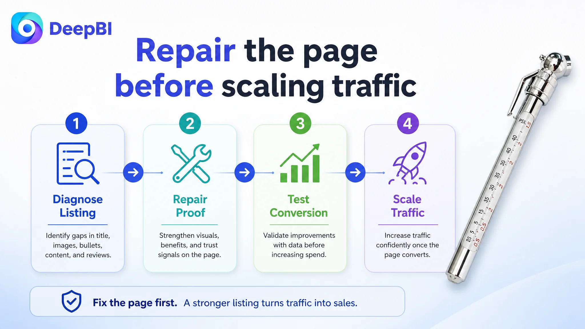
1. Repair the product page’s ability to explain the product.
2. Make the main image and image sequence answer early-stage questions.
3. Rebuild the title and bullets around clarity and buyer value.
4. Add A+ content that demonstrates operation and reliability.
5. Then evaluate how traffic responds to the improved page.
This does not mean advertising is unimportant. It means advertising efficiency depends partly on what happens after the click.
Ads can bring attention to a product. They cannot make an unclear mechanism, weak proof, or empty trust section feel convincing.
For this Listing, the biggest business risk was not merely expensive traffic. It was allowing traffic—paid or organic—to keep landing on a page that was not prepared to convert it.
The New A+ Direction: Simple, Reliable, Ready to Use
The A+ recommendation centered on the product’s actual strengths rather than trying to imitate the benchmark’s digital-gauge positioning.
The product did not need to pretend to be a more advanced electronic device. Its stronger position was simple, portable, battery-free, and ready when needed.
The revised page logic was designed to move through seven questions.
How does it work?
Show the gauge connected to a standard tire valve and make the measurement bar visible.
Is it easy to read?
Use a close-up that clearly presents the PSI and KG scales.
Will it work without maintenance?
Explain the battery-free mechanical design without overstating all-weather performance beyond the product’s confirmed characteristics.
Is it suitable for everyday vehicles?
Clarify use on standard vehicle tires and relevant applications such as cars, motorcycles, trucks, bicycles, and other compatible vehicles.
Is the design practical?
Show the pen shape, lightweight form, pocket clip, and storage convenience.
Is the operation unnecessarily complicated?
Position the no-frills design as a benefit for quick, straightforward pressure checks.
What does regular use help with?
Connect routine pressure monitoring with vehicle handling, tire tread life, and fuel economy, while keeping the claims grounded in the product’s intended use.
This sequence turns a small tool into a complete use case. It helps the shopper understand not only the object, but also the role it can play in everyday vehicle maintenance.
The Optimization Was About Decision Order, Not More Content
The case did not require adding information everywhere.
In fact, adding more content without changing its order could have made the page heavier without making it more persuasive. The key question was: what does the shopper need to understand first, and what doubt follows next?
The revised order was:
- Recognition before detail
- Operation before specification density
- Readability before technical explanation
- Reliability before long-term value
- Practical use before broad claims
That is why the main image, title, bullet points, and A+ content had to work as one system.
The title establishes what the product is. The main image gives shoppers a reason to notice it. The supporting images show how it works. The bullets organize its value. The A+ content builds confidence through demonstration and context. Reviews provide longer-term social proof as the Listing accumulates customer experience.
Improving only one component would leave the decision path fragmented.
What This Amazon Seller Could Change—and What Required Time
The diagnosis separated immediate Listing improvements from longer-term market outcomes.
Immediate controllable changes
- Remove title repetition and improve keyword order.
- Place the core product term and pressure range earlier.
- Show the extended measuring bar.
- Improve the readability of PSI and KG scales.
- Replace vague visual messaging with concrete product evidence.
- Reorganize bullets around accuracy, portability, reliability, application, and benefits.
- Build A+ content around operation, battery-free use, measurement clarity, and storage.
- Add visual quality or calibration proof only where it accurately reflects the product.
Longer-term business changes
- Build a genuine review foundation.
- Increase customer confidence through real usage feedback.
- Test whether stronger page clarity improves conversion.
- Observe whether paid traffic becomes more productive after the Listing is repaired.
- Determine whether the product can regain a healthier balance between organic and paid traffic over time.
No unsupported post-optimization metrics are claimed here. The source material establishes the diagnosis and optimization direction, not a verified final CVR or ACOS result.
That distinction is important. A sound Amazon case should not replace missing evidence with optimistic numbers.
The Business Lesson: Do Not Scale Traffic Into an Unprepared Page
This Listing’s most important problem was not that it lacked every possible selling point. It was that the selling points did not form a credible path to purchase.
The customer had a functional product, but the page made shoppers work too hard to understand:
- What the product was
- How it worked
- Why the mechanical design was useful
- Whether it was dependable
- Where it could be used
- Why it deserved a place in the vehicle or tool kit
DeepBI located the constraint by comparing the Listing across five connected dimensions rather than judging one image or one sentence in isolation. The 39-point score, especially the 3-point detail score and 1-point review score, showed that the conversion problem was structural.
The resulting decision was not to keep adding traffic to the same page. It was to rebuild the page’s ability to receive and convert traffic.
For Amazon sellers, the broader takeaway is clear:
Before increasing ad pressure, ask whether the Listing can explain the product, prove its value, and reduce the shopper’s perceived risk within a few seconds.
A better title may improve recognition. A stronger main image may improve the click decision. Clearer bullets may improve understanding. A useful A+ page may strengthen trust. But the commercial effect comes from their coordination.
Amazon ads can accelerate a healthy Listing. They can also expose the weaknesses of one that is not ready.
In this case, the path forward began when the seller stopped treating the page as a basic product description and started treating it as the product’s sales logic.