

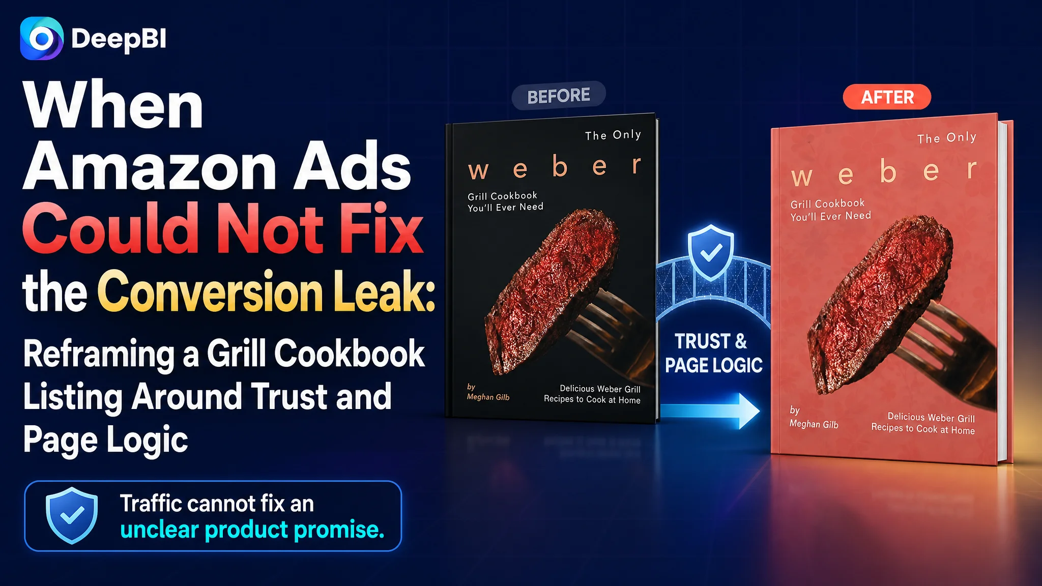
This case involved an Amazon US seller whose grill cookbook Listing was under pressure from a much stronger competing product page. The customer initially treated the issue as a content and presentation problem that could be solved through isolated copy and image adjustments. But the deeper issue was not one weak sentence or one unattractive image. The entire Amazon product page was failing to communicate enough value, credibility, and practical usefulness to convert interest into purchase intent.
DeepBI’s comparison showed a 34/100 Listing score against 87/100 for the benchmark product. The largest gap was not in the title. It was in the product page itself: no A+ content, almost no visual proof of the book’s contents, incomplete bullet-point logic, and a significant review disadvantage.
The later optimization therefore focused on rebuilding the Listing as a sales argument: place the core search terms earlier in the title, make the value more concrete with verified content quantities, use the image sequence to show outcomes and practical use, and add A+ modules that explain the book’s scope and usability. For other Amazon sellers, the lesson is direct: before sending more traffic to a product page, determine whether the page has enough evidence to deserve that traffic.
The Amazon Seller Saw a Weak Listing. The Original Diagnosis Was Too Narrow.
The customer’s Listing represented a grill cookbook designed for home cooking with charcoal or gas grills. Its existing title emphasized a broad claim similar to “The Only… You’ll Ever Need,” followed by general language about delicious recipes.
At first glance, the problem appeared to be a familiar one: the title was not competitive enough, the images needed improvement, and the bullet points required rewriting.
That diagnosis was not completely wrong. It was incomplete.
The Amazon page was not losing on one isolated element. It was losing at several connected decision points:
- The title did not place the most important category keyword prominently enough.
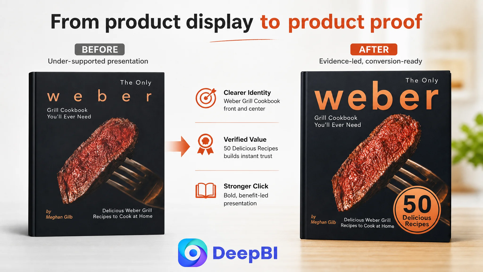
- The main image looked more like a static book cover than a high-conversion Amazon thumbnail.
- The image sequence did not show the book’s physical form, content structure, or expected cooking results.
- The bullet points were incomplete and did not clearly connect features to buyer outcomes.
- The page had no A+ content.
- The review profile offered little reassurance to a first-time buyer.
The result was a page with limited ability to convert either organic traffic or paid traffic.
The core problem was not simply that the Listing needed better copy. It lacked a coherent reason for the shopper to trust, understand, and choose the product.
The Score Gap Revealed Where the Page Was Losing Sales Logic
DeepBI’s Listing comparison quantified the gap rather than treating the competitor page as merely “better designed.”
- Title: Customer Listing: 14/20, Benchmark Listing: 17/20, Gap: -3
- Main image: Customer Listing: 16/30, Benchmark Listing: 25/30, Gap: -9
- Bullet points: Customer Listing: 2/10, Benchmark Listing: 9/10, Gap: -7
- Detail page: Customer Listing: 0/25, Benchmark Listing: 22/25, Gap: -22
- Reviews: Customer Listing: 2/15, Benchmark Listing: 14/15, Gap: -12
- Total: Customer Listing: 34/100, Benchmark Listing: 87/100, Gap: -53
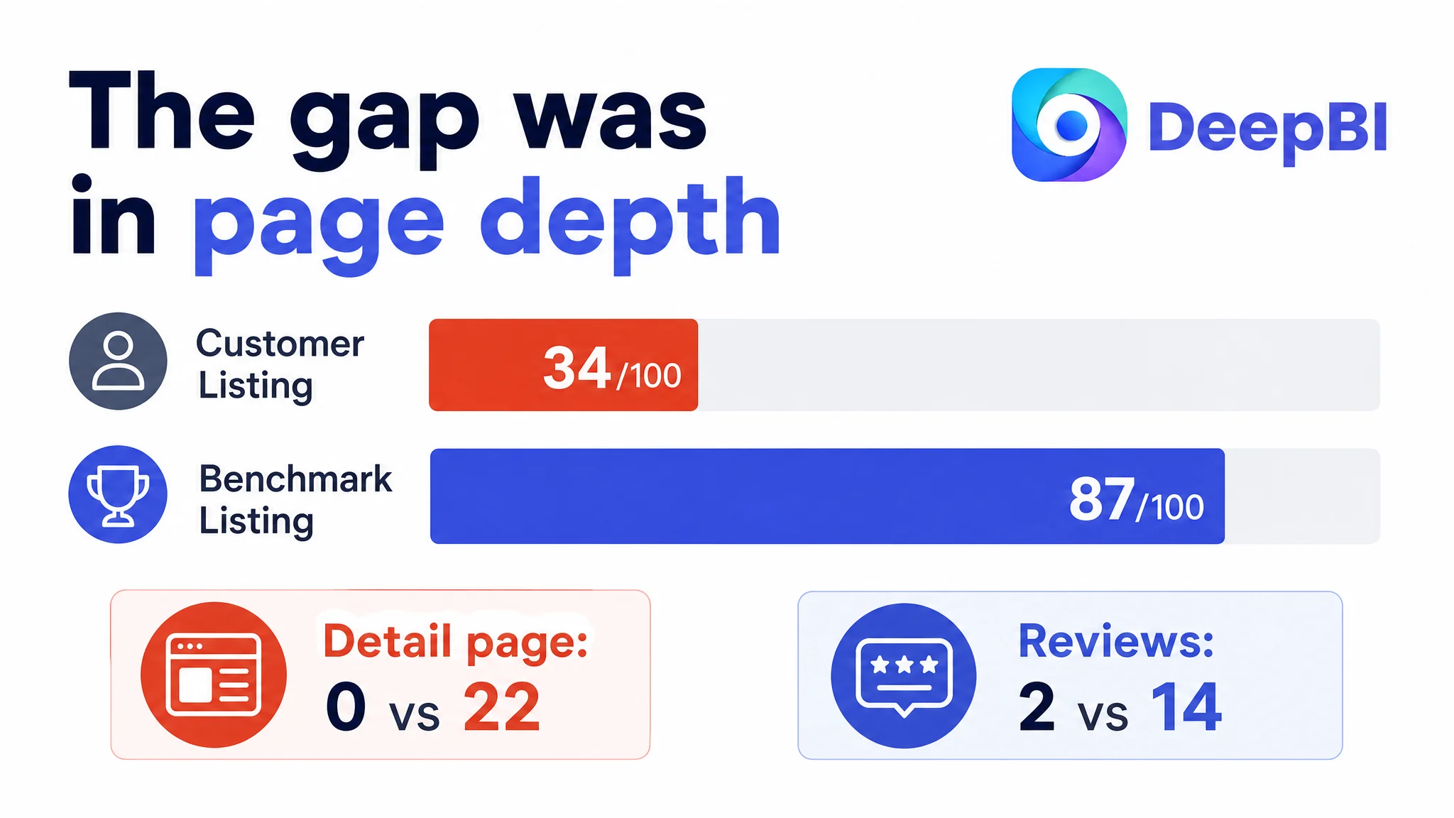
The distribution mattered more than the total.
The title gap was relatively limited. The largest loss came from the detail-page dimension, where the customer had no image modules and no A+ content. The review dimension was also materially behind: the customer Listing had a 3.4-star rating from 22 reviews, while the benchmark had 4.7 stars from 1,154 reviews.
This meant that increasing traffic alone would not address the central constraint. More shoppers would still arrive at a page that offered too little evidence about what the book contained and why it was worth buying.
The title was searchable, but not strategically arranged
The customer title placed the central phrase related to a grill cookbook later in the title. It also opened with a subjective, highly promotional claim.
The benchmark title used a tighter structure built around:
- The product category
- A clear authority signal
- A practical format
- A result-oriented promise
The customer title had relevant words such as recipes and grilling, but they were arranged in a longer, more conversational structure. It did not communicate the product’s strongest practical benefit quickly enough.
The recommended direction was to move a verified core phrase such as “grill cookbook recipes” closer to the beginning, then combine it with relevant terms such as barbecue, outdoor grilling, and step-by-step instructions.
The point was not to imitate the benchmark title. It was to make the product easier to understand at the search-result stage while removing exaggerated language that could create policy or credibility concerns.
The bullet points contained information, but not a buying path
The customer’s bullet points were incomplete and function-oriented. They described operational details without clearly answering the shopper’s more important questions:
- What will this book help me cook?
- Who is it for?
- Is it practical for home use?
- Will the instructions be easy to follow?
- What makes the content substantial enough to justify the purchase?
The benchmark page used a much clearer progression:
1. Establish authority.
2. State the core value.
3. Identify the intended audience.
4. Explain the structure and content.
5. Add practical or educational value.
That structure gave the shopper a reason to continue reading. By contrast, the customer’s bullets did not form a persuasive sequence.
The corrective principle was simple: each bullet should connect a product attribute to a meaningful user outcome. A statement about recipes should clarify range or usability. A statement about visual guidance should explain how it reduces uncertainty while cooking. A statement about home grilling should show where and for whom the book is useful.
The case material also revealed a serious content-quality issue: several proposed bullet-point drafts had drifted away from the actual product and described digital shortcuts rather than cookbook benefits. That kind of mismatch is more dangerous than weak wording. It creates a direct credibility problem and could increase buyer disappointment.
Amazon Listing optimization must begin with product truth. A polished sentence that describes the wrong product is not an optimization.
The Main Image Did Not Give Shoppers Enough Reason to Click
The customer’s cover image used a dramatic food visual and identified the product as a grill cookbook. However, the presentation remained closer to a traditional publication cover than to an Amazon search asset.
The benchmark image created stronger immediate signals through:
- A vivid finished-food image
- A clear cooking context
- Specific content quantities
- Stronger authority language
- A more obvious connection between the product and the expected result
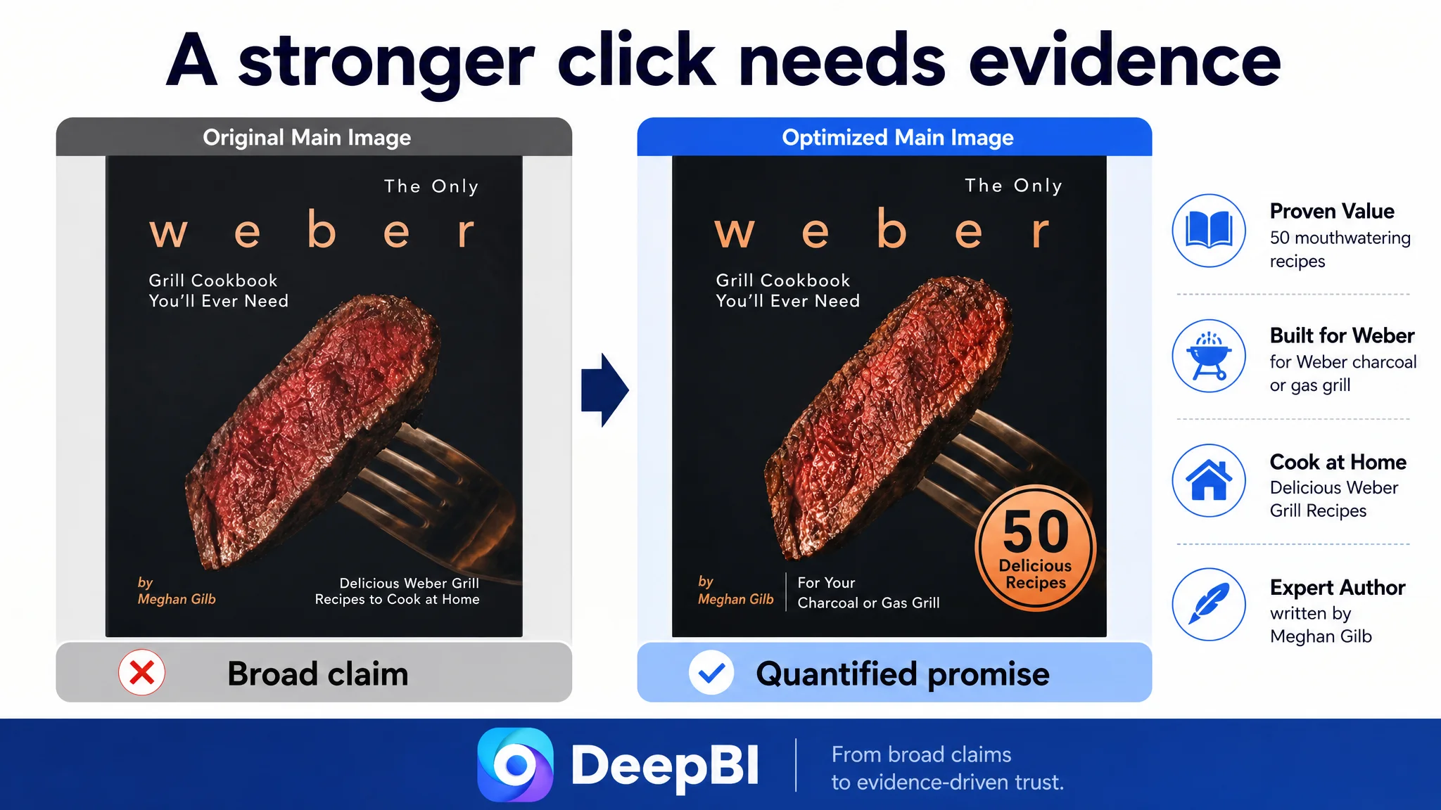
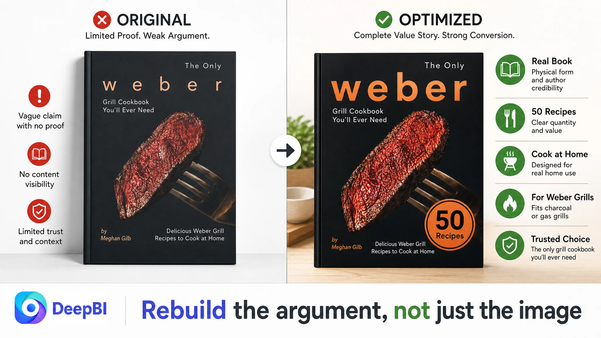
The customer’s image made a broad claim but did not support it with enough structured evidence. If a cover says it is the only cookbook a shopper will need, the page must quickly show why: how many recipes are included, what types of meals are covered, how instructions are presented, and what practical results the buyer can expect.
The main-image problem was therefore not just visual style.
It was a proof problem.
The image needed to move from:
“This is a cookbook with an appealing food image.”
to:
“This cookbook contains a clearly defined body of practical content that can help me produce meals like this at home.”
The recommended visual direction was to retain the authentic product identity while strengthening the first impression with verified quantities, a clearer content promise, and a more functional presentation. The objective was not to copy the benchmark’s design. It was to close the information gap that made the customer’s cover feel less complete.
The Image Sequence Was Missing the Middle of the Decision
Amazon shoppers often need to resolve three questions in sequence:
1. What is the product?
2. Why should I want it?
3. Can I use it successfully?
The customer’s image set did not complete that sequence.
The second image used back-cover-style copy that was difficult to read and did not contribute enough new information. It repeated product identity instead of showing internal structure, recipe range, or practical use.
The proposed replacement logic was more deliberate.
Show the scope of the content
One image should communicate the scale of the book through verified information, such as the confirmed number of recipes and the types of grilling content included.
Show evidence of what is inside
Another image should provide visual proof of the content. A cookbook benefits from showing recipe categories, finished dishes, chapter structure, or interior-page examples where available. The goal is to turn an abstract promise into something the buyer can inspect.
Address practical use
A further image should clarify that the book is intended for home cooking and compatible with the supported grill types, provided those claims are accurate and supported by the product material.
Reduce purchase uncertainty
The final image should consolidate the product’s practical value without relying on unsupported “best” or “only” claims. The buyer should leave the image sequence understanding what the book covers, how it is organized, and whether it fits their cooking situation.
This is where DeepBI’s judgment was important. The recommendation was not “add more images.” It was to assign each image a different role in the shopper’s decision process.
A gallery is not a storage area for product pictures. It is a sequence for resolving buyer doubts.
Missing A+ Content Removed the Page’s Strongest Trust Layer
The largest Listing gap was the complete absence of A+ content.
The customer page had no image modules, no structured content blocks, and no progressive explanation of the book’s value. For a cookbook, this removed several natural opportunities to build confidence:
- Showing the relationship between recipes and finished results
- Explaining the book’s chapter structure
- Demonstrating how instructions are organized
- Clarifying the intended cooking environment
- Presenting the breadth of content through verified numbers
- Helping buyers visualize the experience of using the book
The benchmark page used a strong cover presentation and quantified its content with numbers related to recipes, tips, and photos. Whether or not the customer could match those exact claims was not the point. The relevant lesson was that specific, verified evidence is more persuasive than general praise.
The proposed A+ structure followed a progressive logic.
Start with outcome and scope
The opening module should establish what the buyer can expect from the book and how much content it contains. It should not merely repeat the cover.
Explain the method
The next module should show how the book helps the reader move from ingredients and preparation to finished grilled food. This addresses the practical question: “Will I be able to follow it?”
Prove the structure
A chapter or recipe-category view can demonstrate range and organization. This is especially important when the Listing makes a broad promise about variety.
Clarify use cases
The page should identify the supported home-grilling context and the intended audience, without claiming compatibility beyond what the product actually supports.
Show a desired result
A strong food image or interior content example can make the benefit tangible. The shopper should see more than a book cover; they should see the type of result the book is meant to help create.
Close the practical doubt
The final modules should reinforce clarity and ease of use rather than repeating the opening claim. This completes the persuasion loop: scope, method, proof, applicability, result, and confidence.
The purpose of A+ content here was not decoration. It was to restore the trust and information layers that the original page lacked.
Reviews Made the Page’s Trust Gap More Difficult to Overcome
The review difference increased the pressure on every other Listing element.
The customer page had:
- A 3.4-star rating
- 22 total reviews
- No meaningful review content visible on the first page
- A high proportion of low-star feedback
The benchmark had:
- A 4.7-star rating
- 1,154 total reviews
- Multiple visible customer comments
- Photo and video review content
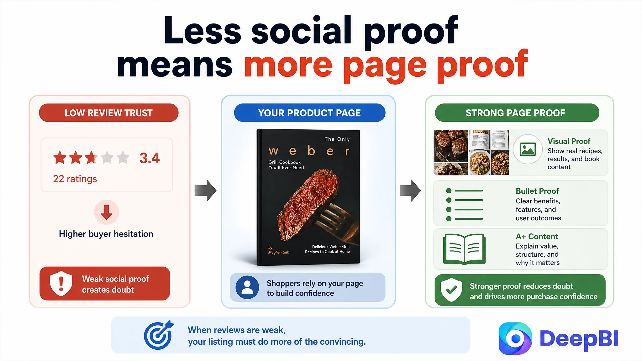
A newer or weaker review profile does not automatically make a product impossible to sell. But it changes the burden placed on the page. When social proof is limited, the title, images, bullet points, and A+ content must work harder to answer practical questions and reduce perceived risk.
This is why review weakness could not be treated as an isolated reputation issue. It interacted with the missing A+ content and weak image sequence. The page had fewer external trust signals and was also failing to provide enough internal proof.
DeepBI did not frame this as a problem that could be solved by cosmetic redesign alone. The Listing needed a more credible sales argument while the seller continued addressing the underlying review and product-experience issues through compliant Amazon practices.
Why DeepBI Did Not Treat the Problem as a Single Image Refresh
A conventional optimization process might begin by replacing the cover image, rewriting the title, or adding several new graphics. That approach risks producing a more attractive page without correcting the order in which buyers make decisions.
DeepBI’s diagnosis connected five dimensions:
- Title: Can the shopper identify the product and its relevance quickly?
- Main image: Is there enough visual reason to click?
- Bullet points: Do the claims connect features with buyer outcomes?
- A+ content: Does the page provide depth, proof, and practical context?
- Reviews: Does independent customer feedback reinforce or weaken trust?
The score pattern showed that the page’s most urgent problem was not keyword coverage alone. It was conversion capacity.
That led to a different decision order:
1. Correct the product positioning and title structure.
2. Rebuild the image sequence around distinct decision roles.
3. Add A+ content to provide depth and proof.
4. Rewrite bullets around audience, outcome, content, and usability.
5. Treat review weakness as a parallel trust risk rather than attempting to hide it with stronger claims.
6. Only then evaluate how additional Amazon traffic should be scaled.
This sequence reduces the risk of using ads to amplify an unprepared product page.
The Optimization Had to Remain Grounded in What the Book Could Prove
The case also illustrates an important boundary for AI-assisted Listing work.
The benchmark provided useful strategic references: quantified value, strong category language, visual recipe proof, and a clear instructional promise. But those elements could not be copied or invented without evidence.
For this cookbook, the usable claims included information supported by the case material:
- 50 mouthwatering recipes
- Cooking at home
- Recipes for supported charcoal or gas grills
- Step-by-step instructions
- The book’s identified author information, where appropriate and authorized
The optimization should not introduce unsupported recipe counts, photo counts, credentials, testing claims, or guarantees merely because a benchmark uses them.
The same principle applies to AI-generated images. Food photography, scene composition, lighting, and page-layout concepts can be enhanced. The actual book, cover, recipe scope, and grill compatibility must remain truthful.
The strongest Amazon Listing is not the one with the biggest claim. It is the one where every claim, image, and page module reinforces the same believable product promise.
What Changed in the Customer Team’s Understanding
The case did not include verified post-optimization CVR, ACOS, or organic-order data, so no numerical performance outcome should be claimed. The business value of the diagnosis was the shift in operating judgment.
The customer team could now see that:
- A weak Amazon product page can make advertising appear inefficient.
- The title, main image, bullets, A+, and reviews operate as one conversion system.
- A broad claim cannot compensate for missing evidence.
- A cookbook must show both content and expected results.
- More images are not automatically better; each image needs a role.
- A+ content is a trust and decision layer, not an optional decorative section.
- Review weakness increases the importance of clear product proof.
- Ads should not be scaled aggressively before the Listing can convert the traffic it receives.
The page’s next stage was therefore not defined by producing more assets as quickly as possible. It was defined by restoring a coherent sales logic.
Amazon advertising can bring a shopper to the product page. It cannot make an unclear product promise credible.
The Broader Lesson for Amazon Sellers
Many Amazon sellers respond to weak advertising efficiency by changing bids, adding keywords, restructuring campaigns, or reducing spend. Those actions may be appropriate when the traffic itself is wrong.
But when traffic reaches the page and fails to convert, the more important question is whether the Listing is prepared to receive it.
In this case, the customer had a relevant product and some useful content. The problem was that the page did not organize those assets into a convincing decision path. The title was not sufficiently focused. The main image did not provide enough structured value. The bullets lacked outcome-oriented logic. The image gallery did not demonstrate content breadth or practical use. The A+ area was empty. The review profile could not carry the trust burden on its own.
DeepBI’s contribution was to identify the constraint behind those symptoms and prioritize the repair accordingly.
The lesson is not that every high-ACOS Amazon campaign is secretly a Listing problem. The lesson is that sellers should test the conversion foundation before assuming that more advertising optimization will solve the business outcome.
Before sending more traffic, ask whether the Amazon product page has earned the right to receive it.