

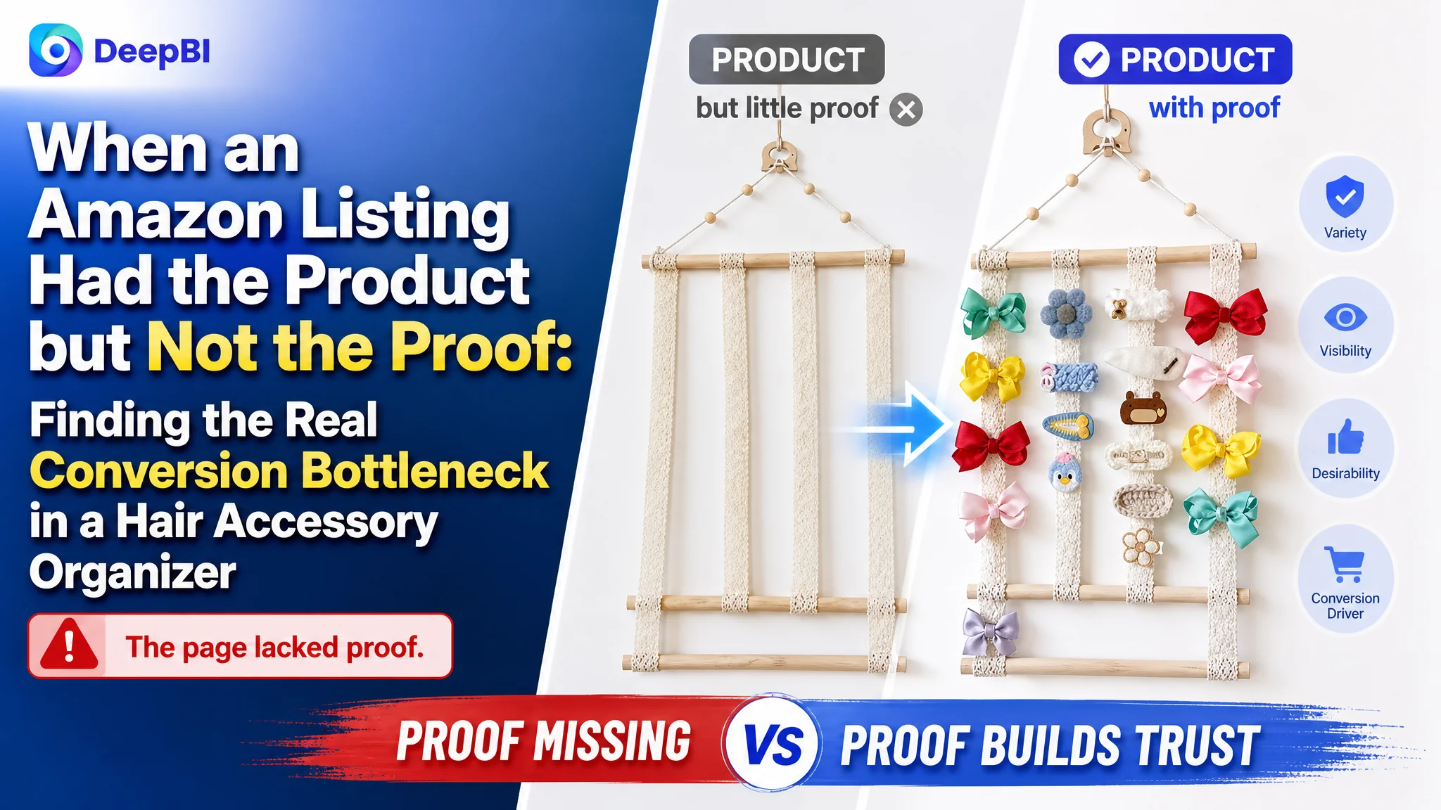
An Amazon seller in the US marketplace was trying to improve a wall-mounted hair accessory organizer Listing. The product had a clear use case—storing bows, headbands, and clips—but the page was not communicating its value with enough clarity or confidence. The initial optimization direction focused heavily on the title, main images, and wording of the bullet points.
DeepBI’s comparison showed that these were not the largest constraints. The Listing scored 46 out of 100, compared with 86 for a closely matched high-performing competitor. The most serious gaps were not limited to keyword placement or image style: the product page lacked visual explanation, measurable proof, and review-based trust.
The later optimization therefore focused on rebuilding the Amazon product page as a complete buying argument. The title and bullets were reorganized, the main images were given clearer functional roles, and the missing A+ story was designed around capacity, materials, installation, use scenarios, and long-term value. For other Amazon sellers, the case offers a practical warning: when traffic or exposure does not translate into orders, the problem may be the page’s conversion capacity—not the next round of ad or keyword adjustments.
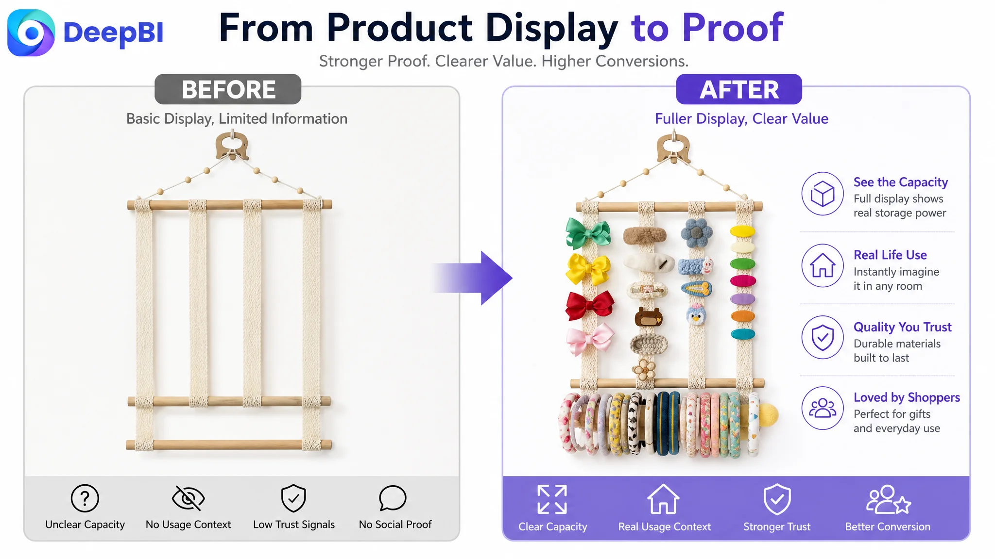
The Page Looked Incomplete Before It Looked Inefficient
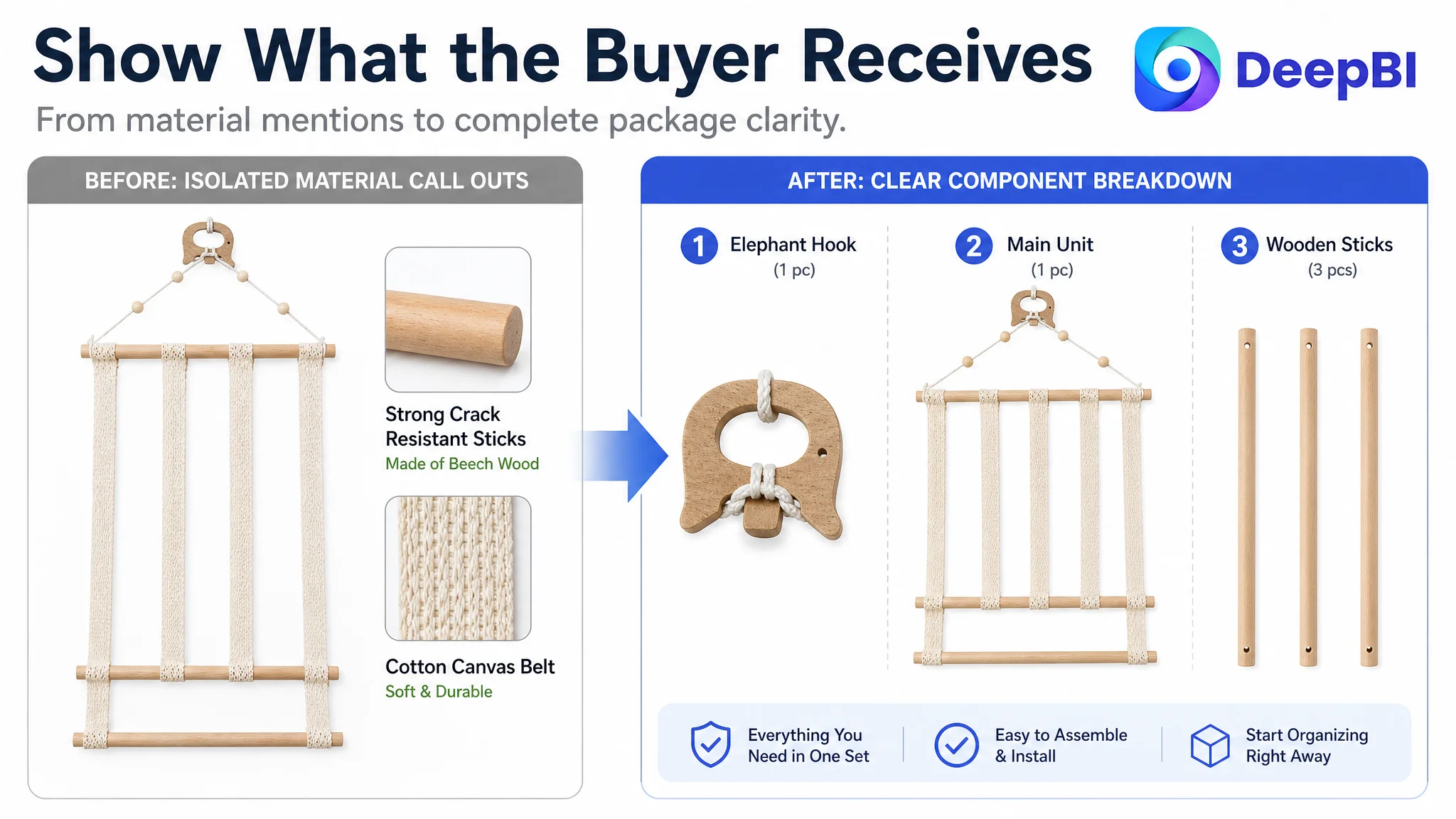
The product itself was not difficult to understand. It was a hanging organizer made with cotton canvas belts, wooden sticks, and a hook, intended to store hair bows, headbands, and other accessories.
But on Amazon, product simplicity does not guarantee purchase simplicity.
A shopper still needs to answer several questions quickly:
- How much can it hold?
- What exactly comes in the package?
- Where can it be installed?
- Is it easy to use?
- Will the materials support a growing collection?
- Does it look appropriate in a child’s room or home?
- Why should the shopper trust this Listing over a more established alternative?
The existing page did not answer these questions in a clear sequence. Its title contained several relevant terms, but the structure was crowded. The main images showed the product, yet did not fully demonstrate capacity or interaction. The bullet points described features, but often stopped at listing information instead of connecting each feature to a buying concern.
Most importantly, the detail section was almost entirely text-based.
That weakness became decisive when the Listing was compared with a stronger Amazon product page in the same use context.
The product did not primarily lack features. The page lacked enough evidence for shoppers to believe those features mattered.
The Initial Optimization Direction Was Too Close to the Surface
The first instinct was understandable: improve the title, make the main images more attractive, and rewrite the five bullet points.
There were genuine problems in all three areas.
The title placed “Hair Claw Clip Organizer” near the front, but it also accumulated multiple terms such as hair bows, jewelry storage, home decor, and other accessory phrases without a strong hierarchy. The result was broader, but not necessarily clearer.
The main image set also needed work. Several images repeated the full product view without showing enough functional information. The product was visible, but the shopper could not immediately judge its storage capacity, assembly logic, or attachment details.
The bullet points contained useful information, but the structure leaned toward feature listing and emotional language. Phrases such as a “cute gift” appeared before the page had fully established practical value.
These issues made the title, main images, and bullet points attractive targets for optimization. But treating them as the central problem would have led to another round of surface-level improvement.
DeepBI’s Listing comparison showed that the largest gap was elsewhere.
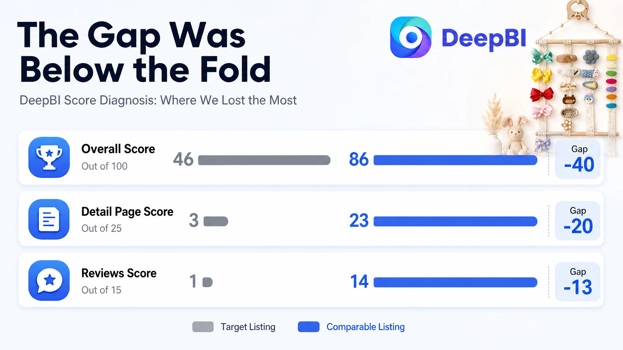
The Score Gap Was Concentrated in the Product Page
The overall score difference was 40 points:
- Title: Target Listing: 14/20, Comparable high-performing Listing: 16/20
- Main image: Target Listing: 23/30, Comparable high-performing Listing: 26/30
- Bullet points: Target Listing: 5/10, Comparable high-performing Listing: 7/10
- Detail page: Target Listing: 3/25, Comparable high-performing Listing: 23/25
- Reviews: Target Listing: 1/15, Comparable high-performing Listing: 14/15
- Total: Target Listing: 46/100, Comparable high-performing Listing: 86/100
The title gap was only two points. The main image gap was three points. The bullet-point gap was two points.
The detail-page gap was twenty points.
The review gap was thirteen points.
That distribution changed the diagnosis. The Listing was not dealing with a single weak keyword or an isolated creative issue. It had a serious trust and explanation deficit below the fold, combined with no review history to support the purchase decision.
The competitor’s page used a broader visual system:
- A room-based hero scene
- Capacity and feature graphics
- Structural detail views
- Material close-ups
- Installation guidance
- Multiple home-use scenarios
- Buyer-generated content
- Variant and style presentation
The target Listing used mostly repeated text.
This was not a minor content difference. It was a difference in how each page handled shopper uncertainty.
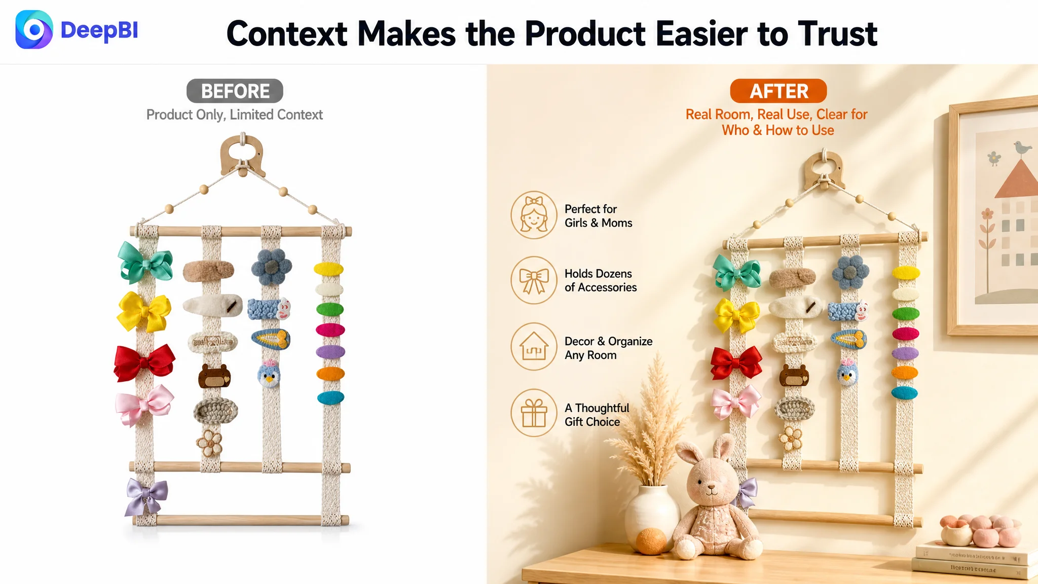
This Was Not Just a Main Image Problem
The main images did need to become more useful, but the reason was not simply that they were less attractive.
The first image did not show enough accessories loaded onto the organizer to make its storage role immediately obvious. A shopper browsing on a mobile screen could see the product form, but might not understand the capacity advantage.
Other images showed dimensions or isolated product details, yet did not consistently connect those details to a real use situation. One image could have been used to show the organizer in a nursery, bedroom, dorm, or other relevant setting. Another could have demonstrated the snap-clip interaction. A separate component view could have clarified what was included in the package.
The revised visual direction was therefore based on function:
Make capacity visible
A “loaded” view should show a richer assortment of bows, clips, and headbands. The objective is not decoration for its own sake. It is to help shoppers understand what the organizer is designed to do.
Connect dimensions with materials
The product is approximately 11.8 inches wide and 16.54 inches high. These measurements become more useful when presented alongside the cotton canvas belts and beech wood components, giving the shopper both a size reference and a reason to trust the construction.
Show the product in a real room
A scene should answer who the product is for and where it belongs. A nursery, bedroom, college dorm, or organized dressing area can make the use case more immediate than another isolated product shot.
Explain how the product works
A close-up of the snap clip, wooden stick, hook, and belt structure can reduce the uncertainty that comes from seeing only the finished product. Shoppers should not have to infer how headbands are placed or how the organizer is hung.
The central change was from showing the object to showing the buying logic.
The Detail Page Was the Largest Missed Opportunity
The absence of a meaningful A+ story created the most serious conversion weakness.
The product had several points that could support a purchase:
- Four cotton canvas belts
- Three wooden sticks
- One hook
- A vertical, space-saving structure
- Beech wood components
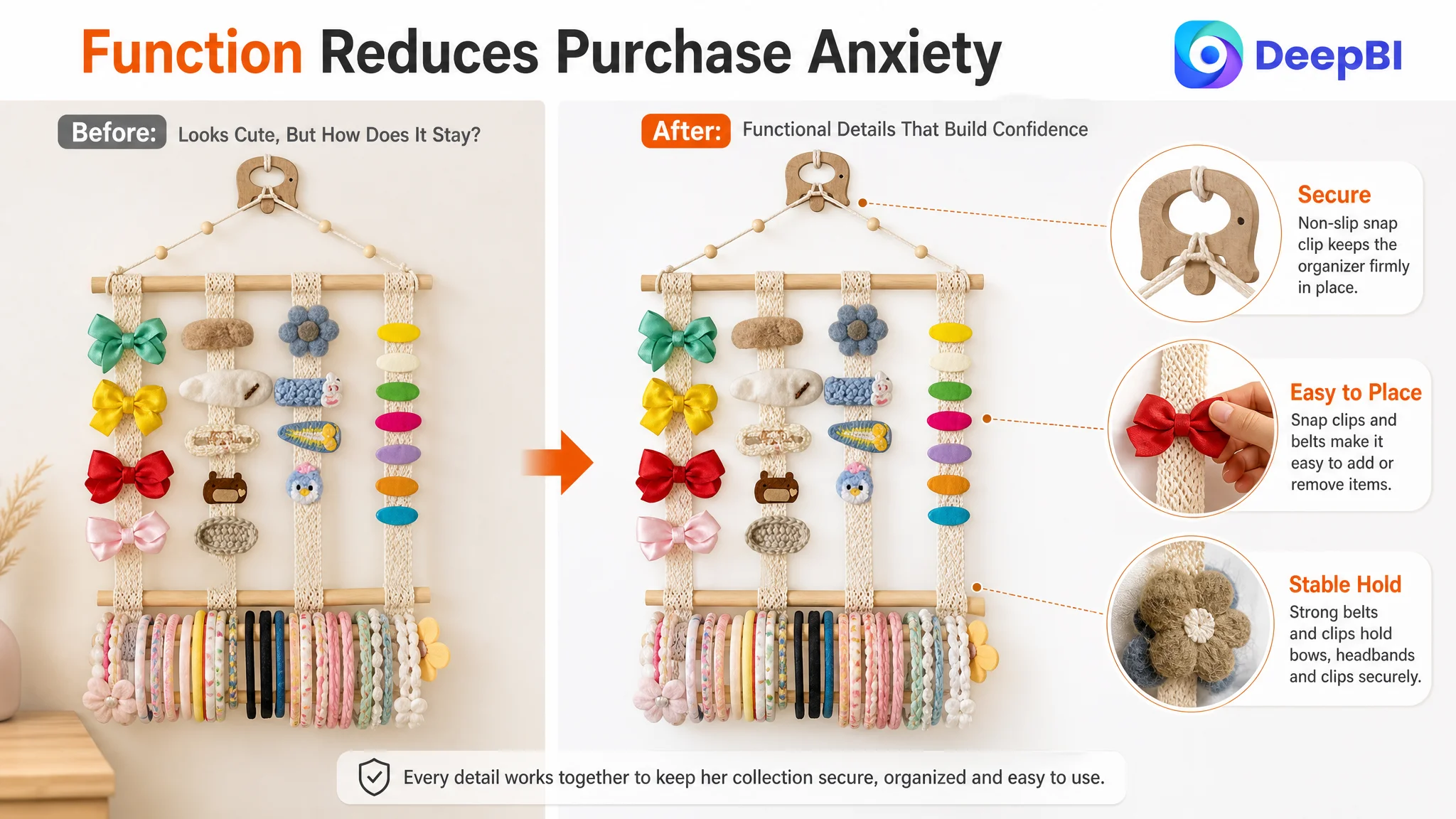
- A snap-clip design
- Wall, door, and cabinet placement
- Use across different stages of a child’s growing accessory collection
But these points were not assembled into a persuasive sequence.
A shopper encountering only text must work too hard to build a mental picture. The shopper has to imagine the product installed, estimate its capacity, understand how the components fit together, and decide whether the materials appear reliable.
A strong A+ section could reduce that effort by organizing the page around the shopper’s decision process.
First, establish the setting
The opening module should make the product feel appropriate for girls’ rooms, nurseries, bedrooms, dorms, or other relevant spaces. It should show the organizer as part of an environment rather than as an isolated object.
Then, address clutter
The product’s practical value is not simply that it hangs on a wall. It helps move hair accessories out of drawers and into an organized display that is easier to browse.
That benefit should be shown visually, not repeated as a vague promise.
Next, prove capacity and versatility
The page should explain what the system includes and how it accommodates bows, headbands, clips, and other accessories. Where the product information supports it, clear capacity and size references should appear early rather than being buried in later copy.
Reduce installation anxiety
The provided material describes a finished organizer that can be opened and hung with the included hook. That is a strong usability point, but it needs to be demonstrated through a simple installation sequence.
The shopper should be able to understand:
1. What arrives in the package
2. How the sticks and belts are arranged
3. How the hook is used
4. Where the organizer can be hung
Reinforce the material story
Beech wood and cotton canvas belts can support a quality narrative, but only when the page explains what those materials contribute: structure, load-bearing support, resistance to deformation, and a more dependable storage experience.
The wording must remain within the confirmed product information. The goal is not to make the product sound more advanced than it is. The goal is to make its existing qualities easier to verify.
The Bullet Points Needed a Buying Sequence
The bullet points were not empty. Their problem was that they did not consistently move from concern to reassurance.
The revised logic placed the practical questions in a more useful order.
Capacity before emotion
The first bullet should establish size, components, and storage purpose. A shopper needs to know what the product can organize before considering it as a gift.
Materials as reassurance
The second bullet should explain the beech wood and cotton canvas construction in relation to durability and load-bearing use, without drifting into unsupported claims.
Installation as risk reduction
The third bullet should make clear that the organizer is designed for simple setup and can be hung on a wall, door, or cabinet.
Snap-clip functionality as interaction value
The fourth bullet should show how the snap-clip design helps children or parents place and remove headbands, while also supporting a neater vertical storage arrangement.
Gift positioning after product value
The gift message belongs later. It becomes more credible after the page has established what the product is, how it works, and why it is useful.
This structure is more effective than presenting “cute,” “handmade,” or “great gift” language before the practical value has been proven.
A gift claim cannot replace product confidence. It works best after the page has already answered the shopper’s functional questions.
The Title Needed Structure, Not More Keywords
The title gap was smaller than the detail-page gap, but its structure still affected search visibility and click clarity.
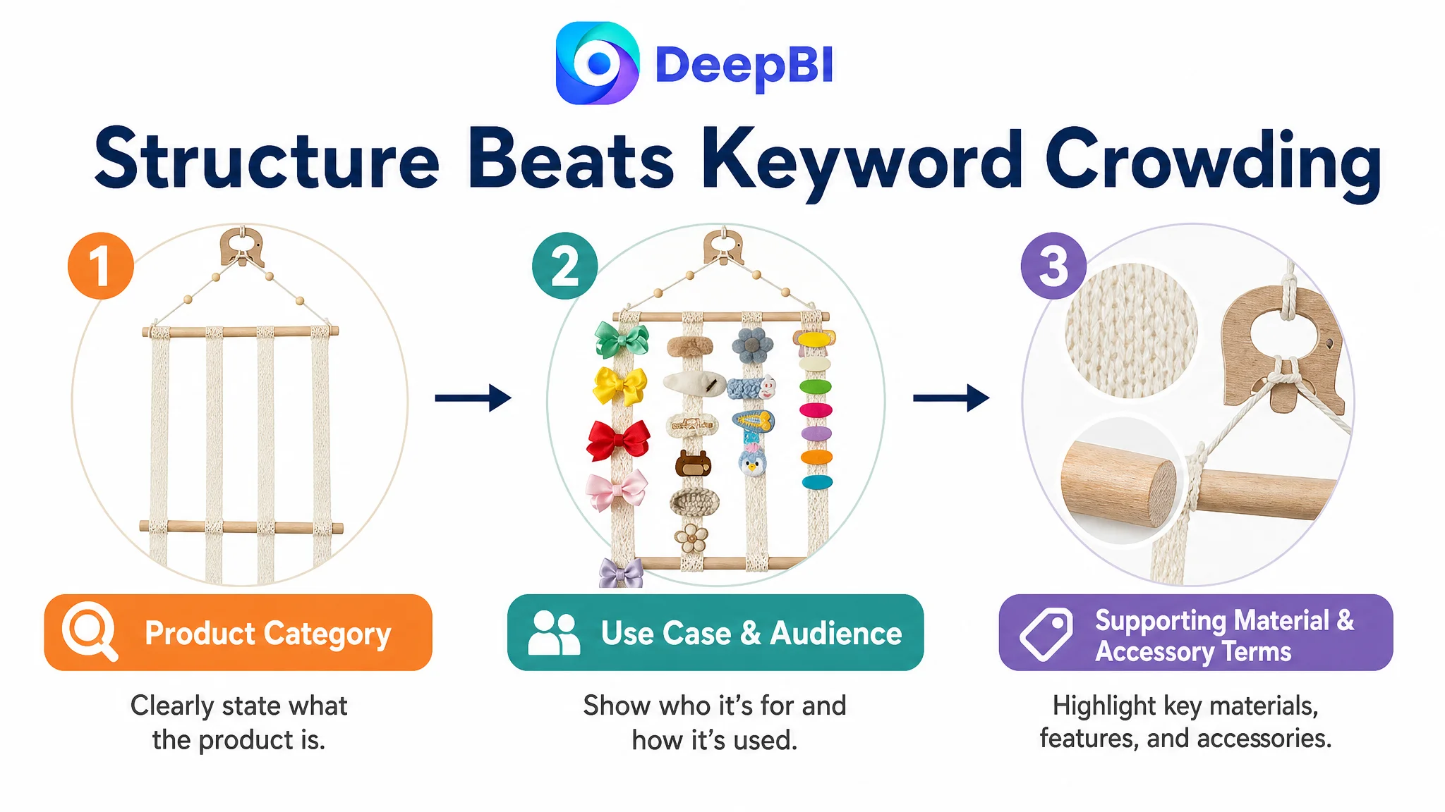
The original title included multiple relevant terms, yet the wording was crowded and the hierarchy was difficult to read. DeepBI’s recommendation was to preserve the core product identity while improving the order of information:
- Primary product category
- Main use or placement
- Key material or structural detail
- Target users
- Related accessory terms
- Home-decor context
- Distinctive hook detail
This is different from adding every possible keyword.
A stronger Amazon title should help both search systems and shoppers identify the product quickly. It should not force the reader to decode a long sequence of loosely connected phrases.
The recommended direction also expanded the audience beyond a narrow use case by incorporating terms related to babies, toddlers, girls, hair accessories, and home storage—provided those terms accurately described the product’s intended use.
Reviews Created a Separate Trust Constraint
The Listing had no effective review presence:
- No star rating
- No review count
- No customer comments on the first page
The comparable Listing had a 4.6-star rating and more than 4,800 reviews, including customer images and videos.
This gap could not be solved through copywriting alone.
It meant that the target Listing needed to compensate through stronger product-page evidence while building its own review base over time. Clear dimensions, visible components, realistic scenes, installation guidance, material close-ups, and accurate capacity communication could reduce uncertainty—but they could not substitute for accumulated customer experience.
That distinction matters for Amazon sellers. A Listing with no review history is not operating under the same conversion conditions as a mature competitor. It must be more precise in the areas it can control.
It must also avoid overpromising. If the page claims a capacity, material quality, or use case that the delivered product does not clearly support, the short-term conversion gain can create longer-term dissatisfaction.
Why DeepBI Did Not Recommend More Surface-Level Editing First
The decision was not based on the idea that titles and main images were unimportant. It was based on the size and commercial meaning of each gap.
A two-point title difference could be improved, but it was unlikely to compensate for a twenty-point detail-page deficit. A stronger hero image could improve first impressions, but it would still send shoppers into a page with limited proof. Rewriting emotional language would not solve the absence of visual explanation or review trust.
The priority had to be:
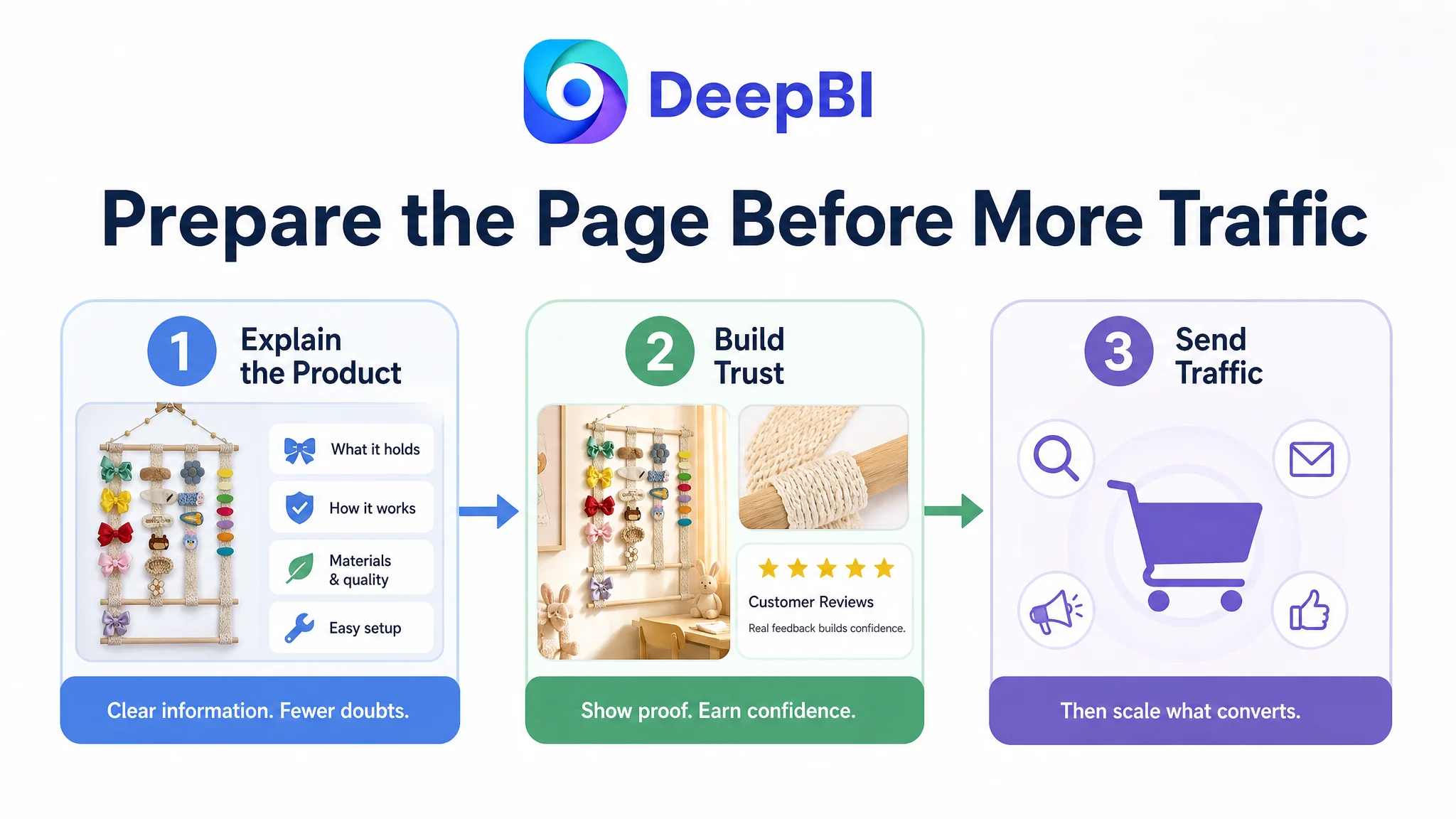
1. Restore the product page’s ability to explain the product
2. Build visual and rational trust
3. Make the main image set support the same message
4. Reorganize the title and bullets around a clear information hierarchy
5. Use advertising only after the page was better prepared to receive traffic
This is the core business judgment in the case.
Sending more Amazon traffic to a page that has not earned enough trust can amplify the page’s weaknesses instead of solving them.
From Product Display to Conversion System
The recommended optimization did not treat each Listing element as an independent task.
The title was meant to define the product clearly.
The main images were meant to create a reason to click and show how the organizer works.
The bullet points were meant to connect features with practical concerns.
The A+ content was meant to create a complete visual explanation.
The review gap was treated as a real business constraint rather than something that could be hidden through design.
Together, these changes would give the Amazon product page a more coherent sales path:
Recognize the product → Understand the capacity → See how it works → Trust the materials → Imagine it in the room → Judge whether it is worth buying or gifting.
That sequence is more valuable than making one image prettier or adding one more keyword.
The Business Understanding Changed
The available case material does not include confirmed post-optimization CTR, CVR, ACOS, or organic-order results, so no numerical performance outcome should be claimed.
What the diagnosis did establish was a clearer operating priority.
The Listing was not simply underperforming because its title lacked keywords. It was constrained by a much broader conversion problem:
- The page did not provide enough visual evidence
- The capacity was not demonstrated clearly
- The installation process was not easy to understand
- The material story was underdeveloped
- The bullet points did not follow the shopper’s decision path
- The Listing had no review-based trust
- The A+ content did not carry the product’s full explanation
For the customer team, this reframed the work from “make the Listing look better” to “make the Listing easier to believe.”
For other Amazon sellers, the lesson is equally practical:
Before increasing ad pressure, determine whether the product page can convert the traffic it already receives.
A title, main image, bullet points, A+ modules, and reviews do not operate as separate decorations. They form the trust structure that determines whether paid and organic traffic can become orders. DeepBI’s value in this case was not the number of edits it could produce. It was identifying which weakness had to be addressed first.