

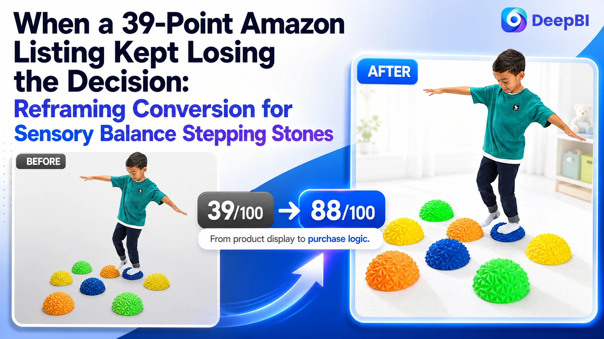
An Amazon seller in the children’s active-play category was not facing a simple image-quality problem. Its sensory balance stepping stones Listing was competing for attention with a product page that scored 39 out of 100, while a comparable high-performing Listing scored 88. The gap appeared across the title, main images, bullet points, A+ content, and reviews—but the most serious weakness was deeper than any single module.
The customer’s initial direction treated the problem as a collection of small presentation defects: the title needed more keywords, the image set needed more product views, and the copy needed clearer specifications and safety information. DeepBI’s diagnosis was different. The Listing did not lack information alone; it lacked a connected buying story that could make parents understand the product, trust it, and imagine using it.
The later optimization therefore focused on rebuilding the Amazon product page around a clear sequence: sensory differentiation, easy setup, developmental value, play scenarios, safety, cleaning, and compact storage. The case shows why Amazon sellers should not judge a Listing by whether every basic fact is present. The more important question is whether the page turns those facts into a reason to click and a reason to buy.
The Seller Saw a Competitive Gap, but Not Yet Its Shape
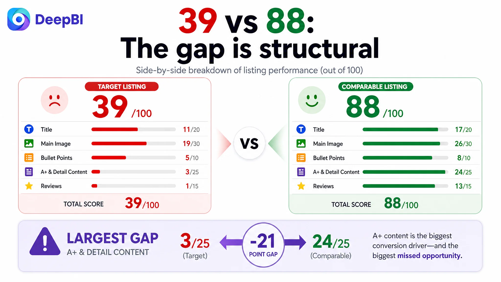
The US Amazon Listing received an overall score of 39 out of 100, compared with 88 out of 100 for a comparable high-performing product page.
The gap was distributed across several dimensions:
- Title: Target Listing: 11/20, Comparable Listing: 17/20, Gap: -6
- Main image: Target Listing: 19/30, Comparable Listing: 26/30, Gap: -7
- Bullet points: Target Listing: 5/10, Comparable Listing: 8/10, Gap: -3
- A+ and detail content: Target Listing: 3/25, Comparable Listing: 24/25, Gap: -21
- Reviews: Target Listing: 1/15, Comparable Listing: 13/15, Gap: -12
- Total: Target Listing: 39/100, Comparable Listing: 88/100, Gap: -49
At first glance, this looked like a broad competitiveness problem. The title was short. The images were visually repetitive. The bullets leaned toward specifications. The A+ section contained text but no image modules. The Listing also had no review history, while the comparable product had a 4.7-star rating and 65 reviews.
That kind of gap can easily push an Amazon team toward scattered fixes. Add more keywords. Rework the first image. Repeat the safety message. List the included pieces more clearly. Try to compensate for the lack of reviews with more product information.
Those actions may improve individual components, but they do not necessarily repair the page’s sales logic.
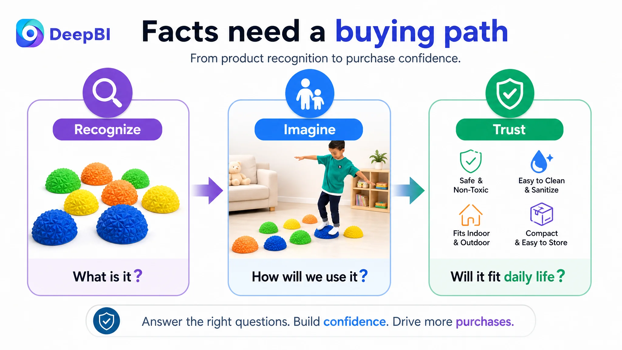
The Listing was not missing facts in isolation. It was missing a persuasive path from recognition to confidence.
The Initial Diagnosis Stayed Too Close to the Surface
The original working direction focused on visible creative shortcomings.
The title described the product type and quantity, but did not clearly communicate the audience, usage context, or key benefit. The image set showed the product accurately, but the early images did not give shoppers enough reason to stop and investigate. The bullet points explained what came in the package, but did not consistently connect each feature to a child’s experience or a parent’s purchasing concern.
The page also contained useful product attributes—such as the pineapple texture, inflatable format, included pump, and four-color set—but these advantages were not organized into a clear value proposition.
This created a common Amazon Listing misdiagnosis: treating conversion weakness as a matter of missing details rather than a failure of information order.
The customer was not simply dealing with “bad images” or “weak copy.” The Listing was asking parents to assemble the product’s value themselves:
- Why is this more interesting than an ordinary balance toy?
- What will children actually do with it?
- What developmental value does it offer?
- Is it easy to set up and store?
- Can it be cleaned easily?
- Is it safe for indoor and outdoor play?
- Will the product remain useful after the first few sessions?
The comparable Listing answered these questions through a coordinated combination of visuals and copy. The target Listing answered them separately, and sometimes only partially.
The Largest Leak Was in the Product Page, Not One Isolated Asset
DeepBI’s score comparison made the priority clear. The most substantial difference was in the detail-content dimension:
- Target Listing: 3/25
- Comparable Listing: 24/25
The target Listing had no visual A+ modules and relied mainly on repeated text. The comparable page used seven structured A+ modules covering the product’s appearance, use cases, benefits, configuration, safety, and specifications.
This was not a minor content-format difference. It changed how much work the shopper had to do before making a decision.
A product page for children’s active-play equipment must do more than identify the item. It must help parents visualize the child using it, understand the physical experience, assess practical risks, and decide whether the product fits their home.
The target Listing had not yet built that sequence.
The title identified the category, but not the buying context
The title placed the core phrase “Sensory Balance Stepping Stones” near the beginning, which helped identify the product. However, its structure remained relatively simple and did not fully communicate:
- The set size
- The PVC material
- The toddler and children audience
- Indoor and outdoor use
- The obstacle-course application
- The non-slip or sensory positioning
- The gift and screen-free play context
A stronger Amazon title does not win by adding keywords at random. It uses the available space to connect search intent with purchase intent.
For this Listing, the direction was to retain the core category language while adding material, quantity, audience, scene, and functional context. The purpose was not merely greater keyword coverage. It was to make the product understandable before the shopper reached the image gallery.
The main image showed the product, but did not establish a strong reason to click
The existing first image confirmed that the product was a balance toy and showed a child using it. But it remained relatively static and did not make the Listing’s distinctive attributes immediately obvious.
The comparable product used stronger emotional and functional cues, including children at play and visible light and musical elements. Its image sequence also used more structured information panels to explain benefits and usage.
The target Listing’s issue was therefore not that the product image was inaccurate. The issue was that it performed mainly as category identification. It did not establish a differentiated hook around:
- The set of eight stepping stones
- The specialized pineapple texture
- The four-color combination
- Balance and coordination activities
- The tactile experience with bare feet or socks
DeepBI’s recommendation was to change the role of each image rather than simply make every image more attractive.
The image sequence needed to move from identification to proof:
1. A stronger first impression of the sensory balance set
2. A feature and trust panel covering cleaning, storage, pump use, and safety
3. Configuration examples showing multiple play paths
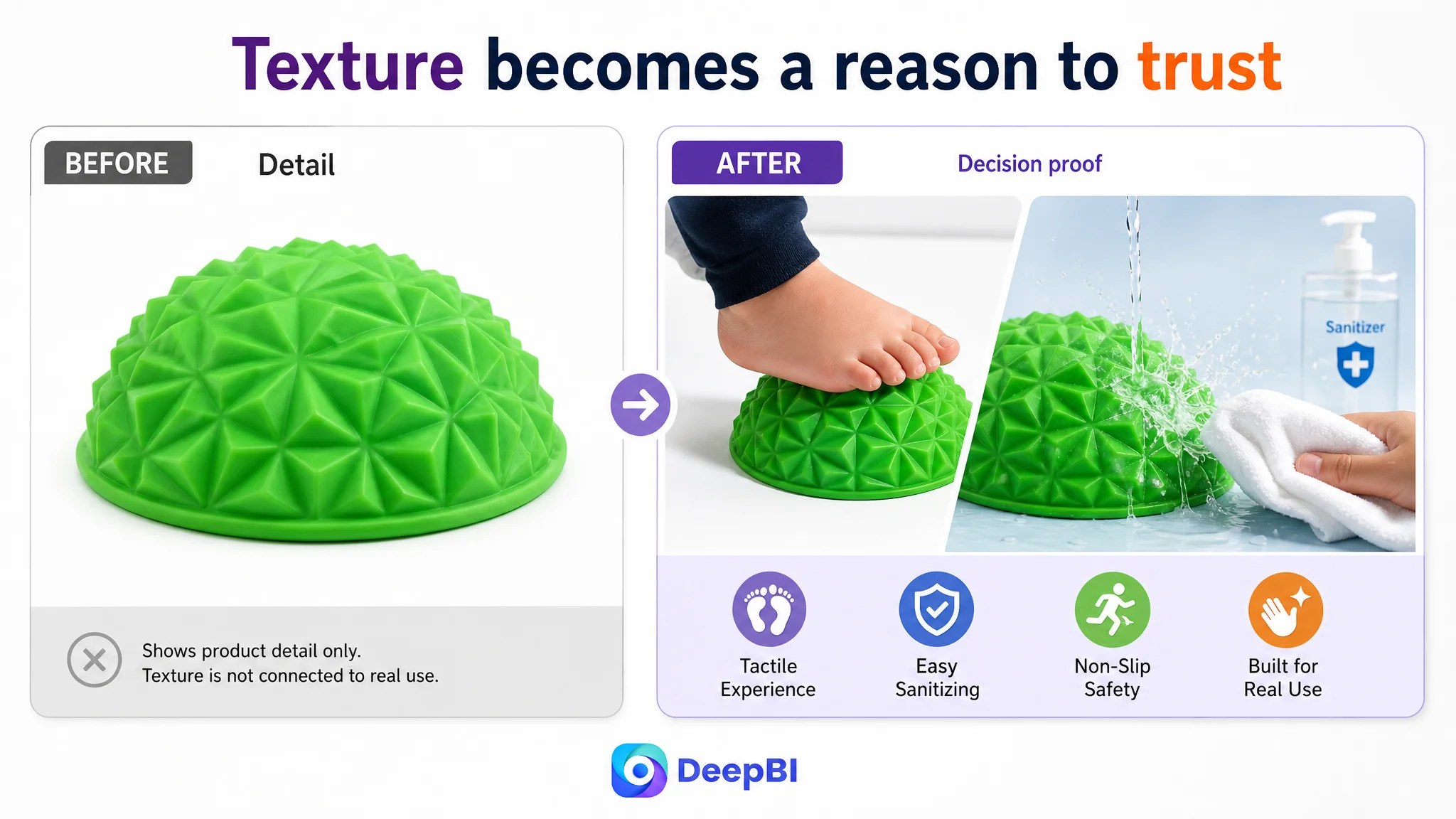
4. A close view of the pineapple texture and tactile experience
5. A final summary that clarified the set, included pump, colors, and gifting suitability
This is a different decision from “replace the images.” It is a decision about what each image must accomplish in the shopper’s evaluation process.
The Bullet Points Had Information, but Not a Buying Logic
The existing bullet structure began with packaging and specifications. That information was not irrelevant, but it was too weak as an opening argument for a children’s play product.
The stronger sequence identified in the comparison was:
- Start with the experience
- Explain how the product is used
- Connect play to physical development
- Introduce sensory and tactile value
- Show imaginative and social play
- Resolve safety, maintenance, and storage concerns
The proposed bullet strategy followed that order.
Lead with the product experience
Instead of beginning with a package inventory, the first bullet could frame the set as an active sensory-play system: eight PVC stepping stones, four bright colors, and an included air pump that allows children to create different home obstacle-course layouts.
Connect movement to recognizable developmental outcomes
“Promotes balance” is an abstract benefit. A stronger explanation links stepping and balancing with coordination, gross motor movement, body awareness, and confidence.
The point is not to make unsupported developmental claims. It is to explain the observable relationship between the activity and the type of movement the product is designed to encourage.
Make the pineapple texture a real differentiator
The pineapple texture was one of the product’s clearest distinctive attributes, but it appeared too late in the existing presentation.
Used with bare feet or socks, the texture could be shown as part of the product experience rather than left as a technical detail. This gave the Listing a sensory anchor that did not depend on copying the competitor’s light and musical positioning.
Turn configurations into play scenarios
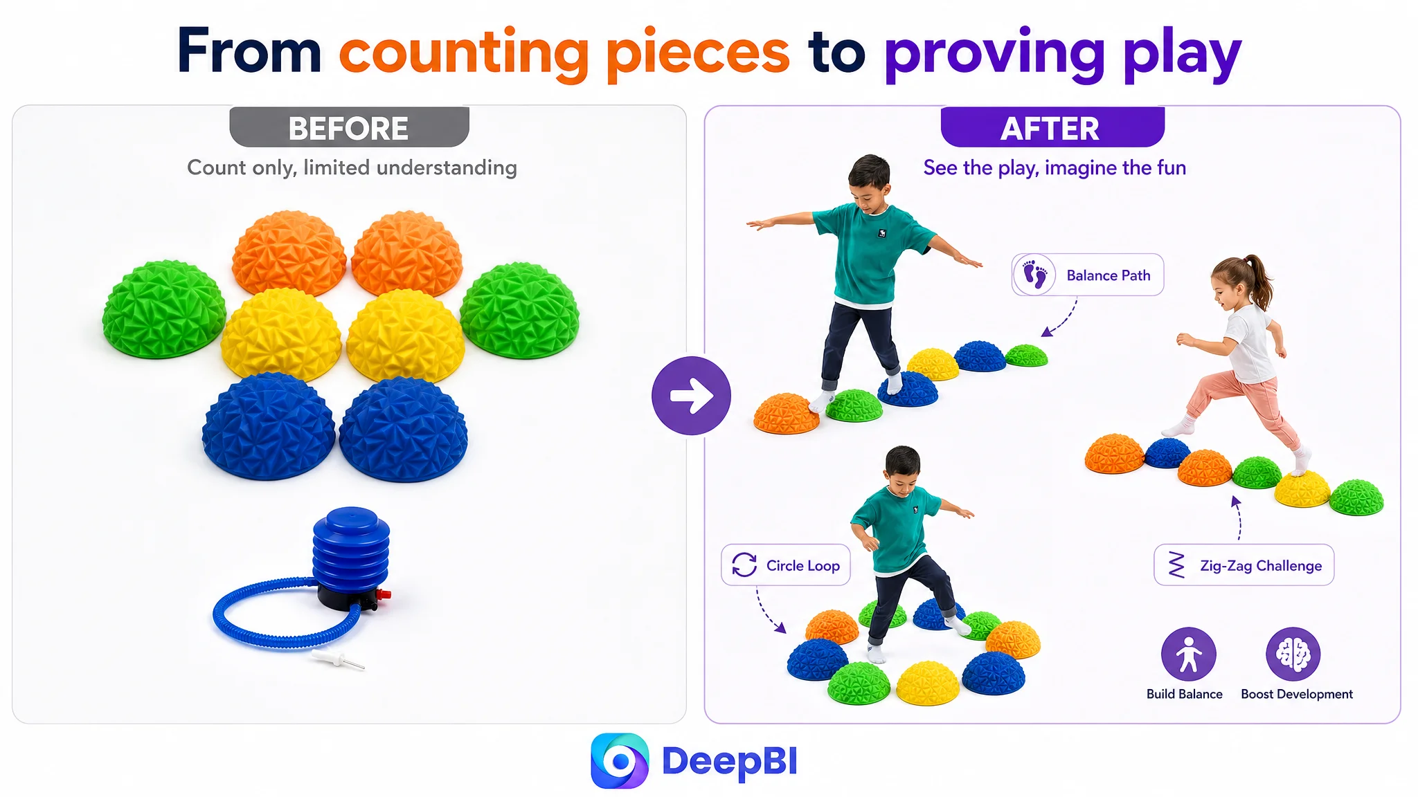
A set of eight pieces can look limited when displayed only as eight individual items. It becomes more valuable when shoppers can see how the same pieces can form a straight path, zigzag route, circular arrangement, or imaginative “floor is lava” game.
The customer’s product did not need connector pieces to prove versatility. Its flexibility came from how children and parents could arrange the stones.
Resolve practical concerns before the shopper leaves
The later bullets were designed to clarify:
- Kid-friendly, non-toxic materials
- Water-resistant surfaces
- Easy sanitizing and disinfecting
- Use on carpet, hardwood, or grass
- Adjustable inflation
- Deflation for compact storage
- The included air pump
- Product dimensions
These details matter because parents are not evaluating only the play value. They are also evaluating mess, storage, durability, safety, and whether the product will fit into daily life.
Why DeepBI Did Not Prioritize Advertising Adjustments First
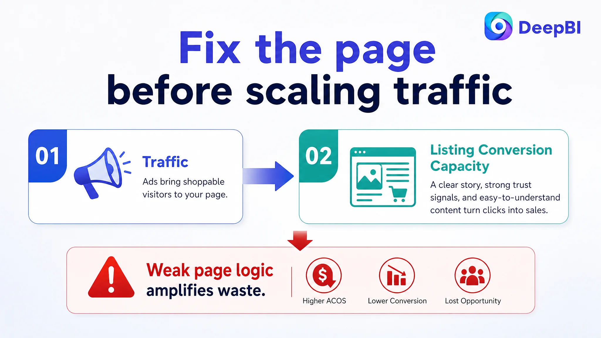
No amount of traffic analysis can make a page persuasive if the product page does not explain why the product deserves consideration.
For an Amazon seller, this creates an important operating risk. Paid traffic can expose a Listing’s weaknesses faster than organic traffic does. If shoppers click but encounter a page with weak differentiation, limited visual proof, no A+ storytelling, and no review foundation, additional traffic may amplify the conversion problem rather than solve it.
The decision was therefore to repair the Listing’s conversion capacity before treating advertising as the primary lever.
That did not mean ads were irrelevant. It meant the order of operations mattered:
1. Clarify what the product is and who it is for
2. Give the first image a stronger reason to earn attention
3. Build a visual sequence that proves use and value
4. Connect the bullets to actual parent concerns
5. Use A+ content to deepen trust and understanding
6. Then evaluate whether paid traffic is being converted efficiently
Advertising can bring a shopper to the product page. It cannot supply the product page’s missing argument.
This was the core business judgment. The Listing had to become more capable of converting both paid and organic traffic before the team could fairly judge the efficiency of traffic acquisition.
The A+ Page Needed to Complete the Parent’s Decision
The proposed A+ structure was designed as a seven-part decision path rather than a collection of decorative banners.
Start with the complete value of the set
The opening module would establish the eight stepping stones, included pump, four color options, and pineapple texture. This gives the shopper an immediate understanding of what is included and why the product belongs in the sensory-play category.
Demonstrate instant setup
The product’s inflatable format creates a practical advantage: place the stones, add air as needed, and begin playing without a complicated connection system.
That convenience should be shown visually. The product’s flexibility comes from arrangement, not from a lengthy assembly process.
Make tactile interaction visible
A close-up of the pineapple texture, combined with a bare-foot and sock-use context, would give the sensory claim physical credibility.
This is where the page could differentiate without imitating the competing product’s electronic features. The story becomes tactile discovery, balance, and body awareness.
Connect the activity to movement
The page could then explain how stepping, balancing, and navigating different paths relate to coordination, gross motor movements, and body awareness.
The purpose is to help parents understand the product as more than a colorful toy without overstating its developmental role.
Prove repeatability through layouts
Linear, zigzag, and circular arrangements would show that the product is not a single-use setup. Different layouts create different challenges and play patterns.
This addresses a common parent concern: whether the product will remain engaging after the novelty wears off.
Resolve safety and hygiene concerns
The safety module would consolidate kid-friendly and non-toxic material messaging with durability and easy cleaning. The water-resistant surface and sanitizing context are particularly important for a product used by children indoors and outdoors.
Close with storage and specifications
The final module would answer the practical question that often remains after the emotional appeal is established: where will the product go when playtime ends?
The included pump, adjustable inflation, deflation for compact storage, and stated dimensions give the shopper enough information to plan for ownership.
The Optimization Direction Was Reframed Around One Question
The question was no longer:
How can this Amazon Listing add more information?
It became:
Can a parent understand the product’s distinct value, imagine using it, trust its practical details, and decide quickly enough to continue toward purchase?
That reframing changed the role of every Listing element.
- The title became a bridge between search language and product context.
- The first image became a click opportunity, not just a product confirmation.
- The image gallery became a proof sequence.
- The bullet points became a structured argument.
- The A+ section became the place where value, trust, and practical concerns were resolved together.
- The product’s texture, easy setup, multiple layouts, and compact storage became connected advantages rather than isolated facts.
DeepBI’s role in this case was not to recommend more content for its own sake. It was to compare the Listing against a relevant market reference, quantify where the gap was concentrated, and identify which weakness constrained the next decision.
The 21-point A+ gap showed that the page’s biggest problem was not simply a low-quality thumbnail. The absence of visual storytelling weakened the entire conversion path. The title, images, bullets, and reviews could not fully compensate for a detail page that left the product’s value underexplained.
What Other Amazon Sellers Can Take From the Case
The case does not provide post-optimization performance data, so it would be premature to claim a specific CVR improvement, ACOS reduction, or increase in organic orders.
What it does establish is a clearer operating direction.
The Listing needed to move from basic product description toward coordinated conversion logic. It needed to make the product easier to recognize, easier to imagine, easier to trust, and easier to fit into everyday use.
For Amazon sellers, several lessons follow:
- A low-converting Listing may be suffering from weak page logic rather than insufficient traffic.
- A title can contain a core keyword and still fail to communicate the buying context.
- Main images should be assigned different decision roles instead of repeating the same product view.
- Bullet points should connect features with customer concerns and observable use.
- A+ content is not a decorative extension of the Listing; it can carry the trust and explanation that short-form content cannot.
- A product with no review history needs especially clear visual and practical proof, even though content cannot replace authentic customer feedback.
- Advertising should not be scaled aggressively before the page has demonstrated that it can convert the traffic being purchased.
In this case, the real change was not a single new title, image, or A+ module. It was a change in diagnosis.
The seller began with a collection of visible Listing weaknesses. DeepBI identified a more important constraint: the Amazon product page lacked the conversion capacity to turn its actual product advantages into a coherent purchase decision.
Once that became the priority, optimization could be judged by business logic rather than by isolated creative preference.