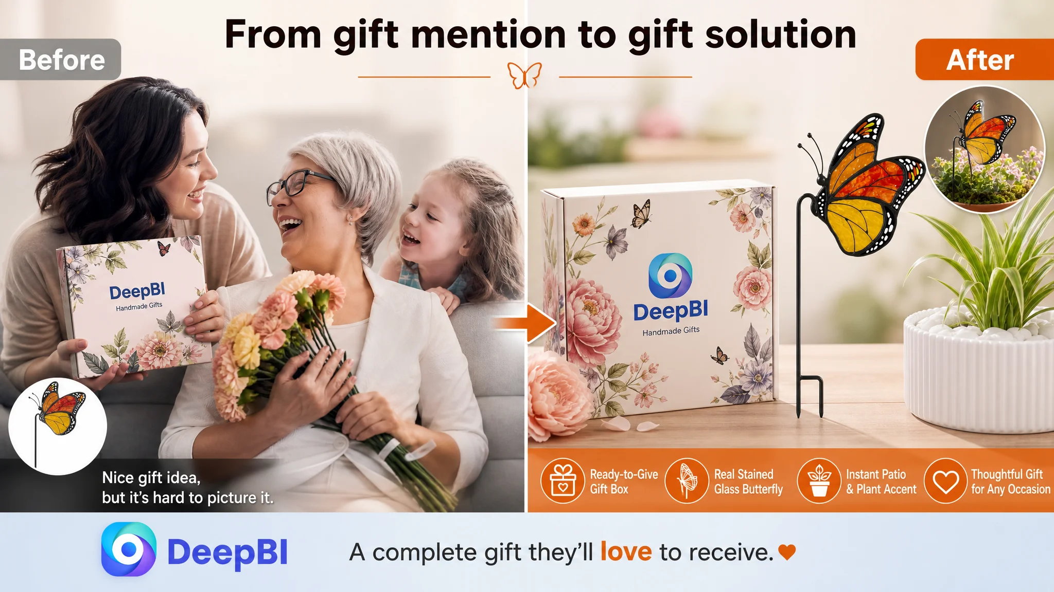
An Amazon seller of stained glass butterfly plant stakes was facing a product-page conversion problem. At first glance, the Listing appeared to need better keywords, stronger product images, and more persuasive bullet points. That naturally led attention toward title wording, visual polish, and the possibility that Amazon ads were not being supported efficiently enough by the page.
But the deeper comparison told a different story. The title and main image were only slightly behind a comparable high-performing Amazon Listing. The real gap was concentrated in the detail experience and customer trust: the page had no A+ content, no visual storytelling, and no meaningful review base.
DeepBI therefore reframed the problem from “How should the seller improve the creatives?” to “Can this Amazon product page give shoppers enough evidence to buy?” The later optimization focused on showing the sun-catching effect, clarifying size and fit, proving material quality, strengthening gift positioning, and building a complete visual path before asking paid or organic traffic to do more work.
For other Amazon sellers, the lesson is straightforward but easy to miss: a Listing can have acceptable keywords and attractive product photography while still lacking the conversion capacity needed to turn traffic into orders. The highest-priority fix is not always the most visible defect.
The Amazon Listing Was Not Losing Everywhere
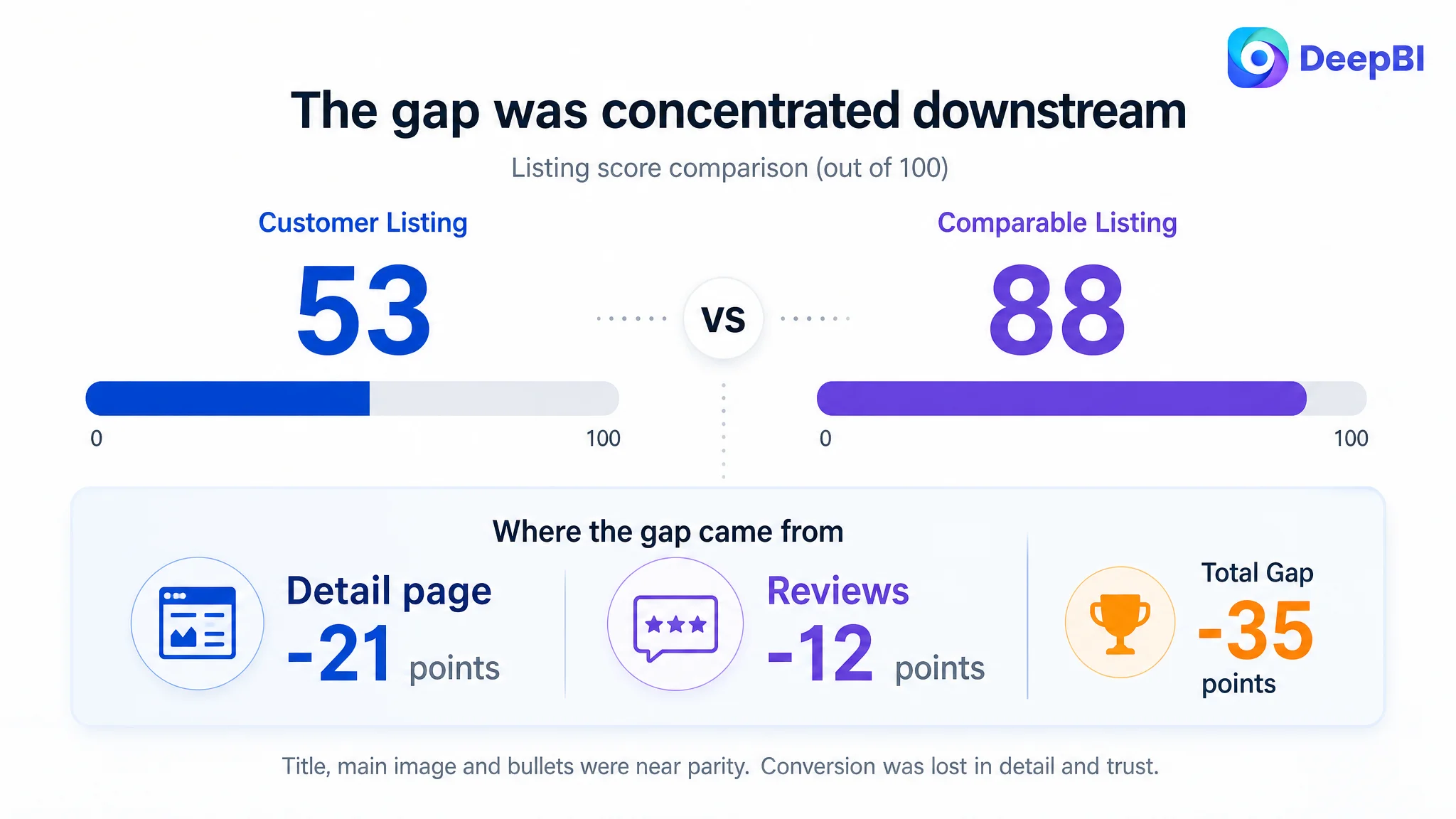
The customer’s Listing received an overall score of 53 out of 100, compared with 88 out of 100 for a comparable high-performing Listing in the same product space.
That 35-point difference looked serious. But the distribution of the score gap mattered more than the total.
- Title: Customer Listing: 16/20, Comparable Listing: 18/20, Difference: -2
- Main image: Customer Listing: 25/30, Comparable Listing: 26/30, Difference: -1
- Bullet points: Customer Listing: 7/10, Comparable Listing: 6/10, Difference: +1
- Detail page: Customer Listing: 3/25, Comparable Listing: 24/25, Difference: -21
- Reviews: Customer Listing: 2/15, Comparable Listing: 14/15, Difference: -12
- Total: Customer Listing: 53/100, Comparable Listing: 88/100, Difference: -35
The first important judgment was that this was not primarily a title problem or a main-image problem.
The customer’s title did have weaknesses. The core phrase appeared later, the size and indoor-use context were less explicit, and the gift occasions were not developed as clearly. The main-image sequence also repeated similar views instead of progressively answering questions about size, installation, light effects, and packaging.
Those issues mattered. But they did not explain the full commercial gap.
The dominant constraint was elsewhere.
The Listing did not lack product information. It lacked enough evidence for shoppers to trust the information and imagine the product in use.
The Initial Diagnosis Stopped at the Visible Symptoms
For an Amazon seller, the most obvious Listing problems are often the easiest to name:
- Keywords are not placed early enough in the title.
- The main image does not stand out.
- The bullet points need stronger wording.
- Competitors appear more polished.
- Advertising traffic may not be converting efficiently.
All of these can be valid observations. None of them is automatically the root cause.
In this case, the title was only two points behind the benchmark, and the main image was only one point behind. The bullet points even scored one point higher. Continuing to focus mainly on copy polishing or repeated image adjustments would have treated the symptoms while leaving the largest conversion barrier untouched.
The more consequential misdiagnosis was to view the Listing as a collection of separate creative assets. The title, images, bullets, detail page, and reviews were being considered as individual improvements rather than as one decision path.
That distinction changed the priority.
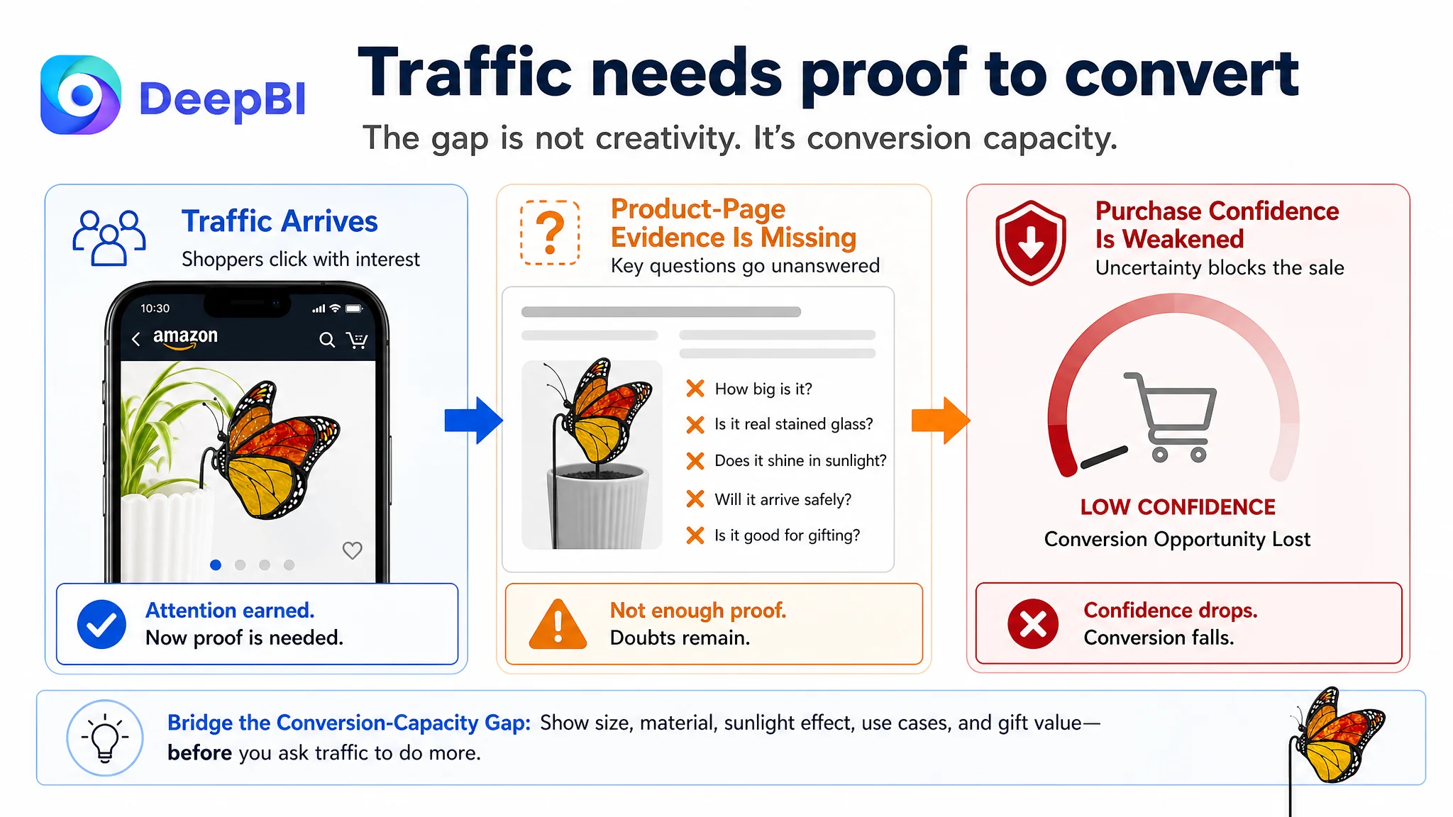
A shopper considering a stained glass butterfly plant stake does not only need to know what the product is. The shopper also needs to understand:
- How large it is in a real planter
- Whether it is genuinely made from stained glass
- What happens when sunlight passes through it
- Whether the stake is suitable for indoor and outdoor use
- Whether it arrives safely
- Whether it is ready to give as a present
- Whether other buyers have received what the page promises
The customer’s Amazon product page did not answer those questions in a structured, visual way.
The Real Constraint Was Listing Conversion Capacity
The largest score gap appeared in the detail page: 3 out of 25, compared with 24 out of 25 for the comparable Listing.
The customer’s page relied on plain text. It had no A+ visual modules, no structured image sequence, and no visual proof of the product’s strongest functional and emotional attributes.
The comparable Listing used a much fuller visual system, including:
- Lifestyle scenes
- Feature-focused panels
- Emotional home-use imagery
- Material and craftsmanship close-ups
- Gift-box presentation
- Holiday and gifting situations
- Multiple-product displays
This was not simply a difference in design quality. It was a difference in how much decision-making work the page performed for the shopper.
The customer’s text could mention that the product was decorative, giftable, and suitable for plant lovers. But text alone could not easily prove that the product creates visible light effects, fits naturally above foliage, or arrives as a complete gift.
For decorative products, this gap is especially important. The purchase is not based only on utility. It depends on the shopper being able to picture the emotional result: a brighter plant corner, a more personal gift, or a small piece of stained glass that changes under sunlight.
Without that visual bridge, the product remains a description rather than an experience.
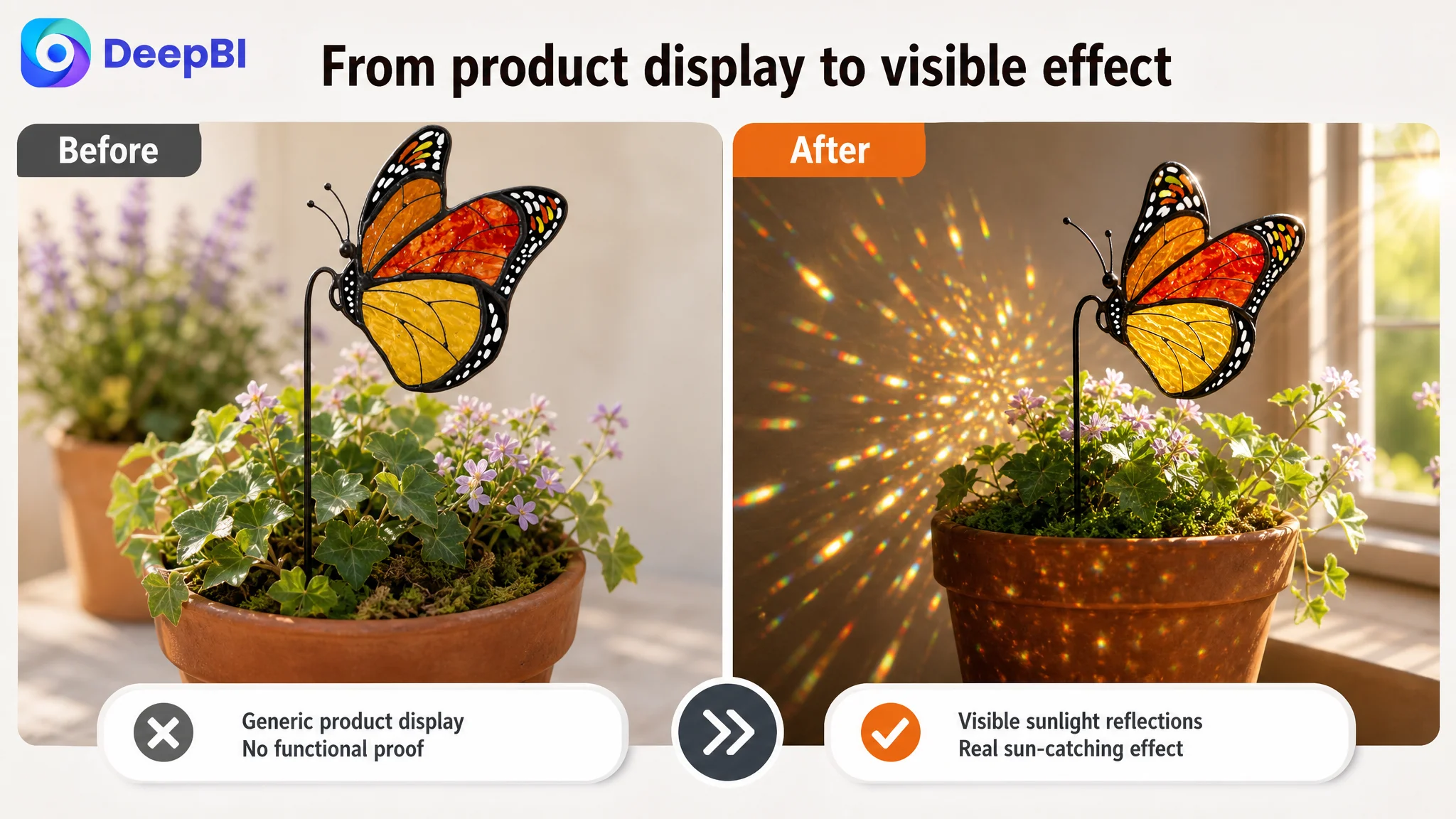
The page had no visual proof of the sun-catching effect
The product’s central promise is not merely that it resembles a butterfly. It is that sunlight can pass through the stained glass and create a distinctive visual effect.
The Listing mentioned this benefit, but did not show it convincingly. A shopper could reasonably ask:
- Will the glass actually transmit light?
- Will the colors appear vivid outside the studio image?
- Is “sun catcher” describing a real effect or only a decorative label?
The recommended direction was therefore to show direct sunlight passing through the translucent glass, with visible reflections or colorful light patches on the plant and surrounding space.
This would replace an abstract promise with visual evidence.
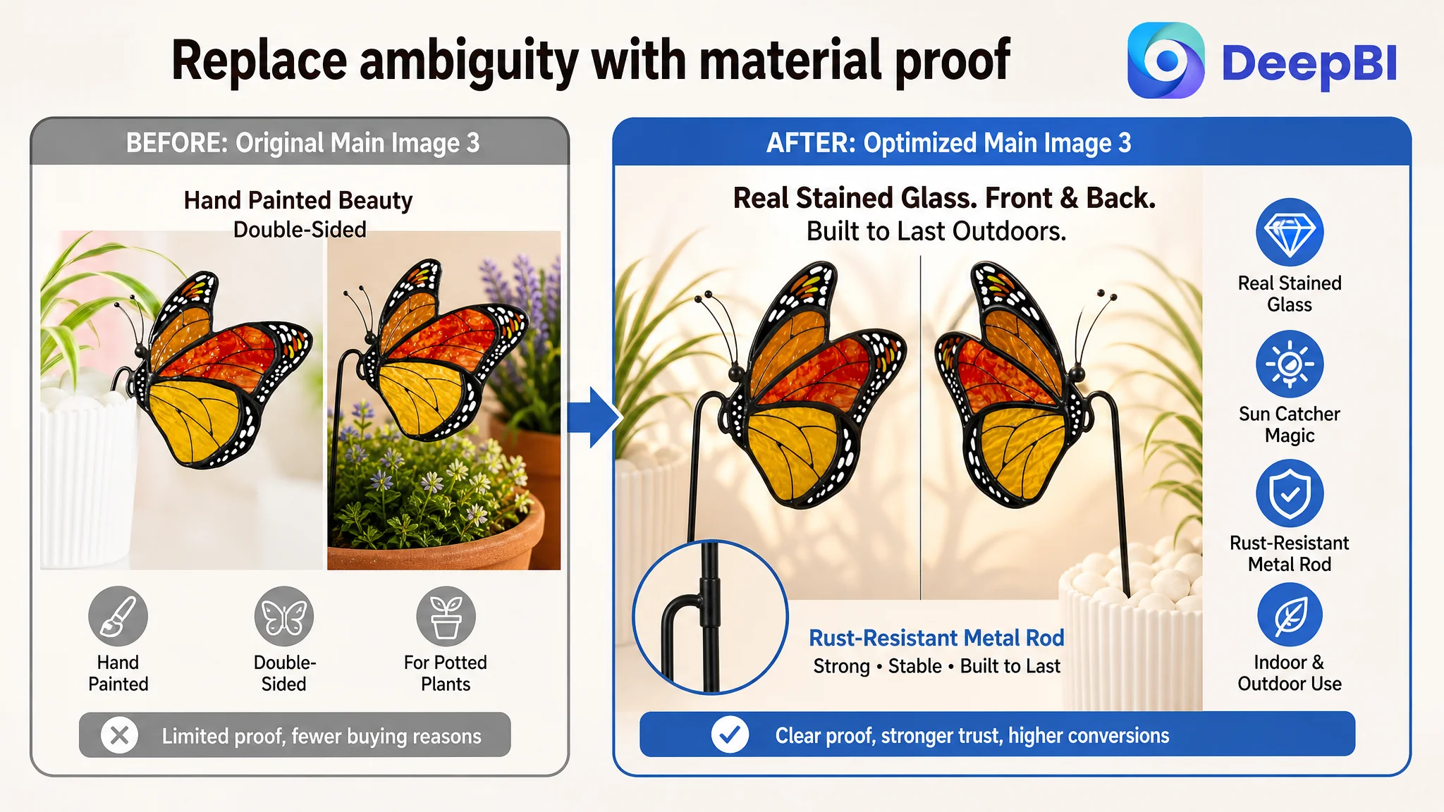
The page did not establish the product’s material boundary
The page needed to make the material clear through both words and images:
- Genuine stained glass
- A sturdy, rust-resistant metal rod
- Vivid color treatment
- A double-sided view that confirms the product’s detail
This mattered because the phrase “hand-painted beauty” could leave room for uncertainty. A shopper might not know whether the product is real glass, painted plastic, or another lower-cost material.
The issue was not to make the product appear more expensive than it was. It was to remove ambiguity about what the customer would receive.
The page did not make gifting tangible
The customer’s Listing referred to gifting, but the gift proposition was not visually developed.
A “gift box included” message is more persuasive when the shopper can see:
- The product and box together
- The product positioned as the central gift
- The packaging as ready to give
- The product in a relevant gifting context
The recommended page structure expanded the use cases to birthdays, Mother’s Day, Christmas, housewarmings, and other occasions, while keeping the product itself central to the visual.
This was not about adding more holiday keywords for their own sake. It was about clarifying why someone would buy the product now and who it might be for.
Reviews Created a Second Trust Barrier
The review score difference was nearly as important as the A+ gap.
The customer’s Listing had:
- No rating
- No review count
- No homepage review presence
The comparable Listing had:
- A 4.8-star rating
- 186 reviews
- A large volume of positive customer feedback
- Many photo and video reviews
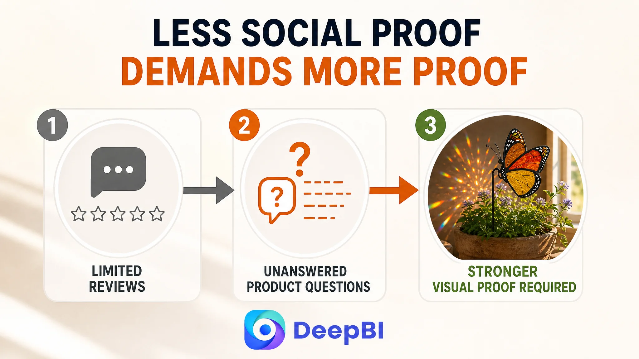
A new or lightly reviewed Amazon Listing is not automatically uncompetitive. But it must compensate with stronger clarity and stronger evidence elsewhere on the page.
This Listing did the opposite. It had very limited social proof and also lacked the visual content that could help reduce uncertainty.
That combination created a trust gap:
1. The shopper had little customer validation.
2. The page did not provide enough visual proof.
3. The product’s material and light effects remained open to interpretation.
4. The gifting and size propositions were not sufficiently tangible.
This is why the review deficit could not be treated as a standalone reputation issue. It interacted directly with the detail-page weakness.
When reviews are limited, the page must work harder to demonstrate what the product is, how it works, and why it is worth buying.
Why DeepBI Did Not Prioritize More Ad Tuning First
The case material does not include post-optimization advertising metrics such as CTR, CVR, ACOS, or TACOS. That makes it important not to claim that ad performance improved after the Listing changes.
The business judgment is still clear.
If the product page cannot explain the value of the product or establish trust, sending more traffic to it does not solve the underlying issue. It increases the number of shoppers who encounter the same unanswered questions.
Advertising can bring a shopper to the Amazon product page. It cannot, by itself, prove that the product is genuine stained glass, show the real light effect, clarify its fit in a planter, or make an unreviewed product feel safe to give as a present.
That is why the correct sequence was:
1. Identify the largest Listing-level conversion gap.
2. Repair the page’s visual and persuasive structure.
3. Make the product’s core value easier to verify.
4. Then evaluate whether paid and organic traffic are being converted more effectively.
This decision order reduces the risk of using ads to amplify a low-conversion page.
The priority was not to stop advertising permanently. It was to make sure the page deserved additional traffic before relying on traffic expansion as the main answer.
The Title Needed Reordering, Not Reinvention
The title was a real weakness, but a limited one.
The customer’s original title placed “Butterfly Stained Glass Plant Pot” before the more important search phrase “Stained Glass.” It also left size, indoor use, and gift occasions less explicit.
The recommended direction brought the main search and product phrases forward:
Stained Glass Butterfly Plant Pot Stake Sun Catcher, Monarch Suncatcher Indoor Decor for Flower Pots, Gifts for Women, Mom, Grandma, Mother's Day, Birthday, Christmas, Gift Box Included
The logic was to improve three things at once:
- Put the core product phrase earlier.
- Clarify that the item is a plant-pot stake and sun catcher.
- Connect the product to gift recipients and occasions.
This was not a keyword-stuffing exercise. The title still needed to be readable and commercially coherent within Amazon’s character constraints.
The title’s role was to help the Listing earn relevant visibility and establish basic product identity. It was not expected to repair a 21-point detail-page gap.
The Main Images Needed to Answer Questions in Sequence
The customer’s image set contained useful materials, but several images repeated similar scenes without adding a new layer of persuasion.
The improved sequence was designed around the questions a shopper asks while moving through the Amazon product page.
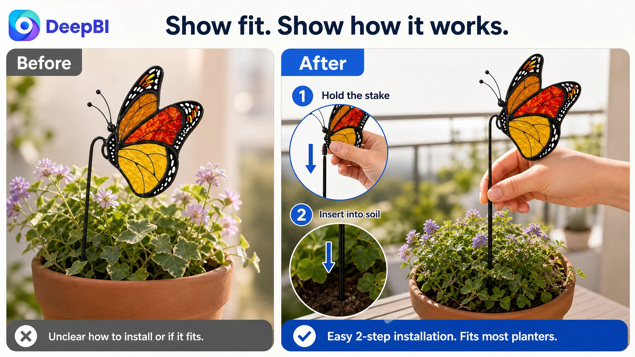
First: Does it fit?
The page needed to show the product’s actual dimensions—approximately 7.1 by 3.5 inches—in relation to a real planter or foliage.
For a decorative plant stake, size is not a minor specification. A shopper needs to know whether it will disappear among the leaves, overwhelm a small pot, or stand upright as shown.
Second: How is it installed?
The images should show the rod inserted into:
- An indoor planter
- A balcony pot
- An outdoor flower bed
- A room with potted plants
The purpose was to replace a static product-identification image with a practical fit and use guide.
Third: Is it really stained glass?
The page needed to show the material through close-up detail and backlit presentation, rather than relying on a phrase that could be interpreted in several ways.
The proposed visual emphasis was:
- Genuine stained glass
- A sturdy, rust-resistant metal rod
- Double-sided detail
- Vivid, long-lasting color
Fourth: Does the sun-catching effect actually happen?
This proof needed to appear earlier in the image sequence, not remain buried as a later emotional concept.
The visual should show sunlight passing through the butterfly and creating visible reflections or colored light across a plant corner. The goal was to connect the product name with a recognizable result.
Fifth: Is it a complete gift?
The product and gift box should be shown together, with the butterfly stake remaining the visual focus. This would make “ready to give” a concrete proposition rather than a text-only claim.
The Bullet Points Needed to Complete the Argument
The bullet points were not the largest weakness, and the score comparison did not support replacing them wholesale. The better approach was to reorganize their role within the broader Listing story.
The recommended structure moved from attraction to reassurance:
- Visual experience: Show how double-sided light transmission creates shimmering patterns.
- Material and durability: Clarify genuine stained glass and the rust-resistant metal rod.
- Installation and fit: Explain how the stake is placed and where it can be repositioned.
- Gift value: Present the ready-to-give box and relevant recipients.
- Packaging and support: Reduce delivery and post-purchase concerns.
This structure aligned each bullet with a specific shopper question.
It also avoided a common Amazon Listing problem: having plenty of information but no clear order. A bullet point should not merely name a feature. It should connect the feature to a reason the shopper cares.
A+ Content Was the Necessary First Repair
The detail page needed to become the visual center of the Listing.
The recommended A+ sequence followed a deliberate persuasion path:
Start with the emotional result
Open with a bright lifestyle scene of the butterfly stake in a plant near a sunlit window. The first task is to establish the product’s charm and role as a potted accessory.
Expand the usage context
Show the product across indoor and outdoor settings, including plant corners, balconies, flower beds, and sunrooms.
This helps the shopper understand where the product belongs without forcing them to infer it from a studio image.
Prove the light effect
Use a dedicated visual module to show sunlight passing through the glass and producing reflections or colorful light patches.
This is the key moment where the page turns a descriptive claim into observable evidence.
Remove material uncertainty
Follow the emotional introduction with close-up details of the genuine stained glass and rust-resistant metal rod.
The sequence matters. The page first creates interest, then supports that interest with rational proof.
Make the gift proposition visible
Show the elegant gift box, the product inside or beside it, and appropriate occasions such as birthdays, Mother’s Day, Christmas, and housewarmings.
Demonstrate fit and ease of use
Show how the rod is inserted deeply into a planter and repositioned across different pot sizes. The product should appear lightweight enough for small planters while remaining visible above the leaves.
Close with durability and year-round value
Reinforce the vivid Monarch butterfly design and its intended long-lasting decorative role without adding unsupported performance claims.
This sequence gave the page a beginning, middle, and end:
Attraction first, proof second, reassurance last.
The Optimization Direction Was Driven by the Gap, Not by Aesthetic Preference
DeepBI’s role in this case was not to declare one image “prettier” than another.
The important judgment came from connecting several types of evidence:
- The overall score gap
- The distribution of weakness across Listing dimensions
- The visual and structural differences between the pages
- The absence of A+ content
- The lack of reviews
- The product’s specific decision barriers around size, material, light effects, and gifting
That evidence established a priority order.
The title required clearer search and gift logic. The image sequence required less repetition and more functional proof. The bullet points required a more coherent decision path. But the detail page required the most fundamental change because it was almost entirely absent as a conversion asset.
The resulting recommendations were also constrained by the real product. The optimization could change composition, lighting, scene, information hierarchy, and visual storytelling. It could not invent a new product structure, add unsupported accessories, or alter the material and dimensions.
That boundary matters for Amazon sellers. A visually impressive image that misrepresents the product may improve attention temporarily while increasing returns, negative reviews, and trust damage later.
What This Amazon Case Changes About the Seller’s Understanding
This case did not provide confirmed post-optimization performance data, so no claim should be made about a completed CVR increase, ACOS decline, or organic-order recovery.
Its value lies in the diagnosis and the decision sequence.
The seller’s understanding should shift in several ways:
- A modest title gap does not explain a severe Listing competitiveness gap.
- A near-parity main-image score does not mean the image sequence is doing enough commercial work.
- Stronger bullet points cannot compensate for a missing A+ story.
- Advertising cannot create the product-page trust that the page itself has not built.
- Reviews and visual proof work together; a review deficit makes page clarity more important.
- Decorative products need to show the experience and result, not only the object.
- Before increasing traffic, the seller should judge whether the Amazon Listing can convert that traffic.
The central conclusion is not that ads are unimportant.
It is that Amazon ads and Amazon organic traffic depend on the product page’s ability to receive and convert demand. When the page lacks visual evidence, trust, and a clear buying logic, traffic optimization alone is operating downstream of the real constraint.
The page did not need more traffic before it had a stronger reason for shoppers to believe, understand, and buy.
For this stained glass plant decor Listing, the most important optimization was therefore not a cosmetic refresh. It was the reconstruction of the product page as a complete sales argument: what the product is, what it does in sunlight, where it fits, how it is made, why it makes a thoughtful gift, and why the shopper should feel confident placing the order.