


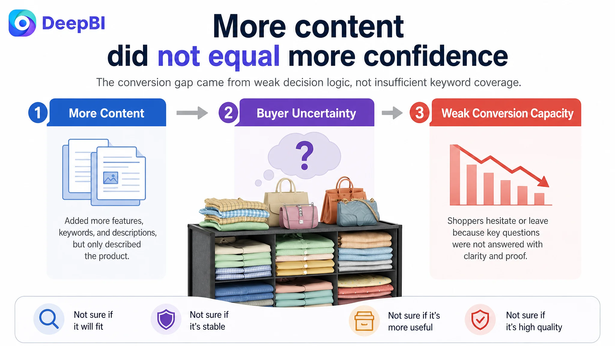
An Amazon seller in the US marketplace was facing a familiar Listing problem: the product had a clear storage function, but its Amazon product page was not presenting that value with enough confidence or urgency. The initial optimization direction leaned toward adding more product attributes, covering more clothing-related keywords, and showing more general usage scenarios.
That direction was incomplete. DeepBI’s comparison found that the Listing was not mainly losing because it lacked information. It was losing because the information did not form a strong buying path. The title delayed the core product value, the main images did not prove flexibility or stability early enough, the bullet points read more like specifications than solutions, and the A+ content did not make the transition from closet clutter to organized space visually convincing.
The later optimization therefore focused on Amazon Listing conversion capacity rather than continuing to add isolated features. The priority became clearer: establish the product’s structure and durability, answer fit and usage concerns, turn benefits into problem-solution messages, and use the A+ page to build trust before asking the shopper to buy. For other Amazon sellers, the lesson is direct: when paid traffic is difficult to make efficient, the first question should not always be which ad setting to change. It should be whether the Amazon product page has earned the next click and the next order.
The Listing Had a Product. It Did Not Yet Have a Strong Sales Argument.
The product was a six-cubby closet organizer with a metal frame, fabric-wrapped storage sections, stackable structure, and multiple use cases for clothing, handbags, jeans, sweaters, and accessories.
On paper, the Listing covered the basic requirements. It had a title, five bullet points, product images, A+ content, and a clear storage proposition.
But Amazon shoppers do not evaluate those elements independently. They form a judgment in sequence:
- Does this product look relevant to my storage problem?
- Will it fit my closet?
- Will it remain stable when loaded?
- Is it more useful than a standard fabric bin or open wire basket?
- Can I trust the quality?
- Will it actually help me create a more organized space?
The page answered some of these questions, but not in the order or depth needed to support conversion.
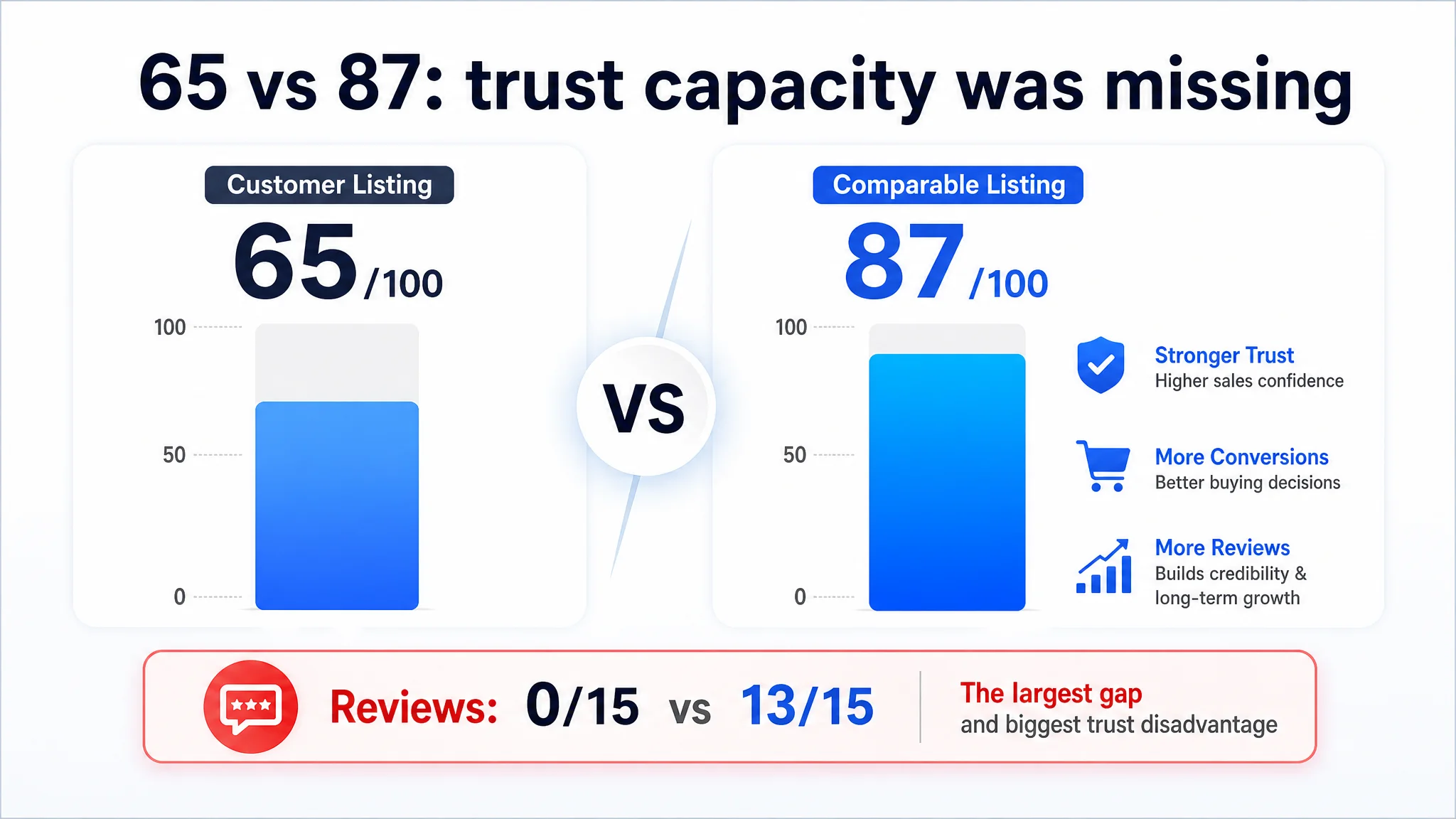
DeepBI’s Listing comparison gave the product a total score of 65 out of 100, compared with 87 out of 100 for a comparable high-performing Amazon Listing.
The gap was not a missing sentence or a weak individual image. It was a breakdown in how the page helped shoppers make a decision.
The Initial Diagnosis Focused on More Content, Not Better Decision Logic
The original direction was understandable. The product had several legitimate selling points, so the natural response was to include more of them:
- Clothes
- Handbags
- Sweaters
- Jeans
- Pants
- Shirts
- Space saving
- Stackability
- Dust protection
- Easy assembly
- Multiple placement scenarios
This approach increased coverage, but not necessarily persuasion.
The title placed the brand name first and moved the main product phrase further back. It also included a long sequence of clothing categories, which made the title less compact and weakened the immediate product definition. The page described what the organizer could hold, but it did not lead strongly with why a shopper should choose this structure over a standard storage basket or open mesh shelf.
The same pattern appeared in the five bullet points. They explained features such as stackability, material, dust protection, and assembly, but the writing remained relatively conservative and instructional.
The incomplete diagnosis was that the Listing needed more explanation.
DeepBI reframed it as a more consequential problem:
The Listing had enough features to describe, but not enough decision logic to convert.
This distinction mattered because adding more traffic to a page with weak decision logic would not solve the underlying issue. It could simply send more shoppers into the same uncertainty.
The Score Gap Showed Where Conversion Capacity Was Being Lost
The comparison became more useful when the total score was separated into the five dimensions that shape an Amazon product page.
- Title: Customer Listing: 16/20, Comparable Listing: 18/20, Gap: -2
- Main image: Customer Listing: 24/30, Comparable Listing: 26/30, Gap: -2
- Bullet points: Customer Listing: 6/10, Comparable Listing: 7/10, Gap: -1
- Detail page: Customer Listing: 19/25, Comparable Listing: 23/25, Gap: -4
- Reviews: Customer Listing: 0/15, Comparable Listing: 13/15, Gap: -13
- Total: Customer Listing: 65/100, Comparable Listing: 87/100, Gap: -22
The review difference was the largest visible disadvantage. The customer Listing had no rating data, no review count, and no customer-generated content on the first page. The comparable Listing had a 4.7-star rating and 477 reviews, including photo and video feedback.
That gap could not be repaired through copywriting alone. It was a structural trust disadvantage that needed to be acknowledged rather than hidden.
At the same time, the other dimensions revealed an important opportunity. The Listing was not only losing because it lacked reviews. It was also leaving trust-building opportunities unused in the title, images, bullets, and A+ content.
This was the key judgment: reviews were a major disadvantage, but they were not a reason to leave the rest of the product page underdeveloped.
The Title Delayed the Product’s Most Important Meaning
The comparable Listing opened with a direct product phrase built around:
- Six-tier closet organizers
- Stackable storage
- Foldable structure
- Organizer system
- A trust-related differentiator
The customer title began with the brand name and then moved through a long list of use cases. The product form and the most valuable structural terms were less prominent.
For an Amazon Listing, the opening portion of the title has to do more than carry keywords. It must quickly tell the shopper what the product is and why it belongs in the consideration set.
The revised direction therefore prioritized:
- “Stackable Closet Organizer”
- “6 Cube Fabric Bins”
- “Metal Frame”
- “Foldable Storage Shelves”
- Relevant clothing and accessory terms
- “Space Saving Closet System”
- Corrected spelling and clearer wording
The goal was not to imitate the competitor’s wording. It was to improve the page’s information hierarchy.
The product needed to be understood first as a structured closet organization system, not as a long list of items it could store.
The title needed to communicate the product before listing every use case
A shopper searching for closet storage is usually trying to resolve a spatial or organizational problem. A compact title should therefore establish:
1. The product category
2. The physical structure
3. The main functional advantage
4. The most relevant use cases
When every clothing type receives equal emphasis, the title can become technically comprehensive but commercially less decisive.
The Main Images Showed the Product, but Did Not Prove Enough
The main image set communicated the six-cubby structure and general storage use. It also showed the organizer in closet environments and included dimensional information.
However, DeepBI found that the image sequence did not establish the strongest proof points early enough.
Three concerns remained insufficiently answered:
- Can the unit be configured for different closet spaces?
- Will the organizer fit without protruding?
- Can the frame and reinforced panels remain stable under a heavy load?
- Does the fabric wrapping provide a meaningful advantage over open mesh or exposed wire?
The existing sequence repeated stackability and general usage scenarios. That created informational overlap instead of building a progressive argument.
A stronger Amazon image path would move from recognition to proof:
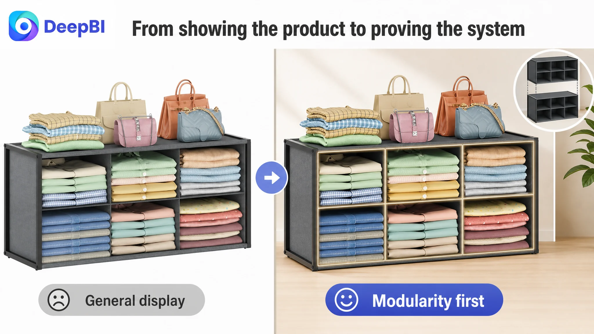
First: make the modular structure immediately visible
The opening image should communicate that the product is not a fixed, inflexible block. The stackable design and six-cubby structure should be visually easy to understand without requiring the shopper to study the image.
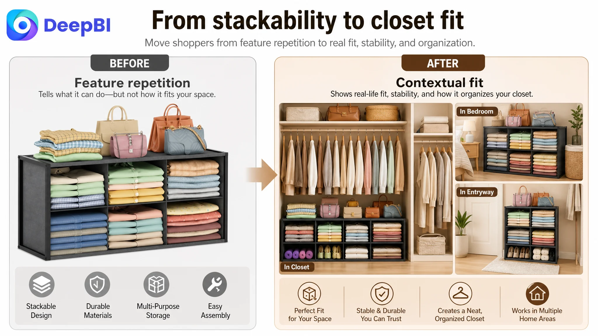
Second: show how the organizer fits into real closet spaces
A general closet scene creates context, but a more useful image would show how smaller configurations or individual sections work within specific wardrobe compartments.
This addresses the shopper’s practical question: Will this work in my closet?
Third: clarify the dimensions that affect fit
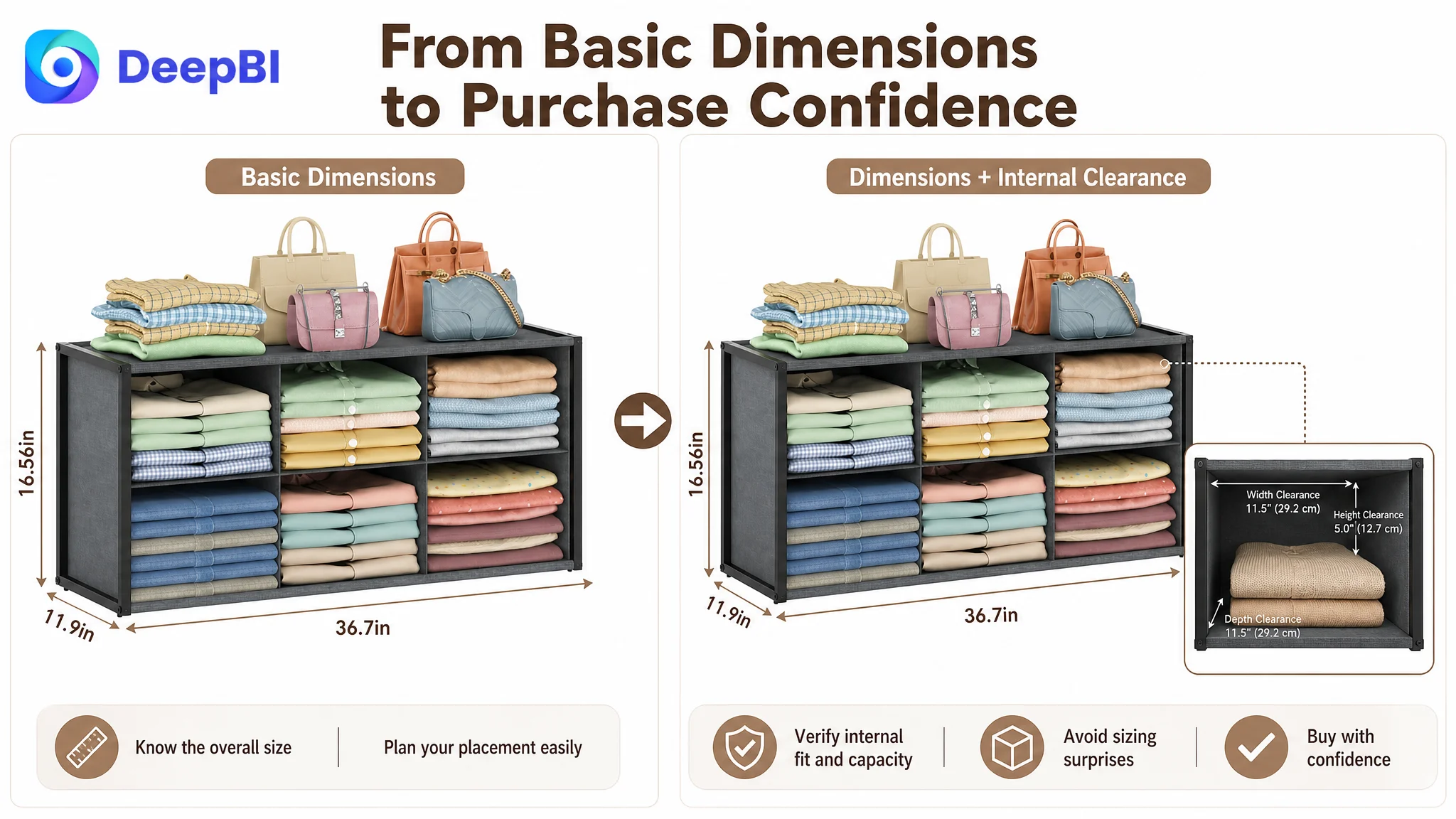
The Listing already had the overall dimensions of 36.7 inches long by 11.9 inches wide by 16.56 inches high. The opportunity was to make those dimensions more useful by clarifying the space they occupy and the internal cubby capacity, using only confirmed measurements.
Fourth: move durability ahead of generic lifestyle imagery
A heavily loaded stack of jeans or pants, supported by the metal frame and reinforced panels, would communicate more than another broad room scene.
The point is not to make an unsupported strength claim. It is to show the confirmed structural benefit in a way shoppers can understand quickly.
Fifth: give the fabric-wrapped design a clear role
The fabric wrapping should not appear as a decorative detail alone. The Listing can use it to communicate reduced dust exposure and protection for delicate fabrics compared with open mesh, provided the visual and wording remain consistent with the confirmed product attributes.
A product image should not only show what the item looks like. It should remove the specific reason a shopper might hesitate.
The Bullet Points Had Information, but Not a Buying Logic
The customer’s bullet points were complete in a technical sense. They discussed space utilization, durability, dust protection, versatility, assembly, and size.
The problem was the sequence and framing.
The competitor’s bullet points more often followed a recognizable pattern:
Customer concern → product response → practical outcome
For example, an upgraded wide-mouth design was presented in relation to large clothing items and closet depth. The organizer was described not just as stackable, but as foldable and adaptable. The iron mesh was positioned against the risk of bending or damage. Installation was described with a clearer expectation that no tools were required.
The customer Listing could use the same decision structure without copying the competitor’s claims.
The first bullet should begin with fit and access
Instead of opening with stackability as a standalone feature, the first bullet should connect the wide opening and vertical organization to large garments, jeans, bags, and closet space.
The shopper should understand both:
- What fits inside
- Why the structure helps use vertical space more effectively
The second bullet should establish stability
“Metal frame” is a material description. “Resists bending when fully loaded with heavy jeans and sweaters” is a use-related outcome, provided it accurately reflects the product.
That shift turns a specification into a reason to trust the product for daily use.
The third bullet should explain the fabric wrapping
The fabric-wrapped design can be presented as a functional barrier that helps reduce dust accumulation and protects delicate items from snags. This gives the material a clear job within the storage solution.
The fourth bullet should expand the solution beyond clothing
The six cubbies and top surface support use for handbags, hats, and accessories, as well as placement in walk-in closets, entryways, or living rooms.
This is more persuasive when framed around restoring control over a cluttered space rather than simply listing possible storage locations.
The fifth bullet should reduce assembly and fit anxiety
The confirmed dimensions and assembly process should help shoppers form a realistic expectation before purchase. Clear wording around the number of screws, the expected assembly time, and the organizer’s depth can reduce uncertainty without promising more than the product can support.
The A+ Page Was Missing the Moment of Transformation
The largest non-review gap appeared in the detail page score: 19 out of 25, compared with 23 out of 25 for the comparable Listing.
The customer’s A+ content included closet scenes, stacking demonstrations, multi-purpose storage, and placement examples. But the modules repeated similar ideas and leaned heavily on idealized presentation.
The comparable Listing used a more persuasive sequence:
- Full-closet integration
- Before-and-after comparisons
- Multiple cabinet and closet arrangements
- Daily-life organization scenes
- Product detail views
- A consistent visual language
The difference was not simply that the competitor had more images. It was that the images moved the shopper through a clearer emotional and rational path.
The opening modules should establish organization power
The first module should show diverse clothing and accessories being organized immediately. It should not spend too much of the early page repeating that the product saves vertical space.
The shopper needs to see the practical scope of the system before being asked to evaluate secondary details.
The next module should address fit and stability
The second module should remain focused on the main closet buyer rather than introducing a different demographic or scenario too early.
It should answer:
- How does the organizer sit inside a standard wardrobe?
- What does its depth mean in use?
- How does the frame support a stacked arrangement?
- How does the fabric-wrapped structure fit the surrounding closet?
The middle modules should prove durability, not repeat stackability
A tall stack containing dense garments such as jeans and pants can make the stability message more concrete. The visual should connect directly to the confirmed benefits of the metal frame and reinforced panels.
This is more valuable than showing another generic placement scene.
The later modules should create a “chaos to control” contrast
The product’s strongest emotional promise is not merely additional storage. It is the visible transition from an unorganized pile to a categorized, accessible closet.
A before-and-after module can communicate that change faster than a paragraph of product description, as long as the scene remains realistic and consistent with the product’s actual use.
The final modules should answer remaining objections
The close of the A+ page should consolidate rational trust around:
- Dimensions
- Garment and accessory compatibility
- Stability when loaded
- Assembly
- Dust reduction
- The relationship between the fabric-wrapped bins and the metal frame
The page should end with confidence, not with another repetition of the same stackable-storage claim.
Why DeepBI Did Not Prioritize More Ad Tuning First
The case did not support the conclusion that changing bids or campaign structure alone would solve the problem.
The more immediate issue was that the Listing had limited conversion capacity:
- The title did not front-load the clearest product meaning.
- The main images did not reduce fit and durability concerns quickly enough.
- The bullets described features without consistently linking them to shopper problems.
- The A+ page lacked a strong before-and-after persuasion path.
- The absence of reviews made every other trust signal more important.
Continuing to push traffic toward the same page would risk amplifying these weaknesses.
This does not mean Amazon ads were irrelevant. Paid traffic can reveal whether a page is receiving attention and where the funnel is breaking. But ads cannot substitute for product-page trust. If the page does not explain the product, prove its structure, and reduce purchase uncertainty, better targeting may only make the same conversion leak more expensive.
Advertising can amplify visibility. It cannot manufacture confidence that the Amazon Listing has failed to build.
The decision order was therefore deliberate:
1. Clarify the Listing’s core product meaning.
2. Improve the visual proof of modularity, fit, stability, and material value.
3. Rebuild the bullet points around customer concerns and outcomes.
4. Use A+ content to show the full organization solution.
5. Treat the review gap as a separate trust challenge rather than pretending copy can replace customer evidence.
6. Reassess the role and efficiency of paid traffic after the page has a stronger ability to convert it.
The Optimization Was a Rebuild of the Page’s Sales Logic
The recommended changes were not a collection of cosmetic edits.
They formed a connected structure:
- Title: define the closet organizer and its core structure earlier.
- Main image sequence: show modularity, fit, dimensions, stability, and fabric-wrapped protection in a more useful order.
- Bullet points: move from feature listing to problem-solution writing.
- A+ content: replace repeated stackability messages with a progression from clutter, to organization, to proof, to confidence.
- Trust strategy: recognize the absence of reviews while strengthening every controllable on-page trust signal.
This is where the case demonstrates the value of diagnosis over execution volume. The seller did not need seven unrelated creative ideas. The seller needed one coherent answer to a buyer’s question:
Why should I trust this organizer to create a stable, clean, and usable closet system in my space?
What Other Amazon Sellers Can Take From This Case
A low Listing score does not automatically tell a seller what to fix first. The more important question is where the score gap affects the buying decision most directly.
For this Amazon closet organizer, the review gap was severe and could not be solved instantly. But the page still had several controllable weaknesses that made the trust disadvantage harder to overcome.
The broader lesson is not to ignore Amazon ads. It is to avoid asking Amazon ads to carry a product page that has not finished its own work.
Before increasing traffic, sellers should examine whether:
- The title identifies the product and its main value immediately.
- The main image creates a reason to click.
- The image sequence answers fit, size, and usage concerns.
- The bullet points connect features to real shopper problems.
- The A+ content shows a meaningful outcome rather than repeating specifications.
- Reviews are being treated as a structural trust factor.
- Paid traffic is being sent to a page that can convert both paid and organic shoppers.
In this case, DeepBI’s role was not to produce more content for its own sake. It was to show that the page’s real constraint was conversion capacity.
The customer was not simply missing keywords, images, or descriptions. The Amazon Listing was missing a persuasive order: define the product, prove the structure, resolve the concern, show the outcome, and then ask for the purchase.
Once that judgment becomes clear, optimization becomes more disciplined. The team no longer has to keep changing ads first whenever efficiency feels difficult. It can ask the more useful question:
Does this Amazon product page deserve more traffic yet?