

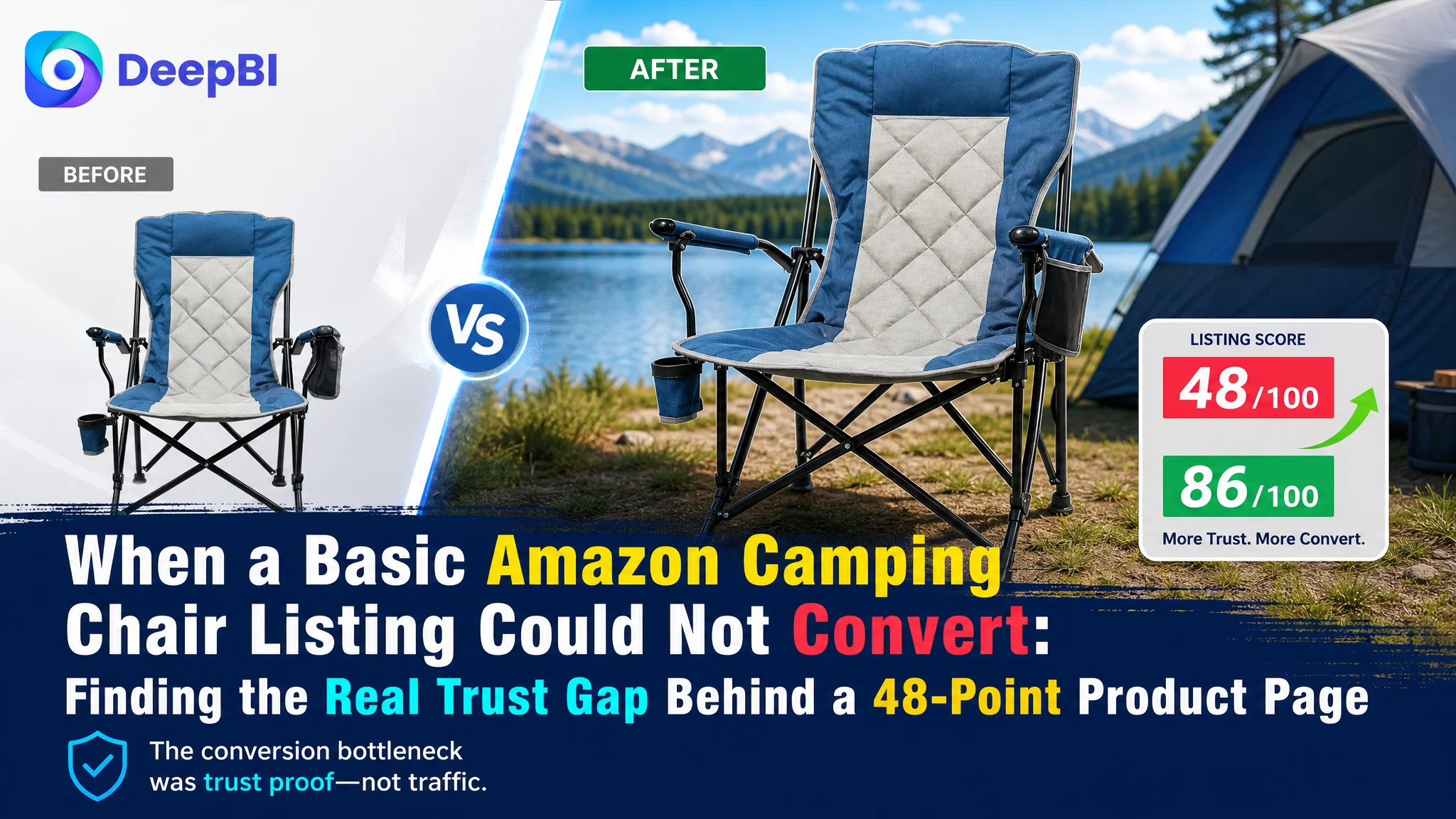
This case involved an Amazon US seller whose portable camping chair Listing appeared to have a straightforward problem: the product information was present, but the page was not competitive enough. The initial direction focused on tightening the title, reorganizing the bullet points, and presenting the chair’s materials and functions more clearly.
DeepBI’s diagnosis showed that the larger problem was not a missing keyword or an isolated image weakness. The Listing was asking shoppers to trust the product without giving them enough visual proof. Its 48/100 score sat 38 points below a comparable high-performing camping chair Listing, with the largest gap concentrated in the detail page and customer reviews.
The later optimization therefore focused on rebuilding the product page’s sales logic: make outdoor use immediately recognizable, prove stability and the verified 130-pound weight capacity, demonstrate portability, clarify storage functions, and use A+ content to answer the questions that text alone could not resolve.
For other Amazon sellers, the case offers a practical warning: when an Amazon product page contains traffic-driving keywords but lacks trust-building evidence, adding more advertising or adding more specifications may only send more shoppers into the same conversion leak.
The Amazon Listing Looked Complete Until the Page Was Compared With the Market
The customer’s Listing was not empty.
It had a product title, five bullet points, product images, basic specifications, and descriptions of features such as:
- Foldable design
- Cup holder
- Side storage pocket
- X-shaped structural support
- Anti-slip feet
- 600D Oxford cloth
- Outdoor use scenarios
On the surface, this looked like a normal Amazon product page for a portable camping chair.
The problem appeared when the Listing was evaluated against a comparable high-performing product in the same category.
- Title: Customer Listing: 14/20, Comparable Listing: 17/20, Gap: -3
- Main image: Customer Listing: 24/30, Comparable Listing: 26/30, Gap: -2
- Bullet points: Customer Listing: 6/10, Comparable Listing: 8/10, Gap: -2
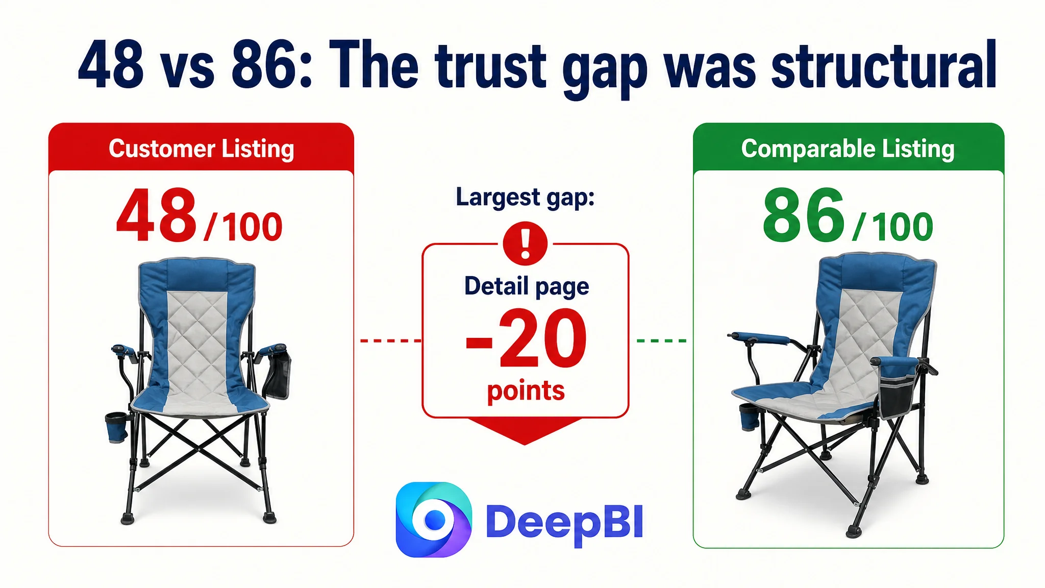
- Detail page: Customer Listing: 3/25, Comparable Listing: 23/25, Gap: -20
- Reviews: Customer Listing: 1/15, Comparable Listing: 12/15, Gap: -11
- Total: Customer Listing: 48/100, Comparable Listing: 86/100, Gap: -38
The overall score was important, but the distribution mattered more.
The title, main image, and bullet points were behind the benchmark, yet the gaps were relatively limited. The serious weakness was concentrated in two areas:
The page was missing 20 points in detail-page communication and 11 points in review-based trust.
That changed the operating question.
This was not primarily a matter of finding a few better keywords. It was a matter of whether the Amazon product page could provide enough evidence for a shopper to move from interest to confidence.
The Initial Diagnosis Stayed Too Close to Product Information
The customer’s Listing described the chair mainly through materials, functions, and usage claims.
That created an understandable but incomplete optimization direction: improve the title, make the bullet points sound more natural, add stronger functional wording, and clarify the product specifications.
Those changes were necessary. They were not sufficient.
The Listing’s language often followed a product-description structure:
- Material
- Structural feature
- Storage feature
- Use case
- Weight or support information
The competing Listing followed a buyer-decision structure:
- Comfort during long periods of use
- A differentiated feature with a clear benefit
- Storage convenience
- Stability and durability
- Multiple outdoor scenarios
The difference was not simply writing quality.
The customer’s copy told shoppers what the chair had. The competing page more consistently showed why those features mattered during a beach trip, fishing outing, picnic, sporting event, or backyard activity.
The difference was not simply writing quality. It was the difference between feature presence and decision proof.
That was the original misdiagnosis: treating the conversion problem as an information arrangement issue when the deeper constraint was insufficient decision proof.
A better title and better bullet points could improve discoverability and readability. But they could not fully compensate for a product page that lacked demonstration, context, and trust signals.
Amazon Ads Would Not Be the First Lever to Pull
For an Amazon seller, it is tempting to treat weak sales efficiency as an advertising problem.
A team may look first at:
- Search terms
- Bid levels
- Campaign structure
- Match types
- Budget allocation
- ACOS or TACOS
Those are valid operating levers. But they are not always the first constraint.
In this case, the Listing evidence suggested that the page itself was not ready to absorb more traffic efficiently. A shopper arriving from Amazon ads could still be left with basic unanswered questions:
- How easy is the chair to set up and fold?
- Can it be carried conveniently?
- How stable is it on grass or sand?
- What does the 130-pound weight capacity mean in practical use?
- Is the seating material genuinely comfortable?
- Where can a user place a phone, drink, or snack?
- What exactly is included with the chair?
- Is the product suitable for the buyer’s intended outdoor setting?
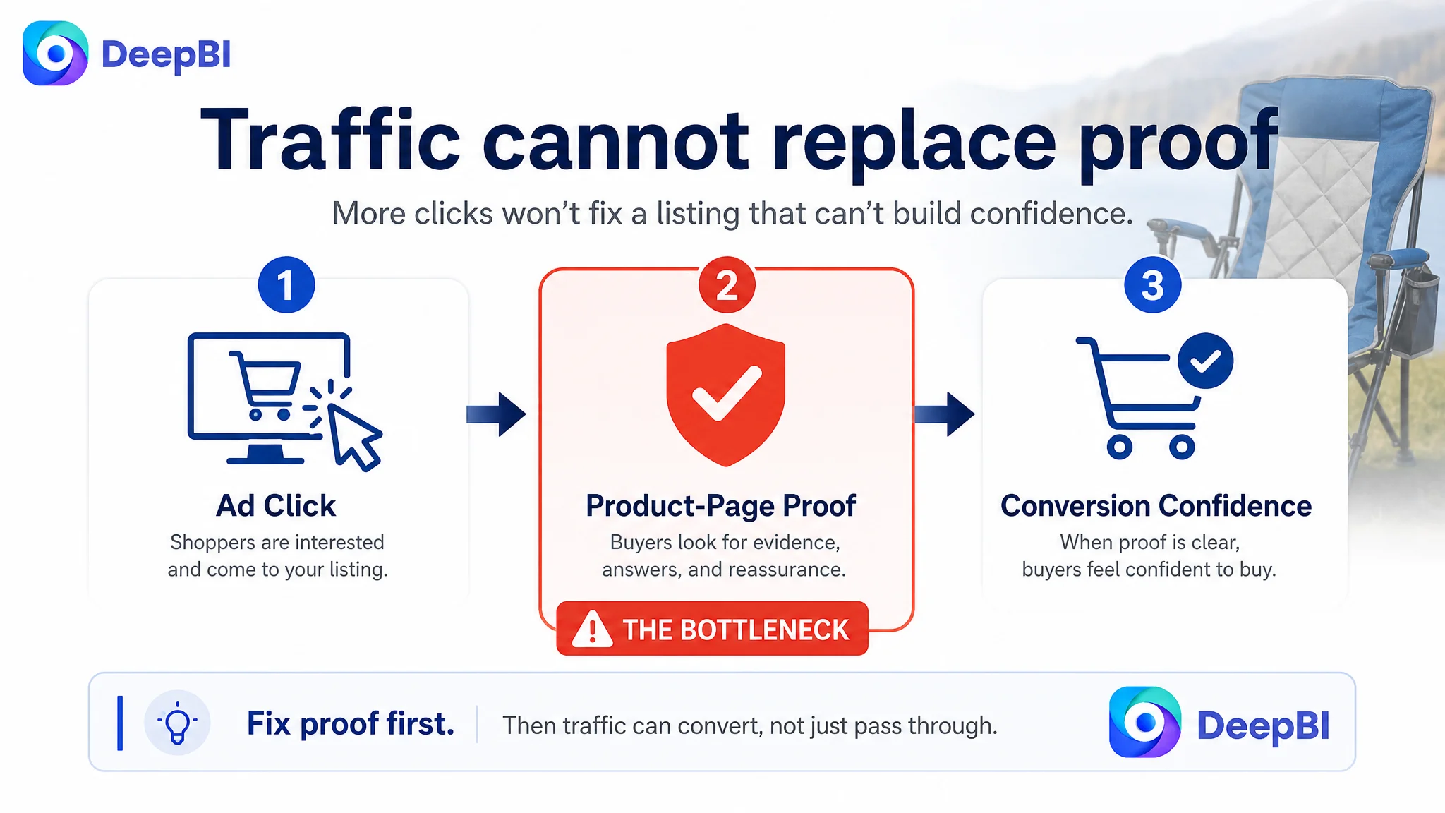
When those questions remain unresolved, advertising can amplify page weakness rather than solve it.
Advertising does not only amplify product strengths. It can also amplify the uncertainty already present on the Amazon Listing.
DeepBI therefore did not treat ad adjustment as the first answer. The more urgent task was to improve the page’s conversion capacity before asking traffic to scale.
The Real Constraint Was Listing Conversion Capacity
The score gap made the priority clear.
The detail page carried the largest structural weakness
The customer’s A+ area relied largely on basic parameter text. It did not provide a visual sequence that helped shoppers understand the product.
The benchmark Listing used a much fuller structure:
- A quick-fold demonstration
- A weight-capacity visual
- Storage-detail images
- Outdoor lifestyle scenes
- Multiple color views
- A four-scenario use matrix
This created several layers of persuasion. The shopper could see how the chair worked, why it was stable, where its features were located, and where it might fit into daily life.
The customer’s page did not yet create that same progression.
It showed a product. It did not sufficiently stage the buying decision.
The review profile added another layer of risk
The customer Listing had a 1.0-star rating from one review, while the comparable Listing had a 4.5-star rating from 20 reviews.
Even though the benchmark’s homepage review display did not contain a large number of highly visible review assets, its overall rating distribution created a stronger sense of market validation.
For the customer’s Listing, the review weakness was not a small supporting issue. It directly increased the burden placed on the rest of the page.
When review trust is limited, the title, images, bullet points, and A+ content must work harder to provide credible product evidence. A page with minimal review support cannot afford to rely on generic claims such as “comfortable,” “durable,” or “stable” without showing why.
The main image system did not create enough context
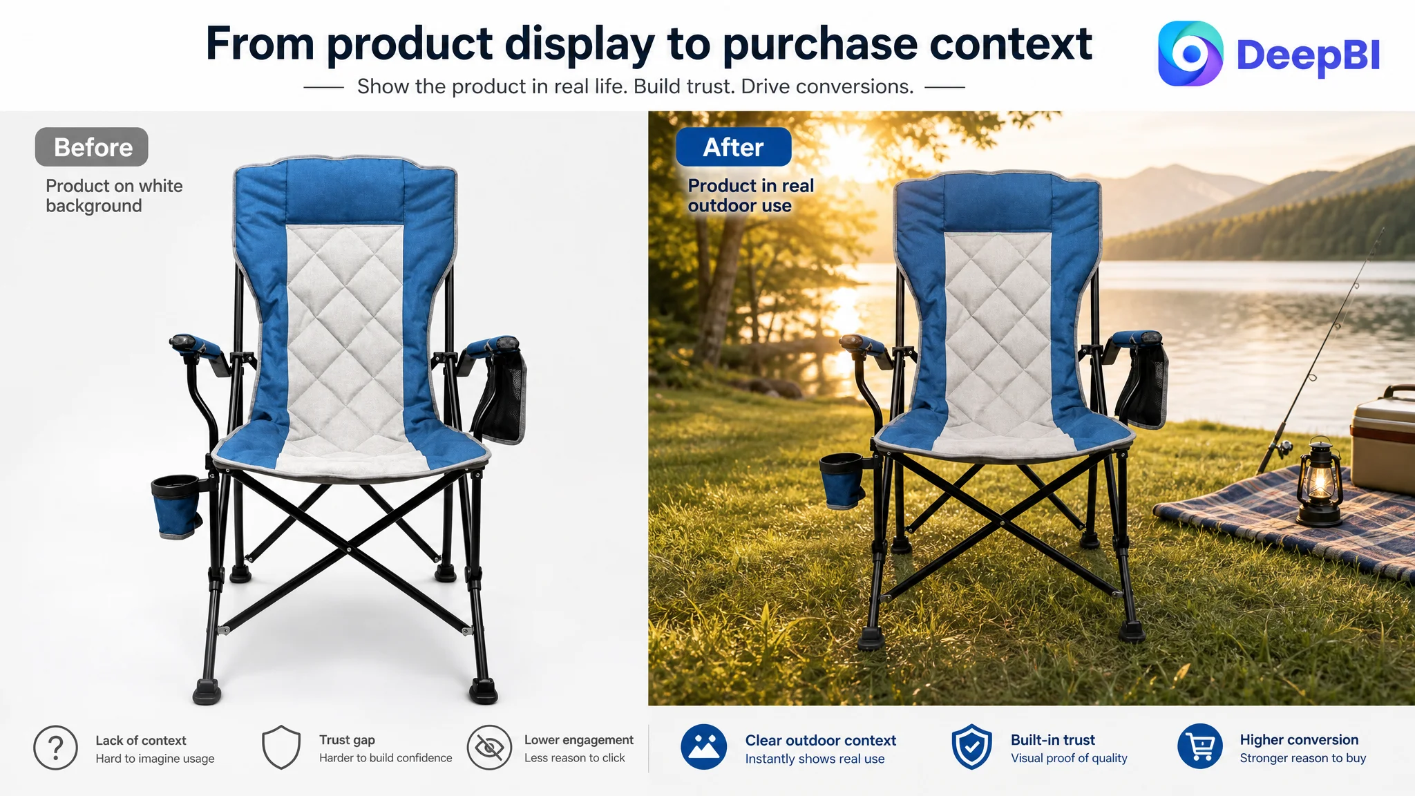
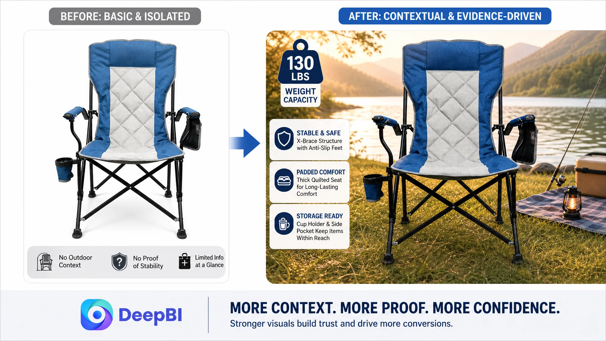
The existing visual direction primarily confirmed the product type and color. It did not immediately communicate the experience of using the chair outdoors.
For a portable camping chair, context matters. Shoppers are not only buying a folded object. They are buying a way to sit comfortably during fishing, camping, picnics, beach trips, sports events, or backyard activities.
The recommended visual direction was therefore to make outdoor use more immediately legible, while keeping all image changes within Amazon’s requirements. Supporting visuals and A+ content could use realistic camping and picnic settings to create immersion. Technical images could then prove the product’s actual structure and functions.
The Title Needed Better Search Logic, Not More Words
The title gap was smaller than the A+ gap, but it still revealed the Listing’s positioning problem.
The customer’s title relied on relatively generic functional wording. It did not establish a strong enough combination of product type, core benefit, portability, and use scenarios near the beginning.
The proposed title direction placed the primary product phrase first:
Portable Camping Chair with Cup Holder & Storage Bag, Heavy Duty Foldable Beach Chair for Adults, Includes Carry Bag, Perfect for Fishing, Picnic, Garden and Outdoor Activities
The purpose was not to copy the benchmark title. It was to improve the title’s search and decision structure by:
- Leading with the core product phrase
- Bringing the cup holder and storage bag into the first section
- Adding “Heavy Duty” and “for Adults” where appropriate
- Including relevant outdoor use scenarios
- Removing unnecessary connective wording
- Keeping the title easier to scan on mobile
The title needed to do two jobs at once: help Amazon understand the product and help shoppers recognize its relevance quickly.
But title optimization was treated as a supporting repair, not the central solution.
A better title could win a more relevant click. The rest of the page still had to justify that click.
The Bullet Points Needed to Move From Features to Buyer Outcomes
The bullet points contained usable facts, but their order and framing were closer to a product manual than a conversion path.
DeepBI’s revised logic reorganized the message around how shoppers evaluate a camping chair.
Comfort should come before material terminology
The original content led with fabric and construction details.
The revised direction began with the user experience:
Durable and Comfortable Fabric
The 600D Oxford cloth remained important, but it was connected to toughness, odorlessness, long-term use, and a more comfortable outdoor seating experience.
The material was no longer presented as an isolated specification. It became evidence for a benefit.
Stability needed a clear, verified proof point
The chair’s X-shaped support and anti-slip sleeves were combined into a stronger stability message:
Heavy-Duty Stability
The verified 130-pound weight capacity was placed alongside the structural support and anti-slip design. This gave shoppers a concrete reference instead of asking them to interpret a vague claim about strength.
This distinction matters on Amazon. “Stable” is a conclusion. The structure, anti-slip feet, and weight limit are the evidence that allows the shopper to reach that conclusion.
Storage features needed to explain convenience
The cup holder and side pocket were not unique in isolation, especially compared with a competing chair that offered a cooler pocket.
The better response was not to imitate the missing cooler function or imply that the chair had one. It was to make the existing storage features more useful in the shopper’s mind:
- Keep a phone within reach
- Hold a beverage
- Store small personal items
- Reduce the need to stand up during outdoor activities
That is a more credible way to address a competitive weakness: clarify the value of the features the product actually has.
Use cases needed to become scenes rather than lists
“Camping, fishing, sports events, and family picnics” can read like a keyword group when presented without context.
The revised direction turned those settings into a more coherent outdoor role for the chair. It positioned the product as a portable companion across recurring activities, rather than as a collection of disconnected functions.
The Visual Strategy Had to Prove What the Copy Was Claiming
The most important change was not to make the Listing more decorative. It was to make the page’s claims easier to verify.
A scene should establish the product’s role
A realistic outdoor setting can help shoppers understand the product immediately.
For this chair, a camping, picnic, beach, fishing, or backyard setting could answer a basic question before the shopper reads deeply:
Where would I actually use this?
The goal was not to add lifestyle imagery for atmosphere alone. It was to connect the product to a recognizable moment of use.
Stability required technical evidence
The product page needed to show:
- The X-shaped structural support
- Reinforced connections
- Bottom anti-slip sleeves
- The verified 130-pound weight capacity
This is more persuasive than repeating “safe and stable” across several images.
Comfort needed material evidence
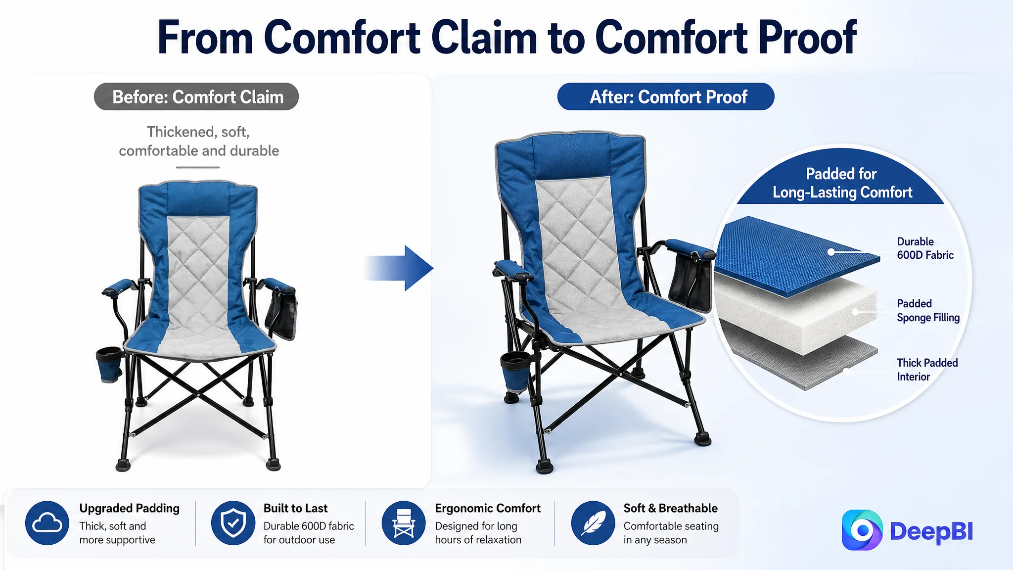
The Listing used terms such as “thickened” and “upgrade quilted,” but the page did not adequately show what supported those claims.
The recommended direction was a close-up or structural visual that made the padded design and 600D Oxford cloth easier to understand without inventing internal materials or unsupported specifications.
The principle was strict: clarify the physical product that exists; do not generate a more advanced product than the customer sells.
Storage features needed functional demonstration
A focused visual could show the cup holder and side pocket with realistic items such as a beverage or mobile phone. The purpose would be to demonstrate convenience, not merely label components.
That distinction also kept the page honest. The chair did not need to claim a cooler function to communicate useful storage.
A+ Content Was the Missing Persuasion Layer
The A+ area was the clearest opportunity because it could organize the entire decision sequence.
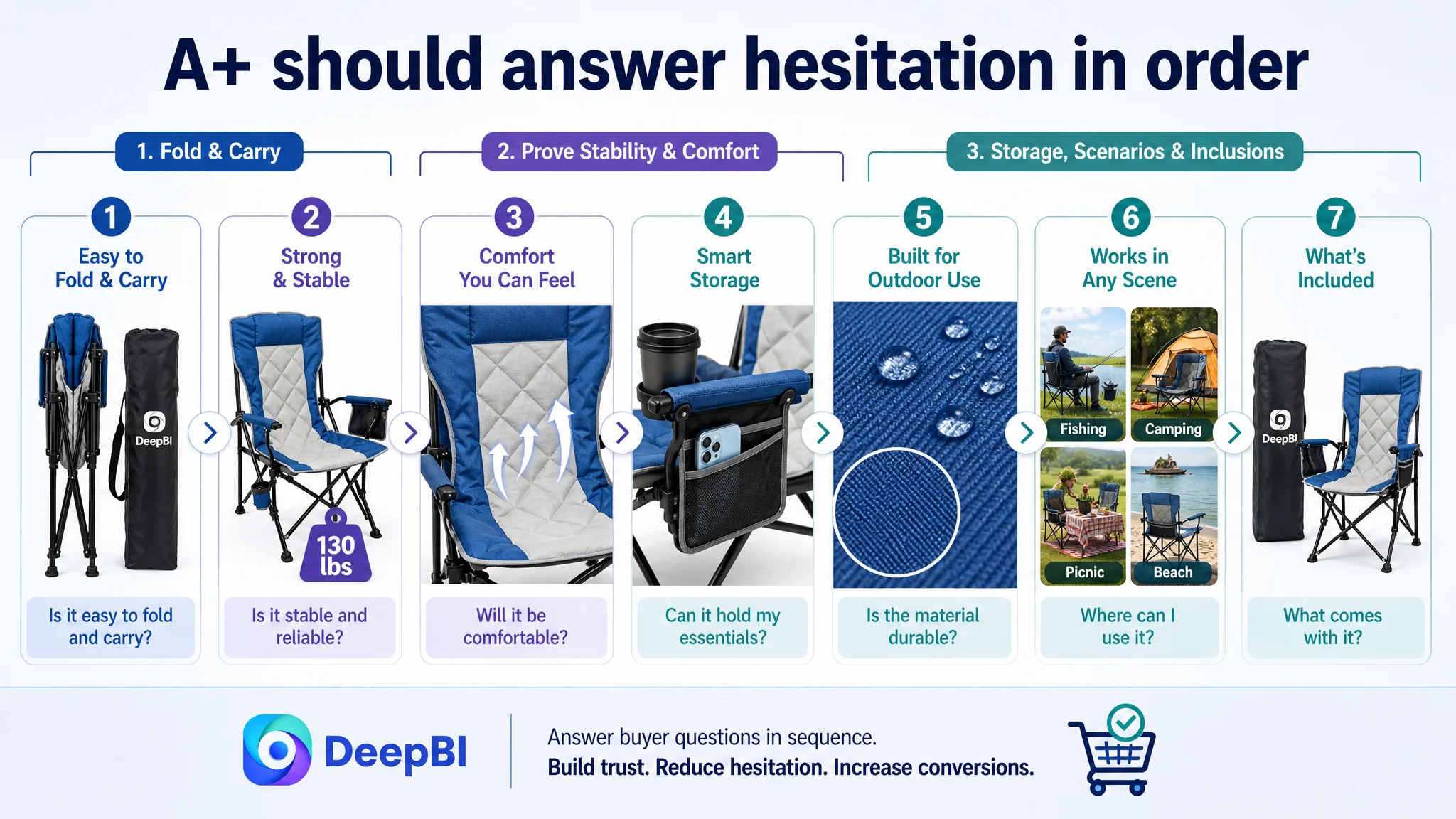
The recommended modules followed the buyer’s remaining questions.
First: Can I set it up and carry it easily?
A visual sequence should show the folding process and how the chair fits into the provided handbag or carry bag.
Portable products often create hesitation around operation. A shopper may wonder whether “foldable” means genuinely convenient or merely technically possible.
Showing the sequence makes portability concrete.
Second: Will it feel stable?
The next module should provide structural proof through the X-shaped support, anti-slip design, and 130-pound verified capacity.
This is where the page should reduce perceived risk rather than repeat general durability language.
Third: What can I keep within reach?
The cup holder and side pocket should be shown in use, with the benefit connected to drinks, phones, and small items.
Fourth: Will the materials hold up?
A close-up of the 600D Oxford cloth can support the durability and odorless-material claims already available in the source information.
Fifth: Does the chair work for an adult user?
A realistic scale comparison can help shoppers judge the chair’s practical use without making unsupported promises about body types or comfort levels.
Sixth: Where can I use it?
A scenario matrix across fishing, beach, picnic, and outdoor activities can give the chair a clearer category position.
Seventh: What is included?
A final contents image can reduce “missing parts” anxiety by showing the chair, storage bag, and handbag as standard components.
This sequence gave the A+ page a job beyond repeating the bullets. It turned the lower page into a structured answer to purchase hesitation.
DeepBI’s Judgment Came From the Order of the Gaps
The value of the diagnosis was not simply that DeepBI identified several weaknesses.
It identified which weakness had to be addressed first.
The score showed that the Listing did not have one isolated defect. It had a broken sequence:
1. The title did not establish the strongest search and product positioning.
2. The images did not create enough immediate outdoor context or technical proof.
3. The bullet points described features without forming a strong buyer journey.
4. The A+ area lacked the visual evidence needed to build confidence.
5. The review profile left the page with less external trust than the benchmark.
The largest business risk was continuing to send more attention toward a page that had not yet earned enough confidence from shoppers.
That is why the priority was Listing conversion capacity—not simply more traffic.
Before the Amazon ads could become more productive, the product page had to become more convincing.
The Operating State Changed Before the Numbers Could Be Claimed
The available case material does not include post-optimization CTR, CVR, ACOS, TACOS, organic-order share, or keyword-ranking results. It would therefore be inaccurate to claim a specific performance lift.
What can be stated clearly is the intended operating change:
- The product’s outdoor use became easier to recognize.
- The 130-pound capacity became a visible proof point.
- Stability claims were connected to the actual structure and anti-slip design.
- Comfort claims were supported through material-focused visuals.
- Storage functions were explained through practical use.
- Folding and carrying were made easier to understand.
- A+ content was given a complete decision path.
- The page became better prepared to convert both organic and paid Amazon traffic.
This also reduced a strategic risk. Instead of relying on advertising to compensate for weak page communication, the customer team had a clearer sequence for future decisions:
Diagnose the Listing first. Repair the conversion bottleneck. Then evaluate whether additional traffic can be absorbed efficiently.
What Amazon Sellers Can Take From the Case
A low-performing Amazon Listing does not always need more copy, more images, or more advertising in isolation.
It needs the right order of diagnosis.
For this portable camping chair, the most important discovery was that the page was not fundamentally lacking product information. It was lacking a convincing relationship between the product, the shopper’s concerns, and the proof shown on the page.
The title needed to attract relevant attention.
The main image system needed to clarify the product’s outdoor role.
The bullet points needed to connect features with outcomes.
The A+ content needed to demonstrate portability, stability, comfort, storage, scale, scenarios, and included components.
And because the review profile was weak, every visual and textual claim needed to carry more trust-building weight.
The broader lesson is straightforward:
Amazon ads can bring shoppers to a Listing, but the Listing still has to give them a reason to believe, compare, and buy.
DeepBI’s role in this case was not to produce a longer checklist. It was to show why the customer’s original optimization direction could not fully solve the problem, where the conversion logic was breaking, and why the product page had to be repaired before traffic became the next priority.