

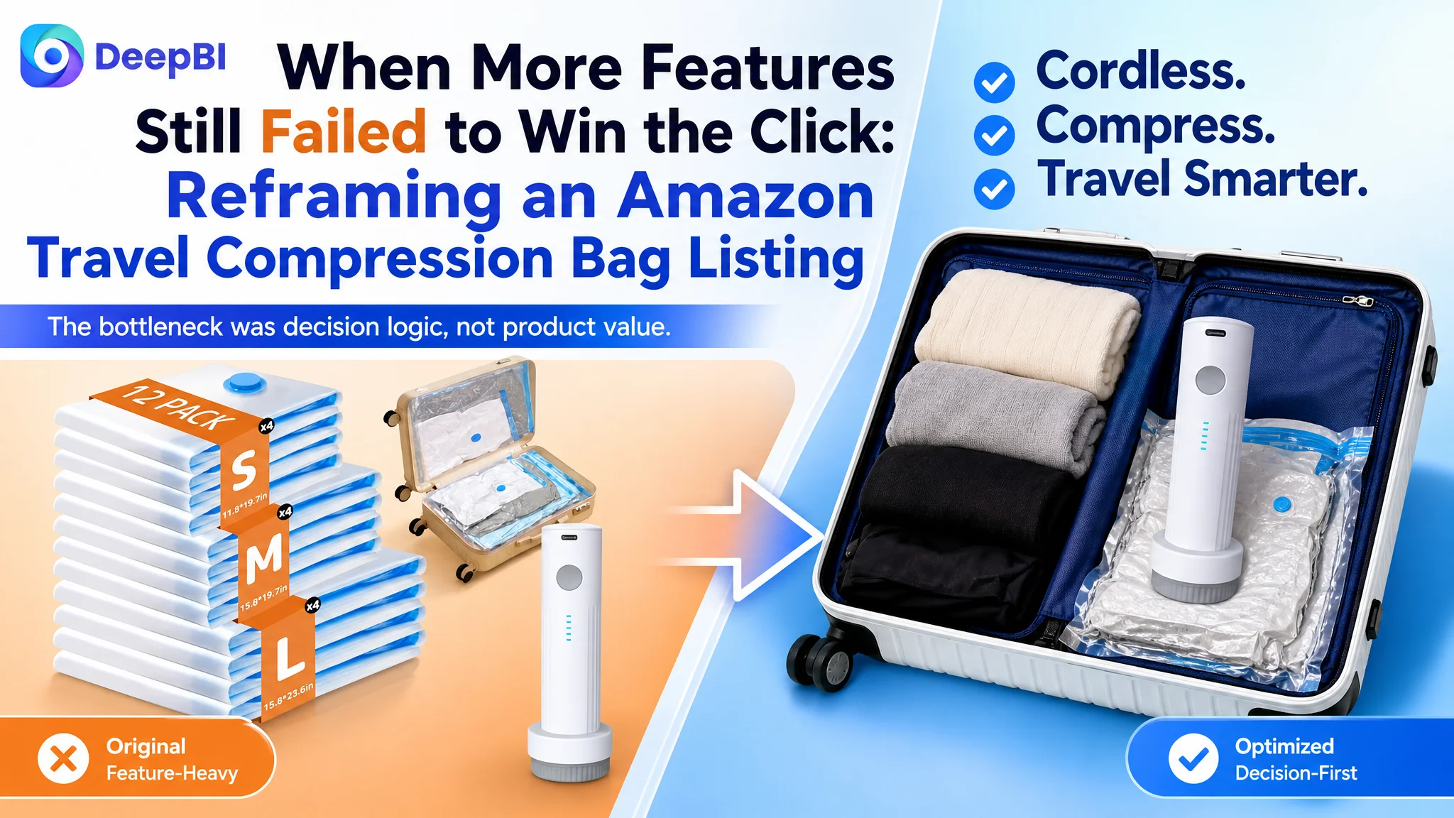
An Amazon seller in the US travel-storage category was not short of product information. The Listing already communicated rechargeable operation, space savings, multiple bag sizes, and travel organization. Yet compared with a stronger category competitor, the product page was still losing persuasive power where buyers made decisions.
The original direction focused on adding or rearranging features: more keywords in the title, more specifications in the images, and clearer explanations of how the bags worked. DeepBI found that this approach treated the Listing as an information problem. The deeper issue was different: the page did not lead shoppers through a convincing travel-packing decision.
The diagnosis shifted from “add more product details” to “rebuild the conversion logic.” The later optimization prioritized the wireless travel experience, quantified performance, bulky-item demonstrations, suitcase-specific sizing, structured A+ storytelling, and trust-building proof. For other Amazon sellers, the lesson is straightforward but easy to miss: a product page can contain the right facts and still fail to make the product feel like the right choice.
The Amazon Listing Had Information. It Lacked a Strong Buying Sequence.
The customer’s Amazon Listing received a score of 75 out of 100, while the comparable high-performing Listing scored 87.
The gap was not concentrated in one isolated element.
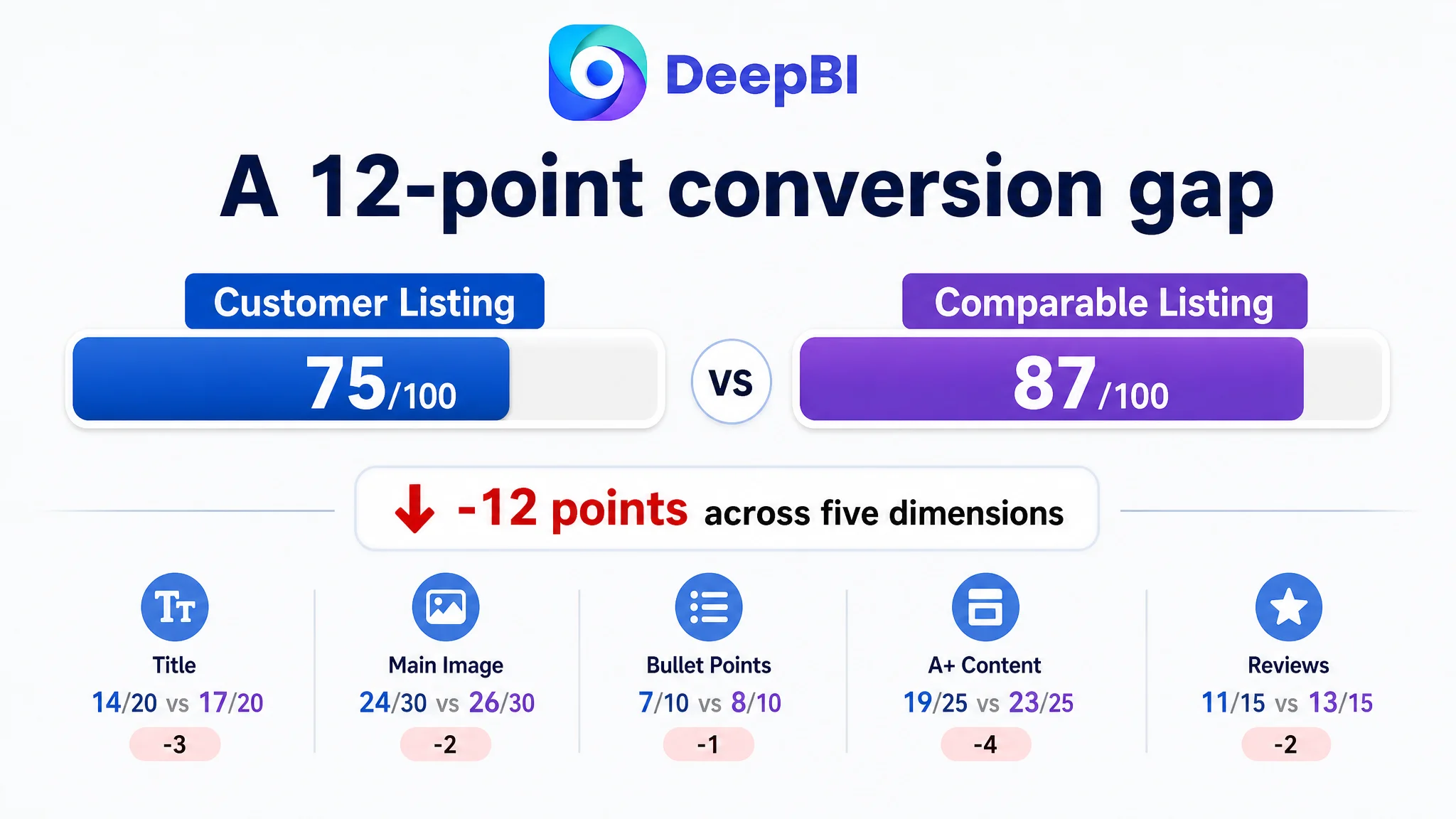
- Title: Customer Listing: 14/20, Comparable Listing: 17/20, Gap: -3
- Main image: Customer Listing: 24/30, Comparable Listing: 26/30, Gap: -2
- Bullet points: Customer Listing: 7/10, Comparable Listing: 8/10, Gap: -1
- A+ content: Customer Listing: 19/25, Comparable Listing: 23/25, Gap: -4
- Reviews: Customer Listing: 11/15, Comparable Listing: 13/15, Gap: -2
- Total: Customer Listing: 75/100, Comparable Listing: 87/100, Gap: -12
At first glance, none of these gaps appeared catastrophic. The product had a rechargeable pump. The bags could save luggage space. The Listing included product images, size information, and use cases.
But the combined effect was significant.
The page explained what the product was without creating enough momentum toward purchase.
That distinction matters on Amazon. A shopper does not evaluate the title, main image, bullet points, A+ content, and reviews as independent assets. These elements form a sequence:
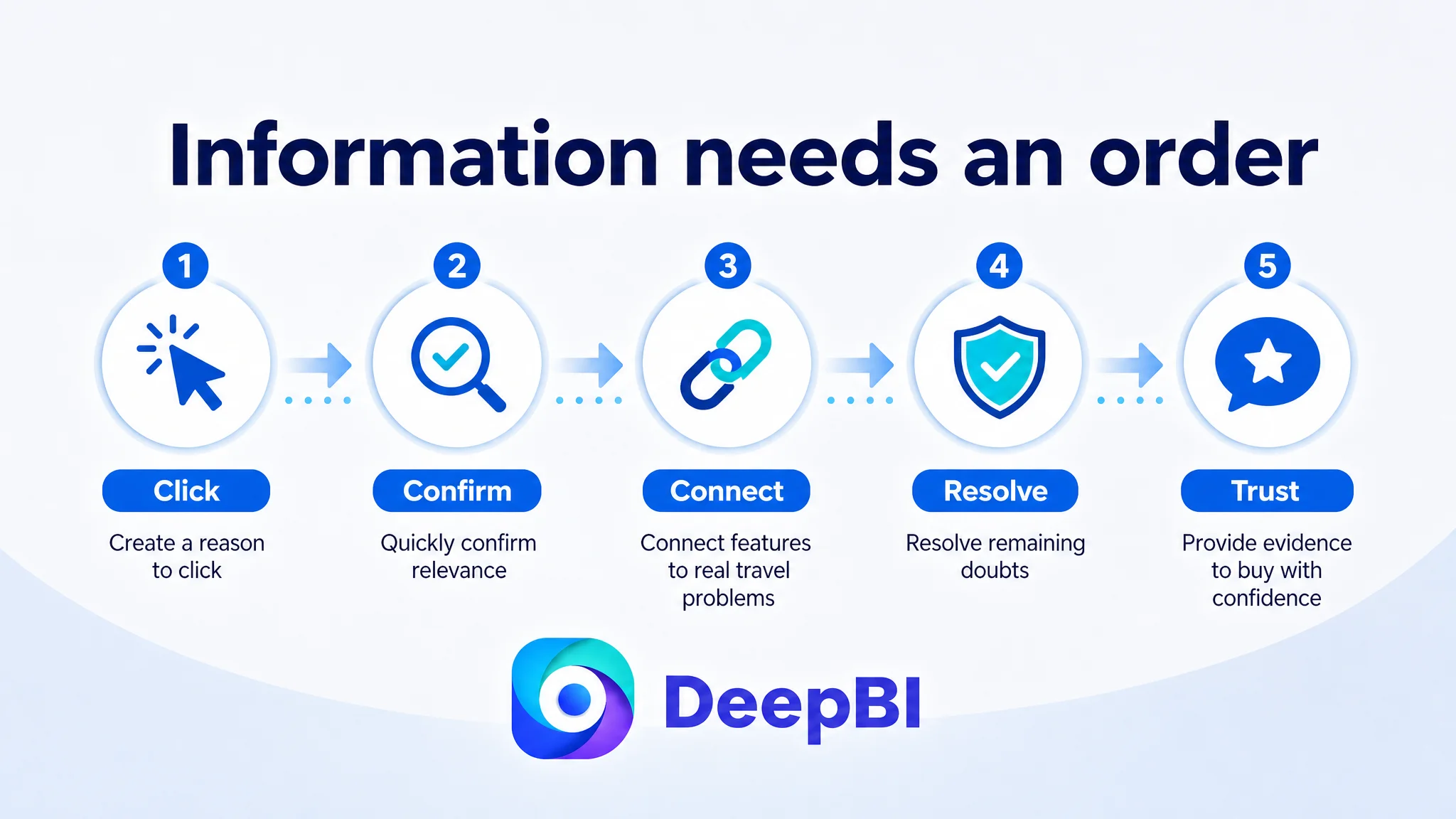
1. The search result must create a reason to click.
2. The product page must quickly confirm relevance.
3. The images and bullets must connect features to real travel problems.
4. The A+ content must resolve remaining doubts.
5. Reviews must provide enough evidence to make the decision feel safe.
The customer Listing was weaker across this sequence than the benchmark. Its score was therefore not just a content checklist result. It reflected a lower ability to convert paid and organic Amazon traffic into confident purchase decisions.
“The problem was not a lack of information. It was a lack of persuasive order.”
The Original Diagnosis Focused on Features, Keywords, and Product Explanation
The customer’s existing approach treated the page primarily as a product-information surface.
The title began with “12 Pack,” which helped communicate quantity but placed the package count ahead of the product’s central travel benefit. The wording emphasized rechargeable functionality, but not the more specific “cordless” travel experience that shoppers could immediately understand. The ending phrase, “Travel Organization,” was broad and less directly connected to the buyer’s search intent than a concrete reference to clothing and luggage.
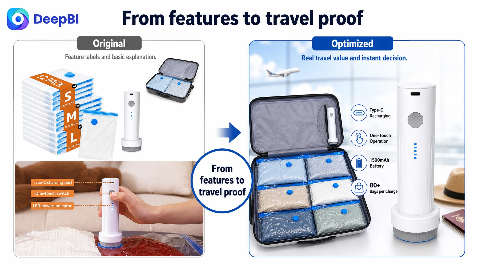
The image sequence followed a similar pattern. It showed the compression result, introduced the pump, explained bag sizes, and presented battery and portability specifications. The content was not irrelevant. The issue was that the strongest reasons to buy appeared too late or were presented in a technical way.
The bullet points also leaned toward feature listing:
- Applicable scenarios and dimensions
- Ease of operation and battery life
- Product form and portability
- Space-saving results
- Material and sealing performance
This structure gave shoppers facts, but not a clear answer to the questions behind the purchase:
- Can I use it in a hotel, airport, or other place without an outlet?
- Will it compress bulky items such as jackets, pillows, or linens?
- Which bag size fits the items I actually need to pack?
- How quickly can I finish packing?
- Will the seal hold during travel?
- Can I identify my clothes without opening every bag?
The original diagnosis was therefore incomplete. It assumed the page needed more complete product explanation. DeepBI’s comparison showed that it needed a stronger decision path.
The Benchmark Was Not Simply “Better Looking”
DeepBI did not treat the competitor’s Listing as a style reference alone. It examined how each page handled buyer uncertainty.
The benchmark Listing used several forms of proof earlier and more clearly:
- Specific performance claims such as 4000Pa suction and 140L/min airflow
- A compression time of 10–15 seconds per bag
- A direct connection between bag sizes and carry-on or checked luggage
- A quantified volume-reduction claim
- USB charging through a laptop or power bank
- A four-step visual sequence: pack, seal, vacuum, store
- More varied travel scenarios, including international trips, camping, and air travel
- Real buyer reviews with images or videos on the first page
The customer Listing had comparable product value in several areas, but its expression was less forceful. It used qualitative wording such as “fast” and “effortless” where specific performance evidence would have been more credible. It showed generic clothing examples where a down jacket, pillow, or blanket would have made the space-saving problem more tangible.
This is where DeepBI’s diagnosis became more useful than a general design opinion. The question was not whether the customer’s images were attractive enough. The question was:
Which buyer hesitation did each image resolve, and when did that proof appear?
The Real Constraint Was Listing Conversion Capacity
The 12-point difference was distributed across five dimensions, but the most important business constraint was the Listing’s conversion capacity.
The page had enough basic content to attract some relevant shoppers. However, it was less effective at converting that attention because the sales logic was fragmented:
- The title did not lead with the strongest travel-relevant product identity.
- The main image sequence delayed the cordless convenience story.
- The bullet points listed functions without consistently closing the loop from problem to solution.
- The A+ content opened with technical information instead of a travel scenario.
- The page did not demonstrate difficult, high-value packing problems strongly enough.
- The review section had much less visible social proof.
This diagnosis changed the optimization order.
If the team had continued adjusting advertising before repairing the page, additional traffic would have been sent into the same conversion gaps. Ads might have increased exposure, but the product page still would not have given shoppers enough reason to trust the product, understand its use, and complete the purchase.
“Advertising can amplify a product page’s strengths. It can also amplify the page’s existing defects.”
That was the key judgment: the next priority was not more traffic. It was making existing traffic more useful.
The Title Needed to Win Relevance Before It Listed Quantity
The proposed title direction was:
12 Pack Travel Compression Bags with Rechargeable Cordless Electric Air Pump, Vacuum Storage Bags for Luggage and Suitcase, Space Saver Packing Bags for Clothing and Travel Organization
The change was not merely a keyword rearrangement.
It moved the core product concept—travel compression bags with a rechargeable cordless pump—closer to the front. It also combined related search language such as “vacuum storage bags,” “packing bags,” “luggage,” “suitcase,” and “space saver” without allowing the title to become an unstructured keyword list.
The title’s job was to make the product legible in the search results:
- What is it?
- What makes it different?
- Where is it used?
- What problem does it solve?
The original title communicated quantity early. The revised direction communicated product identity and travel utility earlier, while retaining the 12-pack information.
That is a small textual change with a larger strategic purpose: the Listing should earn the click by presenting the product as a travel solution, not just as a bundle of bags and a pump.
The Main Image Sequence Needed to Surface the Travel Experience
The main image gap was not that the product was invisible. It was that the sequence did not prioritize the most decision-relevant information.
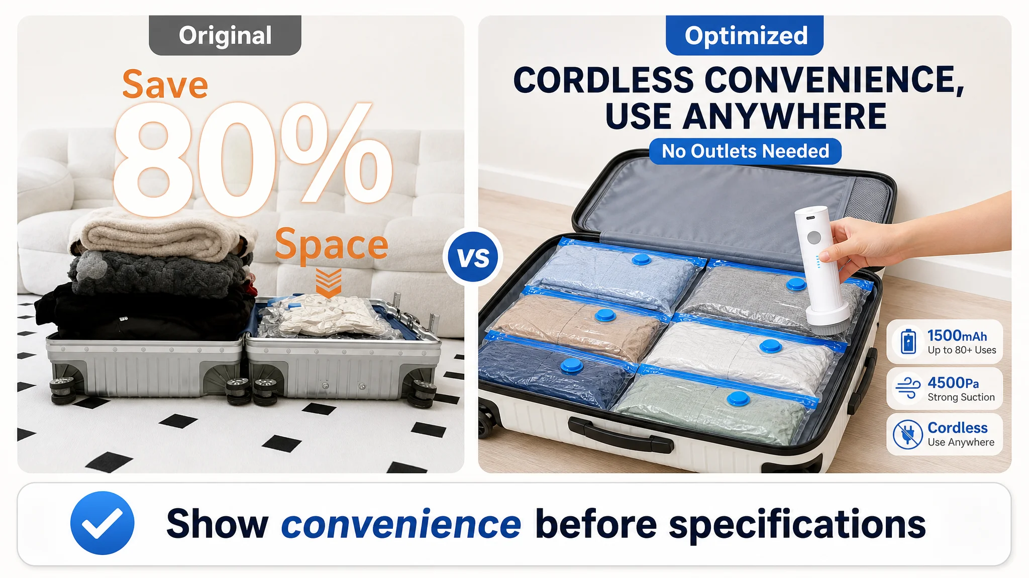
The customer’s second image focused mainly on the before-and-after result of saving up to 80% of luggage space. That benefit mattered, but the comparable Listing used an earlier image to address a different hesitation: how the pump would work while traveling.
The revised sequence therefore prioritized:
- Cordless, no-outlet operation
- Rechargeable convenience
- One-touch compression
- Quantified suction and compression performance
- Specific size references
- A final organized suitcase state
The proposed visual logic was not to add more labels to every image. It was to give each image one clear job.
The second image should answer: “Can I use this easily while traveling?”
The cordless pump should appear earlier, alongside the travel-packing result. “No cords, no outlets” is more than a technical feature. It addresses a practical concern that appears before the shopper begins comparing battery capacity or material structure.
The third image should answer: “How much effort does compression require?”
The customer’s existing image showed the pump in hand with labels such as “One-touch switch” and “LED indicator.” The improved direction placed greater emphasis on the experience: fast, effortless compression at the push of a button, with USB charging and up to 80 uses per charge based on the verified product information.
The fourth image should answer: “Which size fits my belongings?”
The existing examples—shirt, sweater, and jacket—were visually similar and did not create enough distinction between bag sizes. The improved direction used more specific item pairings, such as jackets, pillows, blankets, and other bulky travel items, while preserving clear dimensions:
- 11.8 × 19.7 inches
- 15.8 × 19.7 inches
- 15.8 × 23.6 inches
The fifth image should answer: “What does the finished result look like?”
Rather than continuing with technical specifications such as pump weight and battery capacity, the final image could show a neatly organized suitcase. This would connect the product’s durability, reusable design, and packing capacity to the desired travel outcome.
The Bullet Points Needed to Turn Specifications Into Reasons to Buy
The competitor’s bullet points were more effective because each one connected a product attribute to a recognizable travel problem.
The customer’s revised bullet strategy followed the same logic.
Wireless operation should resolve outlet anxiety
The rechargeable pump’s 1500mAh battery, USB charging, and up to 80 compressions per full charge are useful facts. But they become more persuasive when linked to laptops, power banks, backpacking, students, and international travel.
The point is not simply that the pump has a battery. The point is that the customer can compress clothing without depending on a wall outlet.
Performance data should make “fast” believable
The customer’s materials included verified product information such as 4500Pa suction, a 130g pump weight, Type-C charging, and 80+ uses per charge. Presenting these facts clearly would give the page a more concrete performance foundation than general words such as “fast” or “effortless.”
Any performance claim still needs to remain consistent with the product’s confirmed specifications. The role of the data is to support the buyer’s judgment, not to imitate a competitor’s numbers.
Bag sizes should be tied to packing decisions
A list of dimensions is not enough. Shoppers need help imagining their own packing process.
A stronger structure would connect each size to realistic items and luggage situations while retaining dimensional transparency. This allows buyers to mentally test the product before purchase.
Semi-transparent, tear-resistant construction should reduce search and durability concerns
The PA+PE composite material, dual-zipper airtight seal, and turbo-valve design support a practical benefit: clothes can be identified and organized without opening every bag, while the structure is designed for repeated travel use.
Again, the persuasive power comes from the connection between feature and concern. The customer is not only buying compression. They are buying easier luggage organization with less uncertainty.
A+ Content Was the Largest Missed Opportunity
The A+ content score showed the largest single gap: four points behind the comparable Listing.
The customer’s A+ modules included functional diagrams, space-saving comparisons, size guidance, and travel scenes. But the opening module was too close to a technical specification presentation. It explained the system before establishing why the shopper should care.
The stronger direction was to rebuild the A+ page around a sequence of objections.
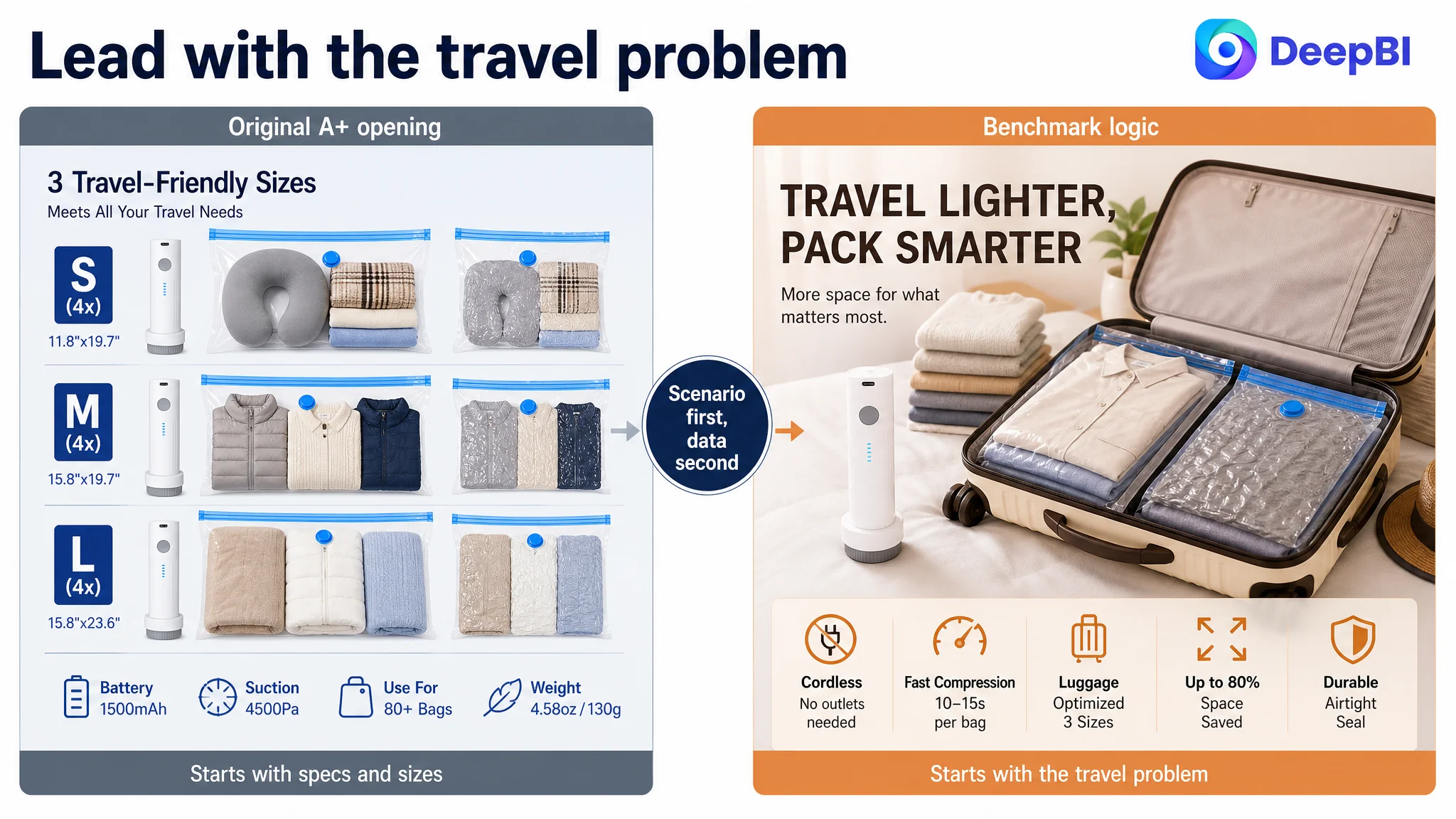
Start with the travel problem, not the specification sheet
The first module should create an immediate connection with light, efficient suitcase packing. A visual hook such as “designed for travel” and “save up to 80% of luggage space” would give the shopper a reason to continue.
Technical specifications could follow after the problem and desired outcome were clear.
Demonstrate difficult items
Generic sweaters did not fully communicate the product’s value. Down jackets, pillows, and linens create a more obvious compression challenge.
Showing those items before and after compression would give the space-saving claim stronger visual credibility and make the product relevant to more than ordinary clothing.
Separate size clarification from lifestyle imagery
The assortment module was doing too many jobs at once. It presented dimensions, product quantity, suitcase context, and a person packing.
A dedicated size-mapping module would be clearer: show the three sizes, connect each to realistic item combinations, and explain how they fit carry-ons or checked luggage. The shopper should be able to identify the most suitable option without decoding a crowded scene.
Move technical proof after the shopper understands the use case
The pump’s verified specifications—1500mAh capacity, 80+ bags per charge, 4500Pa suction, 130g weight, and Type-C charging—are valuable rational proof.
They simply needed to appear later in the page, after the travel scenario and assortment questions had been addressed. This order allows the data to reinforce desire rather than interrupt it.
Add an operation module
The page lacked a dedicated visual explanation of how simple the system was to use.
A short sequence showing the bag being packed, sealed, connected, compressed, and stored would address operational hesitation more directly than isolated feature labels.
Explain sealing and durability as a system
The page also needed to reduce concern about leakage or seal failure. A structured module could show the dual zipper, turbo valve, and thick PA+PE composite as parts of one airtight storage system.
This is more persuasive than simply stating “durable” or “airtight” because it shows how the claim is supported.
Reviews Added a Trust Gap That Content Alone Could Not Fully Repair
Both Listings had a 4.4-star rating, which could make the review situation appear similar at first.
The difference was in scale and visibility:
- Customer Listing: 441 total reviews
- Comparable Listing: 4,981 total reviews
- Customer Listing first page: no effective review content visible
- Comparable Listing first page: 11 effective reviews visible
The customer Listing’s first-page review area was dominated by non-substantive elements rather than useful buyer experiences. The comparable Listing displayed detailed customer feedback, including images, videos, and helpful votes.
This did not mean the customer could solve the problem through review volume alone. Review accumulation is a longer-term business task, not a substitute for a weak page narrative.
But it did change the diagnosis. The customer’s product page needed to compensate for a lower level of visible social proof by becoming clearer and more evidence-driven in other areas:
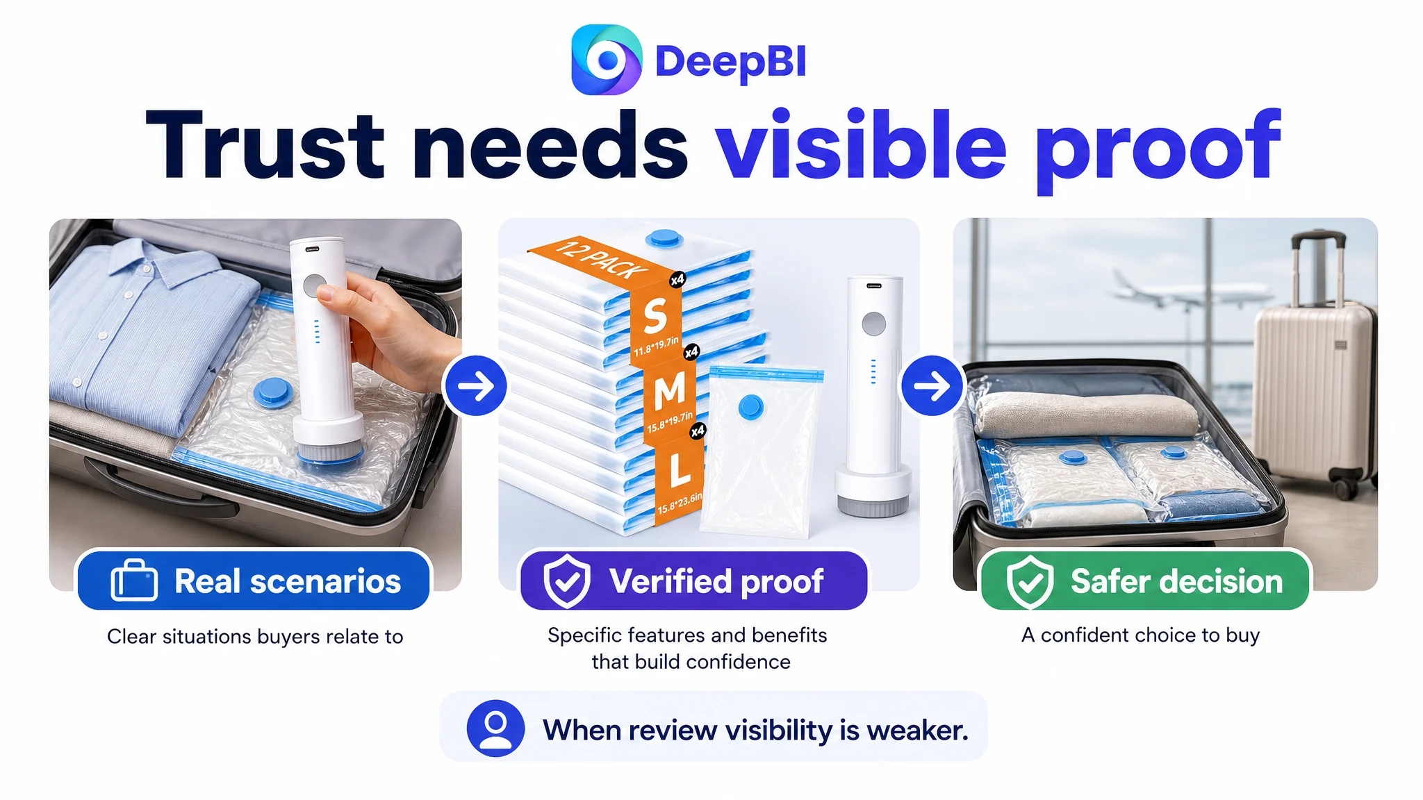
- Show real packing scenarios.
- Use verified performance data.
- Clarify the size-selection process.
- Demonstrate the operating steps.
- Explain sealing and reuse.
- Make the final travel outcome easy to visualize.
The page could not immediately match the competitor’s review scale. It could, however, avoid making shoppers work harder to understand whether the product was reliable.
Why DeepBI Did Not Recommend Tuning Ads First
The critical decision was not which image to redesign first. It was whether the team should continue treating the issue as an advertising problem.
The available Listing evidence pointed to a page-level constraint:
- The total Listing score was 12 points below the benchmark.
- The largest content gap was in A+ storytelling.
- The title and bullet points were less conversion-oriented.
- The image sequence delayed key travel benefits.
- Review visibility was materially weaker.
- The product’s verified specifications were not being used as effectively as they could be.
Under these conditions, more aggressive ad optimization would risk increasing the amount of traffic exposed to the same weaknesses.
The better decision order was:
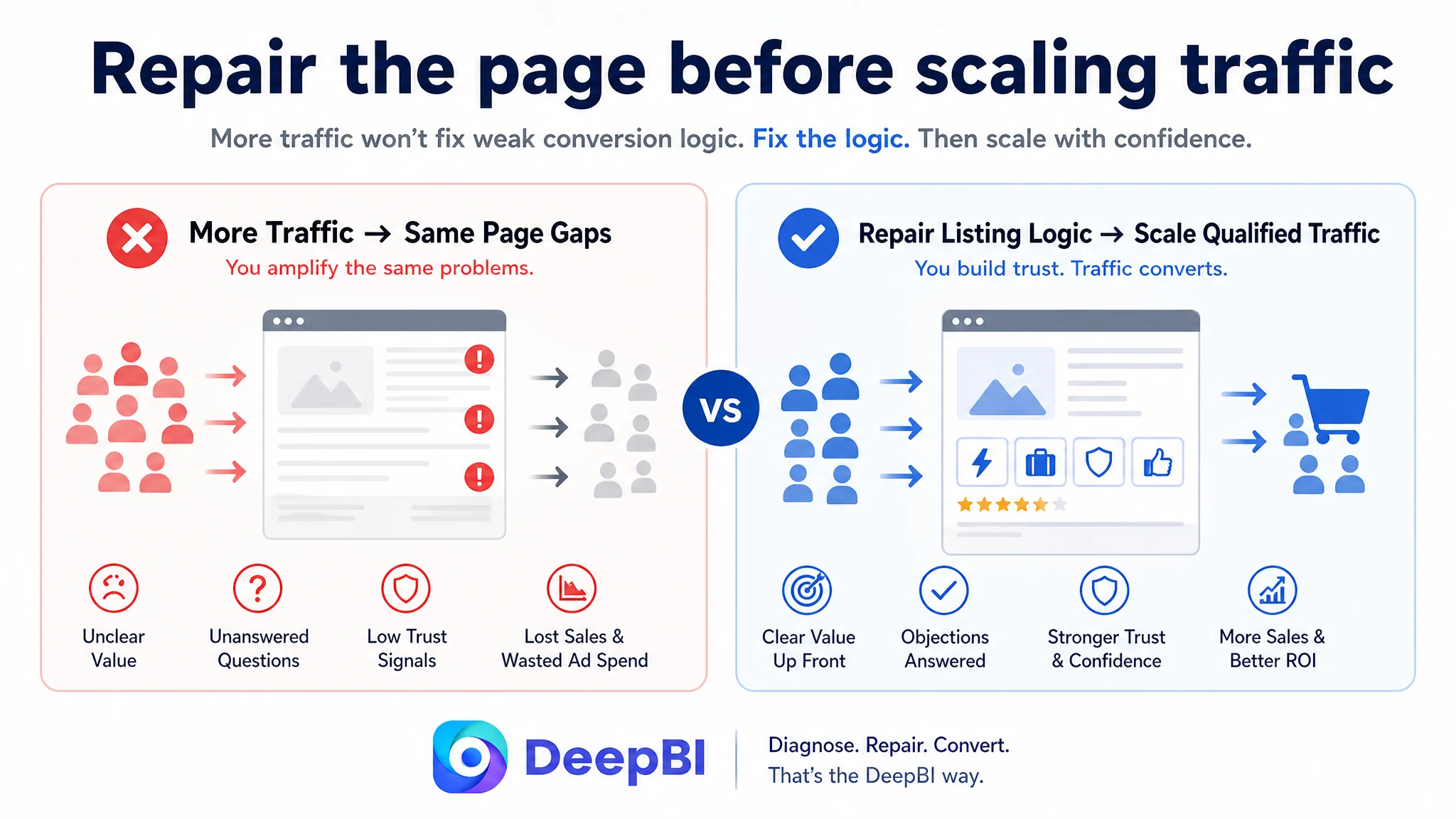
1. Reframe the product around the travel-packing problem.
2. Reorder the most important benefits.
3. Make performance and size information concrete.
4. Rebuild the A+ page as a sequence of objections and answers.
5. Strengthen the visible trust structure.
6. Then evaluate how paid and organic traffic respond.
This does not mean advertising becomes unimportant. Amazon ads remain essential for generating demand and testing traffic. But the Listing must be capable of converting that traffic before the team tries to scale it.
“Before sending more traffic to a page, the team has to decide whether the page deserves more traffic.”
The Page Began to Recover Its Sales Logic
The case material does not provide post-optimization CVR, ACOS, TACOS, or organic-order results, so no numerical performance outcome should be claimed.
The supported change is a change in operating logic.
The customer’s Listing moved from:
- Feature explanation to travel-solution framing
- Generic examples to high-friction packing scenarios
- Static specifications to quantified proof
- Late wireless-pump messaging to earlier convenience messaging
- Mixed A+ modules to a staged persuasion sequence
- General size information to item-specific size matching
- Technical labels to visible operating simplicity
- Broad lifestyle imagery to scenes tied to real travel decisions
This creates a stronger foundation for both organic and paid traffic. The product page can communicate relevance earlier, build trust more deliberately, and answer practical objections before the shopper leaves.
The broader business risk also becomes easier to manage. Ads are no longer being asked to compensate for unclear product-page logic. Instead, advertising can direct qualified shoppers toward a Listing that has a better chance of converting them.
The Customer’s Understanding Had to Change
The most important outcome of this diagnosis was not a new title or a redesigned A+ module. It was a change in how the Amazon seller understood Listing performance.
A rechargeable pump, 12 bags, multiple sizes, and an 80% space-saving claim may all be valid product advantages. But valid advantages do not automatically become conversion advantages.
They become conversion advantages only when the Listing helps shoppers answer, in the right order:
- Why is this useful for my trip?
- Can I use it without an outlet?
- Will it handle the items I need to pack?
- Which size should I choose?
- How quickly and easily does it work?
- Will the bags stay sealed?
- Can I trust the product enough to buy it?
That is the difference between adding content and improving decision logic.
For Amazon sellers, the case offers a practical judgment: when a Listing has traffic potential but still trails a relevant benchmark, the first question should not be whether to add more keywords, increase bids, or produce more images. It should be whether the product page is converting its strongest advantages into a coherent reason to buy.
In this case, the real bottleneck was not the absence of product value. It was the Listing’s inability to present that value as a complete travel-packing solution.
And until that changed, advertising could only bring more shoppers to the same unfinished decision.