


This case involved an Amazon US seller of a red-light facial and neck massager. The product page contained substantial information: seven LED colors, heating, vibration, multiple modes, usage instructions, gift-oriented visuals, and before-and-after content. Yet the Listing was still losing ground to a comparable high-performing product page.
The initial direction appeared to be a familiar one: refine the feature language, improve the product images, and make the device look more attractive as a beauty gift. DeepBI’s comparison showed that the deeper issue was not a lack of content. It was a lack of conversion logic. The page explained what the device could do, but it did not quickly help shoppers answer three questions: Will this address my skin concern? Can I trust the claim? Can I fit it into my routine?
The later optimization therefore focused on rebuilding the Amazon product page around decision order: communicate the core search value earlier, move efficacy proof forward, connect each function to a specific concern, make the bullets outcome-led, and delay gift messaging until after technical trust had been established. Other Amazon sellers can take away an important lesson: before increasing traffic or polishing isolated creative elements, determine whether the Listing is ready to convert the traffic it receives.
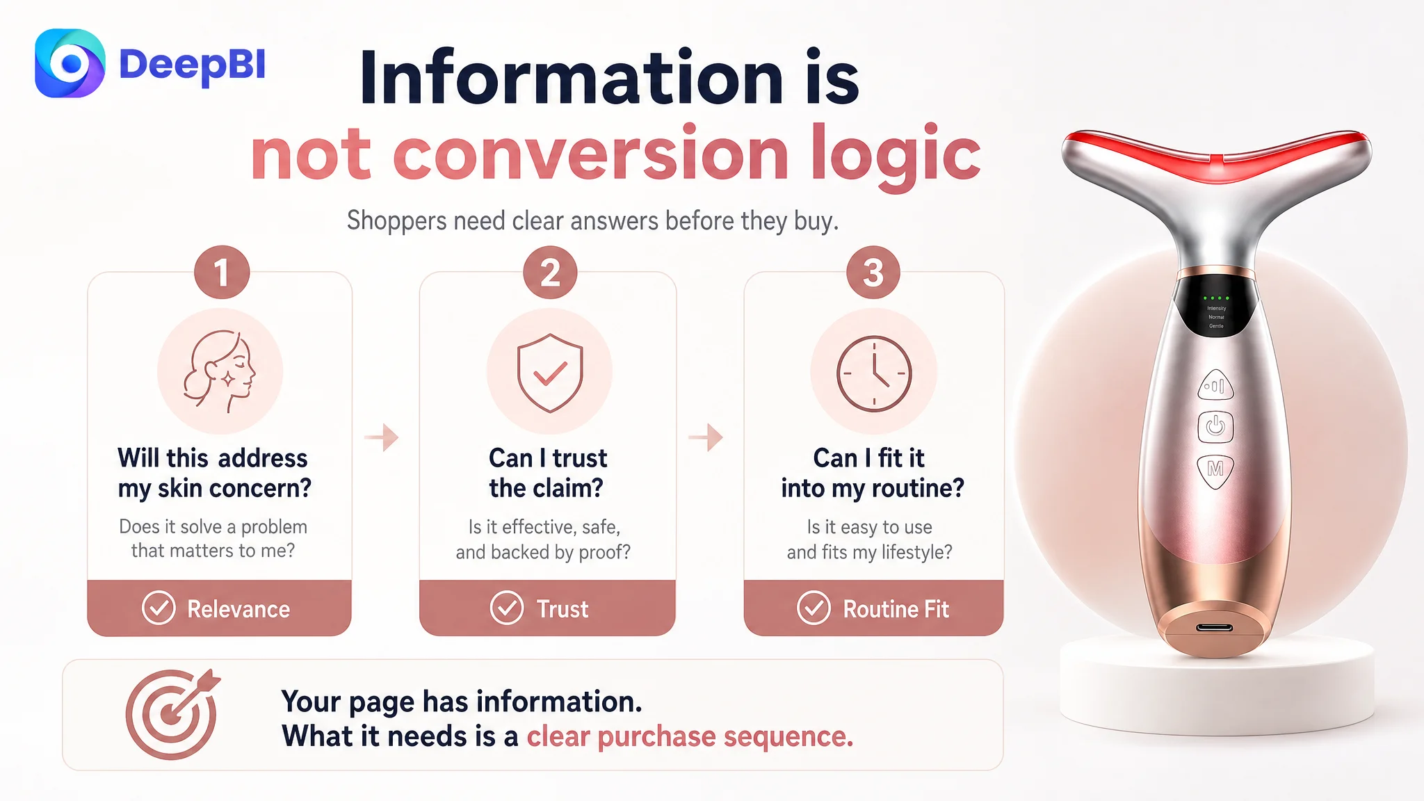
The Page Had Information. The Market Saw a Trust Gap.
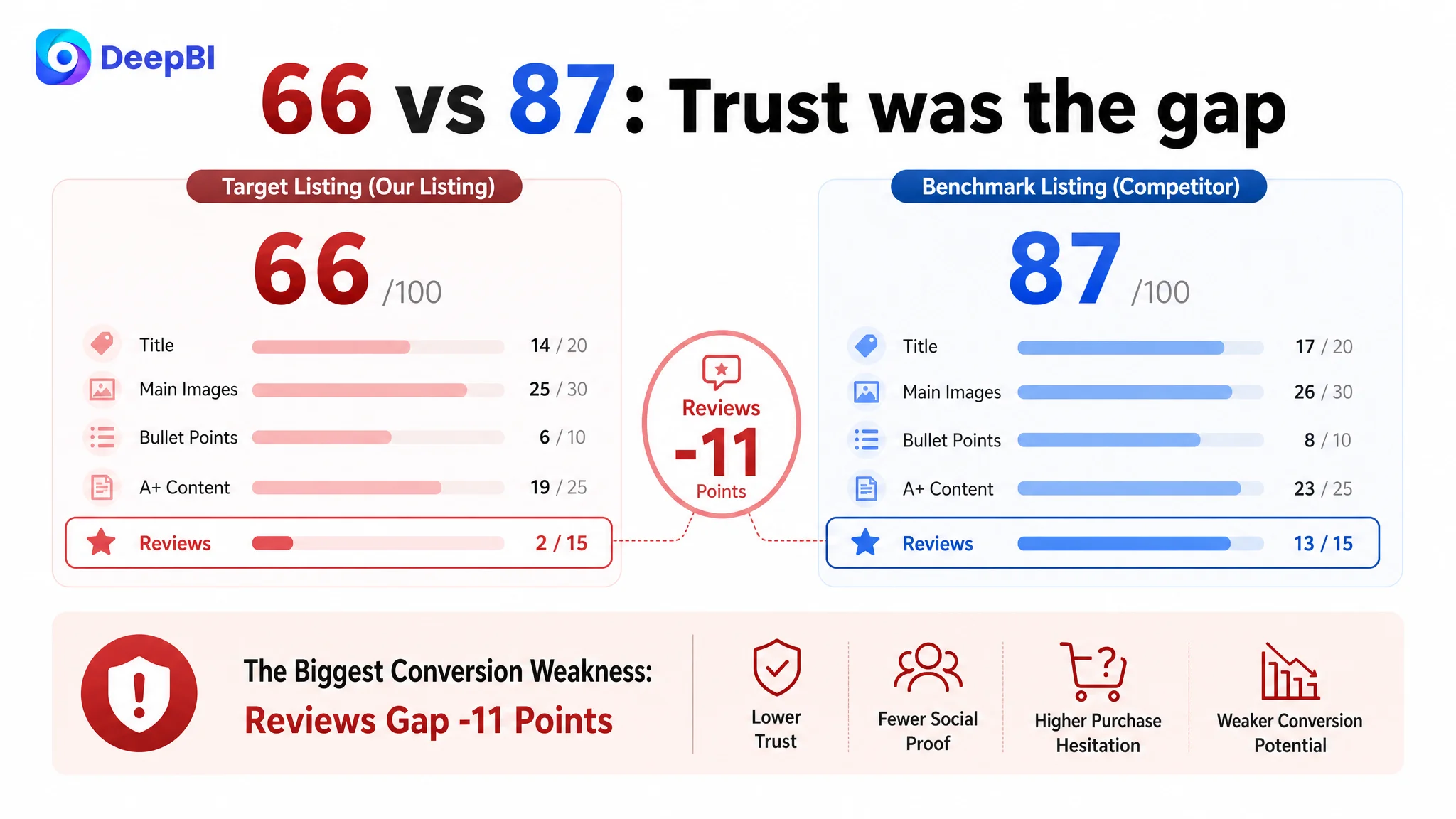
The Listing received an overall score of 66 out of 100, compared with 87 for the benchmark product page.
That 21-point gap was not concentrated in a single visual defect. It appeared across the full Amazon Listing:
- Title: Target Listing: 14/20, Benchmark Listing: 17/20, Gap: -3
- Main images: Target Listing: 25/30, Benchmark Listing: 26/30, Gap: -1
- Bullet points: Target Listing: 6/10, Benchmark Listing: 8/10, Gap: -2
- A+ content: Target Listing: 19/25, Benchmark Listing: 23/25, Gap: -4
- Reviews: Target Listing: 2/15, Benchmark Listing: 13/15, Gap: -11
- Total: Target Listing: 66/100, Benchmark Listing: 87/100, Gap: -21
At first glance, the main image did not appear to be the largest problem. Its score was only one point behind the benchmark. The much larger weaknesses were in reviews and A+ content.
But the score alone did not explain the business problem. The more important finding was how the page handled shopper attention.
The target Listing introduced the product through brand presentation, product naming, technical functions, and gift-oriented visual language. The benchmark Listing introduced a clearer sequence:
skin concern → expected benefit → technical explanation → usage confidence → purchase reassurance
That difference changed the role of every page element. The target Listing had the components of a beauty device page, but those components were not working together as a buying path.
The problem was not that the page lacked information. The problem was that the information arrived in the wrong order.
The Original Direction Focused on Features and Appearance
The customer’s working direction was understandable. A red-light facial massager is a visually complex product with multiple light colors, wavelengths, heat, vibration, modes, and intensity levels. It is natural to assume that shoppers need more specifications before they can make a decision.
That assumption led the page toward:
- LED color and wavelength explanations
- Mode and intensity descriptions
- Safety and operating instructions
- Gift packaging and occasion-based visuals
- General claims about skin appearance
- Product-focused image layouts
The result was a Listing that behaved more like a technical product manual and gift presentation than a conversion-focused Amazon beauty page.
The product was being described through what it contained:
- seven adjustable light modes
- heating
- vibration
- three modes
- four intensity levels
- rechargeable use
- face and neck application
The benchmark page was describing the same category through what shoppers hoped to achieve:
- support for anti-aging routines
- visible skin tightening
- improved contour appearance
- support for acne-prone skin
- brightening and soothing use cases
- a convenient at-home routine
This was the first misdiagnosis. The page was treated as though its main weakness was insufficient feature communication. DeepBI found that the more serious weakness was insufficient translation from feature to buying reason.
The Review Gap Made Every Page Claim Harder to Believe
The review dimension was the clearest commercial constraint.
The target Listing showed:
- 3.5 stars
- 4 total reviews
- no meaningful review content visible on the first page
The comparable benchmark showed:
- 4.3 stars
- 74 total reviews
- stronger social proof and a positive customer-feedback summary
This gap mattered beyond the review section itself.
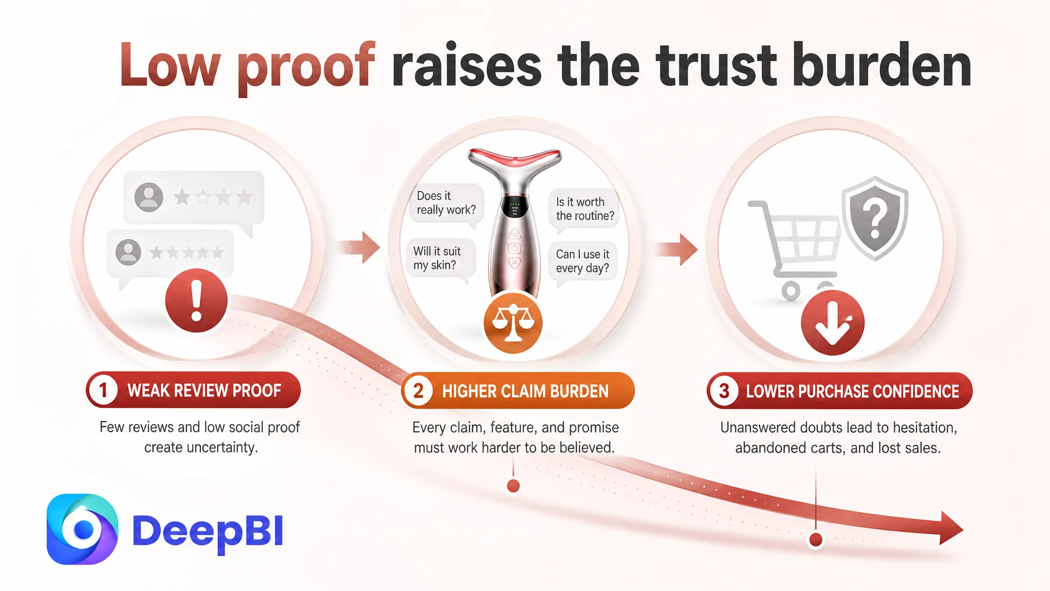
A shopper evaluating a beauty device is not only asking whether the device has seven colors or a heating function. They are also asking whether the promised experience is believable, whether the device is comfortable to use, whether the results are worth the routine, and whether other customers have validated the purchase.
When a page combines a low review count with broad phrases such as “obvious effect,” every other conversion element has to work harder. A stronger title, better image sequence, and clearer bullets can improve understanding, but they cannot fully replace accumulated trust.
The correct business response was not to hide the review weakness behind more decorative content. It was to make every controllable part of the Listing more precise and credible:
- use concrete product specifications where they are supported
- avoid vague outcome language
- explain the role of each function clearly
- provide realistic usage guidance
- answer compatibility and routine questions
- move technical reassurance earlier
- avoid making the customer infer how the product fits their needs
The review gap could not be solved through image polish alone. But the page could stop making that trust gap worse.
The Title Was Giving Search Priority to the Brand Instead of the Product Need
The title score was 14 out of 20, compared with 17 for the benchmark.
The target title placed the brand name first and then described the device through functional language. The benchmark led with the category and high-value search intent:
- 7-color LED red light therapy
- face and neck massager
- anti-aging
- visible skin tightening
- rechargeable
- at-home beauty device
The issue was not simply keyword quantity. It was the relationship between search visibility and shopper interpretation.
The target title made shoppers work to understand:
1. what the product is,
2. what concern it addresses,
3. why it is different,
4. how it fits into an at-home routine.
A stronger Amazon title structure would bring the core category and result-oriented value closer to the front:
Red Light Therapy Facial Massager with Heating and Vibration, 7-Color LED Face and Neck Massager, Anti-Aging Facial Sculptor for Lifting and Firming, Rechargeable At-Home Beauty Device
This structure does more than add terms. It aligns search language with purchase intent.
“Red light therapy facial massager” identifies the category. “Heating and vibration” clarifies the product configuration. “Anti-aging,” “lifting,” and “firming” connect the device to the shopper’s concern. “Rechargeable” and “at-home beauty device” reduce uncertainty about daily use.
The title therefore needed to become a bridge between Amazon search visibility and product-page conversion, not a compressed inventory of functions.
The Main Image Was Recognizable, but It Did Not Create Enough Immediate Relevance
The main image score was 25 out of 30, only slightly below the benchmark. This is important because it shows why isolated scoring can be misleading.
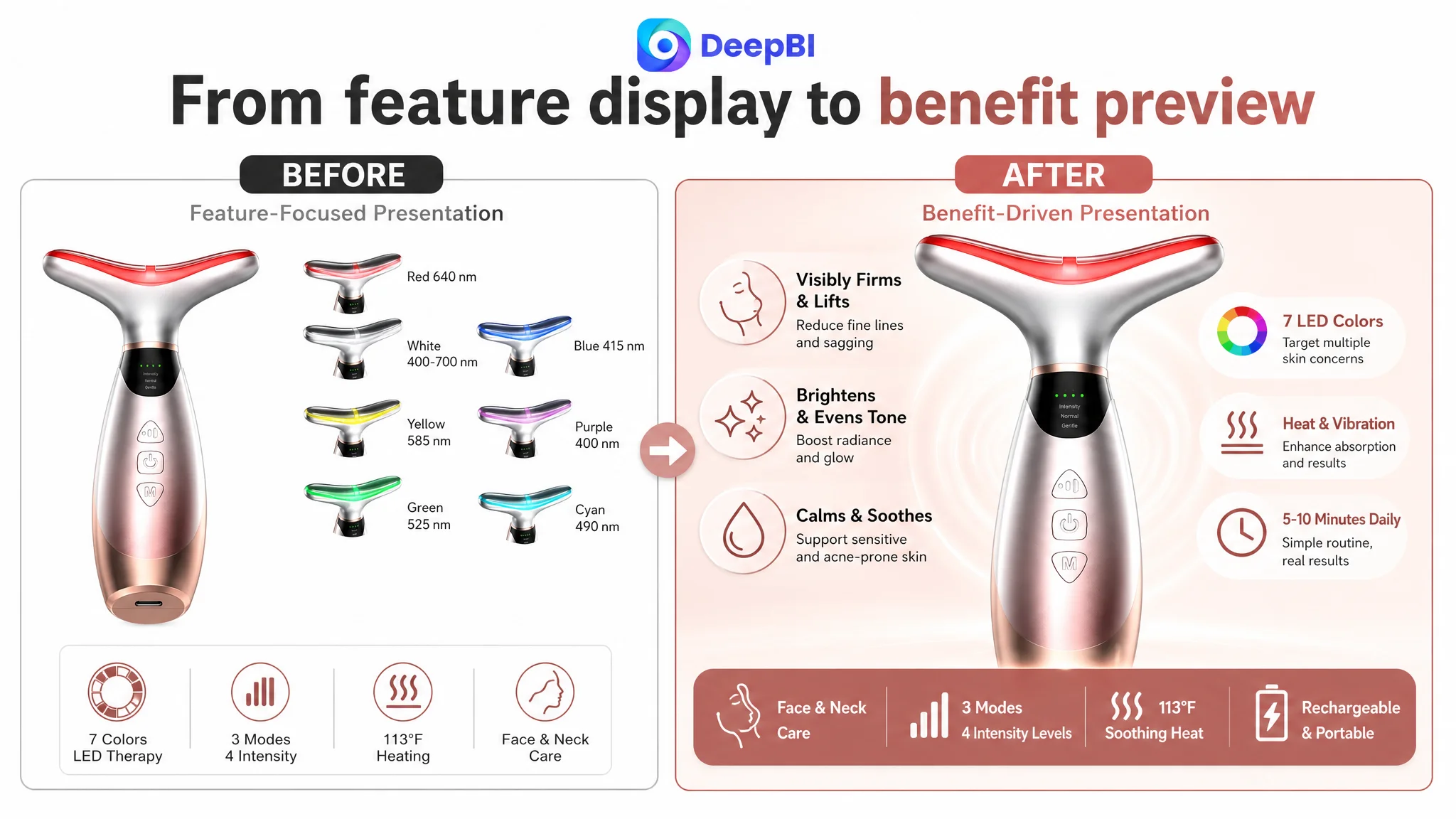
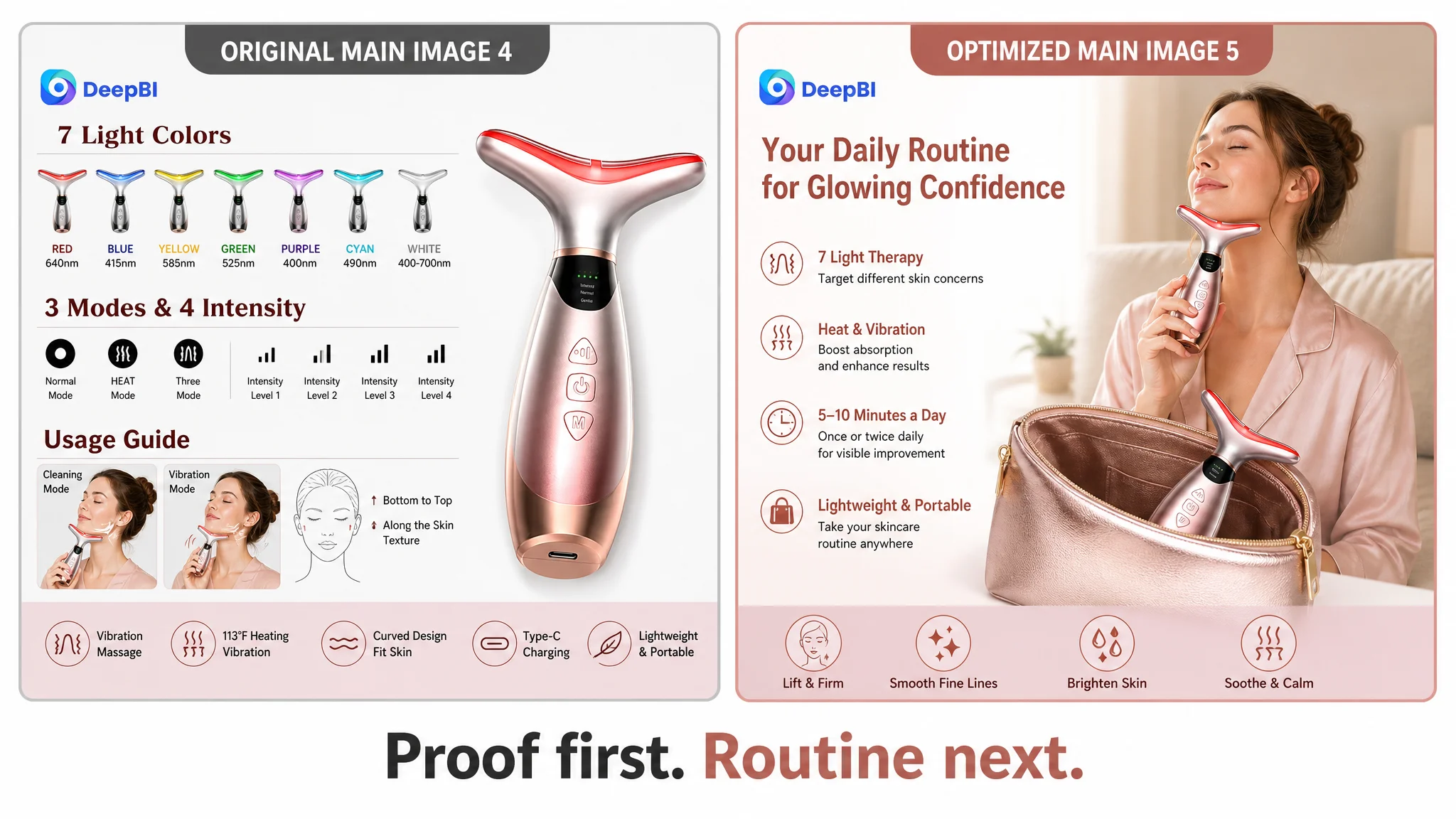
The image was not unusable. It communicated the product and displayed its seven-color capability. The problem was that it spent visual attention on small feature icons and technical presentation without quickly answering the shopper’s first question:
Is this relevant to my anti-aging or skin-firming concern?
The benchmark page used stronger emotional and practical anchors, including at-home spa scenes, visible benefit language, and user-oriented visual framing. Its images made the product easier to imagine as part of a routine.
The recommended shift was not to add more information to the first image. It was to give each image a clearer decision role.
From product recognition to direct benefit preview
The first image should retain accurate product recognition while reducing clutter. The seven small head icons were largely repetitive with later content. Their space could instead support a clearer benefit-oriented presentation around the device.
The visual direction should emphasize:
- face and neck use
- anti-aging positioning
- lifting and firming language where appropriate
- heat and vibration as supporting functions
- a simple, readable hierarchy on mobile screens
From technical explanation to efficacy expectation
The detailed seven-light wavelength graphic was useful, but it appeared too early in the sequence. Technical depth builds credibility only after the shopper has understood why the product may matter.
The before-and-after image, which addressed wrinkles, jawline clarity, and neck appearance, had greater potential as an early trust builder. Moving efficacy-oriented content forward would help the shopper evaluate usefulness before confronting a dense technical chart.
From control-panel explanation to routine confidence
The mode and intensity image focused heavily on how to select functions. It needed to show why those functions mattered and how simply they could fit into daily use.
A stronger image would connect:
- three modes
- four adjustable levels
- heating
- vibration
- the curved massage head
- a five-to-ten-minute routine
The goal was not to make the product appear more complicated. It was to make the routine feel manageable.
From comparison chart to portability
The comparison chart occupied a position that could have answered a more practical objection: Can I use this consistently?
A daily-routine image could show the rechargeable device being used at home, in an office, or while traveling, supported by confirmed details such as:
- lightweight and portable design
- up to two hours of use per full charge
- recommended use once or twice daily
- five to ten minutes per session
The page did not need more abstract persuasion. It needed to reduce the friction between purchase and regular use.
The Bullet Points Listed Specifications Without Completing the Buying Logic
The bullet-point score was 6 out of 10, compared with 8 for the benchmark.
The difference was consistent across all five bullets. The target copy tended to begin with the product’s mechanism. The benchmark began with the customer’s concern and then explained the mechanism as the solution.
The first bullet needed to connect light colors to concerns
A list of wavelengths is informative, but it is not automatically persuasive.
The stronger structure was:
skin concern → corresponding light mode → supporting function → expected appearance benefit
For example, the page could retain confirmed wavelength details while connecting red, blue, yellow, green, purple, cyan, and white light to different skincare needs. The function should not be left as an isolated technical fact.
The shopper should not have to interpret what “640nm” means before understanding why that mode might be relevant.
The second bullet needed to sell the combined experience
The device’s three modes and four intensity levels were presented as controls. They needed to be presented as customization and comfort.
Heat, vibration, and LED light should be described as a coordinated at-home skincare experience, while the copy remains within the product’s supported claims. The page should make the device feel both purposeful and usable, rather than mechanically complex.
The third bullet needed to reduce operational anxiety
Safety language is more useful when it describes what the customer experiences.
The automatic shut-off timer, simplified button operation, charging protection, and recommended usage duration should be organized around:
- worry-free daily use
- simple control
- predictable session length
- manageable routine formation
A specification has more conversion value when it resolves a practical concern.
The fourth bullet needed to make portability concrete
“Portable” is a general adjective. Specific details such as the curved massage head, rechargeable battery, and up to two hours of use create a clearer picture of how the product fits into life.
The shopper can then assess whether the device is suitable for home routines, travel, or short daily sessions.
The fifth bullet should reserve gift messaging for the end
Gift positioning had value, but it was introduced before the page had fully established personal usefulness.
The order should be:
1. Does it address my concern?
2. Do I understand how it works?
3. Is it safe and easy to use?
4. Can I maintain the routine?
5. Would it also make a suitable gift?
Gift language should therefore remain in the final bullet, supported by confirmed points such as packaging, broad skin-type positioning where substantiated, and customer support. It should not replace the core purchase argument.
The bullets did not need more adjectives. They needed a stronger sequence from concern to solution to reassurance.
A+ Content Was Asking Shoppers to Admire Before Asking Them to Believe
The A+ content score was 19 out of 25, compared with 23 for the benchmark.
The target A+ page included several useful modules:
- brand introduction
- gift-box presentation
- seven-color light explanation
- mode and intensity graphics
- effect-oriented content
- skin-layer explanations
- usage scenarios
- before-and-after visuals
- gift occasions
- usage instructions
The issue was not a lack of modules. It was the role assigned to those modules.
The opening visual leaned toward emotional gift presentation and general appearance promises. The benchmark opened with scannable technical confirmation and then built toward efficacy, routine use, and reassurance.
For a shopper who is still uncertain, the first A+ screen should answer:
- What exactly is included?
- What are the main functions?
- How do the light, heat, and vibration features work together?
- What routine is recommended?
- What should the shopper reasonably expect?
The first module needed to establish technical trust
The opening should bring forward confirmed details such as:
- seven adjustable light modes
- heating
- vibration
- three modes
- four adjustable levels
This does not mean turning the A+ page into a manual. It means giving shoppers enough concrete information to believe they are evaluating a real, defined device rather than a general beauty promise.
The light module needed actionable interpretation
Listing wavelengths alone creates technical density without sufficient meaning.
Each light should be connected to its intended skincare concern or routine role, using only supported product information. A shopper should be able to scan the module and understand the difference between the available options without decoding a chart first.
The mode module needed benefit-led naming
Labels such as “Normal” and “HEAT” describe operation but do not communicate purchase value.
The content should explain how different combinations of light, heat, vibration, and intensity support different routine goals. The emphasis should move from “how to switch the device” to “why a shopper would choose this setting.”
The usage module needed a behavioral anchor
The recommendation of five to ten minutes once or twice daily is commercially important because it converts an abstract promise into a routine.
The page should show when and where the device fits:
- a morning skincare routine
- an evening relaxation routine
- face and neck application
- a short session that does not require a salon visit
This is where portability, the curved massage head, and rechargeable use become meaningful rather than decorative details.
The gift module belonged at the end
Gift visuals can support purchase motivation, but only after personal compatibility and product credibility have been established.
The A+ page should first help a shopper decide whether the device is right for them. Only then should it widen the use case to birthdays, anniversaries, holidays, or other gifting occasions.
Why DeepBI Did Not Start With More Ad Tuning
The case material does not provide post-optimization advertising metrics, so it would be inaccurate to claim a specific ACOS reduction, CVR increase, or organic-order recovery.
The decision logic is still clear.
If a product page has a 66/100 Listing score, a substantial A+ gap, a weak review base, and copy that describes functions without clearly translating them into customer outcomes, sending more traffic to the page creates a risk: the seller may spend more to expose the same conversion weakness.
Advertising can increase visibility. It cannot, by itself, supply missing trust, clarify an unclear value proposition, or answer routine and compatibility questions that the product page leaves unresolved.
The correct sequence was therefore:
1. Clarify the product’s search and benefit positioning.
2. Rebuild the title around the category and core use case.
3. Reorder images around relevance, proof, technical confirmation, and routine fit.
4. Rewrite bullets from feature lists into concern-to-solution logic.
5. Restructure A+ content so technical trust and efficacy expectations come before gift presentation.
6. Treat reviews as a material trust constraint rather than a cosmetic page element.
7. Reassess paid traffic only after the page is better prepared to convert it.
Advertising does not only amplify strengths. It can also amplify a Listing’s existing weaknesses.
This was the central operating judgment. The seller did not first need more page visitors. The seller needed a product page that could make better use of each visitor.
The New Optimization Direction Was a Rebuild of Sales Logic
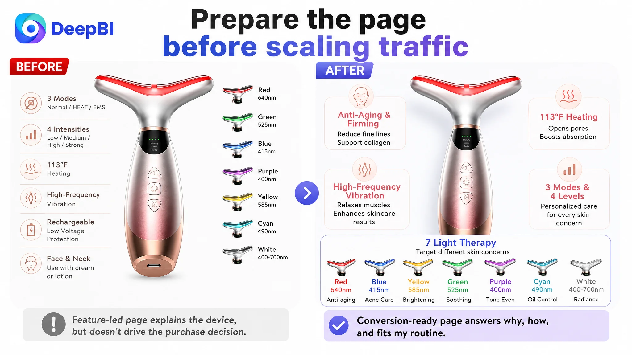
The later direction did not amount to “make the images prettier” or “add more keywords.” It changed the page’s argument.
Before
- Brand and product identity appeared before core search value.
- Technical functions dominated the copy.
- Efficacy proof appeared too late.
- A+ content opened with emotional gift presentation.
- Usage instructions were present but weakly connected to routine formation.
- Broad effect language lacked sufficient specificity.
- Reviews provided limited social proof.
After
- Core category and high-value use cases moved closer to the front.
- The title connected search terms with anti-aging, lifting, firming, and at-home use.
- Main images were assigned clearer roles across benefit preview, efficacy, technical explanation, and portability.
- Bullets connected customer concerns with device functions and practical reassurance.
- A+ content led with technical confirmation and moved gift content later.
- Usage duration and routine frequency were made more visible.
- The page’s claims were expected to remain concrete, supportable, and easier to verify.
The change was not a promise that content alone would overcome the review deficit. It was a way to ensure that every controllable Listing element supported the same commercial message.
What This Amazon Case Changes About the Seller’s Diagnosis
The most important outcome of the diagnosis was a change in understanding.
The page did not have a simple “creative quality” problem. It had a conversion capacity problem.
That distinction matters for Amazon sellers because the same symptoms can lead to very different actions:
- Weak order volume may be blamed on bids when the product page cannot convert.
- High advertising dependence may be treated as a campaign issue when the Listing has not built enough trust.
- A low click-through rate may lead to random image redesign when the title and first visual are not aligned with search intent.
- Low conversion may lead to more feature detail when shoppers actually need proof, clarity, and routine confidence.
- Gift-oriented content may be expanded when the primary shopper has not yet decided whether the product works for them.
DeepBI’s role in this case was not to produce a feature checklist. It was to compare the target Listing with a relevant benchmark across title, main images, bullets, A+ content, and reviews, then identify which gaps were limiting the page’s ability to convert.
That reasoning led to a more disciplined conclusion:
Before scaling Amazon ads, the seller must decide whether the Listing deserves more traffic.
The Practical Lesson for Other Amazon Beauty Sellers
A red-light beauty device can contain plenty of features and still underperform on Amazon.
Seven light colors, multiple wavelengths, heat, vibration, intensity settings, rechargeable use, and gift packaging do not automatically create a persuasive product page. They become commercially useful only when organized around the shopper’s decision process.
For similar Amazon Listings, the questions worth asking are:
- Does the title lead with the product category and the customer’s primary use case?
- Does the first image communicate relevance quickly on mobile?
- Does the second image help the shopper understand expected value?
- Do the bullets begin with concerns rather than specifications?
- Does the A+ page establish technical trust before emotional gifting?
- Are usage duration and routine frequency easy to find?
- Are effect claims specific enough to be credible and supportable?
- Does the review profile create confidence or force every other page element to compensate?
- Is paid traffic being used to scale a proven conversion path, or to test whether the page can convert at all?
The central lesson is not that Amazon ads are unimportant. It is that advertising efficiency depends on what happens after the click.
A stronger Listing does not guarantee a business outcome, and this case material does not include verified post-optimization performance data. What it does show is how a seller can stop treating the page as a collection of isolated assets and start managing it as a connected conversion system.
For this Amazon beauty Listing, the next step was not to add more information. It was to make the existing information answer the buyer’s questions in the right order.