

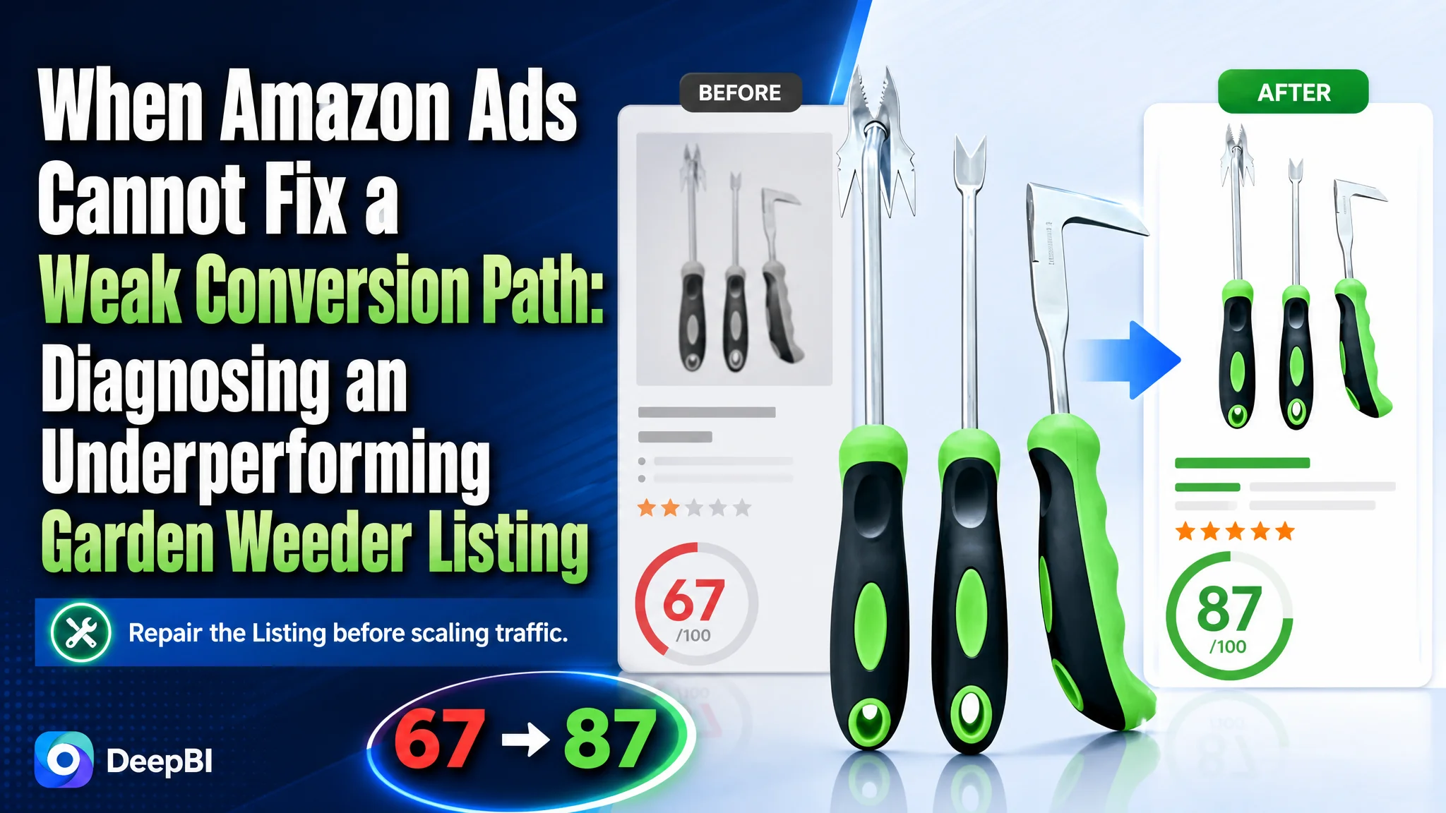
An Amazon seller of a three-piece garden weeding tool set was facing a familiar product-page problem: the Listing contained the expected images, specifications, and usage scenarios, yet it remained materially weaker than a comparable high-performing listing. The customer initially treated the gap as a matter of adding more product information and showing more use cases.
DeepBI found a more fundamental issue. The Amazon Listing was not missing content in a general sense; it was missing a persuasive order of information. The title did not lead with the strongest search and product signals, the images showed outcomes without fully explaining the mechanism, and the bullet points described functions without consistently connecting them to specific gardening problems.
The later optimization therefore focused on rebuilding the page's conversion logic: clarify what each tool solves, explain deep-root removal and leverage, bring technical proof forward, strengthen the main image sequence, and use A+ content to close remaining trust gaps. For other Amazon sellers, the lesson is direct: before increasing Amazon ad traffic, determine whether the product page gives that traffic enough reason to click, trust, and buy.
The Listing Was Not Empty. It Was Underperforming at the Decision Stage.
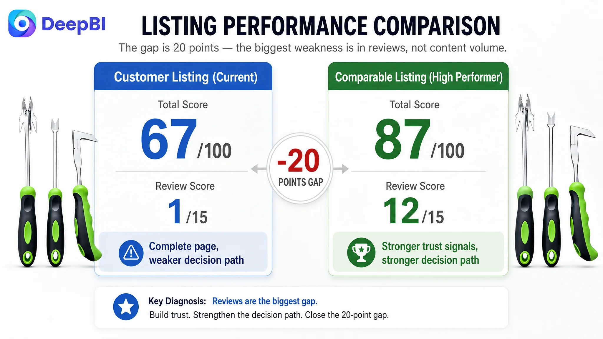
The customer’s Amazon US Listing received a score of 67 out of 100, compared with 87 out of 100 for a comparable high-performing garden weeding tool listing.
At first glance, the gap appeared broad:
- Title: 15 versus 18
- Main image: 24 versus 26
- Bullet points: 6 versus 8
- A+ content: 21 versus 23
- Reviews: 1 versus 12
But the overall score did not tell the most important story by itself.
The page already had product images, tool descriptions, material information, and several gardening scenes. The problem was that these elements were not working together as a progressive buying argument.
The Listing showed the tools.
It described the tools.
It illustrated several use cases.
What it did not do strongly enough was answer the buyer’s practical questions in the right order:
- Which tool should solve my specific weeding problem?
- Can it reach deep roots or hard, compacted soil?
- Why should I trust this tool to work better than a cheaper alternative?
- How does the design reduce effort?
- Is the material durable enough for repeated outdoor use?
- Why is this set worth choosing as a complete solution?
The central problem was not a lack of page content. It was a lack of conversion capacity within the content that already existed.
That distinction matters on Amazon. A product page can appear complete while still losing the decision because its information is presented as a collection of features rather than as a sequence of answers.
The Initial Direction Focused on More Information
The customer’s existing Listing followed a common optimization pattern.
The main images covered product quantity, dimensions, scenarios, and general details. The bullet points introduced the set, described material and comfort, explained individual functions, and ended with storage. The A+ content showed the product, several weeding situations, deep-root removal, precision weeding, and broader applications.
Nothing was obviously irrelevant.
That made the problem harder to identify.
When a page already includes the usual modules, teams often assume that the next improvement should be:
- Add another scene
- Add more specifications
- Repeat the core functions more clearly
- Make the images more attractive
- Show the result more dramatically
- Continue adjusting Amazon ads to find better traffic
These actions can create activity without resolving the underlying bottleneck.
The customer’s page was leaning toward feature coverage. The stronger comparable Listing was leaning toward decision guidance.
That difference appeared across every major content layer.
A Stronger Competitor Was Not Just Showing Tools. It Was Explaining Why They Work.
The comparable Listing used a more deliberate structure.
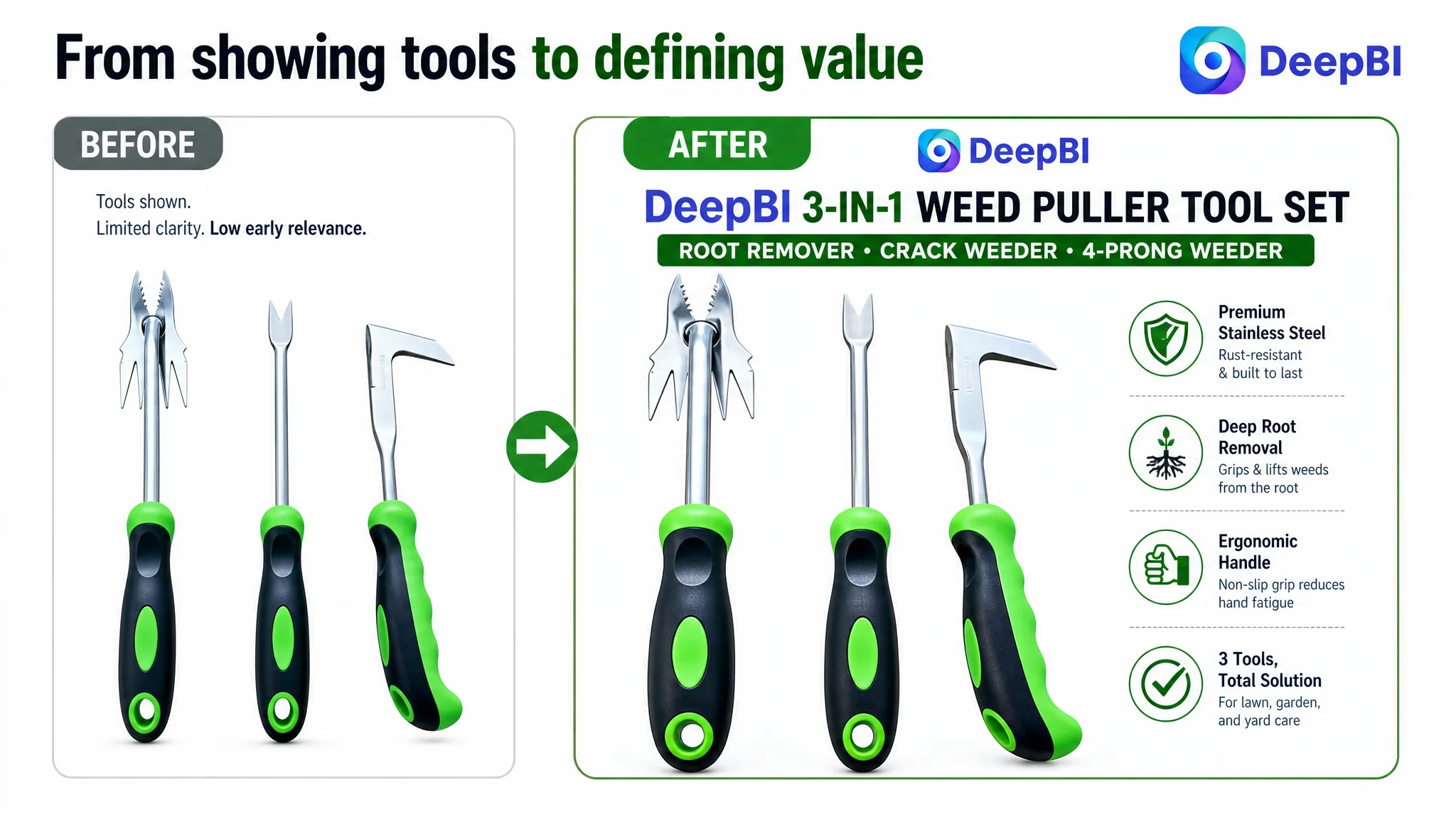
Its title led with the core “weed puller” search concept and included specific tool dimensions. Its images used a combination of structure breakdowns, action demonstrations, and result-oriented explanations. Its bullet points gave each tool an independent problem-to-solution role. Its A+ content moved from brand and user context into mechanism, material, usability, and gift or household scenarios.
The customer’s Listing was more likely to describe the tool set as a whole, then distribute information across general functions and scenes.
That difference weakened the page in three connected ways.
The title did not establish the strongest product identity
The customer’s title began with a general phrase equivalent to “3 Piece Garden Weeder Tool Set.” The comparable Listing placed a more direct “Weed Puller Tool Set” concept closer to the front and added concrete dimensions for the individual tools.
The issue was not simply keyword count.
The title was less effective at combining:
- Core category language
- Specific tool types
- Concrete dimensions
- Material and handle information
- Relevant lawn, garden, and yard use cases
The recommended direction was to place the core product identity earlier, then clarify the set composition with terms such as:
- Garden weeder tool set
- Weed puller
- Crack weeder
- Root remover
- Stainless steel
- Ergonomic handle
This creates a clearer relationship between what the product is, what is included, and where it is used.
The title should not try to carry every possible selling point. Its job is to make the product recognizable and relevant before the shopper reaches the rest of the page.
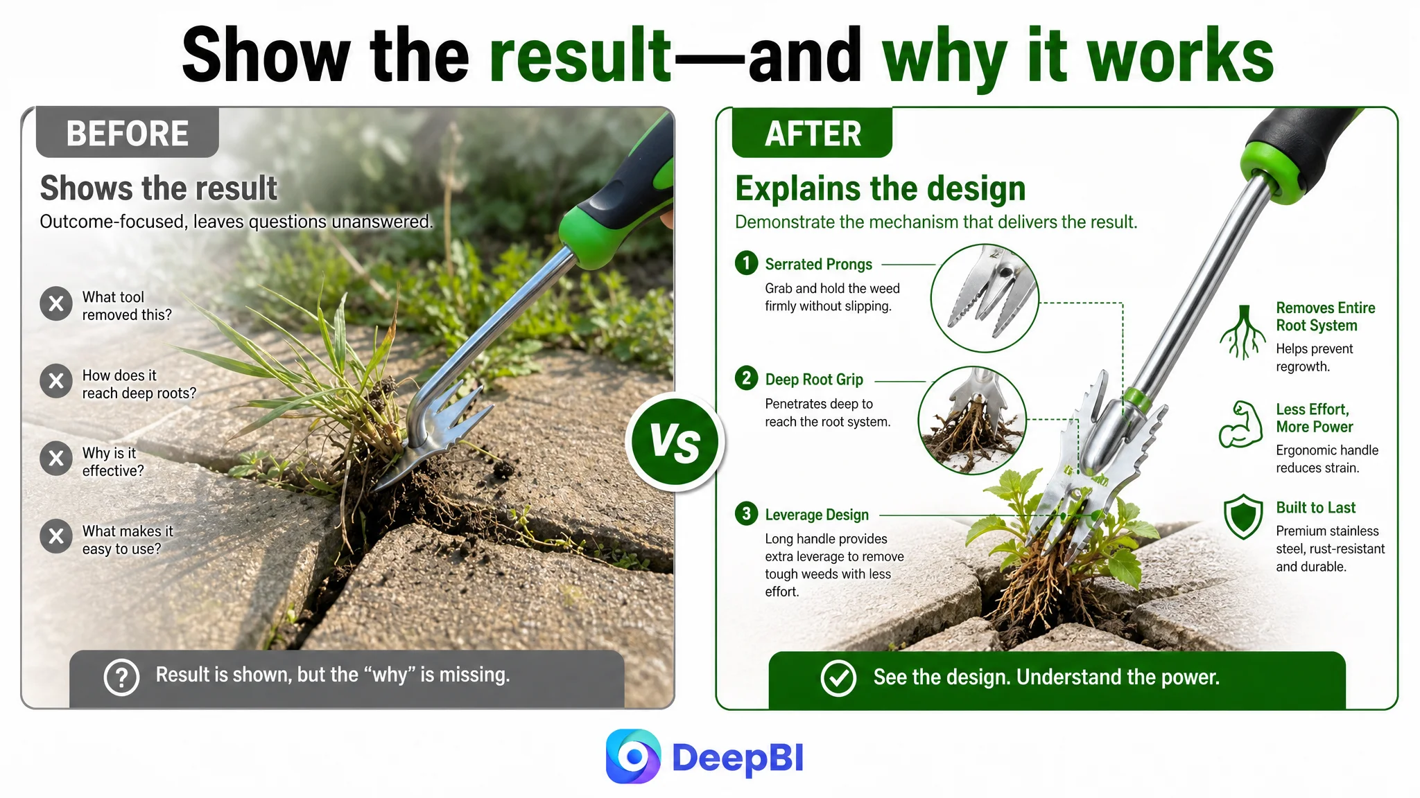
The main images showed results without fully proving the mechanism
The existing image sequence covered useful content, but several images relied on the shopper to infer why the tools would work.
For example, an image could show precise weeding in a crevice. That demonstrates an outcome, but it may not explain why the tool is suited to the task. A shopper may still ask:
- Is the edge sharp enough?
- How does the tool grip the weed?
- What part of the head creates leverage?
- Is the product substantial enough for compacted soil?
- Is the handle secure during repeated use?
The comparable Listing used more visible technical explanation. It showed structure, action, and outcome as connected layers.
DeepBI’s recommendation was not to make the image sequence more decorative. It was to make it more explanatory.
The revised image logic would:
1. Present the three-tool set clearly, with the functional heads easy to distinguish.
2. Add verified specifications, including weight where available, rather than relying on length alone.
3. Explain how the pronged or sharp-edged designs address specific weeding tasks.
4. Connect each tool with a recognizable problem such as deep roots, lawn soil, paver gaps, or driveway cracks.
5. Use later images to reinforce material, handle texture, storage, and durability instead of repeating broad lifestyle scenes.
This is a change from “show more” to “prove more.”
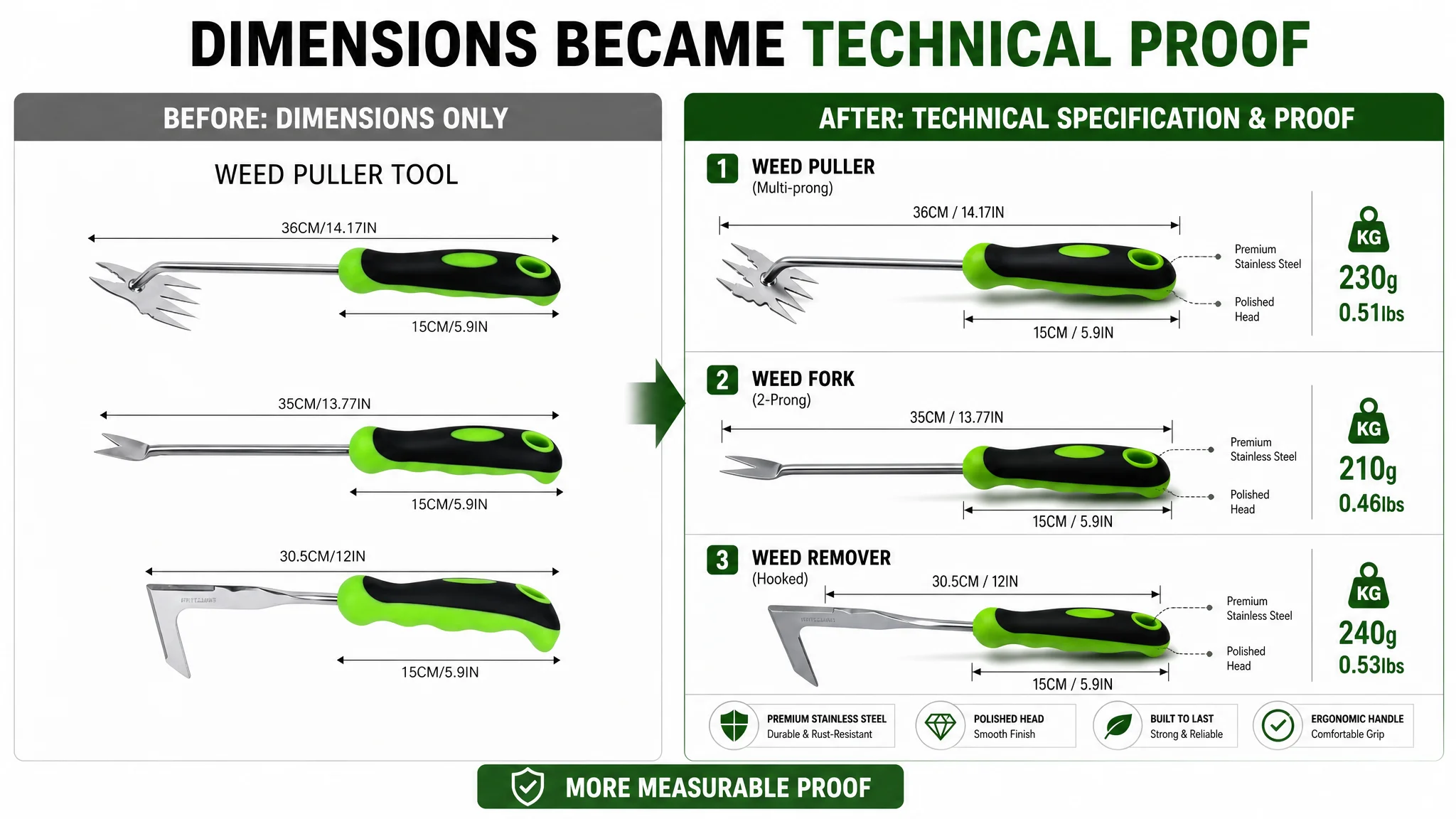
On an Amazon product page, an image is not doing its full job when it only displays the result. It must also help the shopper understand the reason behind the result.
The Bullet Points Had Functions, but Not a Complete Buying Logic
The bullet points showed the same structural weakness in written form.
The existing copy described the set, material, comfort, individual tool functions, and storage. However, the explanations were relatively broad and sometimes combined multiple tools in one description.
The comparable Listing gave each important tool a sharper role:
- The multi-prong tool addressed deep-root removal and soil penetration.
- The L-shaped tool addressed cracks, edges, and hard-to-reach corners.
- The V-shaped tool explained how its fork and base helped pry out roots.
- The final bullet expanded the purchase context to gardeners, first-time users, specific weeds, and gifting.
The recommended rewrite followed a clearer pattern:
Gardening problem → tool design → practical outcome
Deep roots required a stronger functional explanation
The four-prong weeder should not be described only as part of a multi-function set. Its role is more specific: helping penetrate hard or compacted soil, hook stubborn roots, and support soil cultivation.
The relevant benefit is not merely that the tool has four prongs.
The benefit is that the structure helps the user address a difficult task with less repeated digging and pulling.
Crevices required precision, not just versatility
The L-shaped tool was positioned for driveway cracks, paver edges, and other narrow spaces. These are more persuasive than a generic claim that the product is “versatile” because they allow shoppers to recognize their own problem.
A clear description of the sharp or serrated edge also gives the buyer a reason to believe the tool is designed for these locations rather than being a general-purpose hand tool placed into a scene.
The V-shaped tool needed an explanation of leverage
The V-shaped root remover had a potentially strong selling point, but the page did not fully explain the logic behind it.
The curved base, fork tip, and handle should be presented as parts of one use process: position the tool around the root, use the contact point for leverage, and pull the weed from the base.
The ergonomic TPR handle can support this explanation by addressing grip security and hand fatigue. It should not be presented as an empty comfort slogan.
The final bullet should extend the buying reason
The existing final point ended mainly with storage and portability. The revised direction expanded the context to lawns, flower beds, farms, and common invasive weeds such as dandelions and thistles, while retaining the built-in hanging hole and portable design.
This does not mean adding unrelated emotional language.
It means showing that the product can serve multiple realistic purchase situations, including use as a practical gardening gift.
The Most Serious Trust Gap Was Visible in the Review Layer
The review comparison was the largest numerical difference in the diagnosis.
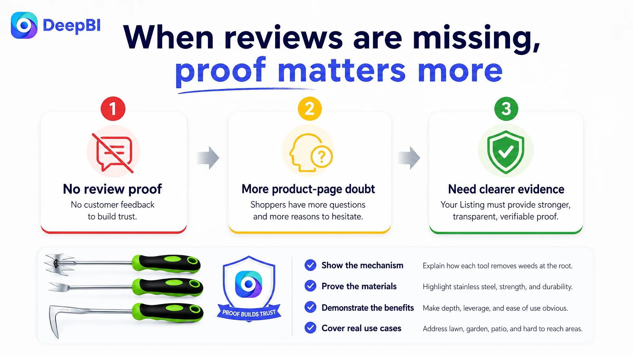
The target Listing had no rating data and no reviews, while the comparable Listing displayed 4.6 stars and 50 reviews, including image and video content. The score difference was 1 versus 12, producing an 11-point gap.
This is not a page-copy problem that can be solved by changing one sentence.
Reviews are accumulated market evidence. A new or unreviewed product cannot instantly reproduce the credibility of an established competitor.
But the absence of reviews changes the responsibility of the rest of the Listing.
When the page has no review proof, the title, images, bullets, and A+ modules must work harder to provide clear, verifiable reasons for confidence. The product page cannot afford vague descriptions, repeated scenes, or unsupported claims.
That is why the diagnosis did not treat the review gap as a reason to stop optimizing the page. It treated it as a reason to remove avoidable trust weaknesses elsewhere.
The page needed to be especially transparent about:
- Tool composition
- Dimensions and verified weight
- Stainless steel construction
- Handle texture and grip
- Sharp or pronged working ends
- Storage design
- The specific task each tool is meant to address
The goal was not to imitate the competitor’s review volume.
The goal was to ensure that the product page did not create additional doubt while the review base was still developing.
DeepBI’s Judgment: Repair the Listing Before Scaling the Traffic
The most important decision was not which image to redesign first.
It was deciding what should come first.
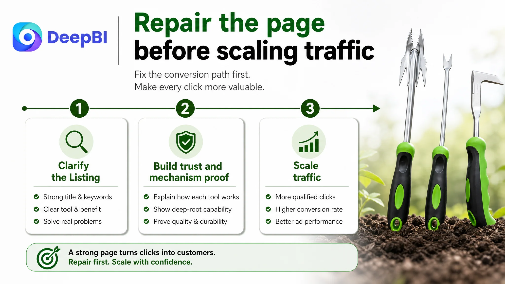
If Amazon ads send more shoppers to a page that explains its value weakly, the additional traffic may simply expose the same conversion leak at a higher cost. Advertising can create impressions and clicks, but it cannot independently supply product-page clarity, mechanism proof, or accumulated customer trust.
That is why continuing to tune campaigns first would have been an incomplete response to this Listing’s condition.
Advertising does not only amplify a product’s strengths. It can also amplify the page’s existing weaknesses.
The score pattern supported a page-level diagnosis:
- The title was usable but less precise than the benchmark.
- The main images displayed the product but did not communicate enough technical proof.
- The bullet points covered functions without consistently building a problem-to-solution path.
- The A+ content presented scenarios but did not build trust progressively.
- The review layer left a major credibility gap.
The immediate business risk was not simply expensive traffic. It was paying to create more opportunities for shoppers to encounter an underdeveloped decision path.
The priority therefore became:
1. Clarify the product’s search and category identity.
2. Make the tool-specific value understandable earlier.
3. Prove how the tools address deep roots, compacted soil, and narrow gaps.
4. Reinforce material and grip quality with close-up evidence.
5. Use A+ content to move the shopper from recognition to validation.
6. Only then evaluate whether additional Amazon ad traffic can be converted more efficiently.
This is not an argument that ads are unimportant.
It is an argument that ad optimization should not be asked to compensate for a Listing conversion problem.
The A+ Content Needed a Progressive Trust Chain
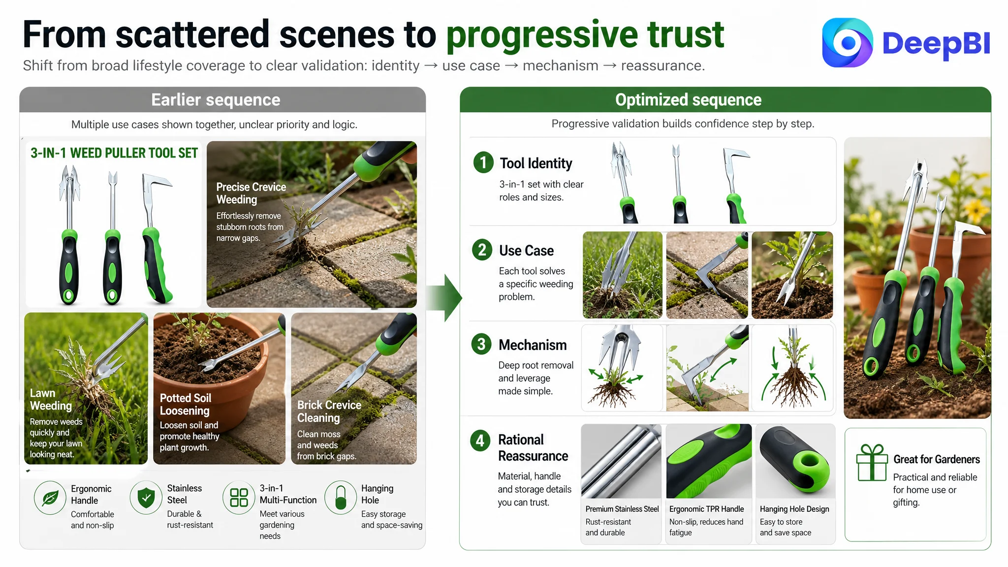
The existing A+ structure began with a general product introduction, moved into crack weeding and deep-root scenarios, showed multi-scene applications, and ended without a distinct practicality or emotional extension module.
The recommendation was to reorder the page around the shopper’s decision process.
Start with the complete solution, not a repeated product summary
The opening module should quickly establish the three-tool structure and the material basis of the set. It should not merely repeat what the main image already shows.
The shopper should understand that the set combines:
- An L-shaped crack weeder
- A V-shaped root remover
- A four-prong weeder
- Stainless steel construction
- An ergonomic handle design
Address the highest-friction problem earlier
Deep-root removal and hard, compacted soil were more important trust questions than narrow crack weeding at the beginning of the A+ sequence.
The V-shaped and four-prong tools should therefore appear earlier, with visual evidence of penetration, hooking, and root removal. This gives the page a stronger reason to believe the set can solve difficult garden problems.
Replace unsupported effort claims with visible logic
A phrase such as “deep roots, no effort” creates a claim without sufficient proof.
The improved direction was to show the V-shaped tool, its contact point, and its ergonomic TPR handle in a way that makes the leverage and grip logic understandable. Where a benefit cannot be verified, the page should use careful wording such as “labor-saving design” only when supported by the product’s actual construction.
The standard is not to make the claim sound stronger.
The standard is to make the reason behind the claim more credible.
Move from generic scenes to material and construction proof
The four-prong tool did not need another broad action shot that looked similar to the previous module. It needed a close-up of the stainless steel surface, working edges, and handle texture.
These details address practical questions that lifestyle images often leave unanswered:
- Does the tool look durable?
- Is the working end clearly formed?
- Does the handle appear secure?
- Is the design suitable for repeated use?
- Can the tools be stored conveniently?
Close with practicality and broader use
A dedicated module for the hanging hole and anti-slip handle would resolve remaining rational concerns. A later scenario or gift-oriented module could then extend the purchase context after the functional case had already been established.
This creates a more natural progression:
What the set includes → what problem it solves → why the design works → whether the materials are trustworthy → where it can be used or gifted
The Optimization Was About Rebuilding the Page’s Sales Logic
The proposed changes were not a collection of isolated copy edits or image beautification tasks.
They were connected by one commercial principle: each Listing element should perform a distinct role in helping the shopper move forward.
The title should win relevance and establish product identity.
The first images should make the set easy to understand and provide early technical confidence.
The middle images should explain the mechanisms behind deep-root removal, crack weeding, and soil cultivation.
The bullet points should assign each tool a clear problem-solving role.
The A+ page should answer deeper questions about material, grip, leverage, storage, and realistic use contexts.
The review layer should be recognized as a major trust constraint rather than hidden behind more promotional language.
DeepBI’s value in this case was not that it produced a higher score or a longer list of recommendations. Its value was in connecting the score differences to a decision order.
A 20-point total gap could have led to scattered improvements across every module.
Instead, the diagnosis identified the more important issue: the page had enough basic information to attract a relevant shopper, but not enough structured proof to move that shopper toward purchase.
What Other Amazon Sellers Can Take From This Case
A garden tool Listing is a straightforward example of a problem that appears across Amazon categories.
A page may have:
- A complete image set
- Several product specifications
- Five bullet points
- A+ content
- Multiple lifestyle scenes
- A reasonable product title
And still fail to convert efficiently because the content does not answer the buyer’s questions in sequence.
The practical lessons are clear.
Do not confuse completeness with conversion readiness
A filled-out Listing is not automatically a persuasive Listing. Count the unanswered questions, not only the number of modules.
Do not treat Amazon ads as an independent conversion solution
If traffic reaches a page that does not establish relevance, trust, and product logic, more traffic can increase waste rather than solve the business problem.
Make every tool or component earn its place
For multi-product sets, each component should have a defined use case and benefit. A list of included items is weaker than a clear explanation of what each item helps the buyer accomplish.
Replace generic claims with visible proof
“Durable,” “easy to use,” and “versatile” are not enough on their own. Show the material, structure, grip, dimensions, and operating logic that make those claims credible.
Treat review scarcity as a reason for greater clarity
A new Amazon Listing cannot immediately match a competitor’s review history. It can, however, avoid adding uncertainty through vague copy, repeated images, or unsupported promises.
Fix the page before asking ads to scale it
The right question is not only whether the campaign can bring in more clicks. It is whether the Listing is ready to convert those clicks into useful business outcomes.
The Page Had to Become More Understandable Before It Could Become More Efficient
The case did not end with a claimed CVR increase, ACOS reduction, or organic-order recovery. The available material supports a diagnosis and an optimization direction, not verified post-implementation performance data.
That limitation is important.
The business change at this stage was a change in operating judgment:
- From adding information to organizing persuasion
- From showing general use cases to proving tool-specific outcomes
- From treating the page as complete to identifying its trust gaps
- From tuning traffic first to repairing conversion capacity first
- From relying on visual preference to using benchmark-based evidence
For this Amazon garden weeder Listing, the next step was not to make the page louder.
It was to make the page more credible, more specific, and easier to understand.
Once the title, images, bullet points, and A+ content began working as one decision path, Amazon ad traffic would have a stronger chance to become productive traffic rather than simply more exposure to the same unresolved weakness.