

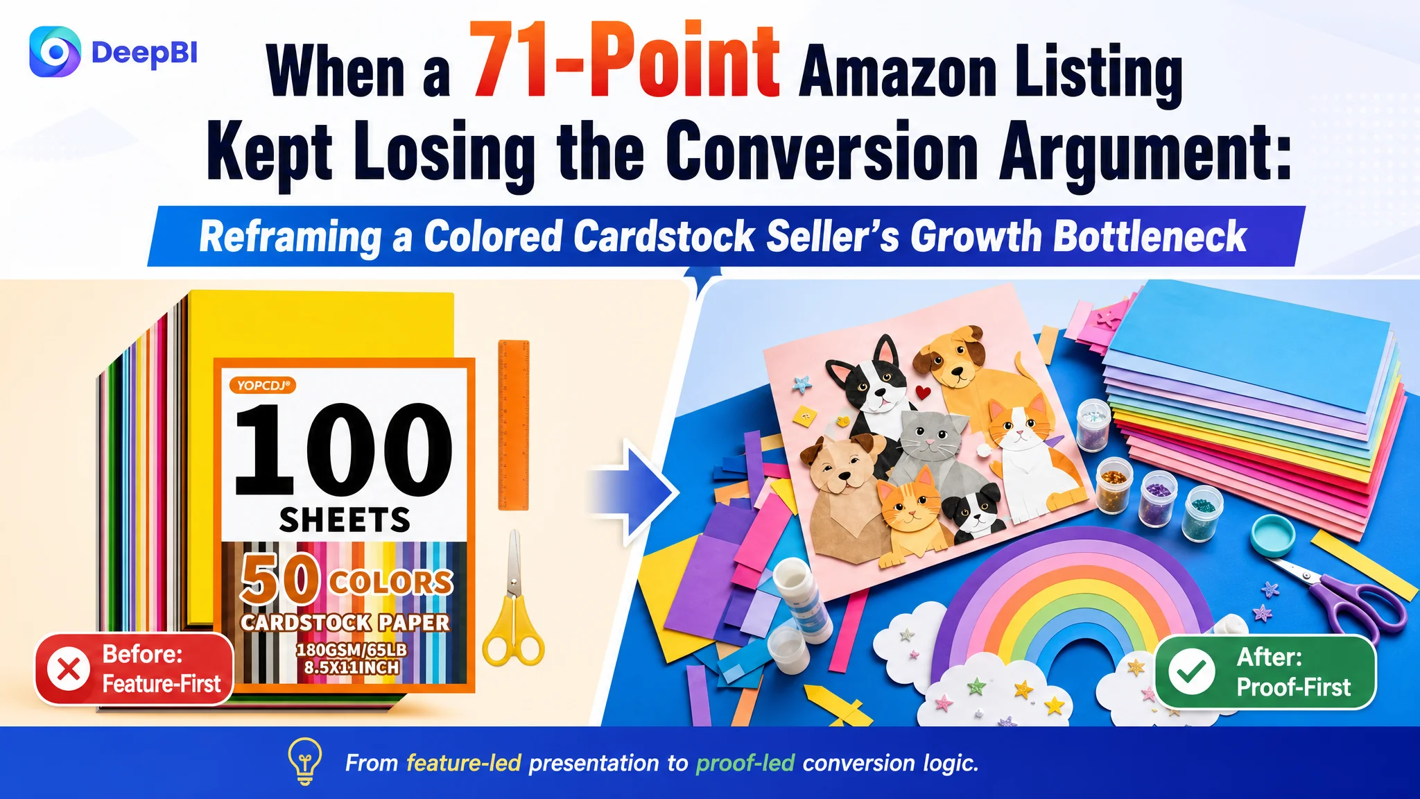
An Amazon seller in the US colored cardstock and craft-paper category was not facing a simple traffic problem. The product page offered 100 sheets in 50 assorted colors, printer compatibility, and an all-in-one set with scissors and a ruler, yet its Listing competitiveness score was 71/100 compared with 87/100 for a comparable high-performing Listing.
The customer’s initial instinct was to improve the visible selling points: add more product information, emphasize the included tools, and continue presenting more crafting scenarios. That direction was understandable, but it treated the Listing as a collection of features rather than as a decision path for Amazon shoppers.
DeepBI ultimately found that the larger issue was not a lack of content. It was a lack of priority. The page was asking buyers to notice accessories and creative possibilities before proving the paper’s core value: quantity, color range, weight, printability, durability, and the absence of white edges after cutting or folding. The later optimization therefore focused on rebuilding the page around the paper itself, while moving quality proof and technical reassurance earlier in the customer journey.
For other Amazon sellers, the case offers a practical warning: when paid or organic traffic reaches a product page, more traffic does not automatically create more orders. Before adjusting traffic further, sellers need to determine whether the Amazon Listing gives shoppers enough evidence to trust the product and understand why it deserves the click.
The Listing Did Not Look Empty. It Looked Misprioritized.
At first glance, this was not a weak product page with no usable material.
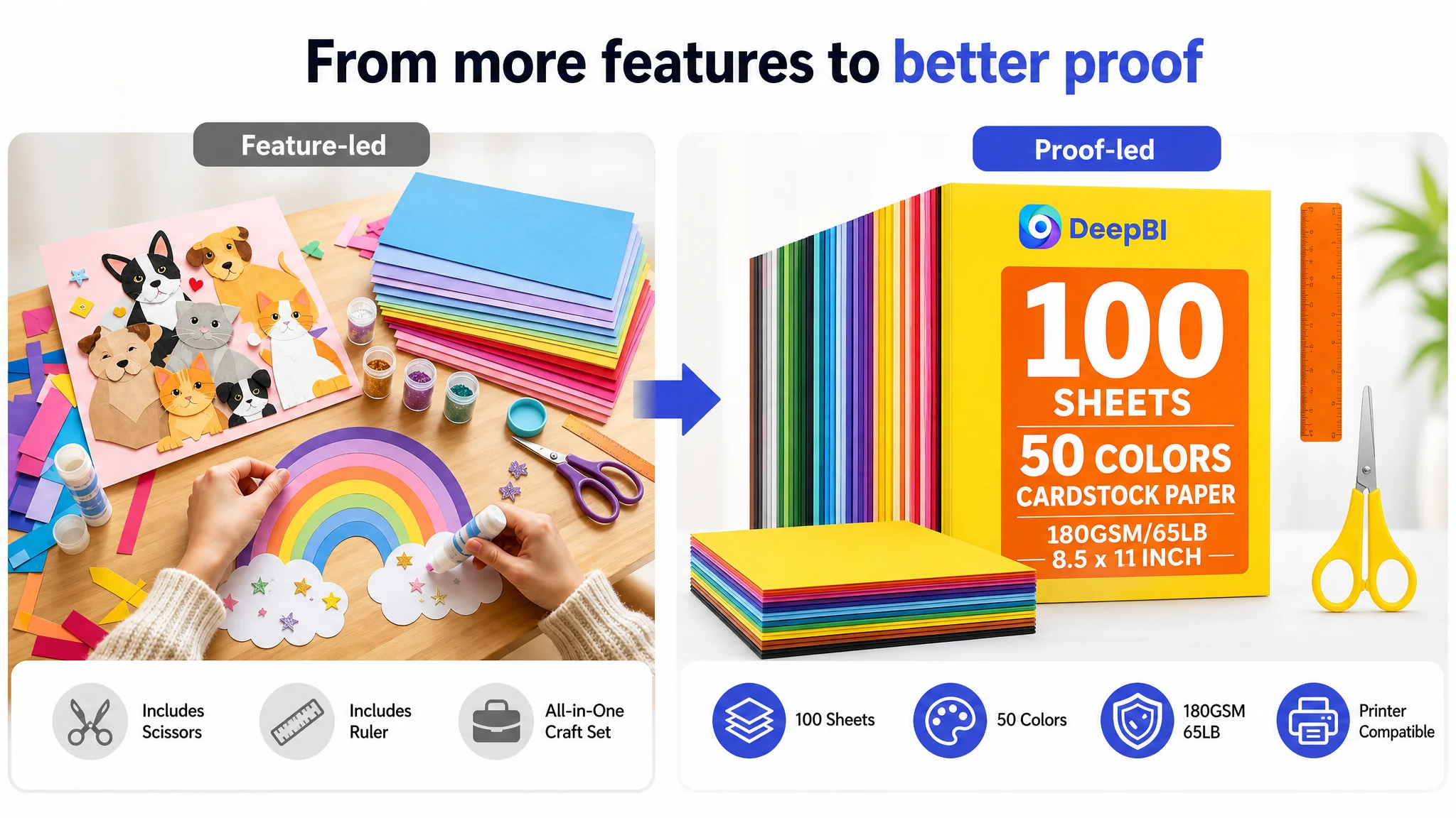
The Listing already communicated several tangible advantages:
- 100 sheets of 8.5 x 11 inch colored cardstock
- 50 assorted colors
- 180GSM/65LB paper
- Compatibility with most inkjet and laser printers
- Full-core dyeing with no white edges
- Included scissors and a ruler
- Applications across card making, school projects, decorations, origami, scrapbooking, and other crafts
The problem was that these advantages were not presented in the order shoppers needed to evaluate them.
The page gave meaningful space to the complete craft set, accessories, and visual project ideas. But the most important purchase questions for cardstock appeared less decisively:
- How many sheets are included?
- How broad and reliable is the color selection?
- Is the paper thick enough for the intended project?
- Will printed colors appear clearly?
- Will cutting or folding reveal a white core?
- Is the paper suitable for both classroom and home use?
These are not secondary questions. They define whether the buyer sees the product as dependable cardstock or merely as a bundle of craft supplies.
The Listing had information. What it lacked was a clear order of proof.
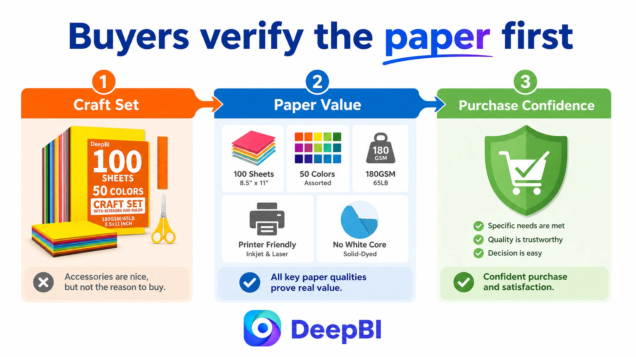
The Customer Was Looking at the Set. Buyers Were Evaluating the Paper.
The original direction placed strong emphasis on the all-in-one nature of the product. Scissors and a ruler made the bundle feel convenient, and that convenience could appeal to shoppers looking for an immediate craft solution.
But the accessories were not the central reason to buy this product.
A buyer searching for colored cardstock is likely comparing paper quantity, color variety, weight, printer performance, and finished-result quality before deciding whether the included tools matter. When accessories appear too early in the persuasion path, they can unintentionally weaken the product’s category identity.
The product begins to look like a general craft kit rather than a substantial cardstock pack.
That distinction matters on Amazon. Search relevance is established through the title and keyword structure, but conversion confidence is built through the product page. If the page does not quickly validate the product’s primary category promise, advertising or organic visibility may bring shoppers to a decision environment that still feels uncertain.
The customer’s original diagnosis was therefore incomplete. The issue was not that the Listing needed more features. It needed a sharper answer to the question:
What is the buyer actually trying to verify before purchasing?
The Score Difference Revealed Where the Pressure Was Concentrated
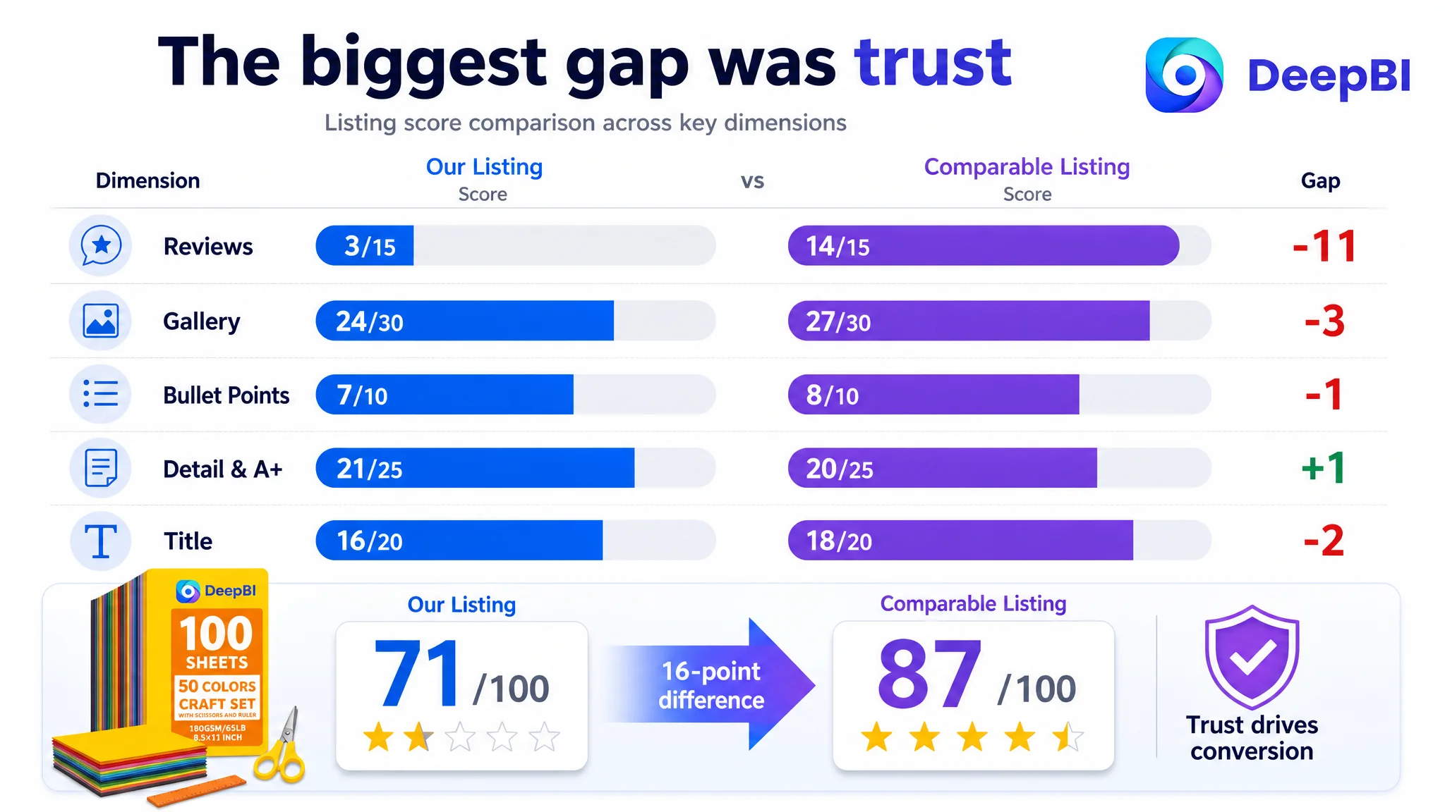
DeepBI’s comparison did not treat the page as one undifferentiated creative asset. It separated the Listing into five practical dimensions and compared each one with a relevant market benchmark.
- Title: Customer Listing: 16/20, Comparable Listing: 18/20, Gap: -2
- Main image and gallery: Customer Listing: 24/30, Comparable Listing: 27/30, Gap: -3
- Bullet points: Customer Listing: 7/10, Comparable Listing: 8/10, Gap: -1
- Detail and A+ content: Customer Listing: 21/25, Comparable Listing: 20/25, Gap: +1
- Reviews: Customer Listing: 3/15, Comparable Listing: 14/15, Gap: -11
- Total: Customer Listing: 71/100, Comparable Listing: 87/100, Gap: -16
The most visible conclusion was the 16-point overall gap.
The more important conclusion was that the gap was not evenly distributed.
The title, gallery, and bullet points were behind the benchmark, but the largest weakness was the review dimension. The customer Listing had no valid rating or review count displayed on the homepage, while the comparable Listing showed a 4.8-star rating supported by 723 reviews, including detailed image and video feedback.
That did not mean the team could solve the business problem through Listing copy alone. Reviews are not a substitute for product-page logic, and a content revision cannot manufacture social proof. But the review gap made every other uncertainty more expensive.
When a buyer is already unsure whether the paper is thick, color-consistent, printer-friendly, or durable, the absence of reviews removes one of the main ways that uncertainty is normally reduced.
This is where DeepBI’s diagnosis became more useful than a general “make the Listing more attractive” recommendation. It distinguished between:
- A structural weakness the team could address immediately
- A trust deficit that needed to be recognized as a separate commercial risk
- Content that was present but placed too late or expressed too generally
The Title Was Carrying Too Many Different Jobs
The customer title included the craft-set concept and the included scissors and ruler. That created a differentiating angle, but it also made the title longer and less focused on the paper’s primary identity.
The comparable title placed the core search and decision terms closer together:
- Colored cardstock
- Construction paper card stock
- Printer paper
- 180GSM/65LB
- School supplies
- Party decorations
The customer title covered several relevant use cases, including scrapbooking, card making, DIY crafts, and decorations. However, the structure was less direct because the accessory description interrupted the main product phrase.
The issue was not simply keyword quantity. It was the relationship between search language and purchase clarity.
A stronger title direction would establish the paper first, then preserve the set advantage as a supporting differentiator:
100 Sheets 8.5 x 11 inch Colored Cardstock, 50 Assorted Colors, 180GSM/65LB Construction Paper Card Stock for Printing, Card Making, DIY Crafts, School Supplies and Party Decorations, with Scissors and Ruler
The precise final wording would still require Amazon compliance and character-limit review. The strategic judgment, however, was clear:
The title should make the shopper understand the primary product before introducing the bundle.
This helps the Listing compete for relevant Amazon searches while reducing the risk that the product appears to be an accessory-led craft kit.
The Gallery Needed to Prove Quality Earlier
The gallery contained useful visual assets, but the sequence did not fully match the buyer’s decision process.
One of the strongest quality messages—thick and sturdy paper with a solid-dyed core and no white edges—was positioned too late. The customer’s gallery also introduced craft scenes before fully proving color range, paper robustness, and print suitability.
That sequence created a problem of misplaced reassurance.
A craft scene can create emotional interest, but it does not answer whether the paper will hold its shape, print cleanly, or retain consistent color after cutting. Those questions should be addressed before the page asks the shopper to imagine advanced creative projects.
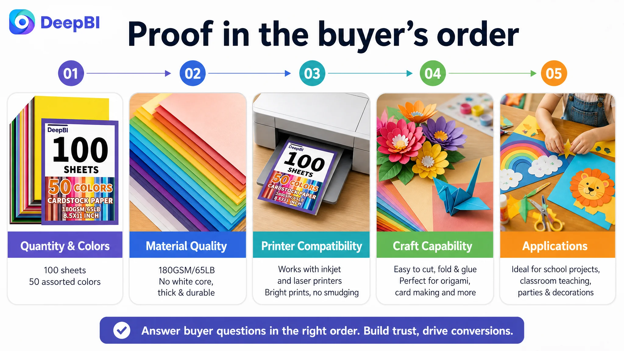
DeepBI’s recommended gallery logic was closer to a proof sequence:
1. Establish the quantity, color count, dimensions, weight, and included tools.
2. Show the complete color range in a systematic, easy-to-check format.
3. Prove the 180GSM weight, sturdy feel, and no-white-core construction.
4. Reintroduce the all-in-one craft-set convenience.
5. Demonstrate printing and broader project applications.
This was not a request to make the images more decorative. It was a change in their commercial roles.
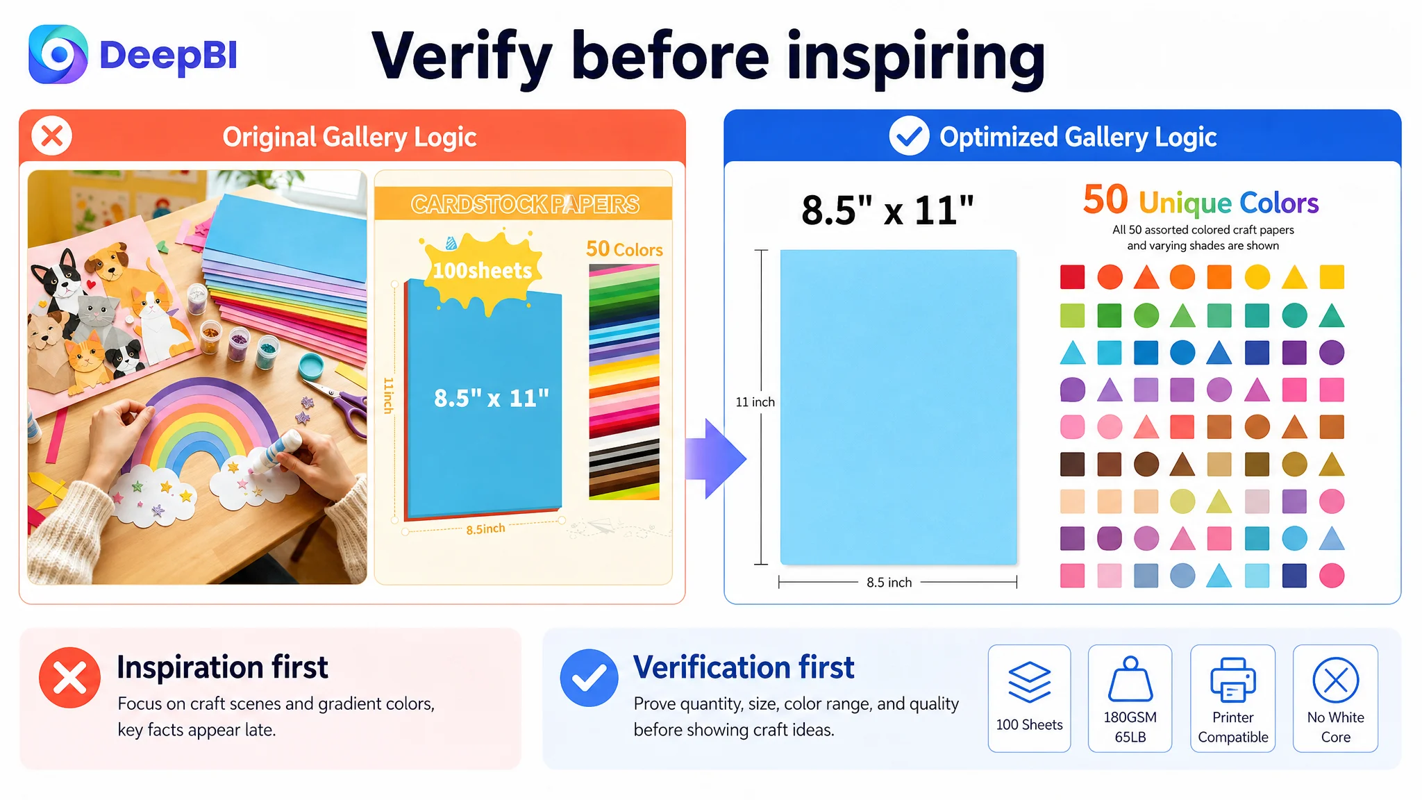
The early images should answer practical doubts
A color gradient can suggest variety, but it does not make all 50 colors easy to verify. A structured color grid or swatch matrix would give buyers a more transparent view of the assortment.
Similarly, a general crafting scene may show possibility, but a close-up of a folded, cut, punched, or torn edge can show the product’s physical boundary more convincingly.
The quality proof should not wait until the end
The “no white core” benefit is especially relevant to cardstock buyers because white edges can make finished projects look inconsistent or unfinished.
Moving this proof forward would allow the Listing to answer a high-value concern before shifting into broader lifestyle and application imagery.
The gallery did not need more imagination first. It needed stronger verification first.
The Bullet Points Listed Features but Did Not Build a Buying Logic
The customer’s bullet points covered the right general territory, but their order and expression were less persuasive than the benchmark.
The first bullet began with the set contents. The comparable Listing began with color variety, which directly appealed to shoppers looking for creative range.
The customer’s material description included paper specifications and printer compatibility, but it did not fully connect those specifications to practical outcomes such as sharp color, reduced ink bleeding, and dependable handling.
The application bullets also tended to list possible uses. The benchmark used more outcome-oriented language around creative projects, education, and practical use.
DeepBI’s suggested structure followed a clearer progression:
Color range before accessory convenience
Lead with the 50-color assortment and then explain that the scissors and ruler make the set convenient for immediate projects.
Paper quality connected to use
Present 180GSM, acid-free material, smooth finish, and printer compatibility as reasons the paper is dependable for classroom and home projects—not as isolated specifications.
No-white-core construction as a visible result
Explain that the color continues through the core, so folding, cutting, punching, or tearing does not expose white edges.
Applications described as finished outcomes
Instead of only naming categories, show what the paper helps create: greeting cards, invitations, party banners, cake toppers, gift tags, origami, rolled paper flowers, and educational props.
Education and festive use as audience expansion
Teachers, parents, students, artists, and DIY enthusiasts represent distinct use contexts. Bringing those audiences into the final bullets could expand relevance without losing the paper’s primary identity.
The central improvement was not more adjectives. It was a shift from what the product contains to why each characteristic matters to the buyer.
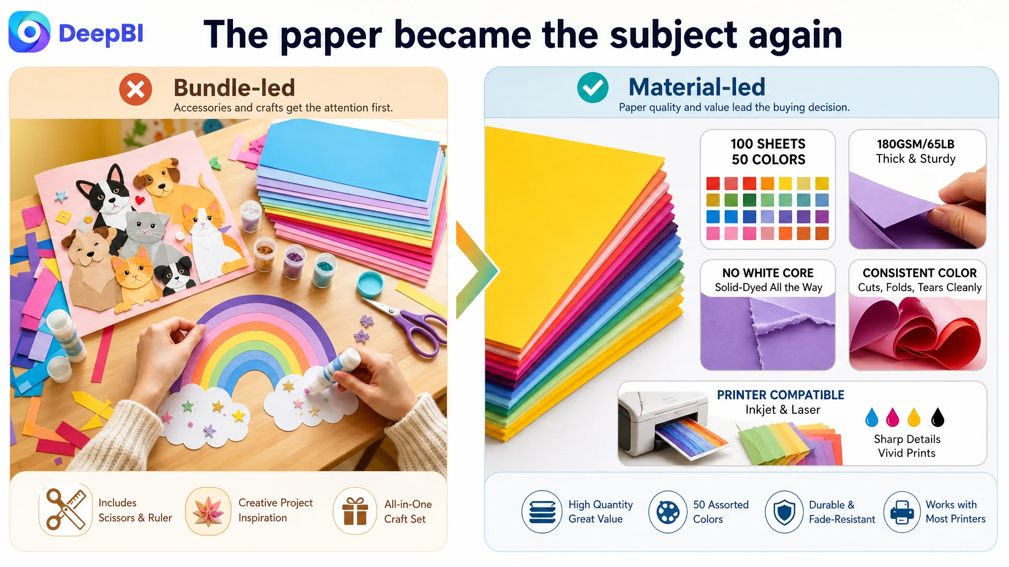
The A+ Content Was Stronger Than the Rest of the Page—but Still Out of Sequence
The detail and A+ dimension scored 21/25, slightly above the comparable Listing’s 20/25. This is an important part of the diagnosis because it prevents a simplistic conclusion that every part of the page was underperforming.
The customer’s A+ content had several strengths:
- Real user-operation imagery in the “Easy to Use,” “Measure,” and “Fold” section
- High-saturation photographs of finished crafts
- Clear application labels such as party, festival, wedding, and teaching
- Visual evidence of complex handmade results
Compared with the benchmark, the customer’s A+ content could even be more convincing in some areas because it used actual demonstrations rather than static illustrations.
But a strong module can still be placed in the wrong role.
The early A+ sections focused on general crafting and the included tools before fully validating the paper specifications. Other sections spent valuable space on scissors and ruler use rather than reinforcing the paper’s core performance.
The recommendation was to redesign the A+ sequence around the product’s main commercial argument:
1. Verify 100 sheets and 50 colors.
2. Prove 180GSM construction and no-white-core quality.
3. Show the full palette systematically.
4. Explain inkjet and laser printer compatibility.
5. Connect the paper to classroom and educational use.
6. Demonstrate complex folded and cut results.
7. Provide printing and handling guidance to reduce technical hesitation.
This approach preserved the customer’s strongest visual materials while changing what each module was responsible for.
The paper needed to become the subject again
The accessories could remain part of the offer, but they should not occupy the early and middle persuasion path.
The page had to answer the primary material questions before presenting secondary convenience.
Complex finished projects could serve as quality evidence
The original flowers, animals, and other three-dimensional crafts were valuable. Their role should shift from generic inspiration to physical capability proof.
If the paper can support intricate folding and manipulation, those finished objects demonstrate durability and performance more effectively than abstract icons or general claims.
Printing proof belonged earlier
Printer compatibility was a rational decision boundary, especially for buyers purchasing cardstock for school materials, invitations, or printed projects. It should appear shortly after material verification rather than near the end of the page.
DeepBI Did Not Recommend More Ad Tuning First
The case material does not provide post-optimization advertising metrics such as CTR, CVR, ACOS, TACOS, or organic-order recovery. It would therefore be misleading to claim that ad efficiency improved or that sales increased after the changes.
What can be established is the decision logic.
If Amazon ads or organic search bring shoppers to a page that has not yet proven its core product value, additional traffic may expose the page’s conversion weaknesses more quickly. More impressions do not repair uncertainty about product quality. More clicks do not compensate for missing trust. Advertising can amplify a Listing’s strengths, but it can also amplify a poorly ordered buying argument.
For this Listing, the priority was not to keep changing bids or campaign structure without first addressing the page’s conversion capacity.
The sequence was:
1. Identify whether the product page could explain and prove its core value.
2. Repair the title, gallery, bullets, and A+ information order.
3. Treat the review gap as an independent trust risk rather than hiding it behind creative changes.
4. Only then evaluate whether additional traffic could be converted efficiently.
This is the point where DeepBI’s role was not to produce more assets for their own sake. It was to determine which problem deserved attention first.
Before scaling traffic, the team had to make sure the page was ready to receive it.
The Customer’s Understanding Had to Shift From “More Features” to “Better Proof”
The initial direction was not irrational. The product did have scissors and a ruler. It did have many possible applications. It did have visually attractive craft examples.
But those elements were not equally important at every stage of the buyer journey.
The deeper lesson was that Listing optimization is not a contest to display the greatest number of features. It is the process of removing the most important purchase uncertainties in the right order.
For this colored cardstock Listing, that meant:
- Establishing the paper category before the accessory bundle
- Making 100 sheets and 50 colors easy to verify
- Showing 180GSM/65LB as a practical quality signal
- Proving the no-white-core construction visually
- Presenting printer compatibility before general inspiration
- Turning finished crafts into evidence of capability
- Treating the absence of reviews as a serious trust limitation
- Keeping the page grounded in what the product can actually support
DeepBI’s comparison made those priorities visible by connecting the score gaps to specific buyer questions rather than treating the score as a final verdict.
What Amazon Sellers Can Take From This Case
A Listing can have a good product, attractive imagery, relevant keywords, and substantial content—and still lose conversion capacity because the page makes shoppers verify the wrong things first.
For Amazon sellers, several principles stand out.
A lower total score does not tell the whole story
The overall 71/100 score mattered, but the distribution mattered more. The -11 review gap carried a different business implication from the -2 title gap or -3 gallery gap. Each weakness required a different response.
A strong A+ page cannot fully compensate for weak early proof
The customer’s detail content was comparatively strong. That did not remove the need to improve the title, gallery sequence, and bullet-point logic. Buyers often form their first judgment before reaching the deepest page modules.
Accessories should support category identity, not replace it
Scissors and a ruler helped differentiate the offer, but the product still needed to be understood first as colored cardstock with specific paper benefits.
Visual quality must be tied to a decision
A beautiful craft image may create interest. A clear no-white-core close-up, color grid, or printer-compatibility explanation can remove a purchase objection. Both have value, but they serve different moments.
Advertising efficiency begins with Listing conversion capacity
Ads may create visibility, but the product page determines whether that visibility becomes useful commercial traffic. When the page is not ready, further traffic optimization can hide the root cause rather than solve it.
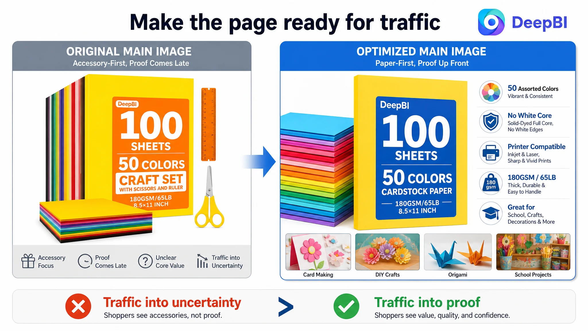
The Real Optimization Was a Change in Order
This case was not about replacing every image, rewriting every line, or adding more creative decoration.
It was about changing the order in which the Amazon Listing made its case.
The product page needed to move from:
Craft set → accessories → general applications → late quality proof
to:
Paper quantity and color range → material quality → printer compatibility → craft capability → broader applications
That sequence better matched the questions a cardstock buyer was likely to ask.
No unsupported post-change performance numbers are available in the case material, so the final business result should be described carefully. The confirmed change was in operating judgment: the team moved away from treating the Listing as an accessory-rich craft bundle and toward presenting it as a verifiable, high-utility cardstock product.
That reframing reduced the risk of sending more Amazon traffic into a page whose strongest proof appeared too late.
And it established a more durable principle for future optimization:
The best Listing is not the one that says the most. It is the one that proves the right thing before the shopper has to ask.