

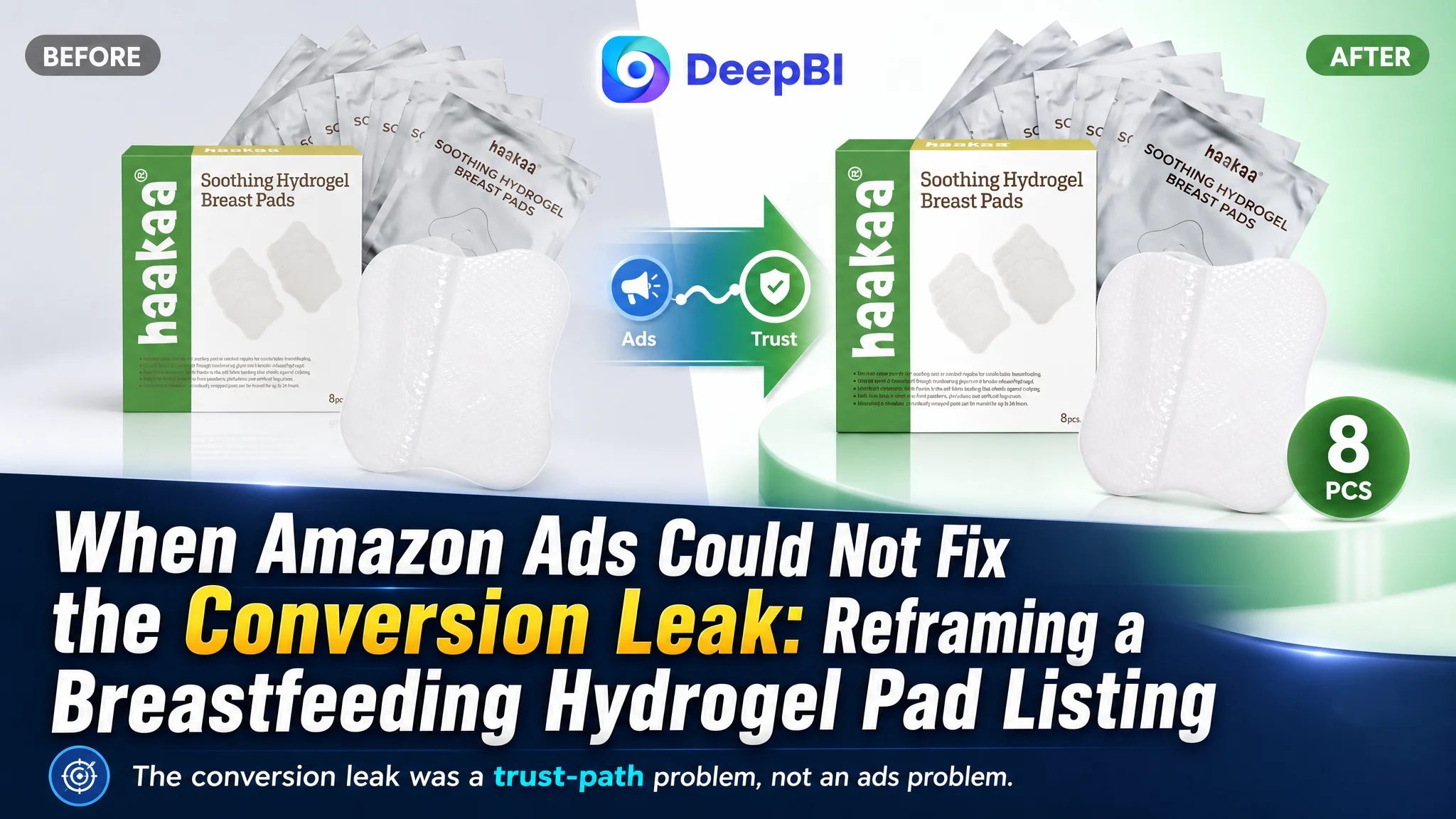
The customer was an Amazon seller in the US marketplace, operating a Listing for hydrogel nipple pads designed for breastfeeding and pumping. The store had a recognizable product, an eight-piece pack, and several functional claims around cooling relief, protection, and reuse. Yet the product page was not creating enough confidence to turn shopper attention into orders.
The initial optimization direction treated the problem as a collection of isolated content weaknesses: make the images more attractive, repeat the cooling benefit more clearly, add more product details, and explain usage more fully. DeepBI’s diagnosis showed that this approach was incomplete. The larger issue was the Listing’s conversion capacity: the title, images, bullet points, A+ content, and review layer were not working together as a persuasive decision path.
The later optimization therefore focused less on adding more claims and more on sequencing the reasons to buy. The Amazon product page needed to establish immediate relief, explain the healing and protection logic, reduce safety concerns, clarify reuse, and create stronger trust before the seller invested further in traffic. For other Amazon sellers, the case offers a practical warning: when paid traffic fails to produce enough orders, the answer may not be another campaign adjustment. The page may be asking shoppers to make a high-trust decision without giving them enough evidence.
The Listing Did Not Have a Traffic Problem Alone
At first glance, this looked like a familiar Amazon performance challenge. A seller has a product in a competitive category, the page receives exposure, but orders do not follow at the expected rate. The natural reaction is to look toward Amazon ads:
- Are the bids too high?
- Are the keywords too broad?
- Is the campaign structure inefficient?
- Should the seller add more long-tail terms?
- Would more traffic solve the problem?
Those questions matter, but they assume the product page can already convert qualified shoppers.
For a breastfeeding-related product, that assumption is risky. The shopper is not evaluating appearance alone. She is likely considering discomfort, skin sensitivity, hygiene, product fit, ease of reuse, and whether the product feels trustworthy enough for a personal and sensitive use case.
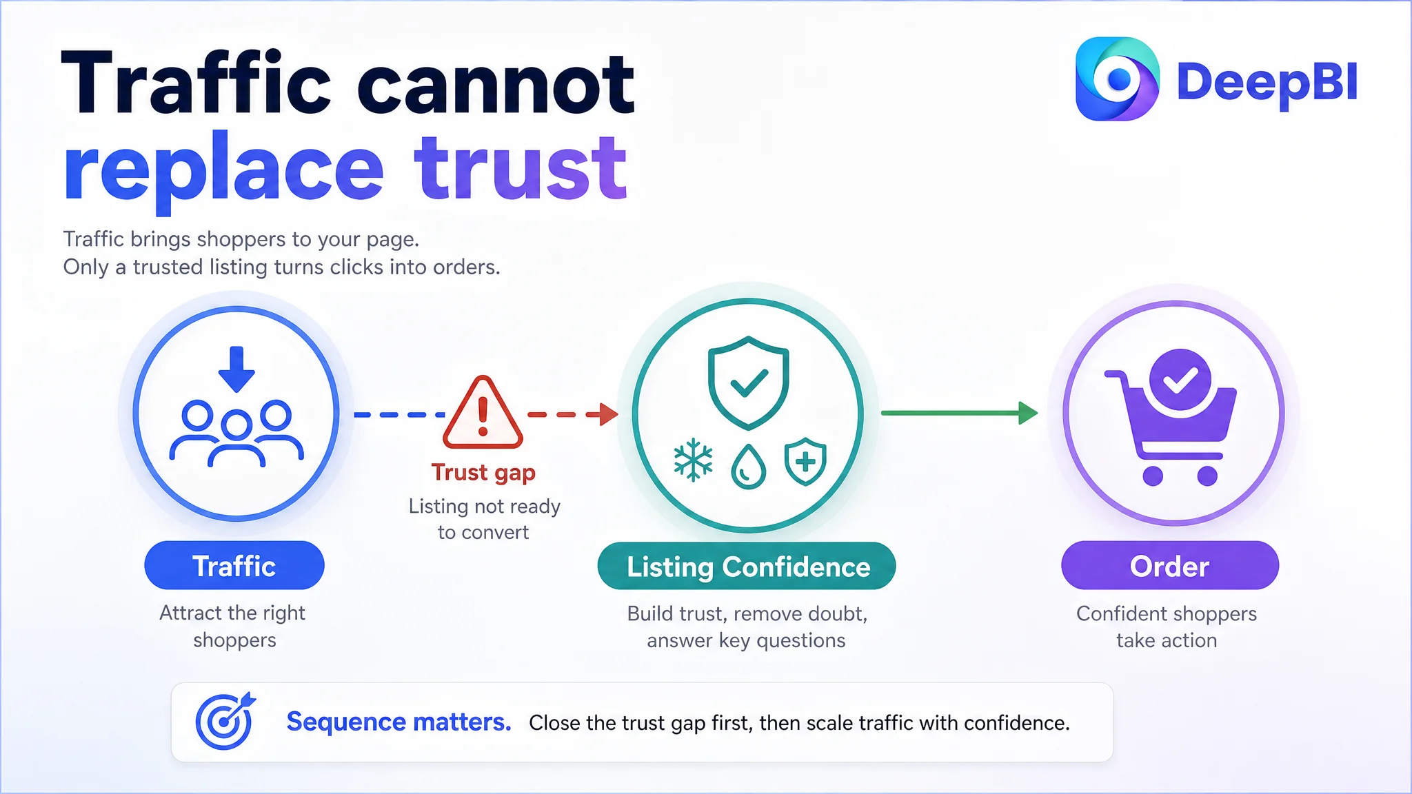
Advertising can bring a shopper to the page. It cannot supply the confidence the page fails to create.
In this case, DeepBI’s Listing comparison gave the team a clearer starting point. The target Listing scored 66 out of 100, while a comparable high-performing Listing scored 87. The 21-point difference was not concentrated in one image or one line of copy. It reflected a broader weakness in how the page handled trust and decision-making.
- Title: Target Listing: 14/20, Comparable high-performing Listing: 16/20, Gap: -2
- Main image: Target Listing: 25/30, Comparable high-performing Listing: 26/30, Gap: -1
- Bullet points: Target Listing: 7/10, Comparable high-performing Listing: 8/10, Gap: -1
- Detail content: Target Listing: 19/25, Comparable high-performing Listing: 23/25, Gap: -4
- Reviews: Target Listing: 1/15, Comparable high-performing Listing: 14/15, Gap: -13
- Total: Target Listing: 66/100, Comparable high-performing Listing: 87/100, Gap: -21
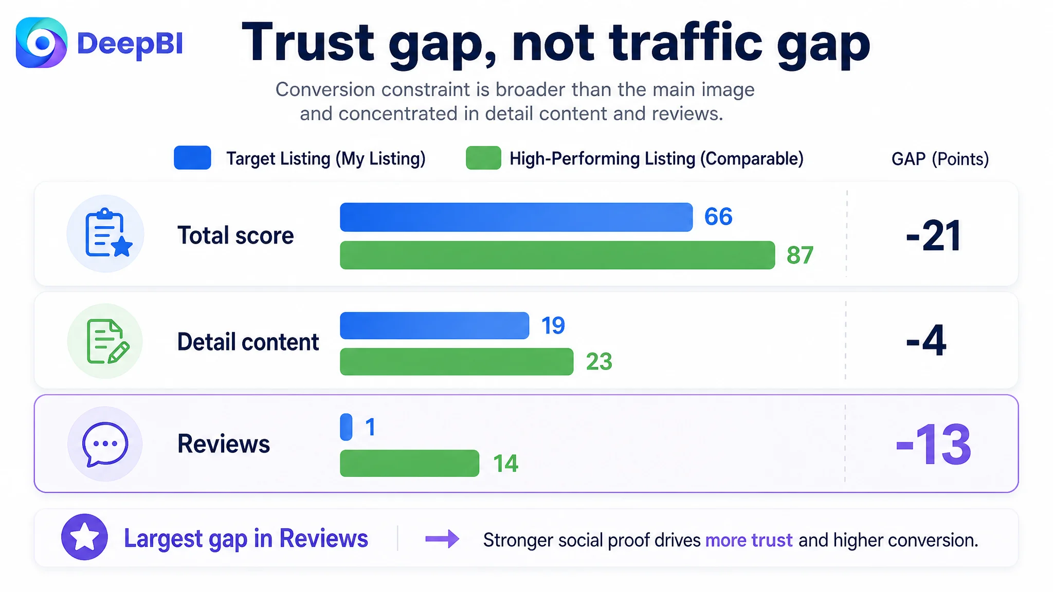
The most important signal was not the small gap in the main image score. It was the combination of weaker detail content and an almost empty review layer.
The target Listing had no effective review data on the page. The comparable Listing had a 4.5-star rating, approximately 11,350 reviews, and visible customer content, including video-based feedback. That difference created a major trust imbalance before shoppers even evaluated the product’s functional claims.
The Original Diagnosis Focused on Content Pieces, Not Conversion Logic
The customer’s page was not empty. It already had product images, usage scenes, packaging details, and several claims related to cooling, comfort, protection, and reusability.
That created a common Amazon Listing trap: because the page contains information, the team assumes it needs more information.
The existing content repeatedly emphasized similar ideas:
- Cooling relief
- Protection
- Product ingredients
- Application instructions
- General safety statements
- Product and packaging details
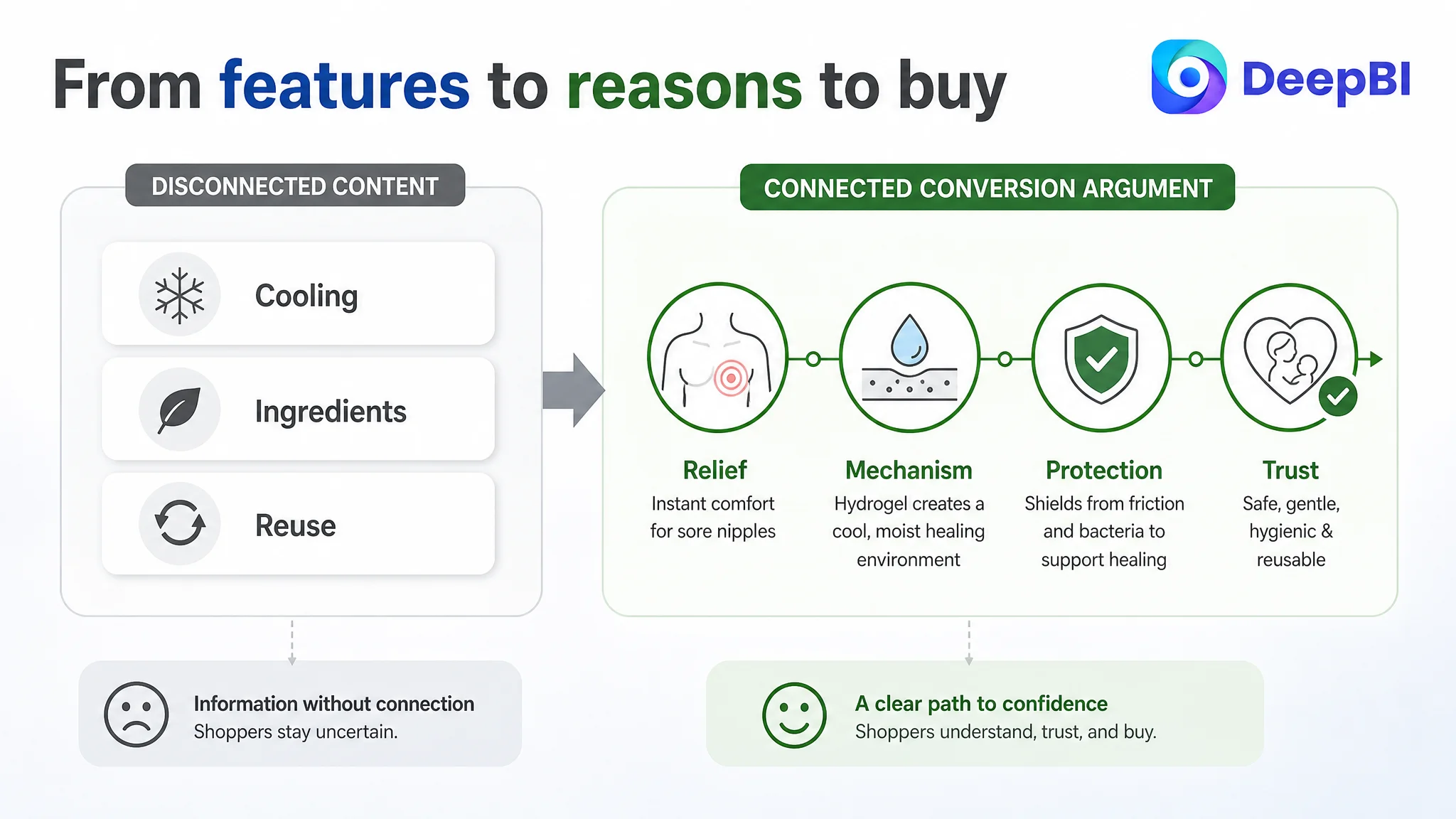
Individually, these points were relevant. Together, they lacked a clear progression.
The page was explaining what the product contained and what it could do, but it was not consistently answering the shopper’s next question:
Why should I trust this product enough to use it for this particular problem?
The original direction therefore risked producing more repetition rather than stronger persuasion. Adding another cooling statement would not solve the absence of a convincing healing explanation. Adding another close-up would not solve the lack of a clear safety and reuse path. Adding more usage detail would not compensate for weak social proof.
This was the central misdiagnosis:
The Listing was treated as a set of assets that needed polishing, when it needed a connected sales argument.
The Biggest Gap Was Trust, Not Visual Attractiveness
DeepBI’s score comparison showed that the target Listing was not dramatically behind in every visual category. The main image score was only one point below the benchmark, and the title and bullet-point gaps were also relatively limited.
The more consequential weakness appeared in the content that had to carry the shopper from interest to confidence.
The high-performing Listing used several layers of reassurance:
- Clear pain-point language
- Outcome-oriented benefits
- A visible explanation of how the product works
- Stronger safety and hygiene signals
- Multiple user situations
- Product-form clarification
- Reuse information
- Substantial customer feedback
By contrast, the target Listing leaned more heavily on ingredient and feature descriptions. Its bullet points mentioned elements such as lanolin, cooling, residue, and protection, but the sequence did not consistently connect those features to the shopper’s concern.
A feature is not yet a reason to buy
“Contains lanolin” is a product detail.
“Creates a moist environment that supports the product’s intended soothing and healing role” is a more complete explanation of why that detail matters—provided the claim is accurate and properly substantiated.
“Reusable” is a specification.
“Individually packaged, reusable within the stated conditions, and supported by a clear rinse-and-reapply process” is a decision aid.
DeepBI’s role in the diagnosis was not to add stronger-sounding claims without limits. It was to identify where the page moved from a factual description to an unsupported or incomplete buying argument.
The Title Had Keywords, but Not Enough Outcome Clarity
The target title placed the core phrase “Hydrogel Nipple Pads” in a useful position and highlighted the eight-piece quantity. That gave it a foundation for search relevance.
The weakness was that the title remained relatively functional and descriptive. It did not communicate the customer’s most urgent concern as directly as the benchmark title did.
The revised direction brought together four elements:
1. Product form: hydrogel nipple pads
2. Relevant use cases: breastfeeding, nursing, and pumping
3. Pain-point language: sore or cracked nipples
4. Outcome-oriented benefits: instant cooling relief and support for natural healing
The eight-piece pack remained important because it created a tangible value distinction. But quantity alone was not enough to win the click. A shopper first needs to recognize that the product is relevant to her situation.
The title therefore needed to move from a list of product attributes toward a clearer structure:
product identity → problem → use context → meaningful benefit → value distinction
This also helped prevent a common Amazon mistake: using the available character space for broad category language while underusing the specific long-tail contexts that signal purchase intent.
The Main Image Needed to Create a Reason to Stop
The main image gap was small in the score, but the diagnosis was still commercially meaningful.
The target image identified the product, yet its communication was more product-led than shopper-led. The eight-piece quantity was not prominent enough to create an immediate value comparison, and the supporting text was dense and somewhat repetitive.
The recommended change was not to make the image visually busier. It was to make the first message more decisive:
- Show the product clearly
- Make “8 PCS” immediately visible
- Use concise visual cues rather than several lines of small text
- Preserve the product’s actual appearance
- Build a stronger connection between the product and the relief use case in the supporting images
The secondary image sequence also needed a new division of labor.
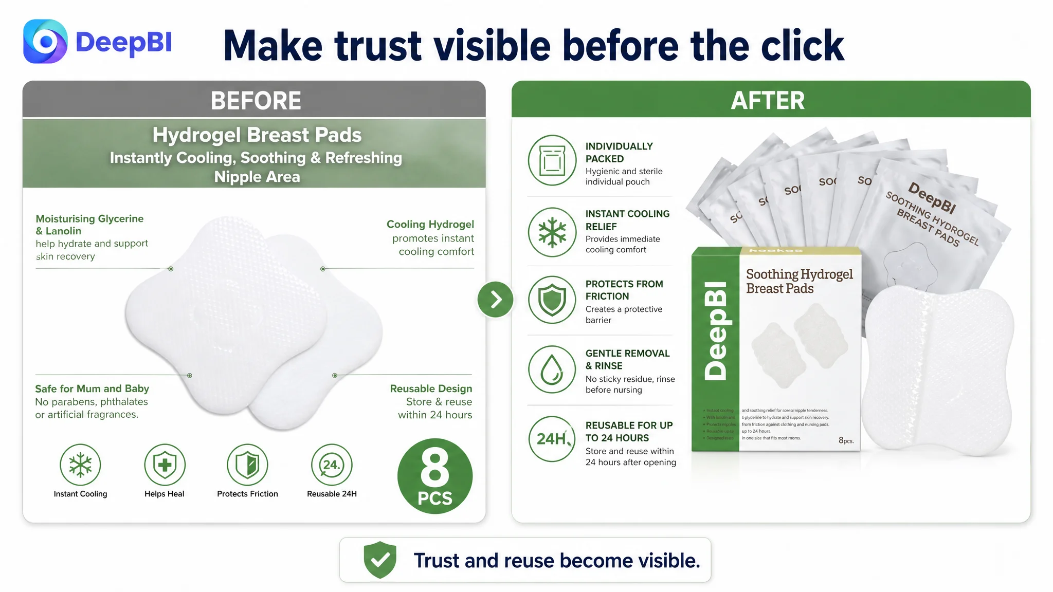
Image 1: Establish identity and value
The first image should answer: What is this, and what do I receive?
The eight-piece quantity was a stronger differentiator than the existing repeated benefit labels. It deserved a clear visual position.
Image 2: Establish the primary use case
Instead of repeating generic cooling language, the next image could connect the product to the breastfeeding context and show the individually wrapped format as a practical hygiene detail.
Image 3: Address safety and reuse
The page needed a visual explanation of how reuse works, including the stated conditions. A simple timeline or rinse-and-reapply sequence would be more useful than another generic cooling claim.
Image 4: Explain the mechanism
The high-water-content hydrogel concept, moist environment, protective barrier, and gentle removal experience could be presented here as a distinct explanation rather than scattered across several images.
Image 5: Reinforce everyday confidence
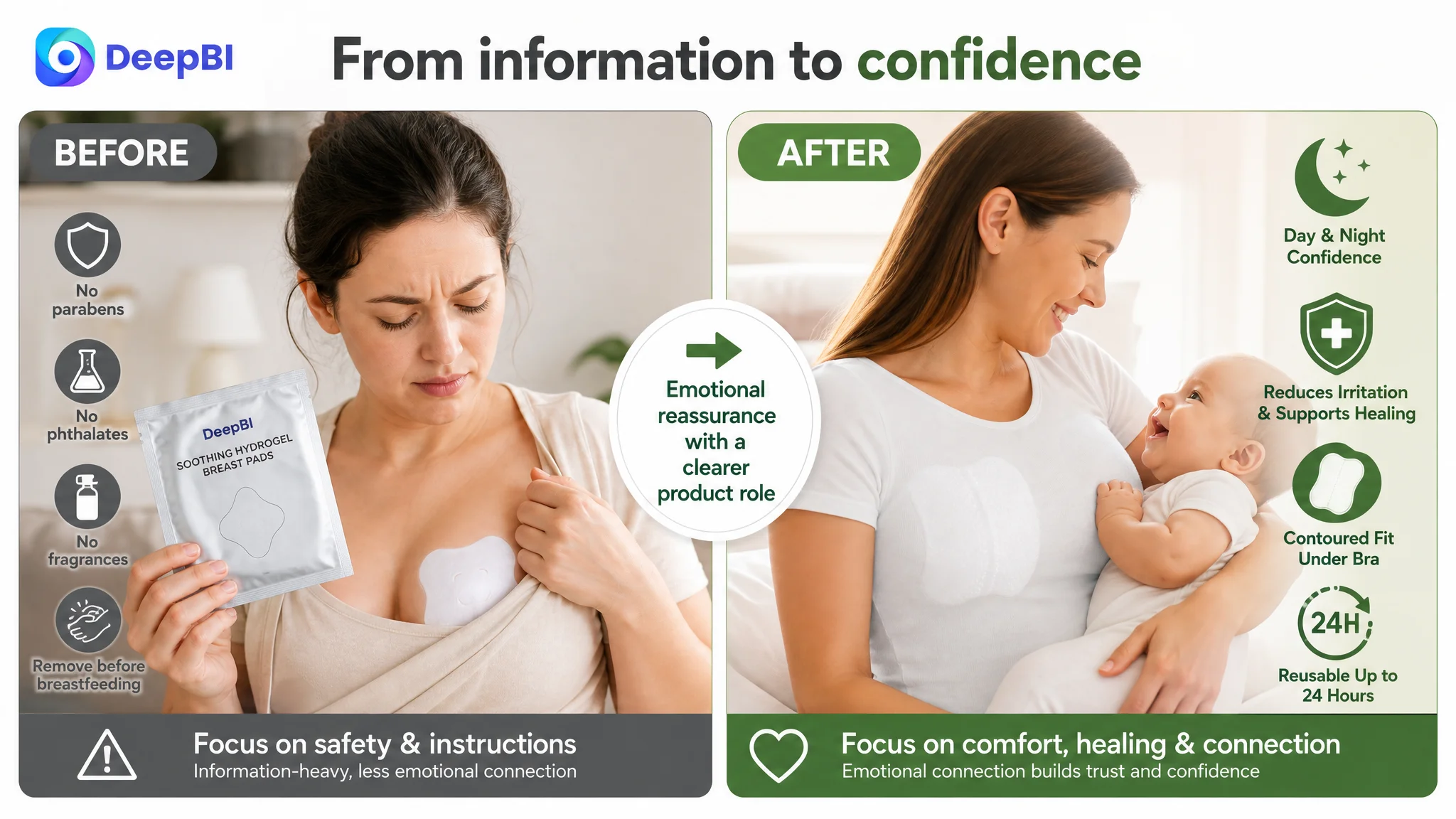
The existing mother-and-baby scene had emotional value, but the message needed to move beyond generic reassurance. It could show how a contoured, discreet fit supports comfort under a bra during normal daily activity, day or night.
The goal was not to show more. It was to ensure that each image answered a different buying question.
The Bullet Points Had Information, but Not a Persuasive Order
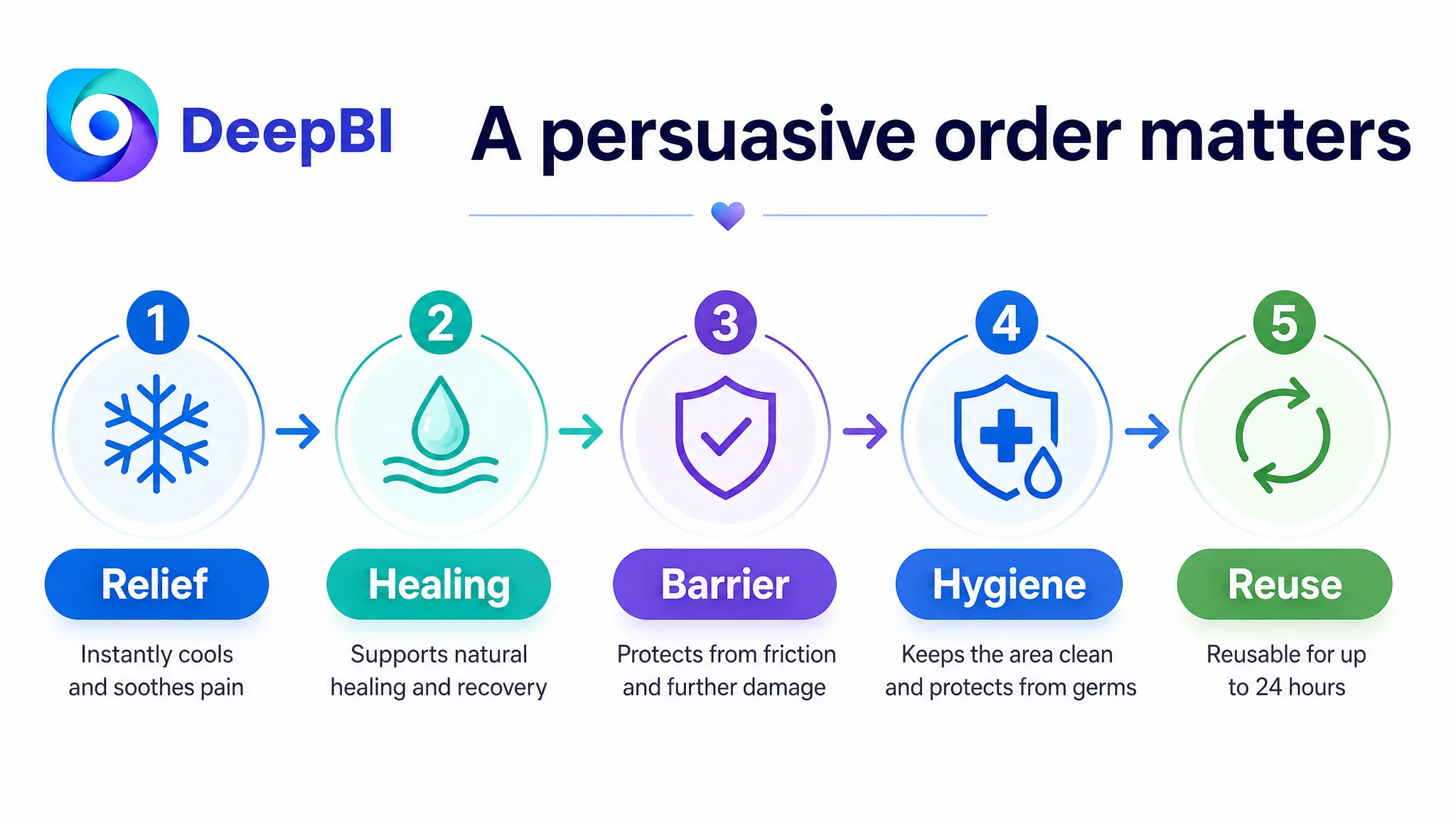
The target bullet points leaned toward ingredients, features, and defensive safety language. The benchmark Listing followed a more recognizable progression:
1. Immediate pain relief
2. Healing support and mechanism
3. Barrier protection
4. Hygiene and contamination protection
5. Safety, testing, and reuse
That order mattered because it followed the shopper’s likely reasoning.
First comes the urgent concern: will this help with discomfort?
Then comes the rational question: how does it work?
Next comes the practical concern: will it protect the area from further friction?
After that, the shopper evaluates hygiene, safety, and ease of use.
The target Listing had many of these ideas, but they were dispersed rather than connected. DeepBI’s suggested rewrite therefore emphasized a pain-point-to-solution structure instead of merely increasing keyword density.
For example, the first bullet could lead with immediate cooling relief and explain the high-water-content mechanism. A later bullet could connect lanolin and glycerine to the intended moist environment, without presenting ingredients as if they were self-explanatory proof.
The distinction is important:
A bullet point should not only state what the product has. It should explain why that feature matters at the moment of purchase.
Any statements involving dermatological testing, sterility, bacterial barriers, safety for mothers and babies, or specific certifications would also need to be verified before publication. DeepBI’s diagnosis can identify a missing trust dimension, but it should not turn an unverified claim into a Listing asset.
The A+ Content Was Missing the Final Layer of Persuasion
The largest content-quality gap appeared in the detail section. The target A+ content had useful elements, including product views, application scenes, and a usage guide. However, the structure did not sufficiently support the shopper’s final decision.
The benchmark Listing created stronger information hierarchy through:
- High-contrast benefit modules
- Clearly separated value points
- Visual icons
- Multiple user scenarios
- Product-form close-ups
- More prominent trust language
- A clearer path from benefit to usage
The target page relied more on text over lifestyle imagery. That approach can look complete while still making important information easy to overlook.
DeepBI’s recommended A+ direction was to rebuild the sequence.
Start with the core relief and healing story
The opening module should connect cooling comfort with the intended healing-support logic. Ingredients such as lanolin and glycerine can appear here only as supporting evidence for claims that are accurate and compliant.
Move rational validation earlier
Safety, material information, packaging, and product specifications should appear before the shopper reaches the usage details. These points help reduce uncertainty and should not be buried after several emotional or decorative modules.
Make discreet comfort concrete
The contoured fit should be shown in relation to normal clothing and bra wear. This is more persuasive than simply calling the product “comfortable” or “flexible.”
Simplify the use path
The usage sequence should be easier to follow:
1. Wash or prepare the skin
2. Apply the pad
3. Remove and rinse as directed
4. Breastfeed with confidence
5. Reapply within the stated reuse conditions
The target page’s five-step explanation placed too much emphasis on unpacking and physical details. The revised sequence needed to focus on successful use and reduce the risk of misunderstanding.
Add a dedicated reuse explanation
Reuse affects both perceived value and perceived safety. The Listing should state the conditions clearly, including the stated 24-hour reuse period after opening, while avoiding ambiguity about cleaning and reapplication.
Fill the missing safety layer
A structured icon module could help organize verified information such as preservative-free composition, absence of specified ingredients, individual packaging, residue expectations, and other substantiated product qualities.
The purpose of A+ content here was not to make the page look more premium. It was to remove the doubts that the title, main image, and bullet points could not fully resolve.
Why DeepBI Did Not Recommend Tuning Ads First
The most important decision was the order of operations.
If the page has weak conversion logic, increasing traffic can amplify the defect. More clicks may create more opportunities, but it can also create more wasted spend when shoppers arrive and still cannot find enough reasons to proceed.
In this case, DeepBI had several reasons to prioritize the Listing:
- The total score was 21 points below the comparable benchmark
- Detail content lagged by four points
- The review layer lagged by 13 points
- The page repeated benefits rather than progressing through them
- The title underused outcome and use-context language
- The image sequence did not clearly divide value, mechanism, trust, and usage
- Reuse and safety concerns were not fully resolved visually
That did not mean Amazon ads were irrelevant. It meant advertising should not be asked to compensate for a page-level trust gap.
“The real risk was not simply expensive traffic. It was sending more traffic to a page that had not yet earned the shopper’s confidence.”
The correct decision path was therefore:
1. Confirm the Listing’s conversion constraints
2. Repair the page’s decision sequence
3. Ensure all claims and visual representations remain accurate
4. Reassess CVR and traffic quality
5. Then decide whether ad scaling or campaign restructuring is justified
This order protects the seller from confusing traffic volume with business progress.
DeepBI’s Strength Was the Judgment Behind the Changes
The value of DeepBI in this case was not a collection of replacement phrases or image prompts. It was the ability to connect several weak signals into one operating judgment.
The score comparison showed where the page was losing ground. The content comparison explained why. The optimization direction then translated those gaps into specific changes:
- Make the eight-piece value visible
- Replace repeated cooling messages with distinct image roles
- Move from ingredients to mechanisms and outcomes
- Connect the product to friction protection and discreet wear
- Clarify reuse conditions
- Strengthen the A+ trust path
- Use social proof as a separate business constraint, not something images can simply replace
That reasoning also required restraint. A product image could be made clearer without changing the product itself. A visual reference could inform composition without copying a competitor’s design. A missing safety signal could be identified without inventing certification or clinical evidence.
This is where structured Listing diagnosis becomes more useful than subjective creative review. The question is not whether a page looks attractive in isolation. The question is whether its content gives the shopper enough accurate, well-ordered evidence to make a decision.
The Operating State Changed Before the Metrics Could
The case material does not include verified post-optimization results for CVR, ACOS, organic orders, or keyword ranking. It would therefore be inappropriate to claim a quantified performance improvement.
The meaningful change was the operating direction.
Before the diagnosis, the page could be treated as a group of content assets requiring incremental improvement. After the diagnosis, the team could see it as a conversion system with a specific constraint: it had product information, but insufficiently connected trust.
That reframing changed how future decisions could be made:
- Ads should be evaluated alongside Listing conversion capacity
- Image testing should be tied to a defined shopper question
- A+ content should remove decision risk, not merely add visual volume
- Bullet points should form a logical progression
- Reuse and safety information should be explicit
- Review scarcity should remain visible in the business diagnosis
- Claims should be strengthened only when they are accurate and supportable
The customer’s understanding therefore moved from “we need better content” to a more useful judgment:
Before scaling Amazon ads, the team must determine whether the product page is ready to convert the traffic it receives.
The Lesson for Amazon Sellers
Amazon ads and Amazon Listing optimization are often managed as separate workstreams. One team watches spend, bids, CTR, CVR, ACOS, and TACOS. Another team revises titles, images, bullet points, and A+ content.
This case shows why that separation can obscure the real bottleneck.
A weak product page can make a healthy traffic source look inefficient. A strong keyword can still produce an unprofitable click if the Listing does not communicate relevance and trust. More images can still leave the shopper uncertain if every image repeats the same benefit.
For this breastfeeding hydrogel pad Listing, the key issue was not a lack of effort or a lack of product information. It was the absence of a complete and credible decision path.
Amazon ads can create the opportunity to be considered. The Listing must still earn the order.
That is why the right diagnosis came before further traffic expansion—and why the most valuable optimization was not another isolated creative adjustment, but a clearer understanding of what the page had to prove.