

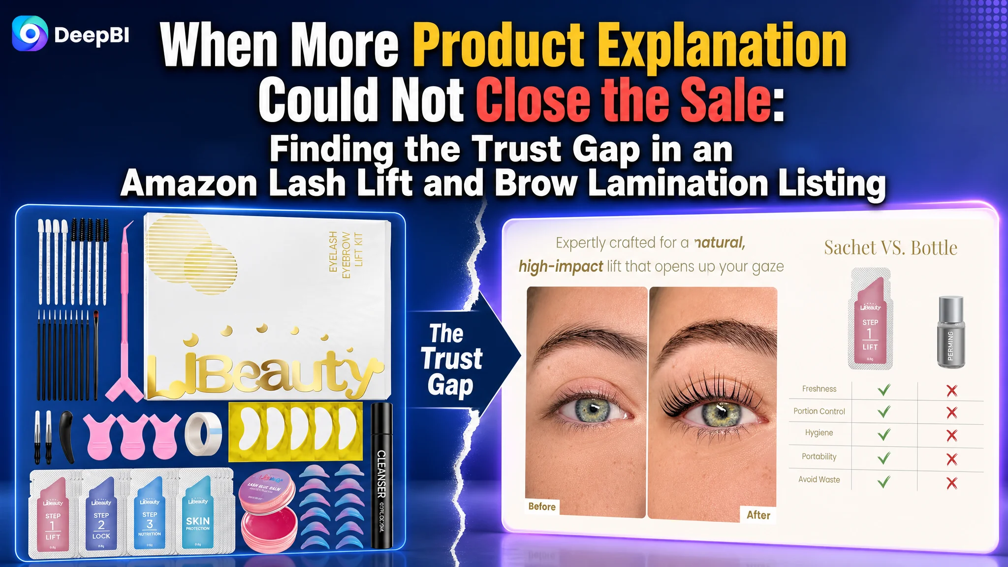
An Amazon seller in the beauty category was working with a Lash Lift and Brow Lamination Kit on the US marketplace. The product page contained the expected building blocks: a complete kit image, before-and-after content, usage steps, individual sachets, a cleanser explanation, and FAQ sections. Yet its Listing score was only 68, compared with 87 for a closely matched high-performing listing.
The initial direction focused on making the product concept clearer: highlight the Korean origin, explain the individually packaged formulas, describe the kit components, and add more detail around the cleansing tool and process. Those improvements were reasonable, but they did not address the buyer's first and most important question on an Amazon product page: Can I trust this kit to produce the result, and can I use it without making a mistake?
DeepBI ultimately identified a broader conversion bottleneck. The page was explaining the product before proving the outcome. It had no meaningful review base, weak immediate result proof, an abstract usage path, and several content modules that introduced secondary details before resolving the buyer's main doubts. The later optimization therefore focused on result visibility, application clarity, safety reassurance, and a more deliberate sequence across the title, main images, bullet points, and A+ content.
For other Amazon sellers, the lesson is direct: when a Listing contains plenty of information but still struggles to convert, the problem may not be a lack of content. It may be that the page is asking buyers to understand too much before giving them a reason to believe.
The Amazon Listing Looked Complete, but Its Persuasion Was Not Complete
At first glance, this was not an empty or neglected Listing.
The product page presented itself as a 2-in-1 solution for eyelash perms and brow lamination. It included:
- A complete kit and component overview
- Before-and-after imagery
- A four-step process graphic
- Individual sachet packaging
- A spray cleanser explanation
- FAQ content
- Claims around gentle use, long-lasting results, and home application
The problem was not the absence of effort. The problem was the order and strength of the evidence.
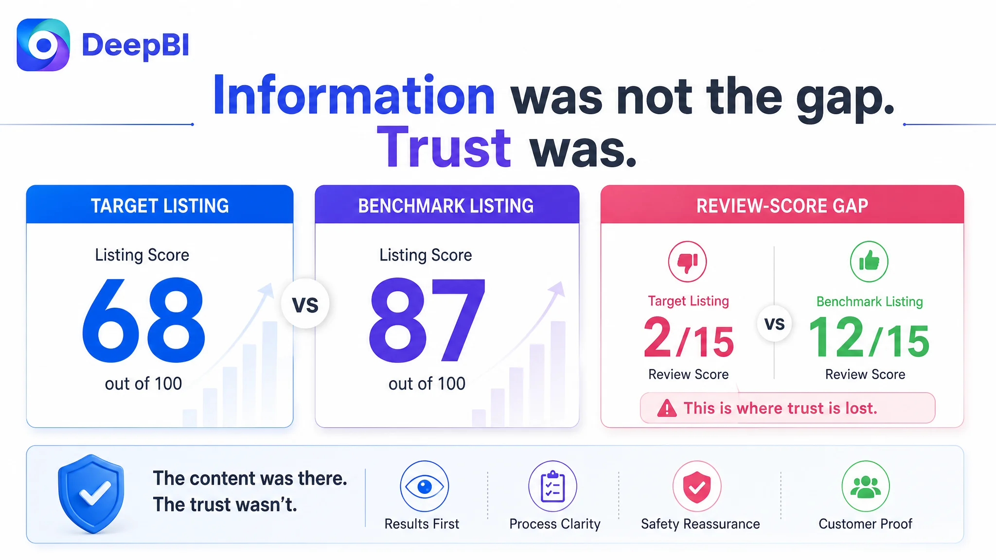
The Listing scored 68 out of 100, while the matched benchmark listing scored 87.
- Title: Target Listing: 14/20, Benchmark Listing: 18/20, Gap: -4
- Main images: Target Listing: 24/30, Benchmark Listing: 26/30, Gap: -2
- Bullet points: Target Listing: 7/10, Benchmark Listing: 8/10, Gap: -1
- A+ content: Target Listing: 21/25, Benchmark Listing: 23/25, Gap: -2
- Reviews: Target Listing: 2/15, Benchmark Listing: 12/15, Gap: -10
- Total: Target Listing: 68/100, Benchmark Listing: 87/100, Gap: -19
The largest gap was not in the title, main images, or bullet points individually. It was in the Listing's ability to create trust.
The target Listing had no rating data, no reviews, and no visible customer commentary on the first page. The benchmark listing had a 4.2-star rating, 41 total reviews, and nine reviews visible on its first page, including detailed user experiences and image or video content.
That difference could not be solved with a minor wording adjustment.
The page was not short of information. It was short of convincing proof at the moments when buyers were deciding whether to continue.
The Original Direction Solved Secondary Doubts First
The customer team had several legitimate advantages to communicate.
The kit used individually packaged components intended for five uses. It included a lash glue balm, a spray cleanser, reusable silicone pads in multiple sizes, and tools for both lashes and brows. These details could support a strong product position.
But the page treated many of these advantages as if they were the first reason to buy.
The packaging concept received considerable attention. The page explained freshness, oxidation, single-use portions, and the difference between sachets and bottles. The cleanser received its own detailed explanation. The process was represented through abstract icons and text. The title began with a differentiating descriptor rather than placing the most important category terms first.
These choices created a reasonable product explanation, but not necessarily a strong buying sequence.
A buyer considering an eyelash lift kit usually has several doubts:
- Will the lift look natural?
- Will the lashes stay attached during the process?
- Can I follow the steps correctly at home?
- Will the formula irritate the sensitive eye area?
- Will the result justify the time and risk?
- Can I trust this product without much review history?
The Listing addressed some of these questions, but not in the order the buyer needed.
It led with what the product was and how it was packaged. The benchmark listing led more strongly with what the buyer could achieve, how the product solved common application problems, and how the process could be completed with less uncertainty.
This was the original misdiagnosis: treating the conversion problem as a matter of adding or clarifying product information, when the deeper issue was a lack of prioritized proof.
The Real Constraint Was Listing Conversion Capacity
DeepBI's comparison did not treat the 19-point gap as a general quality problem. It traced the difference to specific points in the buyer's decision path.
The title carried keywords, but not enough commercial structure
The target title opened with a differentiating phrase related to its Korean positioning. That created identity, but it delayed the strongest category signals.
The benchmark title placed core terms such as lash lift, black color kit, eyelash perm, brow lamination, and 4-in-1 functionality closer to the front. It also used concrete details such as the 15 ml coloring cream and upgraded glue balm.
The issue was not that the target title lacked keywords altogether. It was that search relevance, product value, and usage context were not integrated tightly enough.
A stronger title direction would place the category and core use case earlier, then introduce the differentiators that matter commercially:
- Korean lash lift positioning
- Eyelash perm and brow lamination
- Individual packaging for five uses
- Glue balm
- DIY and home-use context
- Salon-quality positioning
The individual packaging advantage should not disappear. It should be presented as a reason to trust the product's freshness and convenience, rather than as an isolated technical concept.
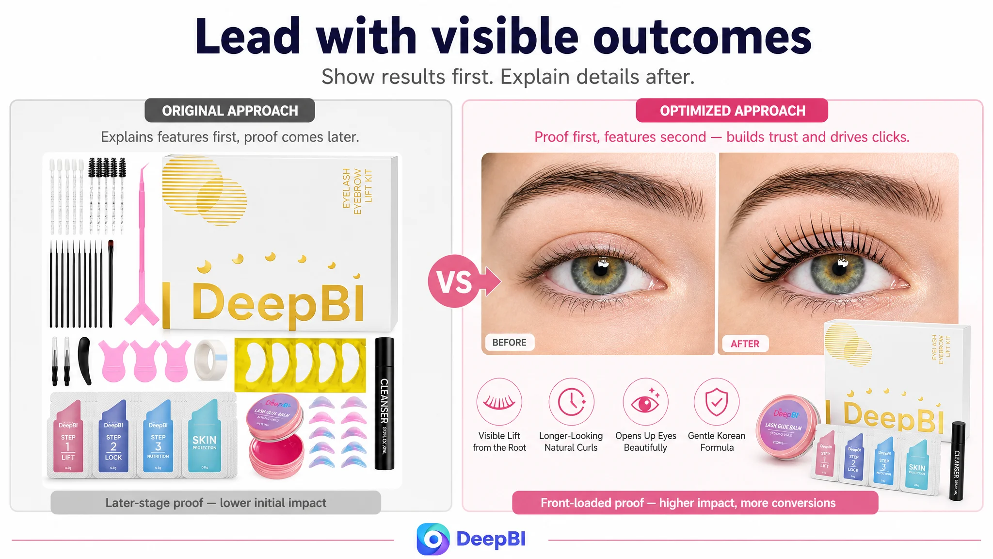
The main image proved the kit, but not the outcome
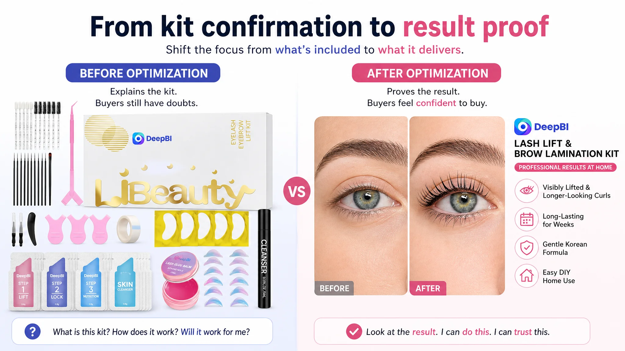
The first image primarily confirmed that the product was a complete 2-in-1 kit. It showed the components and communicated home use.
That answered: What is included?
It did not answer the more urgent question: What will my lashes or brows look like afterward?
The before-and-after visual already existed, but it appeared later in the image sequence. That meant the strongest answer to the buyer's initial doubt was delayed.
The benchmark listing made the result more immediate through a focused visual comparison and stronger product photography. Its presentation created a faster connection between the kit and the desired appearance.
DeepBI therefore judged that the main image sequence should move from product confirmation toward result proof:
1. Lead with a clear, focused result visual.
2. Follow with the complete kit and number of uses.
3. Show the glue balm solving the problem of lashes shifting or popping off.
4. Demonstrate the cleanser in an actual application context.
5. Present the overall process and safety logic.
This is not a call to make the image more decorative. It is a change in the job assigned to each image.
The first image should earn the click. The next images should reduce the buyer's reasons to hesitate.
The bullet points described functions, but did not consistently close pain points
The target bullet points included relevant claims such as freshness, long-lasting curl, gentle formulation, and complete kit coverage. However, several points remained at the level of feature description.
The benchmark listing was more direct about common frustrations:
- Adhesive drying too quickly
- Lashes lifting away from the pad
- Product running out too soon
- Difficulty for first-time users
- The need for safety guidance
The recommended rewrite therefore shifted the structure of each bullet from feature to consequence.
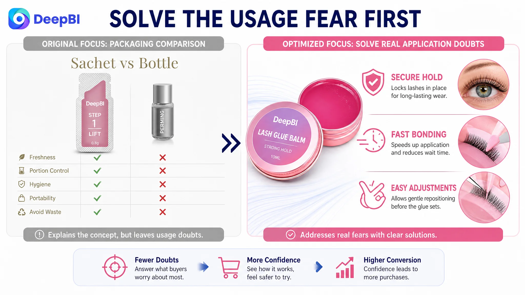
For example, individual sachets were not presented only as a packaging format. They were connected to freshness, controlled dosage, reduced waste, and a more predictable home-use experience.
The glue balm was not presented merely as another kit component. It was positioned as the answer to a specific failure point: lashes popping off or becoming difficult to adjust during styling.
The complete kit was not just a list of accessories. It was framed as a 2-in-1 solution with five pairs of reusable silicone pads, professional applicators, and guidance for both lash lifting and brow lamination.
This creates a more useful commercial sequence:
Buyer concern → Product mechanism → Practical result
That sequence gives the bullet points a role in conversion rather than making them a second inventory list.
The A+ Content Asked Buyers to Learn Before Asking Them to Believe
The A+ content contained several useful modules, but its progression was not strong enough.
The first module provided a general benefit summary. The second showed the kit and its components. The third addressed duration and results. Later modules explained individual packaging, cleanser use, safety, and FAQs.
The sequence was logical from an internal product-information perspective. It was less effective from the buyer's perspective.
The benchmark listing followed a clearer progression:
Result → Product → Product advantage → How to use → Risk reduction
That order matters because buyers do not approach A+ content as a technical manual. They are looking for confirmation after the main image and bullet points have created initial interest.
The opening module needed immediate visual proof
The first A+ module should have shown successful results for both relevant use cases: lashes and brows.
The target page introduced the kit before providing enough direct evidence. That delayed the most important rational confirmation.
A stronger opening would connect the product to the visual outcome immediately, using clear before-and-after imagery and a restrained product reference. The purpose would not be to make a broad promise. It would be to show the kind of result the kit is designed to create.
The process needed to become visual and complete
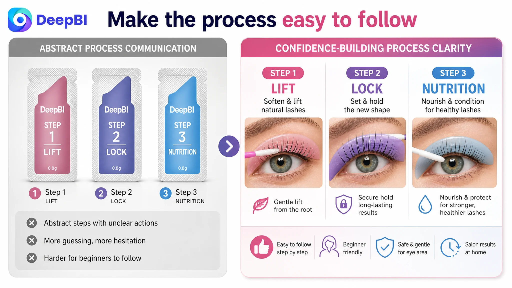
The target page used a four-step graphic with abstract icons and text. This communicated sequence, but it left too much of the actual process to the buyer's imagination.
The benchmark listing used an eight-step tutorial with visible hand movements and close-ups of the product in use. That reduced the learning burden for first-time users.
For an eye-area beauty product, process clarity is not a cosmetic improvement. It directly affects confidence, perceived risk, and the likelihood that a buyer will believe the product is usable at home.
The revised direction was to introduce a complete process guide earlier, before detailed explanations of individual tools. It should show:
- What happens at each stage
- Which product is used
- How the lashes or brows are positioned
- Where the glue balm matters
- How the cleanser is applied
- How the process is completed safely
The spray cleanser still has a role, but its detailed explanation should not interrupt the main buying flow before the overall process is understood.
Packaging freshness was valuable, but not the first proof point
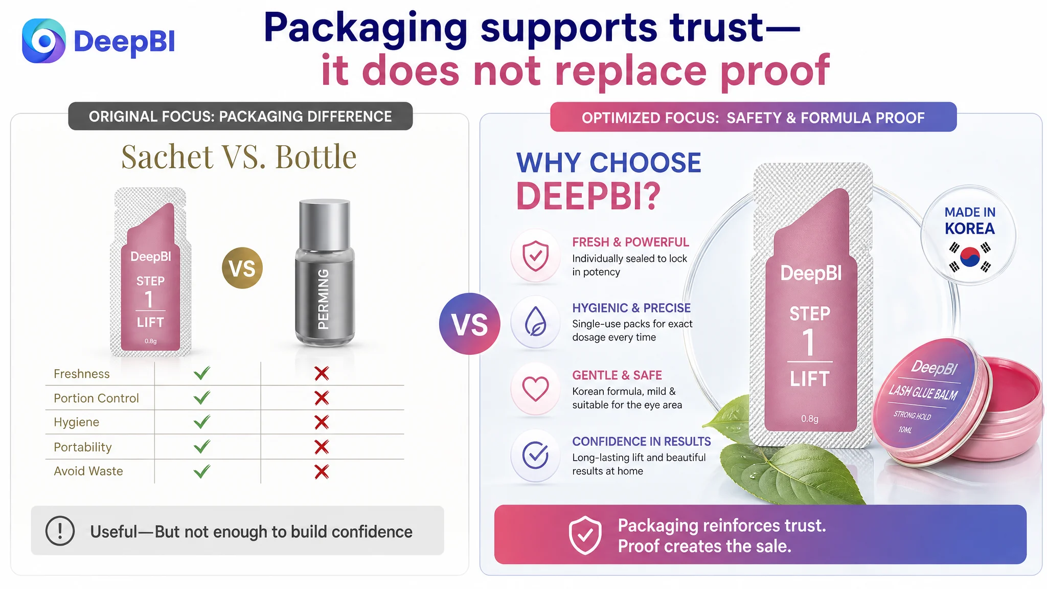
Individual sachets were one of the target Listing's genuine advantages. They could address concerns about oxidation, leakage, smell, freshness, and dosage control.
However, the packaging benefit was being asked to carry too much of the trust burden.
A buyer first needs to believe that the kit can create the desired result and that the process is manageable. Freshness and packaging hygiene then strengthen the decision.
DeepBI repositioned the sachet story as a hygiene and freshness proof point, not as the opening argument. This preserved the differentiator while placing it where it could support, rather than replace, the core sales logic.
Why DeepBI Did Not Recommend More Content Everywhere
The diagnosis did not lead to a simple instruction to add more images, longer bullets, or additional FAQ blocks.
In fact, some content needed to be condensed or moved lower.
The target A+ page placed two FAQ-heavy modules near the end of the main persuasion sequence. Both contained useful information about irritation, curl retention, smell, and cleanser removal. But consecutive text-heavy sections interrupted the visual progression and repeated similar forms of reassurance.
DeepBI's decision was to separate the page into two different jobs:
First, build desire and understanding
- Show the result
- Confirm the complete kit
- Explain the main product advantages
- Demonstrate the full process
- Clarify the role of the glue balm and cleanser
Then, reduce remaining risk
- Explain the gentle formula
- Include the patch-test guidance
- Address concerns such as stinging or lack of curl
- Confirm water resistance, sweat resistance, duration, and residue removal
This decision order prevents the page from turning every possible concern into an early obstacle.
A FAQ can reduce risk, but if it appears before the buyer understands the product's main value, it can also make the product feel more complicated.
The Optimization Path Shifted From Product Description to Decision Support
Once the root cause was reframed, the proposed changes formed one connected direction rather than a list of independent edits.
The title would capture both search intent and product value
The title needed to place the strongest category terms earlier while retaining the target product's genuine differentiators.
The recommended structure combined:
- Core lash lift and brow lamination terms
- Professional and DIY positioning
- Glue balm
- Individual packaging
- Five-use value
- Beginner and home-use context
This was intended to improve the connection between what shoppers search for and what the product actually offers.
The main images would lead with outcomes and application confidence
The image sequence would no longer prioritize the packaging concept repeatedly.
It would show:
- Immediate result proof
- Complete kit value
- Glue balm solving a practical application problem
- Spray cleanser in a clear use context
- A full process roadmap with safety considerations
The target product's physical details would remain unchanged. The improvement would come from composition, sequencing, visual focus, and the role assigned to each image.
The bullet points would make each claim answer a buyer concern
The five bullets would work together as a conversion path:
1. Fresh, controlled single-use packaging
2. Secure but adjustable glue balm
3. Salon-quality results at home
4. Gentle formula with a clear patch-test reminder
5. Complete lash and brow styling kit with reusable pads and guidance
This structure gives each bullet a distinct job and avoids repeating the same type of reassurance.
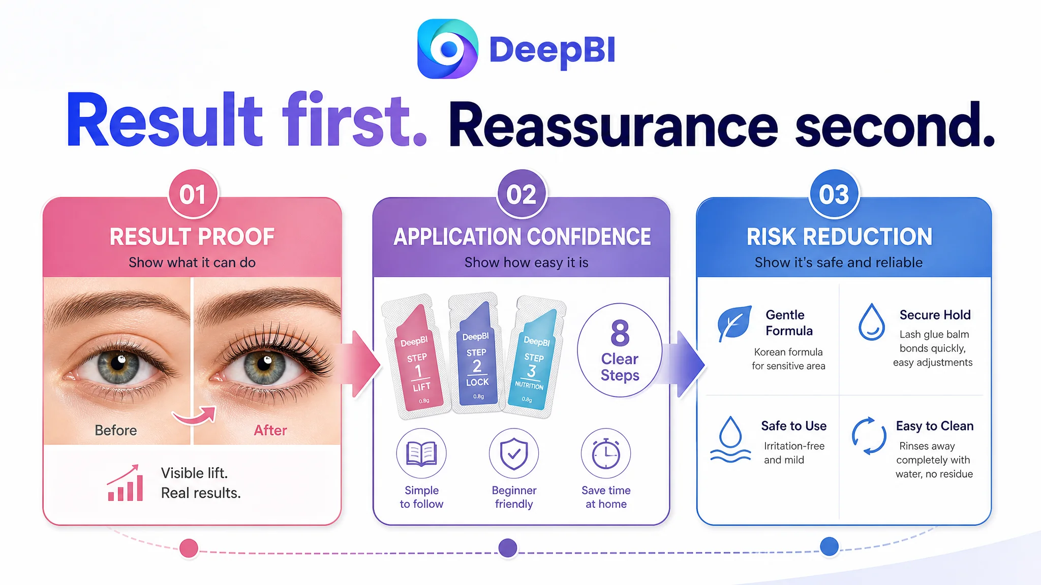
The A+ page would follow the buyer's confidence curve
The revised A+ logic would move from:
1. Result proof for lashes and brows
2. Complete kit and five-use value
3. Duration and performance confirmation
4. Freshness and hygiene advantage
5. Full step-by-step process
6. Risk and doubt reduction
7. Final rational confirmation
The key change was not the number of modules. It was the order in which evidence appeared.
The Case Did Not End With an Invented Performance Claim
The source material does not include post-optimization CTR, CVR, ACOS, TACOS, organic-order, or keyword-ranking results. Those numbers should not be manufactured.
What can be established is the change in operating logic:
- The Listing's largest weakness was recognized as a trust and conversion gap.
- The page stopped treating packaging explanation as the primary persuasion mechanism.
- Result proof was moved earlier.
- The application path became a central conversion asset.
- Title and bullet logic were aligned more closely with search intent and buyer pain points.
- Safety and FAQ content were preserved, but repositioned as risk reduction rather than opening persuasion.
- Main-image and A+ decisions were tied to specific buyer doubts instead of general visual improvement.
This distinction matters. A stronger Listing strategy is not proven by claiming an unsupported percentage increase. It is proven first by whether the page is solving the right problem.
The Amazon Seller's Understanding Had to Change
The central lesson from this Lash Lift and Brow Lamination Listing was not that the product needed more polished images.
It was that every page element had to participate in the same decision logic.
- The title should connect search intent with the product's strongest value.
- The main image should create an immediate reason to click.
- The bullet points should turn features into solutions.
- The A+ page should prove the result before expanding into detail.
- The process guide should reduce the fear of using the product incorrectly.
- Packaging should reinforce freshness and hygiene without replacing outcome proof.
- Reviews and customer evidence should be treated as a major trust constraint, not a minor score category.
The page's 10-point review gap was especially important because it could not be closed through copywriting alone. It represented a missing layer of social proof that made every other claim harder to believe.
That is why DeepBI's diagnosis began with comparison rather than aesthetics. The goal was not to decide whether the Listing looked attractive. The goal was to determine where its commercial logic fell behind a comparable Amazon benchmark.
Advertising and content work better when the product page is ready to receive the traffic. But before any traffic strategy can be judged, the Listing must first prove that it deserves the buyer's confidence.
For Amazon sellers, that is the practical takeaway from this case: when a page contains many claims but conversion remains constrained, do not automatically add more information or keep refining isolated modules. First ask whether the Listing is showing the result, explaining the process, and reducing the right doubts in the right order.
That is where this Amazon beauty Listing needed to change—and where the conversion diagnosis became clearer.