

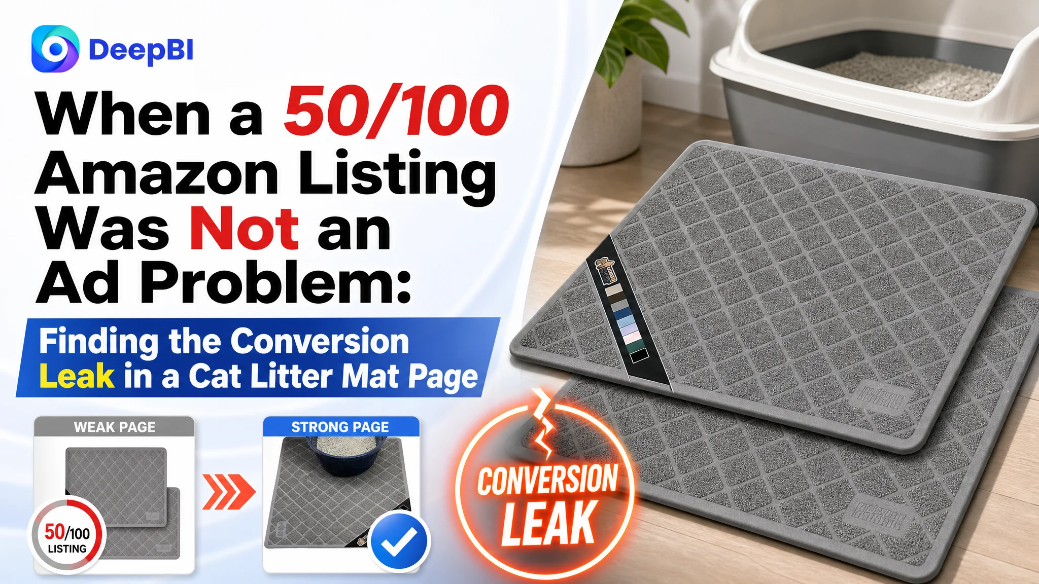
An Amazon seller in the US marketplace was facing a familiar problem: the product page could describe the cat litter mat, but it did not give shoppers enough reasons to trust it, understand it, or choose it. The initial direction centered on product specifications, functional wording, and individual image improvements—the kinds of changes that often appear reasonable when an Amazon Listing is underperforming.
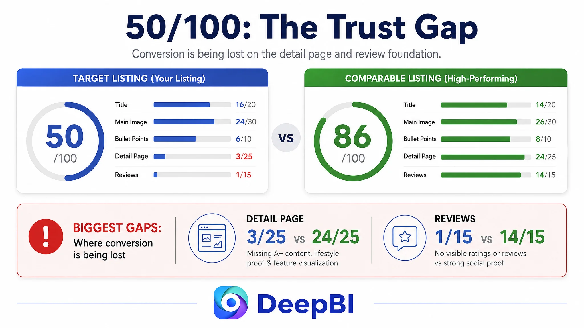
DeepBI’s diagnosis showed that the deeper problem was not a missing keyword or a single unattractive image. The Listing scored 50 out of 100 against a comparable high-performing listing at 86, with the largest gaps concentrated in the detail page and review foundation. The page was receiving an opportunity to convert, but its content structure was not doing enough to support the decision.
The later optimization therefore focused on rebuilding the Amazon product page as a sales sequence: establish the product in a real cat-litter-box setting, prove litter-trapping and floor-protection functions visually, clarify cleaning and stability, explain the value of the two-pack, and use A+ content to reduce uncertainty. The case offers a practical lesson for Amazon sellers: before increasing traffic or repeatedly adjusting creative assets, determine whether the Listing is prepared to convert the traffic it receives.
The page appeared to have information. It did not yet have a persuasive path.
The product was a two-pack cat litter mat, offered in two sizes. Its Listing already contained several useful claims:
- Water-resistant construction
- Non-slip backing
- Textured litter-trapping surface
- Easy cleaning
- Softness for cats’ paws
- Two sizes in one bundle
- Gray color
At first glance, this looked like a content optimization problem. The product had identifiable features, the title included dimensions and several benefits, and the image set explained different parts of the mat.
But Amazon shoppers do not evaluate a product page by counting how many features are present. They move through a sequence of questions:
1. What is this product, and where would I use it?
2. Will it solve the mess around my litter box?
3. Will it stay in place?
4. Will it protect my floor?
5. Is it easy to clean?
6. Does the two-pack offer enough practical value?
7. Can I trust the seller and the product?
The Listing answered some of these questions separately. It did not connect them into a convincing decision path.
The issue was not a total absence of information. It was the absence of an information order that helped shoppers decide.
The original optimization direction stayed too close to the product itself
The customer’s existing approach emphasized the object: its dimensions, materials, backing, texture, and cleaning process. That direction was not technically wrong. It was incomplete.
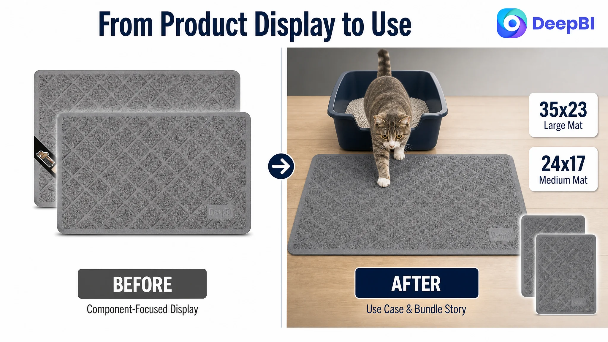
The first image confirmed the bundle and sizes, but mainly as a component display. It showed what was included without quickly showing why the product belonged in the shopper’s home. The feature images continued in a similar direction. They explained construction and function through text, but required shoppers to interpret the claims themselves.
The bullet points followed the same pattern. The first point began with product specifications rather than the shopper’s main concern: keeping litter contained in a limited space. Other bullets described material and maintenance, but did not consistently connect each feature to a clear household outcome.
This created a common Amazon Listing trap:
- The seller sees a complete product description.
- The shopper sees a series of disconnected claims.
- The team adds more information.
- The page becomes fuller, but not necessarily more convincing.
The customer was therefore at risk of treating the problem as a copy or image quantity issue. More specifications, more feature callouts, or more isolated improvements could make the Listing appear more polished without repairing the conversion logic underneath.
The score gap showed where the page was actually losing trust
DeepBI’s comparison produced a total score of 50 out of 100, compared with 86 for the comparable high-performing listing.
The individual scores were revealing:
- Title: Target Listing: 16/20, Comparable listing: 14/20
- Main image: Target Listing: 24/30, Comparable listing: 26/30
- Bullet points: Target Listing: 6/10, Comparable listing: 8/10
- Detail page: Target Listing: 3/25, Comparable listing: 24/25
- Reviews: Target Listing: 1/15, Comparable listing: 14/15
The title and main image were not the largest weaknesses. They had room for improvement, particularly in keyword coverage and visual differentiation, but they were not the central reason the Listing fell behind.
The decisive gap was in the detail page.
The target Listing had no image modules in the detail section and relied on repeated text. The comparable listing used a fuller A+ structure with:
- Brand and trust messaging
- Lifestyle scenes
- Feature icons
- Cleaning and durability explanations
- Comparison-based proof
- Multiple use cases
- Two-pack and multi-purpose positioning
That difference changed the role of the page. One Listing mainly stated what the mat was. The other helped shoppers imagine how it would work in the home and why it was worth choosing.
The review gap added a second layer of difficulty. The target Listing had no effective review foundation: zero visible ratings and zero visible comments on the first page. The comparable listing showed a 4.6-star rating with 222 reviews, including visual and scenario-based customer feedback.
This was not a gap that could be repaired through wording alone. It meant the product page lacked both visual persuasion and social proof.
The largest conversion leak was not the title. It was the missing A+ story.
A high-performing Amazon product page does more than repeat the title and bullet points. It answers doubts that become more important after the initial click.
For a cat litter mat, those doubts are practical:
- Will it look acceptable in the home?
- Will the cat actually step on it?
- Will litter remain on the mat instead of spreading across the floor?
- Will the mat move when the cat is active?
- Is “water resistant” enough for common litter-box messes?
- How is it cleaned?
- What should each size be used for?
- Why buy two instead of one?
The target Listing had no visual narrative for these questions. As a result, shoppers had to infer the product’s value from text and close-up component shots.
The comparable listing used visual evidence more effectively. Its content connected structure to outcome: surface design to litter capture, backing to stability, layers to protection, and multiple sizes to different areas of the home.
DeepBI therefore identified the A+ and detail-page gap as the first issue to address—not because A+ content is automatically valuable, but because this specific page lacked the trust and usage explanation needed to convert interest into purchase confidence.
The product needed an aesthetic entry point
A cat litter mat is a practical household item. If the first impression is purely utilitarian, shoppers may see it as unattractive or difficult to integrate into their space.
The opening of the detail page should establish the product in a clean, natural home setting. The goal is not decorative styling for its own sake. It is to remove the initial appearance barrier and make the product feel appropriate beside a litter box, in a feeding area, or near another everyday pet space.
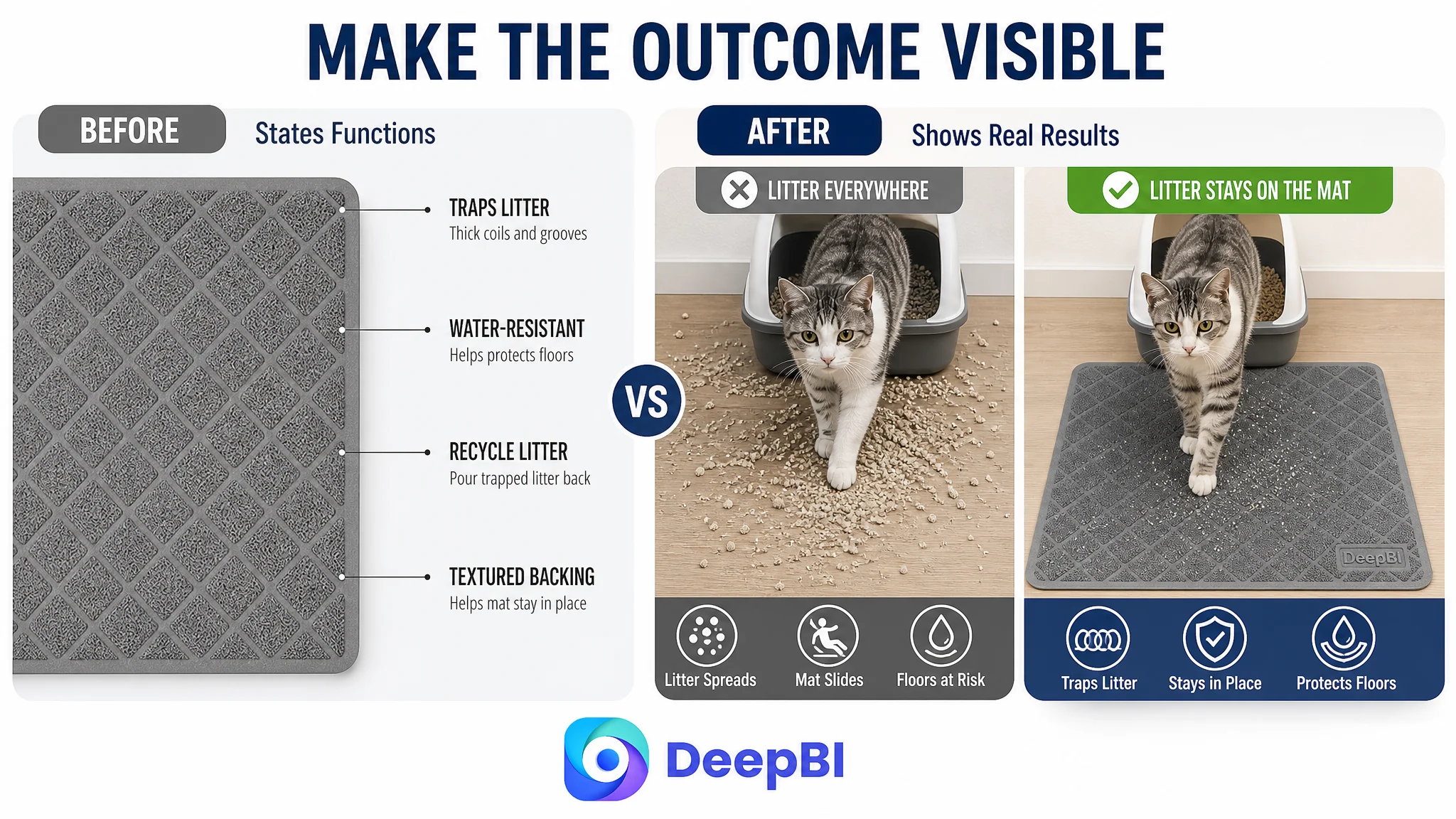
The function needed to be shown, not repeated
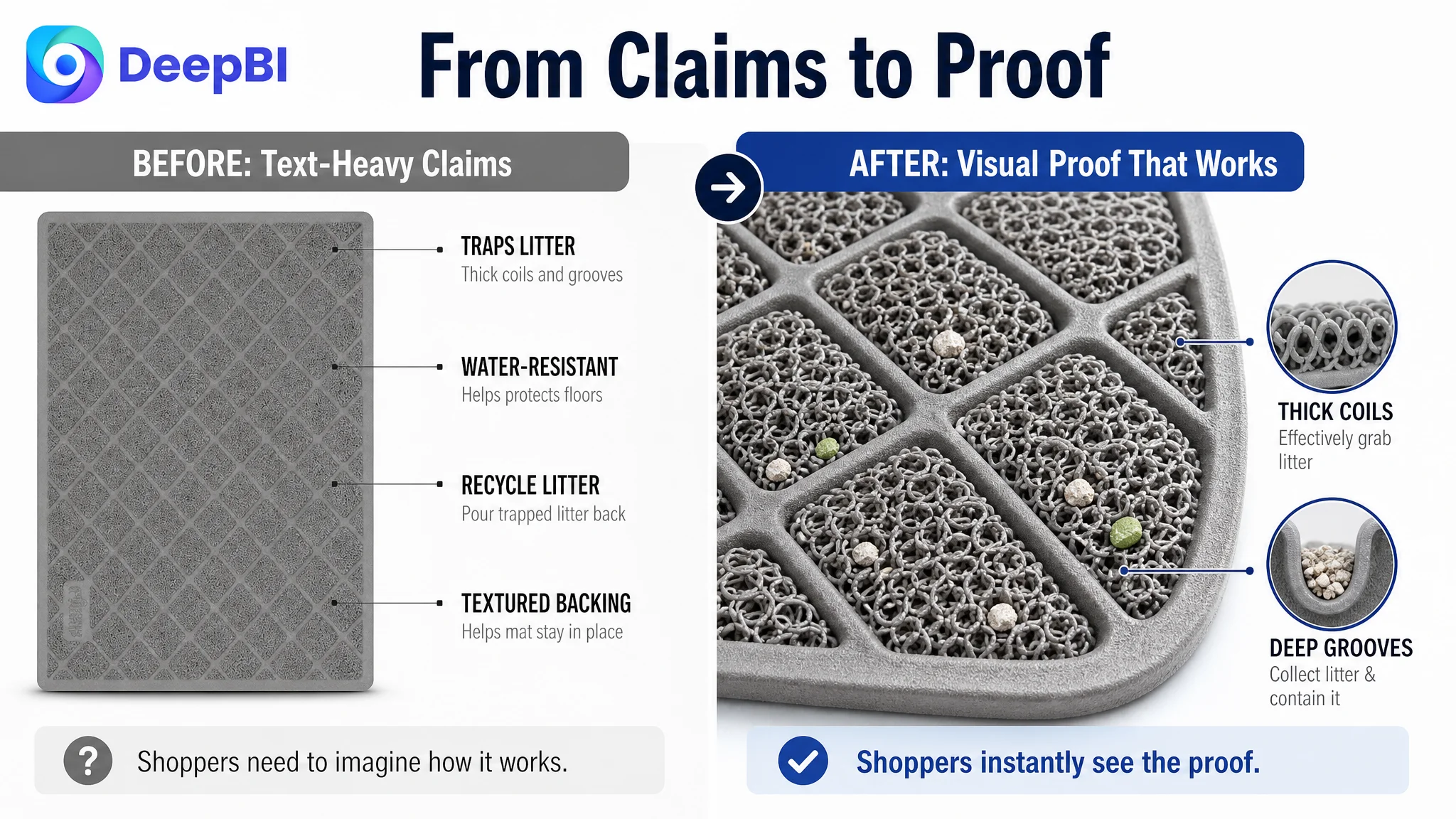
The page already mentioned litter trapping and water resistance. The problem was that these claims were not demonstrated in a sequence shoppers could quickly understand.
The revised direction would show:
- The mat positioned at the exit of a litter box
- Litter caught in the textured surface and grooves
- The floor kept cleaner around the box
- The backing helping the mat remain in place
- A clear, realistic demonstration of water resistance within the product’s supported claim
The important boundary is accuracy. The material supports “water resistant” and floor-mess prevention. It does not support inventing an internal absorbency system, a TPU core, or an unsupported waterproof performance claim. The visual strategy must make the real product more understandable, not make the product appear to be something else.
The two-pack needed to become a value argument
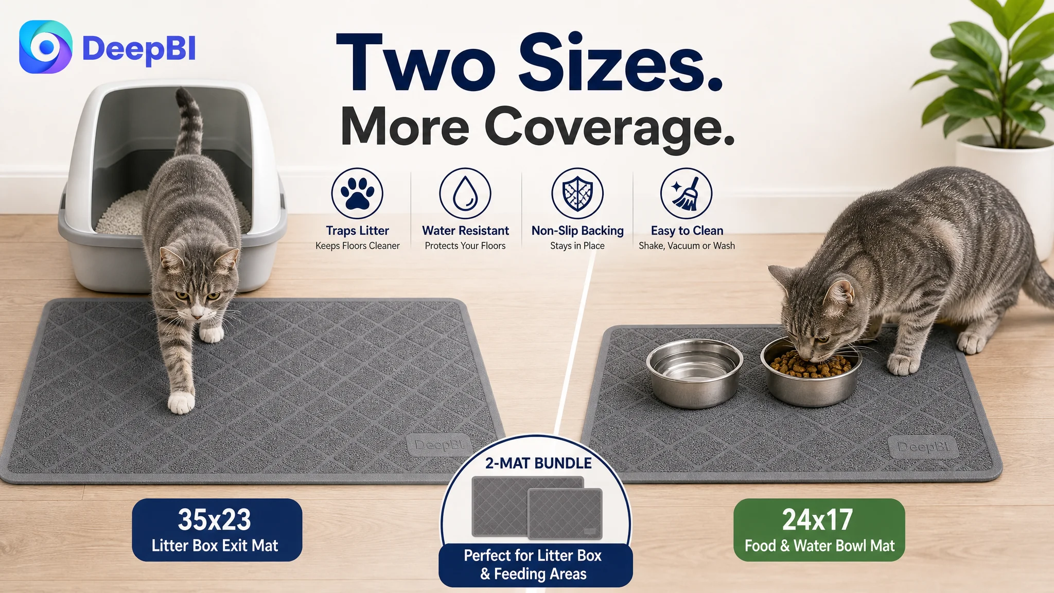
The two sizes were present in the Listing, but their commercial value was not fully visualized.
A more persuasive page would show the larger mat at the litter box and the smaller mat in a complementary location, such as a feeding area. This makes the two-pack easier to evaluate. Instead of reading “two sizes included,” shoppers can see how both pieces may fit into daily use.
Why DeepBI did not recommend continuing to tune the ads first
No advertising performance data was provided in this case, so the diagnosis does not claim a specific ACOS, CTR, or CVR movement. The business logic is still clear.
If advertising is sending shoppers to a page with weak visual explanation, missing A+ content, and no meaningful review foundation, more traffic does not automatically solve the problem. It can increase the number of shoppers encountering the same uncertainty.
Advertising can amplify a product page’s strengths, but it can also amplify the page’s unresolved doubts.
That is why the decision order mattered. The page had to become more capable of receiving traffic before the team could fairly judge whether ad targeting, bids, or campaign structure were the primary constraints.
This did not mean advertising was irrelevant. Amazon ads remain important for generating qualified visits and testing demand. But ads should not be treated as the first lever when the product page is still failing to communicate basic value.
The highest-risk mistake at this stage would have been to keep adjusting traffic while leaving the conversion foundation unchanged. That approach could create more clicks without creating enough additional orders, making the team believe that the ad system was inefficient when the deeper constraint was Listing conversion capacity.
The title and bullets needed better decision order, not just more keywords
The title was one of the stronger areas of the target Listing, scoring 16 out of 20. It already communicated the brand, two sizes, water resistance, easy cleaning, and softness for paws.
Its main opportunity was more precise search and conversion language. Terms such as “urine-proof,” “non-slip,” and “kitty litter rug” could better reflect the ways shoppers search and the concerns they are trying to solve, provided the claims remain accurate and compliant.
The recommended title structure placed the core product and functional value earlier, followed by the two-pack information, sizes, and supporting benefits. This made the Listing easier to understand on mobile search results, where shoppers may see only part of the title.
The bullets required a more substantial change in logic.
The first bullet should lead with the household problem
Instead of beginning with a specification list, the opening bullet should explain how the two sizes create a cleaner zone around different litter-box areas.
The second bullet should connect structure to litter control
The textured surface, thick mesh coils, and deep grooves should be described as part of a litter-trapping function, rather than as isolated construction details.
The third bullet should resolve stability concerns
The non-slip backing should be tied to common floor types and active cats, without overstating performance.
The fourth bullet should make cleaning feel manageable
Shaking, vacuuming, pouring collected litter back into the box, and occasional washing should be presented as a practical maintenance sequence.
The fifth bullet should close with comfort and broader use
Softness for sensitive paws, the two-pack convenience, and possible use near feeding areas or resting spaces can give the product a stronger final value impression.
A further detail was also important: folded packaging can create temporary creases. Adding a clear usage note can reduce the chance that a normal shipping effect becomes an unexpected customer complaint.
The image sequence needed distinct commercial jobs
The existing images repeated information across several slots. DeepBI’s recommendations gave each image a clearer role.
Start with recognition and use
The opening visual should make the category instantly recognizable and show the mat in an appropriate litter-box setting. For Amazon image compliance, the final execution must respect the requirements of the relevant image slot; the commercial principle is to make the use case immediately understandable rather than presenting an isolated component.
Move from features to proof
A text-heavy summary image should be replaced by a clearer demonstration of stability and floor cleanliness. The shopper should be able to understand the difference between a mat that stays useful in place and one that allows litter to spread.
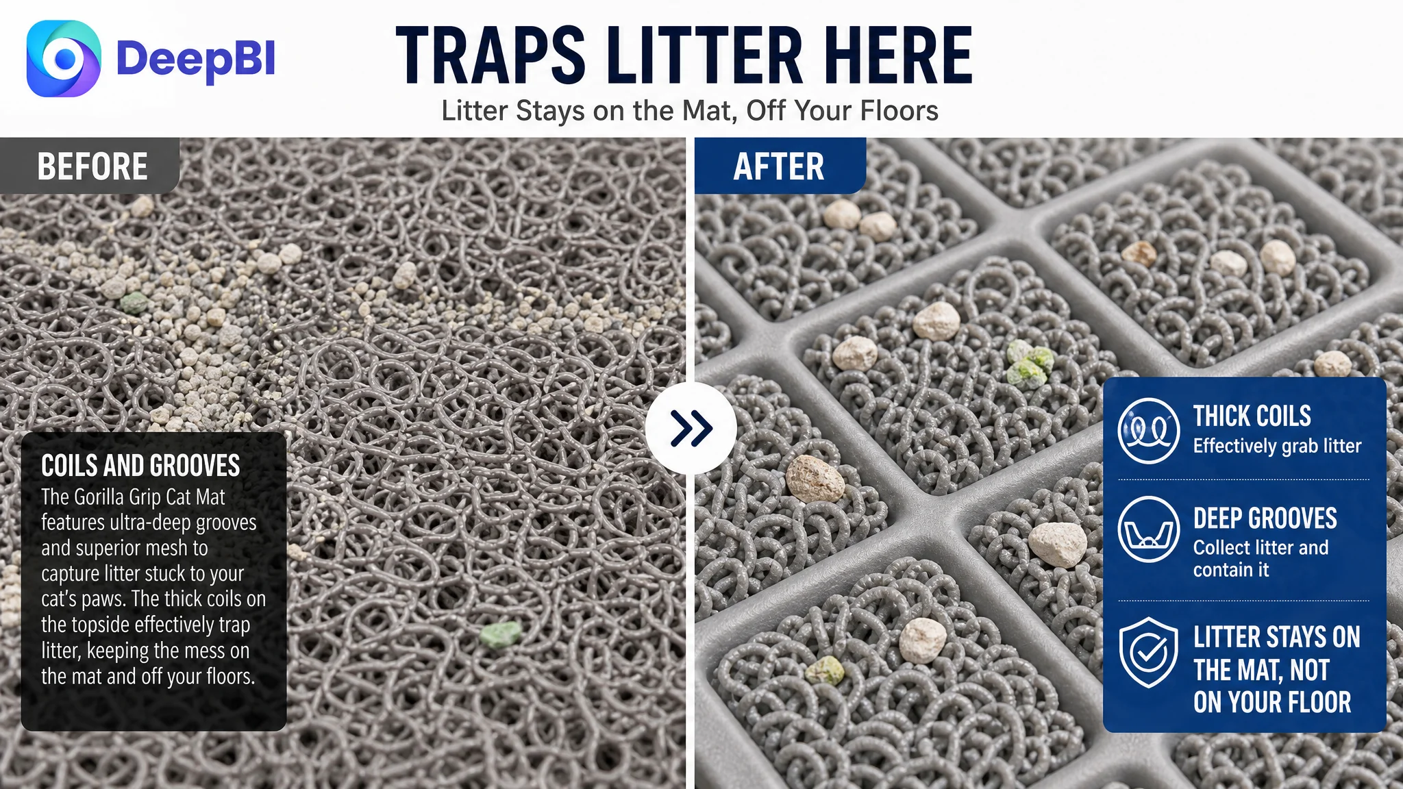
Show the trapping mechanism in action
A close-up can remain valuable, but it should make the captured litter visible. The image should communicate a simple outcome: litter is retained on the mat rather than being carried across the floor.
Visualize the two-pack
One size can be shown at the litter box while the second supports another pet area. This turns bundle information into a practical use case.
Use the final image to reduce remaining risk
Maintenance should not consume the most valuable later image slot if basic trust questions remain unanswered. Softness for paws and realistic water-resistance evidence can do more to support the final decision than another repeated cleaning explanation.
What changed in the team’s understanding
The important change was not merely a new title, a revised bullet list, or a new set of images.
It was a change in diagnosis.
The seller no longer had to ask only:
- Which keyword should be added?
- Which feature should be described again?
- Which image looks more attractive?
- Should more ad traffic be sent to the page?
The more useful questions became:
- Can shoppers understand the product within the first visual impression?
- Does the page prove the functions that matter most?
- Is the two-pack value obvious?
- Does the A+ content reduce uncertainty?
- Is the lack of reviews limiting trust independently of the content quality?
- Is the Listing ready to convert both paid and organic traffic?
This is where the 50/100 score became commercially meaningful. It was not a verdict on whether the product was good. It was evidence that the page was underdeveloped relative to the competitive standard in the exact areas that support conversion.

The result to pursue was a more controllable Listing, not a cosmetic refresh
The case material does not include post-optimization advertising or sales data, so no improvement in CVR, ACOS, organic orders, or keyword rank should be claimed.
The defensible outcome is the change in operating direction:
- The detail page became the first priority rather than an afterthought.
- The image sequence was reorganized around shopper decisions.
- The title was refined for clearer search coverage and value communication.
- The bullets were rebuilt around problem, solution, and use context.
- The two-pack was positioned as practical coverage rather than a quantity statement.
- The limits of “water resistant” were kept clear.
- The Listing’s visual strategy was aligned with the product’s real attributes.
- Advertising could be evaluated more fairly after the page had a stronger conversion foundation.
For Amazon sellers, the broader lesson is straightforward: a product page can have decent keywords and acceptable images while still failing commercially. When the largest gaps sit in A+ content, trust, usage visualization, and review evidence, repeated ad adjustments may only move the symptoms.
Before scaling Amazon ads, judge whether the product page deserves more traffic.