

The customer was an Amazon seller in the US marketplace whose 6-tier indoor plant stand Listing was competing for attention in a visually crowded category. The initial concern was easy to frame as a traffic or advertising problem: the product needed stronger visibility, more persuasive creative, and better access to high-intent searches.
But the deeper issue was not simply how to bring more shoppers to the Amazon product page. The page was not giving those shoppers enough reasons to trust the product, understand its fit, or believe that the grow-light function would solve a real indoor gardening problem.
The seller initially focused on individual elements such as title wording, product images, and feature descriptions. DeepBI’s diagnosis showed that these were not isolated weaknesses. The central problem was a broken Listing conversion path, especially the complete absence of A+ content and the lack of a clear sequence from space-saving design to grow-light value, durability, stability, and assembly.
The later optimization therefore focused on repairing the Amazon product page before treating more traffic as the answer: clarify the title, move dimensions earlier, make the grow-light information more concrete, replace repetitive images with decision-making visuals, and build an A+ story around real home use. The case offers a practical reminder for Amazon sellers: before scaling ads, determine whether the Listing is ready to convert the traffic it receives.
The Store Did Not Have a Single Weak Image. It Had a Weak Sales Path.
At first glance, the Listing appeared to have several manageable issues:
- The title could be tightened.
- The main images could be reordered.
- The five bullet points could be rewritten.
- The grow-light function could be explained more clearly.
- The page could use stronger lifestyle photography.
Those observations were all valid, but treating them as separate editing tasks would have missed the business problem.
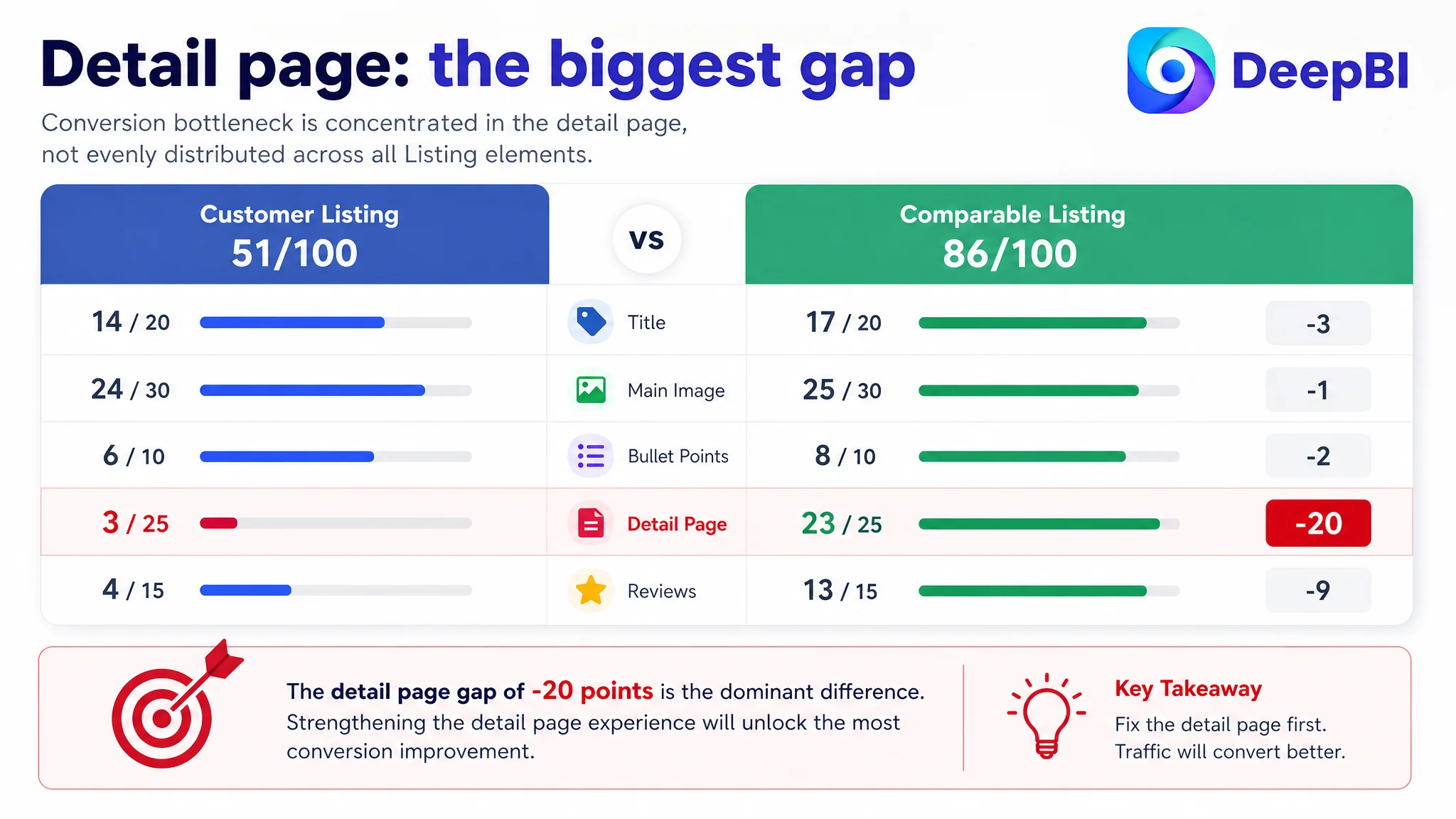
The Listing scored 51 out of 100, compared with 86 out of 100 for a closely matched high-performing competitor. The gap was not distributed evenly across every dimension.
- Title: Customer Listing: 14/20, Comparable high-performing Listing: 17/20, Gap: -3
- Main image: Customer Listing: 24/30, Comparable high-performing Listing: 25/30, Gap: -1
- Bullet points: Customer Listing: 6/10, Comparable high-performing Listing: 8/10, Gap: -2
- Detail page: Customer Listing: 3/25, Comparable high-performing Listing: 23/25, Gap: -20
- Reviews: Customer Listing: 4/15, Comparable high-performing Listing: 13/15, Gap: -9
- Total: Customer Listing: 51/100, Comparable high-performing Listing: 86/100, Gap: -35
The most important finding was not that the title was imperfect or that the main image could be more attractive.
It was that the Listing’s largest weakness sat in the detail page experience. The customer had no A+ content and was using repeated title text rather than visual modules that could explain the product, establish scale, demonstrate function, and address purchase concerns.
The page was not merely missing more content. It was missing the logic that helps a shopper move from interest to confidence.
That distinction changed the optimization order.
Why Traditional Amazon Listing Editing Would Have Been Incomplete
A typical optimization process might have started with keyword placement. The product category contains several important search concepts: indoor plant stand, grow lights, 6-tier plant shelf, corner plant holder, and multiple plants.
The customer’s title already placed some core terms near the front, so the problem was not a total lack of keyword coverage. The issue was that the structure was less mature and less differentiated than the benchmark Listing.
The comparable Listing communicated more in the same space:
- Brand identification
- Core product form
- Grow-light function
- Hanging basket hook
- Color
- Multi-plant use
- Indoor and outdoor placement scenarios
The customer’s title was more repetitive and less compact. It also repeated “Metal” and lacked several useful context terms such as “Multiple Plants,” while failing to communicate a distinctive reason to click.
This matters because an Amazon title has two jobs at once. It must help the product appear for relevant searches, but it must also help a shopper quickly recognize that the product matches the intended use.
Improving the title was necessary. It was not sufficient.
The same pattern appeared in the bullet points. The customer described functions, but the sequence did not consistently connect each function to a buyer concern. By contrast, the benchmark Listing led with space-saving use, then explained adjustable grow-light value, material durability, structural stability, and assembly.
The difference was not simply better English or more keywords.
It was a difference in decision order.
The Real Bottleneck Was Listing Conversion Capacity
The score gap made the priority clear.
The title was behind by 3 points. The bullet points were behind by 2. The main image was behind by only 1. But the detail page was behind by 20 points, and reviews were behind by 9.
That distribution suggested that continuing to polish the top-of-funnel presentation first would not address the most serious constraint.
A shopper arriving on the Amazon product page still needed answers to several practical questions:
- Will this plant stand fit naturally in a living room corner?
- Is the product too large or bulky for the intended space?
- How many plants can it hold?
- Are the grow lights genuinely useful or just decorative?
- What controls are available for brightness, timing, and light modes?
- Will the frame remain stable when pots are watered?
- Can the materials withstand regular indoor or patio use?
- Is assembly likely to become frustrating?
The customer’s page did not guide the shopper through these questions in a structured way.
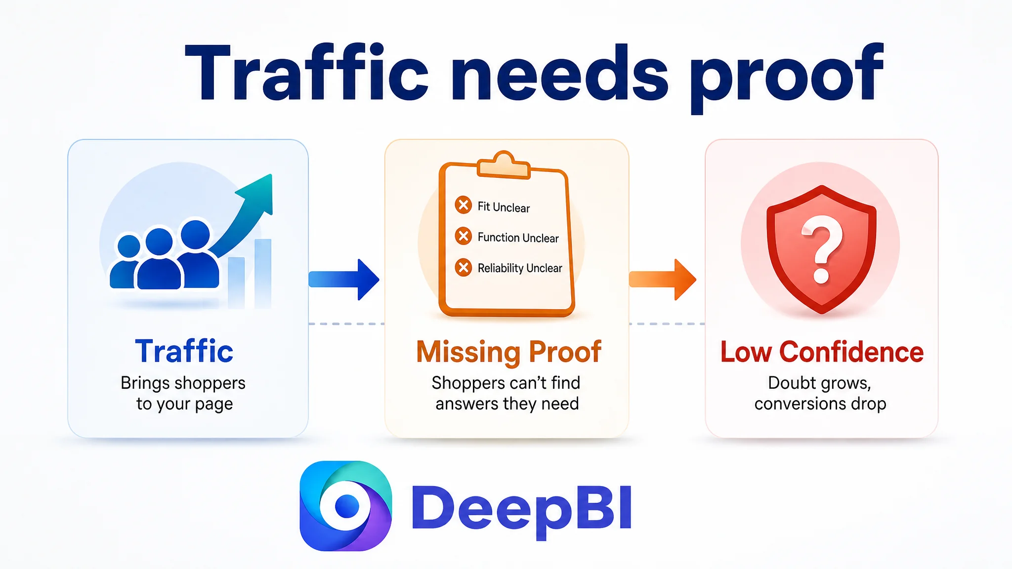
There was no A+ sequence showing the stand in a realistic home environment. There was no dedicated visual explanation of the grow-light system. There was no material comparison, stability module, size-context image, or assembly story.
That left the product asking shoppers to infer too much.
When a Listing requires the shopper to construct the product’s value alone, paid traffic becomes less productive and organic traffic becomes harder to convert.
The Main Image Was Not the Biggest Problem, but It Still Needed a Better Role
The main image dimension scored relatively close to the benchmark, but the image sequence did not make the best use of the available decision stages.
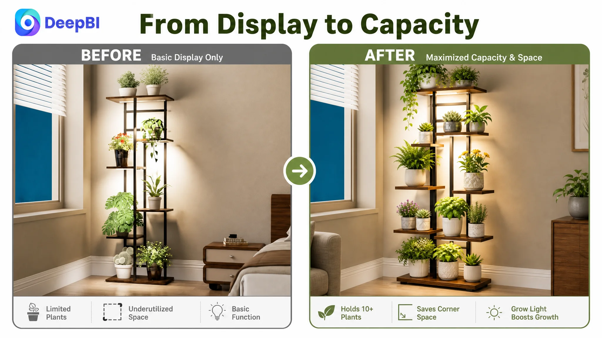
The first image showed the product in a general scene, but it did not make the stand’s full capacity and space-saving role immediately obvious. A 6-tier plant stand has a natural visual advantage: it can organize multiple plants vertically in an area that might otherwise feel crowded.
The image should therefore do more than show the product standing in a room. It should make the capacity promise visible.
A stronger direction would show:
- Several plant sizes arranged across the tiers
- Larger or heavier pots positioned on lower levels
- The stand placed naturally in a corner
- The product fully used without appearing overloaded
- The hanging basket hook, if confirmed as part of the actual product, used as a visible functional element
The goal is not to make the scene busier. It is to make the product’s purpose easier to understand at thumbnail scale.
Dimensions Needed to Move Earlier
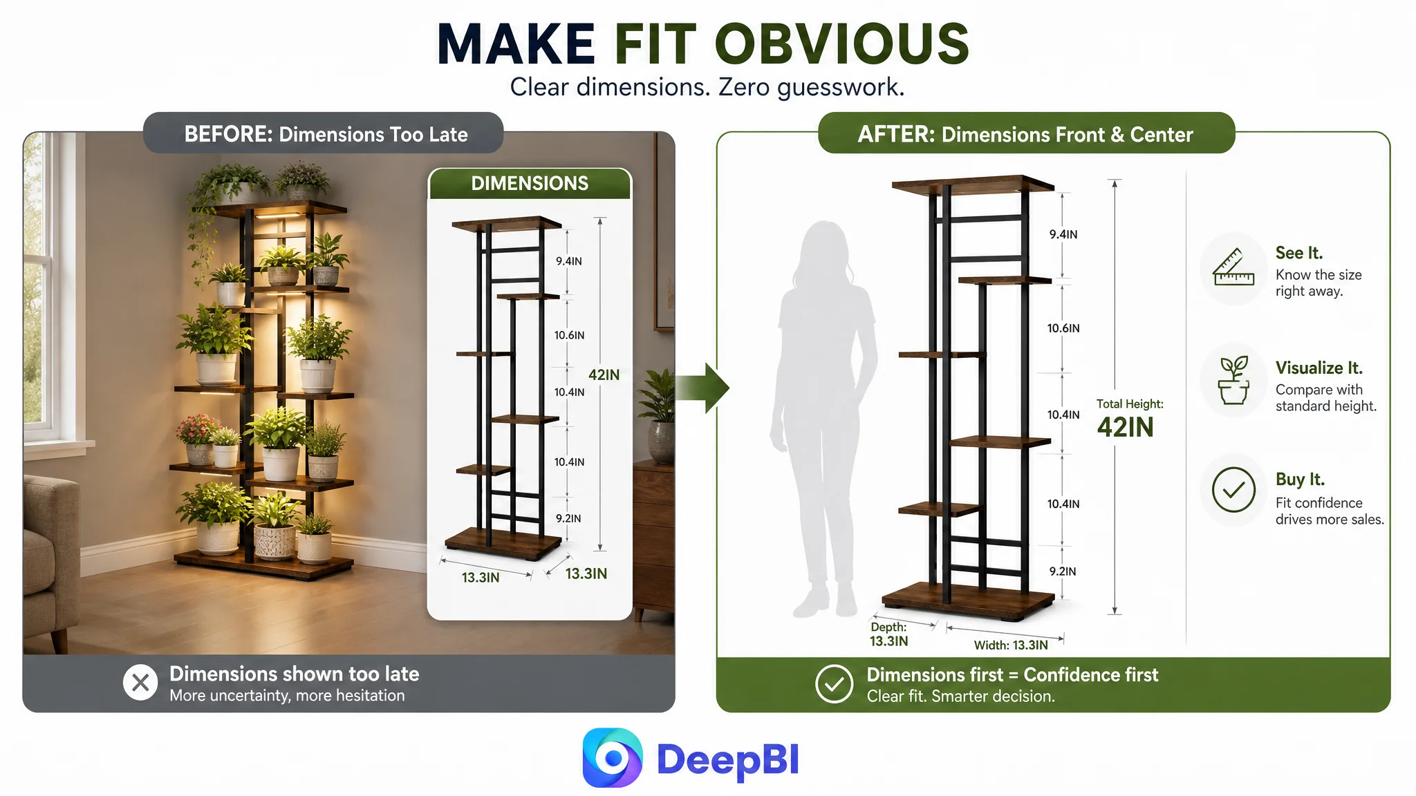
The dimension image appeared too late in the sequence. It was placed fifth, even though physical fit was likely to be one of the first purchase concerns.
For a tall, multi-tier plant stand, shoppers need to establish scale quickly. A dimension image should therefore move to the second position, immediately after the initial product presentation.
That image can work harder by connecting measurements to the buyer’s mental model:
- Clear height and width callouts
- Shelf spacing where relevant
- A human-scale reference or familiar room context
- Examples of the types of pots that can fit on different tiers
This is not merely an image-order adjustment. It reduces a specific form of purchase uncertainty: whether the product will fit the shopper’s room and plants.
Technical Grow-Light Information Needed More Specificity
The existing grow-light image used general icons, but did not provide enough concrete explanation. The benchmark Listing showed a more technical treatment, including timer settings, brightness adjustment, light modes, and the controller or cord arrangement.
The customer’s Listing should communicate only confirmed product specifications, but it should make those specifications easier to verify visually. The relevant information includes:
- Full-spectrum LED grow-light positioning
- Adjustable timing
- Brightness levels
- Light modes
- Adjustable light positions
- The relationship between the controller and the lights
The issue was not that the product lacked a grow light. The issue was that the page did not make the value of that feature sufficiently credible.
Repetitive Images Were Consuming Decision Space
One of the customer’s later images repeated a basic product scene without adding much new information. On Amazon, every image position has a job. A repeated scene may look acceptable, but it does not necessarily remove a buying objection.
That position could instead be used for a before-and-after comparison:
- Before: several plants occupying floor space in a disorganized arrangement
- After: the same plants organized vertically on the 6-tier stand
This type of comparison would make the space-saving benefit concrete. It would also connect directly to the category’s practical problem: plant owners want more display capacity without allowing their living space to become crowded.
The visual should not exaggerate the product’s capacity or invent a use case. It should simply demonstrate the organization benefit in a way that a shopper can understand immediately.
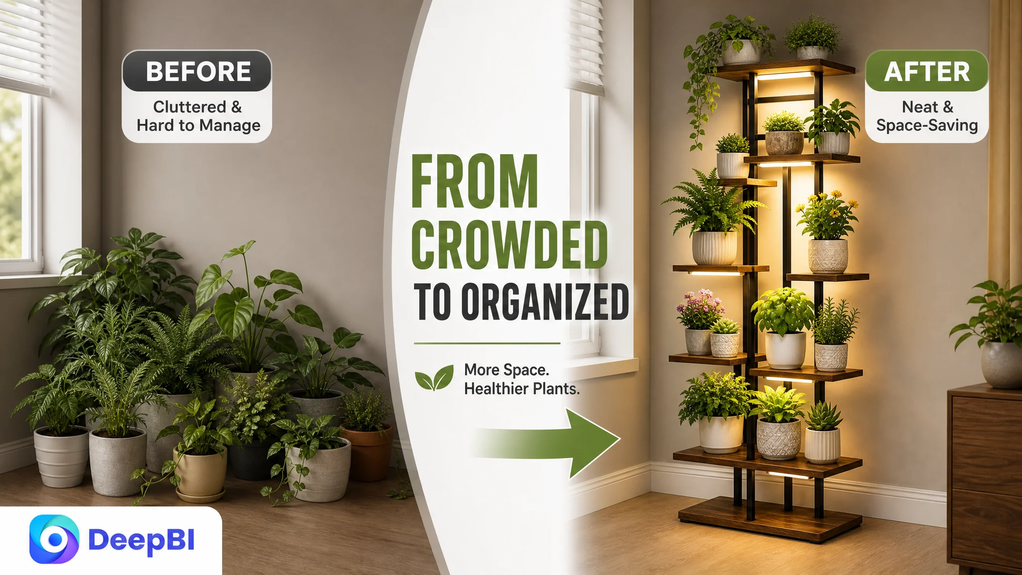
A strong Amazon image does not only make the product look better. It answers a question before the shopper has to ask it.
The Bullet Points Had Information, but Not Enough Buying Logic
The five bullet points contained useful product information, but their order and framing did not consistently follow the shopper’s decision path.
The proposed restructuring placed the strongest purchase concerns into a more persuasive sequence.
The grow light should explain the outcome, not only the component
A stronger first bullet would connect the full-spectrum LED grow lights to practical indoor plant care, while clearly stating the available adjustment functions.
The customer’s product information supports discussion of:
- Adjustable timers
- Multiple brightness levels
- Different light modes
- Flexible light positioning
- Supplemental lighting for indoor plants at different growth stages
This makes the feature more meaningful than a generic statement that the product “has grow lights.”
The vertical structure should lead with space efficiency
The second bullet should explain how the 6-tier vertical design uses corner space and accommodates multiple plants. It can also introduce the product’s secondary display role for books, photos, or ornaments, provided those uses accurately reflect the product.
The key is to lead with the buyer’s problem:
How can several plants be displayed without taking over the room?
Material claims should be tied to daily use
The materials bullet should connect the thickened, rust-resistant metal frame and waterproof coating to practical concerns such as load-bearing, water exposure, maintenance, and long-term indoor or patio use.
Material adjectives alone are weak evidence. Their value becomes clearer when linked to the conditions in which the product will be used.
Stability should show how the structure works
The stability bullet should explain the layered structure, thickened base, and non-slip foot pads. It should also provide a practical placement recommendation: heavier pots on lower tiers can help maintain balance.
This type of guidance is more persuasive than simply calling the stand “stable,” because it shows how the stability claim relates to actual use.
Assembly and placement should close the decision path
The final bullet should address setup and versatility together:
- Necessary tools included
- Clear instructions
- Assembly designed to be completed without complicated installation
- Use in living rooms, bedrooms, balconies, offices, gardens, or patios where appropriate
The result is a progression from need, to function, to durability, to stability, to ownership experience.
The Missing A+ Content Removed the Final Layer of Trust
The most consequential weakness was the absence of A+ content.
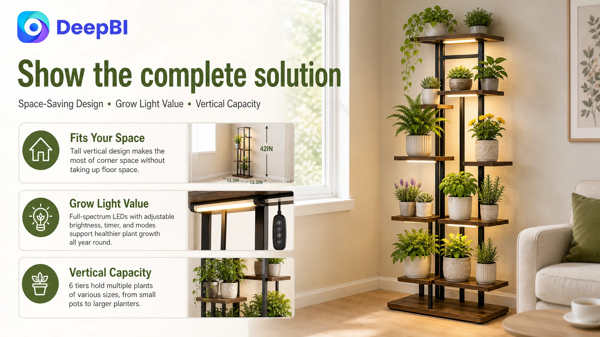
The benchmark Listing used a sequence of visual modules covering:
- Real home scenes
- Core feature explanations
- Dimensions
- Material comparison
- Product details
- Function demonstrations
The customer’s Listing had none of this. The detail section repeated title text without adding visual proof or structured persuasion.
That left several important questions unanswered.
The product needed to be shown at home scale
A realistic living room corner, balcony, or study could help shoppers understand that the product is a tall display solution rather than an oversized piece of furniture.
The visual should show the stand integrated into a believable environment, with enough surrounding context to establish proportion.
The grow light needed a rational explanation
The grow-light module should show how the feature is adjusted and why it matters for indoor plants. It should avoid vague claims and use only confirmed specifications.
The purpose is to distinguish a useful lighting system from a decorative add-on.
The materials needed visible evidence
A material module could show the metal frame, waterproof-coated shelving surface, and relevant construction details. The page should explain why those details matter when plants are watered and the stand is used regularly.
Capacity and stability needed their own proof
A 6-tier structure creates a natural opportunity to show how plants of different sizes can be arranged. A separate module can explain the thickened base and non-slip foot pads, while another can show appropriate placement of heavier pots.
Assembly needed to feel manageable
Multi-tier products can create an immediate concern about setup. A clear assembly module showing included tools, key components, and a simple installation sequence could reduce that concern before it becomes a reason to leave the page.
This is why A+ content was not a cosmetic enhancement in this case. It was the missing middle of the conversion argument.
Reviews Confirmed That the Trust Gap Was Commercially Serious
The review profile reinforced the diagnosis.
The customer’s Listing had:
- 3.9 stars
- 43 total reviews
- 32% one-to-three-star reviews
The benchmark Listing had:
- 4.5 stars
- 344 total reviews
- 13% one-to-three-star reviews
The review volume was approximately one-eighth of the benchmark’s total. The rating gap was 0.6 stars, and the higher share of negative feedback created an additional trust barrier for first-time buyers.
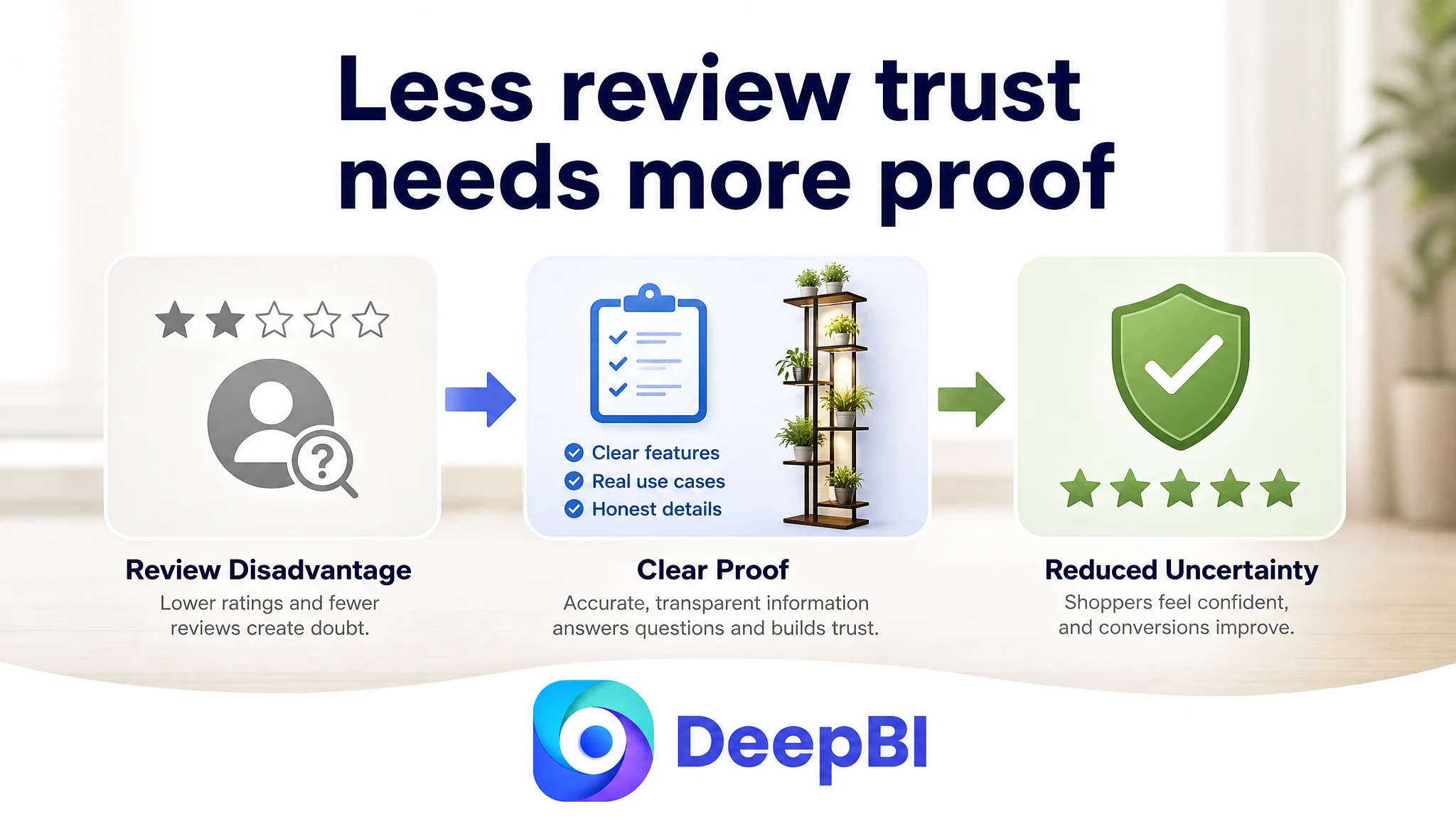
This did not mean the Listing could solve its conversion problem through page content alone. Reviews are a separate business constraint, and visual or copy changes cannot erase product experience problems reflected in customer feedback.
But the review gap made it even more important for the page to communicate clearly and avoid creating new uncertainty. When a shopper sees a lower rating and fewer reviews, unclear dimensions, generic feature claims, and missing A+ content provide little additional reassurance.
The page needed to compensate through accuracy, transparency, and stronger explanation—not through exaggerated promises.
Why DeepBI Did Not Recommend Tuning Ads First
The central decision was not “optimize everything.”
It was to determine what should be fixed first.
If the page has a weak ability to convert traffic, additional advertising can create a misleading operating loop:
1. Ads generate impressions and clicks.
2. Shoppers reach a page that does not clearly explain fit, function, or reliability.
3. More shoppers leave without ordering.
4. Advertising efficiency appears weak.
5. The team responds by changing bids, keywords, or campaign structure.
6. The page-level constraint remains in place.
Advertising can amplify a strong product page, but it can also amplify the consequences of a weak one.
In this case, the score distribution showed that the most serious weakness was not the main image or the initial keyword structure. It was the page’s ability to receive traffic and turn it into confidence.
That is why the recommended order was:
1. Repair the product page’s decision logic.
2. Clarify title and bullet-point communication.
3. Reorder images around fit, function, and proof.
4. Build A+ content that completes the persuasion path.
5. Use later advertising data to evaluate whether the improved page is converting more effectively.
This sequence does not suggest that ads are unimportant. It suggests that ads should not be used as the first response to a page that has not yet earned the opportunity to convert more traffic.
The Optimization Direction Was a Rebuild of the Page’s Commercial Logic
The recommended changes can be summarized as a shift from showing a plant stand to selling a more organized indoor plant-growing experience.
The Listing needed to make five ideas work together:
- Space: A vertical structure helps organize multiple plants in limited areas.
- Light: Adjustable full-spectrum grow lights provide supplemental indoor lighting.
- Durability: The frame and coated shelves are presented in relation to daily use.
- Stability: The base, layered structure, and foot pads address balance and floor protection.
- Ownership: Clear dimensions and straightforward assembly reduce practical hesitation.
The title, images, bullets, and A+ content should not repeat the same claim in different formats. Each element should advance the decision.
The title should capture relevance and core product identity.
The early images should establish appearance, scale, and fit.
The bullet points should connect features to use cases.
The later images should provide technical and practical proof.
The A+ content should bring the full story together in realistic settings.
This is the difference between adding content and building a conversion system.
What Changed in the Customer’s Understanding
No post-optimization performance data was provided, so the case does not support claiming a specific CVR increase, ACOS decline, or organic-order recovery.
The measurable conclusion available at the diagnosis stage was more fundamental: the customer could now see why isolated edits had not addressed the main constraint.
The Listing was not simply “behind the competitor” in a general sense. It was specifically underdeveloped in the area that helps shoppers make a confident purchase decision.
That reframed the business problem in several ways:
- A lower-performing Amazon Listing is not always an advertising setup problem.
- A product page can lose efficiency even when the product has relevant features.
- A title and five bullet points cannot replace missing visual proof.
- A+ content has a direct role in explaining use, fit, function, and trust.
- Review weakness makes clarity and transparency more important.
- Before increasing traffic, sellers should assess whether the page can convert it.
The decisive improvement was not a more aggressive traffic plan. It was a clearer understanding of what the traffic was failing to find on the page.
The Broader Lesson for Amazon Sellers
For Amazon sellers, Listing optimization is often treated as a sequence of small tasks: revise the title, rewrite the bullets, replace an image, add keywords, and monitor the result.
Those tasks matter, but they should follow a diagnosis.
In this case, the largest opportunity was found by comparing the customer Listing against a relevant market benchmark across the full conversion path—not by judging one image in isolation or relying on subjective design preference.
The important question was not:
Which element looks weakest?
It was:
Which missing element is preventing the page from converting the traffic that the seller is trying to acquire?
For this 6-tier indoor plant stand, the answer was a Listing conversion gap centered on missing A+ content, incomplete visual proof, weak information sequencing, and a review disadvantage.
Once that was understood, the optimization direction became more disciplined. The team could improve the title without overloading it, move dimensions before uncertainty grew, make the grow-light function more credible, replace repetitive images with problem-solving visuals, and build an A+ narrative that supports the entire buying decision.
That is the practical value of a data-led Amazon diagnosis: not producing more changes, but identifying which change has to come first.