

An Amazon seller in the US kitchen category was facing a familiar Listing problem: the product page contained the expected features, images, and use cases, yet its overall competitive strength remained far behind a comparable high-performing Amazon Listing. The initial direction leaned toward adding keywords, explaining functions, and showing more product details.
DeepBI’s diagnosis pointed to a different constraint. The page did not mainly lack information; it lacked a clear buying sequence. The title listed features without enough decision value, the main images did not prove usefulness quickly, the bullet points described functions instead of solving user concerns, and the A+ content introduced the brand before confirming that the product worked.
The later optimization therefore focused on Amazon Listing conversion rather than simply adding more content: prove compact storage, make precision visible, demonstrate tare and unit conversion, and move functional validation ahead of aesthetic presentation. The case shows why Amazon sellers should judge whether a product page is ready to receive more traffic before treating advertising as the first place to make changes.
The Page Looked Complete. The Business Logic Was Not
At first glance, the Listing did not appear empty.
The kitchen scale had a title, five bullet points, multiple images, an A+ page, several usage scenarios, and a recognizable visual style. The page showed cooking, baking, meal preparation, food measurement, and a waterproof glass surface.
But a complete page is not necessarily a persuasive page.
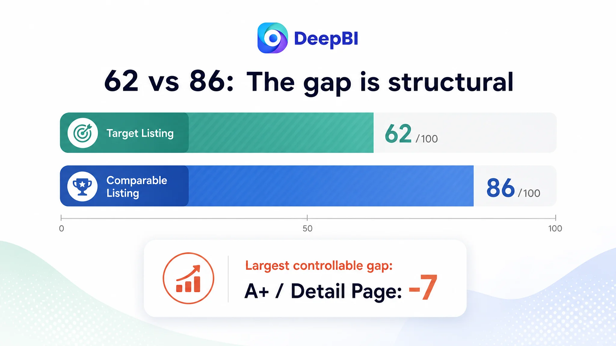
The DeepBI comparison gave the Listing an overall score of 62 out of 100, compared with 86 out of 100 for a comparable high-performing Listing in the same Amazon category.
That 24-point gap was not evenly distributed:
- Title: Target Listing: 14/20, Comparable high-performing Listing: 17/20, Gap: -3
- Main image: Target Listing: 25/30, Comparable high-performing Listing: 24/30, Gap: +1
- Bullet points: Target Listing: 5/10, Comparable high-performing Listing: 8/10, Gap: -3
- Detail page and A+ content: Target Listing: 16/25, Comparable high-performing Listing: 23/25, Gap: -7
- Reviews: Target Listing: 2/15, Comparable high-performing Listing: 14/15, Gap: -12
- Total: Target Listing: 62/100, Comparable high-performing Listing: 86/100, Gap: -24
The first reaction might be to focus on the review gap. That gap was real and commercially important: the target Listing had a 3.8-star rating and six total reviews, while the comparable Listing had 4.6 stars and more than 15,000 reviews.
However, reviews were not the only reason the page struggled. The more actionable issue was that nearly every controllable page element was asking the shopper to interpret the product rather than helping the shopper reach a decision.
The Listing did not lack features. It lacked a clear path from “What is this?” to “Why should I buy it?”
The Original Diagnosis Focused on Coverage
The original page logic followed a common Amazon operating pattern.
The title placed “Food Scale” near the beginning and covered terms such as ounces, grams, dieting, and baking. The images presented dimensions, product details, unit conversion, cleaning, and different food scenarios. The A+ content showed the brand, product patterns, dimensions, features, and general usage.
None of these choices was unreasonable on its own.
The problem was the order and role of the information.
The title placed the color term “Sage Green” and the model name before the core buying advantages. It included several functions, but did not communicate a strong outcome such as precision, portability, or easier multi-ingredient preparation.
The image set contained more images than the comparison Listing, but additional images did not automatically create additional persuasion. Some frames repeated information or presented several food items in a crowded layout. The shopper could see more, but was not necessarily given a stronger reason to click or trust the product.
The A+ page followed a similar pattern. It introduced the brand and product variations early, then moved through dimensions, unit conversion, cleaning, and general applications. This created a page that was rich in content but weak in decision sequencing.
That was the central misdiagnosis: treating Listing weakness as an information coverage problem rather than a conversion logic problem.
The Score Gap Located the Real Constraint
DeepBI’s role in this case was not to declare that one image looked better than another. It was to connect the Listing elements to the decisions they were supposed to support.
The score comparison showed that the largest controllable weaknesses were not in the main image score. They were concentrated in:
- Bullet-point logic
- Detail-page and A+ persuasion
- Title structure and value communication
- Trust signals surrounding the product
The review score was the largest gap overall, but it also represented a structural disadvantage that page edits could not immediately remove. The more urgent question was therefore:
How could the Listing use its controllable assets to build confidence despite having a much smaller review base?
The answer was not to imitate the competitor’s review volume. It was to make the product’s functional value easier to verify.
The title had keywords, but not enough decision value
The title had a search-friendly foundation because “Food Scale” appeared early. But the placement of the color and model information diluted the opening, while the remaining wording leaned toward a list of specifications.
The comparable Listing used a more mature progression:
- Brand or product identity
- Core category term
- Precision benefit
- Ease-of-use benefit
- Compact or portable design
- Cooking, baking, and meal-prep scenarios
The target Listing covered related search terms but underused higher-value language around precision and portability. It also lacked a clear separation between physical attributes, functional benefits, and use cases.
The recommendation was not simply to add more keywords. It was to reorganize the title so that the first mobile-preview impression communicated what the scale was, why it was useful, and where it fit into daily kitchen tasks.
The main image showed the product, but did not create a strong utility hook
The main image dimension was not the weakest score. In fact, it scored slightly higher than the comparable Listing.
That made the diagnosis more nuanced.
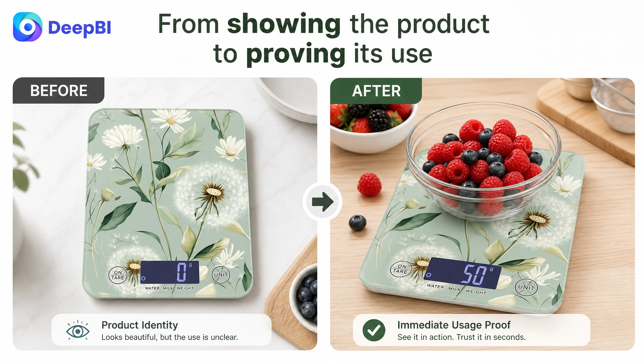
The issue was not that the product was visually unusable. The issue was that the image sequence did not turn the product’s strongest advantages into immediate visual proof. The first image emphasized aesthetic identity, but did not show active measurement. A later image showed dimensions and the back of the scale, but did not translate the thin profile into a storage benefit.
The image set also relied too heavily on text and visual suggestion when it could have used more direct demonstrations:
- A hand sliding the scale into a slim drawer
- A bowl being weighed on the platform
- The display returning to zero during tare
- Light ingredients such as spices or coffee beans being measured
- A wipe removing flour or food residue from the tempered glass surface
These changes were designed to reduce the amount of interpretation required from the shopper.
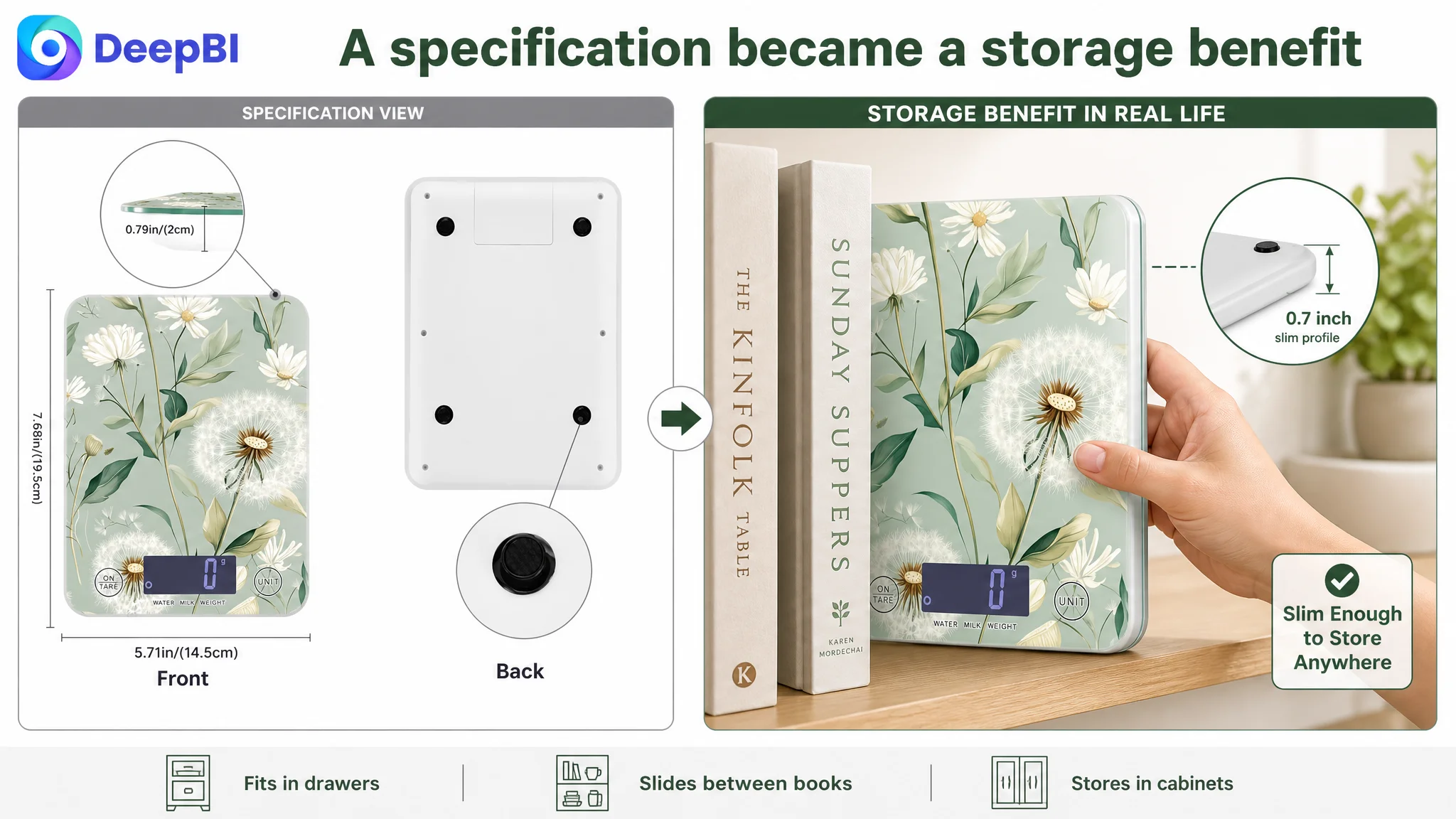
A kitchen scale should not merely look compact or precise. The page should show what compact and precise mean in everyday use.
The Bullet Points Listed Functions Instead of Resolving Concerns
The bullet-point score was 5 out of 10, three points below the comparable Listing.
The target bullets covered dimensions, power behavior, material, unit conversion, tare, and use cases. But the structure remained primarily feature-led.
The comparable Listing started with situations shoppers already recognized:
- Measuring ingredients for recipes
- Saving counter space
- Achieving consistent measurements
- Adding multiple ingredients to one bowl
- Cleaning the scale easily
- Using it across cooking, baking, meal prep, and portion control
This difference matters because shoppers do not usually buy a kitchen scale to own an LCD display or four units. They buy it to avoid inconsistent recipes, reduce extra measuring tools, control portions, or make preparation easier.
The revised direction therefore reorganized the bullets around a sequence of concerns.
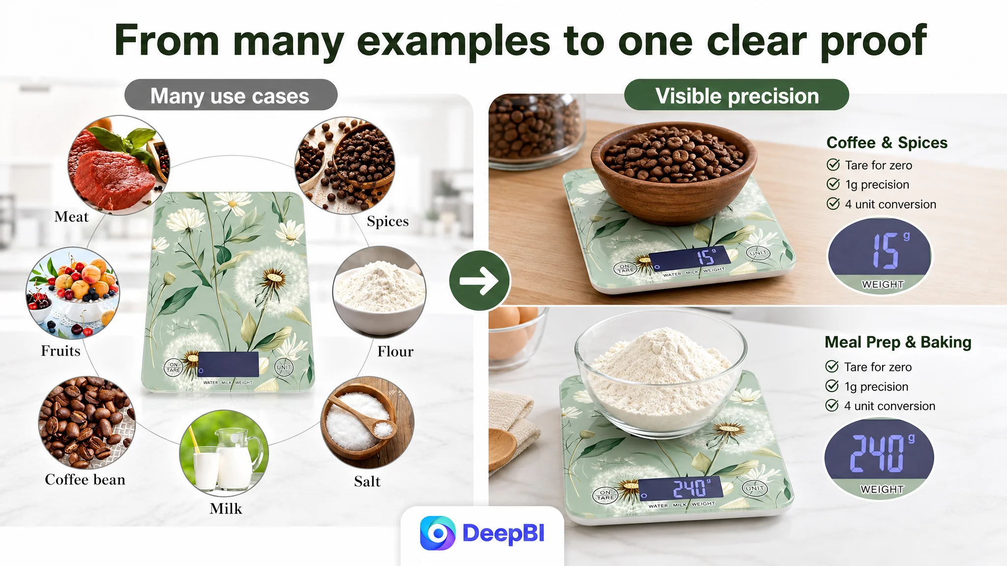
Compactness became a storage benefit
Instead of presenting dimensions as isolated specifications, the first bullet was positioned around drawer and cabinet storage. The product’s 7.6 x 5.7 x 0.7-inch profile became evidence that the scale would not occupy unnecessary counter space.
Precision became something the shopper could trust
The second bullet moved from a general claim about accurate measurement to a clearer explanation of consistent weighing across small ingredients and heavier baking items. Where specifications were confirmed, the recommendation favored concrete measurements and sensor-based support rather than vague claims.
Tare became a preparation workflow
The third bullet explained the practical sequence: place a bowl, reset to zero, and add ingredients one at a time. This turned “tare function” from a button label into a way to reduce extra bowls and calculations.
Material became a maintenance advantage
The tempered glass and waterproof surface were retained, but expressed through the kitchen problem they solved: wiping away flour, food residue, and spills quickly.
Auto-off and everyday use completed the practical case
The final bullet connected automatic shutoff with battery conservation and positioned the scale for coffee, baking, dieting, and meal preparation. The battery requirement was also stated clearly to avoid post-purchase misunderstanding.
This was not a request for longer copy. It was a change from feature presence to user consequence.
The A+ Page Was the Largest Controllable Conversion Leak
The detail-page and A+ score was 16 out of 25, compared with 23 out of 25 for the comparable Listing.
This seven-point gap reflected a deeper difference in storytelling.
The target A+ content moved through brand history, visual variations, dimensions, unit conversion, cleaning, and broad application scenes. The comparable Listing built its content around questions shoppers needed answered:
- Can I weigh ingredients in a bowl?
- Will the scale respond quickly?
- Can I reset the weight between ingredients?
- Can I read the display during active use?
- Is it easy to clean?
- Does it fit real cooking, baking, meal-prep, and portion-control routines?
The recommendation was to change the page order from brand and appearance first to function and confidence first.
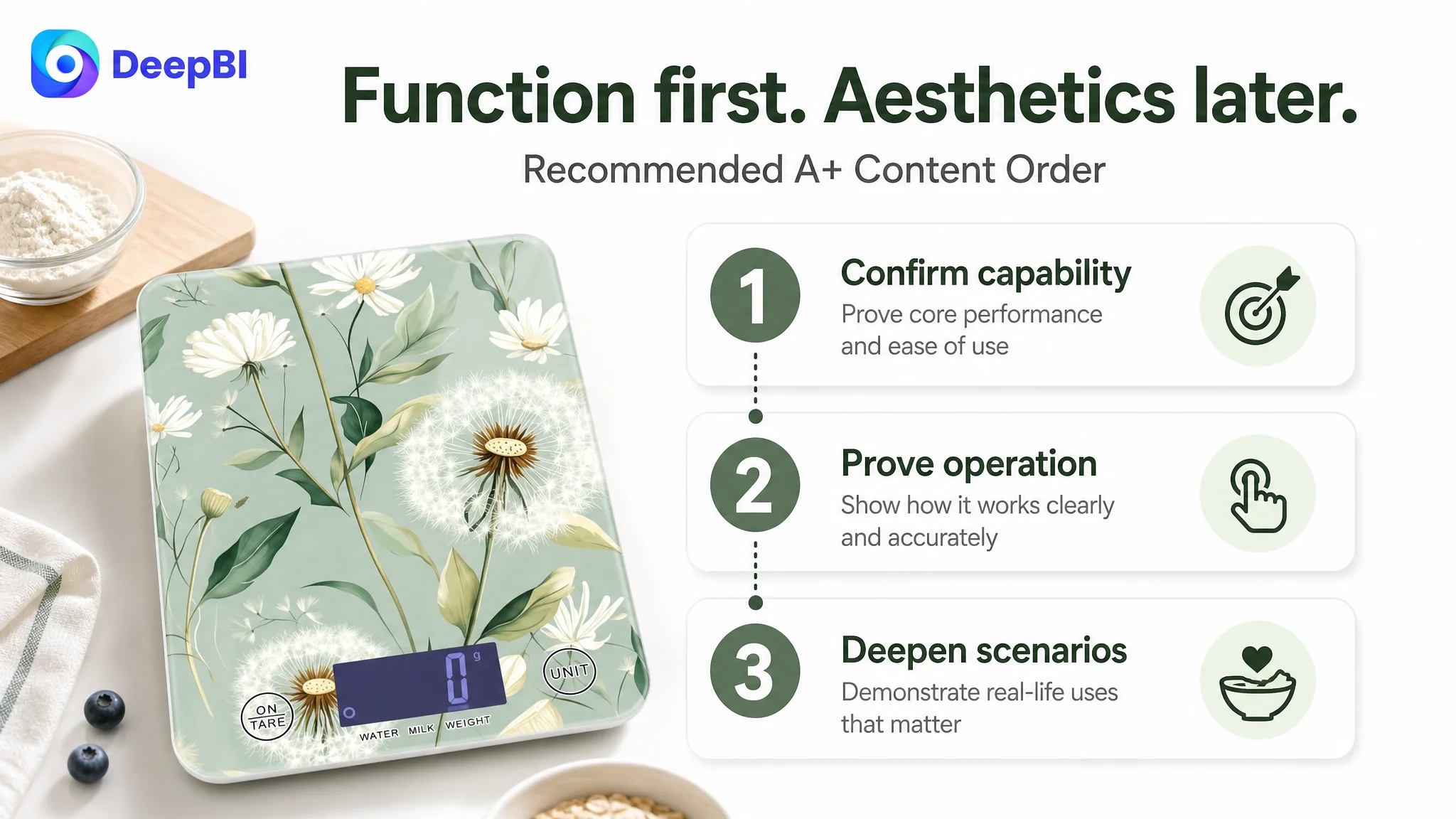
Start with capability confirmation
The opening module should identify the core functions quickly:
- Waterproof tempered glass panel
- LCD display
- Four measurement units
- Tare function
- One-minute auto-off
This gives the shopper a reason to continue before introducing brand history or pattern variations.
Prove that the platform handles real kitchen use
A large bowl or container placed on the 7.6 x 5.7-inch weighing surface would answer a practical question more effectively than a front-and-back specification image.
The shopper needs to see whether the scale can support the way the product will actually be used.
Show the tare action, not just the tare label
The tare function should be demonstrated through a visible sequence: a bowl or ingredient on the scale, a button press, and the display returning to zero.
That visual sequence addresses both ease of use and the fear of measurement errors.
Replace placeholder-looking demonstrations with credible proof
The existing unit-conversion module repeated a feature already mentioned elsewhere and used a display treatment that did not convincingly demonstrate real operation.
A better module would show clear state changes as the user switches among grams, milliliters, fluid ounces, and pounds and ounces. The purpose is not to fill the page with numbers. It is to make responsiveness and readability believable.
Move aesthetics after functional trust
The available patterns and color options still had a role, but they were not the first decision priority. A shopper is more likely to care about style after basic questions about accuracy, usability, storage, and cleaning have been answered.
Use higher-relevance scenarios
The existing milk scenario was less persuasive than a baking, meal-prep, or portion-control scene because those use cases make precise measurement more central to the decision.
A scenario showing a measured meal or small ingredient would connect the scale’s display and unit options to a specific user concern rather than simply showing that the product can weigh food.
Why DeepBI Did Not Prioritize More Ad Tuning
This case did not provide a full before-and-after advertising dataset, so it would be inaccurate to claim a specific ACOS reduction, CVR increase, or organic-order recovery.
The decision logic was still clear.
If paid traffic reaches a page that does not establish usefulness, trust, and product fit quickly, more traffic can increase exposure without solving the conversion constraint. Advertising can amplify a strong Listing, but it can also amplify unclear positioning, weak proof, and a confusing page sequence.
That is why the first priority was not to keep changing the traffic input. It was to improve the page’s ability to handle the traffic already available.
The order of operations was:
1. Clarify the product’s strongest decision benefits.
2. Rebuild the title around search relevance and readable value.
3. Make compactness, precision, tare, and cleaning visually provable.
4. Rewrite the bullets around user situations and outcomes.
5. Reorder the A+ page so functional validation precedes aesthetic presentation.
6. Use advertising data afterward to judge whether the improved page could convert more efficiently.
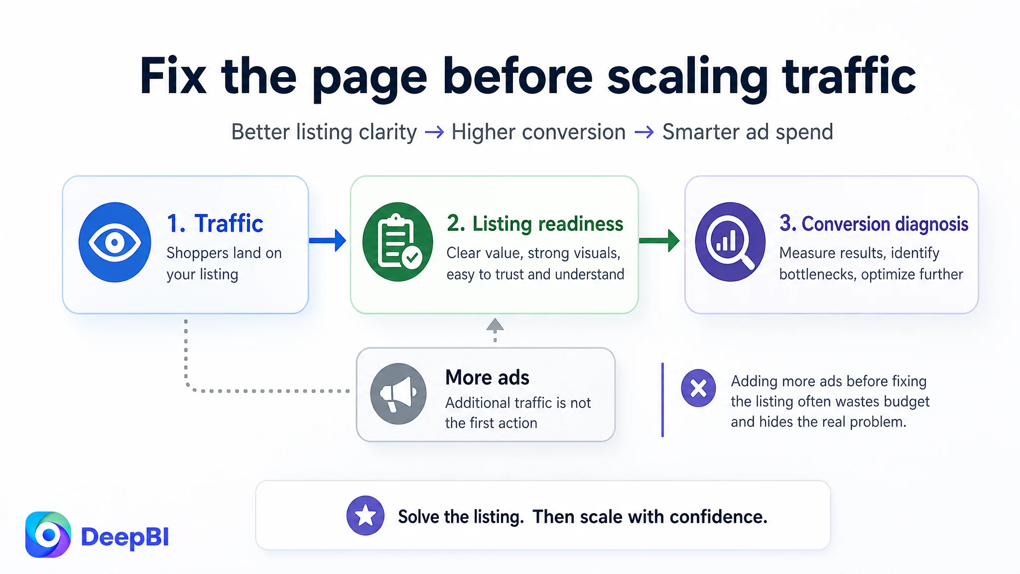
This sequencing reduces a common Amazon operating risk: using ads to force more visitors into a Listing whose sales logic is not yet ready.
Before scaling traffic, the team needed to decide whether the page deserved more traffic.
The Review Gap Changed the Standard of Proof
The review difference could not be ignored.
A Listing with six reviews, a 3.8-star rating, and no meaningful valid review content on the first page begins with a major trust disadvantage against a Listing with thousands of reviews, a 4.6-star rating, and visible customer feedback.
That did not mean the page could not improve. It meant the page had less room for ambiguity.
When review volume is limited, the product page has to work harder in areas it can control:
- Demonstrate the core use case
- Explain the main benefit without clutter
- Show real operating steps
- Make product claims concrete
- Reduce uncertainty around cleaning, storage, and battery use
- Present a coherent reason to choose the product
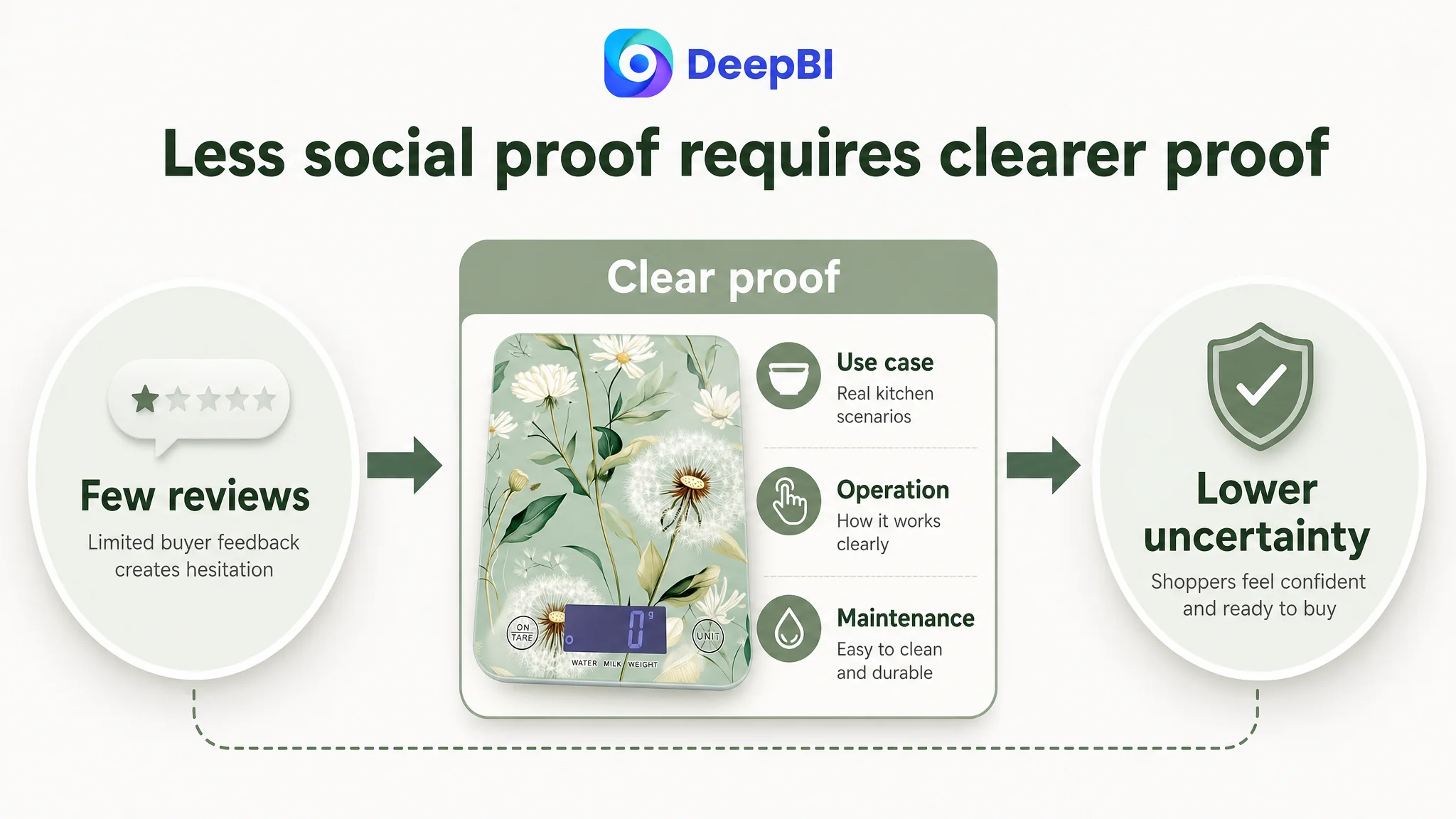
This is also why generic decorative images were not enough. A visually attractive page cannot fully replace social proof, but a functionally persuasive page can reduce the number of unanswered questions that make weak review coverage more damaging.
What Changed in the Operating Understanding
The important change was not a claim that one revised image would solve the Listing.
It was a change in how the Amazon seller understood the problem.
The page was no longer treated as a collection of independent assets. The title, main image, bullets, secondary images, and A+ content were understood as one conversion system.
Each element needed a specific job:
- The title had to establish category relevance and communicate a meaningful reason to consider the product.
- The main image sequence had to create attention and make utility visible.
- The bullet points had to connect features to everyday kitchen problems.
- The A+ content had to validate use, reduce doubt, and deepen relevant scenarios.
- The review section had to be recognized as a trust constraint that page optimization could not instantly remove.
This approach also created a clearer basis for future Amazon ads evaluation. If CTR improved after stronger visual hooks, the main image direction would have gained support. If clicks increased but orders did not, the page would require further work on trust, proof, or offer alignment. The Listing would become easier to diagnose because each change was tied to a specific business question.
The Broader Lesson for Amazon Sellers
The kitchen scale Listing did not fail because it had no content.
It was constrained because the content was not arranged according to shopper decision logic.
A title can contain relevant keywords and still fail to communicate value. A page can have seven images and still leave utility unclear. Five bullets can mention every function and still fail to build confidence. An A+ page can look complete while introducing the wrong information at the wrong stage.
The practical lesson is straightforward:
Amazon Listing optimization should begin with the conversion bottleneck, not with the asset that is easiest to edit.
For this seller, the priority was to make the product’s value easier to verify:
- Compact enough to store
- Precise enough to trust
- Simple enough to use across ingredients
- Easy enough to clean
- Relevant enough for cooking, baking, meal prep, and portion control
Only after those points were made clear did advertising become a more useful diagnostic and growth lever.
That is the difference between adding content to an Amazon product page and repairing the page’s ability to convert the traffic it receives.