

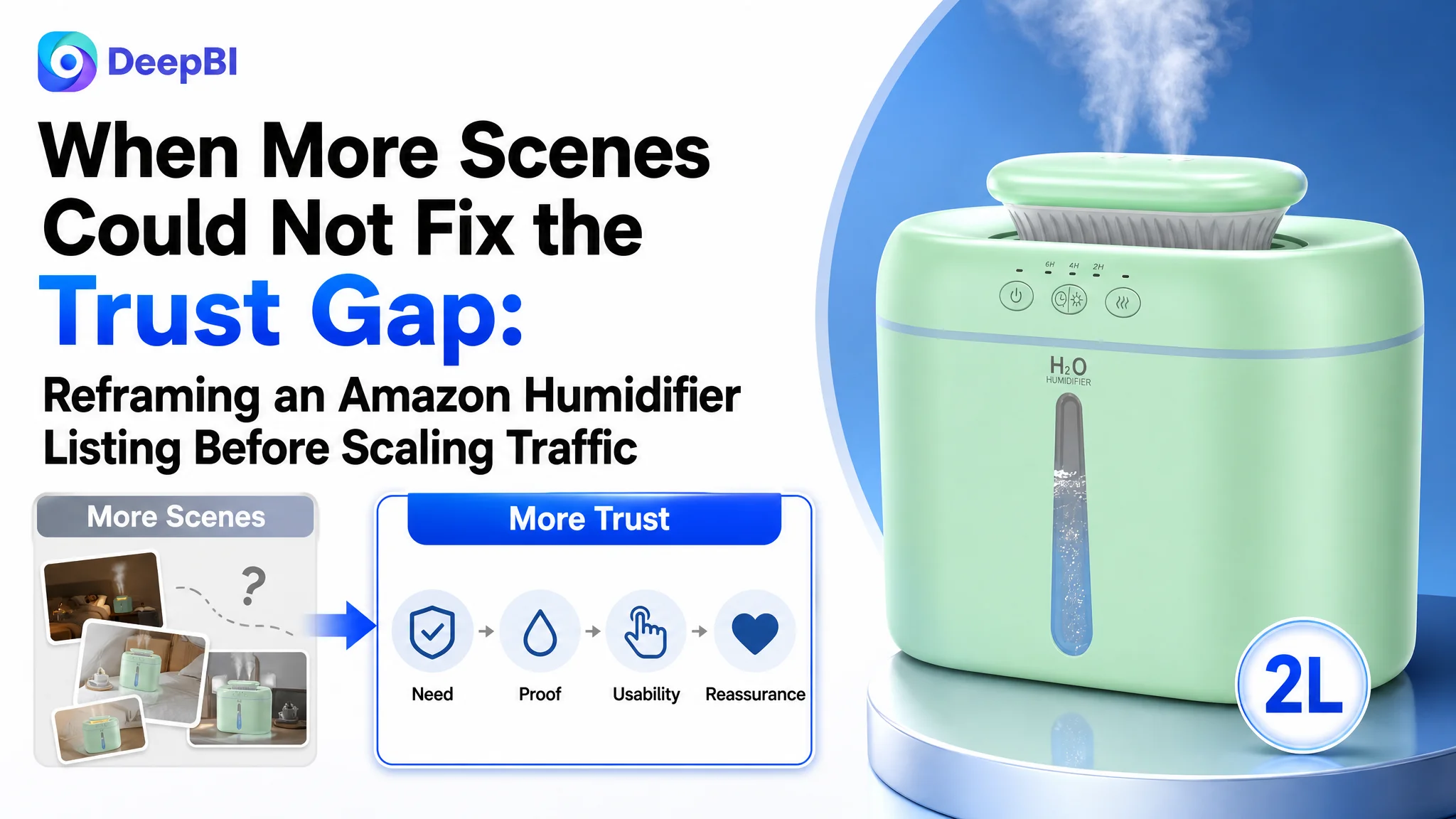
An Amazon seller in the US humidifier category was not facing a simple lack-of-content problem. The product page already covered bedrooms, nurseries, plants, relaxation, and office use. It also presented a 2L tank, 26dB operation, a night light, mist modes, and easy-fill positioning. Yet the Listing remained materially behind a comparable high-performing product page.
The initial direction was to keep expanding feature and scenario communication: show more use cases, add more lifestyle imagery, and make the product appear more versatile. DeepBI’s diagnosis pointed to a different constraint. The page was not failing because buyers could not find enough scenes. It was failing because the page did not establish functional trust in the right order.
The deeper gap appeared across the Amazon product page: a weaker title structure, a gallery that delayed the core buying reason, A+ content that listed scenes before proving usefulness, and a serious review disadvantage. The later optimization therefore focused on rebuilding the page’s sales logic around need, proof, usability, and reassurance—before asking Amazon ads or additional traffic to do more work.
For other Amazon sellers, the lesson is commercially important: when a Listing has traffic but weak purchase confidence, more ad optimization or more creative variety may only amplify the same conversion problem. The first question is whether the product page has earned the next click and the next order.
The Listing Looked Complete. The Buyer Journey Was Not.
At first glance, the humidifier Listing appeared to have many of the expected ingredients.
It communicated:
- A 2L water tank
- Up to 30 hours of runtime
- 26dB quiet operation
- A warm night light
- Dual- and single-nozzle options
- Continuous and intermittent mist modes
- Bedroom, baby, office, and plant-related use cases
- Top-fill and cleaning convenience
The issue was not a complete absence of selling points. The issue was how those selling points were arranged across the Amazon page.
The Listing led buyers through a series of scenes before fully answering more basic questions:
- Why do I need this humidifier?
- What problem will it solve?
- Is it quiet enough for sleep or a nursery?
- Is it easy to refill and clean?
- Can I trust the stated performance?
- Is this product a safer choice than comparable options?
That distinction changed the diagnosis.
The product page did not lack information. It lacked a persuasive sequence.
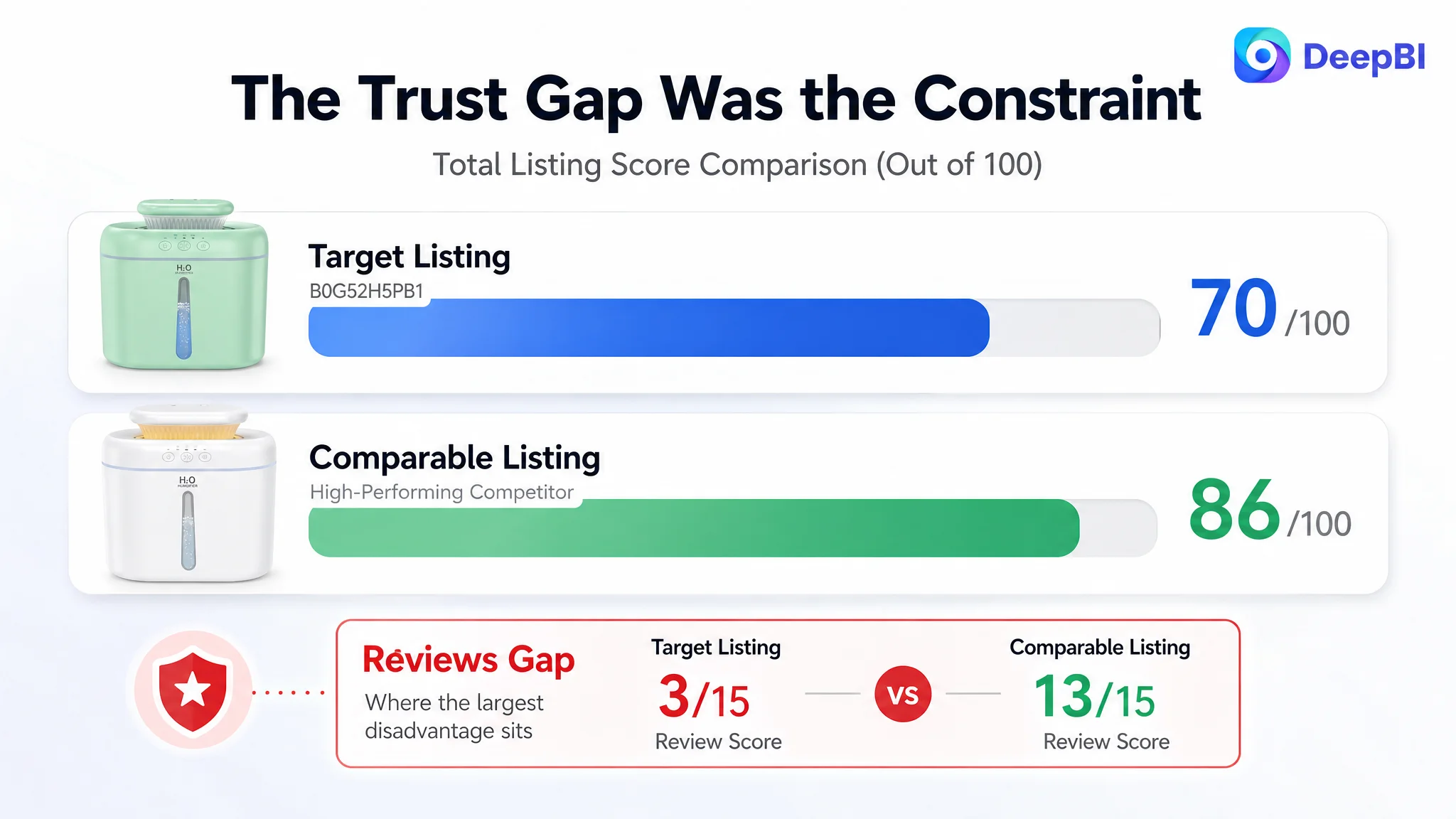
DeepBI’s Listing comparison produced a total score of 70 out of 100, compared with 86 out of 100 for a comparable high-performing humidifier Listing. The gap was not distributed evenly.
- Title: Target Listing: 14/20, Comparable Listing: 17/20, Gap: -3
- Main image and gallery: Target Listing: 24/30, Comparable Listing: 26/30, Gap: -2
- Bullet points: Target Listing: 8/10, Comparable Listing: 6/10, Gap: +2
- Detail page: Target Listing: 21/25, Comparable Listing: 24/25, Gap: -3
- Reviews: Target Listing: 3/15, Comparable Listing: 13/15, Gap: -10
The most important finding was not that every element needed to be rewritten. It was that the largest commercial disadvantage was concentrated in trust and conversion support, especially reviews and the detail-page logic.
The Original Direction: Add More Scenarios and More Feature Expression
The existing Amazon Listing already tried to reach several audiences.
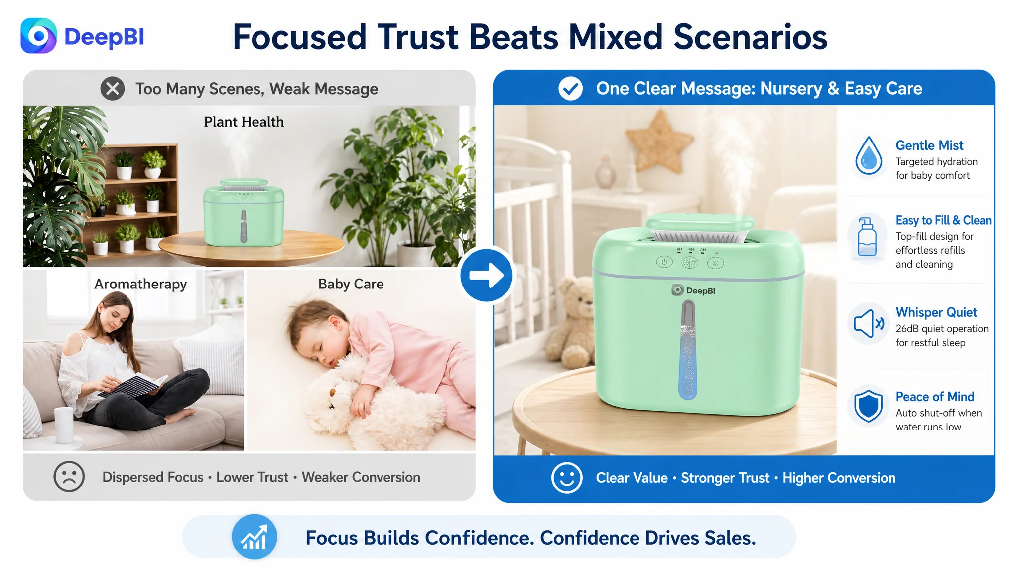
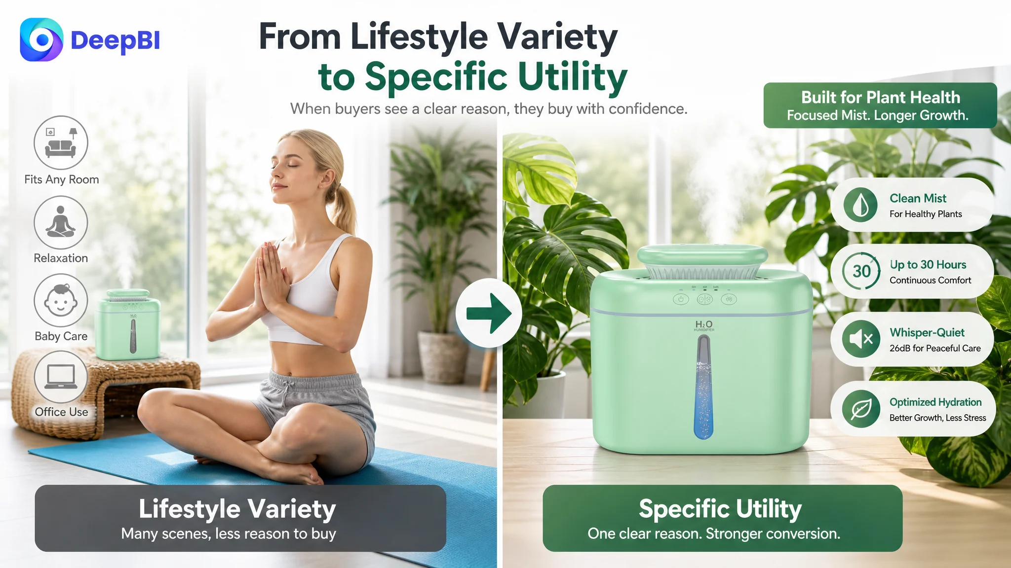
Its content moved through baby care, skincare and relaxation, plants, nighttime use, office use, and general home settings. This created the impression of versatility, but it also diluted the page’s decision path.
The gallery used lifestyle scenes to communicate possibility. The A+ content continued that approach through a sequence of baby, skincare, plant, bedroom, and office applications.
That direction was understandable. A seller looking at the page might conclude that the product needed:
- More use cases
- More lifestyle visuals
- More emotional atmosphere
- More feature descriptions
- More evidence that the humidifier could fit different rooms
But the comparison showed that the stronger Listing was not simply showing more scenes. It was using its content to move buyers through a clearer sequence:
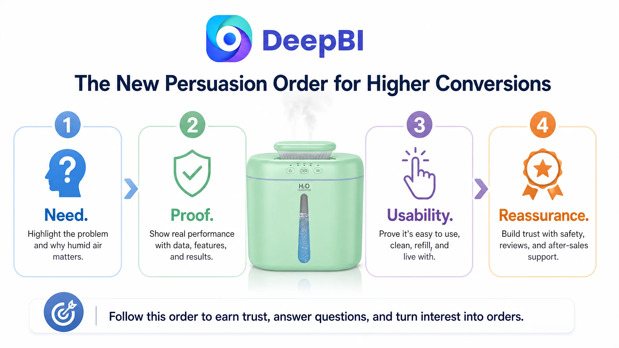
1. Establish the need for humidification
2. Present the product as the solution
3. Prove important functions
4. Reduce usability and safety concerns
5. Validate the product across relevant scenarios
The target Listing often began at step five.
That is the misdiagnosis worth examining. The page was trying to prove that the product could fit many situations before it had fully proved why the product was worth considering in the first place.
The Title Was Carrying Keywords, but Not Enough Decision Logic
The title scored 14 out of 20, three points below the comparable Listing.
The issue was not simply keyword volume. The title included terms such as bedroom, home, baby, plants, quiet operation, runtime, and night light. The problem was that the most important product identity and purchase reasons were not organized clearly enough.
The comparable Listing placed the core product phrase near the beginning, using a structure built around:
- Product type
- Core keyword
- Model or capacity detail
- Quiet operation
- Adjustable output
- Safety-related function
- Relevant room and user contexts
The target title began with a brand abbreviation rather than the core product term. Its selling points were also more scattered, combining capacity, runtime, quietness, timing, and scenarios without a strong hierarchy.
For Amazon search visibility, this weakens the title’s opening. For shoppers, it creates a second problem: the buyer has to process the product category and value proposition at the same time.
The recommended direction was to front-load the product identity and strongest verified advantages:
- Cool mist humidifier
- 2L capacity
- Ultrasonic operation
- 26dB quietness
- Night light
- Timer
- Easy filling and cleaning
- Bedroom and home use
However, one boundary was critical. The source material did not confirm automatic shut-off for this product. It therefore should not be inserted into the Amazon title or bullet points merely because a competitor uses it.
A stronger Listing is not one that claims every category expectation. It is one that expresses its own verified advantages with greater clarity.
The Gallery Showed the Product Before It Explained the Value
The image score was relatively strong at 24 out of 30, but the analysis identified a meaningful persuasion gap.
The early gallery images were visually acceptable, yet they did not immediately communicate a competitive reason to click. The second image focused too quickly on dimensions. That information may matter later, but it does not answer the buyer’s first question after seeing the product:
Why should this humidifier matter to me?
The comparable Listing used its early images to connect a recognizable discomfort with a direct solution. It made the product relevant before presenting secondary specifications.
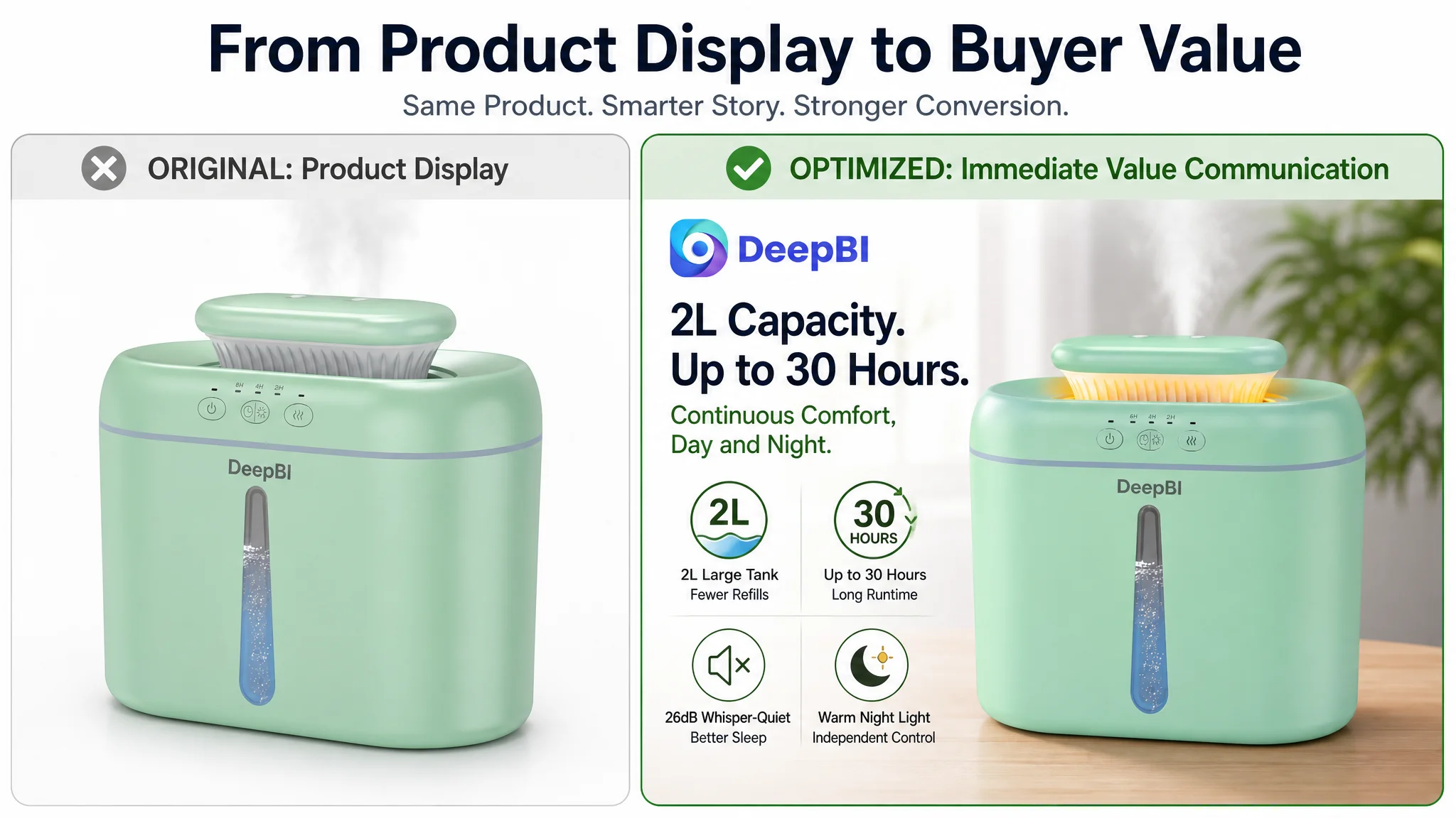
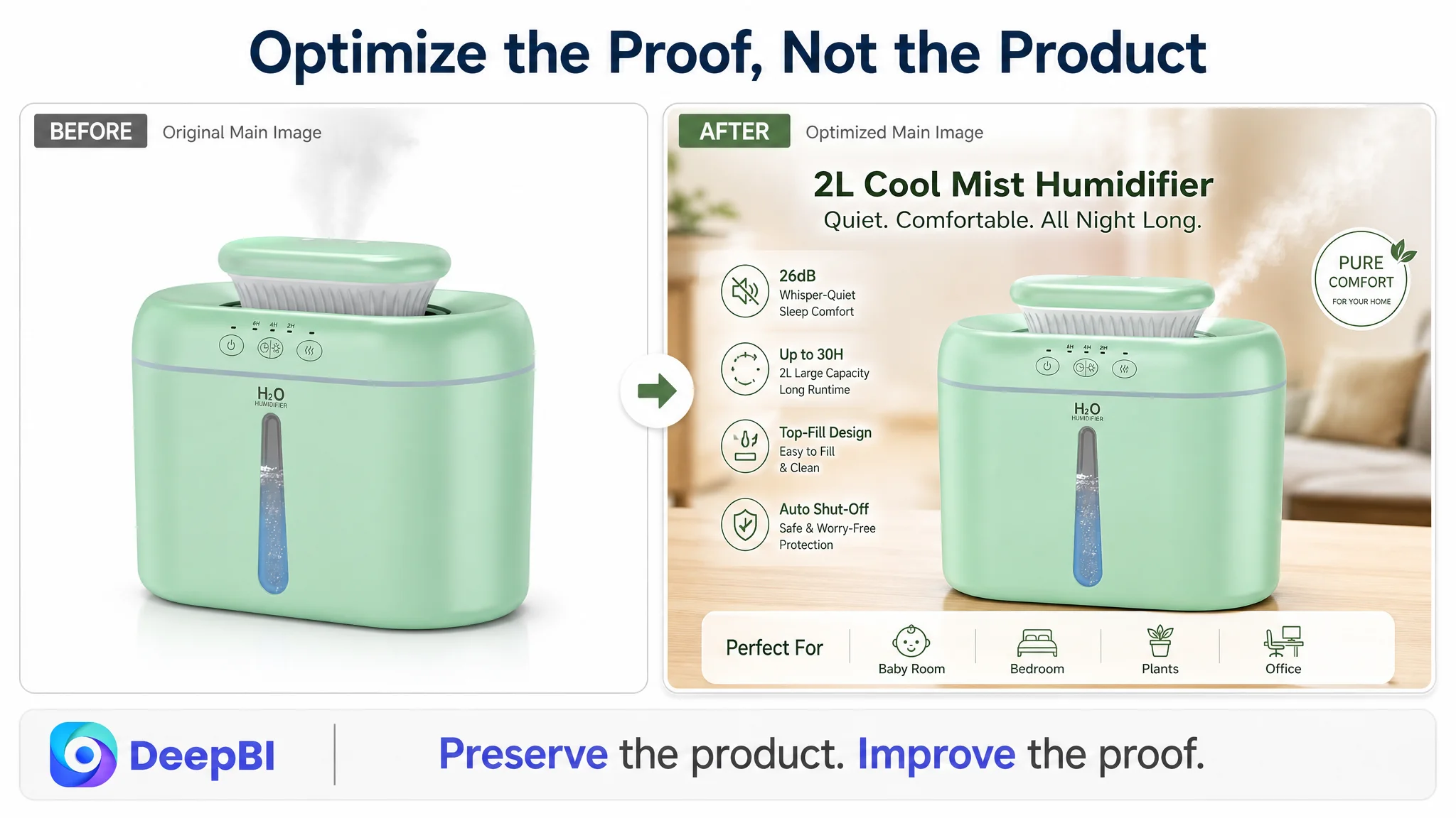
The recommended gallery logic was therefore not “add more decoration.” It was to change the role of each image.
First: Establish identity and practical value
The opening image should make the product recognizable while communicating an immediate advantage, such as its 2L capacity, compact form, or easy top-fill structure.
The product should not be left as a passive object on a white background. The image sequence needs to quickly answer why its size and design are useful.
Second: Move from dimensions to the buyer’s problem
Instead of placing measurements too early, the next image should explain the product’s role in relieving dry-air discomfort.
The relevant message is not a medical promise. It is a practical comfort proposition: gentle mist for the area where the buyer sleeps or works, helping make dry indoor air more comfortable for skin, throat, or nasal passages.
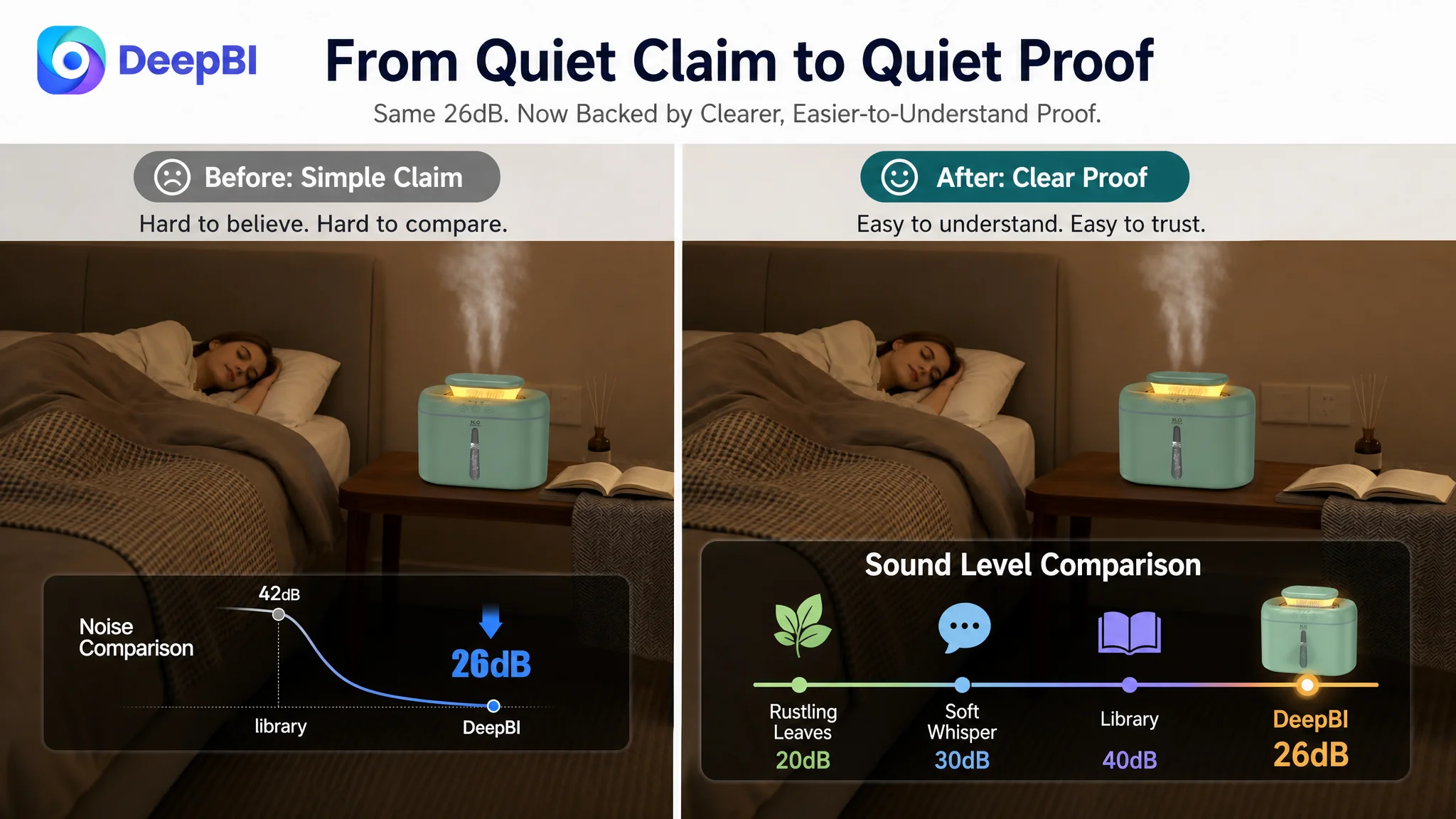
Third: Make 26dB believable
The existing quietness image showed a sleeping environment, but the visual proof was too generic.
A stronger image would make the 26dB claim easier to understand through a detailed comparison with familiar sound levels, such as a whisper or quiet library environment. The number should become a point of confidence rather than a label placed beside a lifestyle scene.
Fourth: Validate the nursery use case carefully
The product is positioned for baby rooms and light sleepers, but the visual must support that positioning with a coherent scene and accurate product information.
The recommendation was to remove the diluted split-view approach and dedicate the image to a more focused nursery or sensitive-user scenario. Any unsupported aromatherapy claim should be excluded, especially because the product materials specifically advise against using essential oils or perfumes.
Fifth: Give plant use a specific reason to exist
The existing plant imagery did not clearly prove a plant-related benefit. A generic plant scene adds variety, but not necessarily purchase confidence.
If the plant use case cannot be supported with strong product logic, the image should instead reinforce a more defensible advantage: 2L capacity, up to 30 hours of runtime, or focused mist near a bedside or workspace.
This is the difference between a gallery that displays possibilities and one that answers objections.
The Bullet Points Were Not the Weakest Link
One important finding prevented the optimization from becoming excessive: the target Listing’s bullet-point score was 8 out of 10, two points higher than the comparable Listing.
That did not mean the bullets were perfect. It meant they were not the first constraint to fix.
The existing bullet structure had several strengths:
- It addressed preparation and usage concerns
- It connected capacity to runtime
- It described quiet operation in a sleep-oriented context
- It explained mist customization
- It covered the package contents and support
The bullets also used notes and tips to address practical issues such as soaking the cotton filter before first use and avoiding essential oils.
The recommended refinement was to make the structure more commercially direct without discarding what already worked.
A stronger order would be:
1. Safe and easy maintenance, using only verified safety claims
2. 2L capacity and up to 30 hours of runtime
3. 26dB operation and independently controlled night light
4. Dual- and single-nozzle mist options for focused use
5. Package contents and customer support
The goal was not to imitate the competitor’s weaker bullet logic. It was to retain the target Listing’s stronger explanatory approach while making each point easier to scan.
The Detail Page Was Showing Scenes Before Establishing Trust
The detail-page score was 21 out of 25, three points below the comparable Listing.
This was the central content diagnosis.
The target A+ content moved through:
- General lifestyle use
- Baby suitability
- Skincare and relaxation
- Plant use
- Quiet nighttime operation
- Office use
- Refilling and cleaning details
The comparable Listing used a more deliberate structure:
- Brand or product promise
- Problem-to-solution comparison
- Refilling design
- Safety and protection
- Quietness proof
- Light modes
- Product details
- Multi-scene validation
The difference was not simply visual quality. It was the timing of reassurance.
The target page asked buyers to imagine the product in multiple environments before resolving the more practical doubts that affect conversion:
- Is it easy to fill?
- Is it easy to clean?
- What type of water should be used?
- Can essential oils be added?
- How does the mist work?
- Is the quietness claim credible?
- What happens if the product is misused?
For a humidifier, these are not secondary questions. They influence perceived ownership risk.
The page needed to prove that the product was useful and manageable before asking buyers to imagine it in every room of the home.
Why DeepBI Did Not Recommend More Ad Tuning First
The case material does not provide a before-and-after ad report, so it would be inappropriate to claim a specific ACOS decline, CVR increase, or organic-order recovery.
What the Listing diagnosis does show is why further traffic-oriented activity should not be treated as the first answer.
When a page has a clear trust deficit, additional traffic can create more exposure without creating more confidence. The seller may see clicks, but buyers still encounter the same unresolved concerns:
- A title that does not lead with the product’s core identity
- A gallery that delays the product’s practical value
- Lifestyle images that do not provide enough technical proof
- A+ content that confirms scenarios before explaining the need
- A review profile of 3.7 stars and only 30 total reviews
- No useful reviews visible on the first page
The review gap alone was substantial. The comparable Listing had a 4.2-star rating, 9,924 reviews, and 10 visible first-page reviews. The target Listing had a 3.7-star rating, 30 reviews, and no effective first-page review content.
This is not a gap that ad bidding can solve.
Ads can place the product in front of more shoppers. They cannot independently create the social proof, page clarity, or functional reassurance that shoppers find after the click.
The Review Gap Changed the Meaning of Every Other Asset
The review score was only 3 out of 15, compared with 13 out of 15 for the comparable Listing. It was the largest single scoring gap in the diagnosis.
The target Listing had three compounding disadvantages:
- Lower average rating
- Far fewer total reviews
- Little useful review content visible to new buyers
The result was that other page claims had to work harder. A statement such as “26dB quiet” or “easy to clean” carried less weight when the page lacked enough customer evidence to reinforce it.
This does not mean the seller could solve the problem by pursuing reviews alone. Review volume is not a substitute for Listing quality. In fact, the diagnosis showed why the two must be considered together.
The page needed to make the product’s real advantages easier for future customers to understand and evaluate. Better title logic, clearer imagery, stronger usage guidance, and more credible A+ content could improve the quality of the buying decision. But the existing review position still represented a structural trust disadvantage that should be treated as a business risk, not a cosmetic weakness.
The New Decision Order: Need, Proof, Usability, Reassurance
The recommended optimization path was deliberately narrower than a full rewrite of every asset.
1. Clarify the product identity
The title should lead with the verified product category and organize the strongest attributes around it. Search language and buyer readability need to work together.
2. Establish the need for humidification
The early gallery and A+ modules should connect dry-air discomfort with a practical solution before expanding into secondary scenarios.
3. Prove the core functions
The page should make 2L capacity, up to 30 hours of runtime, easy filling, cleaning, and 26dB operation visually understandable.
4. Reduce ownership concerns
Water guidance, filter preparation, cleaning steps, and the warning against essential oils should appear as confidence-building information, not as scattered footnotes.
5. Validate relevant scenarios
Only after the core product logic is clear should the page move into nursery, bedside, desktop, or plant-related applications.
This order prevents the page from becoming a collection of attractive but disconnected scenes.
It also creates a more stable relationship between organic and paid traffic. Paid traffic can bring the shopper to the page, while the Listing gives that shopper a coherent reason to continue.
The A+ Content Needed Functional Trust Before Emotional Atmosphere
The revised A+ structure was designed to make each module perform one clear commercial role.
- Opening module: Confirm the core specifications quickly—2L capacity, 30-hour runtime, 26dB operation, easy filling and cleaning, and mist modes.
- Need module: Show the difference between uncomfortable dry air and a more comfortable indoor environment.
- Refilling module: Demonstrate the top-fill process and reduce the daily-use barrier.
- Care and misuse module: Explain appropriate water use, filter preparation, cleaning, and the restriction on essential oils.
- Sleep module: Present the 26dB claim with stronger visual proof and explain that the night light can be controlled independently.
- Flexibility module: Show focused use beside a bed or laptop, supported by the dual- and single-nozzle modes.
- Maintenance module: Separate deep cleaning and long-term care from the initial refilling message.
This is not merely a rearrangement of images. It changes what the page asks the buyer to believe at each stage.
First: the product fits the need. Then: it performs the important functions. Then: it is practical to own. Finally: it fits different lifestyles and rooms.
A More Useful Role for AI-Generated Listing Creative
In this case, AI-generated creative should not be used to invent a more impressive humidifier or add unsupported claims.
Its useful role is narrower and more disciplined:
- Make the 26dB comparison easier to understand
- Show the top-fill and cleaning process clearly
- Create a focused nursery or bedside scene
- Visualize the 2L capacity and long runtime
- Build a problem-to-solution comparison for dry indoor air
- Preserve the actual product structure, color, and functional boundaries
The product’s physical truth remains the highest constraint. Claims such as automatic shut-off, essential-oil compatibility, safety certifications, or other unconfirmed attributes should not be added for visual impact.
That discipline matters especially in Amazon Listing optimization. A page can gain an initial click from a polished image, but if the image promises a function the product does not provide, the resulting mismatch can create dissatisfaction, returns, and negative reviews.
The Business Understanding Changed
The case did not establish a numerical post-optimization outcome, so the final change should be described in terms of operating logic rather than invented performance figures.
The seller’s understanding of the problem changed in several ways.
First, more content was no longer treated as the same thing as stronger conversion. The page already had many scenes. The issue was whether each scene helped the buyer make the next decision.
Second, the main image and gallery were treated as sales assets rather than product documentation. Dimensions and general lifestyle scenes had value, but they could not come before the core reason to care.
Third, A+ content was repositioned as a trust system. It needed to explain function, usability, maintenance, and proof—not simply display the product in more environments.
Fourth, reviews were recognized as a structural conversion factor. A lower rating, limited review volume, and no useful first-page review content could weaken the effect of every other page claim.
Finally, advertising was placed back into its proper role. Amazon ads can create exposure and accelerate learning, but they cannot repair a product page that has not yet built enough confidence to convert that exposure.
Before asking Amazon traffic to scale, the Listing has to show that it can carry the traffic.
For this humidifier seller, the most valuable optimization was not a longer list of features or a larger collection of lifestyle images. It was a clearer judgment about what had to be fixed first: the page needed to turn product information into buyer confidence.
That is where Amazon Listing optimization becomes a business decision rather than a content exercise.