

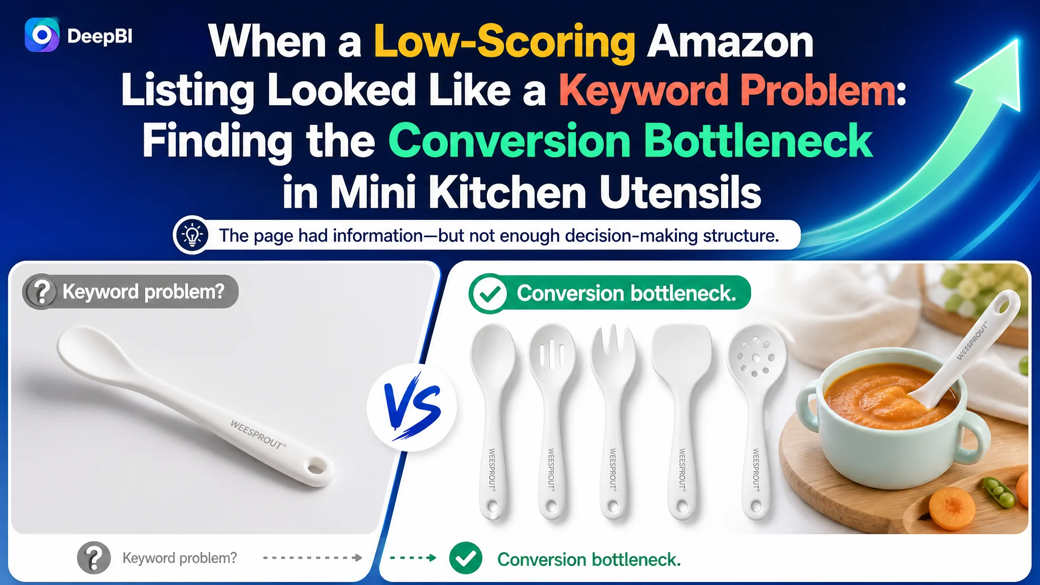
The customer was an Amazon US seller offering a five-piece silicone kitchen utensil set designed for baby food preparation, baking, and small-scale cooking. The Listing was not lacking product information, but its traffic and conversion potential were difficult to unlock because the page did not communicate its value quickly enough.
The initial optimization instinct was to improve isolated elements: broaden the title, add more functional descriptions, and make the images more attractive. But the deeper Amazon Listing diagnosis showed that the problem was not limited to keywords or visual polish. The page lacked a coherent sales logic, and its A+ content provided almost no visual evidence to support important claims about safety, cookware protection, usability, and compact size.
DeepBI ultimately reframed the product from “a small kitchen utensil set” into a specialized solution for baby food preparation and small-portion cooking. The later optimization therefore focused on rebuilding the product page around that use case: clarify the title, make the complete set visible, prove material and cookware-safety benefits, show the tools in realistic situations, and create an A+ story that could carry both organic and paid Amazon traffic. For other Amazon sellers, the lesson is direct: before trying to scale traffic, determine whether the product page has enough trust and decision-making structure to deserve it.
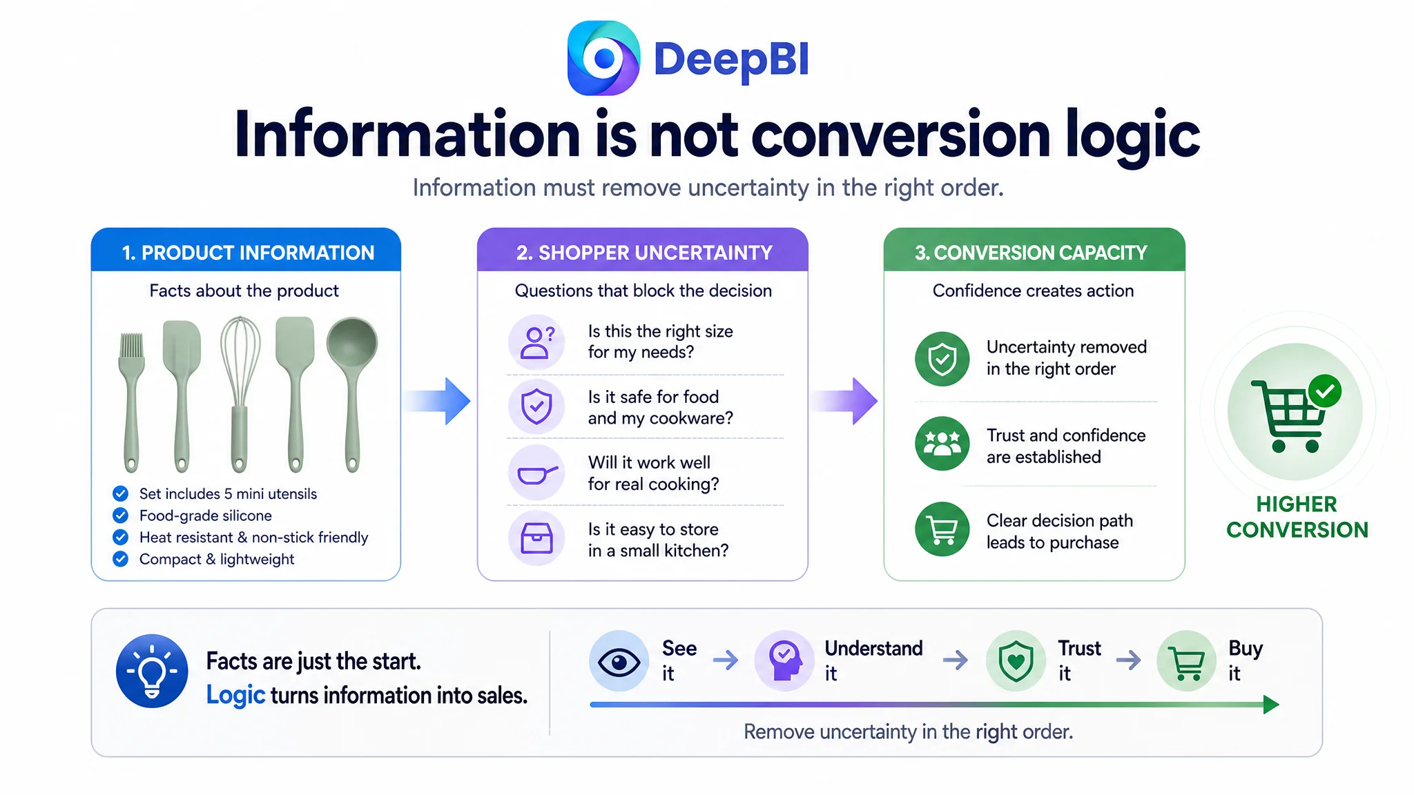
The Listing Had Information. It Did Not Have Enough Conversion Capacity.
At first glance, this product appeared to have several advantages:
- A complete five-piece utensil set
- Food-grade silicone positioning
- A compact form suited to small kitchens
- Relevance to baby food preparation and baking
- Non-stick cookware protection
- Lightweight storage and portability
The problem was that these advantages were not arranged according to how an Amazon shopper makes a decision.
The Listing presented the product largely as a collection of tools, dimensions, and functional descriptions. It did not quickly answer the questions that mattered most to the target buyer:
- Why are mini utensils better for this use case?
- What exactly is included in the set?
- Are the tools safe for food and non-stick cookware?
- Can the product handle practical cooking tasks?
- Is the smaller size a limitation or the main benefit?
- How will the set be stored in a small kitchen?
That distinction mattered because Listing conversion does not come from information volume alone. It comes from the order in which uncertainty is removed.
“The product was small by design. The Listing made that sound like a limitation instead of explaining why the smaller format was useful.”
The Original Diagnosis Risked Becoming an Asset-by-Asset Fix
The page could easily be treated as a conventional content problem.
The title needed better search coverage. The main image needed a stronger composition. The bullet points needed more persuasive language. The A+ content needed more modules. Each observation was valid, but handling them as separate tasks would have missed the commercial constraint connecting them.
A stronger title would not solve a page that still failed to prove the product’s use case. A more attractive image would not resolve uncertainty around what was included. More technical copy would not replace missing visual evidence. And advertising traffic would not automatically create trust when the product page left buyers to imagine the product’s benefits for themselves.
This is where many Amazon sellers become trapped. They interpret weak conversion as a keyword issue, a bid issue, or a creative issue, then continue adjusting the most visible element. The page may receive more attention, but the underlying decision path remains incomplete.
In this case, the central question was not:
“Which single Listing element should be improved first?”
It was:
“What is preventing this page from converting a shopper who is already interested in compact silicone cooking tools?”
That question led to a different diagnosis.
The Score Gap Pointed to the Page Story, Not Just the Search Entry
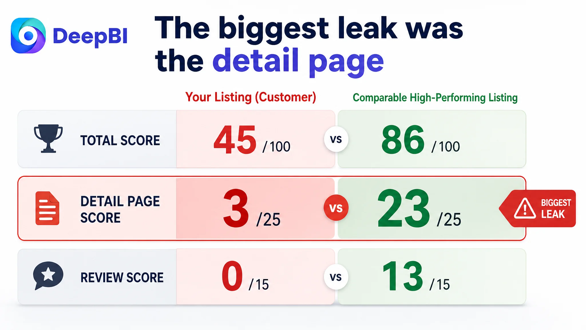
DeepBI’s comparison produced a total score of 45 out of 100, compared with 86 out of 100 for a comparable high-performing Listing.
The gap was not evenly distributed:
- Title: Customer Listing: 12/20, Comparable Listing: 17/20, Difference: -5
- Main image: Customer Listing: 24/30, Comparable Listing: 26/30, Difference: -2
- Bullet points: Customer Listing: 6/10, Comparable Listing: 7/10, Difference: -1
- Detail page: Customer Listing: 3/25, Comparable Listing: 23/25, Difference: -20
- Reviews: Customer Listing: 0/15, Comparable Listing: 13/15, Difference: -13
Two findings changed the priority order.
First, the title, main image, and bullet-point gaps were real, but relatively limited. The main image score was only two points behind the comparison Listing, and the bullet-point gap was one point.
Second, the detail-page gap was dramatically larger. The customer Listing scored 3 out of 25, while the comparable Listing scored 23 out of 25.
That was not a minor presentation difference. It indicated that the page was missing an entire layer of persuasion.
The review gap created another trust barrier. The customer Listing had no rating data and no customer reviews, while the comparable Listing had a 4.5-star rating and more than 30,000 reviews. Reviews could not be created through copy changes, so the page needed to compensate where it could: with clearer product proof, more credible usage scenes, and stronger visual explanation.
The most urgent business problem was therefore weak Listing conversion capacity, especially in the detail page and trust-building layer.
The Competitor Was Not Just Better at Keywords
The comparison Listing began with a broad category phrase equivalent to “Kitchen Cooking Utensils Set,” included a specific quantity, described the material, and named additional components and use-related benefits.
The customer title began with “Mini,” followed by a narrow baby-food cooking description. That wording was relevant to the intended niche, but it restricted the initial search framing and did not communicate the full value of the set.
Several specific differences were important:
The title did not make the set feel complete
The customer title did not use a number to make the product quantity immediately visible. It also did not lead with a clear combination of core category, material, audience, and use case.
The recommended direction was to foreground terms such as:
- Mini silicone kitchen utensils set
- Baby food cooking
- Non-stick
- Heat resistant
- BPA-free
- Toddler or kids-related use
The goal was not to copy a broader competitor or abandon the niche. It was to make the niche legible while preserving enough category relevance for Amazon search.
The main image showed the tools but did not maximize value perception
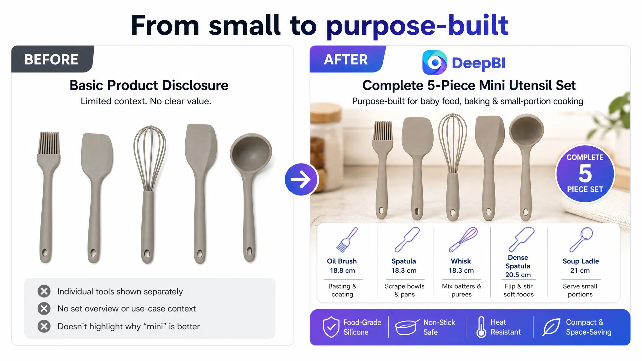
The first image disclosed the utensils against a plain background, but the complete five-piece set was not presented with enough visual impact. The shopper had to work out the set’s completeness rather than seeing it immediately.
The priority was to make the full set visible in a clean spread. This would strengthen the first-glance value proposition without changing the actual product.
The remaining images also needed clearer roles:
- Establish the mini size in a baby-food or small-kitchen scene
- Show the silicone material against non-stick cookware
- Demonstrate the function of each tool
- Quantify the dimensions and weight
- Reinforce compact storage without displaying accessories that were not included
This was not a request for more decorative images. It was a request for each image to answer a different buyer question.
The bullet points described features without building a buying argument
The customer’s bullet points leaned toward specifications and functional description. The comparison Listing placed greater emphasis on durability, heat resistance, cookware protection, and structural value.
The recommended bullet structure moved toward a clearer sequence:
1. Define the complete five-piece mini set and its intended use.
2. Establish food-grade, BPA-free, heat-resistant silicone.
3. Explain how the soft silicone protects non-stick cookware.
4. Show the tools’ durability and practical versatility.
5. Address lightweight storage, small kitchens, dorms, RVs, and travel.
The change was not simply “write stronger copy.” It was to connect each feature to a concern the buyer might have.
The Largest Leak Was the Missing A+ Story
The customer’s detail page relied primarily on repeated text and did not provide meaningful image-based modules.
The comparable Listing used a much fuller sequence:
- Lifestyle context
- Product overview
- Feature icons
- Multiple usage scenes
- Structural or material explanations
- Cleaning and maintenance reassurance
- Storage presentation
The customer page left buyers to construct the product’s purpose themselves. That was especially damaging for a product whose main differentiation was not obvious from a basic product shot.
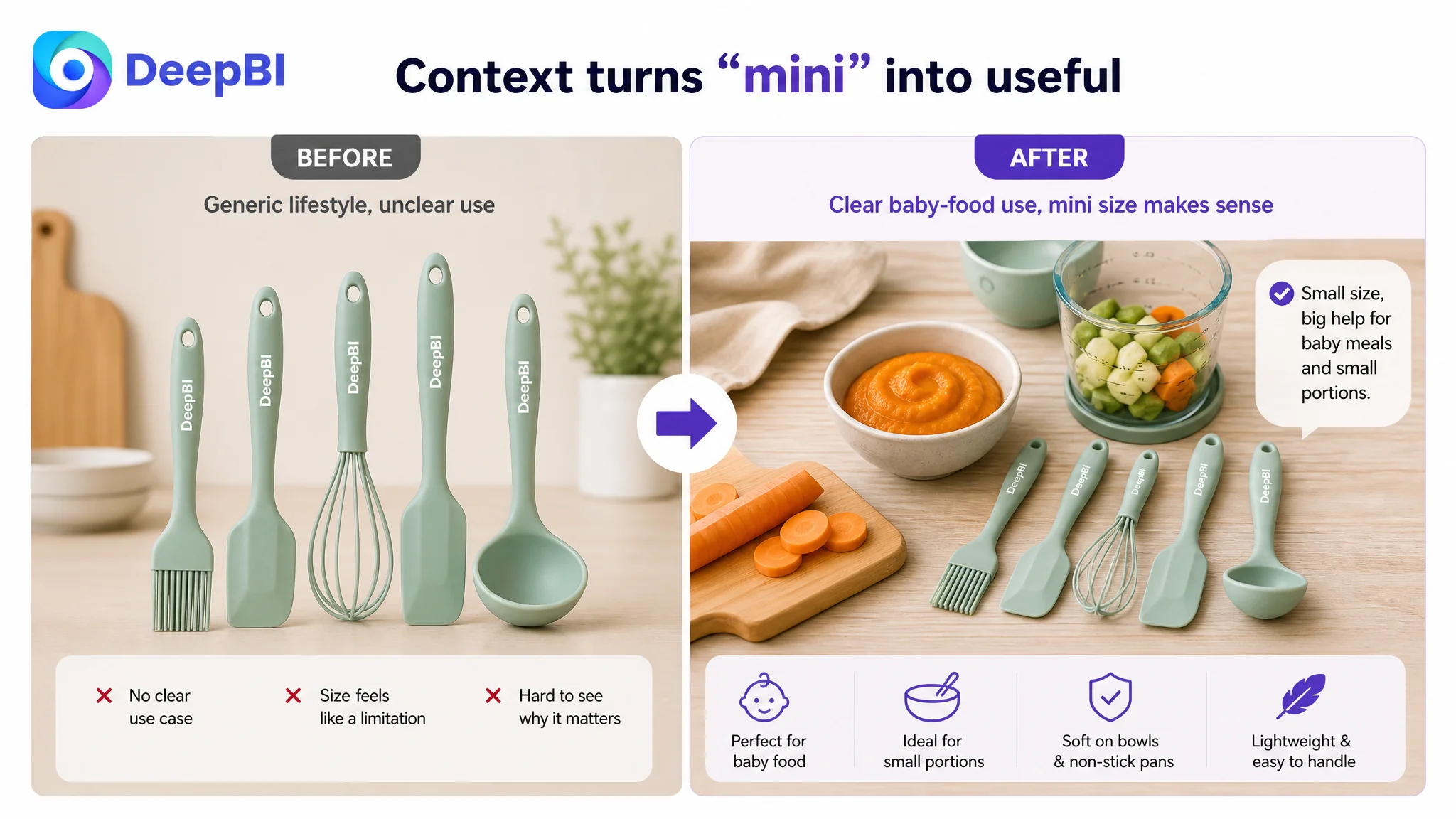
A compact utensil can be misunderstood in two opposite ways. A shopper may see it as inconveniently small, or may understand that the size is precisely what makes it useful for baby purees, small bowls, baking, and limited counter space. The A+ page needed to make the second interpretation unavoidable.
“The page did not need more claims. It needed visible evidence that connected the claims to real cooking situations.”
The New Page Logic Started With the Use Case
DeepBI did not recommend positioning the product as a weaker version of a large general-purpose utensil set. That would have forced the Listing into a direct quantity comparison it was unlikely to win.
Instead, the page needed to explain the product’s own advantage:
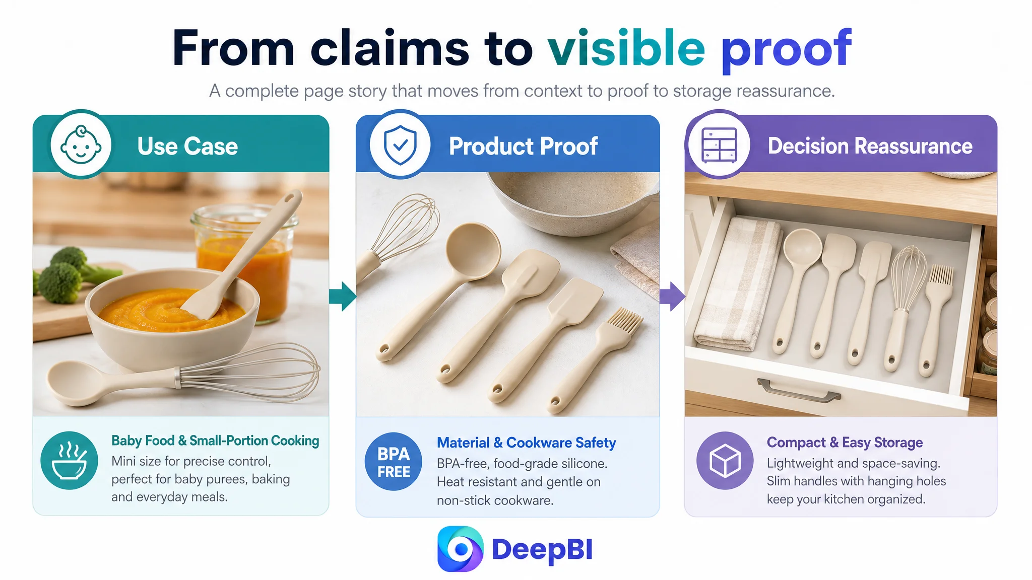
Small and precise for baby food, baking, small portions, and compact kitchens.
That positioning could then guide the full page.
Start with a small-scale cooking scene
The opening A+ module should show a warm, organized preparation area rather than a generic full-size kitchen. The scene needs to help the shopper recognize the product’s intended environment: a small bowl of puree, a compact baking area, or a limited countertop.
The first question should be answered immediately:
“Is this the right size and format for the way I cook?”
Follow with fast material and safety confirmation
After the emotional and situational introduction, the page should provide concise rational support:
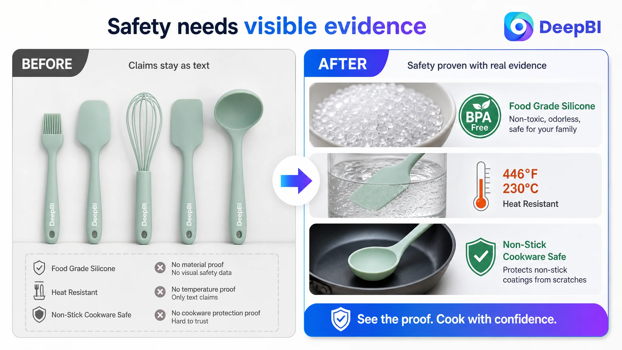
- Food-grade silicone
- BPA-free material
- Heat resistance up to the confirmed 446°F/230°C specification
- Soft surface suitable for non-stick cookware
- Odor-resistant and non-staining claims where supported
The purpose is not to overload the page with icons. It is to reduce hesitation before the shopper starts questioning whether the tools are safe, durable, or practical.
Show all five tools doing real work
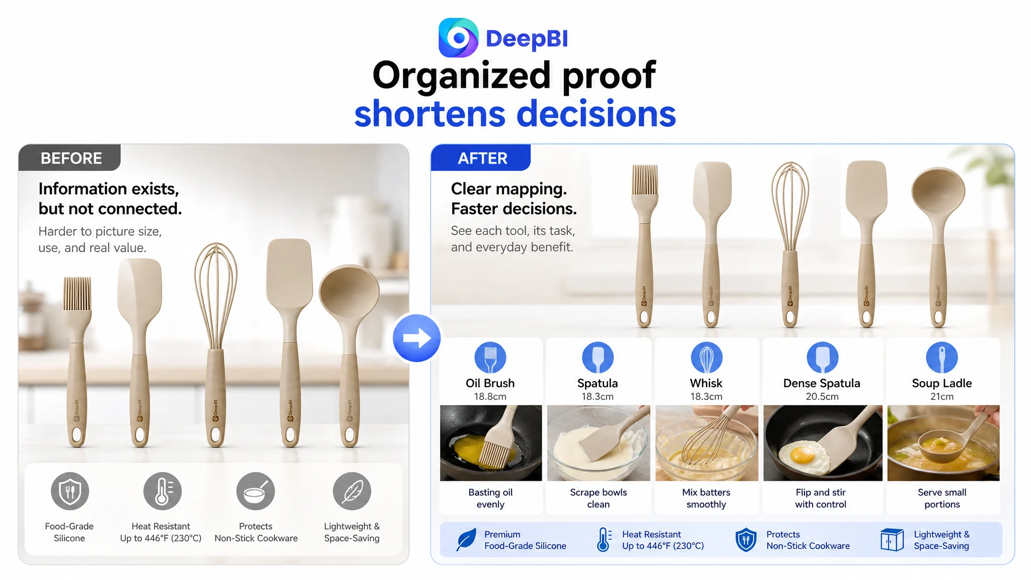
The product’s compact size becomes more persuasive when each tool is shown in a relevant task:
- Brushing oil or glaze
- Scraping a small bowl
- Whisking a mixture
- Flipping food
- Serving a small portion
Scenes involving baby purees, baking, and everyday small meals make the positioning concrete. They also prevent the set from appearing to be five arbitrary miniature tools.
Address maintenance without inventing accessories
The comparable Listing benefited from storage and drainage features that the customer’s product did not have. The correct response was not to imitate those features or display a holder that was not included.
Instead, the page should use the customer product’s actual strengths:
- Smooth silicone surface
- Easy-clean visual proof
- Lightweight construction
- Slim handles
- Built-in hanging holes
- Compact grouping for drawers or small storage spaces
This distinction is commercially important. A visual improvement that introduces an unconfirmed accessory may increase clicks temporarily but create expectation gaps after purchase.
Make durability visible through external proof
The customer Listing could not rely on an unconfirmed internal steel-core structure or an exploded product view. DeepBI therefore directed the proof toward visible external performance:
- Flexible but durable silicone
- Repeated-use context
- Smooth contact with non-stick cookware
- Protection against scratches or surface damage
- Stable use in everyday cooking tasks
The page should strengthen the durability argument without claiming a construction detail that the source material does not confirm.
Why Ads Should Not Be the First Adjustment
This case does not provide a post-optimization advertising data set, so it would be inaccurate to claim a specific ACOS or CVR improvement. But the decision logic is clear.
If paid traffic is sent to a page with weak visual proof, unclear positioning, no review history, and an almost empty A+ experience, the traffic may expose the weakness rather than solve it.
Advertising can bring a shopper to the product page. It cannot make an incomplete page feel complete.
The correct order was therefore:
1. Clarify what the product is for.
2. Improve the search-facing title and first-image value communication.
3. Rebuild the page around real use cases and confirmed product attributes.
4. Add material, cookware-safety, cleaning, and storage reassurance.
5. Only then judge whether additional traffic can be converted efficiently.
This is not an argument against Amazon ads. It is an argument against using ads to compensate for a page that has not yet established a persuasive reason to buy.
“Advertising can amplify attention, but it can also amplify the consequences of a low-conversion product page.”
The Optimization Was a Reordering of Evidence
The final direction did not depend on changing the product itself. It depended on changing the order and clarity of the evidence.
The product should first appear as a complete five-piece mini set. Then the shopper should see the intended niche. Next should come material safety and cookware protection. After that, the page should demonstrate practical use, durability, cleaning, and storage.
That sequence follows the buyer’s decision path:
- What is it?
- Is it suited to my situation?
- Is it safe?
- Will it work?
- Will it damage my cookware?
- Will it last?
- Can I store it easily?
The title, images, bullet points, and A+ content then work as one system rather than four disconnected assets.
What This Amazon Case Changed in the Operating Judgment
The customer Listing did not mainly suffer from a lack of product facts. It suffered from a mismatch between product positioning and page evidence.
The score comparison made that visible:
- The title needed better keyword structure and value communication.
- The main image needed a stronger complete-set presentation.
- The bullet points needed a clearer pain-point-to-benefit sequence.
- The review gap created a major trust disadvantage.
- But the largest immediate constraint was the detail page, which scored only 3 out of 25.
That changed the optimization priority from isolated content editing to conversion-system repair.
The practical lesson for Amazon sellers is not to ignore titles, images, bullets, or ads. It is to understand their order of dependence.
A stronger title may increase relevance. A better main image may improve the chance of a click. But the product page must still explain why the product belongs in the shopper’s kitchen. When the page cannot do that, additional traffic only makes the underlying problem more expensive.
For this mini silicone kitchen utensil Listing, the path forward was to make the product’s specialization visible: small tools for precise, safe, practical cooking in small-scale situations.
That was the point at which the Amazon Listing could begin to earn attention rather than merely receive it.