

The customer was an Amazon seller in the US office-organization category. Its desktop file organizer Listing had multiple product images, detailed bullet points, and clear functional claims, yet the page remained far behind a comparable high-performing Amazon Listing. The initial instinct was to improve individual elements such as keywords, image angles, and feature descriptions.
The deeper issue was not a lack of information. It was a lack of persuasive structure. The product page explained what the organizer could do, but it did not help shoppers quickly understand how it would resolve desk clutter, whether it would fit their workflow, or why its construction deserved trust.
DeepBI’s diagnosis shifted the priority from adding more isolated details to rebuilding the Amazon product-page conversion path. The later optimization focused on a clearer main-image hierarchy, more disciplined title and bullet-point logic, and—most importantly—a visual A+ story built around the problem, the solution, product proof, and purchase reassurance.
For other Amazon sellers, the case is a reminder that a Listing can appear detailed while still failing at conversion. Before increasing traffic or endlessly refining keywords, sellers need to ask whether the page gives shoppers a reason to click, a reason to believe, and a clear reason to buy.
The Listing Looked Active. The Business Result Did Not
The product was a multi-tier metal desk organizer designed for files, letter trays, stationery, and other office supplies. It was not an empty Listing. The page included:
- A product title with core office-organization terms
- Multiple product images
- Functional and dimensional information
- Five bullet points covering construction, storage, assembly, folding, and use cases
- A black metal finish positioned for office, home, school, and dorm settings
At first glance, this looked like a Listing with enough material to support a purchase decision.
The comparison data told a different story.
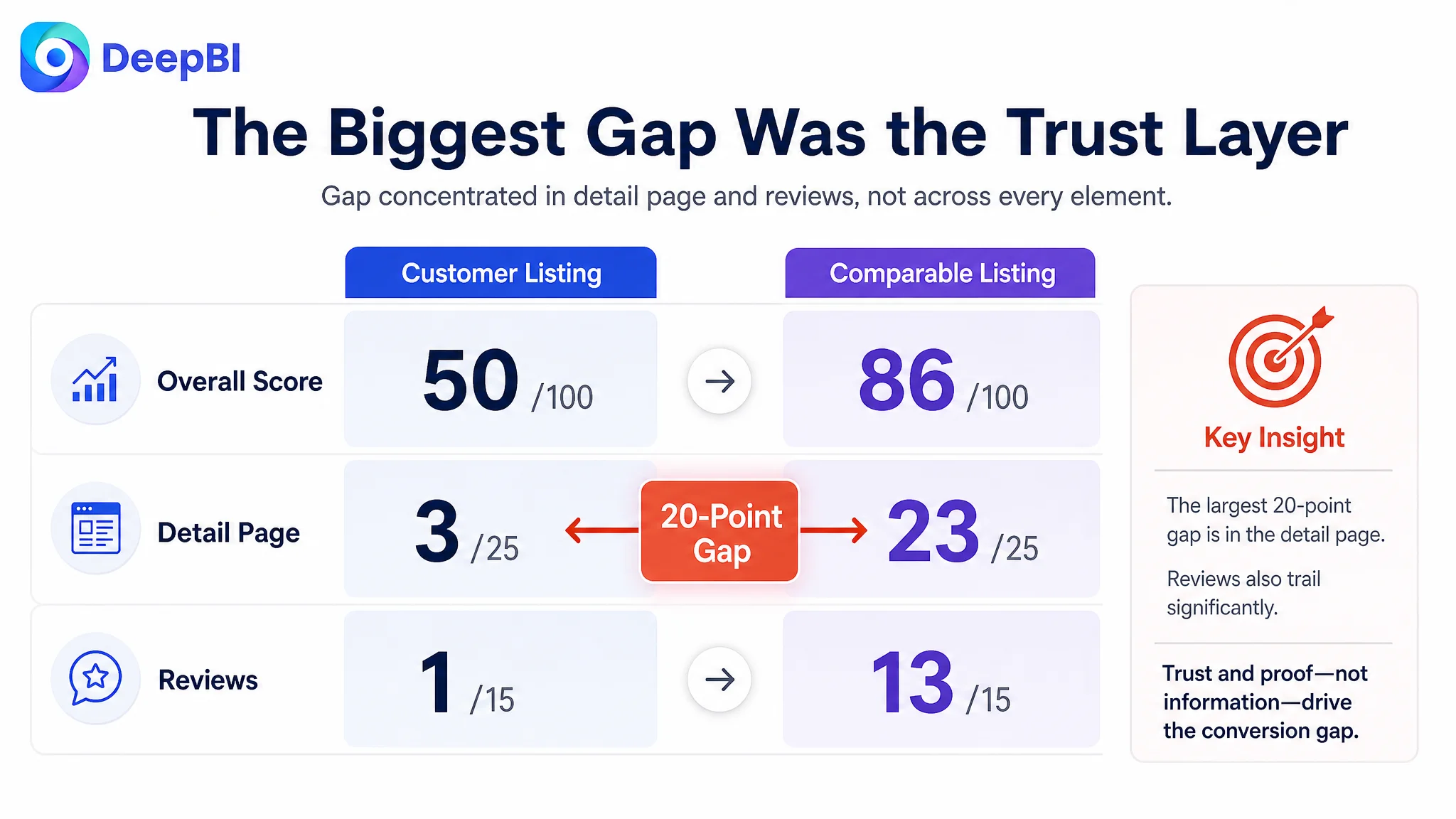
- Overall score: Customer Listing: 50/100, Comparable Listing: 86/100
- Title: Customer Listing: 14/20, Comparable Listing: 16/20
- Main image: Customer Listing: 24/30, Comparable Listing: 27/30
- Bullet points: Customer Listing: 8/10, Comparable Listing: 7/10
- Detail page: Customer Listing: 3/25, Comparable Listing: 23/25
- Reviews: Customer Listing: 1/15, Comparable Listing: 13/15
The most important number was not the overall 36-point gap. It was the 20-point difference in the detail-page dimension.
The title and main images were behind, but not catastrophically. The bullet points were actually stronger than the comparison Listing in several respects. The decisive weakness was that the customer’s Amazon product page relied almost entirely on text, while the comparable Listing used a complete visual A+ structure.
The Listing did not primarily suffer from missing features. It suffered from missing proof.
The First Assumption: More Information Would Make the Page More Convincing
The customer’s five bullet points contained substantial product information. They addressed:
- Four sliding trays
- Two vertical file holders
- Two pen holders
- Reinforced metal construction
- A stated 40-pound capacity
- A compact footprint
- Tool-free assembly
- Foldable storage
- Office, home, school, and dorm use
- Vertical and horizontal access
This was not a case where the seller had ignored product benefits.
The problem was that the information was treated as a collection of claims rather than as a connected buying argument. A shopper could learn what the organizer contained, but the page did not consistently answer the questions behind the purchase:
- How will this reduce desk clutter?
- Where will different types of documents go?
- Can the organizer handle heavier binders and magazines?
- Will the structure remain stable?
- Will it fit on a limited desk?
- Can it be assembled without frustration?
- What makes this organizer more trustworthy than a cheaper alternative?
The initial direction therefore remained too close to content accumulation: add specifications, describe more functions, and refine keyword coverage.
That approach missed the difference between describing capacity and making capacity believable.
The bullet points were not the main bottleneck
The bullet-point score was 8/10, compared with 7/10 for the benchmark Listing. That mattered because it prevented a common misdiagnosis.
The customer’s copy already had several strong ingredients:
- Pain-point-oriented language
- Specific dimensions
- A stated load-bearing capacity
- A clear assembly benefit
- Multiple use scenarios
- Differentiated structural features
The issue was not that the copy needed to become longer. In fact, some points were repetitive and overly dense. The better direction was to make each bullet perform one distinct role in the buying journey.
For example:
- Establish the complete storage system
- Prove durability and stability
- Show how the footprint saves desk space
- Remove assembly and storage anxiety
- Position the organizer as a practical part of a professional workspace
The change was from more claims to better sequencing.
Amazon Ads Were Not the First Place to Look
The case material did not point to a specific ACOS, CTR, or CVR trend. That limitation is important: no post-optimization advertising results should be invented.
But the Listing diagnosis still exposed a familiar Amazon operating risk. If ads were used to send more shoppers to this product page, the page had limited ability to convert those visits into confidence.
Advertising can create visibility. It cannot replace missing product-page persuasion.
A shopper arriving from Amazon ads would still encounter:
- A title that began with a generic functional description rather than a distinctive product identity
- A main-image sequence that did not immediately show the full storage system
- A product page without visual A+ modules
- No review history to provide third-party reassurance
- Product claims that were not consistently demonstrated through visual evidence
This is why increasing traffic before repairing the page would have been a risky decision. More paid traffic could expose the Listing to more shoppers without resolving the reasons they hesitated.
Traffic was not the only variable. The page’s ability to convert traffic was the constraint that needed attention first.
DeepBI Located the Largest Gap in the Product Page
DeepBI’s comparison did not stop at “the competitor looks better.” It quantified where the gap was concentrated and connected that gap to buyer decision logic.
The detail-page score was 3/25 versus 23/25 for the comparable Listing. The difference came from a fundamental structural contrast:
The customer Listing used plain text. The comparable Listing used a visual conversion sequence.
That sequence included:
1. A hero message focused on desk clutter
2. A visual explanation of the storage functions
3. Use-case scenes across office, school, and home environments
4. Structural and material close-ups
5. Dimensions and compatibility information
6. Comparison-style proof
7. A multi-color presentation that expanded decision flexibility
The customer’s text mentioned many of these benefits, but the shopper had to imagine them. The comparable Listing showed them.
This distinction is especially important for an office-organization product. A desktop organizer is purchased through mental simulation. Shoppers want to picture their mail, files, notebooks, pens, binders, and magazines in the compartments before they commit.
Without that visual mapping, functional claims remain abstract.
The title had a relevance problem, not a total failure
The title score was 14/20 versus 16/20. The gap was relatively small, but the structure still limited clarity.
The existing title led with a functional phrase similar to “4-Tier Desk Organizer” and then moved through office organization, paper, document, and stationery storage terms. It covered the category, but its structure felt more like a list of keywords than a deliberate buying statement.
The comparison Listing made several elements easier to recognize:
- Brand or product identity
- Core product category
- Letter-tray function
- Drawer and pen-holder features
- Office and home use
- Model and pack information
The proposed direction was not to copy the competing title. It was to reorganize the customer’s own relevant terms into a cleaner Amazon title structure:
core product identity → material and configuration → key storage functions → use context
That could place a phrase such as “4-Tier Metal Desk Organizer” earlier, then clarify the file holders, pen holders, letter trays, and workspace use without repeating similar terms.
The goal was better search relevance and faster comprehension—not simply adding more keywords.
The main image hid part of the product’s value
The main-image score was 24/30 versus 27/30. Again, this was not a collapse. It was a missed opportunity.
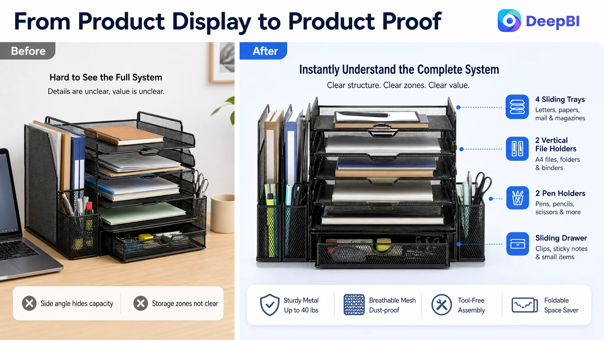
The existing image set included dimensions and several use scenarios, but the visual sequence did not create a strong first impression of the organizer’s complete capacity. A side or rear-oriented perspective made it harder to see:
- The four sliding trays
- The two vertical file holders
- The two pen holders
- The staggered structure
- The distinction between horizontal and vertical storage
The recommended change was a direct or 45-degree front-facing view that loaded the product with representative office items. This would make the organizer’s value legible at a glance without changing the product itself.
The image sequence could then move through a clearer order:
1. Immediate desk-clutter solution
2. Functional zoning and dimensions
3. Before-and-after workspace context
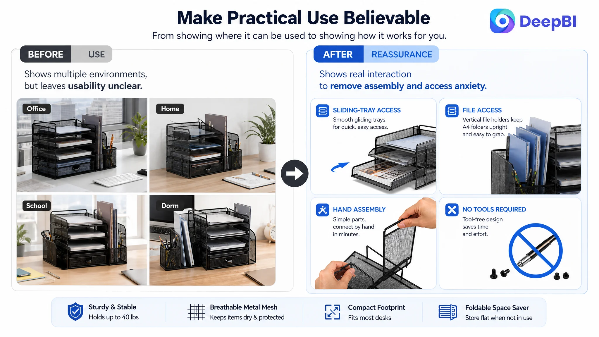
4. Real interaction and tool-free assembly
5. Material construction and stability
That order matters because shoppers do not evaluate every image with equal attention. The early images need to establish relevance before later images provide technical proof.
The Missing A+ Story Was More Serious Than a Missing Image
The most consequential finding was the absence of visual A+ content.
The customer’s page used text where the comparison Listing used a series of full-width visual modules. This created several problems at once:
- No emotional opening
- No visual explanation of how the compartments work
- No direct connection between common desk clutter and the product’s solution
- No close-up evidence of the reinforced mesh and solid frame
- No structural explanation of stability
- No final reassurance around dimensions and assembly
The proposed A+ direction followed a simple but commercially important progression.
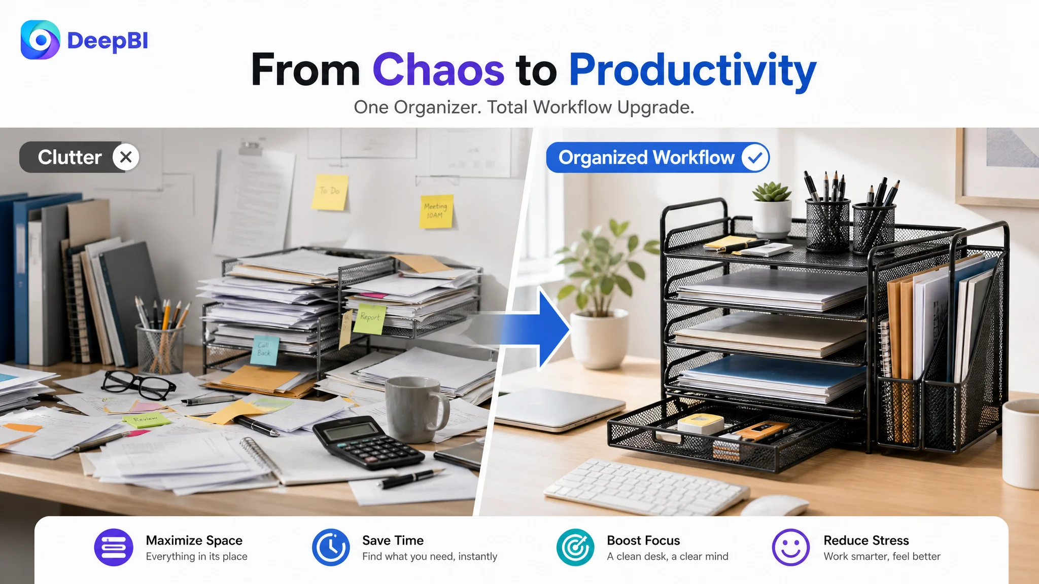
Start with the workspace problem
The opening module should establish the desired outcome: a cleaner, more professional, less distracting workspace.
This is not decorative storytelling. It connects the product to the reason people buy desk organizers in the first place. A tidy desk is not merely an arrangement of objects; it represents easier access, less visual friction, and a more controlled work or study environment.
Make the storage system easy to understand
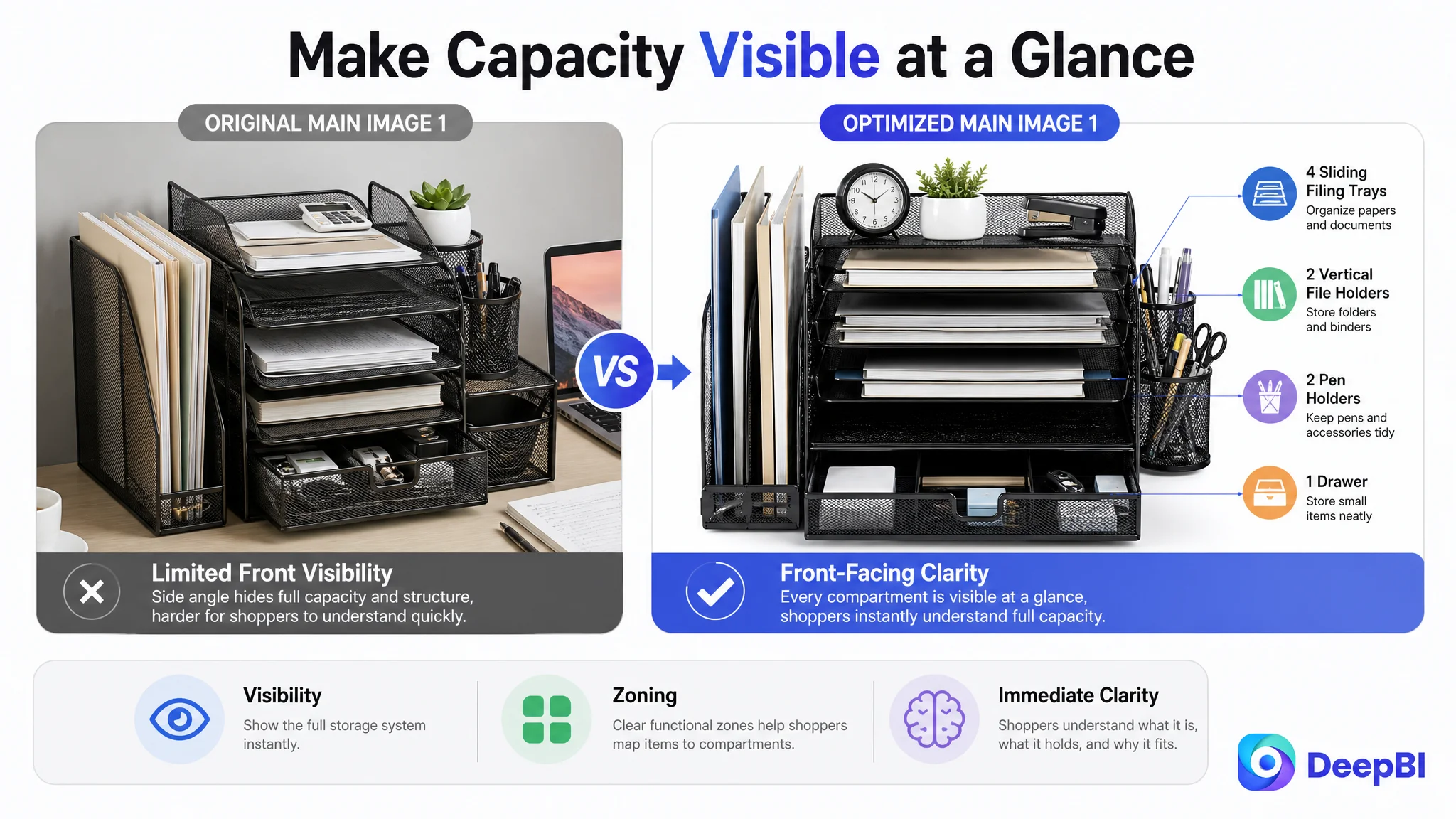
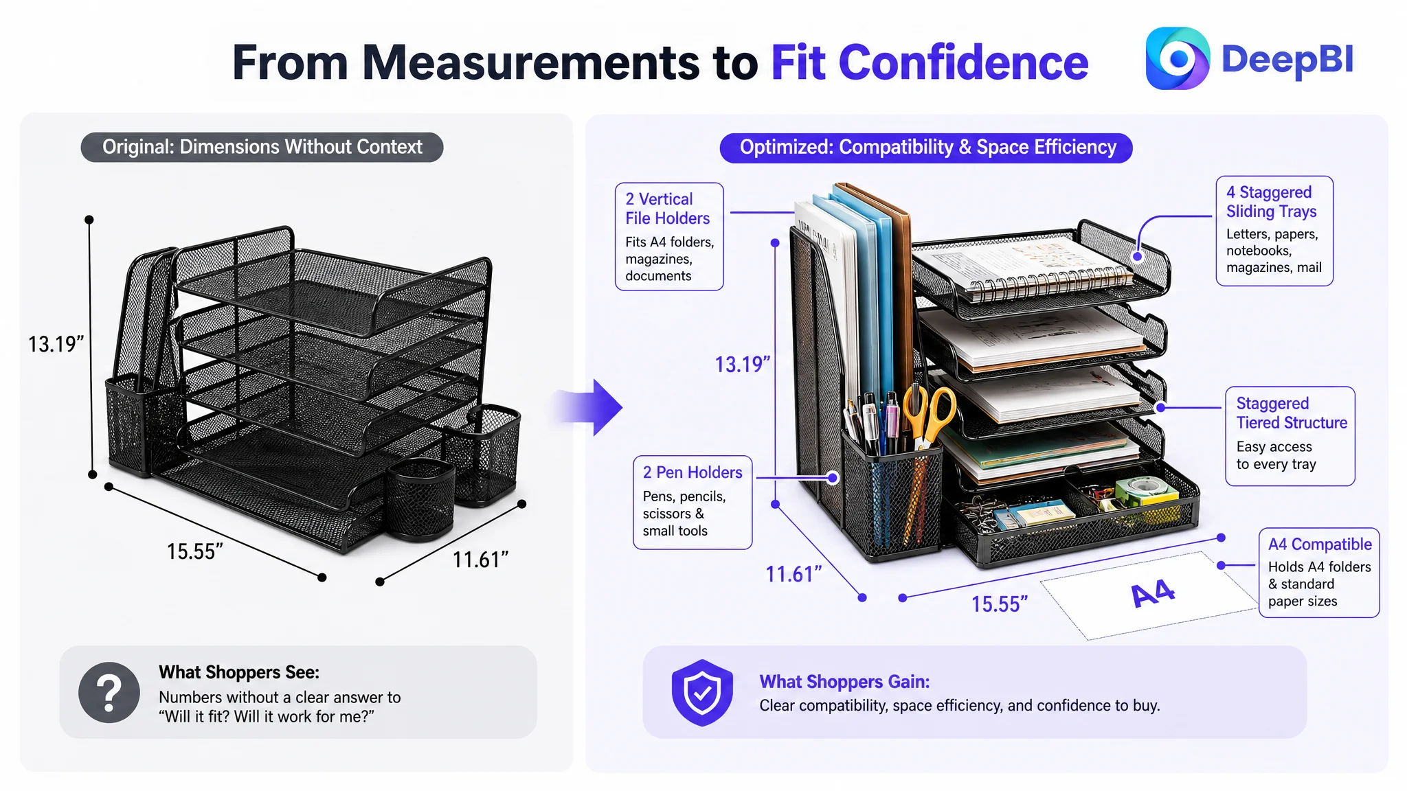
The next module should map common office items to the product’s actual zones:
- Files and folders in the vertical holders
- Letters and magazines in the sliding trays
- Pens and small stationery in the pen holders
- Binders, mail, notes, and accessories across the available compartments
This directly addresses the shopper’s practical question: Will my things fit, and will I know where to put them?
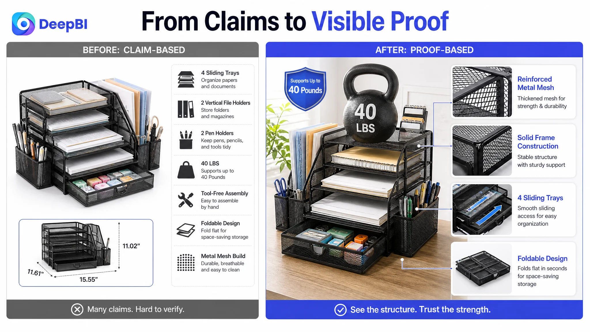
Turn structure into visible proof
The organizer’s features should not remain isolated labels such as “sturdy,” “multi-functional,” or “space-saving.”
The page should show how the parts work together:
- Four sliding filing trays
- Two vertical file holders
- Two pen holders
- Staggered tiered access
- A compact footprint of 15.55 by 11.61 inches
- Foldable storage when the unit is not in use
The more specific the visual explanation, the less work the shopper must do to translate features into daily use.
Show material and stability without overclaiming
The available product information supports a reinforced metal mesh construction, solid frame, breathable mesh design, and stated capacity of up to 40 pounds.
Those claims should be presented through close-up material views and structural emphasis. The purpose is not to make the organizer appear heavier or more advanced than it is. It is to answer reasonable concerns about wobbling, deformation, ventilation, and long-term use.
DeepBI’s value in this step is not inventing a more impressive product. It is translating existing product truth into clearer evidence.
End by removing practical hesitation
A final module should address the two remaining barriers:
- Will it fit my desk?
- Will assembly be difficult?
Precise dimensions, foldable storage, and tool-free assembly belong near this decision point because they resolve practical risk after the shopper already understands the product’s value.
Reviews Created a Separate Trust Deficit
The review dimension was also materially behind:
- Customer Listing: 0 reviews and no rating data
- Comparable Listing: 185 reviews with a 4.5-star average
This gap could not be solved through page design alone. Reviews are a separate source of social proof, and the customer Listing had no review base to support the purchase decision.
That does not mean review collection should automatically come before every Listing improvement. It means the lack of reviews made the missing A+ story more damaging.
When shoppers cannot rely on customer feedback, the product page must work harder to provide:
- Clear product identity
- Concrete use scenarios
- Visible construction evidence
- Accurate dimensions
- A believable assembly experience
- A coherent explanation of why the product is worth choosing
The right business judgment was therefore not to treat reviews and A+ content as interchangeable fixes. Reviews required a separate, compliant long-term operating effort. The immediate Listing opportunity was to make the product’s own evidence stronger.
Why DeepBI Did Not Recommend Endless Ad Tuning First
The decision order followed the size and nature of the gaps.
The title and main image needed improvement, but their scores were comparatively close to the benchmark. The bullet points were not the weakest area. The detail page, however, was almost entirely missing as a visual conversion layer, and the review base provided no meaningful external reassurance.
That made continued ad-first optimization a poor priority.
The more responsible sequence was:
1. Rebuild the product page’s persuasion logic
2. Clarify the title and shorten redundant wording
3. Reorganize the image sequence around attention and proof
4. Build A+ modules that connect clutter, function, quality, fit, and assembly
5. Address review-building through appropriate operational processes
6. Then evaluate how paid traffic performs against the revised page
This order protects the advertising budget from being used to amplify unresolved page weaknesses.
Ads can bring a shopper to the Listing. The Listing still has to earn the order.
From Feature Inventory to Buying Logic
The proposed changes were not a request to make every element more elaborate. They were a shift in the page’s operating logic.
The title would make the product and its core storage function easier to identify.
The main images would show the full product system before moving into dimensions, scenarios, interaction, and construction.
The bullet points would give each benefit a distinct role rather than repeating related information.
The A+ content would provide the missing visual narrative:
desk clutter → organized zones → visible structure → material confidence → fit and assembly reassurance
That sequence gives shoppers a way to evaluate the product in the order their uncertainty develops.
It also keeps optimization grounded in the real product. The product remains the same black metal desktop organizer with its existing compartments, dimensions, foldable design, and stated capacity. The improvement lies in how clearly the page communicates those facts.
What This Case Changed in the Seller’s Understanding
The case did not produce a fabricated claim of lower ACOS, higher CVR, or increased organic orders. No post-optimization advertising data was provided.
What it did produce was a more accurate operating diagnosis.
The seller could now distinguish between:
- A keyword coverage problem and a comprehension problem
- A lack of features and a lack of proof
- A content volume issue and a content sequencing issue
- A main-image weakness and a page-wide trust gap
- A traffic problem and a conversion-capacity problem
That distinction is commercially important for Amazon sellers. A Listing with detailed bullets and multiple images can still be underprepared for paid traffic if the shopper cannot see how the product works or why it deserves trust.
The practical lesson is straightforward:
Before asking Amazon ads to deliver more traffic, determine whether the product page is ready to convert the traffic it already receives.
For this desktop file organizer, DeepBI’s most valuable judgment was not a longer title or a more polished image. It was identifying the missing layer between product information and purchase confidence—and putting the A+ product-page story at the center of the next decision.