

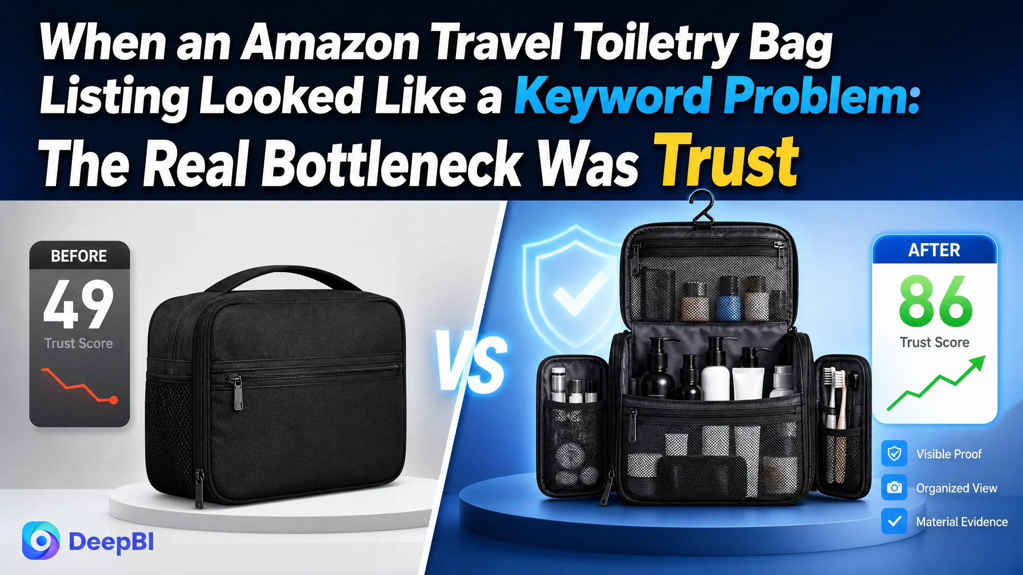
The customer was an Amazon seller in the US travel-accessories category, operating a travel toiletry bag Listing that appeared to need the usual fixes: refine the title, add more relevant keywords, clarify the product features, and improve the images. The initial direction treated the page mainly as a search-visibility and information-coverage problem.
That diagnosis was incomplete. DeepBI’s comparison showed that the largest gap was not in the title or even the main images. It was in the product-page experience after the shopper arrived. The Listing scored 49 out of 100 against 86 for a comparable high-performing Amazon product page, with the most severe weakness concentrated in the detail content and customer proof.
The later optimization therefore focused on rebuilding the page’s sales logic: show how the bag solves travel organization problems, make capacity and compartment design visible, demonstrate hanging and leak-protection use cases, and use A+ content to create trust. For other Amazon sellers, the case is a reminder that ads and keywords cannot compensate for a product page that asks shoppers to imagine too much and trust too little.
The page did not have one small weakness. It had one dominant gap.
At first glance, the Listing’s problems appeared spread across several areas:
- The title repeated variations of “Travel Toiletry Bag.”
- The main images showed the product but did not immediately communicate its storage value.
- The bullet points listed functions without building a strong buying sequence.
- The detail page contained no visual modules.
- The Listing had no customer reviews.
But the score comparison made the priority clear.
- Title: Customer Listing: 14/20, Comparable high-performing Listing: 16/20, Gap: -2
- Main images: Customer Listing: 24/30, Comparable high-performing Listing: 26/30, Gap: -2
- Bullet points: Customer Listing: 6/10, Comparable high-performing Listing: 8/10, Gap: -2
- Detail content: Customer Listing: 3/25, Comparable high-performing Listing: 22/25, Gap: -19
- Reviews: Customer Listing: 2/15, Comparable high-performing Listing: 14/15, Gap: -12
- Total: Customer Listing: 49/100, Comparable high-performing Listing: 86/100, Gap: -37
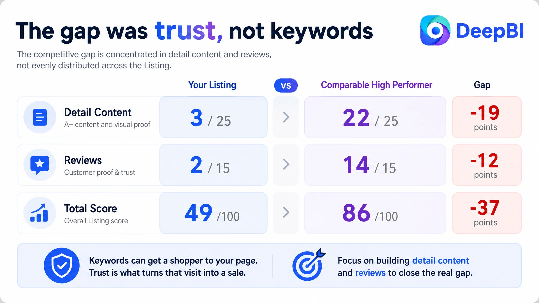
The result was not a balanced shortfall. The title, main images, and bullet points were behind, but only by two points each. The detail content and reviews accounted for nearly the entire competitive distance.
The Listing was not primarily losing because it lacked more keywords. It was losing because the page did not provide enough evidence for a first-time buyer to feel confident.
That distinction changed the order of operations.
The original direction focused on expression before conversion logic
The customer’s existing page was not empty. It contained dimensions, materials, storage features, zippers, handles, and multi-use claims. From an internal perspective, the product information was present.
The problem was that the information remained largely at the feature level.
A buyer does not evaluate a travel toiletry bag by counting how many features appear in the copy. The buyer is trying to answer practical questions:
- Will it hold the items needed for a short trip?
- Can bottles, shaving accessories, and grooming tools stay organized?
- Can small items be found quickly?
- Will it fit into a suitcase without wasting space?
- Can it be hung in a small hotel bathroom?
- What happens if something leaks inside the bag?
- Does the product look dependable enough to justify the purchase?
The original content did not consistently connect each feature to one of these decisions. The title repeated product-type terms, the bullet points moved from one function to another, and the images presented dimensions more as static information than as travel guidance.
This created a familiar Amazon operating trap: the team could keep polishing individual elements without addressing the reason the page was not persuasive as a whole.
The likely next step in that situation would be to keep refining keywords, adjusting bids, or producing more feature-focused copy. But those changes would not repair the missing bridge between product information and purchase confidence.
The Amazon title needed refinement, but it was not the main leak
The title comparison did identify meaningful issues.
The comparable Listing used a compact structure built around:
- The core product term
- The hanging use case
- Broader audience coverage
- Waterproof positioning
- Travel-related search language
- A concise size and color ending
The customer title repeated “Toiletry Bag” and “Travel Toiletry Bag,” focused narrowly on men, and used narrower wording such as “Shaving Hygiene Bag.” It also gave less emphasis to the broader “Travel Essentials” and organizer use cases.
These were real search and readability issues. The recommended direction was to reduce repetition, combine the product form with the water-resistant nylon material, and add broader travel-use language without turning the title into a keyword block.
But the title gap was only two points.
That mattered because it prevented the team from treating the title as the central diagnosis. A better title could improve relevance and search coverage, but it could not create the trust that the rest of the page was missing.
The main images showed the product, but not enough of the reason to buy it
The main-image gap was also smaller than the detail-page gap, but it affected the first moments of the Amazon shopping journey.
The existing image sequence established a basic product-category impression. Shoppers could see a toiletry bag, its dimensions, and some internal organization. What they could not immediately see was the product’s practical promise:
one organized bag that reduces travel clutter.
The stronger comparable Listing used visual proof more aggressively. It showed how capacity worked, how compartments related to real travel items, how the bag could be used while hanging, and how the product fit into a bathroom or packing environment.
DeepBI’s diagnosis focused on the decision role of each image rather than treating every image as another product view.
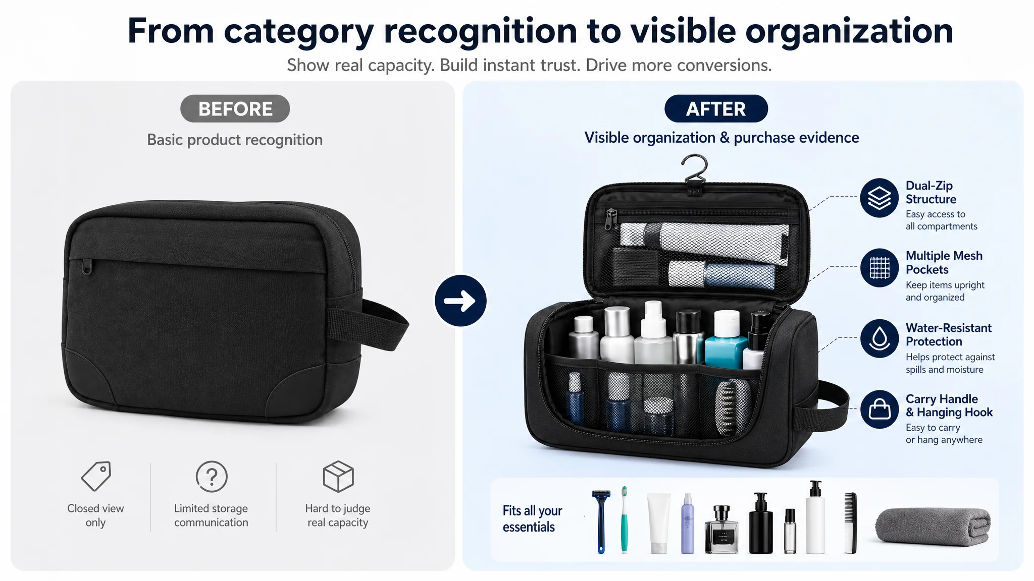
The first image needed to communicate organization
A closed bag on its own creates category recognition. It does not necessarily create a reason to click.
The stronger direction was to make “spacious organization” visible at first glance while preserving the actual product structure. The visual should help shoppers understand the bag’s storage potential without requiring them to read several bullets.
The size image needed to reduce fit uncertainty
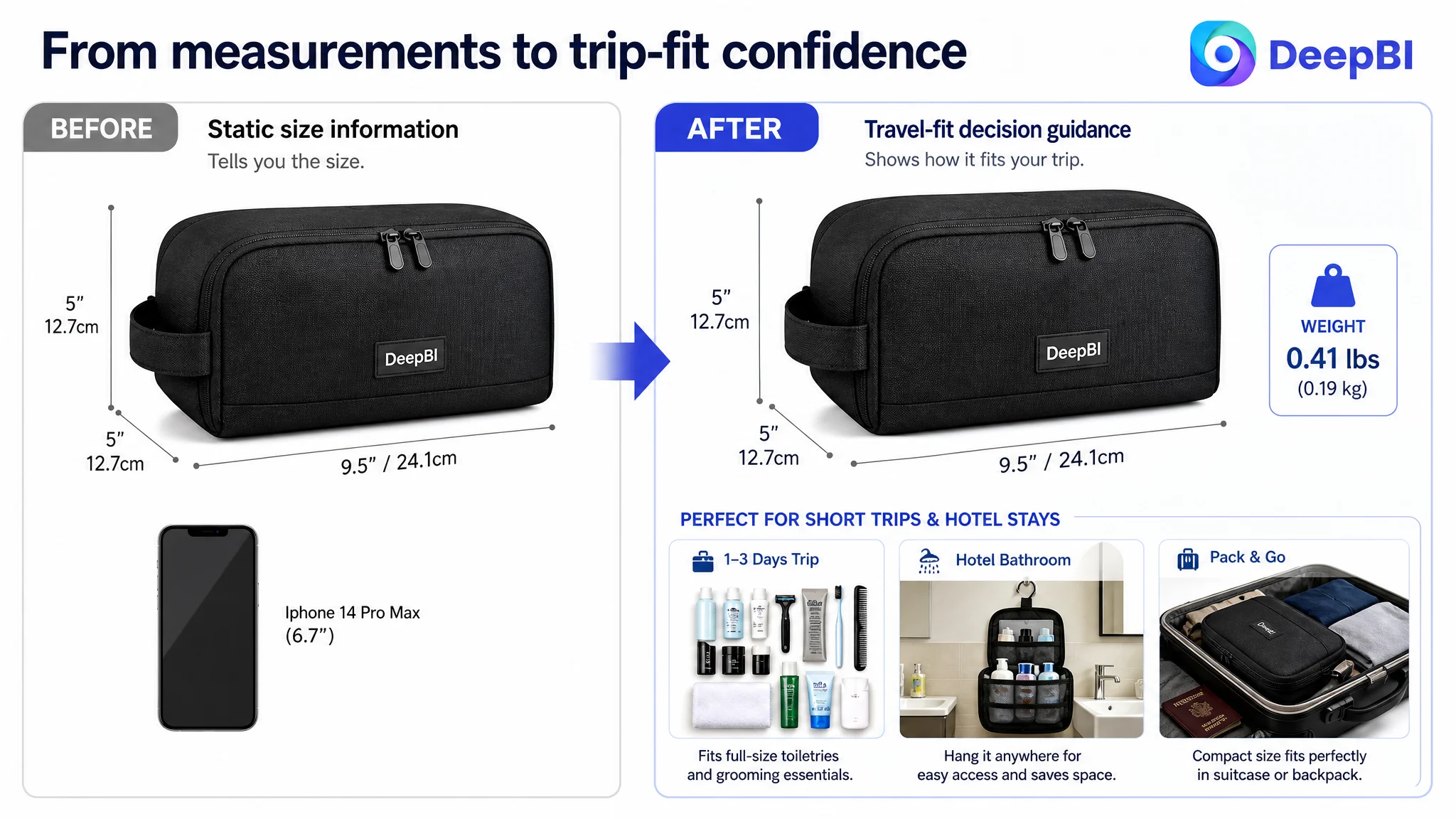
The customer Listing showed dimensions as rational data. That answered “How large is it?” but not necessarily “Will it work for my trip?”
A more useful image would connect the dimensions with a realistic travel scenario: the types of toiletries that fit, the amount of gear suitable for a short trip, and the way the bag sits inside luggage or a backpack.
The hanging function needed to become a usage scene
The product’s hanging or carry function was not sufficiently connected to the problem of limited hotel-bathroom space.
For frequent travelers, the value is not simply that the bag can hang. It is that hanging can keep toiletries visible, accessible, and away from a wet counter. That is a complete use case, not just a feature label.
The internal organization needed to add new evidence
One of the later images repeated the general idea of an open bag instead of advancing the decision. The sequence needed clearer roles:
1. Establish the product and its organizing value.
2. Show capacity through real items.
3. Explain size in a travel context.
4. Demonstrate water resistance and spill protection.
5. Show zippers, handles, hanging, and home-use flexibility.
This is where visual optimization becomes business reasoning. The question is not whether an image looks polished. It is whether it removes a specific purchase doubt.
The largest issue was the missing A+ story
The detail-content score was 3 out of 25. The customer page had no image modules and largely repeated text descriptions. The comparable Listing used a fuller visual structure:
- A problem-and-solution introduction
- A large-capacity demonstration
- Scenario-based organization examples
- Feature close-ups
- Material and durability evidence
- Product and color presentation
This was not simply a difference in page decoration.
The comparable page gave shoppers a sequence for understanding the product:
1. Travel organization is difficult.
2. The bag creates more usable structure.
3. Each compartment addresses a practical need.
4. The material helps manage spills and moisture.
5. The product is useful beyond one trip.
6. The bag can be packed and carried without unnecessary bulk.
The customer page required shoppers to construct that logic themselves from repeated descriptions.
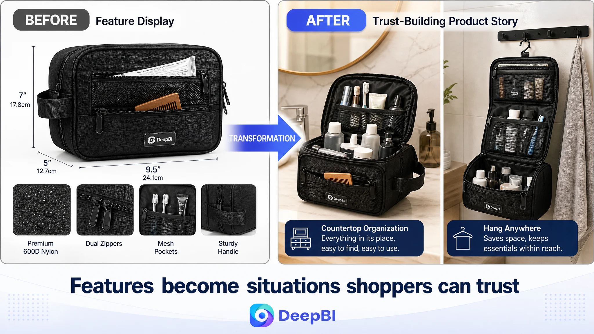
A+ content was not an optional brand layer in this case. It was the missing explanation for why the product deserved consideration.
For this travel toiletry bag, the A+ direction needed to make the product’s value visible through real situations:
- A crowded travel kit becoming organized
- Shampoo, toothpaste, shaving items, brushes, and other essentials placed into appropriate compartments
- Small accessories kept accessible through side pockets
- The bag hanging from a bathroom hook or towel rack
- Water-resistant material helping protect surrounding luggage from internal spills
- The closed bag fitting neatly into a suitcase or backpack
- The same organizer working in a home bathroom or on a dressing table
The emphasis had to remain within the product’s verified properties. The case material did not support adding unverified durability numbers or inventing test results. Where quantitative evidence was unavailable, the page should rely on clear visual demonstrations of structure, material, and use.
The bullet points had features, but not a buying path
The five bullet points scored 6 out of 10. Their weakness was not a total lack of information. It was the absence of a consistent problem-to-solution progression.
The existing structure moved through dimensions, materials, storage, zippers, handles, and general use. The recommended structure reordered those facts around shopper decisions.
Capacity should answer a packing problem
Instead of presenting dimensions alone, the first bullet should connect the bag’s size with recognizable travel items and trip types. A shopper should be able to imagine what the bag can hold and whether it suits a short trip or weekend getaway.
Compartments should explain access and protection
The second bullet should show how the zippered mesh pocket and open mesh pockets keep items separated and easier to find. The value is not “more pockets.” It is less searching and less disorder.
Hanging should explain space savings
The hanging design should be tied to a small hotel bathroom, limited counter space, and easier access. That makes the feature relevant to the traveler’s environment.
Construction should explain packing stability
Dual zippers, a reinforced handle, and a structured shape should be described in terms of carrying, opening, protecting contents, and fitting into luggage. The copy should not stop at “sturdy” or “smooth.”
Versatility should remove the one-trip objection
Business travel, gym sessions, camping, and home bathroom storage help establish that the product is not useful only during occasional vacations. This supports the broader “travel essential” positioning without overstating the product.
Each bullet therefore needed to follow a clearer pattern:
What the shopper cares about → What the product provides → How that changes the use experience.
That structure is more valuable than adding more adjectives.
Reviews created a separate trust constraint
The review dimension revealed the hardest limitation in the case.
The customer Listing had no rating data, no total review count, and no visible customer comments. The comparable high-performing Listing had a 4.6-star rating, 4,914 reviews, and 45 reviews visible on the first page, including user images and videos.
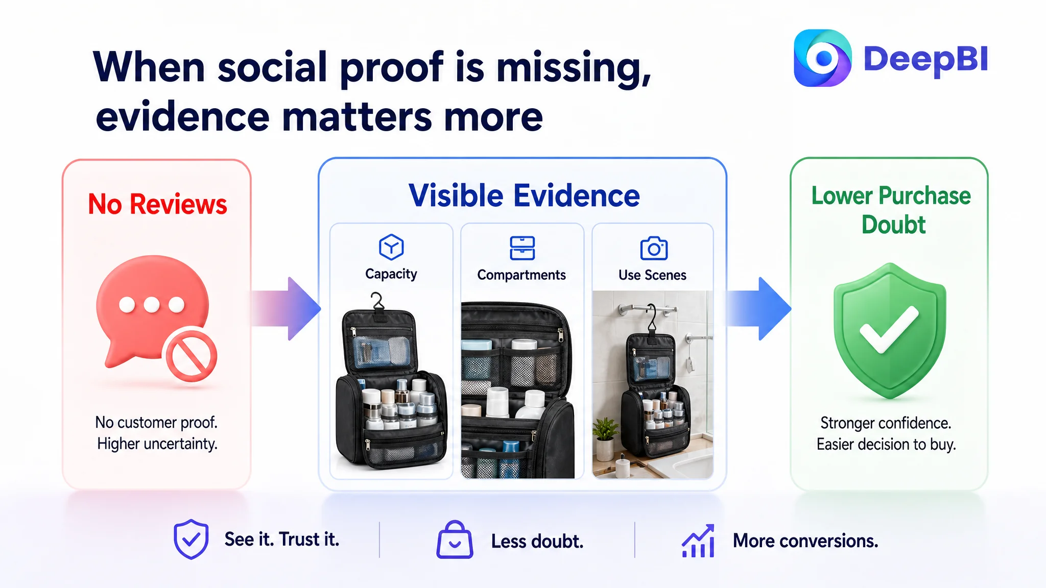
This gap could not be solved by rewriting a bullet point or generating a more attractive product image. A page without customer proof faces a different level of resistance, especially in a category where buyers want reassurance about capacity, construction, and travel convenience.
That did not mean the team should wait for reviews before fixing the Listing. It meant the page needed to reduce every other avoidable source of doubt while the review base remained undeveloped.
The product page could not manufacture social proof. It could, however:
- Make capacity easier to verify
- Show the product in realistic use
- Clarify how compartments work
- Demonstrate the hanging function
- Explain material protection accurately
- Confirm packability
- Replace vague claims with visible evidence
The absence of reviews increased the importance of every other trust signal.
Why DeepBI did not recommend tuning ads first
The case material does not provide post-optimization advertising results or a specific ACOS trend. That limitation is important. The correct judgment is not that advertising had already failed numerically, but that additional paid traffic would face a weak conversion environment.
If Amazon ads send shoppers to a page with limited trust, the ads do not repair the page. They increase the number of shoppers exposed to the same uncertainty.
The operational order therefore became:
1. Clarify the product’s search and use-case positioning.
2. Improve the main-image decision sequence.
3. Rebuild the bullet points around shopper problems.
4. Create an A+ narrative with visual proof.
5. Address review-generation and trust development as a separate business task.
6. Only then judge whether additional ad traffic is being converted efficiently.
This sequence protects the seller from amplifying a page-level defect.
Advertising can bring a shopper to the Listing. It cannot decide whether the shopper believes the Listing.
DeepBI’s value in this case was not producing a longer list of changes. It was identifying which problem had to be addressed first and which weaknesses were downstream of that decision.
The revised page was designed to carry its own sales logic
The optimization direction moved from “show more features” to “help the shopper reach a decision.”
That meant the page needed to communicate four linked ideas:
The bag solves travel clutter
The opening visual and A+ introduction should position large capacity as a solution to carrying multiple loose bags and losing small essentials.
The compartments create practical order
The page should demonstrate where awkward and frequently used items go, rather than asking shoppers to infer the value of each pocket.
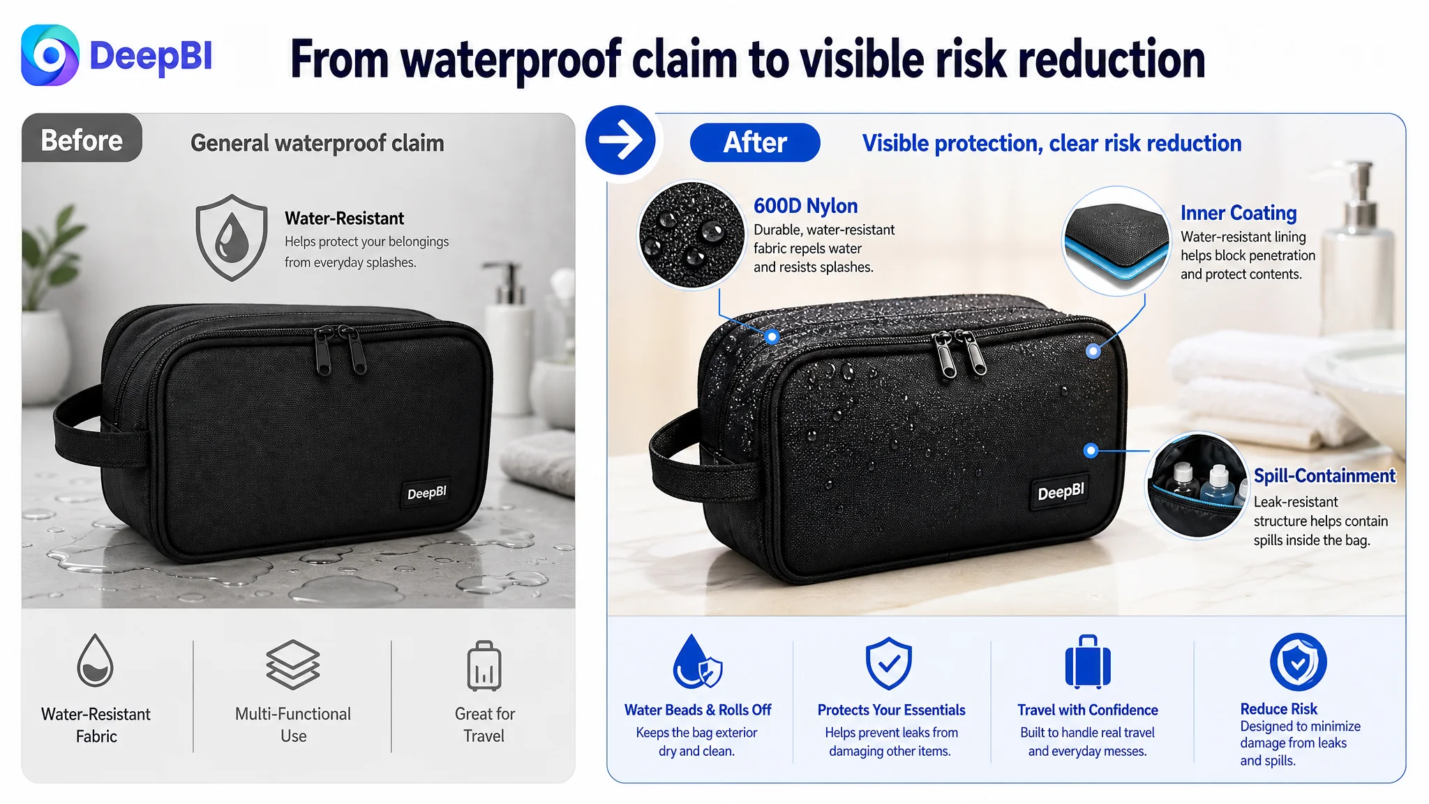
The material reduces a specific travel risk
Water-resistant nylon should be connected to spills and moisture inside luggage or around other gear, while avoiding unsupported claims about performance.
The product remains useful after the trip
Home bathroom organization, dressing-table storage, gym use, and camping extend the product’s utility and reduce the concern that it will sit unused between vacations.
This is a more complete conversion path than repeating “large,” “multi-functional,” and “water-resistant.”
What changed in the customer team’s understanding
The case did not establish a verified post-optimization CVR, ACOS, or organic-order increase, so no numerical performance claim should be attached to the outcome.
The meaningful change was in operating judgment.
The team could now separate several issues that had previously blended together:
- Search relevance was not the same as purchase confidence.
- A better title could improve discoverability, but not replace missing proof.
- More feature text could not substitute for scenario-based visual communication.
- A+ content was central to conversion for a product whose value depends on organization and use context.
- Zero reviews created a trust deficit that needed its own plan.
- Paid traffic should not be scaled as though it were independent of product-page quality.
The Listing’s business risk also became clearer. With a 37-point competitive gap, the priority was not to make isolated cosmetic improvements. It was to rebuild the page’s ability to convert both organic and paid shoppers over time.
The broader lesson for Amazon sellers
Many Amazon sellers diagnose weak performance at the level of the most visible metric: impressions, clicks, bids, keywords, or ACOS. But a Listing can have a search problem, a click problem, or a trust problem, and those require different decisions.
In this case, the title and main images needed work, but they were not the largest constraint. The decisive weakness was the page’s inability to turn product information into confidence.
That is why the right question was not:
“What else can we add to the Listing?”
It was:
“What does a shopper still have to imagine before buying?”
For this Amazon travel toiletry bag, the answer included capacity, organization, hanging use, spill protection, packing fit, and product reliability. Once those uncertainties became the center of the optimization, the page had a clearer role: not merely displaying a bag, but proving how the bag fits into a traveler’s routine.
And that is the point at which Amazon ads can become more useful again—not because the ads changed first, but because the product page became more capable of converting the attention they create.