

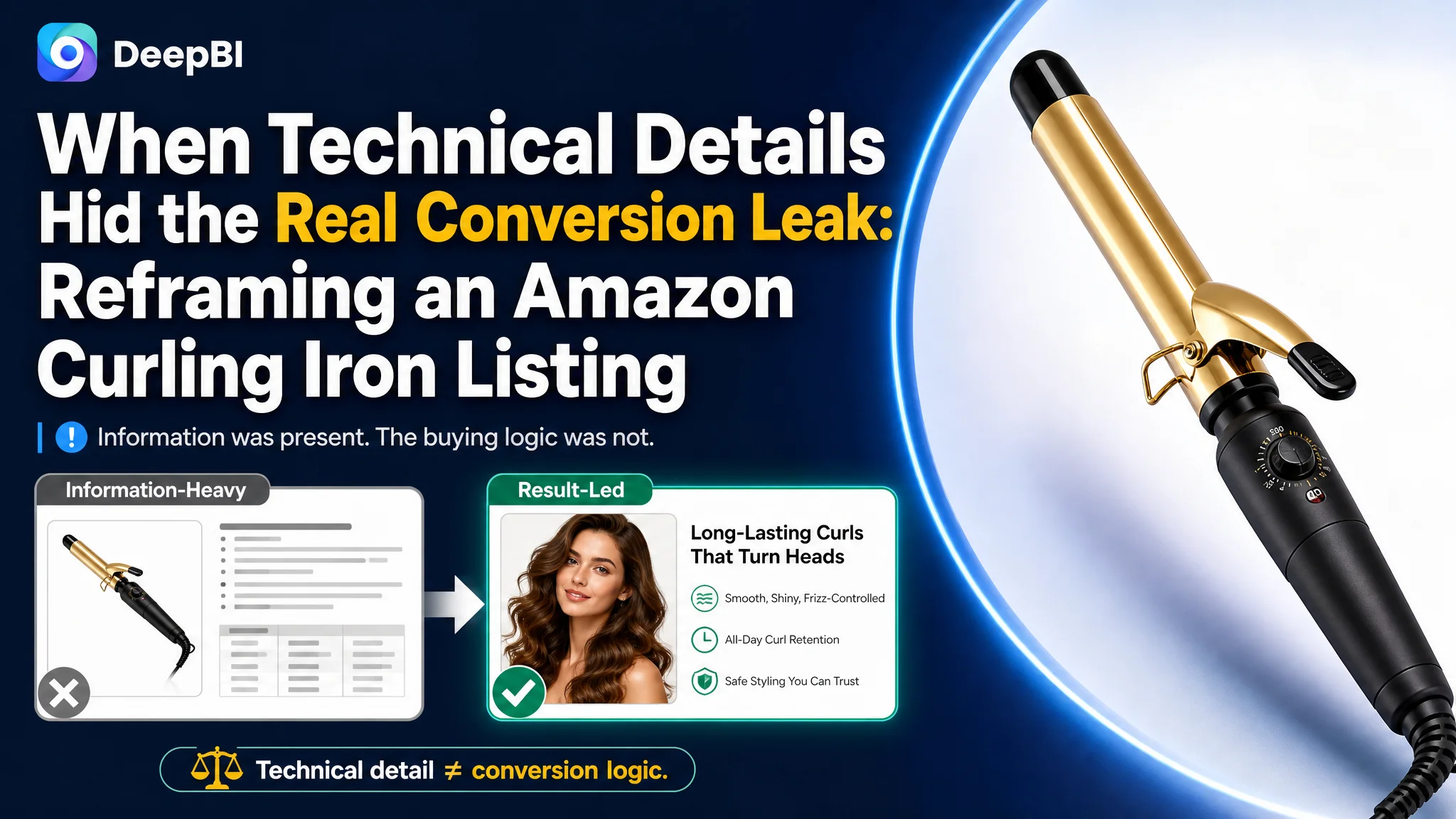
An Amazon seller in the US haircare category was not facing a simple lack of product information. Its curling iron Listing already included temperature settings, ceramic technology, dual voltage, styling functions, and usage scenarios. Yet the page remained materially weaker than a comparable high-performing Amazon Listing, with a total score of 67/100 versus 85/100.
The customer’s initial direction was centered on adding or refining technical details: temperature ranges, materials, heating performance, and the product’s 2-in-1 functionality. The underlying assumption was that the page mainly needed more specifications and clearer feature descriptions. DeepBI’s diagnosis pointed to a different constraint: the Listing had information, but not enough persuasive logic to turn that information into a buying decision.
The later optimization therefore focused on Amazon product-page conversion rather than simply adding more content. The title, main images, bullet points, and A+ content needed to work as one sales path: show the desired styling result first, clarify who the product is for, address concerns about heat and hair damage, and provide enough visual and review-based trust to make the product easier to choose.
For other Amazon sellers, the lesson is commercially important: when traffic does not produce enough orders, the problem may not be keyword coverage or ad settings alone. Before sending more paid traffic to a page, sellers need to determine whether the Amazon Listing can create a clear reason to click and enough confidence to convert.
The page contained information, but the business logic was weak
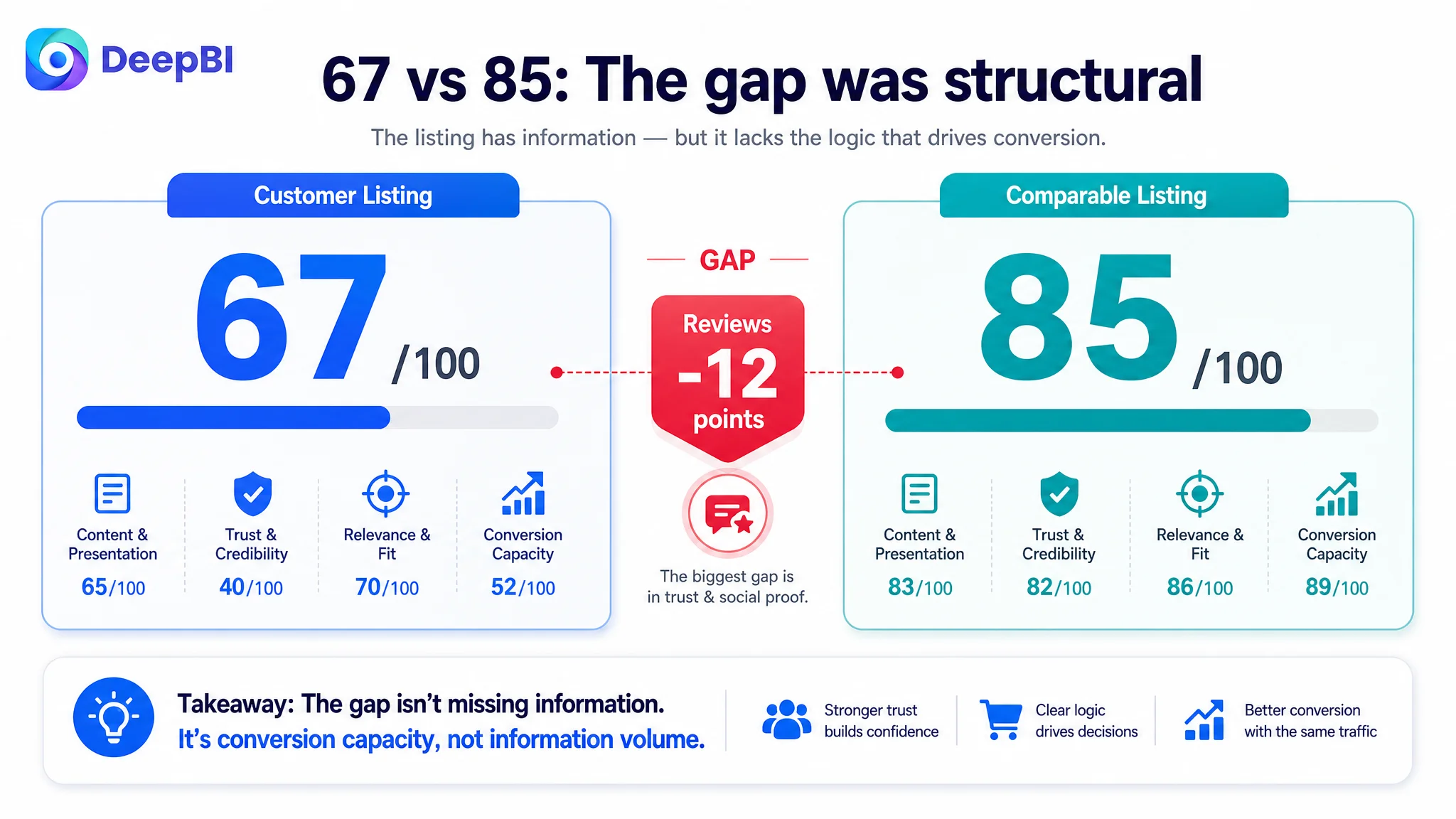
The Listing scored 67/100, while the comparable category Listing scored 85/100.
The gap was not distributed evenly:
- Title: Customer Listing: 15/20, Comparable Listing: 18/20, Gap: -3
- Main image: Customer Listing: 25/30, Comparable Listing: 23/30, Gap: +2
- Bullet points: Customer Listing: 6/10, Comparable Listing: 8/10, Gap: -2
- Detail page: Customer Listing: 19/25, Comparable Listing: 22/25, Gap: -3
- Reviews: Customer Listing: 2/15, Comparable Listing: 14/15, Gap: -12
- Total: Customer Listing: 67/100, Comparable Listing: 85/100, Gap: -18
At first glance, the page did not appear empty or incomplete. It mentioned a 1.25-inch barrel, adjustable temperature, 24K Gold Technology, ceramic coating, dual voltage, fast heat-up, and the ability to create different styles.
But Amazon shoppers do not evaluate a curling iron by counting specifications. They are deciding whether the product can help them achieve a desired result, whether it will work for their hair type and length, whether it feels safe to use, and whether other buyers provide enough evidence to trust the promise.
That was the central distinction in this case.
The Listing did not primarily lack features. It lacked a persuasive order for those features.
The original direction overvalued technical completeness
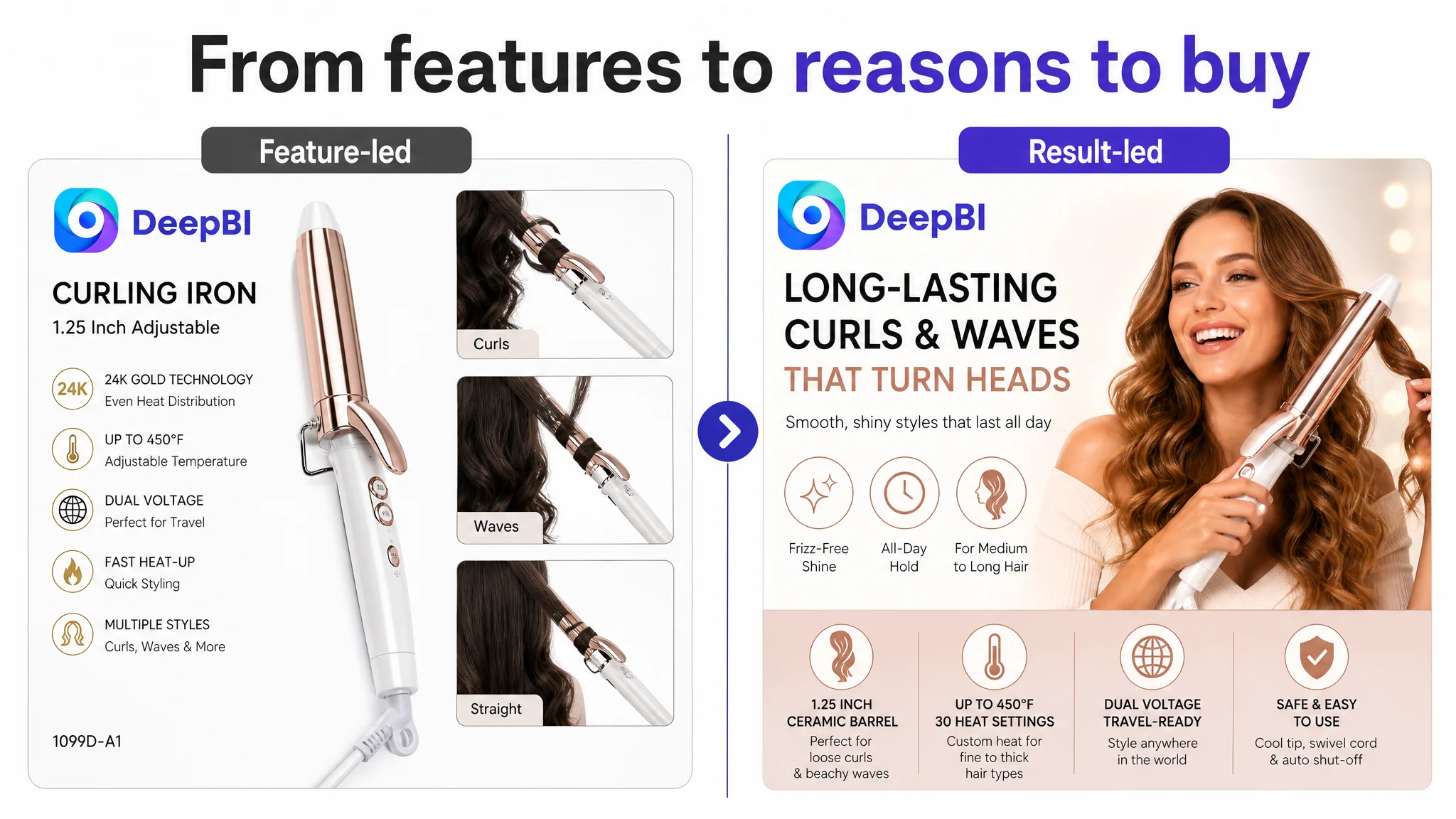
The customer’s content leaned heavily toward product construction and functional explanation.
The title opened with a generic product term and later introduced attributes such as barrel size, temperature adjustment, and dual voltage. The bullet points began with technical material and temperature information. The detail page also presented heating technology, power, cord length, and other specifications as separate facts.
This approach was not inaccurate. The issue was that it placed product knowledge before customer motivation.
A shopper looking for a curling iron is usually trying to answer questions such as:
- Can it create loose waves or defined curls?
- Will the style last?
- Is the barrel suitable for medium or long hair?
- Can it work across fine, medium, or coarse hair?
- How can the heat be adjusted without creating unnecessary damage?
- Is it comfortable and safe to use?
The comparable Listing answered these questions much earlier. Its title identified the target hair length and styling results. Its bullet points led with long-lasting curls, barrel convenience, hair-type flexibility, ease of control, travel use, and safety.
The customer’s Listing, by contrast, often asked the shopper to translate a feature into a benefit on their own.
That translation step is where conversion friction begins.
The real gap was Listing conversion capacity
DeepBI’s score comparison showed that the largest structural weakness was not the main image score. The customer’s main image dimension scored 25/30, slightly above the comparable Listing’s 23/30.
The more important gaps were found in the areas that support decision confidence:
- The title was less precise and less professionally structured.
- The bullet points described features without forming a clear problem-solution sequence.
- The detail page presented information without enough personalization or decision guidance.
- The review dimension scored only 2/15, compared with 14/15 for the comparable Listing.
This changed the priority of the diagnosis.
If the main image had been the dominant problem, the first decision would have been to rebuild the thumbnail experience to improve click appeal. But the score pattern suggested a broader conversion problem after the initial product impression: the Listing was not doing enough to validate the product’s results, suitability, safety, and credibility.
In other words, the page could attract attention, but it did not consistently complete the argument for purchase.
The title was searchable, but not sufficiently decisive
The title included relevant product terms, but its structure was weaker than the comparable Listing.
The comparable title used several specific decision signals:
- A recognizable brand position at the front
- “Double Ceramic”
- “Long Barrel”
- “30 Heat Settings”
- “Medium to Long Hair”
- “Loose Curls and Classic Waves”
- A clear color and model reference
The customer’s title included “Curling Iron,” “1.25 Inch,” “Adjustable Temperature,” “All Hair Types,” and “Long-Lasting Curls and Straight,” but these elements did not form an equally clear hierarchy.
Several problems followed:
The result was not specific enough
“Long-Lasting Curls and Straight” was broader and less natural than explicitly naming outcomes such as loose curls, classic waves, or beachy waves.
The audience was too broad
“All Hair Types” communicates range, but it does not tell a shopper how the product relates to hair length, thickness, or styling goals.
The temperature claim lacked a concrete signal
The page referred to adjustable temperature but did not communicate a specific number of settings in the title. A measurable detail can make a technical claim easier to evaluate.
The ending added noise rather than recognition
The model string at the end did not help the shopper understand the product. It occupied valuable title space without strengthening product identity or purchase intent.
The revised direction was not to add every available keyword. It was to reorder the information around the customer’s decision:
1. Product form and barrel size
2. Ceramic and temperature-control attributes
3. Dual-voltage utility
4. Target styling outcomes
5. Hair-type and use-case relevance
That is a more useful connection between Amazon search visibility and product-page conversion.
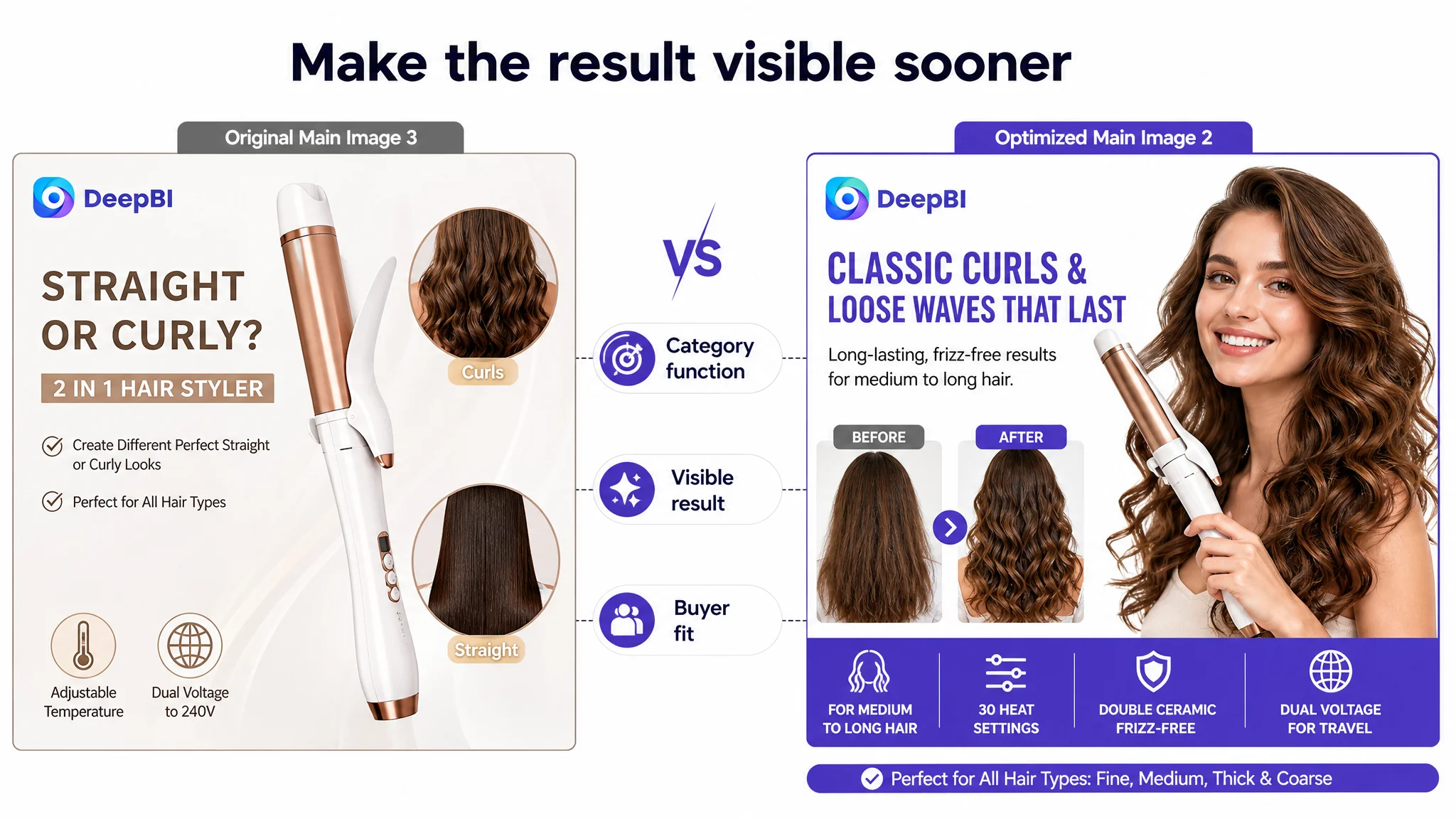
The main image needed to show the result sooner
The main image dimension was not the weakest area, but the visual review still identified a conversion issue: the image sequence introduced technology and functionality before proving the styling result.
The customer’s images showed the product’s form, 2-in-1 use, heating material, temperature range, and different functions. However, several images relied on technical explanation or text-heavy layouts.
The comparable Listing created a stronger visual progression:
- Desired curl and wave results
- A more emotional presentation of the outcome
- A before-and-after style comparison
- A heat guide that supported professional confidence
- More clearly separated product and benefit visuals
The issue was not that technical images had no value. It was that they appeared too early and carried too much responsibility.
The first image needed a clearer reason to click
The initial product presentation established that the item could curl and straighten hair, but that was close to a category-level promise. It did not immediately communicate the stronger value proposition of fast, smooth, long-lasting curls.
The revised direction was to connect the product form with the outcome:
- 1.25-inch ceramic barrel
- Loose curls and beachy waves
- Fast heat-up
- Smooth, frizz-free finish
- Long-lasting styling results
The second image needed to connect technology with performance
“24K Gold Technology” is a technical phrase. By itself, it does not explain why the shopper should care.
The more persuasive connection is:
even heat distribution → smoother styling → less frizz → more consistent results
That does not require inventing a new product benefit. It requires making the existing technology legible in terms of the user’s expected outcome.
The third image needed stronger proof
Showing two styling states can establish versatility, but it does not necessarily prove effectiveness. The image sequence needed to make the difference between defined curls, loose waves, and smooth styling more visually credible.
The page should answer not only, “Can this product do two things?” but also, “What will the finished result look like?”
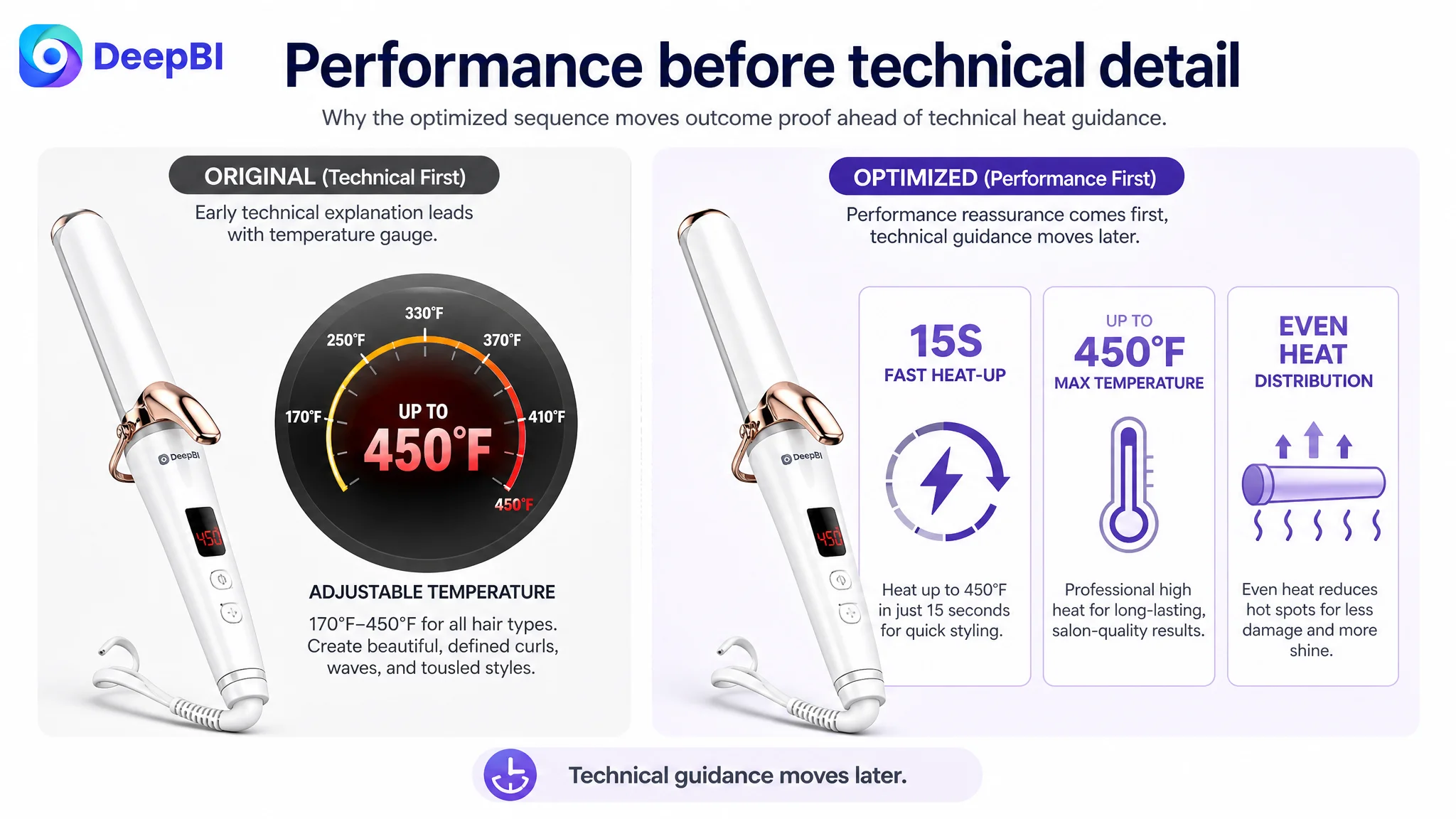
Technical charts belonged later
The temperature gauge was useful for reassurance, but it was too detailed for an early image position. Moving it later would allow the visual sequence to follow a more natural order:
result first, capability second, technical guidance third.
This is a decision about information timing, not simply image design.
The bullet points listed features without building a buying path
The customer’s bullet points had useful information, but the structure was less persuasive.
The sequence moved through:
- Technical material
- Temperature range
- Barrel size and ceramic function
- 2-in-1 capability and travel voltage
- Fast heat-up and tourmaline technology
The comparable Listing used a more customer-centered order:
- Styling results and target user
- Long-barrel convenience
- Hair-type flexibility and heat protection
- Comfortable handling
- Travel compatibility and safety
That sequence reduced the amount of interpretation required from the shopper.
Benefit one: lead with the desired result
The first bullet should not force the shopper to begin with material science. It should establish the core result: long-lasting curls, loose waves, smoothness, and reduced frizz.
The 24K Gold Technology can then support that promise by explaining how the product distributes heat consistently.
Benefit two: connect barrel size to hair length
A 1.25-inch barrel is more useful when the Listing explains what it helps the shopper create and who benefits from it.
The page should connect the barrel to:
- Medium to long hair
- Loose, bouncy curls
- Beachy waves
- Smooth, polished finishes
This turns a measurement into a styling decision.
Benefit three: make temperature control actionable
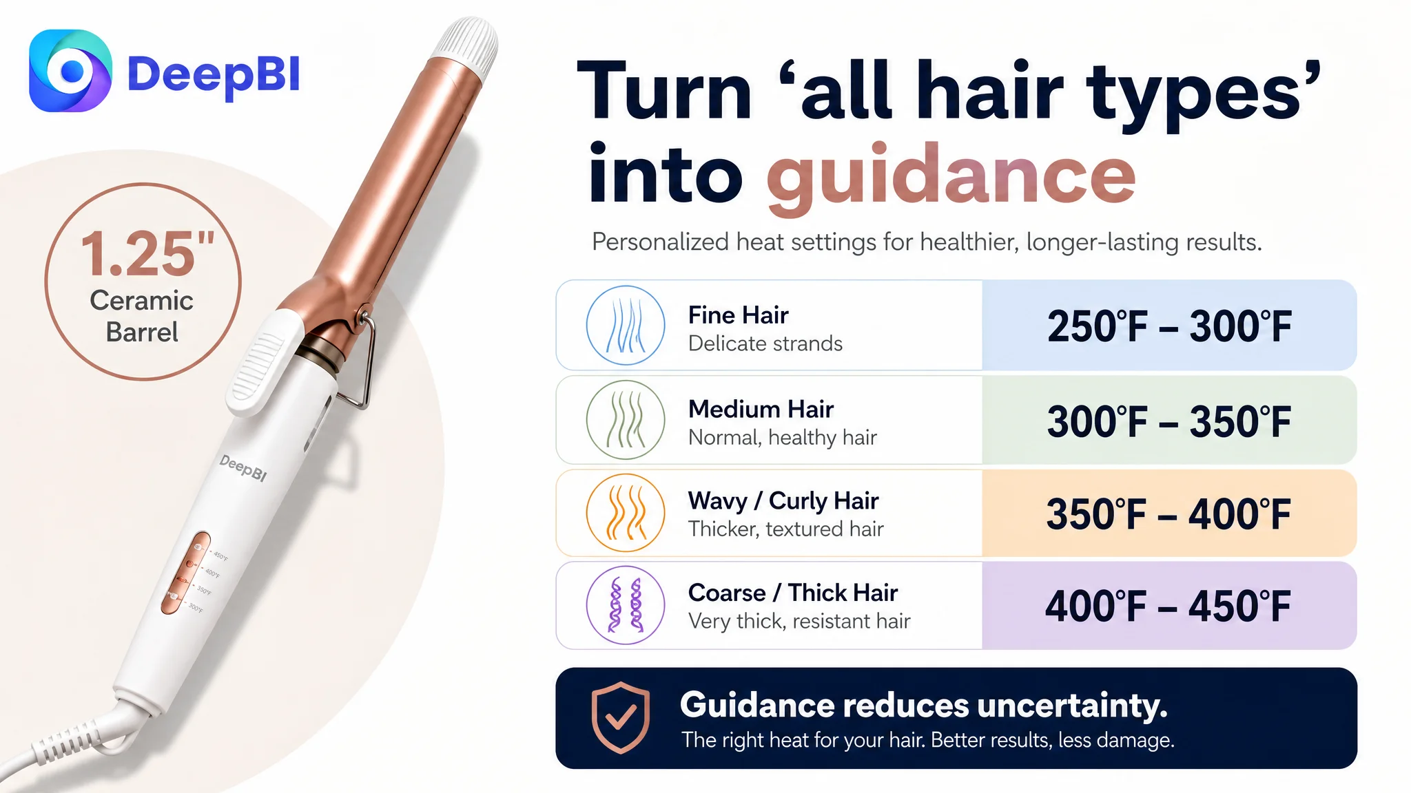
The page referred to heat adjustment up to 450°F, but the information was not sufficiently personalized.
A stronger approach is to show how different heat levels relate to different hair conditions and styling needs, while avoiding unsupported guarantees. Fine, medium, wavy, curly, and coarse hair should not be treated as identical use cases.
The customer does not need a more complicated specification block. It needs a more useful guide.
Benefit four: separate travel from handling
The original content mixed 2-in-1 functionality and travel voltage, which weakened both points.
Travel readiness, dual voltage, comfort, cord flexibility, cool-touch handling, and safety should be grouped according to the actual customer concern they address.
If a feature is confirmed for the product, it should be tied to a practical benefit. A swivel cord is not merely a specification; it relates to movement and maneuverability. Dual voltage is not merely an electrical detail; it relates to use while traveling.
Benefit five: avoid unsupported safety claims
The case material references automatic shutoff and a cool tip in the recommended direction only where the product has those features. This is an important boundary.
Amazon Listing optimization cannot improve conversion by adding functions the product does not actually have. Any safety or performance statement must be verified against the product itself.
The A+ content was too focused on explanation and not focused enough on reassurance
The A+ content included product details, hair-type scenes, styling choices, functional images, heating technology, opening or gifting scenes, and a usage guide.
The problem was not a lack of modules. It was the way the modules were arranged and connected.
The comparable Listing used a more direct problem-solution structure:
- Want classic curls?
- Need loose waves?
- Which heat level suits your hair?
- How does the product protect hair?
- What makes it easier and safer to use?
The customer’s A+ content often presented information as a feature collection. That created three conversion weaknesses.
It did not validate the target buyer early enough
The first A+ module should quickly confirm:
- 1.25-inch ceramic barrel
- Suitability for medium to long hair
- Loose curls and beachy waves
- Relevance across fine, medium, and coarse hair
A shopper should know within the first section whether the product fits their needs.
It did not explain “all hair types”
“All hair types” is a broad promise. Without guidance, it can sound generic.
A heat guide that maps hair types to appropriate temperature ranges would make the claim more concrete and help reduce concern about excessive heat.
It separated specifications from benefits
Details such as a 9-foot swivel cord and 73W power were presented as isolated facts. The page needed to connect them to practical outcomes such as easier movement, fewer tangles, or more convenient use in a specific setting.
This is the difference between a product specification and a reason to believe.
The gift module displaced stronger persuasion
The gift-focused section did not add much decision value for a shopper comparing curling irons. That space could be used to reinforce:
- Styling versatility
- Handling comfort
- Travel use
- Heat guidance
- Safety
- A final recap of the product’s strongest reasons to choose it
The page had limited attention to work with. Each module needed to answer a question that stood between the shopper and purchase.
Reviews were not a secondary issue
The review dimension showed the most severe gap:
- Customer Listing: 4.0 stars from 14 reviews
- Comparable Listing: 4.3 stars from 98,301 reviews
- Review score: 2/15 versus 14/15
The customer Listing also had no effective review content visible on the first page, while much of the available review area was occupied by system-generated page code rather than useful customer evidence.
This created a trust disadvantage that title, images, and bullet points could not fully compensate for.
The gap was not only the 0.3-star difference. It was the enormous difference in review volume and the amount of social proof available to a first-time buyer. A comparable Listing had accumulated enough customer feedback, including image and video reviews, to reduce uncertainty at the point of decision.
That matters because a curling iron carries several perceived risks:
- Will the finished style look as promised?
- Will the curls last?
- Is it suitable for my hair type?
- Is it easy to control?
- Will it cause excessive heat concerns?
- Does the product perform consistently?
A page with limited credible review evidence has to work much harder through its visual and textual content. Even strong creative cannot instantly replace a mature review base.
The practical conclusion is not that review volume can be solved through Listing editing. It cannot. The conclusion is that the page must avoid making unsupported claims and must use every controllable content element to create a more credible, coherent purchase argument.
Why DeepBI did not recommend tuning the page one element at a time
A conventional workflow might have started by rewriting the title, then refreshing the main image, then adjusting bullet points, and finally revisiting A+ content.
That sequence risks producing isolated improvements without fixing the page’s underlying sales logic.
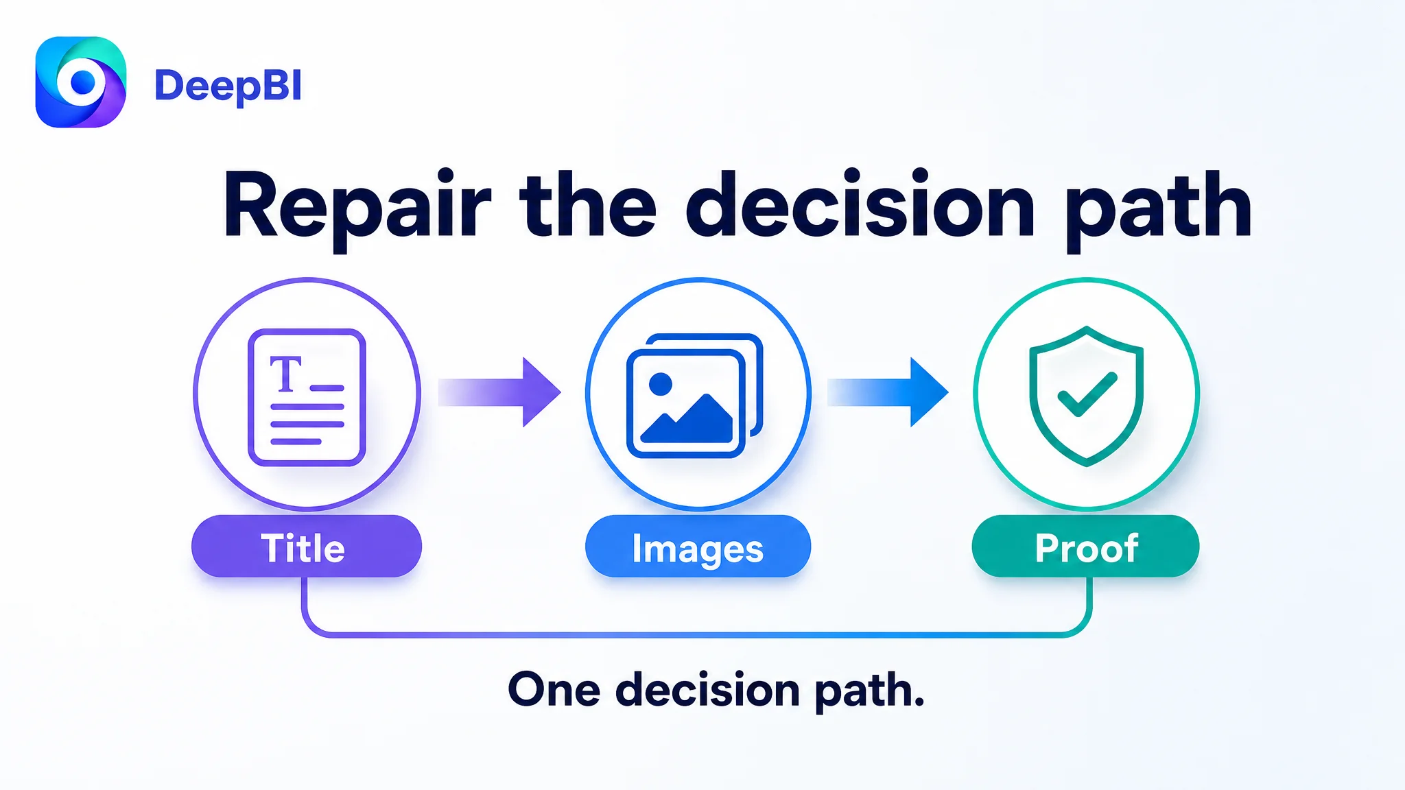
DeepBI’s diagnosis treated the Listing as a connected system:
- The title defines the product and desired result.
- The main images make the result visible.
- The bullet points explain why the product can deliver it.
- The A+ content addresses hair type, heat control, operation, and safety.
- Reviews provide external confirmation.
- Advertising then sends traffic into that combined experience.
The problem was therefore not “which sentence should be changed first?” It was:
Does every part of the Amazon product page move the shopper toward the same decision?
In this case, the answer was not yet strong enough.
The correct priority was to repair the page’s sales logic
The recommended order was clear.
First, clarify the buyer and the result
The Listing needed to identify medium-to-long-hair users and make loose curls, classic waves, and beachy waves more prominent.
Next, move proof ahead of technical detail
Before explaining every temperature setting or material attribute, the page needed to show the styling outcome and make the promise easier to believe.
Then, translate technology into risk reduction
Ceramic coating, 24K Gold Technology, adjustable heat, and tourmaline technology should explain smoother heat distribution, reduced hot spots, better control, and more informed use.
After that, consolidate practical reassurance
Dual voltage, swivel cord, cool-touch handling, auto shutoff, and fast heat-up should appear where they answer genuine use concerns, provided each feature is verified.
Finally, accept the limits of content optimization
The review deficit remained a structural disadvantage. Content could improve the page’s ability to present the product, but it could not manufacture the market history represented by a large body of genuine customer feedback.
This prioritization prevented the team from treating every weakness as equally urgent.
The case changes how advertising should be interpreted
The case material does not include post-optimization advertising results such as CVR, ACOS, TACOS, organic-order share, or keyword ranking changes. Those outcomes should not be invented.
But the business logic is clear.
If Amazon ads drive traffic to a page that does not establish a strong result, clear audience fit, practical guidance, and credible trust, more traffic may only expose the same conversion weaknesses at a higher cost.
Advertising can amplify a strong Listing. It can also amplify a weak one.
That is why ad optimization and Listing optimization should not be treated as separate operating decisions. Search terms, clicks, and traffic sources matter, but their commercial value depends on the page’s ability to convert the resulting visit.
In this case, the first question was not whether the seller should increase traffic. It was whether the product page deserved more traffic in its current form.
What changed in the customer team’s understanding
The most important change was not a single rewritten bullet point or a redesigned image. It was a change in diagnosis.
The team moved from:
- “The page needs more specifications.”
- “The technology should be explained more clearly.”
- “The product’s functions are already present.”
- “The main task is to add more information.”
Toward:
- “The product result must appear before the technical explanation.”
- “The title must identify the use case, not only the product category.”
- “Bullet points need a problem-solution sequence.”
- “A+ content must guide the shopper by hair type, style, and concern.”
- “Reviews and visual proof are part of conversion capacity.”
- “Ads should not be used to compensate for a page-level trust gap.”
A better Amazon Listing is not the one with the most information. It is the one that makes the right information easy to believe and easy to act on.
For this curling iron Listing, the next optimization direction was therefore not a cosmetic refresh. It was a coordinated repair of the product page’s decision path: result first, audience fit second, technical credibility third, practical reassurance fourth, and advertising only after the page could better receive the traffic.