

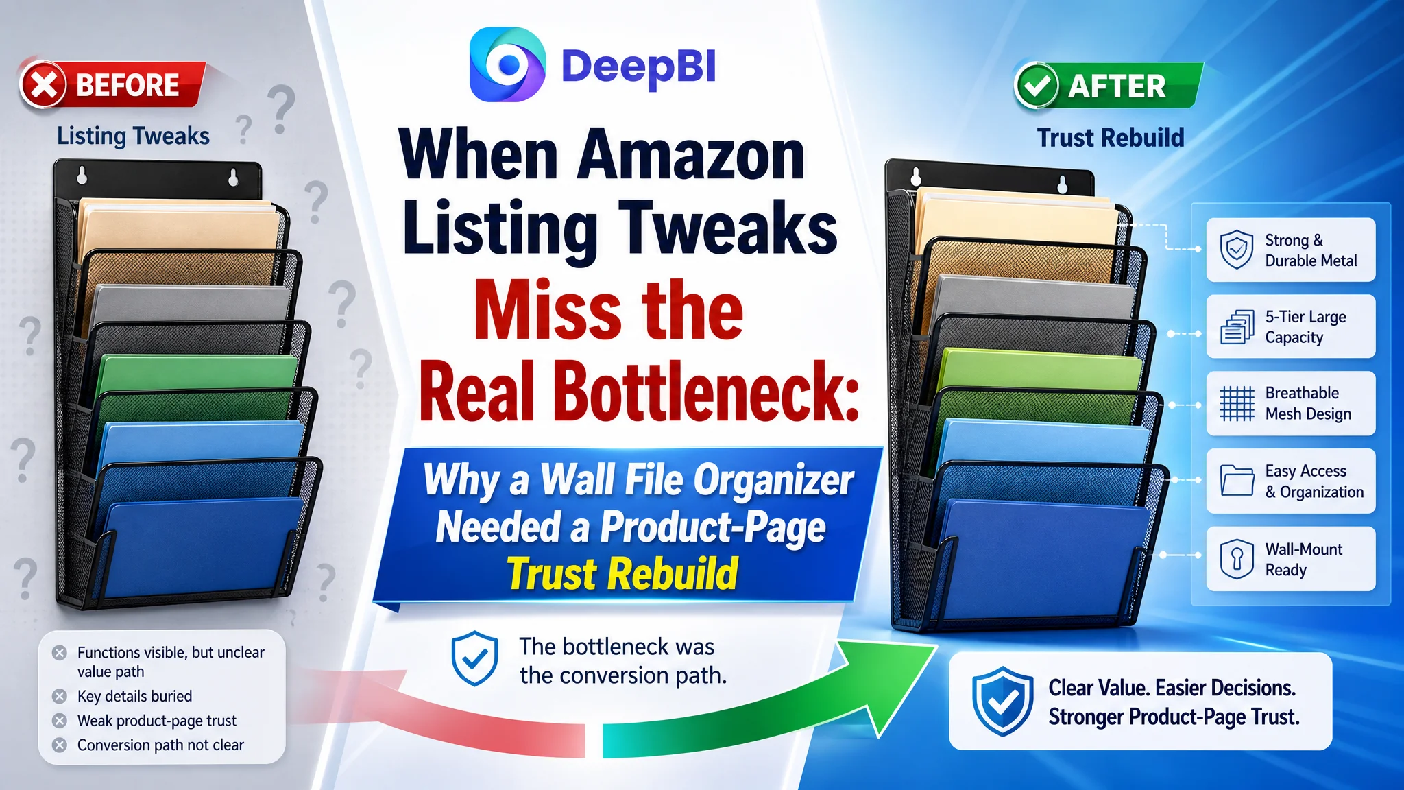
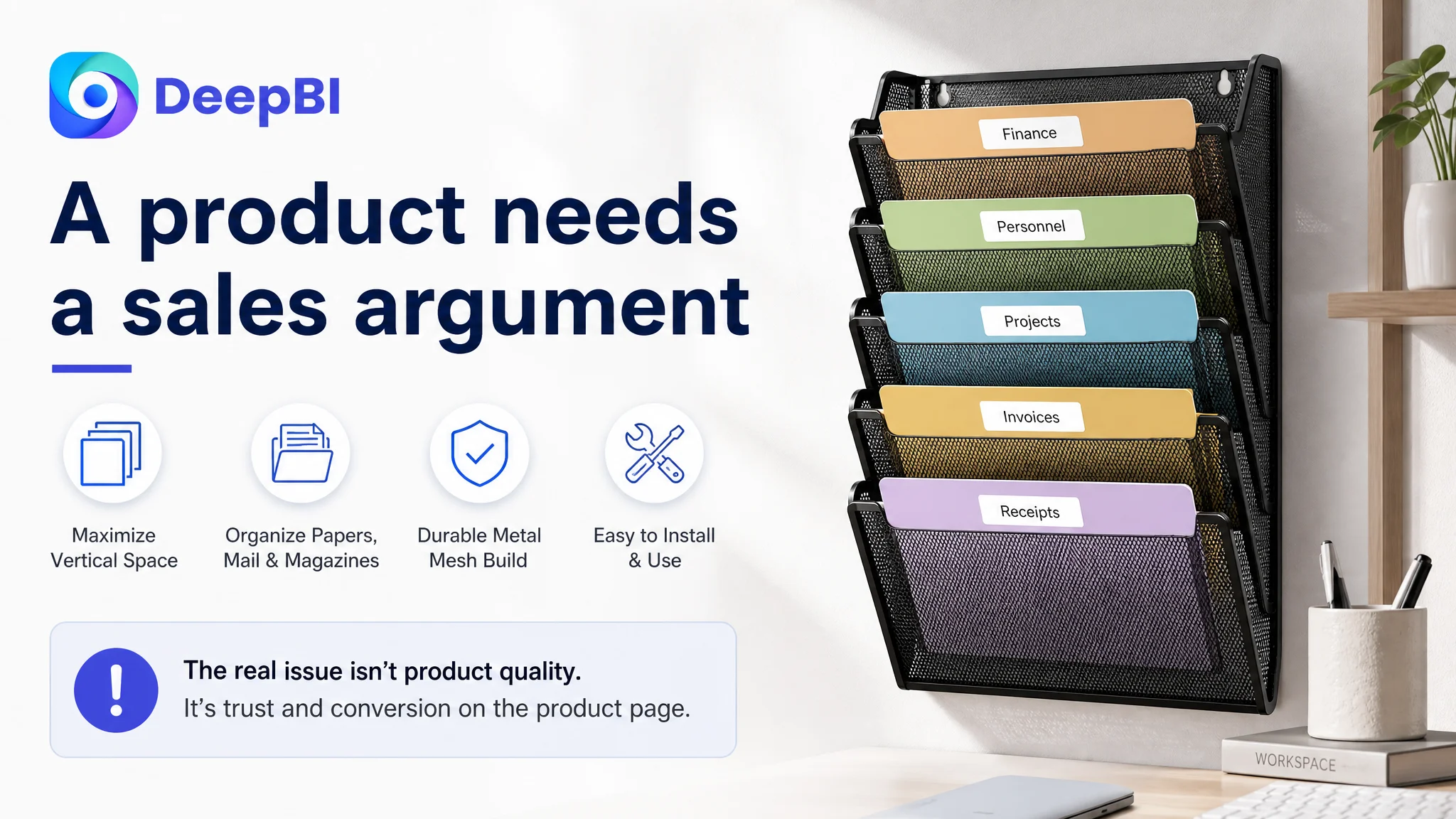
An Amazon seller selling a wall-mounted file organizer was not facing a clear product-quality problem. The Listing had a 4.7-star rating, a recognizable five-tier structure, and a product that could hold papers, folders, mail, and magazines. Yet its Amazon product page was not communicating those advantages as convincingly as comparable listings.
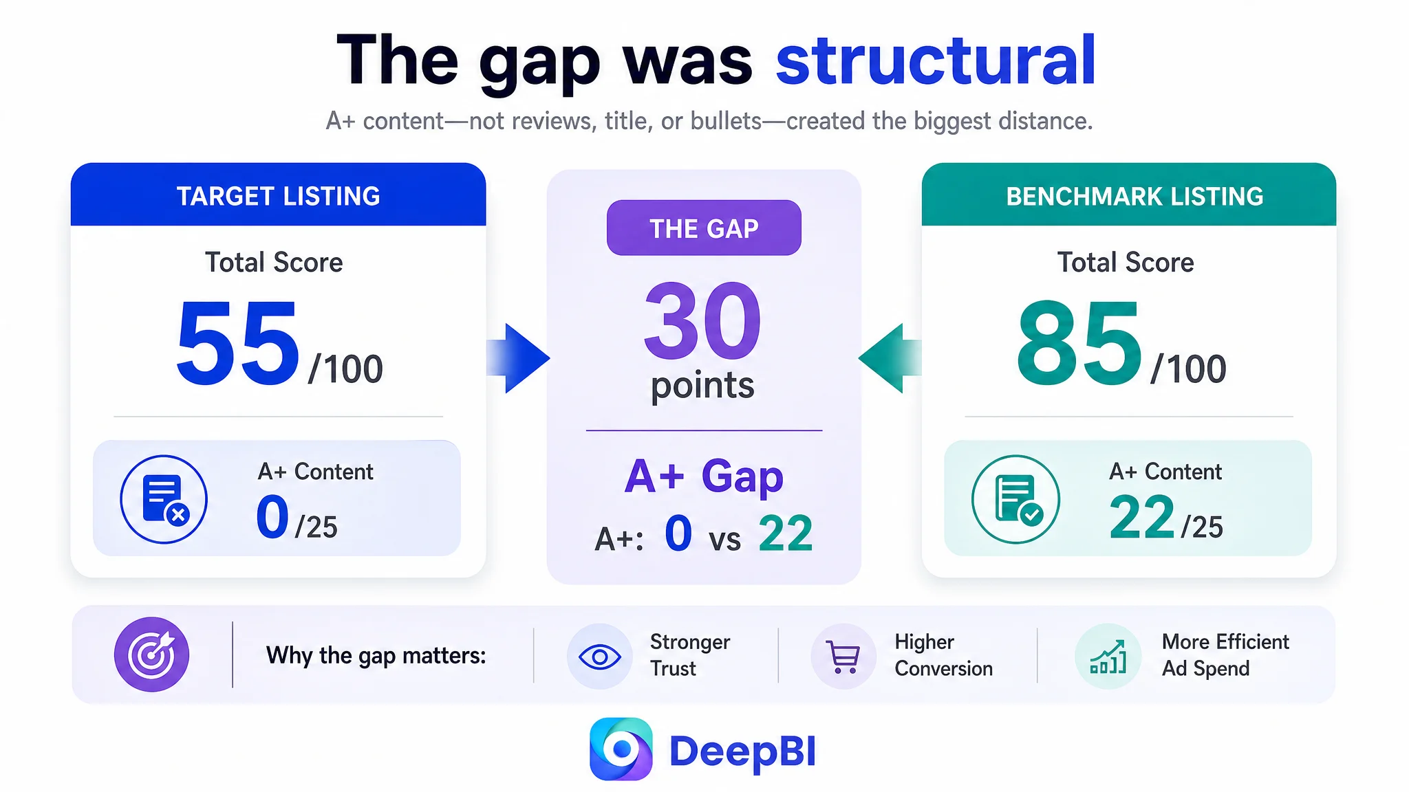
The initial optimization direction leaned toward tightening the title, adding keywords, refining bullet points, and improving individual images. Those changes were useful, but they did not explain the largest competitive gap. DeepBI’s comparison found that the Listing scored 55 out of 100, while the benchmark product reached 85. The decisive difference was not reviews or one isolated keyword. It was the absence of a complete product-page conversion path, especially the missing A+ content.
That changed the priority. Instead of treating Amazon ads or individual Listing elements as separate problems, the team needed to rebuild how the page created attention, answered objections, demonstrated use, and justified the purchase. For other Amazon sellers, the case offers a practical warning: before sending more paid traffic to a Listing, first determine whether the page is ready to convert it.
The Listing Had a Product. The Page Did Not Yet Have a Strong Sales Argument.
The product was a five-tier hanging wall file organizer for home offices, workplaces, schools, doors, cabinets, and other flat surfaces. Its potential value was straightforward:
- Use vertical space instead of filling the desk
- Keep papers and folders visible and accessible
- Organize mail, magazines, and documents by category
- Create a more orderly home or office environment
But Amazon shoppers do not buy a product because its functions exist in isolation. They buy when the product page makes the outcome easy to understand and the remaining doubts easy to resolve.
In this case, the Listing communicated many functions, but the information was distributed unevenly. The title was somewhat repetitive. The bullet points leaned toward specifications and general functions. The image sequence showed individual features without always connecting them into a clear problem-and-solution story. Most importantly, the product page had no A+ content.
That gap mattered more than the small differences in review strength.
The Listing did not primarily lack information. It lacked a connected reason for the shopper to believe the product would improve their workspace.
The Score Gap Made the Misdiagnosis Visible
DeepBI’s comparison produced a simple but important result:
- Title: Target Listing: 14/20, Benchmark Listing: 16/20, Gap: -2
- Main images: Target Listing: 21/30, Benchmark Listing: 26/30, Gap: -5
- Bullet points: Target Listing: 7/10, Benchmark Listing: 8/10, Gap: -1
- A+ content: Target Listing: 0/25, Benchmark Listing: 22/25, Gap: -22
- Reviews: Target Listing: 13/15, Benchmark Listing: 13/15, Gap: 0
- Total: Target Listing: 55/100, Benchmark Listing: 85/100, Gap: -30
The most obvious temptation would have been to focus on the title or main images because those elements are highly visible and relatively easy to change. But the scoring pattern showed that the central weakness was elsewhere.
The title gap was limited. The bullet-point gap was limited. Review quality was effectively equal: both Listings had a 4.7-star rating, and the target Listing had 375 reviews compared with the benchmark’s 692. That review-volume difference was worth recognizing, but it did not explain the full 30-point gap.
The missing A+ section did.
The benchmark Listing used a sequence of visual modules covering product specifications, storage categories, installation, material quality, accessibility, and multiple usage environments. The target Listing had no structured A+ content at all.
This was not a cosmetic omission. It removed the part of the product page responsible for carrying the shopper from basic recognition to purchase confidence.
Why Small Copy Changes Could Not Solve a Structural Page Problem
The title did need refinement. The current wording repeated the core phrase “Wall File Organizer,” placed “5 Tier” too late, and did not clearly use material and scenario language such as “Metal,” “Mesh,” “Mail Paper Organization,” or “Home Office.”
The recommended direction was more compact:
Brand name + five-tier and hanging attributes + metal or mesh material + product form + use case
That structure could improve search clarity and make the product’s capacity more visible. But title optimization could only address the entry point of the Listing.
The bullet points had a similar limitation. They described capacity, material, installation, accessibility, and usage scenarios, but mostly as separate facts. The benchmark Listing was more effective because each point connected a product attribute to a user outcome:
- Dimensions and capacity were linked to fit and organization
- Wall mounting was linked to saved desk space
- Metal construction was linked to durability
- Open access was linked to faster retrieval
- Multiple installation environments were linked to practical flexibility
The target Listing already had many of the underlying facts. The problem was the order and logic in which shoppers encountered them.
It was not a shortage of features. It was a shortage of persuasion between the features.
The Main Image Sequence Showed Functions, but Not Enough Progression
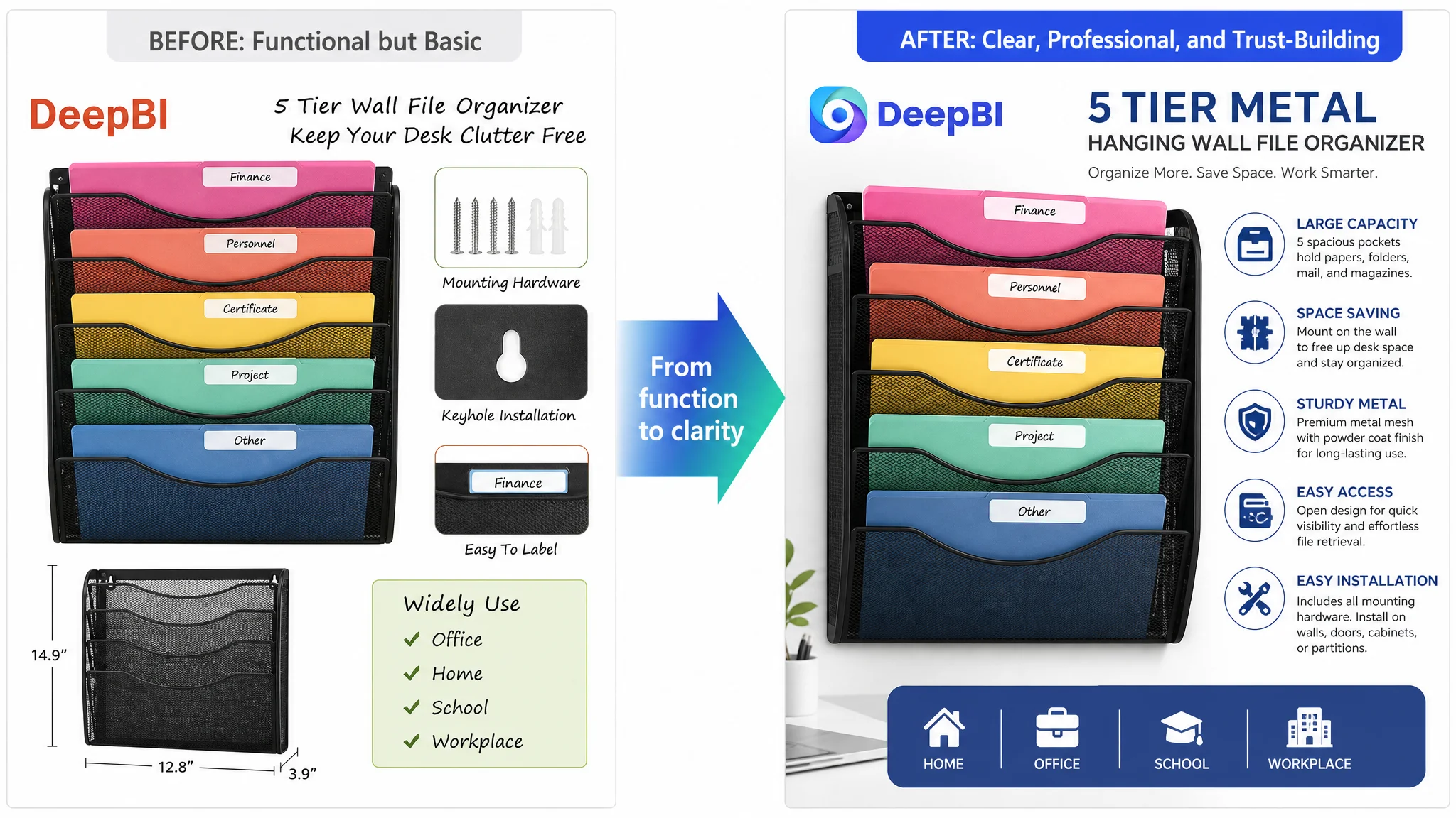
The image diagnosis revealed a second layer of the conversion problem.
The product images could demonstrate that the organizer held folders and had five vertical pockets. They could show dimensions, mounting hardware, a keyhole installation method, labeling, and possible use environments. But the sequence did not consistently build a visual story.
The first image needed a cleaner functional signal
The pre-filled folder concept was useful because it showed immediate function. However, varied folder sizes and handwritten-style labels created a less polished impression than the benchmark’s more controlled presentation.
The improvement was not to change the product. It was to make the existing product easier to read:
- Keep the folders and labels that demonstrate use
- Reduce visual clutter
- Create a clearer focal point
- Present the organizer as a professional filing solution rather than a loose collection of documents
The dimensions image needed to answer an installation question
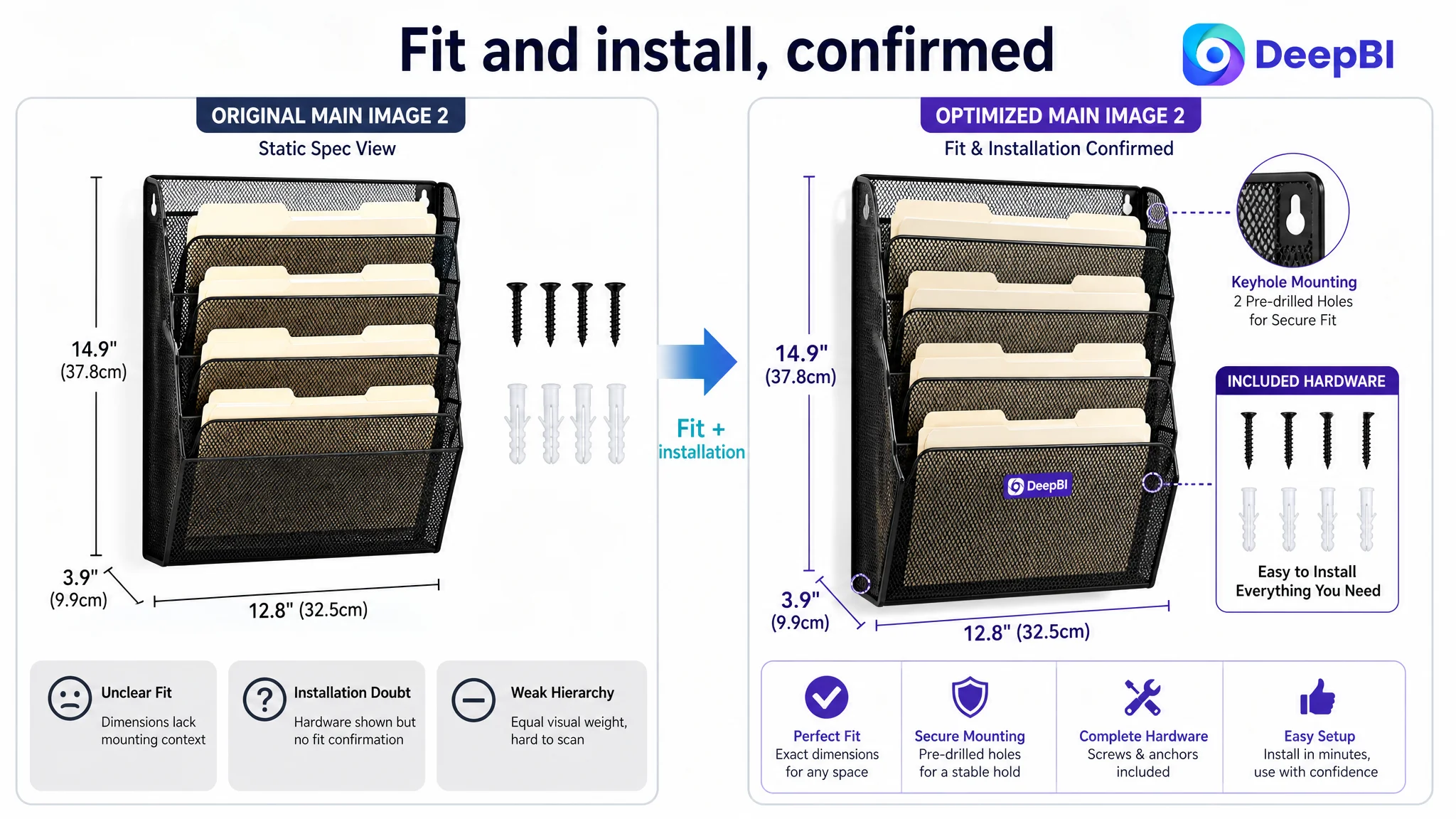
The existing dimensions image included the mounting hardware, which was valuable. But the layout felt static and did not make the installation advantage obvious.
A stronger version would combine:
- A slightly rotated product view
- Clear dimensions
- Visible screws and anchors
- A clean visual relationship between the organizer and the mounting surface
This matters because shoppers assessing wall-mounted products are not only asking, “Will it fit?” They are also asking, “Will I know how to install it, and will everything I need be included?”
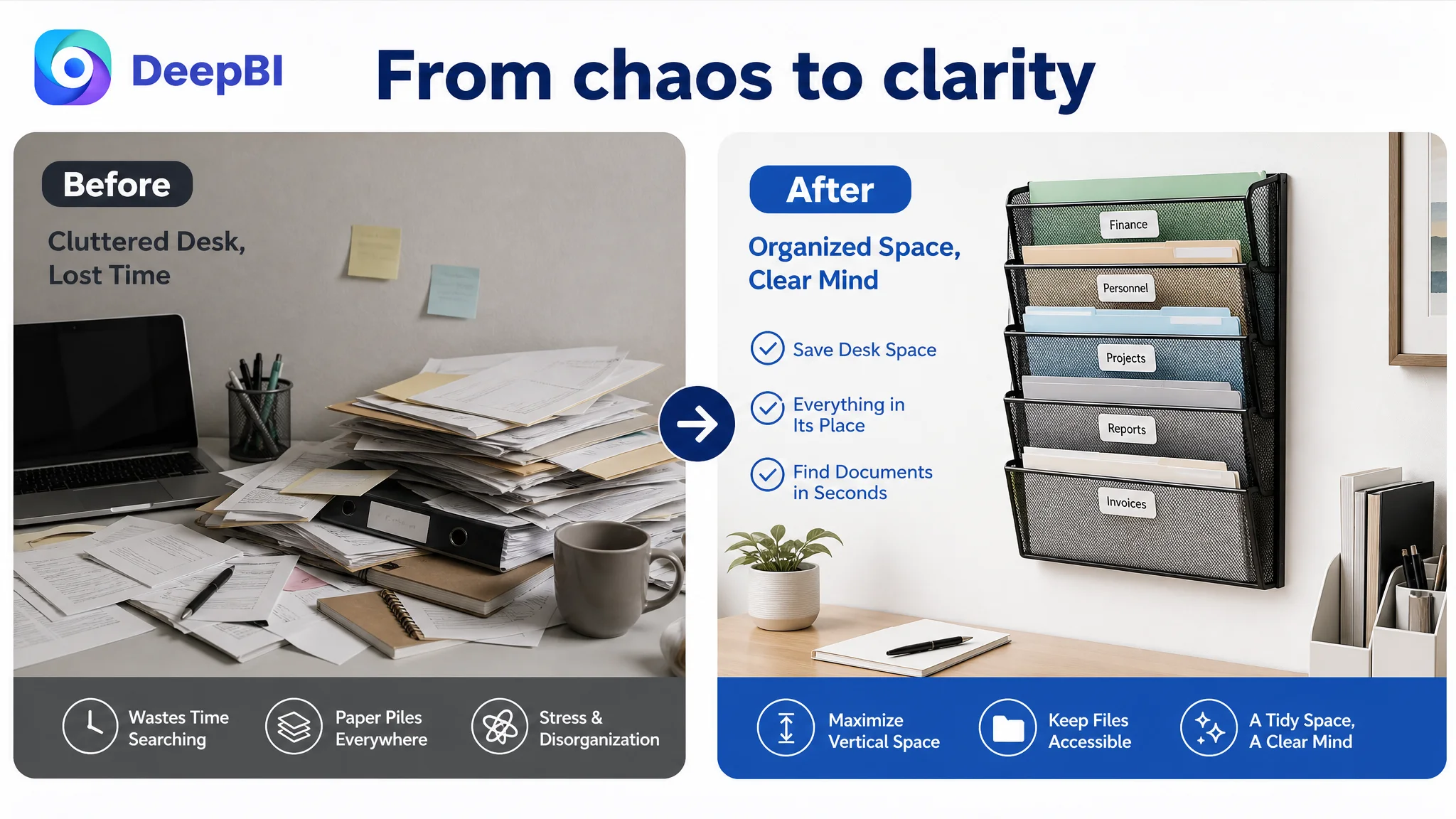
The before-and-after image needed a clearer result
The cluttered “Before” scene could establish the problem, but the “After” scene did not create enough contrast. The same desk area needed to show a more obvious transition from loose papers and mixed items to a cleaner filing workflow.
The intended message was simple:
Less desk clutter, better visibility, faster access.
Without a strong visual contrast, the image remained a feature demonstration instead of becoming a solution demonstration.
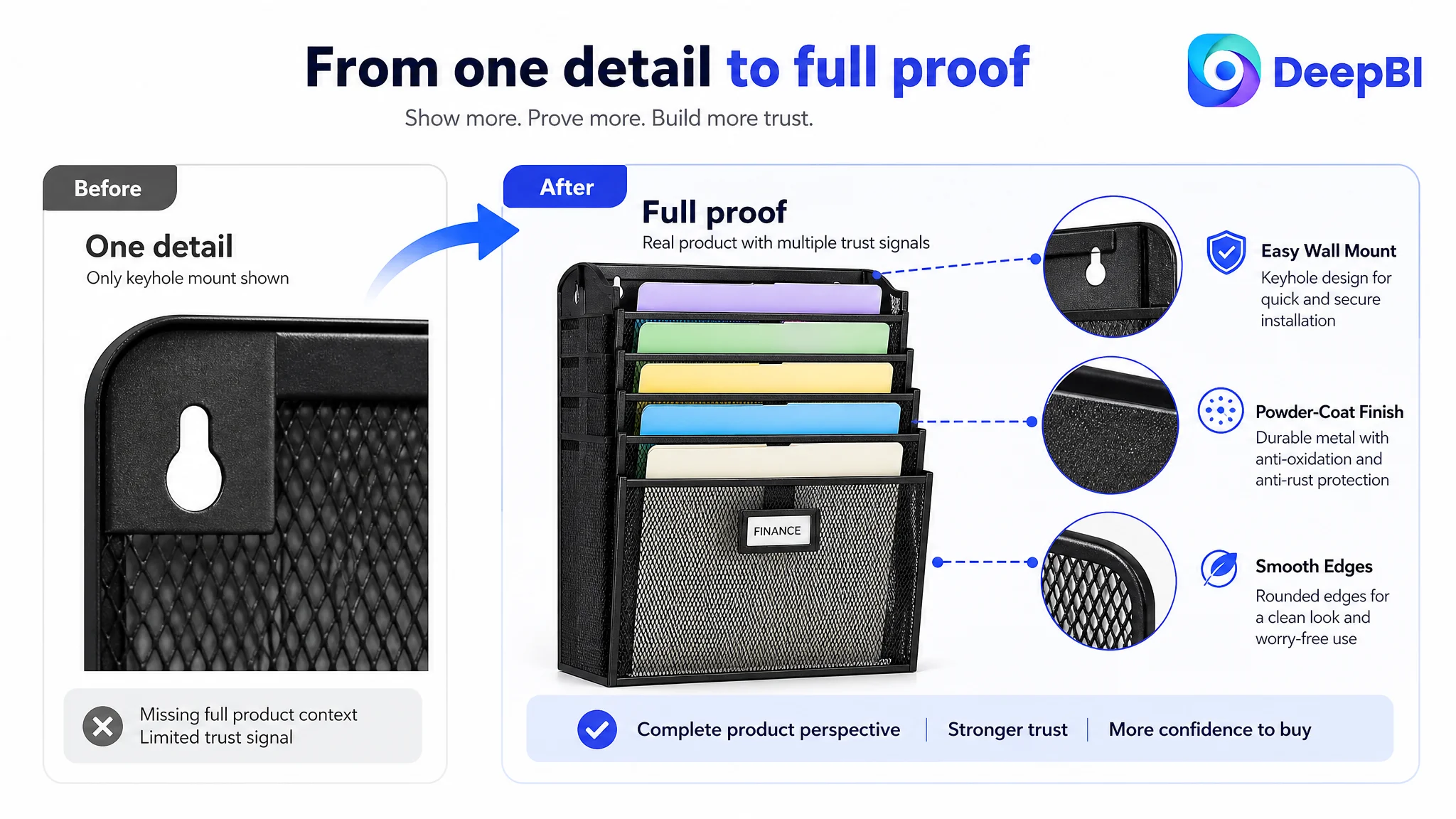
The detail images were too narrow
One image focused heavily on the mounting hole. Another focused on labeling. Both were relevant, but each addressed only one small question.
A stronger image could combine the visible quality signals that shoppers need to assess:
- Metal construction
- Powder-coated finish
- Smooth edges
- Keyhole mounting
- Overall structural presentation
Likewise, the labeling image could be expanded into a real usage scene, such as a mail center or shared office, where labeled pockets help multiple users find documents quickly.
The Real Constraint Was Listing Conversion Capacity
The most important judgment was not that every image was poor or that every line of copy needed rewriting.
It was that the Amazon product page was being asked to convert shoppers without the content structure needed to support the decision.
The score pattern supported this conclusion:
- Title: close enough to the benchmark to be a secondary issue
- Bullet points: slightly behind, but with clear material to improve
- Reviews: competitive in rating and quality
- Images: functional, but weaker in visual hierarchy, contrast, and trust-building
- A+: completely absent, creating the largest structural gap
This is why continuing to tune ads first would be a weak decision path if the advertising data showed traffic but insufficient conversion. Ads can bring shoppers into the Listing, but they cannot supply the missing installation explanation, material proof, usage context, or final purchase justification.
Advertising does not repair a weak product page. It increases the number of shoppers who encounter it.
Why A+ Content Had to Move to the Front of the Queue
The missing A+ section removed several stages of the page’s sales logic.
A complete A+ structure for this product should have answered the shopper’s questions in sequence.
First, does this product fit my space?
A professional home-office or workplace scene could establish the black, five-tier structure and show how the organizer occupies vertical wall space without overwhelming the room.
Second, what can it actually hold?
Icons or labeled sections could clarify that the organizer is suitable for papers, file folders, mail, magazines, and other office supplies. This would make the capacity claim visible rather than leaving it to the bullet points.
Third, how difficult is installation?
A dedicated module could show the mounting screws, keyhole structure, and suitable surfaces such as walls, doors, cabinets, or office partitions. This directly addresses a common hesitation with wall-mounted products.
Fourth, will it hold up to daily use?
The page needed visual proof of the metal structure and powder-coated finish rather than relying only on the word “sturdy.” The objective was not to add unsupported claims, but to make the existing construction and finish easier to evaluate.
Fifth, will it work in my environment?
Home offices, corporate workspaces, schools, and shared filing areas could demonstrate the product’s range without presenting the use cases as an unstructured list.
Finally, does it solve the problem I came with?
The closing module should return to the central outcome: removing desk clutter, using vertical space, and keeping important documents within easy reach.
This sequence would give the shopper a reason to continue evaluating the product after the initial click.
DeepBI Did Not Treat “Better Images” as a Sufficient Diagnosis
A common Listing review ends with a vague recommendation: make the images cleaner, more premium, or more professional.
That was not enough for this case.
The useful question was: What job should each image perform in the buyer’s decision?
- The first image should establish the product and its immediate function.
- The dimensions image should confirm fit and included hardware.
- The comparison image should make the clutter problem and organizational result unmistakable.
- The construction image should reduce doubts about durability and installation.
- The usage image should show how labeling and access work in a real environment.
- The A+ modules should connect these individual claims into a complete purchase argument.
This distinction matters because a visually attractive image can still fail commercially if it does not answer the question the shopper is asking at that stage.
DeepBI’s role in the diagnosis was to compare not only whether the benchmark Listing had more content, but how that content was arranged around shopper objections and expected outcomes. The recommendation therefore stayed within the product’s verified characteristics: five vertical pockets, metal construction, powder-coated finish, mounting hardware, accessible storage, and use across home, office, and school settings.
No new product capability was required. The page needed to make the existing capability easier to trust.
The Text Needed to Shift from Function Lists to Buying Logic
The title and bullet points still mattered, but their role was to support the larger page structure.
A stronger title would bring “5 Tier” and “Hanging” closer to the beginning, remove repeated wording, and incorporate material and scenario terms such as “Metal,” “Mesh,” and “Home Office.” This could improve both search relevance and first-glance comprehension.
The bullet points should then progress in a deliberate order:
1. Capacity and size — five vertical pockets, dimensions, and suitable document types
2. Material and finish — metal construction and the visible durability of the powder-coated surface
3. Access — open vertical design for identifying and retrieving documents
4. Installation and settings — included mounting hardware and suitable surfaces
5. Outcome — clearer desks, better use of vertical space, and easier document access
This structure is stronger than presenting five unrelated functions because it follows how shoppers evaluate risk:
Will it fit? Will it hold what I need? Will it last? Can I install it? Will it make my workspace better?
What Could Be Judged Now—and What Still Requires Measurement
The case material provides a strong pre-optimization diagnosis, but it does not include confirmed post-optimization CTR, CVR, ACOS, TACOS, keyword ranking, or organic-order results. Those outcomes should not be invented.
The immediate business change was therefore a change in operating judgment:
- The title and bullet points became supporting improvements rather than the main solution.
- Main-image revisions were tied to specific shopper questions.
- A+ content became the highest-priority Listing gap.
- Advertising should not be scaled aggressively until the page could better receive and convert traffic.
- Future testing should distinguish between click improvement from stronger imagery and conversion improvement from clearer product-page persuasion.
Once the revised assets are live, the relevant signals would include:
- Whether the Listing earns more qualified clicks
- Whether shoppers convert more effectively after entering the page
- Whether paid traffic becomes less wasteful
- Whether organic conversion begins to recover
- Whether the traffic mix becomes more stable
The point is not to assume improvement. It is to establish a diagnosis that can be tested against business data.
The Seller’s Understanding Had to Change
This case began with a familiar Amazon Listing instinct: refine the title, improve the images, and add more persuasive bullet points.
Those actions were not wrong. They were incomplete.
The larger issue was that the Listing had no A+ layer to connect product specifications, installation, durability, accessibility, and use scenarios into one coherent buying path. The page was capable of describing the organizer, but not yet capable of fully selling the outcome.
For Amazon sellers, the broader lesson is clear:
- A high review rating does not compensate for missing product-page persuasion.
- A functional image can still fail to create a reason to click or continue.
- Bullet points should translate features into user outcomes.
- A+ content is not decoration when the product requires explanation and trust.
- Ads cannot solve every conversion problem.
- Before increasing traffic, sellers need to ask whether the Listing deserves more traffic.
The most important optimization was not making one element look better. It was restoring the connection between the shopper’s problem, the product’s proof, and the purchase decision.
For this wall file organizer, that meant moving from a page that listed functions to an Amazon product page that demonstrated a complete solution: less clutter, better use of vertical space, easier access, and greater confidence in the product before purchase.