

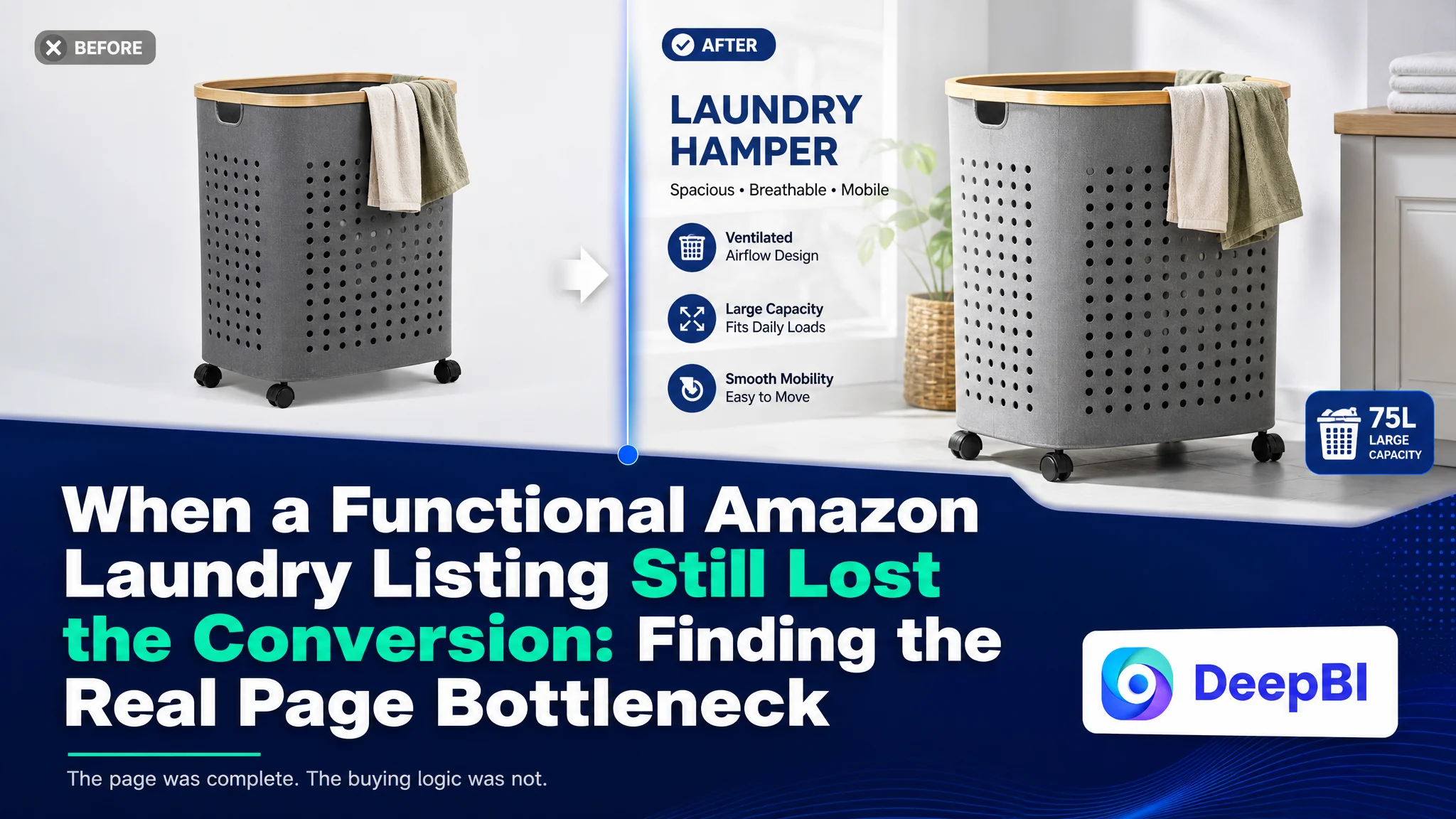
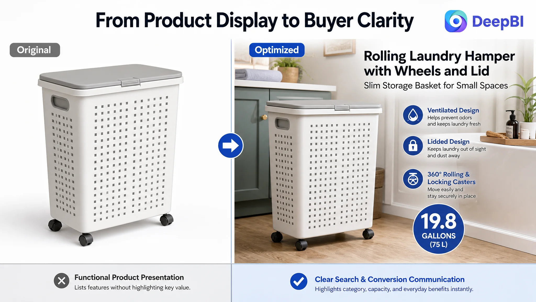
An Amazon seller of rolling plastic laundry hampers was not facing a simple traffic problem. The product page already presented the basic product clearly: wheels, a lid, handles, ventilation, and a 19.8-gallon capacity. Yet compared with a stronger competing Listing in the US marketplace, the page was not building the same level of search relevance, daily-use value, or buyer confidence.
The initial optimization direction appeared to lean toward explaining the product more completely—especially its assembly, structure, and individual features. DeepBI’s comparison showed that this was not the most important constraint. The larger issue was that the Amazon Listing described what the hamper was, but did not consistently show how it solved the buyer’s everyday problems: storing a week’s laundry in a small space, controlling moisture and odors, hiding mess, and moving the basket without lifting or bending.
The later direction therefore focused on Amazon Listing conversion rather than simply adding more traffic or more technical detail. The title was reorganized around search intent, the bullet points were rewritten around user pain points, and the main images and A+ content were repositioned around capacity, privacy, moisture control, mobility, and home integration. For other Amazon sellers, the case offers a practical reminder: before scaling Amazon ads, determine whether the product page is giving paid and organic visitors a convincing reason to buy.
The Page Was Complete. The Buying Logic Was Not.
The product was a rolling laundry hamper designed for bedrooms, bathrooms, laundry rooms, and other compact spaces. Its core attributes were not difficult to identify:
- 19.8-gallon, or 75-liter, capacity
- Four casters
- Two locking brakes
- A lid for privacy and dust protection
- Ventilation holes
- Side handles
- Thick plastic construction
- A slim footprint for smaller spaces
On paper, the Listing contained enough information to explain the product.
But Amazon shoppers do not convert because every component has been mentioned. They convert when the page helps them answer practical questions quickly:
- Will it hold enough laundry for my routine?
- Will it fit beside a bathroom cabinet or in a narrow bedroom corner?
- Can I store damp towels or workout clothes without creating unpleasant odors?
- Can I move it without lifting a heavy basket?
- Will dirty laundry stay hidden?
- Does the product look stable and durable enough for daily use?
The competing Listing addressed these questions more directly. Its title led with high-intent category language, its bullet points translated features into household benefits, and its A+ content showed a more complete usage story.
That difference was reflected in the overall comparison.
- Overall score: Target Listing: 70/100, Comparable high-performing Listing: 85/100
- Title: Target Listing: 15/20, Comparable high-performing Listing: 18/20
- Main images: Target Listing: 24/30, Comparable high-performing Listing: 23/30
- Bullet points: Target Listing: 6/10, Comparable high-performing Listing: 8/10
- A+ content: Target Listing: 19/25, Comparable high-performing Listing: 23/25
- Reviews: Target Listing: 6/15, Comparable high-performing Listing: 13/15
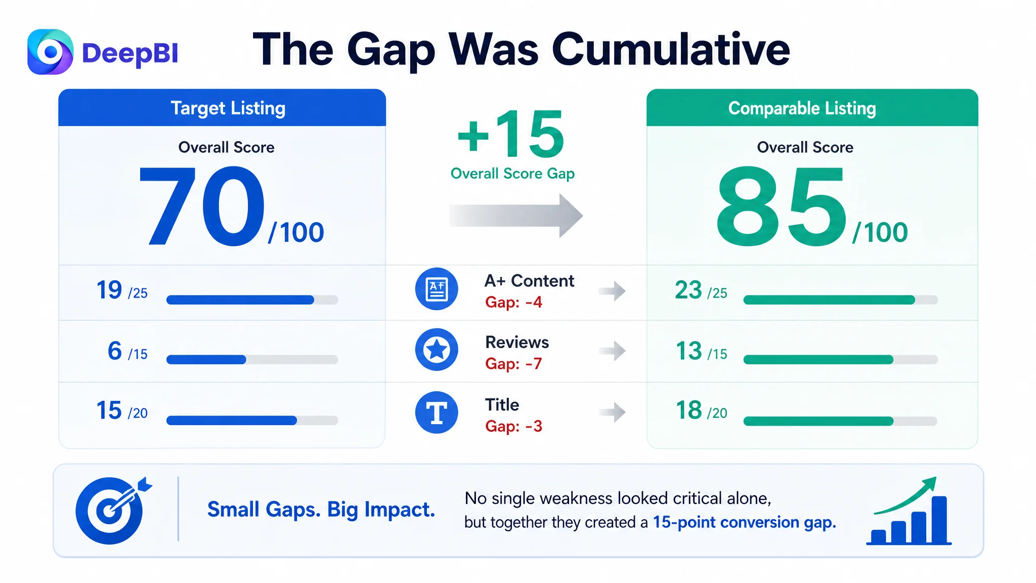
The important point was not that every dimension was weak. The main-image score was actually slightly higher than the comparable Listing’s score. The issue was that several smaller gaps combined into a larger conversion problem.
The Listing did not lack information. It lacked a clear sequence of reasons to trust, want, and choose the product.
The Original Direction Stayed Too Close to Product Features
The product page’s existing logic was largely functional.
It explained dimensions, ventilation, the lid, wheels, locking functions, material, and assembly. These details were valid, but they did not always connect to the moments that matter most in the buyer’s daily routine.
Assembly is a good example. It can reduce purchase hesitation, but it is a one-time concern. Capacity, odor control, privacy, stability, and ease of movement are recurring concerns. They influence how the product is imagined in the home every day.
The page had given too much importance to the process of putting the hamper together and not enough to the experience of using it afterward.
This is where the initial diagnosis could easily go wrong. A team reviewing the Listing might conclude that it needs:
- More technical details
- More close-ups of parts
- More explanation of how the product is assembled
- More general claims about durability
- More images showing the product from different angles
Those changes may make the page more complete without making it more persuasive.
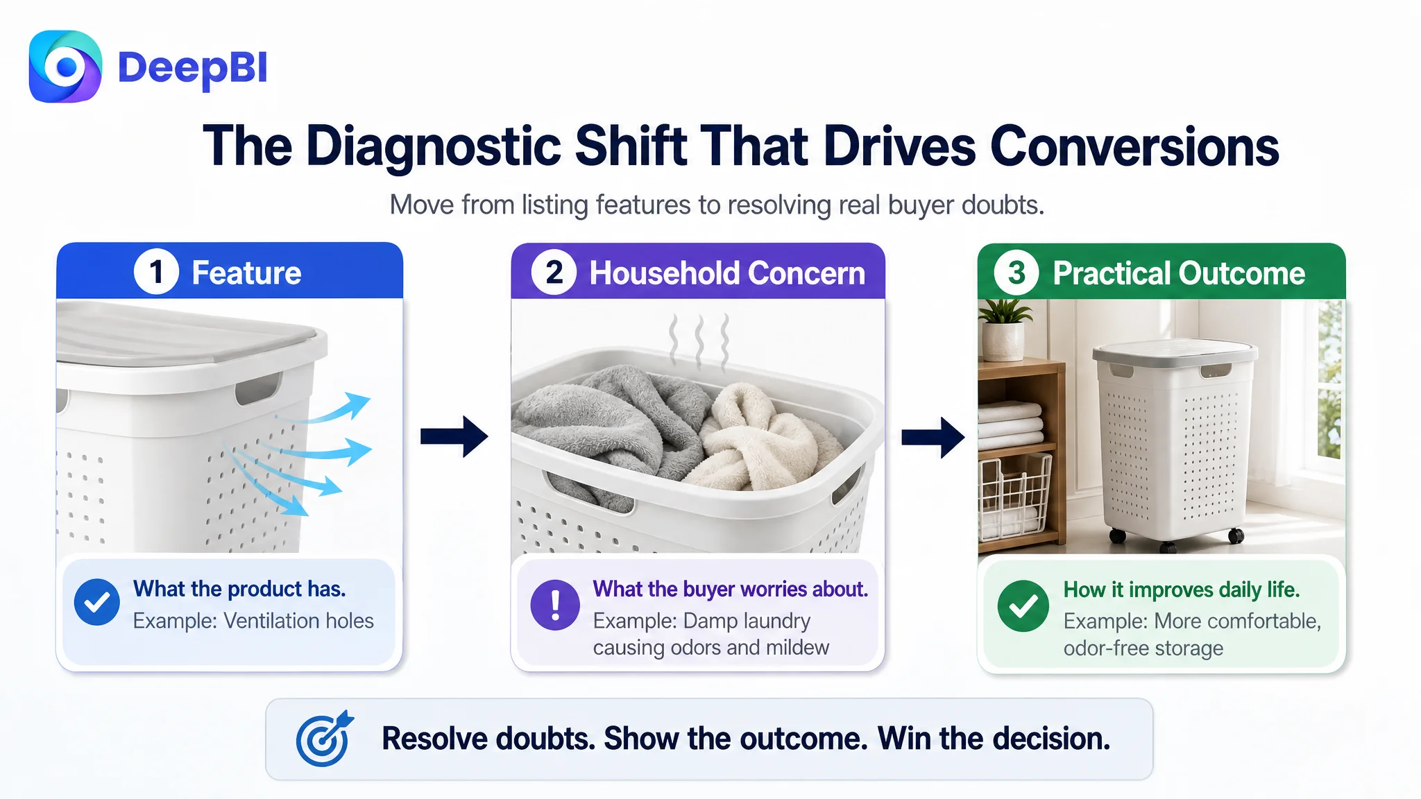
DeepBI’s comparison reframed the question from “What information is missing?” to “Which buying doubts remain unresolved?”
That change in framing mattered because the competing Listing was not winning simply by showing more product parts. It was converting product attributes into recognizable household outcomes.
The Title Was Carrying Too Little Search and Positioning Weight
The title dimension scored 15 compared with 18 for the comparable Listing. The gap was not caused by the absence of relevant keywords. The core terms were present. The issue was their order and commercial role.
The competing title opened with category language similar to “Rolling Laundry Hamper with Wheels and Lid.” It then added two important differentiators:
- Foldable
- Divided
It also used “for Small Spaces” to identify a specific audience and use case.
The target title placed the brand name first, used a long product identifier, and presented its selling points in a flatter sequence. Bathroom and bedroom use cases appeared later, while the slim-space advantage was not communicated strongly enough.
This created two problems.
First, the title was less efficient as a search entry point. High-intent category terms were not given the strongest position.
Second, it did not establish a clear reason to consider this product. The product did not have divided compartments or a foldable structure, so those competitor advantages could not simply be copied. The correct response was not to imitate unavailable features. It was to sharpen the product’s own boundaries:
- Plastic laundry hamper with wheels and lid
- 19.8-gallon capacity
- Slim storage design
- Small-space suitability
- Side handle
- Bathroom and bedroom use
The recommended title direction made the product easier to classify and easier to compare without inventing capabilities it did not have.
This is a key part of DeepBI’s judgment: a competitor’s strength is not automatically a valid feature for the target Listing. The useful lesson is the underlying buying logic, not the literal wording.
The Bullet Points Listed Functions Instead of Completing the Argument
The bullet points were complete in a technical sense, but their structure left value on the table.
The competing Listing consistently followed a stronger pattern:
Feature → household problem → practical outcome
The target Listing more often stopped at the feature itself.
Capacity needed to become a routine benefit
The product had a 75-liter capacity, but the existing presentation used general language such as everyday laundry. That did not give shoppers a clear sense of what the capacity meant in practice.
The revised direction connected the capacity to a specific routine: approximately one person’s week of laundry, while also emphasizing the slim footprint and potential use for blankets, toys, or sports gear.
This did not change the product. It changed the buyer’s ability to visualize it.
Ventilation needed to address moisture and odor
The page described ventilation, but ventilation alone is not the pain point. Damp towels, swimsuits, and workout clothes are the pain points.
The stronger message was therefore:
- Breathable openings promote airflow
- Damp items can be stored more comfortably
- The hamper can be rinsed or wiped clean
- The design helps address concerns about moisture and odor
That is a more useful conversion argument than simply stating that the product has ventilation holes.
The lid needed to represent privacy and order
The existing page gave considerable attention to the lid as a structural feature and extra surface. DeepBI’s recommendation moved privacy and tidiness to the front.
The core benefit was not merely that the lid could hold small items. It was that the lid kept dirty laundry out of sight and helped maintain a more organized room.
The extra surface remained useful, but it became a secondary benefit rather than the main reason to care about the lid.
Wheels needed to show reduced effort and controlled movement
The Listing already mentioned mobility and locking functions. The improvement was to translate them into physical experience.
A shopper should be able to picture moving the hamper from a bedroom to a laundry room without heavy lifting or repeated bending. At the same time, the two brakes should remove the concern that the hamper will roll away when it is parked.
This created a more complete value proposition:
- Easy to move
- Easy to control
- Secure when needed
Material needed to support confidence
The material point was also shifted away from a generic durability statement. A thick PP structure, a smooth surface, and reinforced packaging were presented as practical confidence signals.
The goal was not to make an unsupported quality promise. It was to answer the buyer’s concerns about daily handling, cleaning, deformation, and transport damage using the product information already available.
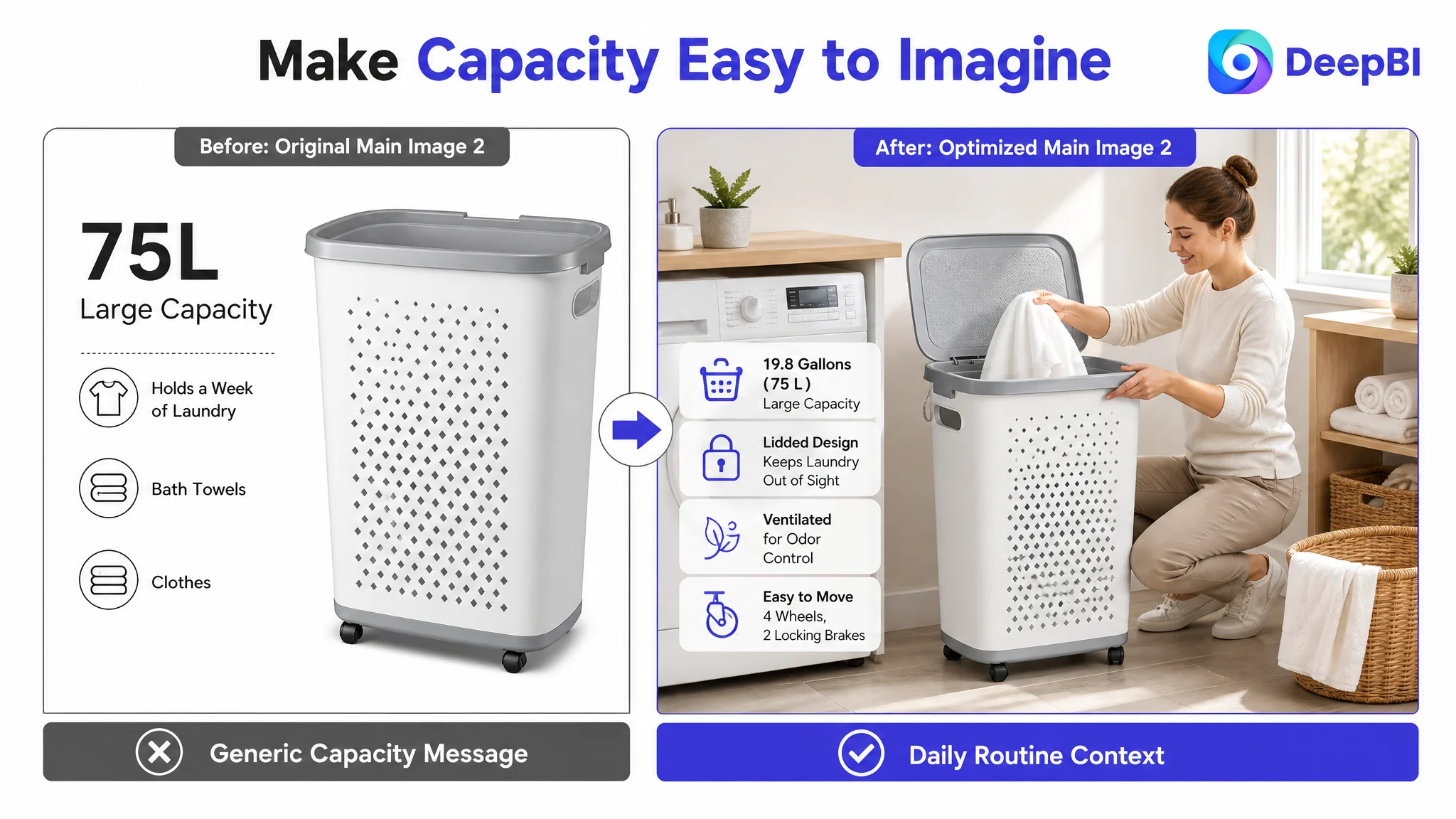
The Main Images Were Not Weak. They Were Prioritized Incorrectly.
The main-image dimension scored 24 compared with 23 for the comparable Listing, so this was not a case of replacing every image because the visuals were fundamentally poor.
The more precise diagnosis was that the images contained useful information but did not always establish the correct priority quickly enough, particularly on mobile screens.
Several images placed too much emphasis on feature density. The shopper could see the product’s functions, but the most commercially important message was not always the first message understood.
Capacity needed a more concrete frame
The product was smaller than the comparable product in capacity: 75 liters versus approximately 100 liters. That made vague capacity language especially risky.
The image direction therefore focused on a more specific claim: capacity suitable for up to one person’s week of laundry. The visual should support that message through a fuller hamper or a clearer capacity cue, without exaggerating the product’s size.
This was not an attempt to compete by pretending the hamper was larger. It was a way to make the real capacity more meaningful within its intended use case.
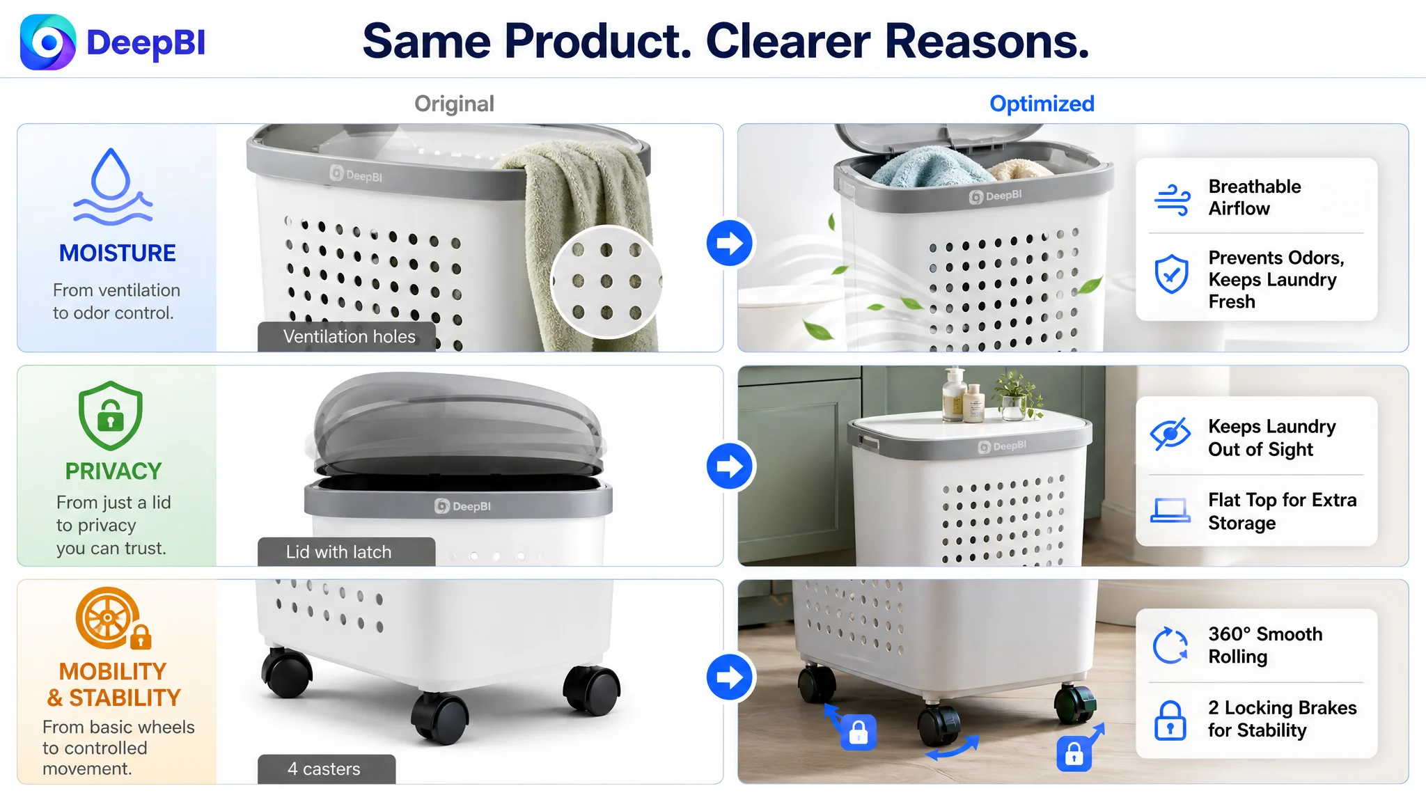
Moisture control was a usable point of differentiation
The product’s plastic construction and ventilation made it suitable for wet towels, swimsuits, and similar items. This was a stronger opportunity than the existing presentation suggested.
The visual story could show the relationship between ventilation, damp-item storage, and easy cleaning. The claim remained within the product’s actual capabilities while giving the shopper a clearer reason to prefer this design.
Privacy needed to lead the lid message
The lid image emphasized placing items on top, while the more immediate household problem was visible laundry and a cluttered room.
The revised priority was:
1. Laundry stays out of sight
2. The room looks tidier
3. The lid can also hold small essentials
This order better matched the emotional and practical reason a shopper might want a lidded hamper.
Stability needed visible proof
The wheels were already present, but the locking mechanism did not receive enough visual emphasis. A close-up callout for two locking brakes would help remove uncertainty about stability.
The side handles also deserved clearer treatment. They were not merely decorative details; they supported controlled pushing and pulling, especially in narrow spaces.
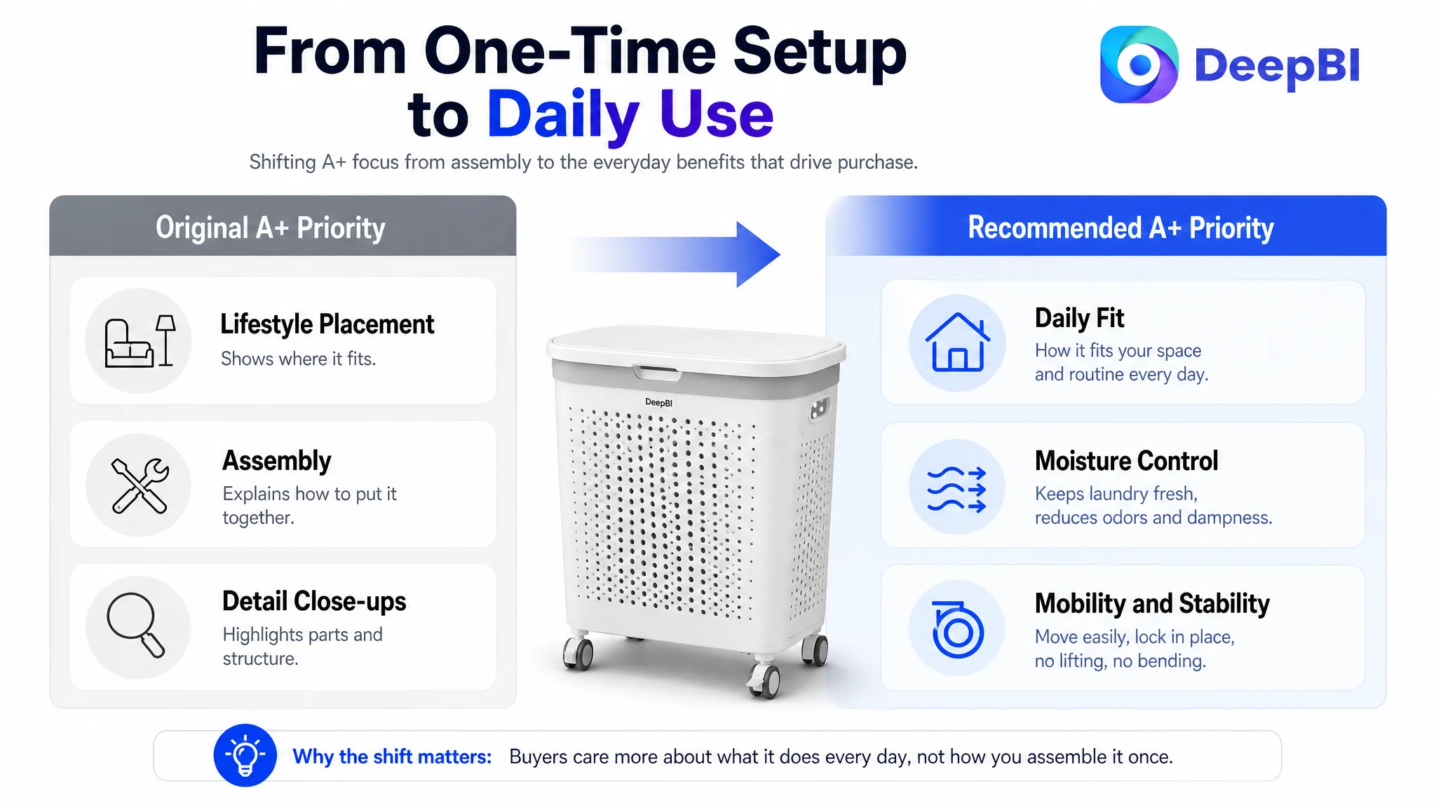
A+ Content Was Spending Space on One-Time Concerns
The A+ comparison exposed one of the clearest structural gaps.
The target Listing used three broad content types:
- Lifestyle placement
- Assembly guidance
- Detail close-ups
The comparable Listing used six distinct persuasion layers:
- Immersive home setting
- Functional demonstration
- Size comparison
- Structural details
- Wheel close-up
- Product-line or selection guidance
The difference was not simply the number of modules. It was the order of persuasion.
The target A+ content used valuable space to explain assembly and small construction details. The competing page used more of its space to demonstrate how the product fits into daily life and why its core design matters.
DeepBI therefore recommended moving assembly later and giving priority to higher-frequency usage concerns.
The opening should sell everyday fit
The first module should do more than place the hamper in a clean room. It should establish the product’s role:
- Slim enough for compact areas
- Large enough for a meaningful amount of laundry
- Lidded for a tidier appearance
- Suitable for bedrooms, bathrooms, laundry rooms, and dorm-style spaces
The goal is to help shoppers recognize their own environment in the image.
Moisture control deserved a dedicated role
Because the product did not have divided compartments, it could not compete on sorting laundry. The correct strategy was to strengthen its actual secondary advantage: moisture management.
A dedicated section could show ventilation openings, damp towels or swimsuits, and the ability to rinse or wipe the plastic surface clean.
This was a good example of constrained optimization. DeepBI did not recommend adding a feature the product did not have. It redirected the page toward a benefit the product could credibly support.
Mobility needed demonstration, not a detail shot
A close-up of a handle does not necessarily prove that a hamper is easy to move. A stronger module would show the basket being rolled and then secured with the brakes.
This turns a component into an experience:
Move it when the room changes. Lock it when the basket is where it belongs.
The lid should connect interaction with order
Opening the lid is not, by itself, a high-value selling point. The stronger story combines interaction with privacy and organization.
The page should show the lid open for daily access, closed to hide laundry, and useful as a small surface without allowing that secondary function to distract from the main benefit.
Low-value details should be consolidated
The latch and rounded-corner modules occupied space without contributing enough to the purchase decision. In isolation, a tiny latch could even invite questions about durability or ease of use.
These details were better consolidated into broader messages about thoughtful design, secure closing, durability, and ease of interaction.
The unused final module could then support a practical selection decision by showing the 75-liter capacity and suitable rooms or use cases.
Reviews Made the Trust Gap Impossible to Ignore
The largest numerical difference appeared in reviews.
The target Listing had:
- 3.0 stars
- 47 total reviews
- Eight reviews visible on the first page
- A high share of one- and two-star reviews among the visible reviews
- Negative feedback related to material, assembly, and price
- No clear presence of image or video reviews
The comparable Listing had:
- 4.7 stars
- 60 total reviews
- Eight reviews visible on the first page
- Visible reviews emphasizing ease of assembly, sturdiness, and appearance
The review-count difference was relatively small. The quality and tone difference was not.
This mattered because Listing optimization cannot fully compensate for a trust problem created by poor visible reviews. Better images and stronger copy can improve clarity, but shoppers will still look for confirmation from other buyers.
The page therefore needed to avoid making claims that the review experience could not support. If the product is described as durable, easy to assemble, or worth the price, those claims should be expressed carefully and supported by accurate visuals and product details.
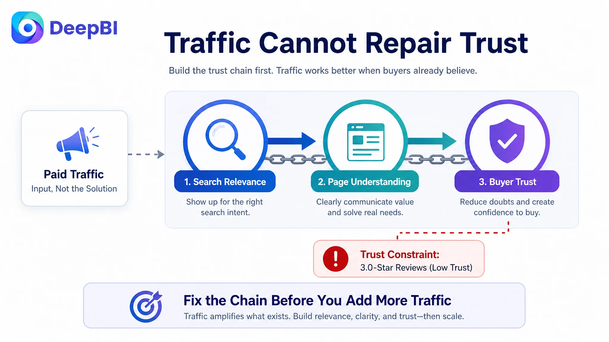
This also changed the order of operations. The page could be improved, but paid traffic should not be treated as the first answer while the visible trust gap remained unresolved.
Advertising can bring a shopper to the page. It cannot make a 3.0-star impression feel like a 4.7-star one.
Why DeepBI Did Not Recommend Tuning Traffic First
The available case material does not include post-optimization advertising results or a before-and-after ACOS, CTR, or CVR trend. It would therefore be incorrect to claim that the changes already reduced ad costs or increased orders.
What the diagnosis did establish was a decision priority.
The product page had a 15-point overall gap against a comparable Listing. The largest weaknesses were not concentrated in one keyword or one image. They appeared across the complete conversion path:
- Search relevance was weaker
- Benefits were less scenario-oriented
- A+ content provided fewer high-value persuasion modules
- Reviews created a substantial trust barrier
Under these conditions, continuing to adjust bids, targeting, or campaign structure first could create a measurement problem. More traffic would make the page’s existing strengths and weaknesses more visible, but it would not repair the page itself.
The more defensible sequence was:
1. Clarify what the product can credibly win on
2. Rebuild the title around category intent and small-space relevance
3. Convert bullet points from feature lists into problem-solving arguments
4. Reprioritize images around capacity, moisture, privacy, and stability
5. Rebuild A+ content around daily use rather than assembly
6. Treat review quality as a trust constraint
7. Then evaluate how paid and organic traffic respond
This is the business value of the diagnosis. It did not suggest changing everything at once. It identified which improvements could strengthen the page’s ability to receive traffic before traffic was scaled further.
The Optimization Direction Became More Precise
The later strategy for this Amazon Listing was not “make the page more attractive.” It was more specific:
Make the product easier to find, easier to imagine, and easier to trust.
That meant:
- Using the title to communicate the category and space-saving position earlier
- Showing what 75 liters means in a real household routine
- Connecting ventilation to damp-item storage and odor concerns
- Positioning the lid around privacy and tidiness
- Showing wheels, handles, and brakes as an easier movement system
- Using A+ content to demonstrate daily functionality
- Keeping every claim within the product’s actual structure and specifications
The direction also respected what the product could not claim. It did not attempt to imitate divided compartments or foldability. Instead, it built a competitive position around slim storage, lidded privacy, moisture-friendly use, and controlled mobility.
That distinction is important in Amazon Listing optimization. Competitive analysis should reveal the decision logic behind a high-performing page, not encourage a seller to copy features or promises that do not belong to the product.
The Broader Lesson for Amazon Sellers
This laundry hamper case shows why Amazon ads optimization and Amazon Listing optimization cannot be separated completely.
A campaign may be well structured while the product page remains difficult to trust. A title may contain the right keywords while failing to express a meaningful position. A main image may be technically complete while burying the most important benefit. An A+ page may look polished while spending its best space on a one-time assembly concern.
The key question is not only whether the Listing has enough content.
It is whether the content forms a persuasive path from search to purchase.
For this Amazon seller, the diagnosis shifted the operating conversation away from adding more explanations and toward fixing the conversion logic of the page. The available materials do not yet establish a quantified post-optimization result, but they do establish a clearer business path and a more controllable test plan.
Before increasing dependence on Amazon ads, the team could now judge the page against a more useful standard:
- Does the title attract the right search intent?
- Does the main image create immediate understanding?
- Do the bullet points answer real household concerns?
- Does the A+ content show the product working in daily life?
- Do reviews reinforce or undermine the promises?
- Can the Listing convert both paid and organic visitors?
That is the lasting lesson from the case.
Traffic is only valuable when the Amazon product page is ready to convert it.