

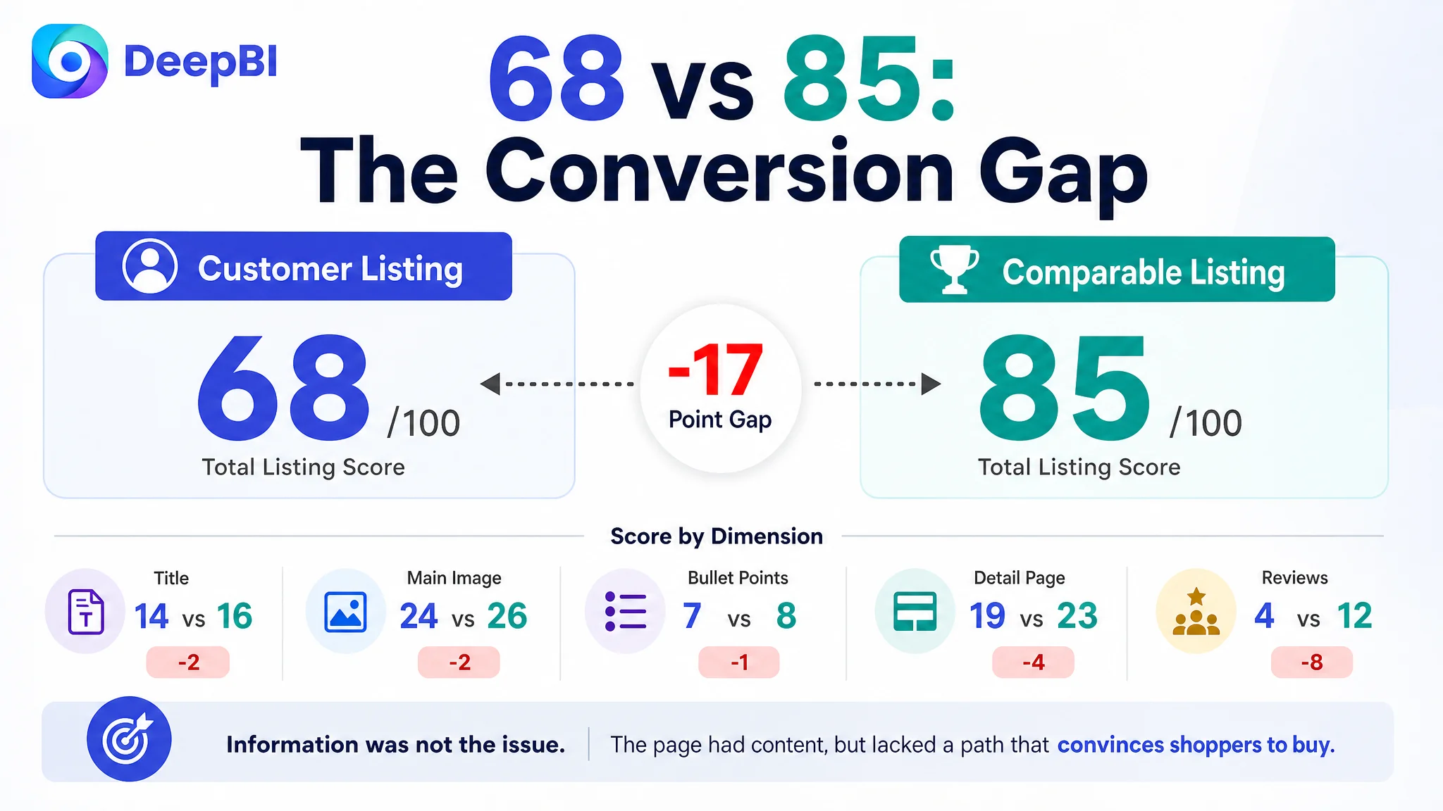
The customer was an Amazon seller in the beauty-device category, operating a US Marketplace Listing for a facial massager with 3D rollers, lymphatic-drainage positioning, heat, vibration, light, and multiple intensity settings. The product page contained substantial information, but its overall Listing score was 68, compared with 85 for a comparable high-performing facial-massager Listing.
The initial direction was to add or refine more product information: more functions, more operating details, more usage guidance, and more keyword coverage. That approach treated the problem as a content completeness issue. DeepBI found a different constraint. The page did not lack features; it lacked a sufficiently convincing path from search result to purchase decision.
The later optimization therefore focused on Amazon Listing conversion rather than isolated copy edits: clarify the product's core facial-contouring promise, make the main image communicate a reason to click, turn bullet points into pain-point-to-benefit arguments, and rebuild A+ content around technical confidence, use scenarios, and proof. The broader lesson for Amazon sellers is straightforward but commercially important: before sending more traffic or refining more ad settings, determine whether the product page can convert the traffic it already has the opportunity to receive.
The Product Page Looked Complete. The Buying Logic Was Not
At first glance, this Amazon facial massager Listing did not appear empty or underdeveloped.
It included:
- A multi-function product concept
- A 4-roller and V-shape design
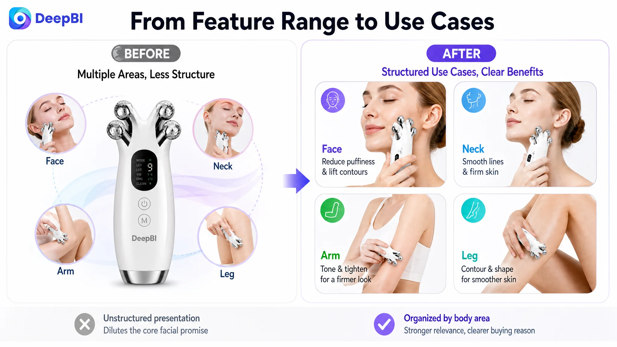
- Face, neck, arm, and leg usage scenarios
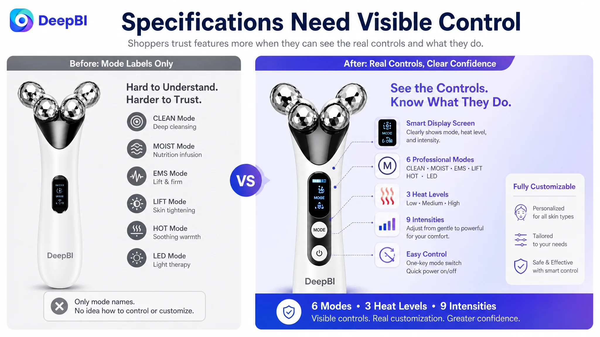
- Adjustable modes, heat levels, and massage intensities
- Usage instructions
- Product photography and technical illustrations
- A+ content covering features and operation
The problem was not the absence of information. It was the order and role of that information.
The page explained what the device had, but it was less effective at answering the questions that determine conversion:
- Why should a shopper click this product instead of another facial roller?
- What result is the product designed to support?
- Why should the shopper trust the device's professional positioning?
- How does its physical design relate to facial contours?
- What evidence or explanation makes the expected experience believable?
- Why is this product relevant to a morning routine, travel use, or a specific concern such as facial puffiness?
That distinction matters on Amazon. A Listing can contain every major specification and still leave the shopper uncertain.
The page had product information, but not enough decision-making support.
The Customer Initially Treated the Gap as a Feature and Copy Problem
The original optimization direction was understandable.
The product offered several visible differentiators, including a display screen, multiple modes, heat settings, vibration, and adjustable intensity. The natural response was to emphasize those functions more clearly and make the title and bullet points carry more of the product story.
The team also had reasons to focus on keyword structure. The existing title included important terms such as “Facial Massager,” “3D Roller,” “Lymphatic Drainage,” and “Double Chin Reducer,” but its structure was dense and repeated some concepts. Compared with the benchmark Listing, it was less compact and less clearly organized around brand, product type, target user, benefit, and use scenario.
That made title refinement necessary. It did not make title refinement sufficient.
The same pattern appeared in the bullet points. The existing bullets described functions, design, modes, safety considerations, and usage suggestions. The comparable Listing led with wireless convenience, facial fit, puffiness and contour concerns, quiet operation, and gifting value.
The difference was not simply that one Listing had better wording.
The difference was that the benchmark Listing organized information around shopper concerns, while the customer's Listing organized it around product attributes.
The page described the device before it framed the decision
A feature such as “6 modes, 3 heat levels, and 9 massage intensities” can demonstrate flexibility. But without a clear reason for that flexibility, it remains a specification.
A 4-roller V-shape design can sound distinctive. But if the page does not show how that structure relates to the cheeks, jawline, and facial contours, the design remains difficult to evaluate.
A multi-part application claim can broaden the use case. But introduced too early, it can dilute the core reason a shopper is considering a facial-massager product in the first place.
DeepBI's diagnosis was therefore not “add more selling points.” It was to reorder the selling logic so that each element answered a specific buying question.
The Score Gap Showed Where Trust Was Being Lost
The benchmark comparison gave the team a clearer basis for prioritization.
- Title: Customer Listing: 14/20, Comparable Listing: 16/20, Gap: -2
- Main image: Customer Listing: 24/30, Comparable Listing: 26/30, Gap: -2
- Bullet points: Customer Listing: 7/10, Comparable Listing: 8/10, Gap: -1
- Detail page: Customer Listing: 19/25, Comparable Listing: 23/25, Gap: -4
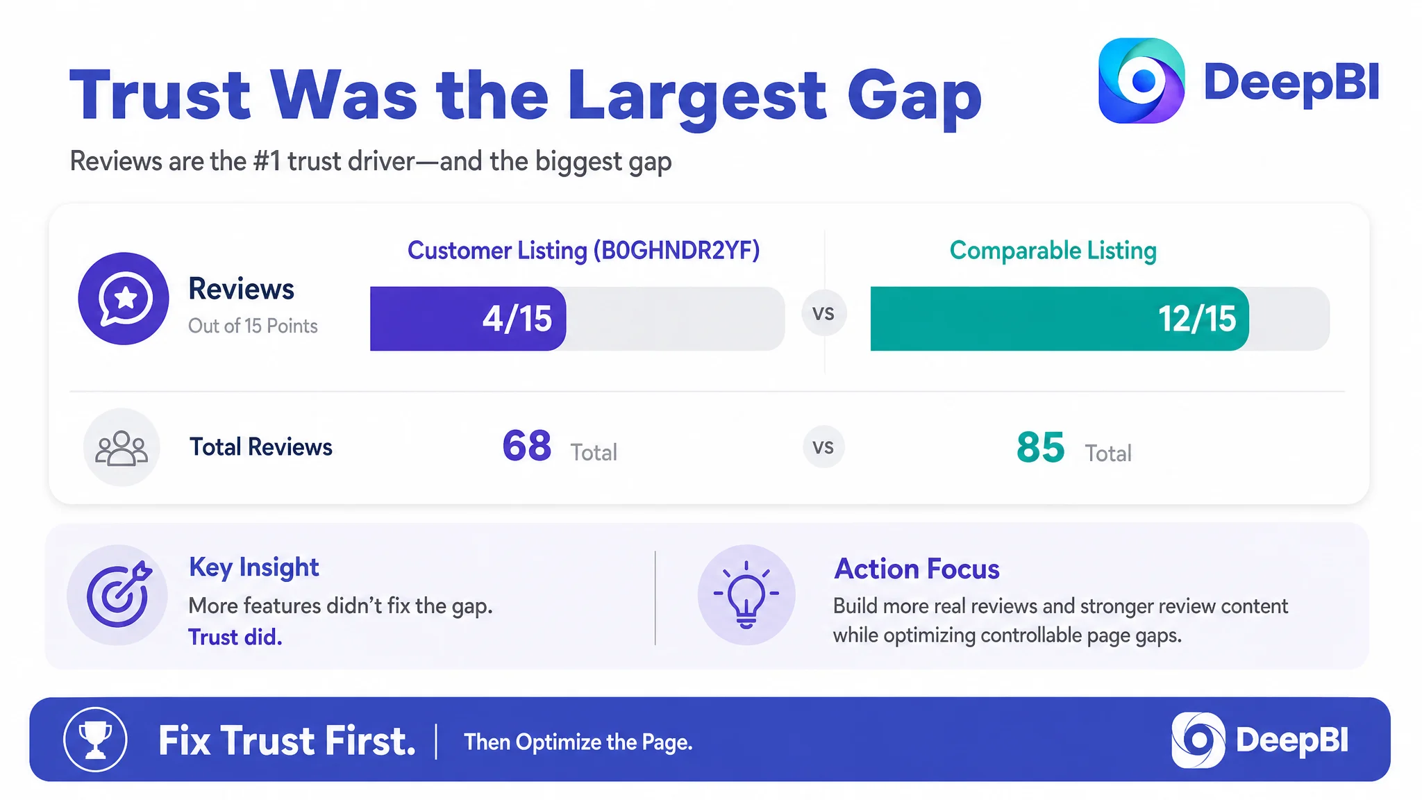
- Reviews: Customer Listing: 4/15, Comparable Listing: 12/15, Gap: -8
- Total: Customer Listing: 68/100, Comparable Listing: 85/100, Gap: -17
The largest numerical difference was in reviews. The customer Listing showed a 3.8-star rating with 24 total reviews, while the comparable Listing showed 4.4 stars with 41 reviews. The customer's page also lacked effective review content on the visible page because the captured review area contained invalid content, while the comparable Listing presented stronger social proof, including video reviews and positive summaries.
This was a serious trust disadvantage, but it was not a reason to stop the diagnosis at “get more reviews.”
Reviews were an external constraint that could not be repaired instantly through copy changes. The more actionable question was: Was the page doing enough to compensate for the trust gap in the areas the seller could control?
The answer was no.
The title, main image, bullet points, and A+ content were all slightly behind the benchmark. Individually, none of these gaps looked catastrophic. Together, they created a weaker decision environment:
- The title did not establish the product's value proposition as quickly.
- The main image did not make the technology or desired outcome sufficiently visible.
- The bullet points emphasized functions more than user concerns.
- The A+ page explained operation but did not build a strong evidence chain.
- The review weakness was left exposed rather than offset by stronger page-level persuasion.
This is why the total score mattered more than any single component.
The Main Image Was Not Just a Design Issue
The main-image gap was only two points, but its position in the Amazon funnel made it strategically important.
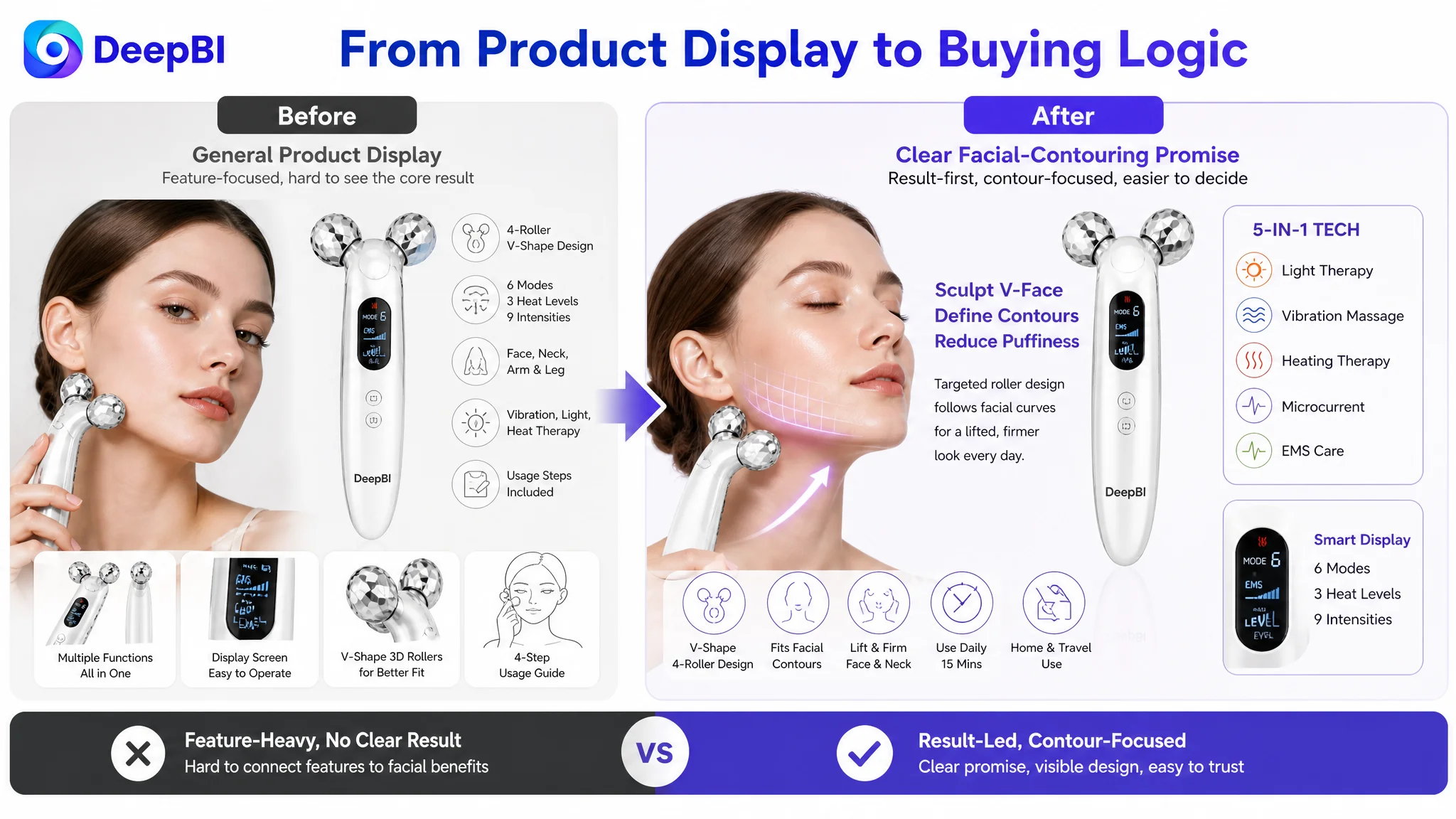
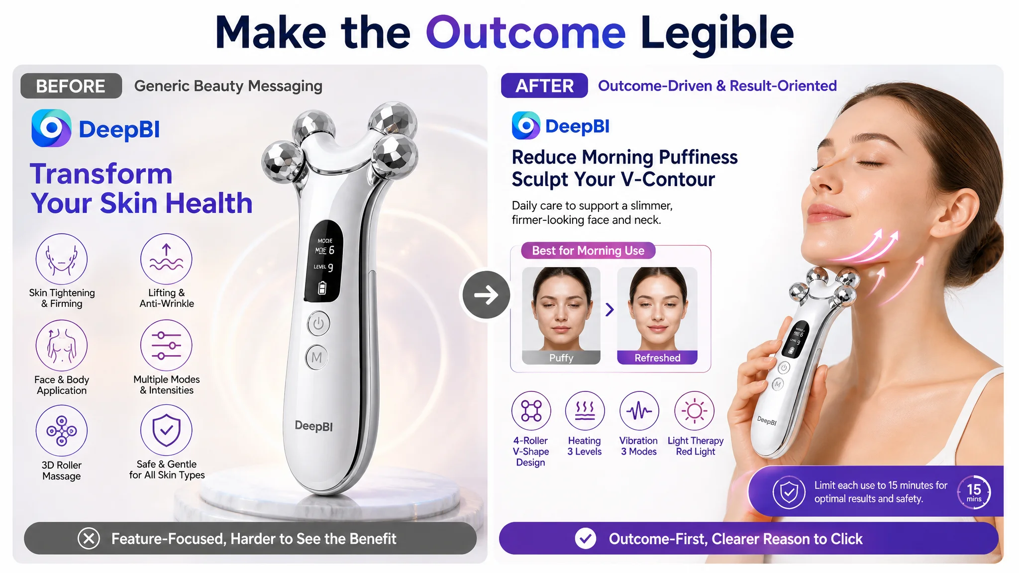
The current visual treatment devoted space to a model portrait and general product presentation. It did not immediately emphasize the product's distinctive multi-roller structure, display screen, or combination of light, massage, vibration, and heating functions.
Another image used generic icons and the phrase “Transform Your Skin Health.” That communicated a broad beauty intention, but it did not visualize the more specific outcome the shopper might be seeking: facial contouring, a V-face appearance, or relief from morning puffiness.
The recommendation was not to make the images more decorative. It was to make them more decision-oriented.
The first visual job was category recognition
The opening image needed to establish that this was more than an ordinary facial roller. The available product attributes supported a clearer presentation of:
- 5-in-1 functionality
- The 4-roller and V-shape structure
- The display screen
- Light, massage, vibration, and heating functions
This would help shoppers understand the product's category and point of difference without forcing them to decode a dense text block.
The second visual job was outcome relevance
The page needed to connect the device with the shopper's intended use. A model demonstrating a facial-contouring use case could communicate more than abstract icons and general wellness language.
The goal was not to promise an unsupported transformation. It was to make the intended use legible: facial contour care, lymphatic-drainage positioning, morning use, and attention to puffiness and fatigue.
The third visual job was control and confidence
The product had meaningful control settings, but the existing presentation treated them as a list. A closer view of the actual screen and controls could show shoppers how the device is adjusted and why the range of settings matters.
That is a different visual argument from simply printing “6 modes, 3 heat levels, and 9 intensities” over an image.
The main image did not need more information. It needed a clearer reason to click.
The Bullet Points Had Features, but Not a Persuasive Sequence
The bullet points were not factually empty. Their weakness was structural.
They leaned toward product explanation:
- What the device includes
- How the rollers are designed
- Which body areas it can serve
- What modes and intensities are available
- How to prepare for use
The benchmark Listing used a more direct sequence:
1. Convenience and portability
2. Fit with facial contours
3. Puffiness and contour concerns
4. Quiet operation
5. Gifting value
This sequence moved from practical usability to physical fit, then to desired outcomes and emotional relevance.
The recommended rewrite followed the same principle while preserving the customer's actual product attributes. The 5-in-1 function and wireless design were connected to convenience. The 4-roller V-shape was connected to facial contours and massage precision. The face, neck, arm, and leg applications were connected to a use scenario rather than presented as a disconnected range.
The important change was from:
“Here are the functions this device contains.”
to:
“Here is the concern, here is how the design addresses it, and here is what the user can reasonably expect from the experience.”
This also changed the treatment of safety guidance. A warning such as not holding the heated device still is professionally responsible, but placing it without context may introduce anxiety. The recommendation was to frame usage guidance as part of controlled, informed operation rather than allowing a caution to become the emotional center of a buying point.
The A+ Page Was the Largest Controllable Conversion Gap
The detail-page score was 19 out of 25, four points below the comparable Listing. This was the clearest page-content weakness outside reviews.
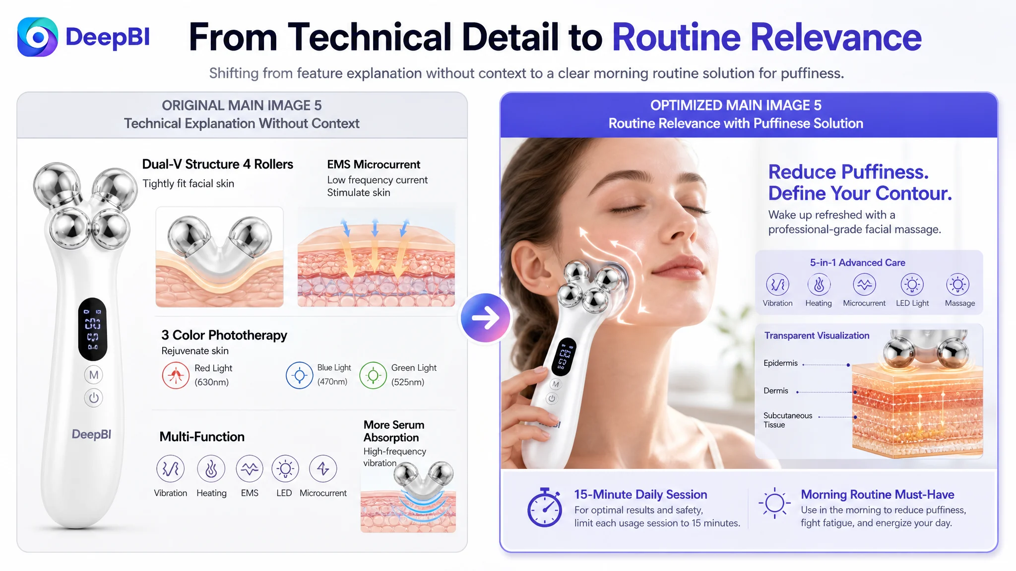
The existing A+ content included feature icons, mode explanations, multiple body-part images, product close-ups, an operating principle illustration, and a four-step usage guide. Its problem was not a lack of modules. It was that the modules did not follow the strongest decision order.
The benchmark Listing used a more developed persuasion path:
- Product and function introduction
- Technical structure and internal component explanation
- Charging and ergonomic confidence
- Before-and-after presentation
- Skin-layer mechanism visualization
- Dedicated face, neck, arm, and thigh contour scenarios
- Travel use
The customer page relied more heavily on line-art instructions and general feature presentation. As a result, it explained use without providing enough rational confidence about why the product deserved trust.
The first A+ modules needed to establish the core promise
The opening section should lead with the product's central facial-care positioning:
- Lymphatic contour care
- Face and double-chin positioning
- 4-roller and V-shape design
- A structure intended to follow facial contours
Body use should not lead the page. It is a useful expansion of the product's versatility, but it should come after the core facial use case has been made credible.
Technical features needed to become user benefits
The display screen, modes, heat levels, and massage intensities were valuable only when connected to control and comfort.
The A+ content needed to show:
- What the user can adjust
- Why adjustment matters
- How the device supports a more tailored routine
- How the physical structure relates to the intended massage experience
This is stronger than placing specifications beside decorative icons.
The page needed stronger visual evidence
The most important missing element was a direct visual explanation of expected use and effect. The source material does not support inventing transformation claims or adding unsupported clinical proof. However, it does support creating clearer visual context around facial puffiness, contour-focused use, and morning routines.
Where a true before-and-after image is not available, the page should not fabricate one. It should instead set transparent expectations, explain the routine, and show how the product is intended to be used.
That constraint is commercially important. A stronger page cannot be built by replacing a trust gap with an unverified promise.
Purchase-risk information had to appear earlier
The existing page placed general preparation and usage steps in a way that consumed valuable persuasion space. The revised sequence moved risk-reducing information closer to the point where a shopper evaluates product suitability.
For example:
- Explain the use of gel or lotion for smoother glide and conductivity.
- Clarify the heated-use instruction.
- State the recommended maximum session of 15 minutes.
- Present charging or operation information only where it can be supported by actual product evidence.
This approach builds transparent confidence instead of pretending that every concern can be solved with a promotional claim.
Why DeepBI Did Not Recommend Tuning Ads First
This case did not provide a verified post-optimization dataset for ACOS, TACOS, CTR, or CVR. The central diagnosis therefore came from the Listing evidence rather than from a claimed advertising turnaround.
That limitation does not weaken the business logic. It clarifies the decision order.
If an Amazon seller is considering more paid traffic, higher bids, or broader keyword coverage while the product page still has weak visual communication and incomplete trust-building, the additional traffic may simply expose more shoppers to the same conversion friction.
The page had three kinds of risk:
Click risk. The main image and title did not communicate the product's distinctive value quickly enough.
Consideration risk. The bullet points and A+ content did not turn functions into a clear buying argument.
Trust risk. The review position was materially weaker, while the page lacked enough technical and visual evidence to offset that disadvantage.
Under those conditions, ad tuning was not necessarily irrelevant. It was simply not the first constraint to remove.
Advertising can amplify a strong Listing, but it can also amplify a page's existing weaknesses.
DeepBI's judgment was to repair the conversion foundation before treating additional traffic as the primary solution. That meant prioritizing the elements most directly connected to shopper understanding and confidence:
1. Reframe the title around the core product category and use case.
2. Make the main image communicate the distinctive design and intended outcome.
3. Rebuild the bullet points around pain point, product response, and usage relevance.
4. Reorder A+ content so facial credibility comes before body versatility.
5. Use transparent guidance where proof or technical evidence is limited.
6. Treat reviews as a trust constraint to monitor, not as a reason to abandon controllable page improvements.
The Recommended Direction Was a Rebuild of Sales Logic
The proposed title moved the core product phrase to the front:
“Facial Massager with 3D Roller Lymphatic Drainage Tool for Face and Neck, Shaper & Slimmer for Double Chin Reducer, Contour Face Brush for Women, Home & Travel Use (Pearl White)”
The purpose was not to copy the benchmark Listing. It was to improve the page's search and decision structure by:
- Leading with the primary product category
- Keeping relevant facial-massager and lymphatic-drainage terms visible
- Connecting the product to face, neck, contour, and home or travel use
- Removing unnecessary repetition
- Placing the color attribute at the end
The recommended bullet-point direction similarly converted functions into buying logic:
- 5-in-1 technology and portable use
- 4-roller V-shape design for facial contours
- Face, neck, arm, and leg application
- Adjustable modes, heat, and intensity with quiet operation
- Usage guidance and gifting relevance
The A+ direction completed the sequence by moving from core facial promise to technical credibility, then to controlled use, transparent guidance, broader body applications, and routine expectations.
This was not a list of unrelated edits. It was an attempt to make every page element perform a distinct job.
What Changed in the Business Understanding
Because the case material does not include confirmed post-change performance data, it would be inaccurate to claim a specific CVR increase, ACOS reduction, or organic-order recovery.
The confirmed change was in diagnosis and operating priority.
The customer Listing was no longer viewed as a product with too few features or insufficient descriptive content. It was understood as a page whose information was not yet arranged to overcome a meaningful trust and persuasion gap.
That changed the questions the team needed to ask:
- Is the product's main promise visible before the shopper reads deeply?
- Does the title establish category, audience, and benefit without becoming repetitive?
- Do the images show why the product is different?
- Do the bullet points address concerns rather than recite specifications?
- Does the A+ page build confidence before expanding the use case?
- Are limitations and usage conditions handled transparently?
- Is the page ready to convert paid and organic traffic before scaling either one?
For Amazon sellers, this is the more durable lesson.
A Listing score is not valuable because it produces a number. It is valuable when the score exposes where the page is losing the shopper's decision. In this case, the 68-to-85 comparison revealed that the problem was distributed across the conversion path, with the most important controllable gap in the relationship between product capability, visual proof, and trust.
The next optimization step was therefore not “add more.”
It was to make the page say the right thing, in the right order, with enough evidence for the shopper to believe it.