

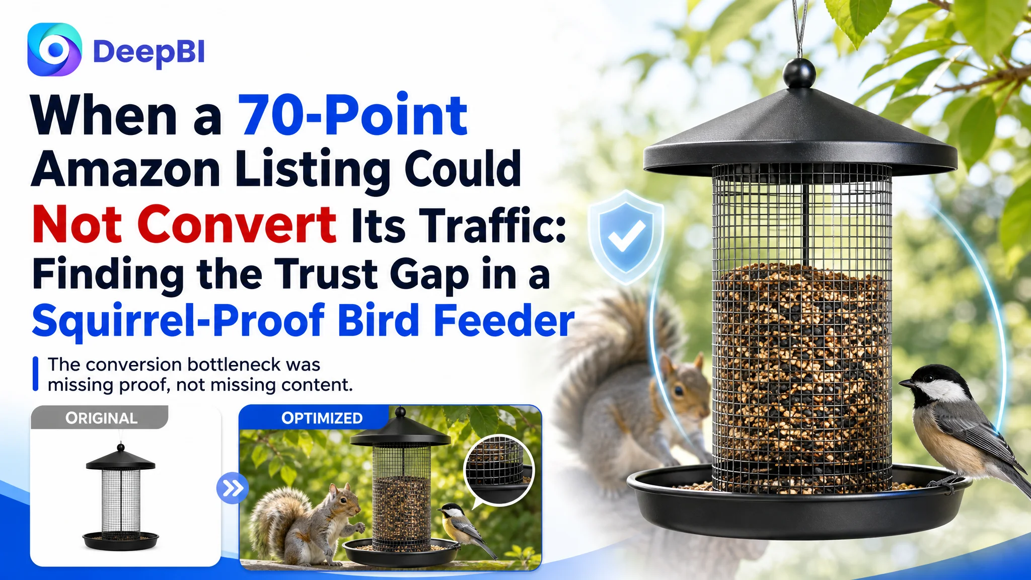
This case follows an Amazon seller whose squirrel-proof bird feeder Listing was competing in the US marketplace but was not presenting its value as clearly or convincingly as a stronger comparable product page. The initial instinct was to improve individual elements such as keywords, product images, and feature descriptions.
DeepBI’s diagnosis showed that the issue was not one isolated creative defect. The Listing scored 70 out of 100, compared with 85 for the benchmark Listing, and the largest losses were concentrated in the detail page and review profile. The product page described useful features, but it did not prove the most important claims quickly enough: how the feeder blocked squirrels, kept seed under control, resisted weather, and remained easy to maintain.
The later optimization therefore focused on rebuilding the Amazon product page’s decision logic. The title needed clearer keyword and benefit sequencing, the image set needed to demonstrate the mechanism rather than repeat static claims, and the A+ content needed to move from decorative outdoor scenes to practical proof. For other Amazon sellers, the broader lesson is direct: before pushing more traffic through Amazon ads, determine whether the Listing can earn trust once that traffic arrives.
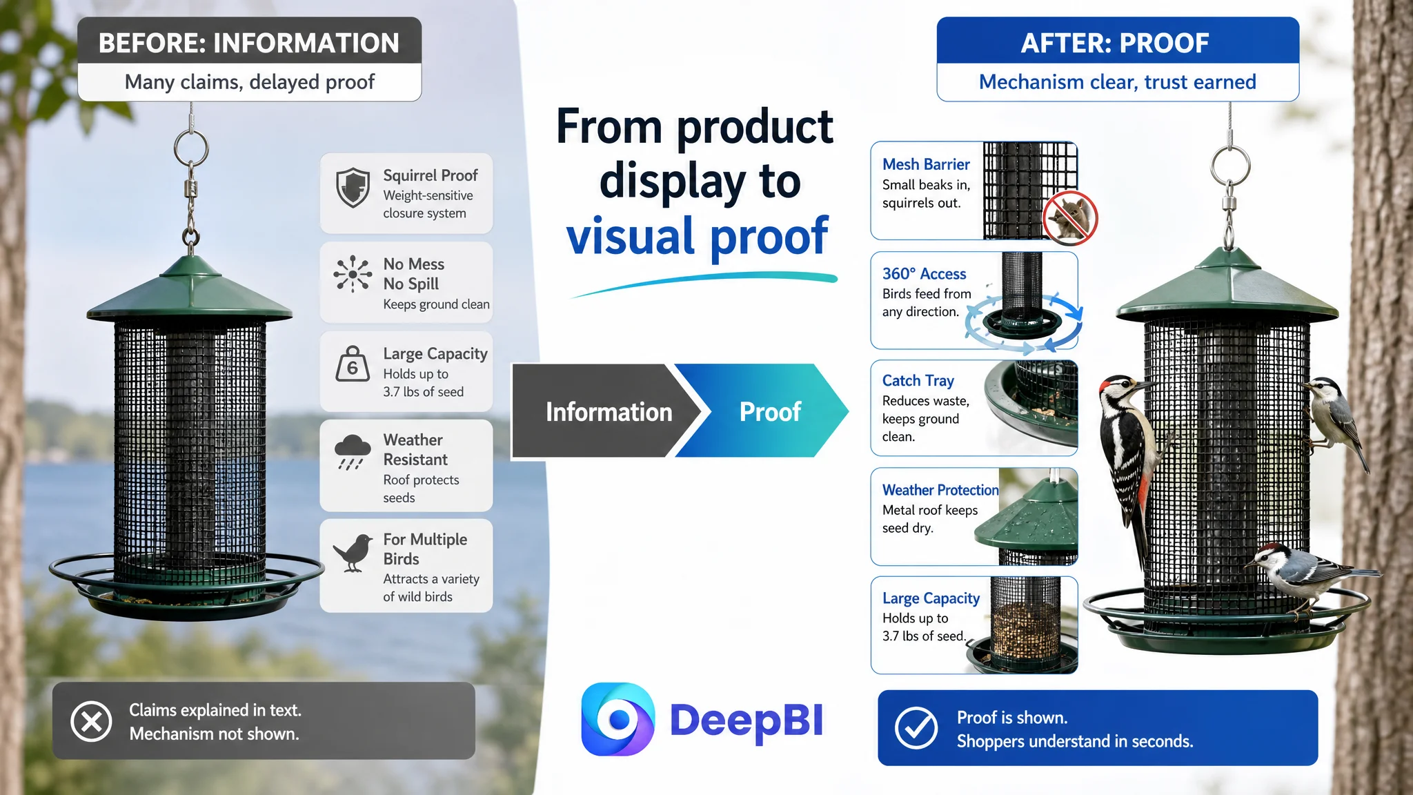
The Amazon seller did not have a lack-of-information problem
The product page already contained many relevant claims:
- Squirrel-proof design
- No-mess and no-spill benefits
- Large seed capacity
- Heavy-duty metal construction
- Weather resistance
- Support for multiple bird species
- A mesh-style feeding surface
The five bullet points were not empty, either. They used specific details such as a 3.7-pound capacity and the potential to save up to one-third of birdseed. They also described use cases involving woodpeckers, nuthatches, and other trunk-hugging birds.
The problem was that these points did not carry equal weight at every stage of the buying decision.
On Amazon, shoppers often make a quick judgment from the title and first image, then look for proof of the product’s main promise before reading deeper. In this category, “squirrel-proof” is not a decorative feature. It is the reason many shoppers are considering a replacement feeder in the first place.
The Listing explained the promise, but the visual sequence delayed the proof.
The page had product information. It lacked a clear order of persuasion.
The original optimization direction focused on visible defects
The customer’s Listing had several easy-to-see weaknesses:
- The title began with “Bird Feeder for Outdoor Hanging” instead of leading with the core search term.
- “Squirrel Proof” appeared more than once, creating repetition without adding meaning.
- Multiple vertical separators made the title feel less structured.
- The main image did not establish the squirrel-proof mechanism immediately.
- Several secondary images depended on text and icons rather than showing the product in action.
- The A+ content used several similar outdoor scenes.
- The page did not provide enough visual explanation of weather protection, installation, cleaning, or mechanism design.
- The product had a 3.8-star rating with only 51 reviews, including negative feedback related to squirrel protection and design concerns.
These issues made it tempting to treat the case as a standard creative refresh: improve the title, make the images more attractive, and add more feature descriptions.
That direction was incomplete.
A more attractive outdoor scene could improve presentation, but it would not automatically answer whether a squirrel could reach the seed. A longer bullet point could add more information, but it would not necessarily make the mechanism easier to understand on mobile. Adding another bird-in-the-yard image could create atmosphere, but it would not resolve doubts about refilling, cleaning, or installation.
The question was not whether the Listing had enough content.
The question was whether the content appeared in the order shoppers needed.
The score gap showed where the conversion problem was concentrated
DeepBI’s comparison placed the target Listing at 70 out of 100, while the comparable benchmark reached 85.
- Title: Target Listing: 14/20, Benchmark: 17/20, Difference: -3
- Main image: Target Listing: 24/30, Benchmark: 26/30, Difference: -2
- Bullet points: Target Listing: 7/10, Benchmark: 6/10, Difference: +1
- Detail page: Target Listing: 17/25, Benchmark: 23/25, Difference: -6
- Reviews: Target Listing: 8/15, Benchmark: 13/15, Difference: -5
- Total: Target Listing: 70/100, Benchmark: 85/100, Difference: -15
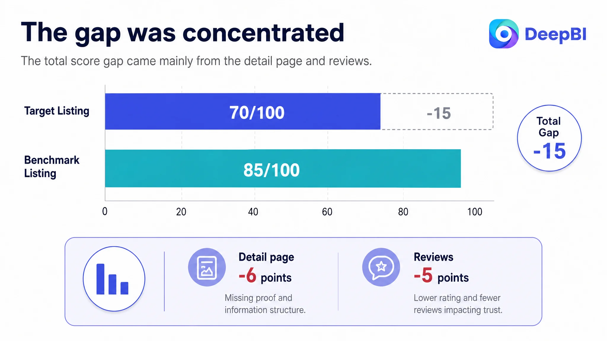
The distribution mattered more than the total score.
The bullet points were actually one point ahead of the benchmark. They had a stronger pain-point-to-benefit structure, more quantified claims, and richer usage scenarios. That meant rewriting every part of the Listing from scratch would have been a poor use of effort.
The largest content gap was the detail page, followed by the review profile.
That shifted the diagnosis from “the Listing needs better copy” to:
The product page’s central claims were not being converted into sufficient visual trust.
The detail page was the real bottleneck
The A+ content included product scenes, feature explanations, close-up views, seasonal settings, and comparison content. On the surface, it appeared comprehensive.
But the modules did not create a strong commercial progression.
The benchmark page used a more direct sequence:
1. Establish the use situation.
2. Show the problem the product solves.
3. Explain the squirrel-proof mechanism.
4. Demonstrate refilling and cleaning.
5. Reinforce weather resistance and practical use.
The target page placed more emphasis on attractive scenes and repeated visual themes. It showed the feeder in different environments, but several images did not provide new evidence. The result was content volume without enough decision support.
For a bird feeder, the most important questions are practical:
- Can squirrels physically reach the seed?
- How does the mesh allow birds to feed while blocking squirrels?
- Does the roof keep seed dry?
- How much seed can it hold?
- How is it refilled?
- Can it be cleaned without unnecessary effort?
- Where should it be hung for the mechanism to work properly?
- Does the tray reduce scattered seed and ground mess?
The existing A+ content did not answer these questions with enough visual clarity.
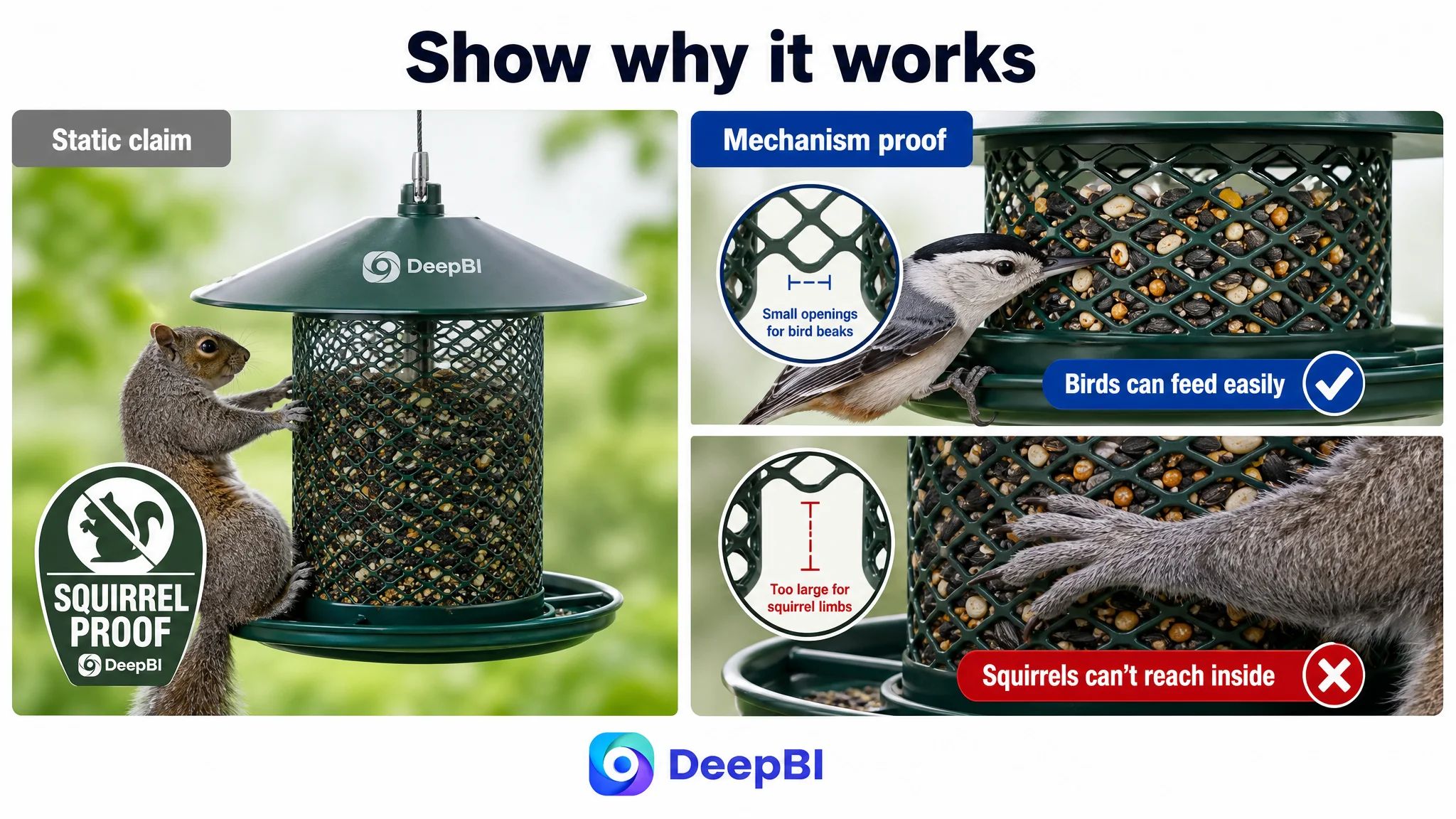
The mechanism needed to be demonstrated
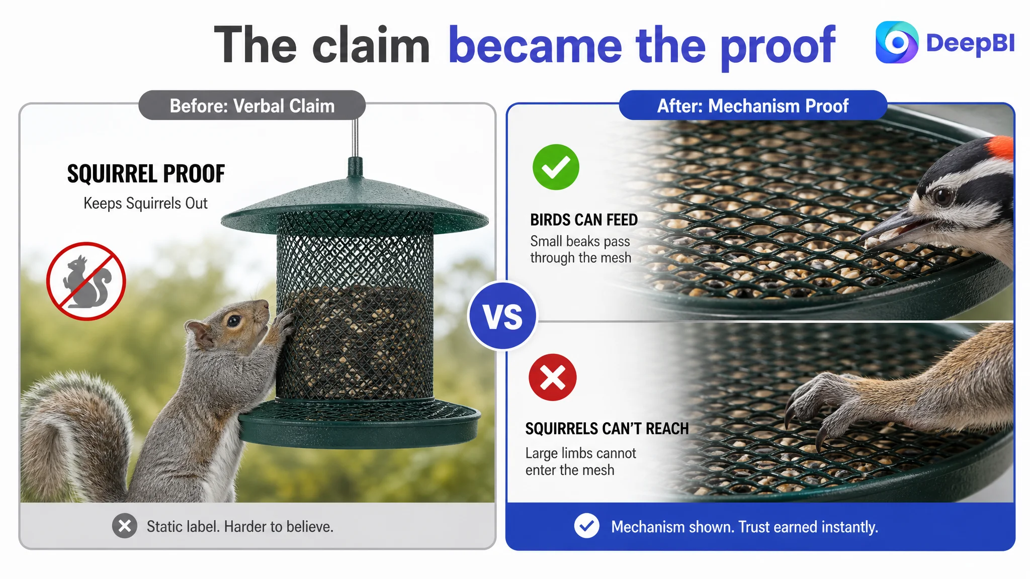
The Listing described the unique mesh design, but the mechanism appeared too late and too statically.
A stronger explanation would show the physical logic:
- Small bird beaks can pass through the mesh.
- Squirrels’ larger limbs cannot reach the seed in the same way.
- The structure creates a barrier without relying only on a verbal “squirrel-proof” claim.
This is more persuasive than placing a label over a product image. Shoppers do not only need to know that the feeder is squirrel-proof. They need to understand why.
Weather protection needed evidence, not atmosphere
The page used rain-related visual effects to suggest weather resistance. However, a rain overlay is not the same as showing how the roof protects the seed or how the powder-coated heavy steel supports outdoor use.
The optimization direction therefore moved toward:
- Showing how the roof covers the seed area.
- Connecting the roof design to dry and fresher seed.
- Presenting powder-coated heavy steel as a durability attribute.
- Clarifying rust resistance without overstating performance.
- Placing weather protection earlier in the A+ sequence.
The goal was not to make the product look more rugged. It was to make the reason for trusting its outdoor use easier to verify.
Cleaning and installation were missing parts of the buying logic
The benchmark Listing made usability more concrete through one-handed refilling and cleaning guidance. The target Listing had capacity and usage information, but less evidence about what ownership would feel like after purchase.
That creates conversion friction. A shopper may like the product’s design but still wonder whether refilling is awkward, whether the feeder is difficult to clean, or whether installation requirements are unclear.
DeepBI’s recommendation was to use the A+ content to clarify:
- How the feeder is refilled.
- Which structural features support easier maintenance.
- How the feeder can be disassembled or cleaned.
- Where and how it should be hung.
- How placement affects the squirrel-proof design.
- How the catch tray reduces seed on the ground and limits rodent attraction.
These are not secondary details. They reduce perceived ownership risk.
The title needed to win both search relevance and immediate understanding
The title scored 14 out of 20, three points below the benchmark.
The benchmark led with the core phrase “Squirrel Proof Bird Feeder,” while the target title began with a broader phrase related to outdoor hanging. That weakened the first impression of relevance and pushed the most important category term further back.
The title also repeated “Squirrel Proof,” used several separators, and did not bring forward enough concrete product attributes.
The recommended direction was to place the strongest search and decision signals earlier:
Squirrel Proof Bird Feeder with Mesh Catch Tray, All-Metal Large Capacity for Outdoor Hanging, No Mess No Spill Wild Bird Seeds Feeder with 360° Feeding Perch
The value of this change was not keyword volume alone. It reorganized the title around the shopper’s decision:
- What is it?
- What problem does it solve?
- What structural feature supports that promise?
- What practical benefits does it offer?
- How is it used?
The title should not become a collection of search terms. It should create a coherent reason to continue into the images and bullets.
The main image set answered the wrong questions in the wrong order
The main image dimension scored 24 out of 30, only two points below the benchmark. This was not a complete visual failure. The product was visible, bird usage was represented, and the Listing communicated several functional claims.
The issue was sequencing.
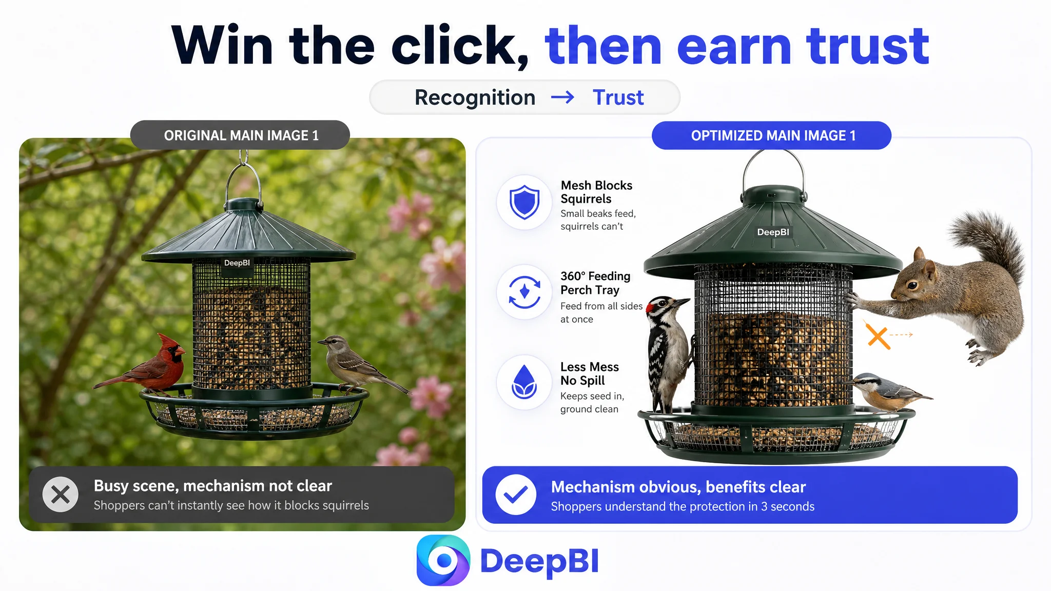
Image one needed a clearer visual hook
The first image provided a static view of the product and its general use. It did not immediately differentiate the feeder around its central promise.
For Amazon search and advertising placements, the first image must quickly communicate what makes the product worth clicking. The optimization direction was to preserve the product’s real structure while improving:
- White-background compliance and subject focus.
- Contrast and visual hierarchy.
- Immediate recognition of the feeder form.
- A stronger relationship between the product and its squirrel-proof positioning.
Secondary benefits such as exact capacity could be placed later. The first image’s job was to earn attention and establish the product category.
Image two needed to show how squirrel protection works
The existing sequence addressed the squirrel-proof claim too late and relied heavily on static explanation.
A more effective second image would use a visual comparison:
- A small bird accessing the seed through the mesh.
- A squirrel unable to reach through the same structure.
- A close view of the mesh opening and feeding area.
- Minimal copy supporting the visual rather than replacing it.
This turns an abstract claim into a mechanism a shopper can understand at a glance.
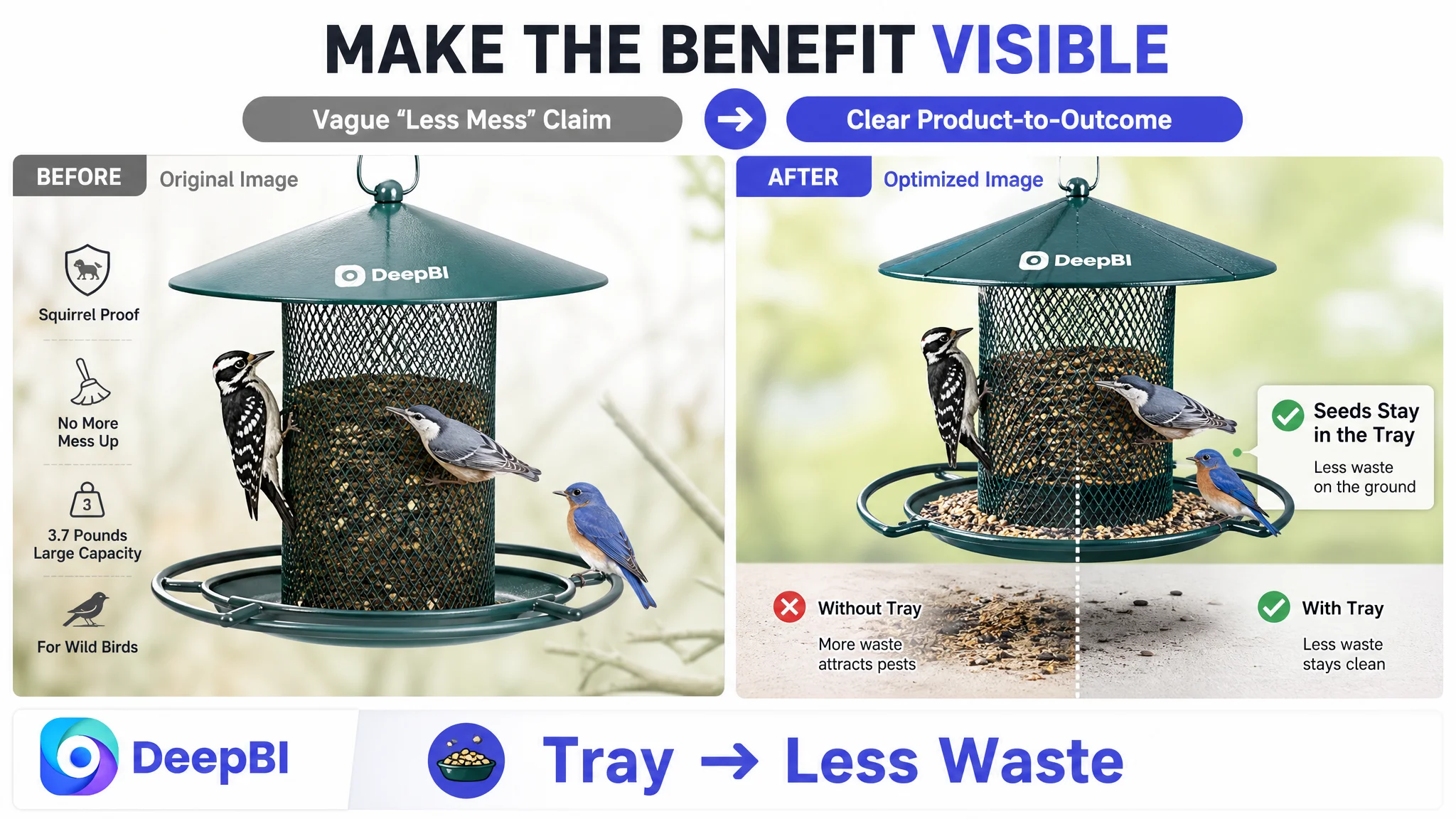
Image three needed to connect the tray to savings
The catch tray was a meaningful differentiator, but the existing comparison did not clearly prove its advantage. Comparing different feeder designs without isolating the relevant benefit can create confusion.
The improved role for this image was to show:
- How the tray catches fallen seed.
- How less scattering keeps the ground cleaner.
- How reduced waste supports the claim of saving up to one-third of birdseed.
- How a cleaner feeding area may reduce the attraction of rodents.
The key is to connect structure to outcome: the tray is not simply an added part; it is the reason the product can reduce mess and waste.
Image four needed logistical proof
The Listing’s capacity and seed-type information appeared as icons and lists. That made the information easy to overlook and did not show how the feeder fits into actual use.
A stronger image would connect the 3.7-pound capacity with:
- Suitable seed types such as black oil sunflower seeds or mixed nuts.
- The kinds of birds the design is intended to attract.
- The value of fewer refills.
- A realistic backyard or tree-hanging context.
This helps the shopper imagine the product in operation instead of reading isolated specifications.
Image five needed to make maintenance feel manageable
The final image opportunity was not another weather claim. It was a practical ownership message.
The product’s heavy steel construction, wide mesh area, and refilling structure could be used to show:
- How the feeder is opened or refilled.
- How the structure supports long-term outdoor use.
- How the product’s physical design relates to maintenance.
- Why the feeder can remain useful across different weather conditions.
The image set would then progress from click motivation to mechanism proof, savings, capacity, and ownership confidence.
Reviews were a structural trust constraint
The review dimension scored 8 out of 15.
The target Listing had:
- A 3.8-star rating.
- 51 total reviews.
- Eight reviews visible on the first page.
- Two low-rating reviews among those visible reviews.
- Negative feedback related in part to squirrel protection and design concerns.
The benchmark had a 4.2-star rating and 1,183 reviews, creating a much stronger sense of market validation.
This gap could not be solved by changing the title or generating a more polished image. It was a separate trust constraint that had to be acknowledged in the business diagnosis.
However, the presence of a review disadvantage did not mean the team should wait passively for more reviews before improving the Listing. It meant the page needed to compensate through stronger evidence wherever it still had control:
- Demonstrate the squirrel-proof mechanism clearly.
- Set accurate expectations around installation.
- Explain the product’s intended bird and seed use.
- Show cleaning and refilling steps.
- Avoid vague or absolute claims that could create additional disappointment.
When review strength is limited, unclear content becomes even more expensive. A page with fewer reviews has less room for shoppers to fill in missing information through social proof.
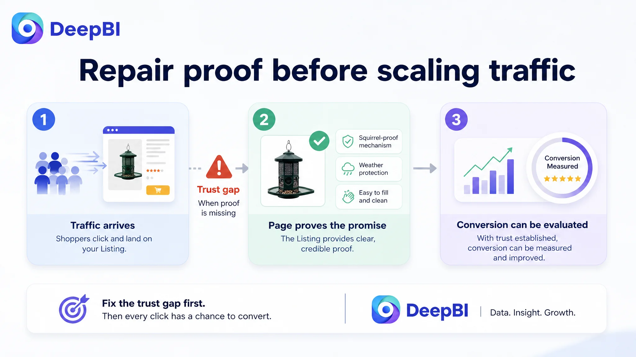
Why DeepBI did not prioritize the ads first
The case material does not provide post-optimization advertising metrics such as CTR, CVR, ACOS, or TACOS. It would therefore be inaccurate to claim that the Listing changes produced a specific advertising result.
The decision logic is still clear.
If an Amazon product page has not established its main promise, additional traffic can expose the weakness more quickly without resolving it. Advertising may bring shoppers to the product page, but it cannot independently explain a poorly demonstrated mechanism, replace missing A+ proof, or overcome uncertainty about installation and maintenance.
That is why DeepBI treated Listing conversion capacity as the first constraint.
The recommended order was:
1. Clarify the title’s search and value structure.
2. Rebuild the image sequence around the squirrel-proof mechanism.
3. Use visual proof for waste reduction, weather protection, capacity, and refilling.
4. Reorganize A+ content around problem, solution, proof, and ownership confidence.
5. Address installation and cleaning expectations.
6. Then evaluate how paid and organic traffic respond to the repaired page.
Ads can amplify a strong product page, but they can also amplify unresolved page-level doubts.
The deeper lesson for Amazon sellers
This Listing did not fail because the seller lacked effort or product information. It was constrained by a mismatch between product value and buyer understanding.
The five bullet points already carried useful quantified benefits. The product had a clear category use case. The main weaknesses were concentrated in how quickly and convincingly the page proved its most important claims.
DeepBI’s role in the case was to connect the score gap to a decision order:
- The title had a relevance and clarity problem.
- The main image set had a proof-sequencing problem.
- The detail page had a trust and information-density problem.
- The review profile created an external credibility disadvantage.
- The bullet points were not the first place to spend effort because they were already comparatively strong.
That is a different approach from treating every Listing element as equally defective.
Before more traffic, make the page deserve the click
For this squirrel-proof bird feeder, the next optimization direction was not “make everything more attractive.” It was to make the page more defensible.
The product needed to show:
- Why the mesh blocks squirrels while allowing birds to feed.
- How the catch tray reduces waste and ground mess.
- How the roof protects seed from weather.
- How the 3.7-pound capacity supports fewer refills.
- How the heavy steel construction supports outdoor durability.
- How refilling, cleaning, and installation work.
- Why the design suits trunk-hugging birds such as woodpeckers and nuthatches.
Only after those points were arranged into a coherent Amazon Listing story would further traffic become more useful to evaluate.
The business understanding changed from “we need better images and more keywords” to a more precise judgment:
The product page did not primarily need more content. It needed stronger proof at the moments when shoppers decide whether to trust the product.
That is the conversion bottleneck DeepBI identified—and the reason Listing diagnosis had to come before continued traffic optimization.