

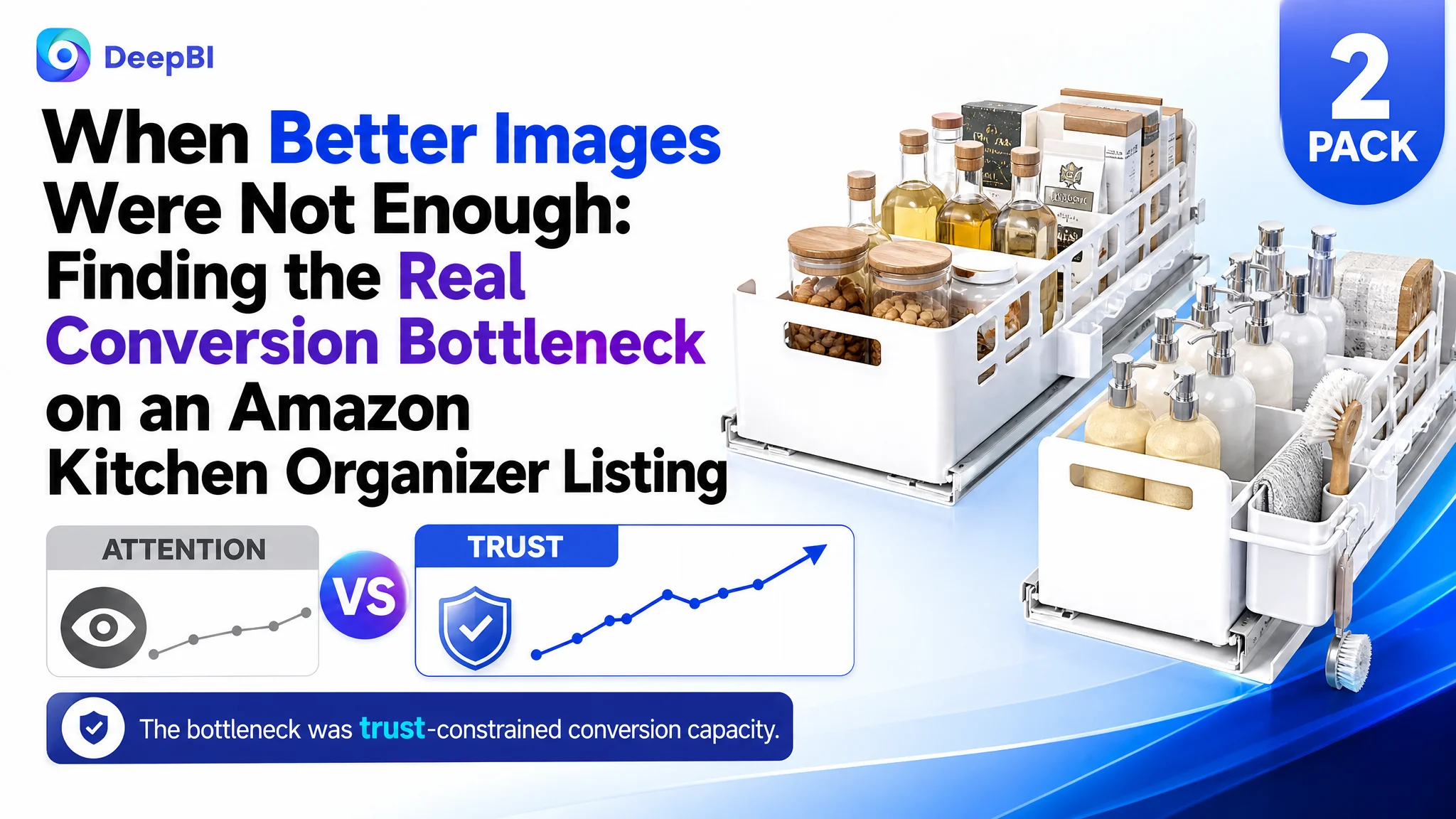
This case follows an Amazon seller whose kitchen cabinet organizer Listing was receiving a familiar kind of pressure: the product had clear functions, multiple use scenarios, and a workable pull-out design, yet its product page was not communicating enough confidence to turn attention into purchase decisions. The initial direction focused on improving installation visuals, adding specifications, and presenting more product functions.
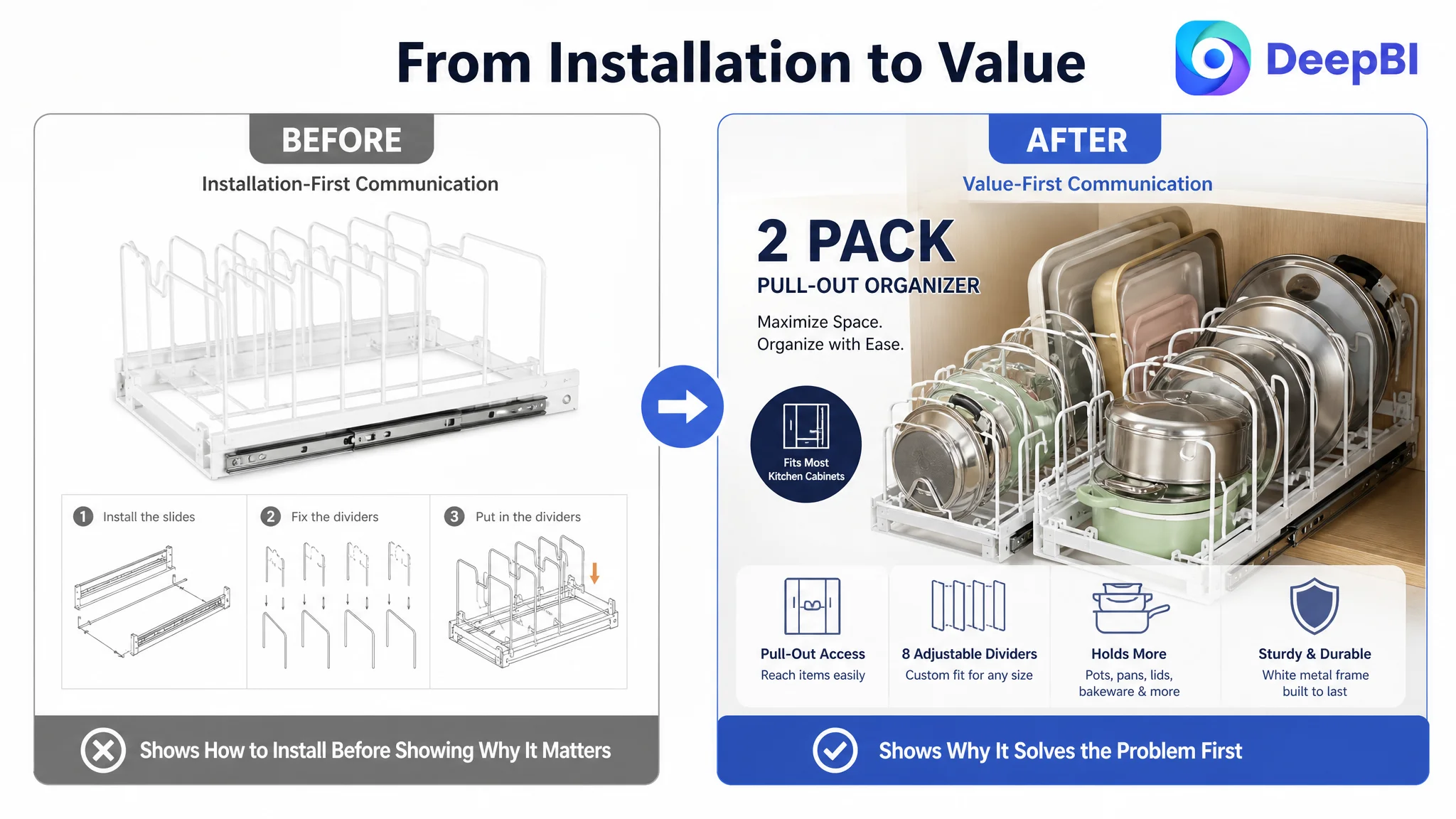
DeepBI’s diagnosis showed that the problem was broader than any single image or keyword. The Listing scored 68 out of 100 against 85 for a comparable high-performing Amazon Listing, with the largest gap appearing in customer trust: a 3.9-star rating, 58 total reviews, no meaningful review content on the first page, and a much higher share of low ratings.
The later optimization therefore focused on rebuilding the page’s sales logic in the right order: establish the 2-pack value, prove storage capacity, clarify fit and material information, show the before-and-after outcome, and use the title, main images, bullet points, A+ content, and reviews as one connected conversion system. For other Amazon sellers, the lesson is direct: before sending more traffic or polishing isolated assets, determine whether the Listing gives shoppers enough reasons to trust, understand, and choose the product.
The Listing Had Functions. It Did Not Yet Have a Strong Buying Argument.
The product was a pull-out kitchen organizer designed for pots, pans, pot lids, dishes, bakeware, and food storage containers. It could be used inside cabinets or on countertops, and each organizer included adjustable dividers.
On paper, the product had several useful selling points:
- A 2-pack configuration
- Pull-out access to items stored deep inside cabinets
- Eight adjustable dividers per organizer
- Vertical cookware organization
- A white metal frame
- Multiple storage scenarios
The problem was not a lack of features.
The problem was that these features were not arranged around the customer’s most urgent decision questions:
- Will this solve my cabinet clutter?
- Can it hold the cookware I actually use?
- Will it fit my available space?
- Can I adjust it for different sizes?
- Will the material remain stable in a humid kitchen?
- Am I buying one organizer or two?
- Do other buyers trust this product?
A Listing can contain all the necessary information and still fail to convert if the information arrives in the wrong sequence.
The product page was describing what the organizer could do before proving why the shopper should feel confident buying it.
That distinction became the central issue in the diagnosis.
The Initial Optimization Direction Focused Too Closely on Individual Assets
The customer’s page had several visible weaknesses, so it was natural to approach them one by one.
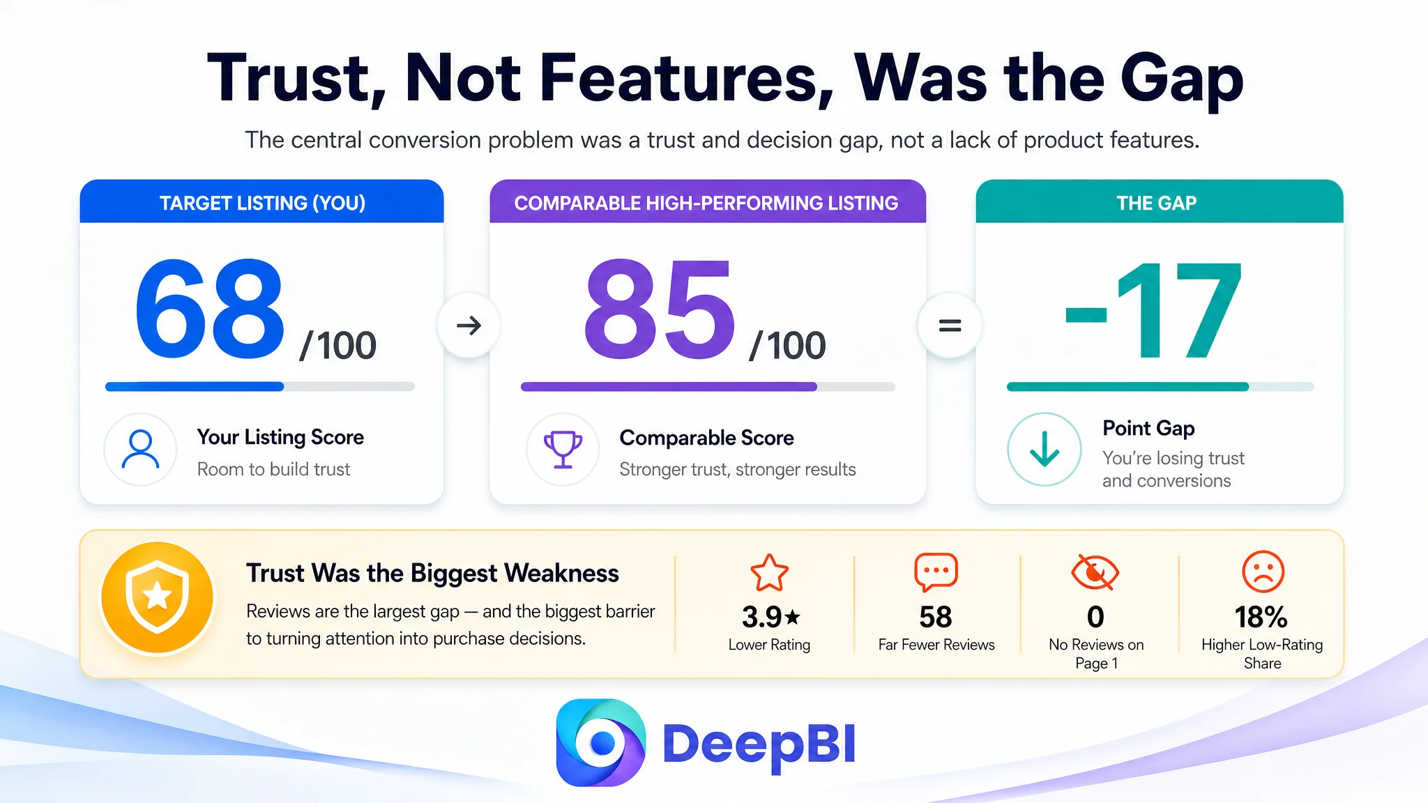
The installation image appeared early in the image sequence. Technical details were presented before the core storage outcome had been established. The title included relevant functions but did not give enough weight to the most important search and decision terms. The bullet points described features, but their structure leaned toward functional listing rather than pain point resolution.
This created a reasonable but incomplete optimization path:
- Improve the installation explanation
- Add more technical information
- Show more usage scenarios
- Adjust the title wording
- Add more descriptions of durability and organization
Each action addressed a real issue. None addressed the full conversion constraint.
The customer’s original direction was therefore not wrong because the content was irrelevant. It was incomplete because it treated the Listing as a collection of assets rather than as a decision path.
For an Amazon seller, this distinction matters. A stronger image cannot compensate for unclear value. A longer title cannot compensate for weak trust. More specifications cannot compensate for a missing answer to the shopper’s main concern.
The Score Gap Made the Problem Visible
DeepBI’s comparison created a clearer market reference point.
- Title: Target Listing: 14/20, Comparable High-Performing Listing: 16/20, Gap: -2
- Main images: Target Listing: 25/30, Comparable High-Performing Listing: 26/30, Gap: -1
- Bullet points: Target Listing: 5/10, Comparable High-Performing Listing: 7/10, Gap: -2
- A+ content: Target Listing: 21/25, Comparable High-Performing Listing: 23/25, Gap: -2
- Reviews: Target Listing: 3/15, Comparable High-Performing Listing: 13/15, Gap: -10
- Total: Target Listing: 68/100, Comparable High-Performing Listing: 85/100, Gap: -17
The first important judgment was that the largest weakness was not the main image.
The main image score was only one point behind the comparable Listing. The title, bullet points, and A+ content each showed moderate gaps. But the review dimension was ten points behind, making it the clearest trust deficit in the entire comparison.
The customer’s Listing had:
- A 3.9-star rating
- 58 total reviews
- No meaningful review content visible on the first page
- An 18% share of three-star-or-lower reviews
The comparable Listing had:
- A 4.3-star rating
- 700 total reviews
- 13 visible review entries with ratings on the first page
- A 4% share of three-star-or-lower reviews
This gap changed the interpretation of the page.
The Listing was not merely failing to explain the organizer well enough. It was asking shoppers to take a higher level of product and quality risk than the comparable alternative.
The Real Constraint Was Listing Conversion Capacity
The central problem was a trust-constrained Listing conversion bottleneck.
The page had enough basic information to introduce the product, but not enough structured proof to remove hesitation. That weakness appeared across the page:
- The title did not make the complete 2-pack value prominent enough.
- The main image sequence delayed important quantity and fit information.
- The bullet points described functions without consistently linking them to customer pain points.
- The A+ content emphasized features and installation before showing the clutter problem and the storage result.
- The review profile created a significant credibility gap.
This is why isolated visual improvement would not be enough.
A more attractive image might improve attention. A more complete title might improve relevance. A more detailed bullet point might improve understanding. But the purchase decision still depended on whether the full page could answer the shopper’s concerns in a credible sequence.
DeepBI’s role in this case was not to declare that every asset needed to be replaced. It was to identify which weaknesses were connected and which decision had to come first.
The Title Was Relevant, but Its Value Hierarchy Was Weak
The existing title included terms such as pull-out storage, pot lids, dishes, and bakeware. However, the structure did not place the most commercially important information where shoppers could recognize it quickly.
The comparable Listing made several decisions more clearly:
- It placed the core category phrase near the front.
- It included the under-cabinet use case.
- It used specific quantity and divider information.
- It expanded coverage to food storage container lids.
- It used a clearer structure for search relevance and mobile scanning.
The recommended direction was not to add keywords indiscriminately. It was to establish a more useful hierarchy:
1. Product quantity and form
2. Core category and use case
3. Material and organizer type
4. Adjustable divider information
5. Supported cookware and storage scenarios
The proposed title direction emphasized:
- A 2-pack configuration
- Cabinet and countertop use
- A white metal frame
- Eight adjustable dividers
- Storage for pot lids, dishes, bakeware, and food containers
This made the title work harder as both a search entry point and a first-stage value summary.
The Main Images Needed to Resolve Doubts Earlier
The main image score was relatively close to the comparable Listing, but the image sequence still placed important information too late.
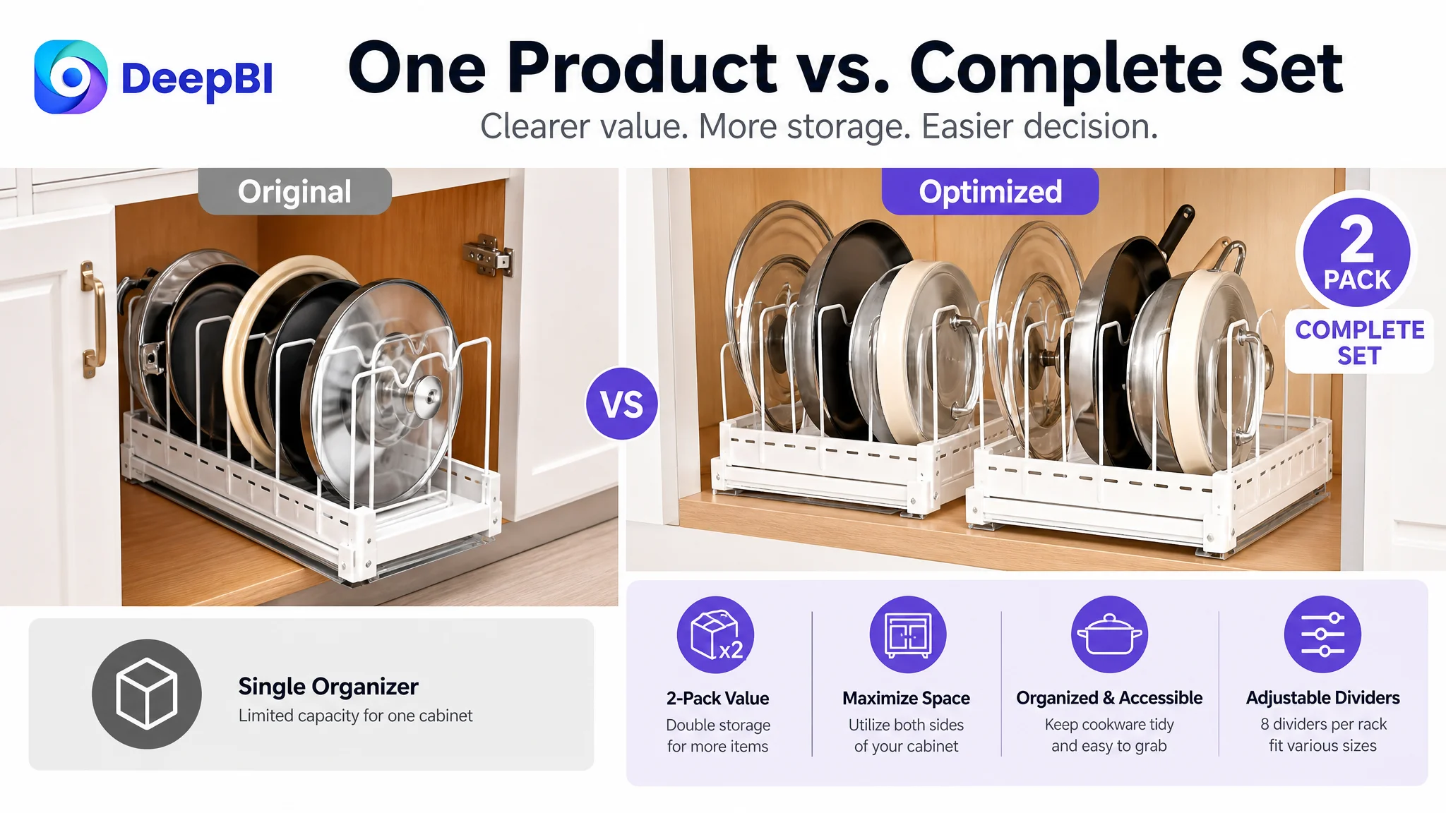
The first visual impression established the pull-out design, yet it did not state the quantity clearly enough. For a shopper scanning quickly, the difference between one organizer and a 2-pack is not a minor detail. It changes the perceived value of the entire offer.
The recommended sequence therefore began with confidence-building information:
First: Confirm the offer
The first supporting image should make the “2 Pack Complete Set” unmistakable. It should show that the listing includes two organizer racks, not one.
Second: Confirm fit and construction
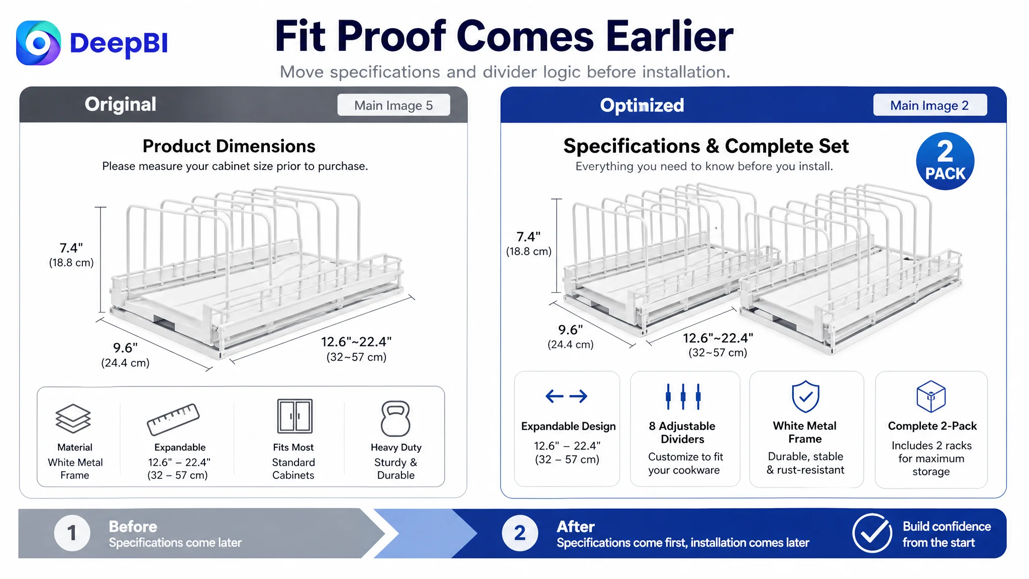
The next image should present dimensions, divider count, and the visible white metal frame. These are practical questions that influence whether the product appears compatible with the shopper’s cabinet and cookware.
Third: Confirm usage range
The image sequence should show use in cabinets and on countertops, with pots, pans, lids, dishes, and bakeware. This answers where the organizer belongs and what it can actually hold.
Fourth: Prove the storage outcome
Installation instructions are useful, but they answer a later-stage question. Before shoppers study installation, they need to believe that the organizer will solve the clutter problem.
A stronger image position should therefore be used for:
- Space-saving logic
- Feature comparison
- Pull-out accessibility
- Storage capacity
- A clear before-and-after result
Fifth: Reinforce the complete value
The final early-stage visual should consolidate the 2-pack value and show how the two organizers work together to create a more complete kitchen storage solution.
The image sequence should move from “What am I buying?” to “Will it fit?” to “What problem will it solve?” before asking the shopper to study installation.
The Bullet Points Needed to Move From Features to Friction Removal
The original bullet structure was functional, but it did not consistently follow the customer’s decision logic.
The revised direction organized the bullet points around the questions most likely to block a purchase.
The 2-pack needed to become a value proposition
Instead of mentioning quantity as a specification, the first bullet should explain what two organizers make possible: more complete storage for pots, pans, lids, and bakeware across deep cabinets or countertop areas.
Adjustable dividers needed to communicate control
“Eight adjustable dividers” is useful information, but the shopper also needs to understand the result: cookware can be separated by size, held more securely, and arranged according to the available space.
Any protective claim must remain tied to verified product attributes. The safe emphasis here is on organized positioning and the visible design, not on adding unsupported material promises.
Pull-out access needed to be framed as a convenience benefit
The pull-out mechanism is not just a structural detail. Its value is that it makes items stored at the back of a cabinet easier to reach.
The metal frame needed a clear durability role
The white metal frame should be presented as part of the product’s sturdy construction, while avoiding claims that are not confirmed by the source material. The page should communicate stable, long-term organization rather than simply naming the material.
Open construction needed to support maintenance logic
The open-wire structure can be connected to airflow and ease of cleaning. This gives the feature a practical role in a kitchen environment rather than leaving it as a visual description.
The result is a more persuasive bullet structure:
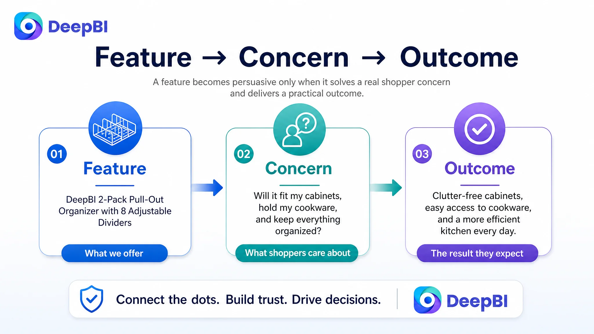
Feature → practical concern → expected use outcome
That structure is more useful than a sequence of disconnected specifications.
The A+ Content Was the Biggest Missed Opportunity for Persuasion
The existing A+ content included functional displays, structure details, usage scenes, color options, and installation guidance. The issue was not that the content lacked effort. It was that the modules did not follow the strongest customer decision order.
The recommended A+ logic began with the outcome.
Start with heavy cookware and cabinet disorder
The first module should establish that the organizer is intended to address a real storage problem: heavy pots, pans, lids, and bakeware occupying difficult-to-reach cabinet space.
“No drilling” can remain useful, but it should support the main promise rather than lead it.
Show real cabinet and drawer scenarios
The next module should help shoppers imagine the product inside their own storage environment. Showing cabinet and deep-drawer use addresses fit anxiety more effectively than introducing technical rail or snap details too early.
Explain adjustment as a path to compatibility
The adjustable dividers should be shown in action. The shopper needs to see how positions can change for different cookware sizes, including awkward or bulky items.
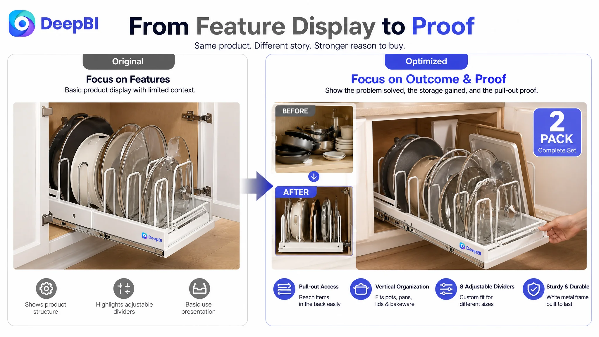
Use a clear before-and-after story
A cluttered cabinet compared with an organized cabinet creates a stronger emotional reason to act than another generic product image.
The “before” state should make the storage problem recognizable. The “after” state should show the product’s role in restoring visibility, access, and order.
Add a defensive trust section
A later module should address concerns about stability, construction, and smooth access. This is where the sturdy white metal frame and pull-out mechanism belong.
End with a complete-set confirmation
The final consolidation module should clearly show:
- Two organizer racks
- Eight adjustable dividers per rack
- The total storage role of the set
- Installation information as a final rational reassurance
This sequence transforms A+ from a product gallery into a structured argument.
Why DeepBI Did Not Recommend Tuning the Page Randomly
The diagnosis did not prioritize every weakness equally.
The main image was only slightly behind the comparable Listing. The title and bullet points needed restructuring, but their gaps were also moderate. The review dimension, however, was materially weaker and affected how every other claim would be received.
That meant the right path was not:
1. Make every image more attractive
2. Add every possible keyword
3. Expand every bullet point
4. Add more product variations
5. Move on to advertising
The better order was:
1. Clarify the offer and the core storage outcome.
2. Resolve quantity, fit, and usage questions earlier.
3. Rebuild the bullet and A+ narrative around customer friction.
4. Strengthen trust signals and address the review weakness through ongoing customer experience and review development.
5. Only then evaluate whether additional traffic should be scaled.
This is the business judgment at the center of the case.
More traffic would not remove uncertainty from a page that still left shoppers unsure about value, fit, and reliability.
Advertising Can Amplify a Page’s Existing Weaknesses
The case material does not provide post-optimization advertising metrics such as CTR, CVR, ACOS, or TACOS, so no numerical advertising result can be claimed.
The operating principle is still clear.
When Amazon ads send shoppers to a Listing, the product page inherits the responsibility of converting that visit. If the page does not establish the offer, solve the storage problem, and provide enough trust, paid traffic can expose the weakness faster without solving it.
That is why Listing optimization and Amazon ads optimization cannot be treated as separate decisions.
- Weak offer clarity can reduce the value of a click.
- Weak visual sequencing can delay product understanding.
- Weak bullet logic can leave objections unanswered.
- Weak A+ storytelling can limit final confidence.
- Weak review signals can make every other claim harder to believe.
The correct question is not only, “Can we buy more traffic?”
It is also, “Has the product page earned the right to receive more traffic?”

The Operating State Began to Change Before Any Result Was Claimed
Because the source material does not include confirmed post-optimization performance data, the case should not claim a specific CVR increase, ACOS reduction, or organic-order recovery.
The meaningful change was the change in decision quality.
The Listing moved from a collection of product descriptions toward a more deliberate conversion system:
- The 2-pack offer became easier to recognize.
- Product fit was addressed earlier.
- Pull-out access was connected to a real cabinet problem.
- Adjustable dividers were connected to cookware compatibility.
- The before-and-after outcome became more central.
- Installation moved behind the primary value argument.
- A+ content was organized around problem, solution, proof, and confirmation.
- The review gap was identified as a business trust issue rather than a cosmetic weakness.
This also reduced the risk of making random content changes. Each proposed revision had a defined role in the shopper’s decision path.
The Customer’s Understanding Had to Change
The most important outcome of the diagnosis was not a new title or a revised image order. It was a change in how the Amazon seller understood the problem.
The Listing was not underperforming because it lacked enough words or images.
It was underperforming because the page did not yet make the purchase decision easy enough.
The customer’s understanding shifted in several ways:
- Amazon ads cannot solve every product-page conversion problem.
- Listing quality directly affects the value of paid traffic.
- A feature becomes persuasive only when it answers a customer concern.
- A+ content should not repeat the image gallery; it should resolve deeper hesitation.
- Reviews are not a secondary reputation detail when the trust gap is this large.
- The product’s strongest story is not installation. It is restoring order and access to crowded kitchen storage.
- Before scaling traffic, the team must assess whether the page can convert both paid and organic visitors.
The final direction was not “make the Listing look better.” It was “make the Listing easier to believe.”
For Amazon sellers, that is the durable lesson from this kitchen organizer case. When a product page has traffic potential but weak conversion logic, the next breakthrough may not come from another campaign adjustment. It may come from identifying the trust and decision gap that the page has been asking advertising to cover.