


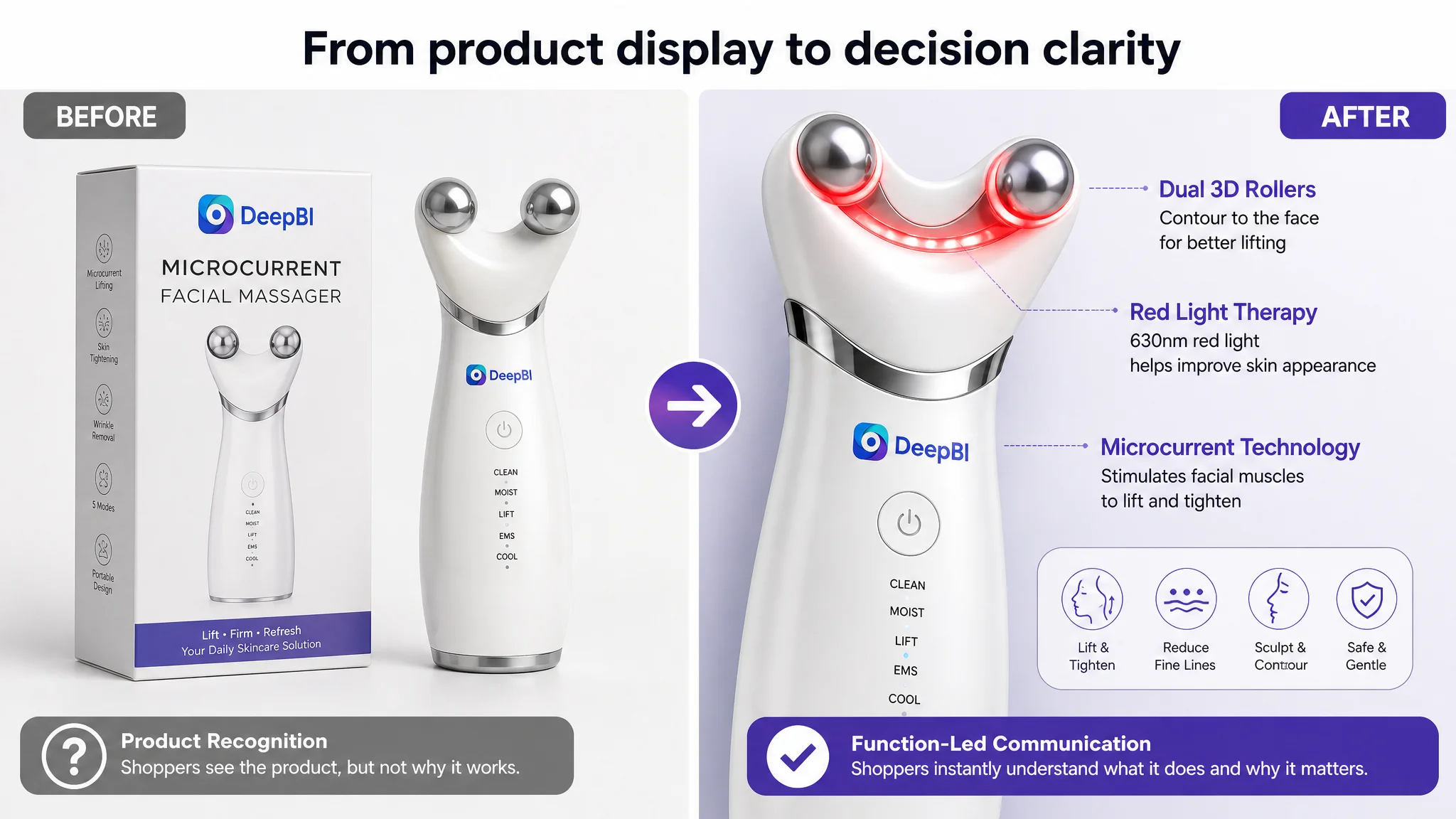
The customer was an Amazon US seller competing in the microcurrent facial device category. The Listing was not invisible: it had a complete title, five bullet points, product images, A+ content, and multiple before-and-after visuals. Yet the product page was not building enough confidence for shoppers considering an anti-aging and facial-lifting device.
The initial direction was to add more explanations, more usage details, and more visible results. The page had plenty of information, but its sales logic was still unclear. Technical principles appeared before the shopper understood the relevant benefit, while several broad comparison images created doubt rather than reassurance.
DeepBI ultimately identified the deeper problem as weak Listing conversion capacity. The title was functional but repetitive, the main image did not create a strong reason to click, the bullet points mixed technical information with benefits, and the A+ page delayed the most relevant proof. The review profile also created a significant trust gap.
The later optimization therefore focused on rebuilding the Amazon product page in decision order: attract attention first, connect the device to specific concerns such as the jawline and neck, explain operation clearly, manage user expectations, and use A+ content as structured reassurance. For other Amazon sellers, the case offers a practical warning: before pushing more traffic through Amazon ads, confirm that the Listing can explain, reassure, and convert that traffic.
The Amazon Listing Was Complete, but Not Competitive
At first glance, this microcurrent facial device Listing appeared to have all the expected components.
It included:
- A title built around “Microcurrent Face Device”
- Five bullet points covering technology, usage, portability, and gifting
- A set of product and lifestyle images
- A+ content with usage instructions and comparison visuals
- Before-and-after imagery
- A product positioned around facial lifting, tightening, wrinkle care, and daily skincare
The issue was not a missing module in the narrow sense. The issue was that the modules were not working together as a clear buying path.
DeepBI’s comparison showed a meaningful gap:
- Overall score: Customer Listing: 71/100, Comparable high-performing Listing: 85/100
- Title: Customer Listing: 14/20, Comparable high-performing Listing: 16/20
- Main image: Customer Listing: 24/30, Comparable high-performing Listing: 26/30
- Bullet points: Customer Listing: 6/10, Comparable high-performing Listing: 7/10
- Detail page: Customer Listing: 21/25, Comparable high-performing Listing: 23/25
- Reviews: Customer Listing: 6/15, Comparable high-performing Listing: 13/15
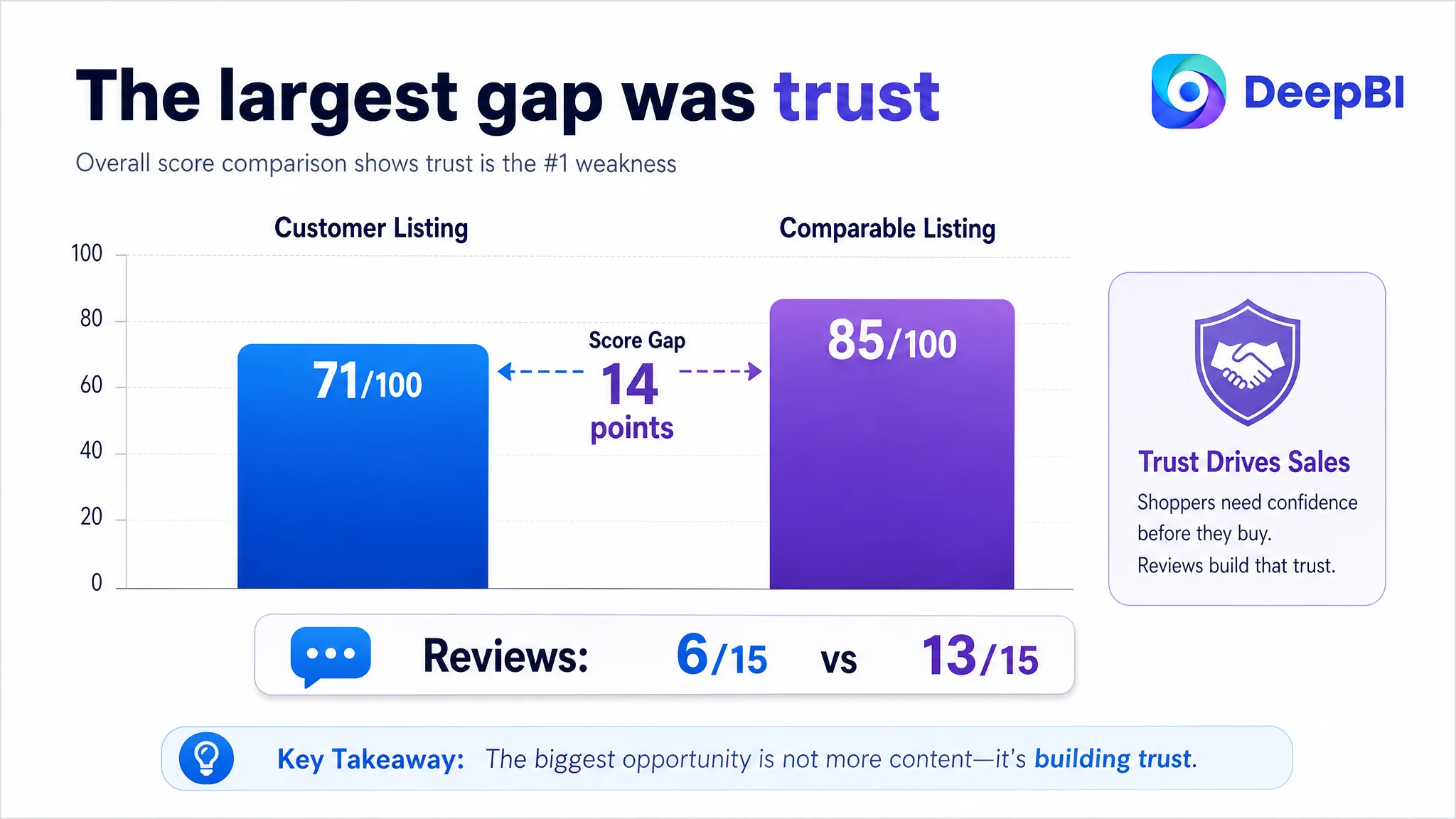
The largest gap was not in the title or image score. It was in reviews: 6 points versus 13, supported by a 3.6-star rating and 30 total reviews compared with 4.4 stars and 439 reviews for the comparable Listing.
That gap mattered because shoppers were not evaluating this product only as a beauty accessory. They were evaluating whether a relatively unfamiliar device could deliver a credible and comfortable experience.
The page did not merely need more content. It needed a more convincing order of decisions.
The Original Direction: Add More Information and More Results
The customer’s existing Amazon product page appeared to assume that additional explanation would increase confidence.
The Listing explained the microcurrent principle, described skincare combinations, showed multiple use cases, and included several full-face before-and-after comparisons. Some images also introduced acne or blemish-related outcomes, even though the product’s primary positioning was facial lifting, tightening, and anti-aging care.
This created two problems.
First, the page was trying to answer too many questions at once:
- What does microcurrent do?
- Can it support facial lifting?
- Can it help with wrinkles?
- Can it be used with skincare products?
- Can it address acne?
- Is it suitable for different skin types?
- How many modes does it have?
- How long does it take to use?
- Can it be used on different body areas?
Second, the information was not arranged according to shopper intent.
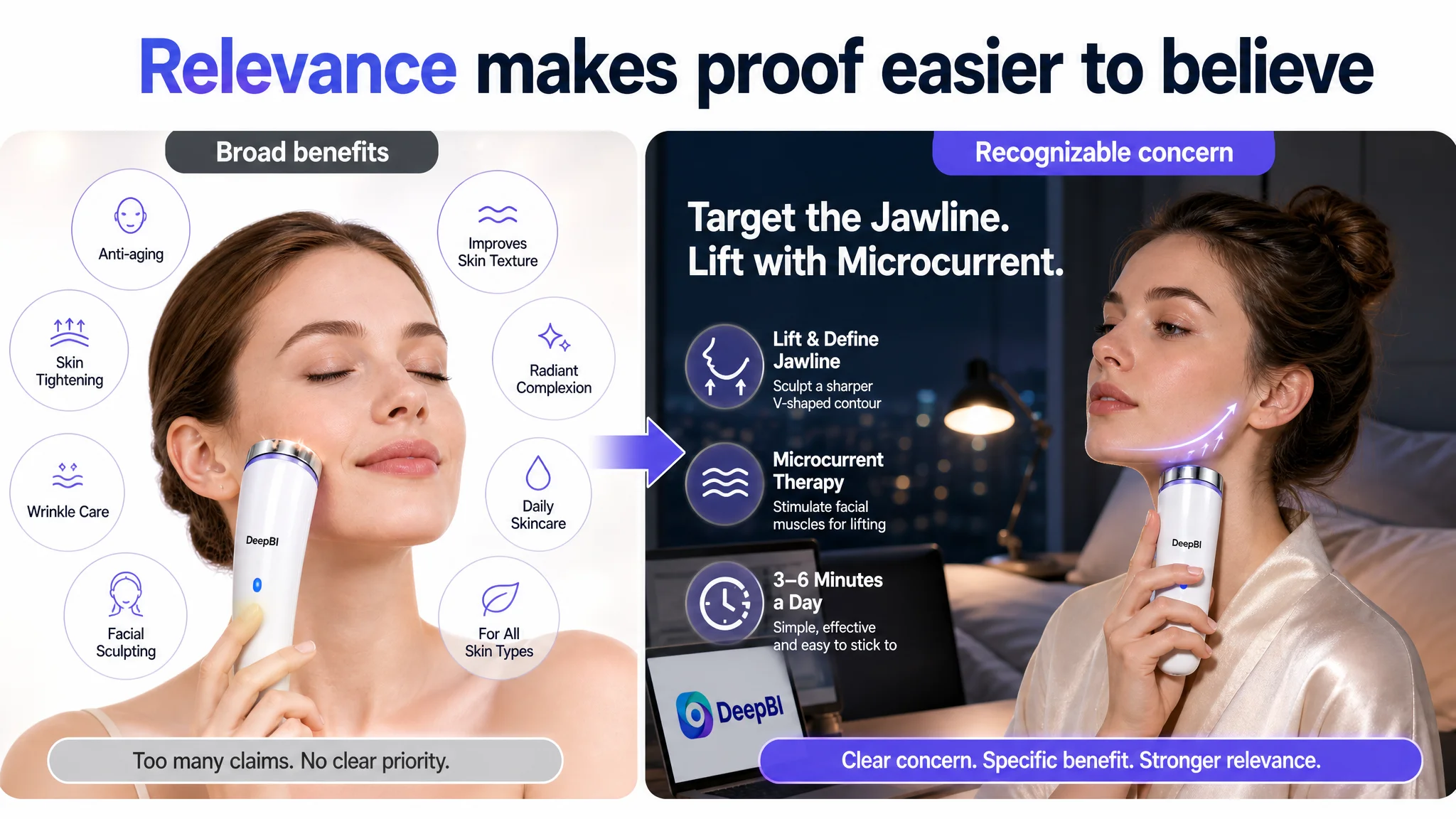
The page introduced technical explanations before clearly establishing why the device mattered. It presented general skin suitability where shoppers needed more specific relevance. It used broad comparison images where targeted concerns such as the jawline, cheeks, and neck would have been easier to understand.
The underlying misdiagnosis was therefore not simply “the images are not attractive enough.”
It was closer to this:
If the page shows more functions, more usage information, and more visible results, shoppers will naturally become more confident.
DeepBI’s diagnosis showed why that assumption was incomplete. More content does not automatically produce more trust. When the content is broad, repetitive, or poorly sequenced, it can make the shopper work harder to understand the product.
The Real Constraint Was Listing Conversion Capacity
DeepBI did not treat the 71-point score as a generic quality label. It used the difference between the customer Listing and the comparable high-performing Listing to identify where the product page was losing persuasive force.
The weaknesses were connected.
The title contained the keyword, but not a clear reason to choose
The title placed the core keyword “Microcurrent Face Device” early, which was useful for search relevance. But it then repeated similar wording through “USB Micro Current” and related phrases.
The result was a title that was technically descriptive but structurally loose.
It also relied on broad benefit language such as:
- Wrinkle removal
- Anti-aging
- Face lifting
- Facial sculpting
These phrases described the category, but they did not create a distinct reason to investigate this particular device. The comparable Listing introduced its technology more prominently and used a clearer structure around technology, function, and product identity.
The customer title also contained:
- Repeated keyword phrasing
- Non-core information such as “Mini” and the color
- An awkward spelling and hyphenation issue
- No strong model or product identity cue
DeepBI’s recommended direction was not to copy the competing title or add unsupported technical claims. It was to simplify the search structure and make the intended outcome easier to understand:
Microcurrent Face Device, USB Facial Shaping Tool for Skin Tightening and Lifting, Portable Microcurrent Facial Sculpting Device for Wrinkle Removal and Anti-Aging (White)
The logic was straightforward:
1. Keep the main search term visible.
2. Remove redundant keyword repetition.
3. Connect the product form to the key use case.
4. Prioritize lifting and tightening over a scattered list of benefits.
5. Replace vague or promotional wording with clearer, more durable language.
The title was not the largest problem, but it reflected the broader issue: the Listing was naming many functions without establishing a strong hierarchy.
The main image showed the product, but did not create a click trigger
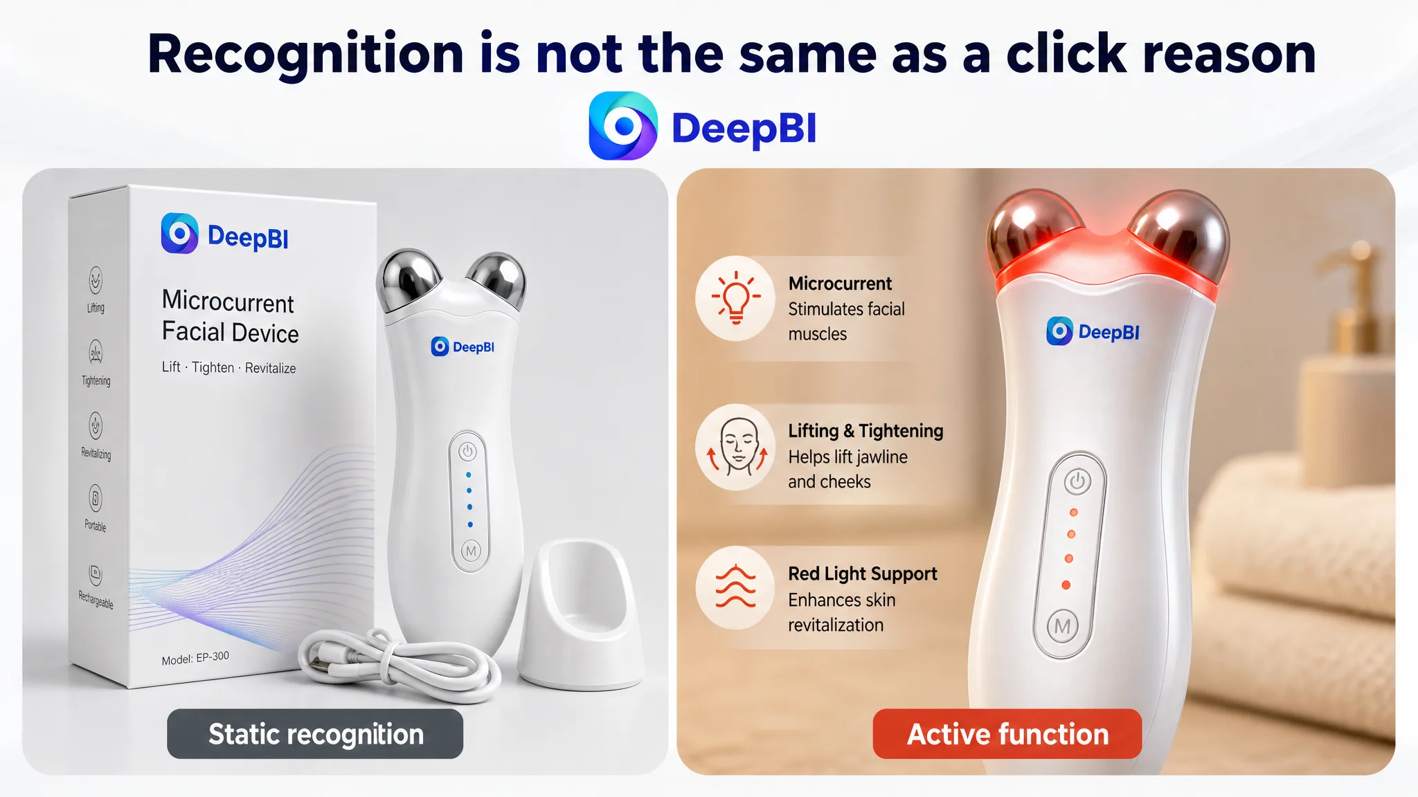
The existing main-image direction leaned toward a static, aesthetic presentation. Packaging competed with the product itself, and the device was not shown in an immediately active or function-oriented state.
In a crowded Amazon beauty category, product recognition alone is not enough. The first image must help the shopper understand why this device deserves attention.
The comparable Listing created stronger visual impact through:
- A more direct product presentation
- A visible active state
- Stronger technical visual cues
- More concentrated product focus
- A clearer sense of premium finish
DeepBI’s recommendation was to simplify rather than decorate:
- Remove the packaging from the main product presentation.
- Show the two rollers clearly.
- Use a close-up angle that emphasizes the device’s physical form.
- Show an active visual state, such as the red light, only if that state is genuinely supported by the product.
- Preserve the actual product structure and appearance.
- Move more complex technical explanation into later images.
The important change was not “make the image more beautiful.”
It was to make the image communicate one immediate idea:
This is a working microcurrent facial device designed for lifting and tightening care.
The main image was not only a visual asset. It was the first decision point in the Amazon conversion path.
The bullet points had information, but not a buying logic
The five bullet points covered many valid areas, including technology, daily skincare, adjustable modes, portability, and gifting.
The problem was their sequence.
The copy mixed:
- Technical principles
- Facial lifting
- Skincare absorption
- Usage frequency
- Product portability
- Customer reassurance
- Gifting
A shopper had to assemble the value proposition independently.
The recommended structure gave each bullet a clearer role:
Technology first, with a defined purpose
The first bullet should connect microcurrent technology with the intended facial-care use instead of presenting technical language and benefits as separate fragments.
Core concern second
The second bullet should address facial contouring and the jawline or neck, where the customer’s target concern becomes more concrete.
Daily routine third
The third bullet should explain how the device fits into a skincare routine, including the suggested short massage duration and use with compatible skincare products where appropriate.
Expectation management fourth
The fourth bullet should explain the five adjustable intensity levels and help first-time users understand that a slight tingling sensation may occur during use, while directing them to start at the lowest level and follow the product instructions.
Portability and gifting last
The final bullet should close with the practical use case: compact design, travel convenience, and gifting.
This is more than a copywriting adjustment. It changes the progression from:
What the device contains → what the device claims → where else it can be used
to:
What concern it addresses → how it works → how to use it → what to expect → why it fits daily life
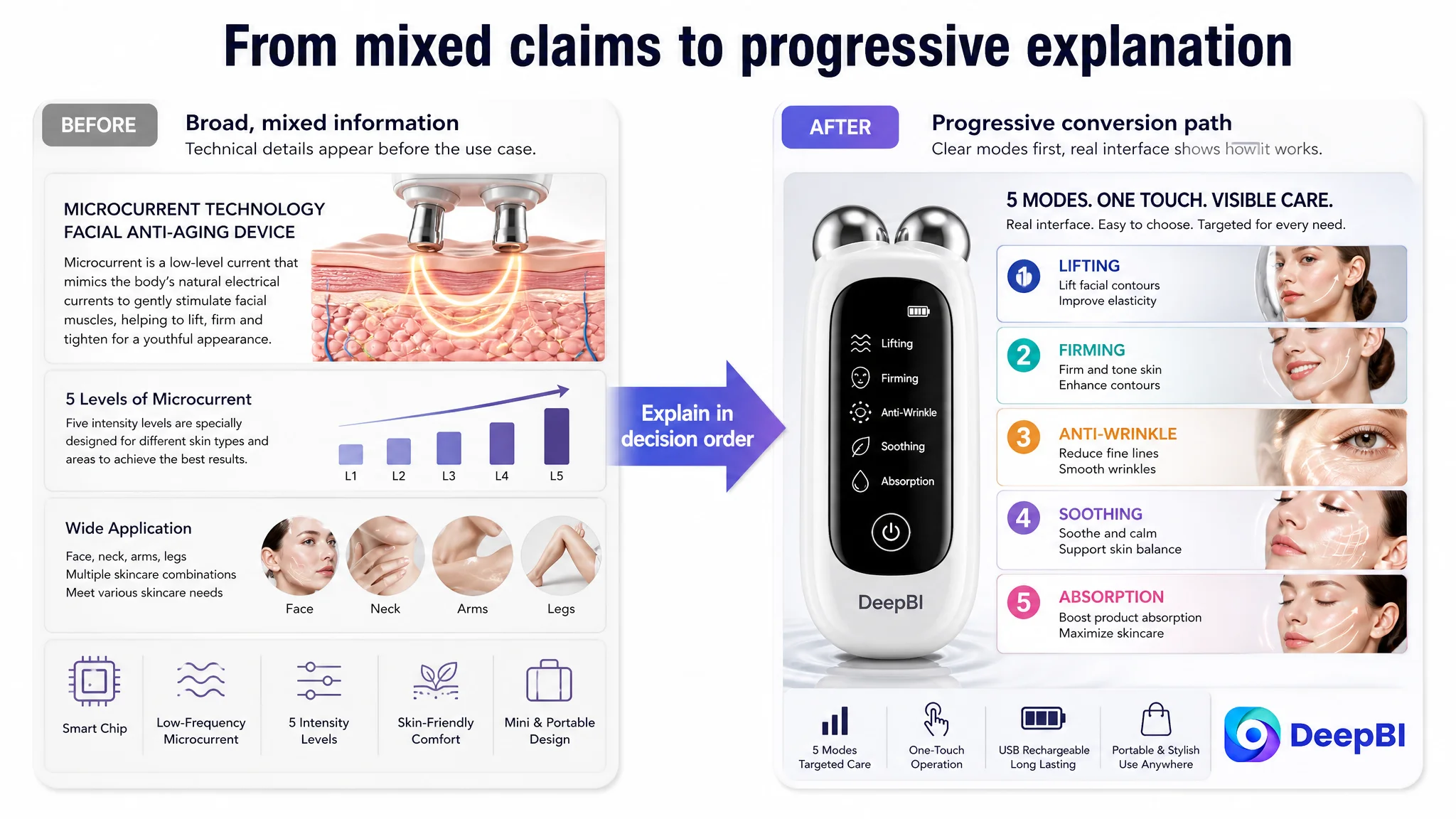
The Product Page Was Showing Results Before Establishing Relevance
The A+ content exposed the clearest structural problem.
The customer’s page included:
- A leading visual selling-point module
- Skin-type suitability content
- Three sets of before-and-after comparisons
- Usage steps
- Multi-area application
- Product and gifting scenes
The comparable Listing used a different persuasion sequence:
- Product introduction
- A focused result comparison
- A stronger visual selling-point section
- Specific area-based visuals for the eyes, face, and jawline
- Function details
- Product and gifting content
The difference was not simply the number of images. It was the order in which uncertainty was reduced.
A shopper considering a microcurrent facial device usually needs to answer several questions:
1. Is this product relevant to my concern?
2. What area can I use it on?
3. Does the operating method seem understandable?
4. What should I expect during use?
5. Can it fit into my routine?
6. Does the product appear credible enough to purchase?
The customer’s A+ page often addressed later questions before the first two had been resolved.
The first module needed to establish the product’s role
The opening A+ module focused too much on usage time and general explanation.
That is a weak entry point. Time commitment matters, but only after the shopper understands whether the product is relevant.
The recommended first module was repositioned around:
- Product design
- Microcurrent technology
- Five adjustable modes
- Compact and portable form
- General suitability for facial and neck care
The purpose was to give the product a clear role before introducing operational details.
Specific areas needed to appear earlier
The page’s general skin-type content did not provide the same relevance as targeted visuals of:
- The jawline
- The cheeks
- The neck
- The eye area, where safe and appropriate to show
The customer’s existing before-and-after imagery covered different ages and genders, but did not consistently identify the specific area being addressed. That weakened the shopper’s ability to connect the image with a personal concern.
DeepBI recommended moving area-specific reassurance into the second major module and replacing broad, difficult-to-interpret comparisons with more focused visual communication.
This was a critical shift:
Show the shopper where the product fits before asking the shopper to believe a broad result.
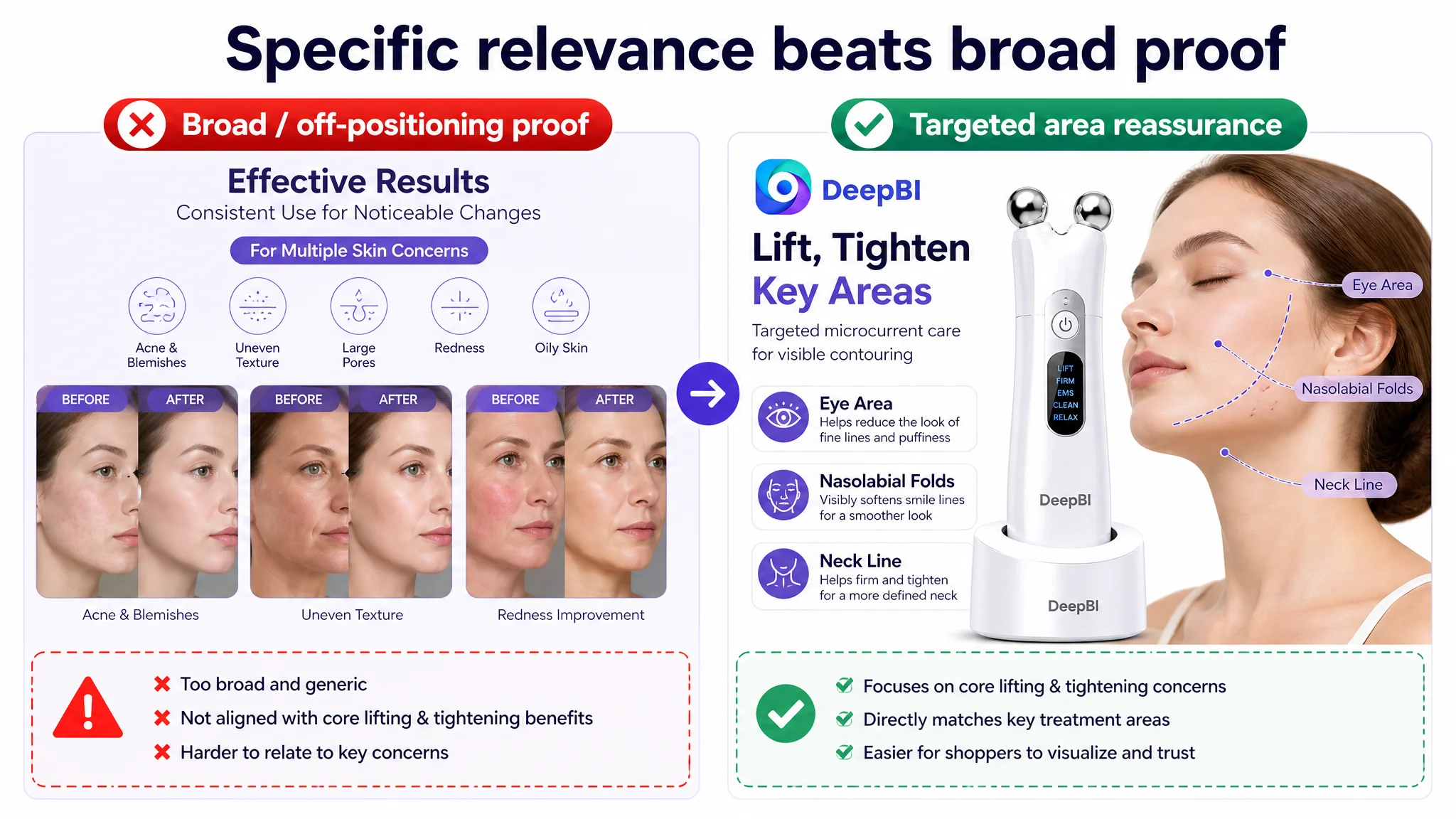
Broad acne imagery weakened the product’s positioning
Several A+ modules emphasized acne or blemish-related comparisons. That created a mismatch with the product’s central positioning as a microcurrent facial device for lifting, tightening, contour care, and anti-aging routines.
The issue was not only credibility. It was expectation management.
If an image suggests an outcome that is not clearly supported by the product’s stated mechanism, shoppers may:
- Misunderstand the product’s purpose
- Expect an outcome the device is not designed to provide
- Question the authenticity of other claims
- Experience disappointment after purchase
DeepBI’s recommendation was to remove or de-emphasize off-positioning acne comparisons and focus the page on the concerns the product can more clearly communicate:
- Facial lifting and tightening
- Jawline and cheek contour care
- Neck massage and care
- Fine-line and skin-texture positioning where compliant and supportable
- Integration with a daily skincare routine
Usage instructions should reduce friction, not lead the story
The customer’s operation module contained several details, including preparation and cleaning guidance. Those instructions may be useful in a manual, but they were too prominent in the A+ persuasion path.
The product page needed a simpler operating message:
- Apply the appropriate conductive skincare product if required.
- Glide the device over the face while avoiding the eye area.
- Select one of the five intensity modes.
- Use it consistently according to the product instructions.
The goal was not to remove responsible guidance. It was to prevent operational detail from interrupting the shopper’s understanding of the product’s value.
Why DeepBI Did Not Recommend “More Ads First”
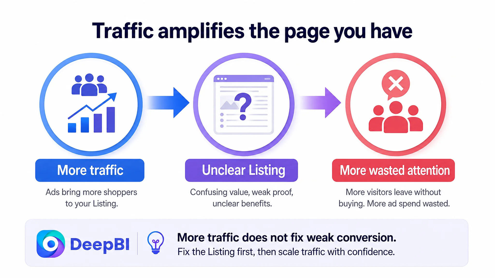
The case material does not include a post-optimization advertising dataset, so it would be inaccurate to claim a specific ACOS decline, CVR increase, or organic-order recovery.
But the Listing diagnosis still established the correct decision order.
When a product page has a 14-point gap against a comparable Listing, a review disadvantage of 0.8 stars, and clear weaknesses across the title, main image, bullet points, and A+ content, increasing traffic before repairing the page creates a business risk.
Paid traffic would be arriving on a page where:
- The first image did not strongly communicate the product’s active value.
- The title used repeated and broad language.
- The bullet points did not build a clear concern-to-solution path.
- The A+ page delayed specific reassurance.
- Some comparison visuals could create the wrong expectation.
- The review profile offered less trust than the competing Listing.
Advertising can bring shoppers to a product page. It cannot make an unclear page become clear.
Ads do not only amplify strengths. They can also amplify a Listing’s existing conversion defects.
That is why the priority was not to keep changing bids, expanding keywords, or adding traffic before the page was ready. The first step was to improve the page’s ability to convert both paid and organic visitors.
The Optimization Path Followed the Shopper’s Decision Order
The recommended changes formed one connected system rather than a collection of isolated edits.
1. Clarify the title’s hierarchy
The title should lead with the core keyword, then connect the device with facial shaping, lifting, tightening, and portability.
It should remove repeated phrases, correct spelling issues, reduce non-core information, and avoid unsupported or overly promotional technical claims.
2. Make the main image product-led and function-aware
The first image should:
- Focus on the device rather than the packaging.
- Show the rollers and physical form clearly.
- Use an active state only when visually and factually supported.
- Avoid adding unverified specifications.
- Reserve complex explanations for later images.
3. Introduce a concrete user concern
A later image can use a relevant scenario, such as a late-work or tired-day context, to connect the product with the shopper’s facial-lifting concern.
The purpose is not to dramatize the problem. It is to make the use case recognizable.
4. Explain the five modes progressively
Instead of combining vague benefit bubbles with technical statements, the page should show the five intensity modes in a simple, readable structure.
The shopper should be able to understand:
- There are multiple intensity levels.
- The modes are designed for different comfort preferences and routines.
- The device can be incorporated into daily skincare use.
5. Replace broad proof with targeted reassurance
Rather than relying heavily on full-face before-and-after imagery, the page should focus on clearly identified areas such as:
- Jawline
- Cheeks
- Neck
- Other areas that are genuinely appropriate for the product
This makes the visual claim more specific and easier to evaluate.
6. Move the technical principle later
The microcurrent principle still has a role. It can support trust after the shopper understands the product’s intended use.
The page should first answer why this matters, then explain how the device supports the routine.
7. Close with portability and gifting
Portability and gifting are useful conversion supports, but they should not carry the opening argument.
They work better after the page has already established:
- Product relevance
- Core use cases
- Operating simplicity
- Expected experience
The Review Gap Could Not Be Designed Away
The review dimension was the most difficult gap in the comparison.
The customer Listing had:
- A 3.6-star rating
- 30 total reviews
- Eight reviews visible on the first page
- Two one- or two-star reviews among those visible
The comparable Listing had:
- A 4.4-star rating
- 439 total reviews
- Fourteen reviews visible on the first page
- More five-star feedback describing specific experiences and recommendations
This difference affected the entire page because shoppers interpret content through the level of trust already established by other customers.
A polished image may attract attention, but it cannot fully compensate for a low rating and a small review base. A technical explanation may sound credible, but it cannot replace consistent customer validation.
That does not mean the Listing should respond with exaggerated claims or artificial review language. It means the team needed to distinguish between two types of work:
- Content issues that can be repaired now, such as title structure, image logic, bullet sequence, and A+ organization.
- Trust assets that must be improved through the broader customer and product experience, including product quality, expectation management, instructions, support, and compliant review development.
The bullet-point recommendation to explain that a slight tingling sensation may be normal for first-time users was part of this wider expectation-management logic. Clear instructions can reduce avoidable anxiety, misuse, and dissatisfaction, but they cannot replace the need for a reliable product experience.
What Changed in the Business Judgment
The most important outcome of this case was not a single rewritten title or a redesigned image.
It was the change in the team’s understanding of the problem.
The page had initially treated content as a collection of claims:
- Microcurrent technology
- Red light
- Facial lifting
- Wrinkle care
- Skincare absorption
- Five modes
- Portability
- Gifting
- Multiple before-and-after examples
DeepBI reframed the page as a sequence of decisions:
1. Capture attention with a clear product presentation.
2. Connect the device to a recognizable facial-care concern.
3. Show where and how it can be used.
4. Explain the operating experience.
5. Set reasonable expectations.
6. Support the decision with focused A+ content and credible trust signals.
That reframing changed what should be prioritized.
The team did not need to keep adding claims. It needed to reduce ambiguity.
The main image needed to answer why the product deserved a click. The title needed to answer what the product was for. The bullet points needed to answer how the product fit the shopper’s routine. The A+ content needed to answer whether the product felt relevant, understandable, and credible.
The Broader Lesson for Amazon Sellers
This microcurrent facial device case illustrates a common Amazon Listing problem: a page can be full of content while still lacking conversion logic.
A high volume of images does not guarantee a high-converting product page. More before-and-after comparisons do not automatically create trust. Technical detail does not help if it arrives before the shopper understands the benefit. Advertising does not solve every product-page problem.
For Amazon sellers, the practical sequence is:
- Compare the Listing against a genuinely relevant market benchmark.
- Separate the review gap from the content gap.
- Identify whether the main image creates a clear click reason.
- Check whether the title communicates one primary value path.
- Review whether the bullet points move from concern to solution.
- Make A+ content answer specific questions in a logical order.
- Remove claims or visuals that introduce unsupported expectations.
- Repair the page before scaling traffic into it.
The case did not support inventing post-optimization revenue or advertising results. But it did support a clear operating conclusion:
Before asking Amazon ads to deliver more traffic, ask whether the product page has earned the right to receive it.
For this Listing, the next stage was not about producing more content. It was about making every visible element contribute to the same sales logic: a credible, understandable, and focused path from search result to purchase decision.