

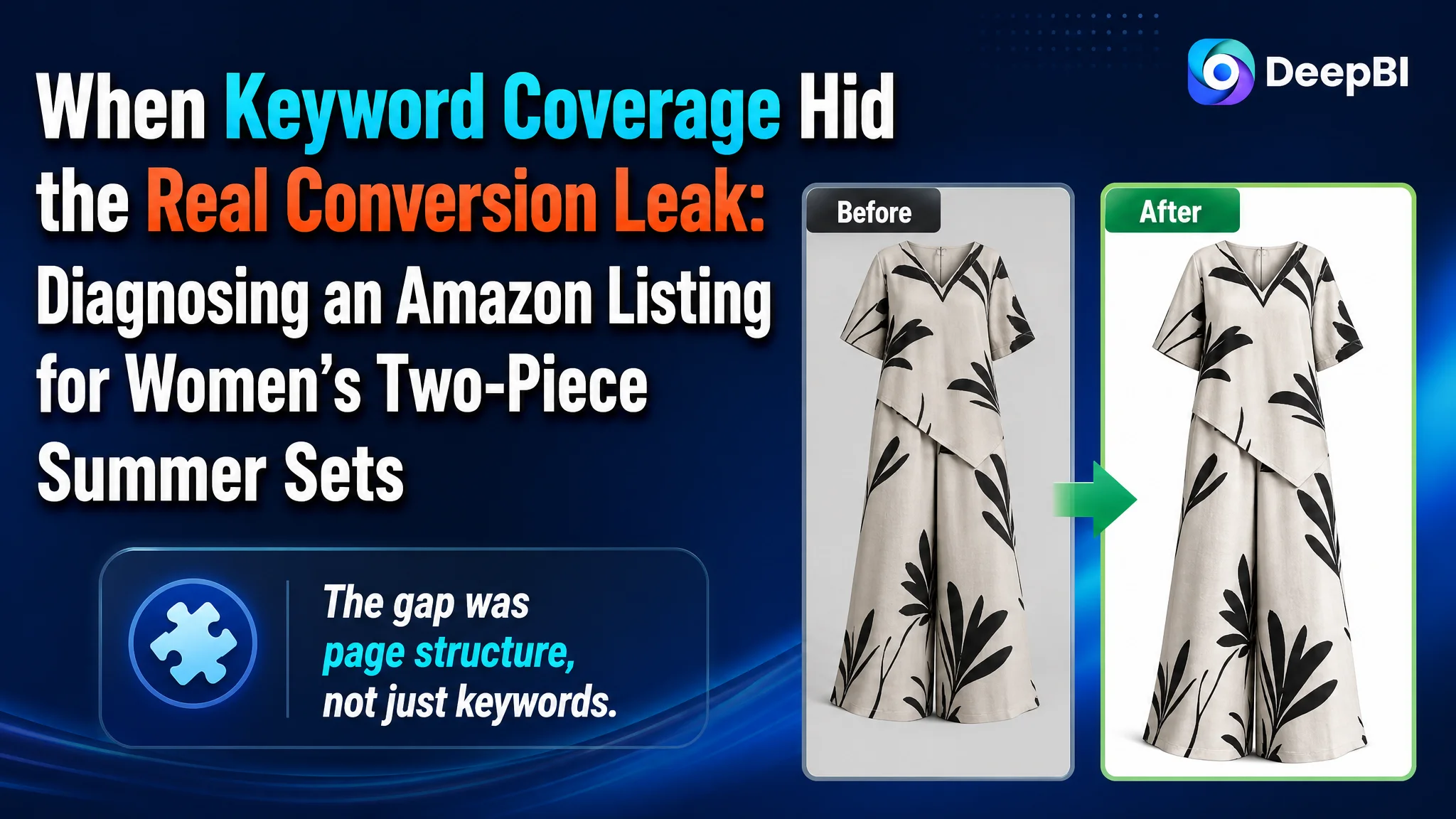
An Amazon seller of women’s two-piece summer sets was facing a product-page problem that looked, at first, like a matter of keyword coverage and basic product information. The title contained the wrong opening phrase, the bullet points described fabric and design features, and the image set showed the outfit from several angles. Yet the Listing still lacked the elements that help shoppers decide whether the set fits their lifestyle, body, and expectations.
The initial direction was to repair the wording, add more product details, and display the available patterns more clearly. DeepBI’s diagnosis showed that these changes alone would not address the main constraint. The Listing was not short of information; it was short of persuasive structure. A 39/100 score against 85/100 for a comparable high-performing Amazon Listing revealed that the largest gap was not the title or even the main image. It was the missing conversion logic across the detail page, supported by a complete lack of review-based trust.
The later optimization therefore focused on rebuilding the Amazon product page as a decision path: establish the summer context immediately, show the fit and comfort of the set, explain how it can be worn, provide clear sizing evidence, and use A+ content to close the trust gap. Other Amazon sellers can learn from this case that advertising and search visibility can bring shoppers to a Listing, but the page still has to give them a reason to believe, imagine, and buy.
The Amazon Listing Had Product Information, but Not Enough Buying Logic
The product itself was not difficult to describe. It was a sleeveless two-piece set with wide-leg pants, a novelty print, a V-neck top, an asymmetrical hem, and a size range from S to 5XL.
The problem was how those elements were arranged across the Amazon Listing.
The original title began with an unrelated phrase, “Chef Hat Cooking Tools,” before reaching the actual apparel terms. The core phrase “Two Piece Set” was not placed early enough, and the title provided little context about when or why a shopper might wear the product.
The five bullet points mainly listed:
- Fabric characteristics
- Neckline and garment details
- Pants details
- Size information
- General use occasions
That structure was technically informative, but it did not create a strong sequence from interest to confidence. It did not clearly answer the questions that often determine conversion for apparel:
- How will the set look when worn?
- Does the cut feel relaxed or restrictive?
- Can it work beyond one novelty occasion?
- How can the buyer style it?
- Will the fit be predictable?
- Does the fabric support everyday summer wear?
The Listing was describing the product as an object instead of presenting it as a solution to a shopper’s decision problem.
The Original Diagnosis Focused on Coverage and Completeness
The customer’s working assumption was understandable. The Listing appeared to need more keywords, clearer product attributes, and more visible information.
The title needed to be corrected. The bullet points needed stronger wording. The images needed to show the top and pants more clearly. The product page needed more content.
Those observations were not wrong, but they were incomplete.
They treated the problem as a collection of isolated content defects:
- A keyword was misplaced
- A feature was not emphasized
- An image was too repetitive
- A sizing table needed improvement
- The available patterns needed more exposure
That approach can produce a cleaner Listing without necessarily producing a more convincing one. It also risks encouraging the team to keep adjusting individual elements while missing the larger question:
What does the shopper need to understand before this product feels safe to buy?
For an Amazon apparel Listing, the answer is rarely just the material composition or the number of available prints. Buyers are also judging fit, comfort, versatility, visual appeal, and the credibility of the product presentation.
The original page did not connect those questions into a coherent path.
The Score Gap Located the Constraint
DeepBI’s comparison did not treat every weakness as equally important. It quantified where the Listing was losing commercial strength against a comparable category benchmark.
- Title: Target Listing: 13, Comparable Listing: 16, Maximum: 20
- Main image: Target Listing: 19, Comparable Listing: 25, Maximum: 30
- Bullet points: Target Listing: 5, Comparable Listing: 8, Maximum: 10
- Detail page: Target Listing: 2, Comparable Listing: 23, Maximum: 25
- Reviews: Target Listing: 0, Comparable Listing: 13, Maximum: 15
- Total: Target Listing: 39, Comparable Listing: 85, Maximum: 100
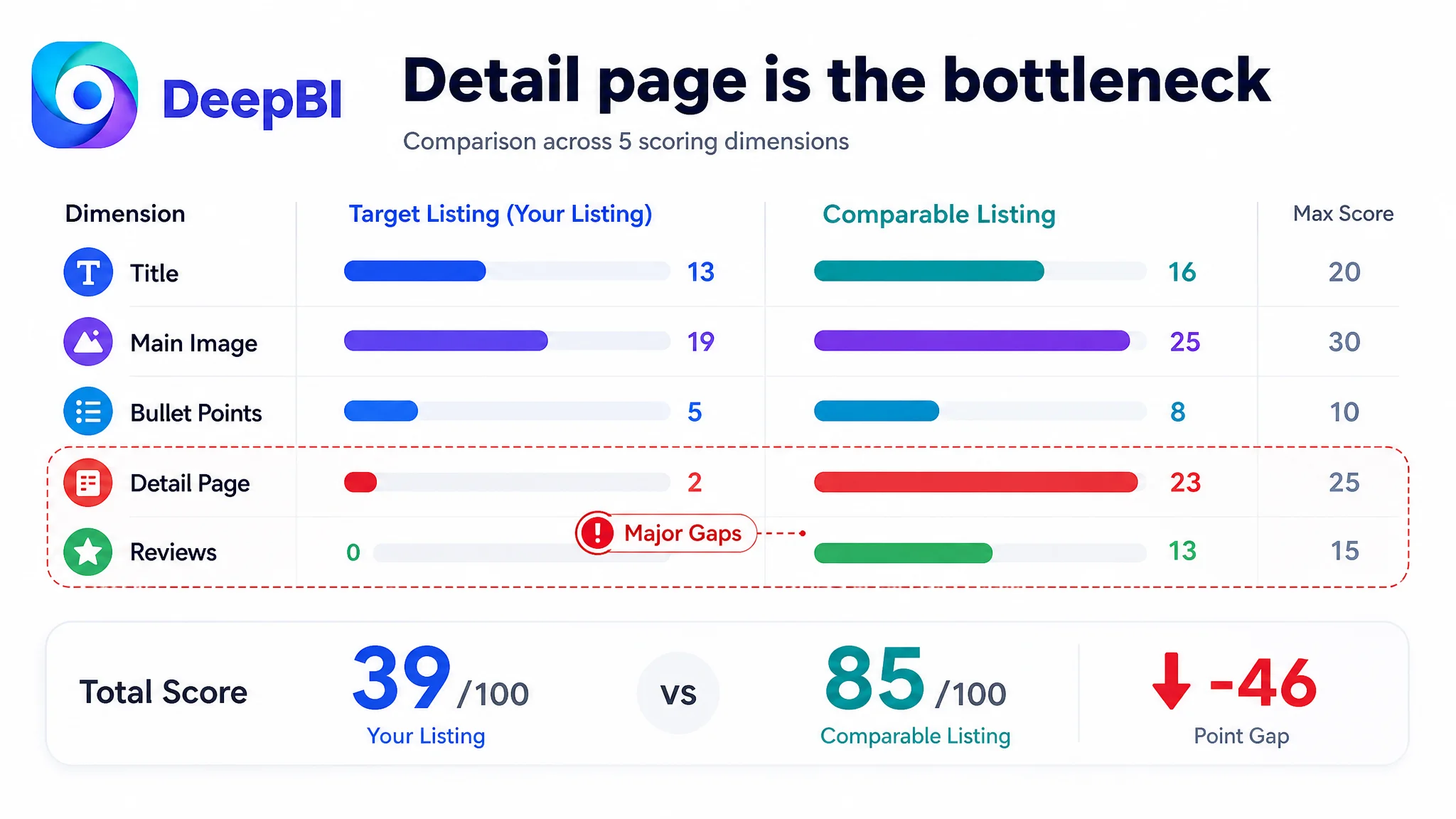
The most important signal was the detail-page gap: 2 points versus 23.
The title gap was real, but relatively limited. The main-image gap mattered for click appeal and initial trust, but it was not the largest weakness. The five-point gap showed that the copy needed a stronger selling structure, yet the detail page remained the clearest bottleneck.
This changed the order of operations.
Instead of treating the Listing as a title problem with supporting image issues, DeepBI reframed it as a product-page conversion capacity problem. The page needed to do more than identify the garment. It needed to make the garment understandable, desirable, and less risky.
The Detail Page Was Consuming the Value of the Traffic
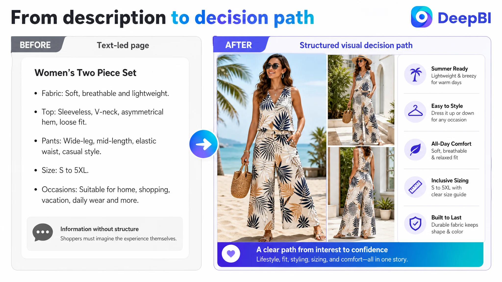
The Amazon product page used a largely text-based presentation without a meaningful visual A+ structure. A shopper could read about the product, but could not easily see a complete story about how the set looked, fit, felt, or worked across different occasions.
The comparable Listing used a more developed sequence:
1. A lifestyle scene to establish the use context
2. Product and fit details
3. Styling and versatility guidance
4. Size information
5. Fabric and comfort reassurance
That sequence matters because shoppers do not process every detail at the same moment.
They first need a reason to continue looking. Then they need to understand the product’s design. After that, they need reassurance about comfort, fit, and use. Finally, they need enough rational information to complete the purchase.
The target Listing placed too much weight on static description and repeated product views. It did not provide enough visual evidence at the moments when uncertainty was highest.
“The largest gap was not the absence of another product description. It was the absence of a persuasive page structure.”
If Amazon ads or organic search bring a shopper to this kind of page, additional traffic does not automatically solve the problem. It may simply expose more shoppers to the same unanswered questions.
The Main Image Needed to Establish Style, Not Just Product Type
The existing image set did identify the basic product: a sleeveless top and wide-leg cropped pants with a novelty print. But several images repeated similar information without helping the shopper make a new judgment.
The first image should have functioned as the definitive style reference. It needed to communicate the complete silhouette immediately and make the asymmetrical hem and mid-length pants easy to recognize.
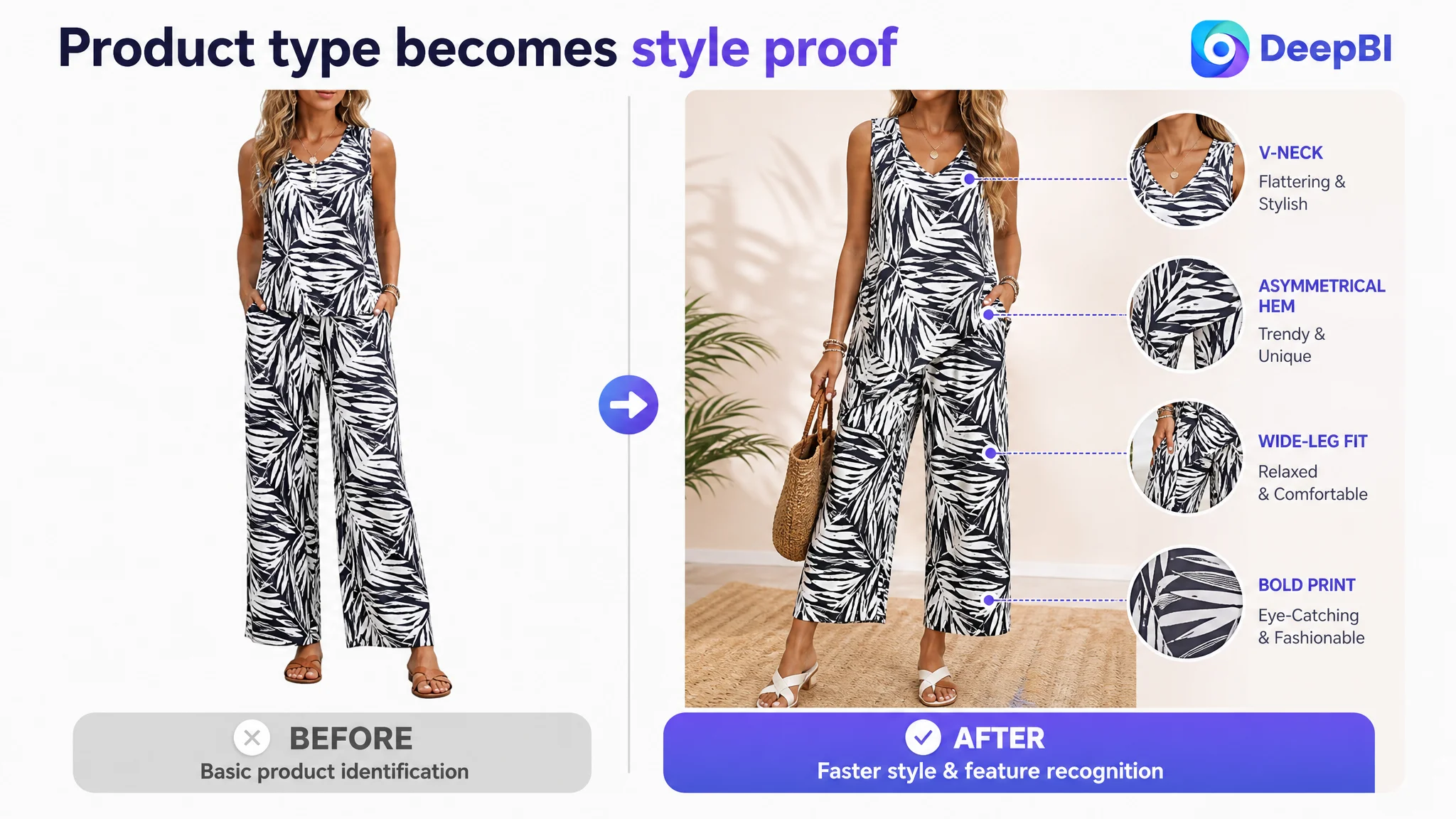
The later images should then have answered different questions rather than repeating the print.
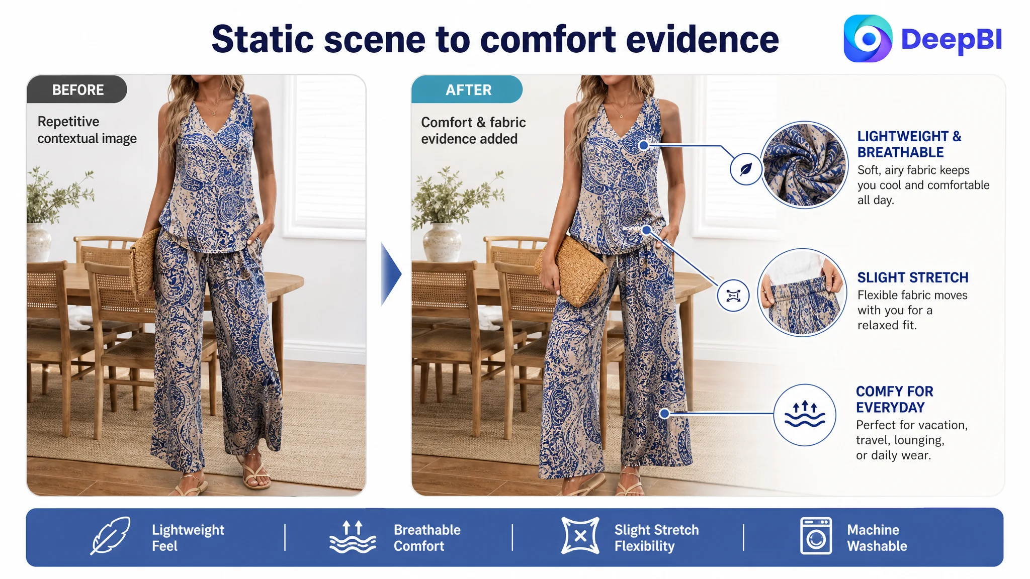
The second image needed to address comfort
A static product presentation did little to communicate lightweight fabric, breathability, or slight stretch. These properties were confirmed in the source material, so the visual direction could show soft drape or a natural movement pose without inventing a performance claim.
The purpose was not to make the fabric look more luxurious than it was. It was to help the shopper visualize how the set might feel in ordinary summer use.
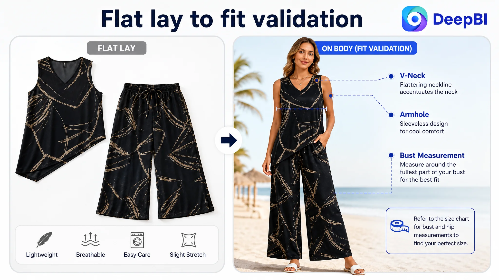
The third image needed to validate the top’s fit
A flat lay of the top provided limited decision value. A model or bust-form presentation could show the neckline, armholes, and upper-body fit more clearly.
This is especially important because the Listing’s text referred to a V-neck, while the existing images did not communicate that feature consistently. Any revised image would need to remain faithful to the actual product rather than create a more attractive but inaccurate version.
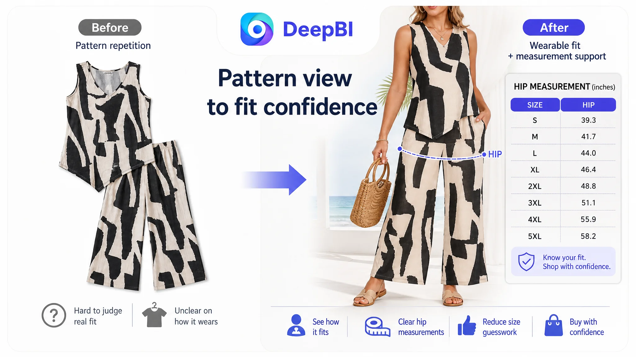
The fourth image needed to reduce uncertainty about the pants
Showing the pants as an isolated flat lay emphasized the pattern but did not establish how the wide-leg, mid-length cut would sit on the body.
A focused waist-down view could make the fit easier to judge using only confirmed attributes. It should not imply a drawstring or other construction detail that was not verified.
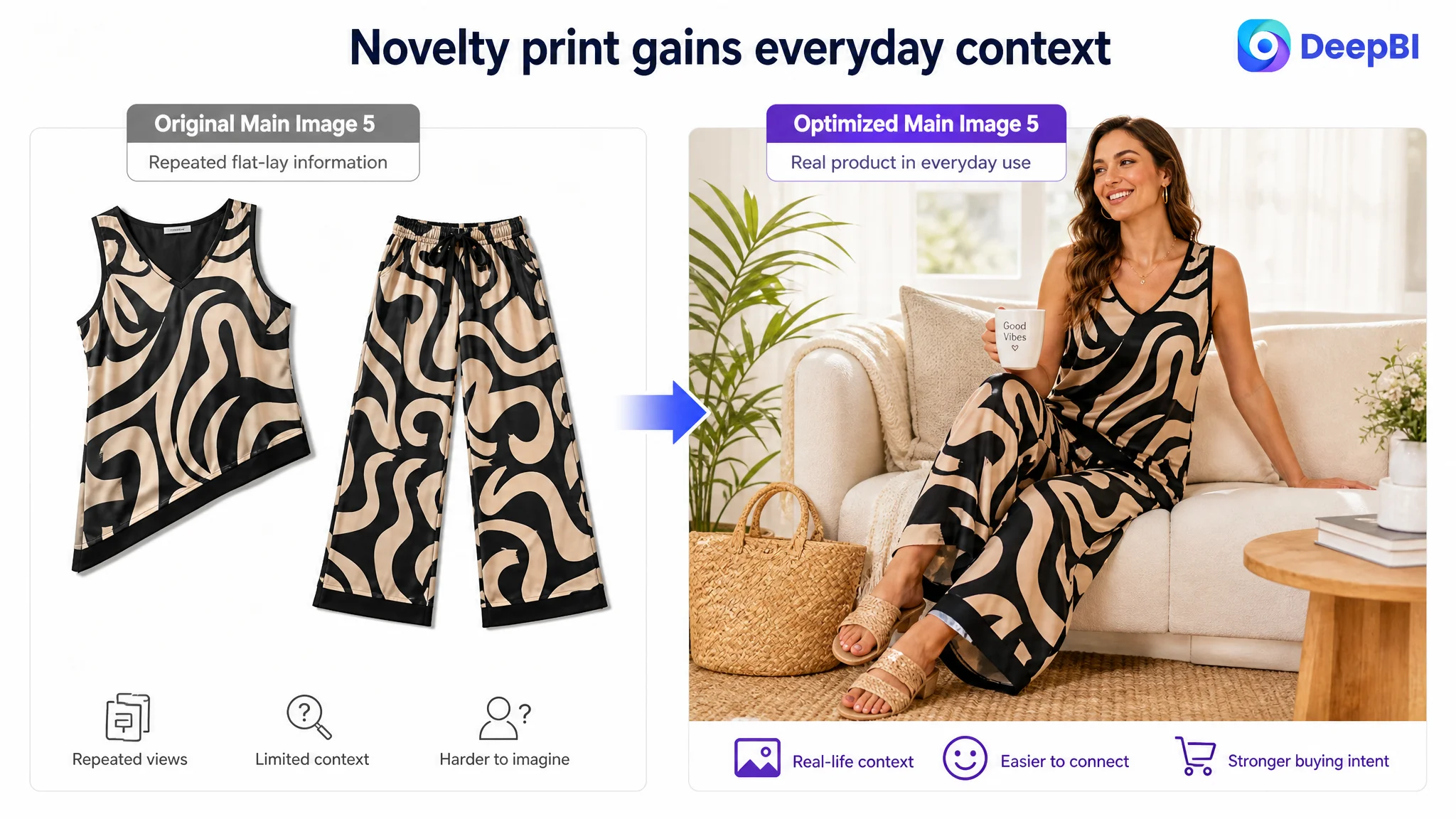
The fifth image needed to demonstrate everyday versatility
The existing layout repeated information already visible elsewhere. A more useful image would connect the novelty print with permitted everyday contexts such as relaxing at home, shopping, or casual summer wear.
That distinction was commercially important. Without it, the print could make the product feel limited to a themed setting. With it, the page could show that the set has a wider role in a summer wardrobe.
The Title Needed Relevance Before Expansion
The suggested title moved the product category to the front:
“Women’s Two Piece Tank Top Wide Leg Pants Outfits Summer Matching Set Sleeveless 2 Piece Outfits for Women Vacation Travel Beach Casual Wear”
The key improvement was not simply adding more search terms. It was removing unrelated noise and making the product’s actual identity clear at the beginning.
The title optimization followed three priorities:
- Replace the unrelated opening phrase with relevant apparel terms
- Put the two-piece set and tank-top/wide-leg-pants structure earlier
- Add supported contexts such as summer, vacation, travel, and beach casual wear
This gave the title a more usable relationship between search relevance and shopper understanding.
A title can help secure visibility, but it cannot compensate for a page that fails to answer the shopper’s practical questions. In this case, title repair was necessary, but it was not the first business constraint to solve.
The Bullet Points Needed to Move From Features to Outcomes
The original bullet points had useful raw material, but the logic remained close to a specification sheet.
The revised direction gave each point a clearer commercial role.
Material should explain the wearing experience
Instead of stopping at polyester composition, the first bullet could connect lightweight fabric, breathability, slight stretch, and machine-wash durability to all-day summer comfort and repeat use.
The claim must remain within confirmed product information. The goal is not to exaggerate performance, but to make the existing attributes meaningful.
Design should explain the visual benefit
The V-neck and asymmetrical hem should be presented as part of the garment’s silhouette and style identity, not merely listed as construction details.
The shopper should understand what makes the set different from a basic matching outfit.
The pants should solve an occasion problem
The wide-leg cut and mid-length style could be connected to relaxed movement and warm-weather wear across home, errands, and beach walks.
That is more useful than listing occasions without explaining why the garment suits them.
Styling guidance should reduce decision friction
The comparable Listing gave shoppers practical ideas involving sneakers, sandals, jewelry, bags, and light layering. The target Listing did not provide similar guidance.
Styling content helps answer a quiet but important concern: “If I buy this set, will I know how to wear it?”
It also helps the shopper imagine more than one use case without requiring the page to claim that the product is suitable for every situation.
Size information should become a confidence mechanism
The S-to-5XL range was a meaningful selling point, but it required clear measurement support. The proposed direction used bust measurements for the top and hip measurements for the pants rather than relying only on generic size labels.
For apparel, sizing is not a final administrative detail. It is a conversion and returns-risk issue. The page needed to make the fit decision more concrete.
The A+ Page Had to Repair the Trust Sequence
The detail-page recommendation was not to imitate the comparable Listing’s exact style. It was to learn from its decision sequence while preserving the target product’s own features.
The proposed A+ structure followed a deliberate order.
Start with the summer context
The first module should establish a casual summer setting and show the full set, with the sleeveless top, V-neck, asymmetrical hem, and printed design visible as one coherent look.
Clarify the pants as part of the value
A second module should give the wide-leg, mid-length pants their own visual explanation. The shopper should be able to understand how the lower half contributes to comfort and style rather than seeing it as a secondary pattern panel.
Show variety without creating confusion
The available printed designs can support a versatility message, but the module should remain organized. The purpose is to help shoppers understand choice and use, not to fill the page with repeated color or pattern tiles.
Make comfort and care credible
A fabric-focused module could reinforce the confirmed attributes of lightweight construction, breathability, slight stretch, and machine washing. This is where rational reassurance belongs, after the shopper has already understood the product’s visual identity.
Connect outdoor and at-home use
The page should show that the set can move between casual summer wear, home, shopping, vacation, travel, and beach-related contexts supported by the source material.
This widens perceived utility without making unsupported claims about workwear, formal occasions, or performance use.
Put the size chart where it can close the doubt
The size table should include S through 5XL and show the relevant bust and hip measurements. Clear visual presentation is essential because sizing uncertainty can stop a purchase even when the product itself is appealing.
End with the distinctive design
The asymmetrical hem and V-neck should return near the end of the page as the product’s own style signature. The final section should help the shopper confirm why this set is not simply another generic two-piece outfit.
Why DeepBI Did Not Prioritize Advertising Adjustments First
The case material does not provide post-optimization advertising results such as CTR, CVR, ACOS, or TACOS. It would therefore be inaccurate to claim that the seller reduced ad costs or recovered organic orders after the changes.
The business judgment is still clear.
If the Amazon Listing scores only 2 out of 25 on the detail-page dimension, has no review evidence, and uses repetitive images with limited fit or scenario communication, continuing to push more traffic before repairing the page creates a structural risk.
Advertising can amplify a strong page, but it can also amplify the page’s unresolved weaknesses.
That is why the recommended sequence was:
1. Correct the product identity and remove irrelevant title language
2. Rebuild image roles around style, comfort, fit, and versatility
3. Replace feature-only bullets with shopper-oriented decision logic
4. Build an A+ sequence that creates context and trust
5. Strengthen size validation using confirmed measurements
6. Only then evaluate how paid and organic traffic respond
This is not an argument that Amazon ads are unimportant. It is an argument that ad optimization should be judged in relation to the page receiving the traffic.
The Review Gap Was a Separate Trust Risk
The target Listing had no rating data, no total review count, and no customer comments on the first page.
The comparable Listing had:
- 955 total reviews
- A 4.2-star average rating
- Twelve reviews visible on the first page
- Multiple image and video reviews
This difference could not be solved through copywriting or image generation alone.
Reviews form a separate layer of trust. They help shoppers evaluate whether the product shown in the Listing matches the experience of real buyers. In apparel, where fit, fabric feel, and appearance can vary from expectations, that evidence is particularly important.
The absence of reviews made every other conversion element work harder. Better images could improve understanding, and stronger A+ content could improve confidence, but the Listing still lacked the social proof already present on the comparable page.
That is why the review gap should be treated as a risk to manage, not as a content field to disguise.
The Real Change Was the Order of Judgment
The most important outcome of this diagnosis was not a particular title rewrite or image concept. It was the change in how the Listing was understood.
The seller began with a content-completeness view:
- Add keywords
- Explain the fabric
- Show the patterns
- Improve the wording
- Add more information
DeepBI reframed the problem around conversion capacity:
- Does the main image establish the product’s style quickly?
- Do the images answer fit and comfort questions?
- Do the bullets connect features to use situations?
- Does the A+ page build a complete visual and rational story?
- Does the size information reduce purchase risk?
- Is there enough trust evidence to support the decision?
That shift changes what gets prioritized.
The page does not need more content merely because content is missing. It needs the right evidence at the right stage of the shopper’s decision.
“Before an Amazon seller scales traffic, the Listing must prove that it can receive that traffic.”
What Other Amazon Sellers Can Take From This Case
This case does not establish a confirmed post-optimization performance lift, because no later business data was provided. Its value lies in the diagnosis and the decision order.
For other Amazon sellers, several lessons stand out:
- A title problem may be visible without being the largest conversion constraint.
- Repeated product images do not necessarily create more information.
- Feature descriptions become more useful when they explain a shopper benefit or decision.
- A+ content is not decorative space; it can carry the trust and context that the main image and bullets cannot.
- Apparel sizing should be treated as a conversion issue and a risk-control issue.
- A lack of reviews can weaken the entire page, even when the product itself is viable.
- Amazon ads should not be used to compensate for a product page that has not yet established trust.
- Competitor analysis is most useful when it reveals decision logic rather than encouraging visual imitation.
- Any visual improvement must remain faithful to the actual product, including its neckline, hem, pants length, fabric properties, and confirmed size data.
The central lesson is straightforward: traffic is only useful when the Amazon Listing has enough conversion capacity to receive it. In this case, the page did not first need more pressure from advertising. It needed a clearer reason for shoppers to click, understand, trust, and complete the purchase.