

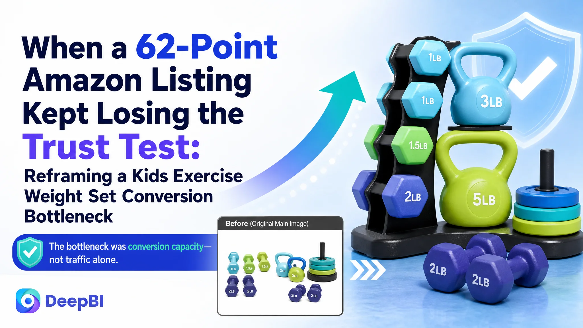
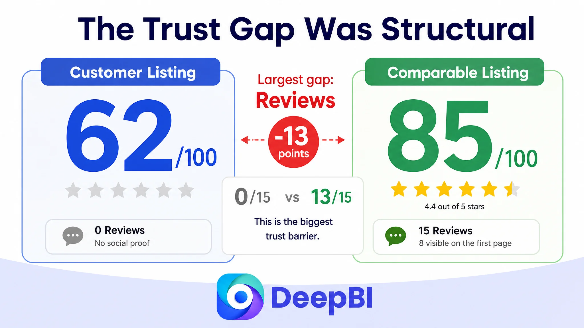
An Amazon seller in the US marketplace was not facing a simple traffic problem. Its kids exercise weight set Listing had a clear product concept, multiple components, and several useful page modules, yet the product page was not communicating its value with enough certainty. The Listing scored 62 out of 100, compared with 85 for a closely comparable high-performing Listing.
The initial working assumption was that the page mainly needed more technical explanation: clearer weight adjustment details, more assembly guidance, and additional visual information. DeepBI found a broader issue. The page was presenting information, but not in the order parents use to make a purchase decision. It also lacked the review evidence and trust signals that could make an unfamiliar children's fitness product feel safe and worthwhile.
The later direction therefore moved away from adding more isolated details. It focused on rebuilding the Amazon product page around a clearer sequence: establish the complete mini-gym value, prove the five-in-one use cases, reduce assembly concerns, explain safety and adjustability, and finish with a credible gift and family-use scenario. The case offers a practical lesson for Amazon sellers: before sending more traffic to a Listing, determine whether the page can quickly explain the product, reduce risk, and give buyers enough reason to trust it.
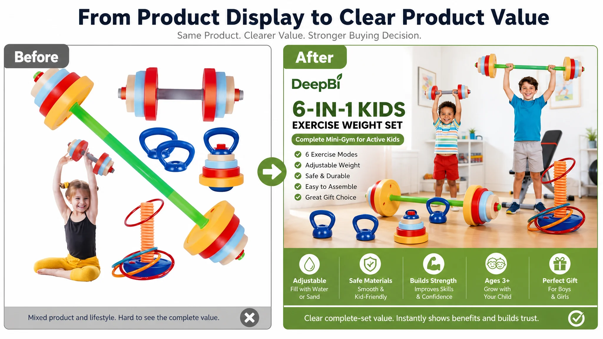
The Listing Had a Product Story, but Not Yet a Buying Story
At first glance, the page appeared to contain the essential ingredients:
- A colorful children's fitness set
- Adjustable weight through water or sand filling
- Multiple exercise configurations
- Assembly instructions
- Product inventory information
- Lifestyle and gift-oriented images
The problem was not the absence of content. It was the lack of a convincing decision path.
The product was positioned as a children's exercise weight set, but the Listing did not make the full value immediately obvious. The title described the category in relatively simple terms. The main images showed the product and its functions, but the sequence did not establish a strong “complete mini-gym” concept early enough. The bullet points explained features, but they did not consistently connect those features to parental concerns or child outcomes.
For an Amazon parent shopper, the decision is unlikely to be based on one question alone. The buyer is evaluating several points in rapid succession:
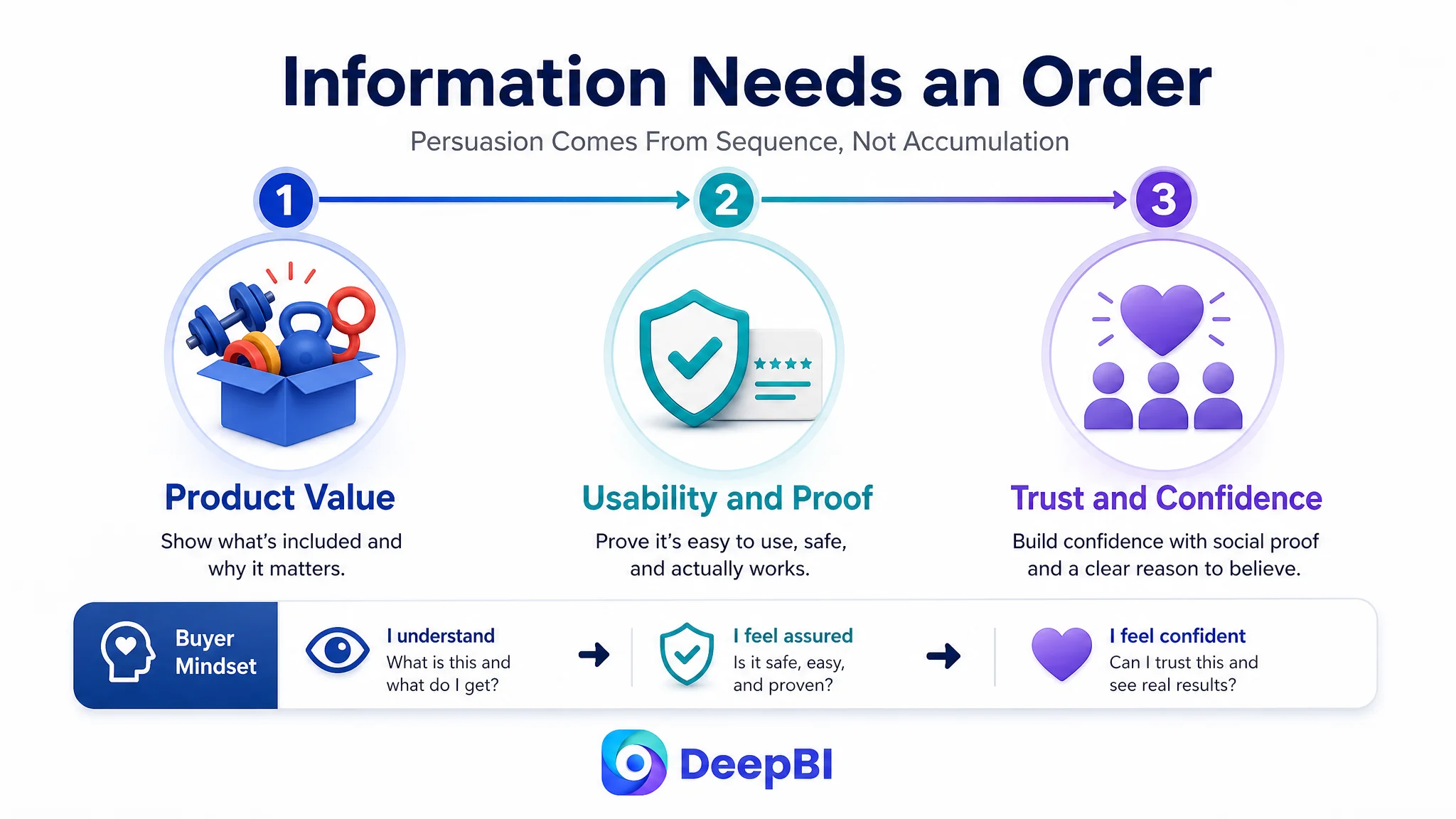
1. What exactly is included?
2. Is this genuinely versatile, or is it just a colorful toy?
3. Can my child use it safely?
4. Is assembly manageable?
5. Will the product remain useful as the child grows?
6. Does the page provide enough evidence to justify the purchase?
7. Is it presentable enough to give as a gift?
The Listing addressed most of these questions somewhere. It did not answer them in a sufficiently efficient order.
The page did not lack information. It lacked a structured path from interest to confidence.
The First Misdiagnosis Was Treating Each Gap as an Isolated Content Problem
The seller's page suggested a familiar optimization instinct: add more details to address each objection.
If shoppers might question weight adjustment, explain the filling process. If assembly might appear difficult, show the steps. If the product's value is unclear, list the components. If the product is intended as a gift, add a lifestyle scene.
Each action is reasonable on its own. The problem is that adding information without defining the role of each image or module can make the page more complete without making it more persuasive.
The existing page placed considerable attention on weight customization and assembly. Those were relevant concerns, but they were not necessarily the first concerns a buyer had immediately after landing on the page. Before asking how the weight changes, a parent first needs to understand what the set is and why the collection of components matters.
Likewise, assembly instructions can reduce risk, but they do not create initial product value. They work better after the page has already established the product's use cases and made the modular design feel worthwhile.
This was the key reframing:
The Listing did not primarily need more explanations. It needed a better hierarchy of explanations.
That distinction prevented the optimization from becoming a series of disconnected repairs.
The Score Gap Showed Where the Business Risk Was Concentrated
DeepBI's comparison made the problem more concrete by separating the Listing into five dimensions.
- Title: Customer Listing: 10/20, Comparable Listing: 16/20, Gap: -6
- Main image: Customer Listing: 25/30, Comparable Listing: 24/30, Gap: +1
- Bullet points: Customer Listing: 6/10, Comparable Listing: 9/10, Gap: -3
- Detail page: Customer Listing: 21/25, Comparable Listing: 23/25, Gap: -2
- Reviews: Customer Listing: 0/15, Comparable Listing: 13/15, Gap: -13
- Total: Customer Listing: 62/100, Comparable Listing: 85/100, Gap: -23
The most important finding was not simply that the total score was lower. It was that the weaknesses were uneven.
The main image score was slightly higher than the comparable Listing's score. That meant the diagnosis could not be reduced to “the images are bad.” The stronger issue was how the images worked together and what each image was responsible for proving.
The title, bullet points, and review dimensions revealed a more serious conversion constraint. The title lacked strong long-tail coverage and differentiated product language. The bullet points leaned toward functional description instead of a complete benefit and trust sequence. Most importantly, the Listing had no review data, while the comparable page displayed 15 reviews, including eight visible reviews on the first page and an average rating of 4.4 stars.
A page with no reviews is not merely missing social proof as a decorative element. For a children's product involving exercise, materials, assembly, and adjustable weight, the absence of customer evidence increases the burden placed on every other page element.
The title has to work harder. The images have to work harder. The safety explanation has to work harder. The A+ content has to work harder.
The review gap was therefore a structural trust risk, not just a score deduction.
A Strong Main Image Can Still Perform the Wrong Job
The main image dimension created an important nuance.
The customer's main image score was not materially behind the comparable Listing. However, the visual analysis identified several opportunities to improve the role of the image sequence:
- The first image did not fully establish the complete mini-gym concept.
- A lifestyle inset competed with the clearer display of the full product assortment.
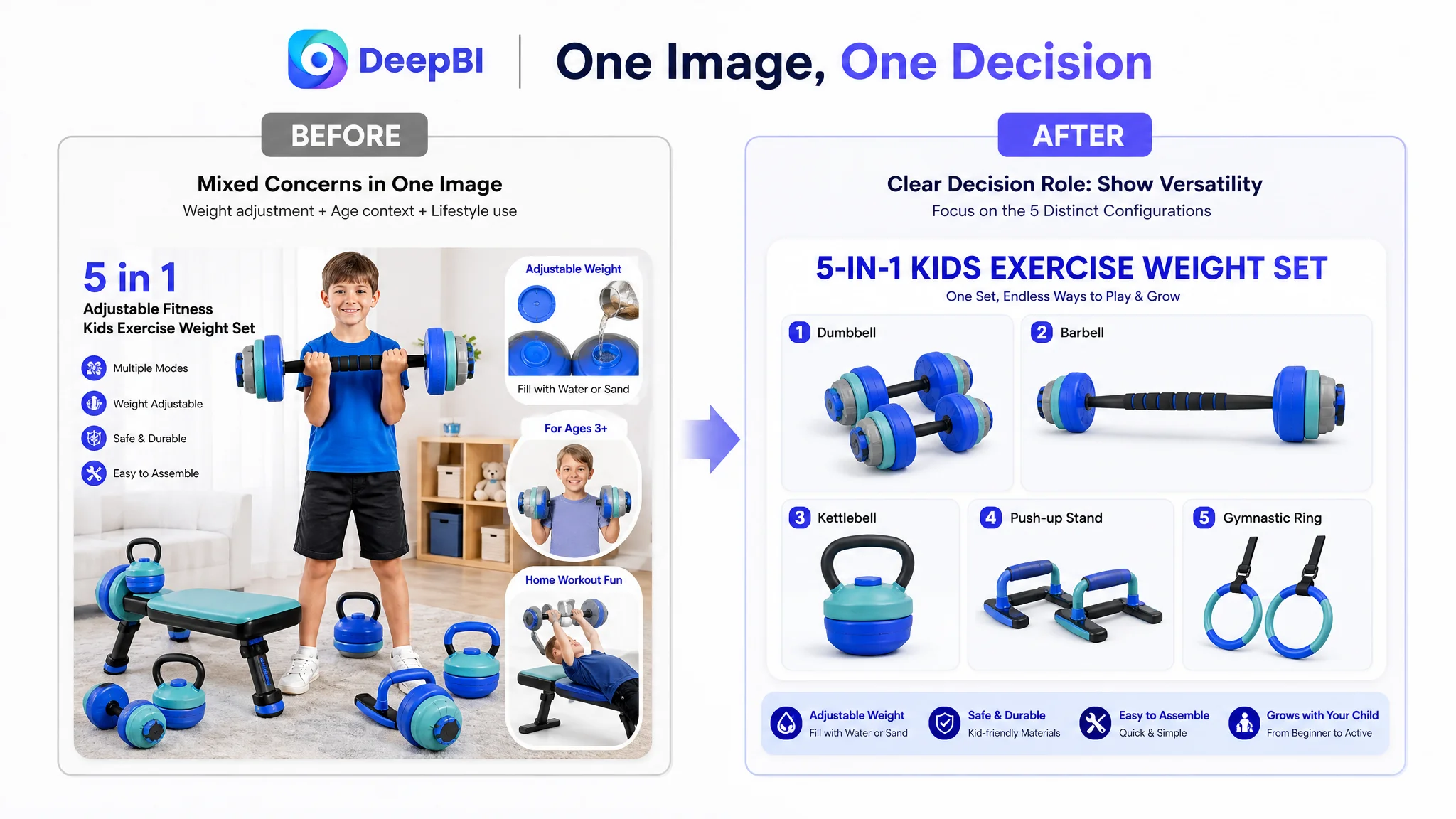
- Functional images combined too many technical concerns at once.
- The later lifestyle image did not create a strong emotional anchor around family use or gifting.
This is why visual diagnosis cannot stop at asking whether an image looks polished.
The more useful question is:
What decision is this image supposed to help the buyer make?
For this Listing, the first image should answer “What is this and what do I receive?” It should make the five-in-one concept visually immediate and show the complete set without distraction.
The next functional image should answer “How can these pieces be used?” It should present the different configurations clearly, such as dumbbell, barbell, kettlebell, push-up, and ring-related uses, rather than mixing usage, age suitability, and weight adjustment into one crowded message.
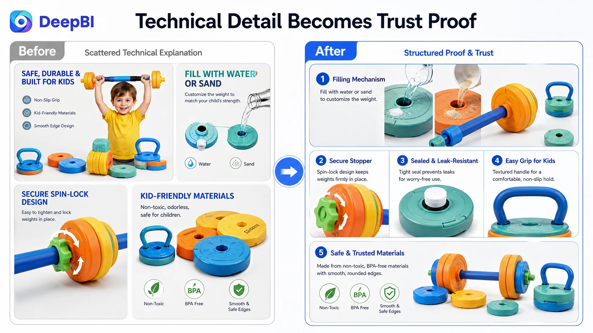
A later image can answer “Can I trust the materials and adjustment mechanism?” That is where water or sand filling, sealing details, smooth edges, and child-friendly material claims become more persuasive.
A final lifestyle image can then answer “Can I imagine my child using and enjoying this?” That is a different job from proving inventory or mechanics.
A main image is not only a visual asset. It is the first decision point in the Amazon buying sequence.
The Title Was Losing Both Search Coverage and Click Meaning
The title weakness was more direct.
The existing title included the core category phrase “Kids Exercise Weight Set,” but its structure remained relatively simple. It did not make the product's multi-function format, adjustable design, or intended play and gift scenarios immediately clear.
The comparable Listing used a more mature structure:
- A numerical product concept
- Specific equipment names
- Adjustable functionality
- Pretend-play positioning
- Toddler and child-oriented search language
- Gift and use-case terms
The recommended title direction followed the same commercial logic without treating keyword density as the entire solution:
Brand term + 6-in-1 kids exercise weight set + adjustable dumbbell/barbell/kettlebell + toddler pretend-play gym set + children's fitness training equipment + gift context
The purpose was not simply to insert more search terms. It was to align search visibility with buyer understanding.
A parent searching for a toddler gym set, pretend-play workout equipment, or a children's fitness gift should be able to recognize the product's format and use immediately. The title needed to communicate both what the product is and why it is different.
That is the difference between a title that merely names a product and a title that helps qualify the right click.
The Bullet Points Had Features, but Not a Complete Persuasion Sequence
The bullet points showed another form of incomplete logic.
The original structure covered product positioning, safety, functionality, versatility, and gift value. But the descriptions tended to remain at the level of product information. The comparable Listing more consistently connected each feature to a buyer concern or child outcome.
A stronger sequence for this category would move through:
Value and adaptability
Explain the full set, identify the included equipment, and show how water or sand filling allows the weight to be adjusted as the child develops.
Developmental relevance
Connect active play with motor skills, hand-eye coordination, balance, and healthy exercise habits, without turning the copy into unsupported health promises.
Role-play and family imitation
Position the product as a way for children to imitate adult workouts and turn movement into imaginative play.
Safety and material reassurance
Use the confirmed material and design information available for the product, including BPA-free ABS, rounded edges, lightweight handling, and the absence of metal parts where supported by the product material.
Gift and age context
Clarify the intended age range and gift occasions, while presenting the product as an engaging activity set rather than a collection of plastic components.
This structure matters because parents do not process every bullet point as an independent fact. They are building an overall judgment about usefulness, safety, and fit.
The A+ Page Needed to Prove the Product's Logic Earlier
The detail-page analysis showed that the existing A+ content was not empty. Its weakness was the order and emphasis of the modules.
The page used a core selling-point image, weight-adjustment information, assembly guidance, usage scenes, a component list, and a holiday gift scene. The comparable page created a more deliberate progression:
1. Establish the product's complete multi-function concept
2. Show how the pieces are assembled
3. Confirm the distinct exercise modes
4. Explain customization and progression
5. Verify the exact inventory
6. Build emotional value around family and healthy childhood
7. Confirm gift-ready packaging
The recommended change was not to add technical material everywhere. It was to make each module answer one specific question.
First, make the five-in-one value visible
The current page referenced multiple modes but did not create a sufficiently strong visual structure around them. A clear icon or grid system could make the product's variety immediately understandable.
Next, reduce assembly uncertainty
An exploded assembly diagram should appear earlier, showing how different parts are connected and reconfigured. This would make the modular design feel accessible rather than complicated.
Then, verify the exercise modes
A dedicated visual matrix should confirm the distinct configurations. This is more effective than asking the buyer to infer versatility from several scattered images.
Move weight customization later
The filling process and adjustable resistance are useful proof points, but they work better after the buyer understands the product's overall value. At that stage, the information becomes validation rather than an interruption.
Make the inventory count explicit
A transparent component list should quantify the included pieces wherever the confirmed product information allows it. This directly addresses the concern that a colorful set may contain less than expected.
End with emotional and retail reassurance
The gift scene should remain, but it should be supported by a final image showing the presentation quality of the retail packaging. For a gift-oriented product, packaging is part of perceived value.
The revised page sequence was designed to move from value, to usability, to proof, and finally to emotional confidence.
Why DeepBI Did Not Treat the Problem as “Just Improve the Images”
The score comparison made it possible to avoid a common Amazon optimization mistake: overcorrecting the most visible asset.
Because the Listing's main image score was already slightly above the comparable page, replacing every image on the assumption that visual quality was the main problem would have been poorly prioritized. It could have consumed production resources without addressing the larger gaps in title clarity, bullet-point logic, A+ sequencing, and review-based trust.
DeepBI's judgment came from combining several forms of evidence:
- The total score and dimension-level differences
- The structural comparison between title and bullet points
- The role of each image in the customer decision path
- The organization of the A+ modules
- The absence of reviews
- The trust requirements of a children's exercise product
This is the difference between aesthetic editing and business diagnosis.
The goal was not to make the Listing look more similar to a high-performing competitor. It was to understand why the comparable page created clarity and confidence more efficiently, then translate those principles into changes that remained truthful to the customer's actual product.
The Correct Decision Order Was to Repair Conversion Capacity Before Scaling Traffic
The case does not provide post-optimization advertising or sales data, so it would be inappropriate to claim a specific CVR improvement, ACOS decline, or organic-order recovery.
The business judgment is still clear.
If the page has no reviews, a weak title structure, underdeveloped bullet-point logic, and an A+ sequence that delays core product validation, sending more paid traffic to the Listing increases exposure without resolving the conversion burden. Advertising may create more opportunities to be evaluated, but it cannot supply the missing product-page proof by itself.
For this Listing, the priority order was therefore:
1. Clarify the product's category and complete-set value in the title and opening image
2. Make the five-in-one structure immediately understandable
3. Reduce assembly and safety uncertainty
4. Explain adjustability as a progression benefit
5. Improve the bullet points' pain-point and outcome logic
6. Strengthen A+ content as a trust-building sequence
7. Build review evidence through compliant, legitimate operating practices
8. Only then evaluate whether additional traffic can be scaled efficiently
This order reduces the risk of amplifying a page that has not yet earned the click it receives.
What Changed Was the Operating Understanding
Even without unsupported performance claims, the case produced several concrete changes in operating judgment.
The seller could now distinguish between:
- A page that contains product information and a page that communicates value quickly
- A visually acceptable image and an image assigned to the wrong decision role
- A feature list and a pain-point solution
- A complete A+ page and a persuasive A+ sequence
- A traffic opportunity and a page capable of converting that traffic
- A missing review count and a broader trust deficit
The Listing's 62-point score was not a verdict on the product itself. It was evidence that the current page was not presenting the product with the level of clarity and reassurance already visible in a comparable Amazon Listing.
The more important finding was that the weaknesses were connected. The title did not fully communicate the product's multi-function value. The bullet points did not consistently translate features into parental benefits. The images did not assign each proof point to the clearest position. The A+ page delayed important validation. The absence of reviews left the entire page with a higher trust burden.
The Lesson for Amazon Sellers
When an Amazon Listing underperforms, the first question should not always be whether the ads need more adjustment or whether the images need to look more attractive.
A better starting point is:
Can the product page make the right buyer understand the product, trust the product, and imagine using the product in the correct order?
For this children's exercise weight set, the real bottleneck was not one isolated image or one missing keyword. It was the Listing's conversion capacity: the ability to turn a product concept into a clear, credible buying decision.
DeepBI's role in the case was to locate that constraint, separate high-priority gaps from secondary improvements, and establish why the page needed to be repaired before traffic expansion became the main focus.
That is the practical distinction between optimizing content and diagnosing an Amazon business problem.