

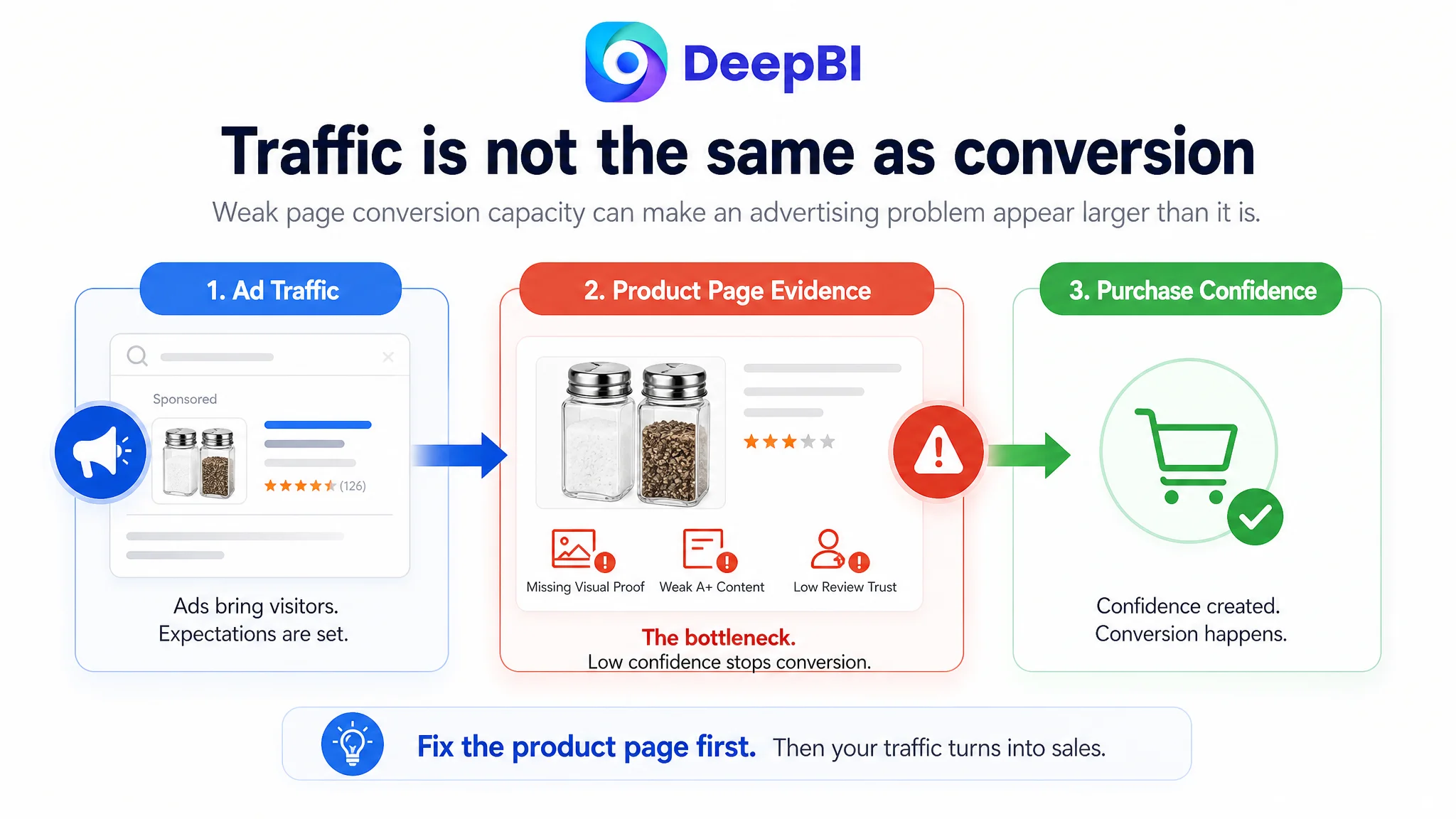
The customer was an Amazon US seller of a glass salt and pepper shaker set. The Listing was receiving attention in a highly comparable category, but its product-page conversion foundation was weak. The initial optimization direction centered on visible elements such as keyword placement, image presentation, and feature wording—reasonable concerns, but not enough to explain the full business problem.
DeepBI’s diagnosis showed that the larger constraint was not one isolated creative defect. The Listing was failing to build confidence across the buying journey: the main image did not immediately identify the set, the bullet points listed functions without a clear problem-solving sequence, the A+ area contained no visual modules, and the review profile created an additional trust gap.
That changed the order of work. Instead of continuing to send more Amazon ad traffic toward an underdeveloped product page, the later optimization focused on restoring the page’s sales logic: clarify the product at first contact, quantify its practical value, demonstrate everyday and outdoor use, and use A+ content to answer the questions that advertising cannot solve. For other Amazon sellers, the case is a reminder that ad efficiency often depends on whether the Listing is ready to convert the traffic it receives.
The Listing Was Not Losing on One Element
At first glance, the product appeared to have several manageable weaknesses:
- The core keyword was not placed prominently enough in the title.
- The main image did not clearly distinguish the salt shaker from the pepper shaker.
- The bullet points relied too heavily on descriptive language.
- The product page lacked visual content.
- The review rating and review volume were far below a comparable high-performing Listing.
Any one of these issues might have led the team toward a specific adjustment. Rewrite the title. Replace the first image. Add more specifications. Improve the farmhouse styling.
But the score comparison revealed a more serious pattern.
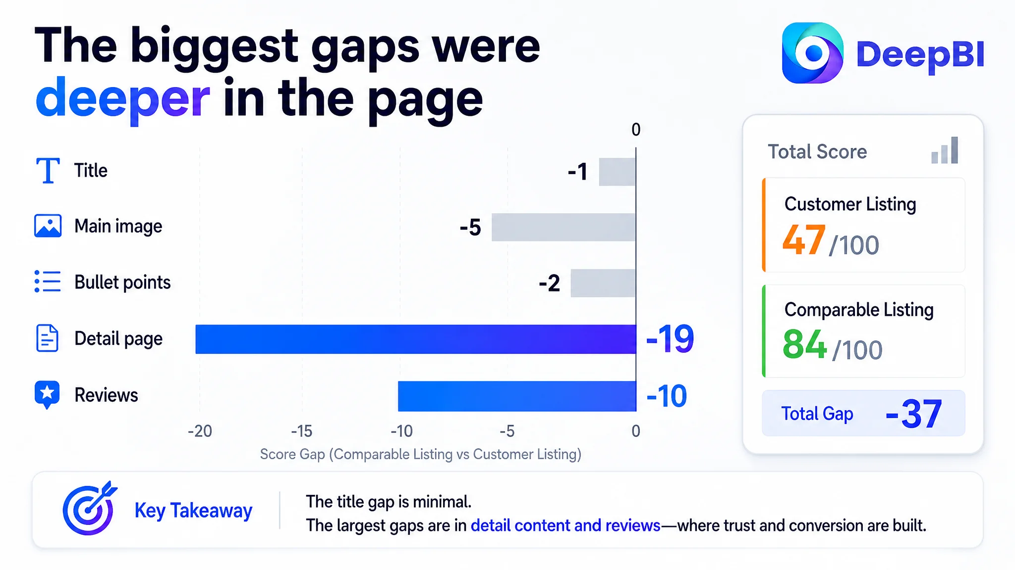
- Title: Customer Listing: 14/20, Comparable Listing: 15/20, Gap: -1
- Main image: Customer Listing: 21/30, Comparable Listing: 26/30, Gap: -5
- Bullet points: Customer Listing: 6/10, Comparable Listing: 8/10, Gap: -2
- Detail page: Customer Listing: 3/25, Comparable Listing: 22/25, Gap: -19
- Reviews: Customer Listing: 3/15, Comparable Listing: 13/15, Gap: -10
- Total: Customer Listing: 47/100, Comparable Listing: 84/100, Gap: -37
The important signal was not simply that the total score was low. It was where the score was being lost.
The title, main image, and bullet points were behind, but not catastrophically so. The detail page and reviews created the largest structural gaps. That meant the Listing did not merely need more polished content. It lacked the trust and explanation required to convert a shopper who had already clicked through from Amazon search or an ad.
The most important gap was not a single weak image. It was the absence of a complete reason to buy.
The Initial Diagnosis Focused Too Narrowly on Search and Presentation
The original working direction was understandable. In a crowded Amazon kitchen-accessories category, sellers often look first at the most visible levers:
- Is the main keyword too far back in the title?
- Does the first image stand out in search results?
- Are the product features expressed clearly?
- Does the Listing look attractive enough beside competing products?
For this shaker set, those questions led to several valid observations. The title began with a brand reference rather than the core product phrase. Repeated words such as “glass” and “shaker” occupied valuable space. The title also lacked some high-value use contexts, including kitchen, BBQ, bar, RV, and camping.
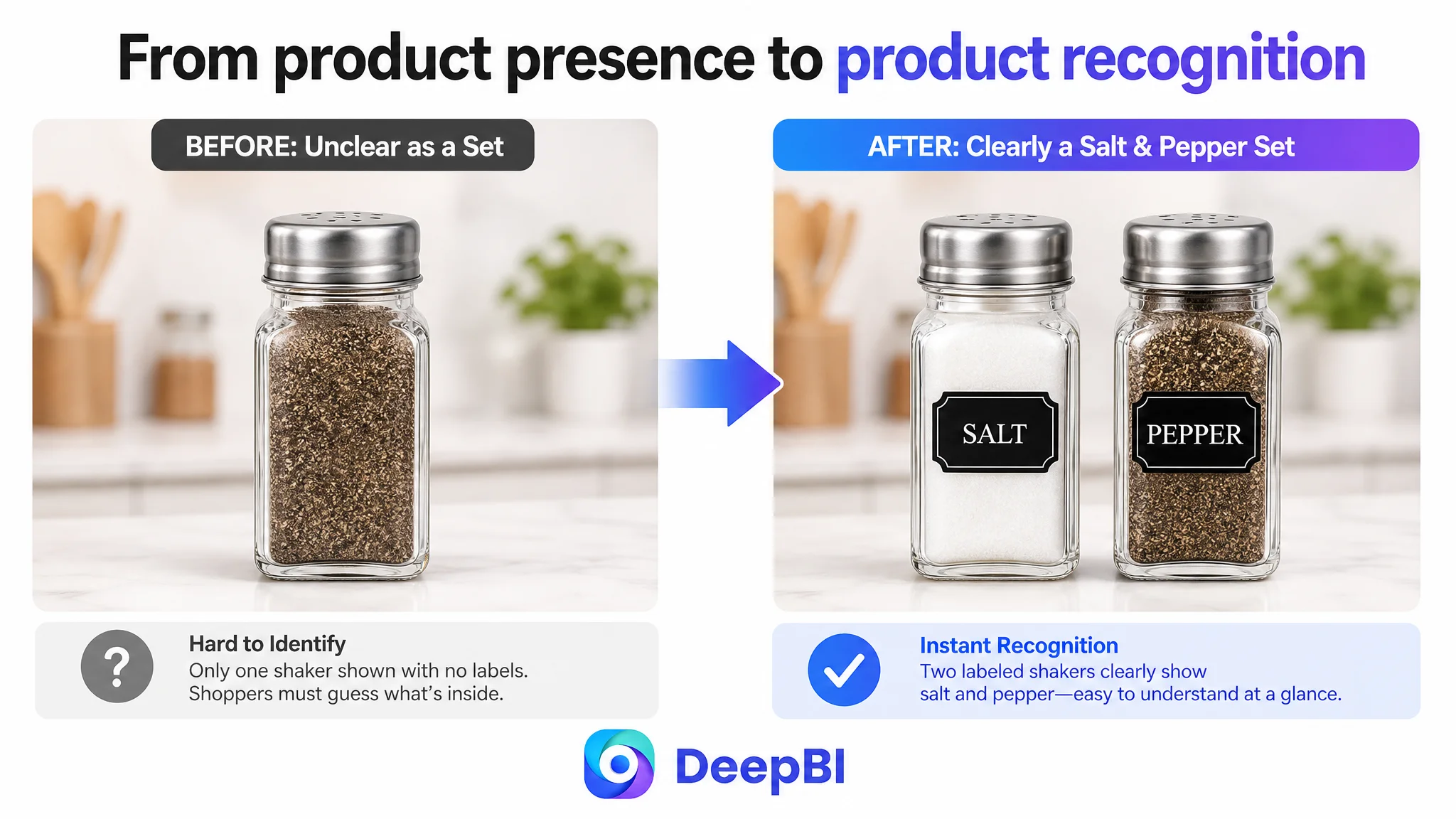
The main image had a related issue. It showed the product, but it did not make the set immediately self-explanatory. The customer had to work harder to understand which container was intended for salt and which was intended for pepper. The image also lacked the visual hook created by clearly labeled shakers and visible differences in contents.
These were real problems. But treating them as the whole problem would keep the team at the surface level.
A better title can improve search relevance. A clearer main image can improve first-contact understanding. Neither one can fully compensate for a product page that provides almost no visual proof, has a 3.7-star rating, and contains only repetitive text in the detail section.
That was the misdiagnosis: the Listing was being treated as a collection of independent assets rather than as one conversion path.
The Real Constraint Was Listing Conversion Capacity
DeepBI’s comparison placed the customer Listing beside a comparable, stronger Listing and examined five dimensions together: title, main image, bullet points, detail content, and reviews.
This made the business problem easier to define.
The product page had enough basic information to be found, but not enough structured evidence to make the purchase feel low-risk. A shopper could see that the product was a glass shaker set. They had less help answering the questions that typically determine conversion:
- Can I tell the two shakers apart immediately?
- How much seasoning does each container hold?
- Will the shaker dispense evenly?
- Can I see when it needs to be refilled?
- Will the lid help keep moisture out?
- Is it easy to clean and refill?
- Does it fit daily cooking, BBQ, travel, or camping?
- Is the product durable enough for repeated use?
- Can I trust the quality despite the limited review history?
The comparable Listing addressed these questions through a coordinated structure. It used specific measurements, capacity information, hole counts, visible labeling, transparent glass, cleaning guidance, and multiple usage contexts. The customer Listing communicated more like a product description than a buying argument.
The title had keywords, but not enough decision value
The customer’s title used relevant product terms, but the keyword structure was less efficient. The main phrase appeared later, some terms were repeated, and lower-value attributes such as the rectangular shape occupied space without doing enough work for search or conversion.
The stronger title structure followed a clearer sequence:
Core product phrase → specification → functional material or design → use scenarios
That structure helps both sides of the Amazon funnel. It gives the search system a clearer product identity while giving the shopper immediate context about size, material, and where the product fits into daily life.
The revised direction therefore did not mean adding more words indiscriminately. It meant increasing the information value of each word while retaining only claims supported by the product.
The main image showed the product, but did not resolve recognition
The first image is not only a visual presentation asset. On Amazon, it is part of the shopper’s decision to stop, inspect, and click.
The customer’s main image lacked strong identification of “salt” and “pepper” as a pair. Showing only one shaker also increased the possibility that shoppers would need to infer whether the offer included a complete set.
The priority was therefore not to make the image more decorative. It was to make the product more immediately legible:
- Show both shakers.
- Use clear “SALT” and “PEPPER” labels.
- Make the transparent glass and different contents easy to see.
- Keep the composition clean enough to remain readable in search results.
The later image sequence could then address dimensions, capacity, filling, dispensing, sealing, durability, and use scenarios. Each image would answer a different question instead of repeating the same product view.
The Largest Miss Was the Missing A+ Story
The detail-page score was 3 out of 25, compared with 22 for the comparable Listing. This was the clearest indication that the product page was not completing the conversion process.
The customer Listing used no image modules in the detail area. It relied on one repetitive block of text. The comparable Listing used a sequence of visual modules showing the product in the kitchen, during cooking, outdoors, and alongside food.
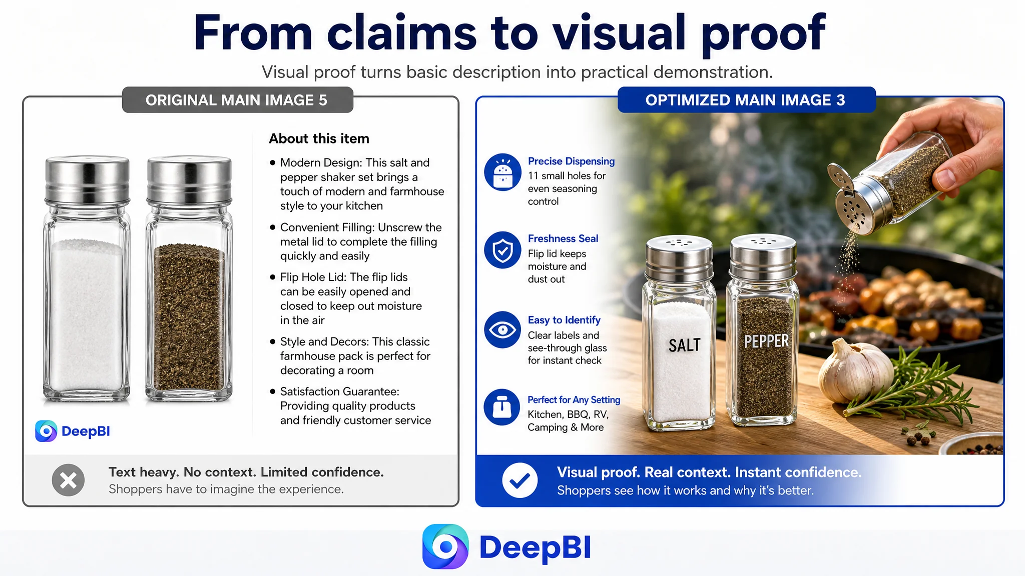
This difference mattered because the product’s value is practical and contextual. A shaker set is not purchased only because it is made of glass. It is purchased because it should be easy to identify, easy to use, easy to refill, and suitable for repeated seasoning in real situations.
Without A+ content, the customer Listing had no effective space to demonstrate:
- Controlled dispensing over food
- Transparent visibility of contents and remaining quantity
- Moisture protection through the flip-lid design
- Simple unscrewing and refilling
- Cleaning and repeated use
- Suitability for countertops, dining tables, BBQs, camping, and travel
- Farmhouse styling and gift presentation
The product page therefore stopped at basic description. It did not develop the product into a credible solution for everyday use.
A+ content was not an optional decoration here. It was the missing layer between product recognition and purchase confidence.
Why DeepBI Did Not Recommend Tuning Amazon Ads First
When an Amazon Listing has weak advertising efficiency, it is natural to inspect bids, targeting, search terms, and campaign structure. Those decisions still matter. But they should not automatically come first.
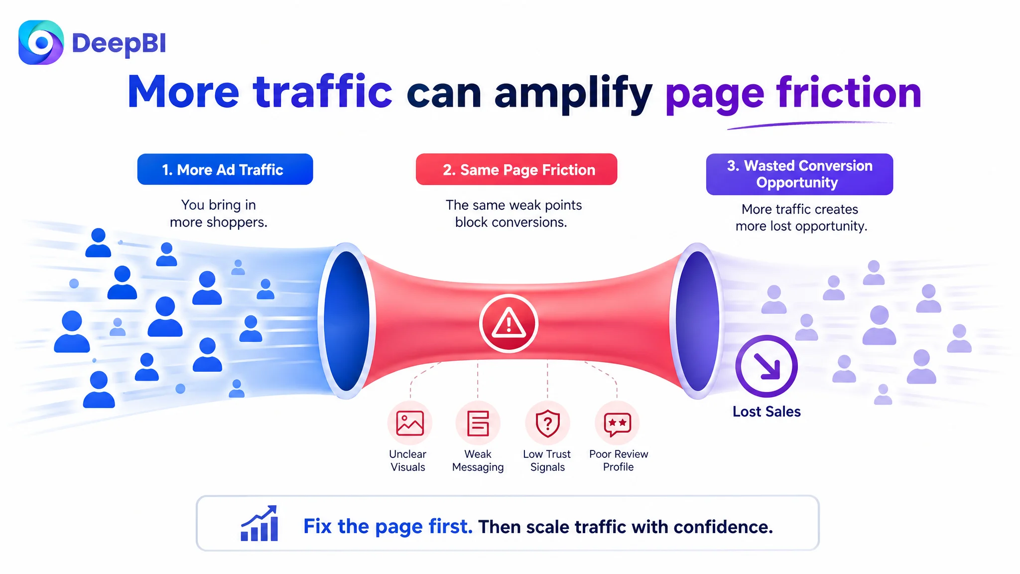
In this case, the page-level evidence was already strong enough to show that more traffic would encounter the same conversion obstacles:
1. The first image did not immediately explain the set.
2. The title did not use its available space efficiently.
3. The bullet points lacked a clear pain-point-to-solution sequence.
4. The detail page provided almost no visual proof.
5. The review profile created a substantial trust disadvantage.
If Amazon ads were scaled before these issues were addressed, the likely business risk was not simply higher spend. It was the amplification of a page that had not yet earned the traffic.
Advertising can create exposure and clicks. It cannot independently explain how the product works, demonstrate its use in context, repair missing page content, or remove the hesitation created by a weak review profile.
That is why Listing conversion had to be addressed first. The immediate objective was to improve the page’s ability to receive both paid and organic traffic—not to assume that more precise ad settings could compensate for missing product-page evidence.
The Optimization Shifted From “More Features” to “Clearer Buying Logic”
The revised direction followed the customer’s actual conversion gaps rather than adding content evenly across every module.
First, clarify the product at the search and thumbnail stage
The title and first image needed to establish the product identity quickly.
The title direction brought the salt and pepper shaker set closer to the front, then connected the product form and material with practical contexts such as kitchen, BBQ, table, RV, and camping. The goal was to improve both search clarity and shopper recognition without relying on repeated or vague wording.
The first image direction placed both shakers together and made the labels prominent. This reduced the effort required to understand the offer before the shopper moved deeper into the page.
Next, turn bullet points into answers to practical concerns
The original bullet points leaned toward appearance, general functionality, packaging, and service language. The revised sequence placed more weight on what shoppers needed to know before buying:
- Dimensions and 4-ounce capacity
- Reduced refill frequency
- Eleven evenly distributed dispensing holes
- Clear labeling and visible glass
- Moisture protection
- Easy refilling and cleaning
- Repeated use across cooking, BBQ, travel, and camping
- Gift presentation and purchase assurance
This structure is more persuasive because each point connects a product attribute with a user concern.
The difference is not merely between short copy and long copy. It is between feature listing and decision support.
Then, use the image sequence to demonstrate use rather than repeat claims
The recommended image progression followed the same logic:
- Product identification
- Dimensions and capacity
- Controlled dispensing
- Filling and material details
- Daily kitchen or outdoor use
- Moisture protection and purchase assurance
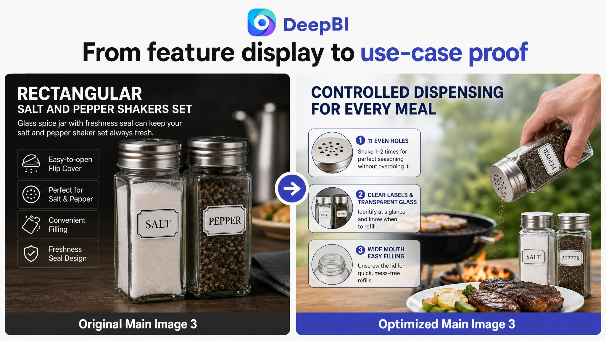
This also required restraint. The analysis identified the risk that certain accessories or surrounding objects could make the offer appear to include items that were not confirmed. The visual direction therefore had to strengthen context without introducing misleading associations.
DeepBI’s role in this process was not to create an attractive image in isolation. It was to connect each visual change to a diagnosed Listing gap while keeping the product’s actual structure, material, and confirmed attributes intact.
Reviews Were a Trust Constraint, Not a Copywriting Problem
The review gap could not be solved through title or A+ improvements alone.
The customer Listing had:
- A 3.7-star rating
- 25 total reviews
- Eight reviews visible on the first page
- Three one-star reviews among those eight visible reviews
The comparable Listing had a 4.8-star rating and 1,384 reviews.
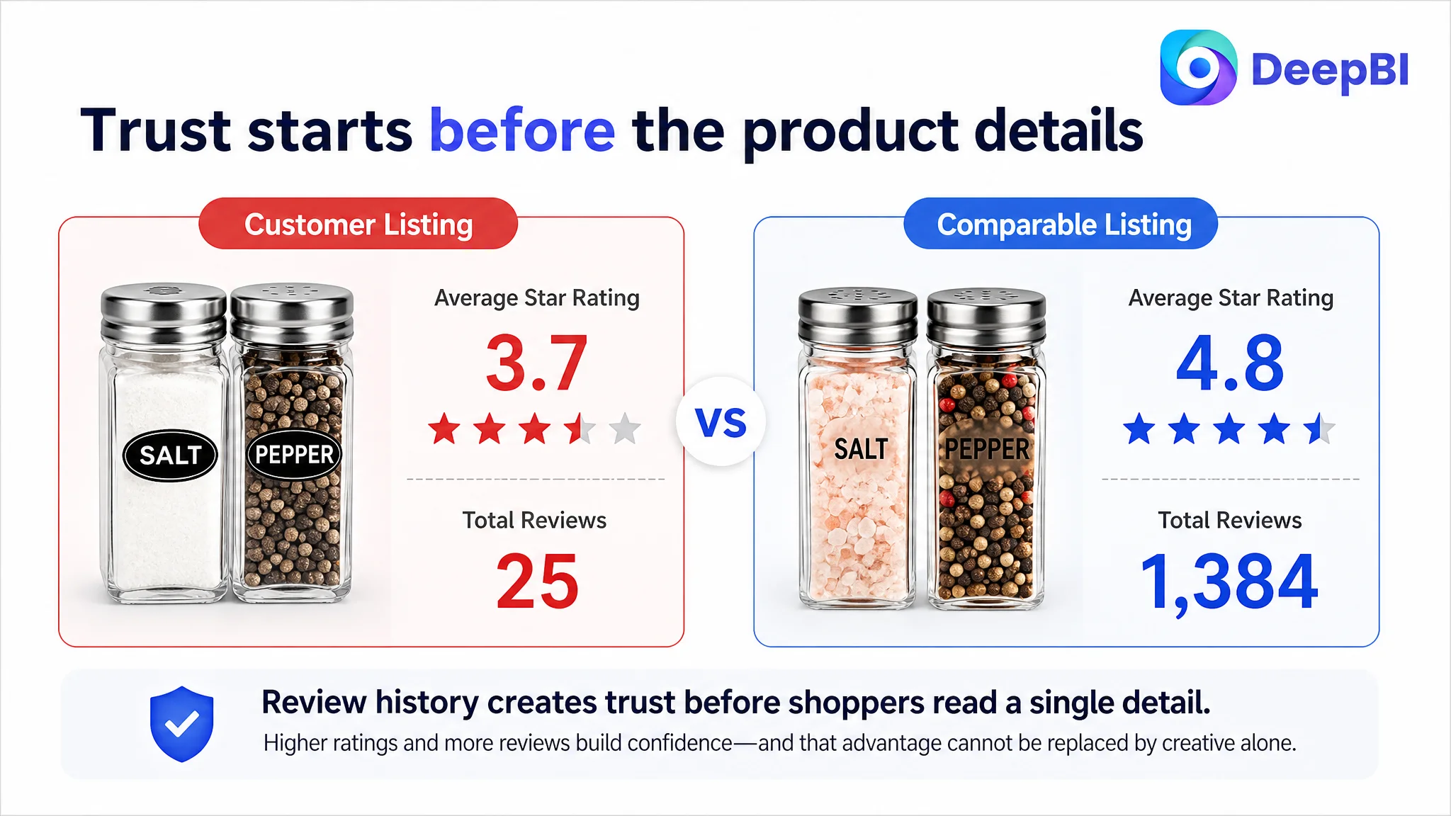
The difference created a trust problem before shoppers evaluated the finer details of the product. Some negative feedback also suggested that the product description had created confusion about what was included, including an expectation of receiving more than one item. That made accurate set identification especially important.
This is where the page and review diagnosis connected. Better labeling and clearer product presentation could reduce future misunderstanding, but they could not erase the existing review history. The appropriate business judgment was therefore to treat reviews as a risk constraint while repairing the areas the team could control immediately.
The Listing needed to become more accurate, more specific, and more demonstrative so that advertising would not drive shoppers into avoidable expectation gaps.
The Business Priority Became Easier to Explain
After the diagnosis, the decision order was no longer “improve everything and see what happens.”
It became:
1. Repair product recognition through the title and first image.
2. Clarify practical value through measurable, pain-point-oriented bullets.
3. Build visual proof through A+ modules and usage scenarios.
4. Reduce expectation risk by showing the set, contents, dimensions, filling process, and use cases clearly.
5. Then evaluate advertising efficiency against a page with stronger conversion capacity.
This order protected the business from treating advertising as an isolated control panel. It recognized that ACOS, CVR, and traffic quality are interpreted differently depending on the page receiving the traffic.
A low-conversion page can make a reasonable campaign look inefficient. A stronger page gives the same traffic a better chance to produce useful commercial signals.
What This Amazon Seller Could Learn From the Case
The case did not provide verified post-optimization performance data, so it would be premature to claim a specific CVR increase, ACOS decline, or recovery in organic orders.
The more important change was in business understanding.
The team moved from asking, “Which ad or creative element should we adjust next?” to asking, “Is the Amazon product page ready to convert the traffic we are buying?”
That shift has several practical implications for other Amazon sellers:
- A Listing score should be read as a pattern of constraints, not as a single number.
- A small title gap does not necessarily deserve priority over a severe A+ or review gap.
- Main images should solve recognition problems before they pursue visual sophistication.
- Bullet points should connect specifications with user concerns.
- A+ content should demonstrate why the product belongs in the shopper’s life.
- Reviews may limit trust, but clearer product communication can prevent additional expectation problems.
- Amazon ads can expose a page’s weaknesses as easily as they can generate demand.
- Before increasing traffic, sellers should judge whether the Listing has enough evidence to convert it.
The real lesson was not that this shaker set needed better images. It was that every part of the Amazon Listing needed to support the same purchase decision.
For this customer, the bottleneck was not a lack of possible optimization ideas. It was the lack of a clear priority. DeepBI made the gap visible by comparing the Listing dimensions together, identifying where the largest business risk sat, and separating immediate conversion constraints from secondary refinements.
That is the difference between making an Amazon Listing look improved and making it more capable of doing its commercial job.