

An Amazon seller in the kitchen accessories category was facing a familiar product-page problem: the Listing had a complete title, five bullet points, and a 24-piece multicolor potholder set, but its overall competitive score was only 57 out of 100. A comparable high-performing Amazon Listing scored 84.
The initial direction could easily have been interpreted as a search-coverage or creative problem. Add more keywords, refine the title, make the main images more attractive, and explain the product more clearly. Those actions were relevant, but they did not explain the size of the conversion gap.
DeepBI found that the real constraint was deeper inside the Amazon product page. The title was only one point behind the benchmark, and the bullet points were structurally stronger. The major losses came from the missing visual detail-page experience, weak review trust, and a main-image sequence that confirmed the product without fully communicating its value, quality, and uses.
The later optimization therefore focused on rebuilding the page's sales logic: make the 24-piece value immediately clear, establish material and heat-protection credibility, show practical kitchen scenarios, add a structured A+ story, and treat advertising traffic as something the page must be ready to convert. Other Amazon sellers can learn an important lesson from this case: before pushing harder on Amazon ads or search exposure, confirm that the Listing can earn trust once shoppers arrive.
The Amazon Listing Looked Complete. The Score Said Otherwise.
At first glance, this was not an empty or careless Listing.
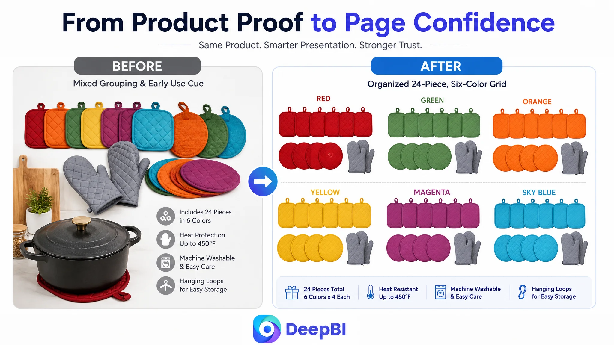
The product page presented a 24-piece kitchen potholder set in six colors. The title covered the basic product form. The five bullet points included concrete benefits such as color-coding kitchen tasks, heat protection, hanging loops, machine washability, and multiple use cases.
Yet the total Listing score was only 57/100, compared with 84/100 for a comparable benchmark Listing.
That 27-point gap mattered because Amazon conversion does not depend on whether each individual component exists. It depends on whether the components work together during the buyer's decision process.
A shopper needs to understand several things quickly:
- What is included in the set
- Whether the quantity justifies the purchase
- Whether the material feels reliable for hot cookware
- Whether the product is easy to clean and store
- Whether the set will be useful beyond a single kitchen task
- Whether other buyers have provided enough evidence to trust the product
The customer Listing answered some of these questions in text. It did not answer enough of them visually or credibly.
The problem was not that the Amazon product page lacked information. It was that the information did not arrive in the right order, with enough proof, at the moments when shoppers were deciding whether to continue.
The First Diagnosis Focused Too Much on Search and Surface-Level Presentation
The title gap was real, but small.
The customer's title scored 17/20, while the benchmark scored 18/20. The benchmark used a more compact structure, surfaced heat resistance earlier, used the plural form “Potholders Sets,” and included “Trivet” as an additional use-related search term.
These were valid opportunities. A revised title could make the product form, quantity, material, color variety, and trivet use easier to recognize:
24 Pcs Pot Holders for Kitchen, Heat Resistant Quilted Cotton Potholder Set with Oven Mitts, Multicolor Hot Pads and Trivets with Hanging Loops for Cooking and Baking
But a one-point title difference could not explain a 27-point total gap.
The same was true of the main images. The customer's image set showed the product and included useful information, but the visual sequence was not sufficiently decisive. The first image communicated quantity without creating a strong sense of abundance or visual value. Other images introduced dimensions, construction, use cases, and storage, but the order and emphasis were not fully aligned with how shoppers evaluate a large kitchen set.
This created a common Amazon optimization trap: treating every visible weakness as equally important.
The team could have continued refining keywords, adding descriptive language, or making isolated image changes. But the scoring pattern indicated that the primary issue was not simply discoverability. It was the product page's ability to turn attention into confidence.
The Largest Loss Was in the Detail Page, Not the Title
The dimension that changed the diagnosis was the detail page.
The customer's detail-page score was 4/25. The benchmark scored 22/25.
The reason was straightforward: the customer's page relied on plain text, while the benchmark used a structured A+ experience containing:
- A lifestyle opening scene
- A clear specification module
- Material and construction details
- Multiple kitchen-use scenarios
- Functional value and storage benefits
This was not just a difference in visual polish.
The benchmark's A+ content created a sequence of reassurance:
1. The product looked useful in a real kitchen.
2. The quantity and color distribution were easy to confirm.
3. The materials and construction appeared more credible.
4. The use cases made the full set feel practical.
5. Storage and everyday convenience reduced purchase friction.
6. The final value proposition tied quantity, protection, and organization together.
The customer's plain-text detail page could mention some of these ideas, but it could not make them easy to see, compare, and remember.
The missing A+ content removed the page's opportunity to explain why a large potholder set was worth buying.
This was especially important for a product with 24 pieces. A large quantity can be a value advantage, but it can also raise questions:
- Are the pieces substantial or cheaply made?
- Will all the colors actually be useful?
- Is there enough storage space?
- Can the product withstand repeated use and washing?
- Will buyers use the full set, or will most of it remain unused?
The page needed to answer these concerns visually rather than relying on broad phrases such as “perfect” or “unmatched value.”
The Customer's Bullet Points Were Not the Main Problem
The bullet-point comparison produced an important reversal.
The customer's bullet-point score was 9/10, while the benchmark scored 6/10.
That did not mean the bullet points were finished. It meant they were not the first constraint to address.
The customer's copy already had several strengths:
- It began with user benefits rather than static product facts.
- It connected the six colors to different kitchen tasks.
- It followed a more logical progression from material to protection, durability, cleaning, and versatility.
- It used specific situations, such as responding to a cooking emergency.
- It included construction details that helped support quality perception.
- It closed with positive use cases rather than emphasizing a restrictive technical limit.
The benchmark Listing provided useful ideas about quantity, sharing, color variety, and usage locations. But its text was more informational and less persuasive in structure.
This distinction mattered for prioritization. Rewriting the bullet points could improve clarity, but the page already had a relatively strong text foundation. The larger commercial risk was that the page's stronger arguments were not supported by equally strong visual evidence.
A well-written bullet point cannot fully compensate for a missing A+ story.
The title needed tighter search logic
The title should make the most important search and buying terms easier to process:
- 24-piece quantity
- Kitchen potholders
- Heat-resistant construction
- Quilted cotton or polyester-cotton material
- Oven mitts, hot pads, and trivets
- Six colors
- Hanging loops
The goal was not to add every possible phrase. It was to reduce unnecessary wording and place the core product definition earlier.
The bullet points needed to support the page, not carry it alone
The recommended structure connected each claim to a practical reason to buy:
- 24-piece value set: quantity, six colors, replacement, sharing, and task organization
- Heat-resistant material: construction and protection for hands and surfaces
- Space-saving design: 7-by-7-inch size, hanging loops, and convenient access
- Durability and cleaning: quilted construction, machine washability, and color retention
- Versatile kitchen use: cookware handling, countertop protection, jar gripping, and gatherings
The copy was useful because it gave the visual modules a narrative foundation. But it was not the page's central repair.
Reviews Confirmed That This Was Also a Trust Problem
The review dimension added another layer to the diagnosis.
The customer's Listing had:
- 3.3 stars
- 5 total reviews
- 4 reviews visible on the first page
- 2 one-star reviews
The benchmark had:
- 4.5 stars
- 119 total reviews
- 8 reviews visible on the first page
This was an 8-point gap in the review dimension.
Reviews cannot be solved through image design or copywriting alone. A new A+ module cannot erase a low rating, and a revised title cannot create a history of customer experience. That limitation made prioritization even more important.
The page had to strengthen the elements it could control while recognizing that review trust was a structural disadvantage.
This is where many Amazon sellers make the wrong operating decision. When reviews are weak, they may try to compensate by buying more traffic. But more traffic also means more shoppers are exposed to the same trust gap. If the page has limited review proof and limited visual reassurance, advertising can increase the number of people who leave without ordering.
Advertising does not only amplify a Listing's strengths. It can also amplify the reasons shoppers hesitate.
The correct response was not to pretend the review gap did not exist. It was to make the controllable parts of the product page as clear and credible as possible.
DeepBI Reframed the Bottleneck as Listing Conversion Capacity
The combined score pattern created a clear evidence chain:
- Title: Customer Listing: 17/20, Benchmark Listing: 18/20, Gap: -1
- Main image: Customer Listing: 23/30, Benchmark Listing: 26/30, Gap: -3
- Bullet points: Customer Listing: 9/10, Benchmark Listing: 6/10, Gap: +3
- Detail page: Customer Listing: 4/25, Benchmark Listing: 22/25, Gap: -18
- Reviews: Customer Listing: 4/15, Benchmark Listing: 12/15, Gap: -8
- Total: Customer Listing: 57/100, Benchmark Listing: 84/100, Gap: -27
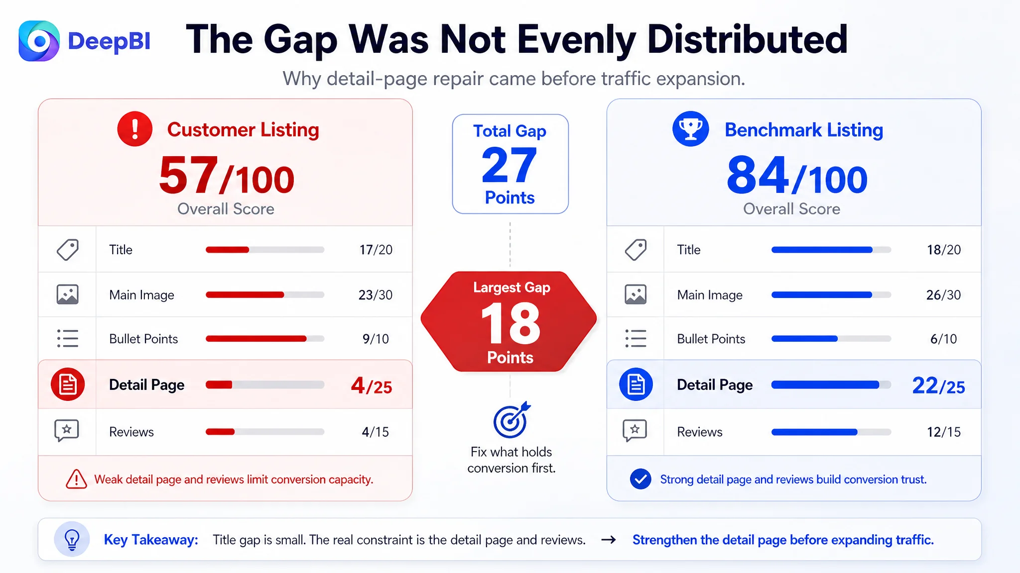
The most important fact was not that several areas needed attention. It was that the gaps were highly uneven.
The customer was relatively strong in bullet-point logic. The title was close to the benchmark. The main-image gap was meaningful but manageable. The two severe weaknesses were the detail page and review trust.
That changed the priority order:
1. Repair the product page's ability to explain and prove value.
2. Improve the image sequence so it confirms quantity, quality, use, and storage in a logical order.
3. Tighten the title to improve search clarity and click understanding.
4. Preserve the stronger bullet-point logic while aligning it with the new visual story.
5. Treat reviews as an ongoing trust constraint rather than a problem that copy alone can solve.
This was the central judgment: the page needed more conversion capacity before additional traffic could become commercially useful.
The Main Image Needed to Establish Value Before Showing Use
The image recommendations were not simply about making the product more attractive.
They clarified the role each image should play.
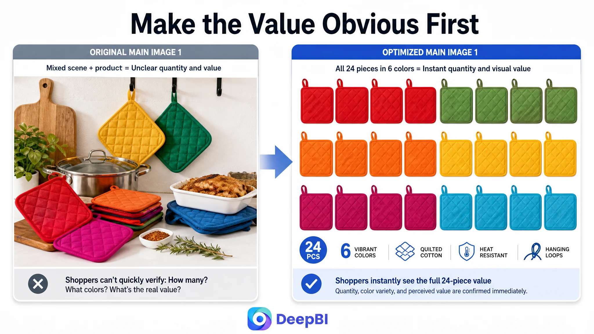
The first image: confirm abundance and color variety
The first image should focus on the product's most immediate value signals:
- 24 individual pieces
- Six colors
- Four pieces of each color
- A structured, organized arrangement
- Strong product presence in the frame
The original first image introduced usage too early, which diluted the question shoppers were asking first: “What exactly am I getting?”
For a large set, the first image should make the quantity feel real and easy to verify.
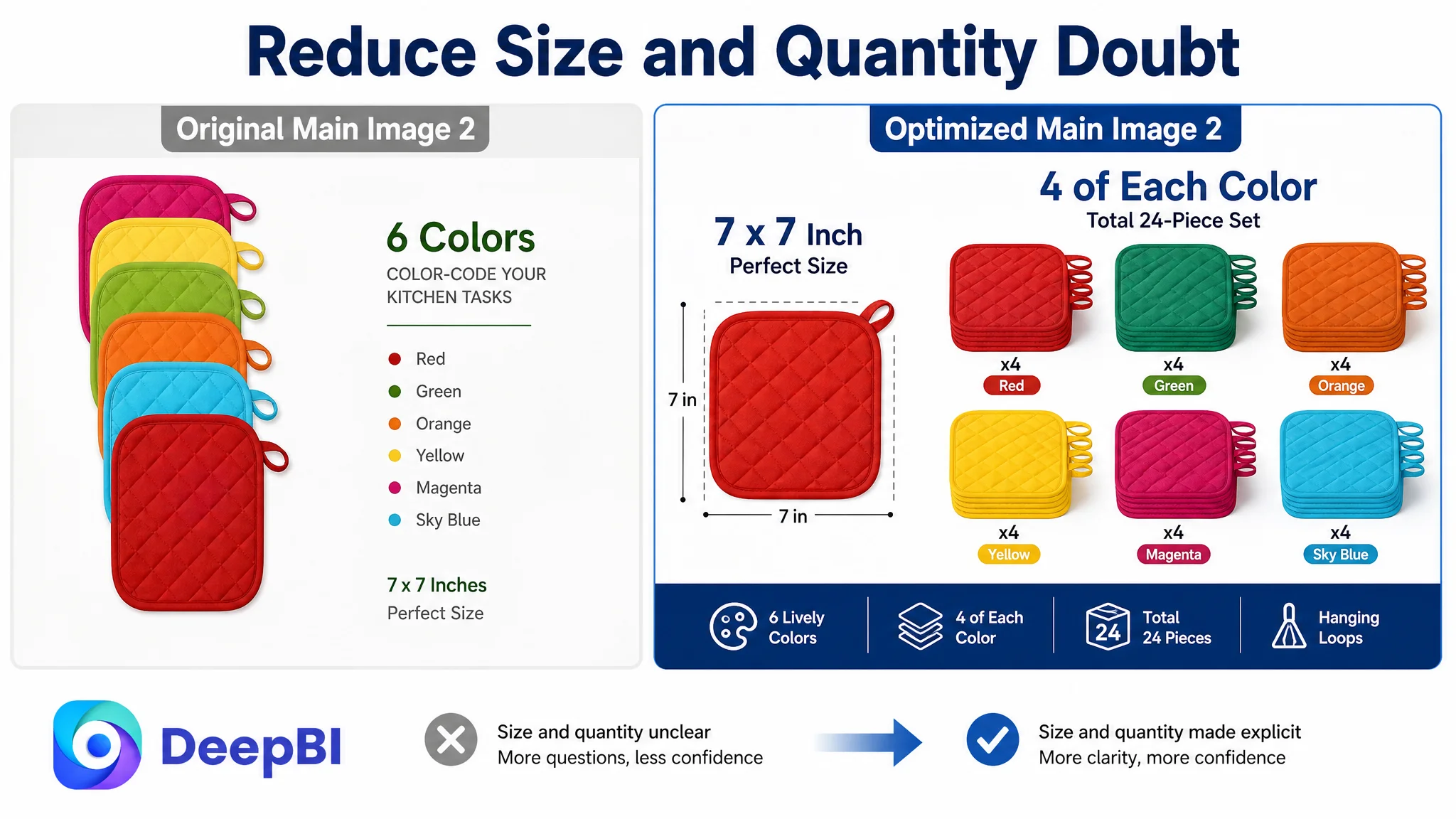
The second image: remove size and distribution uncertainty
The next image should make the 7-by-7-inch size and color breakdown equally clear.
A shopper considering a bulk set may need both pieces of information before moving on:
- How large is each potholder?
- How many pieces of each color are included?
The image should not force the customer to choose between understanding dimensions and understanding quantity distribution.
The third image: show real construction without inventing technology
The product had quilted construction, polyester-cotton material, polyester filling, and hanging loops. Those were sufficient visual anchors.
The page did not need to claim an anti-slip backing, advanced technical lining, or any other feature not established in the case material.
This restraint was important. A visual upgrade that introduces unsupported product claims may improve appearance while creating a later trust or returns problem.
The fourth image: prove practical heat-related use
Only after quantity and construction were established should the image sequence move into use:
- Handling hot pots
- Moving pans from the stove
- Removing baking dishes from the oven
- Using a potholder as a trivet to protect countertops
This created a more credible progression from “what the set is” to “how the set works in daily life.”
The fifth image: solve the storage concern
A 24-piece kitchen set can also imply clutter.
Showing multiple colored potholders hanging neatly on a rack addressed that concern directly. The hanging loop was not merely a small design feature; it supported the product's practicality as a large, frequently used set.
The A+ Page Had to Tell a Complete Kitchen Story
The detail-page rebuild was the highest-priority change because it could connect the product's separate advantages into one buying logic.
The recommended A+ structure followed this sequence:
First, make the value visible
Open with the six-color, 24-piece set in a professional kitchen context.
The purpose was to make the quantity feel useful rather than excessive. The color variety could be connected to task organization, replacement, sharing, and everyday kitchen routines.
Then, confirm the specification
A dedicated module should clarify:
- Total quantity
- Six colors
- Four pieces of each color
- 7-by-7-inch dimensions
This reduced the need for shoppers to reconstruct the offer from scattered copy.
Next, establish material confidence
The page should show the polyester-cotton construction, filling, and quilted surface as tangible product details.
The message was not simply “high quality.” It was that the construction forms a practical heat-resistant barrier for handling hot cookware and baking dishes.
After that, answer care and storage concerns
Machine washability, sturdy quilting, resistance to filling shift, and hanging loops addressed the everyday objections that bulk kitchen accessories often create.
A buyer should be able to imagine not only using the product, but also cleaning and storing it.
Finally, broaden the use case
The set could be shown in several realistic contexts:
- Removing hot cookware
- Protecting countertops with trivets
- Gripping stubborn jar lids
- Supporting family meals, gatherings, cafes, or bakeries
- Keeping enough pieces available while others are being washed
This helped justify the full 24-piece quantity.
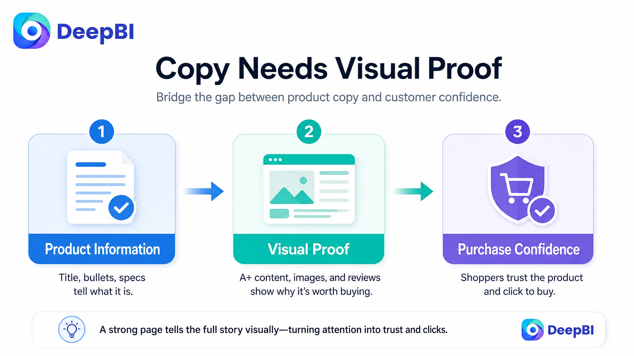
A+ content was not an add-on in this case. It was the missing layer between product information and purchase confidence.
Why DeepBI Did Not Recommend Tuning Ads First
The case material does not provide post-optimization advertising metrics such as CTR, CVR, ACOS, TACOS, or organic-order share. It would therefore be misleading to claim that ad efficiency improved or that campaign performance recovered.
The decision logic can still be stated clearly.
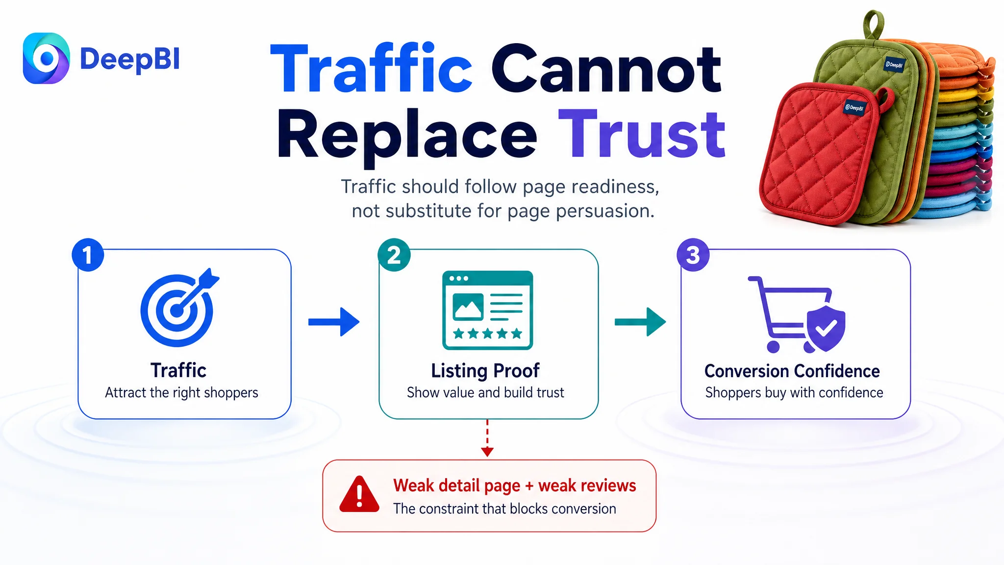
If the product page has a severe detail-page gap and a significant review-trust gap, increasing paid traffic before addressing the page creates a measurable business risk: more shoppers may enter a conversion environment that does not yet explain the product's value well enough.
That does not mean Amazon ads are unimportant. It means ads should be evaluated in relation to the Listing they are sending traffic to.
For this product, the more appropriate sequence was:
- Clarify the offer in the title.
- Make the value and variety unmistakable in the image sequence.
- Visualize construction, heat-related use, cleaning, and storage.
- Build an A+ journey that handles the main purchase objections.
- Preserve the stronger bullet-point logic and connect it to the visual narrative.
- Then use advertising data to observe whether the improved page is better able to receive and convert traffic.
This was not a decision to stop advertising. It was a decision not to use advertising as a substitute for product-page persuasion.
The Business Change Was a Change in Operating Understanding
Because the source material does not include confirmed post-optimization results, the final change should not be described as a numerical performance win.
The meaningful change was in how the Amazon seller understood the problem.
Before the diagnosis, the Listing could be viewed as a product with:
- A slightly incomplete title
- Images that needed more visual impact
- Copy that could be refined
- A small review base
After the diagnosis, the page could be understood as a conversion system with one dominant constraint: it was not making the value, quality, and practical usefulness of the full set visible enough.
That distinction changed the order of work.
The seller did not need to keep treating every weakness equally. The Listing already had relatively strong bullet-point logic. The largest opportunity was to repair the missing visual explanation and reduce avoidable uncertainty on the product page.
The case also made several risks more visible:
- Advertising could send traffic to a page with insufficient trust-building content.
- A large quantity could create doubts instead of value if it was not clearly explained.
- A weak review profile could not be fixed through claims alone.
- Attractive images would not be enough unless each image had a distinct role.
- Unsupported technical claims could create a new credibility problem.
- A+ content needed to follow a decision sequence, not become a collection of decorative modules.
The Lesson for Amazon Sellers
This kitchen potholder Listing did not fail because one title phrase was missing or because the product had no usable selling points.
It was constrained by a mismatch between the product's actual value and the amount of value the Amazon page could communicate and prove.
The score made that mismatch visible:
- The title was close.
- The bullet points were comparatively strong.
- The main-image gap was meaningful but not dominant.
- The detail page was severely underdeveloped.
- Reviews created an additional trust disadvantage.
That is why the most commercially sound next step was not to keep adjusting every element or simply push more traffic. It was to repair the page's ability to convert attention into confidence.
Before scaling Amazon ads, ask whether the Listing deserves more traffic yet.
For this product, the answer depended on making five things clear:
1. The 24-piece quantity and six-color distribution
2. The material and heat-protection story
3. The practical kitchen applications
4. The cleaning and storage advantages
5. The difference between a complete visual buying journey and a page that merely contains product information
The broader lesson is not limited to kitchen accessories. On Amazon, ad efficiency is closely tied to Listing quality. When the page cannot carry the traffic, more traffic only makes the underlying weakness easier to see.