

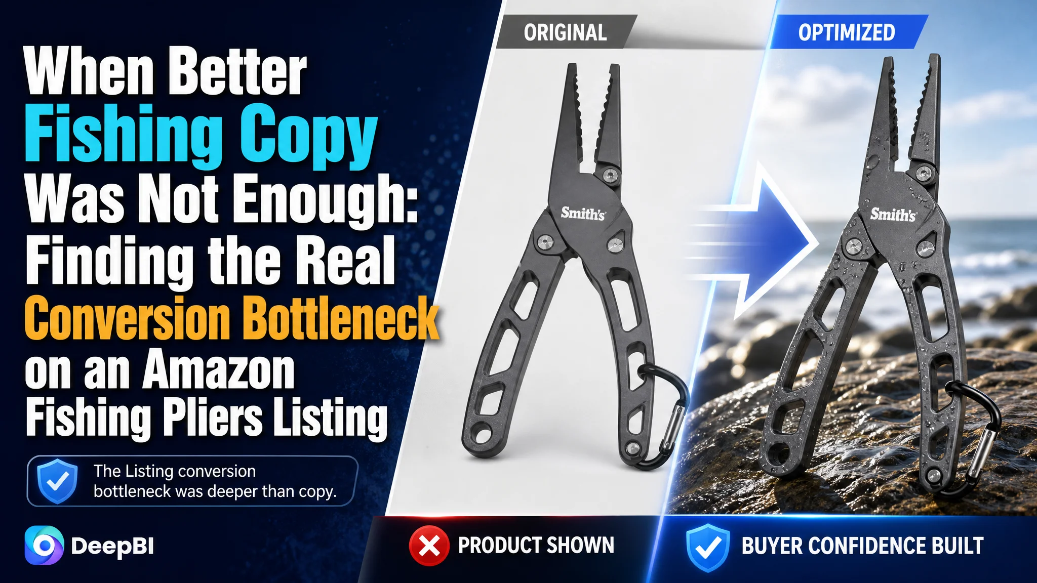
An Amazon seller selling locking aluminum fishing pliers was not facing a simple traffic problem. The product page had a functional product, relevant use cases, and a complete set of basic selling points, yet its Amazon Listing was not giving shoppers enough reasons to click, trust, and buy.
The initial direction treated the weakness as a collection of separate issues: adjust the title, add more product images, explain the functions more clearly, and continue refining the selling points. DeepBI’s diagnosis showed a deeper constraint. The Listing scored 55 out of 100 against 84 for a comparable high-performing fishing pliers Listing, with the largest gaps in reviews, A+ content, the main image, and the title structure.
The later optimization therefore focused less on adding more information and more on rebuilding the product page’s decision logic: make the product immediately understandable, demonstrate its use in real fishing situations, visualize technical proof, clarify portability and safety, and connect each feature to a specific angler concern. The broader lesson for Amazon sellers is direct: before asking Amazon ads to generate more traffic, determine whether the product page can convert that traffic.
The Product Page Was Not Empty. It Was Underpowered
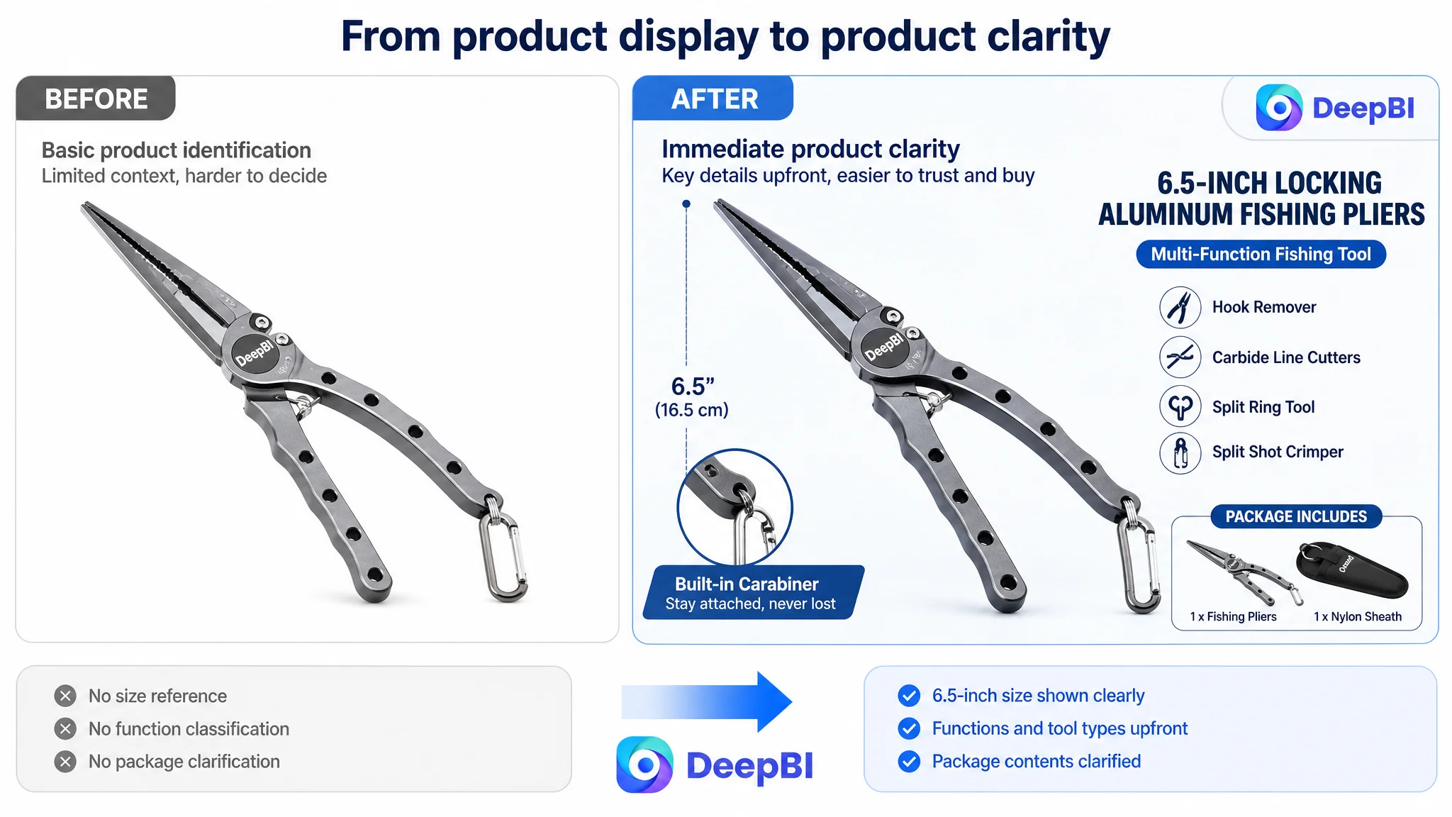
The Listing belonged to the fishing tools category and presented a 6.5-inch locking aluminum fishing pliers product for tasks such as hook removal, line cutting, crimping, and general tackle-box use.
At first glance, the page contained many of the expected elements:
- An aluminum construction claim
- Corrosion-resistance positioning
- Spring-loaded handles
- One-handed operation
- Needle-nose jaws
- Line-cutting functionality
- A built-in carabiner
- Product photography and A+ content
That made the problem easy to misread.
The page had information. But information alone is not the same as persuasion.
A shopper comparing fishing pliers is not only asking what the tool is made of. The shopper is also asking:
- Will it hold up in saltwater?
- Is it light enough to use throughout a long fishing trip?
- Can it remove a hook precisely when the fish is difficult to handle?
- Can I cut braid or mono line without struggling?
- Will the tool stay attached instead of being lost overboard?
- Does this product look credible enough to trust?
The existing Listing answered some of these questions in isolated places. It did not guide the shopper through them in a clear sequence.
The page had product information, but it did not yet provide a complete buying argument.
The Working Assumption Focused on Individual Assets
The original optimization direction was understandable. The team could see that the title was not fully competitive, the images were more passive than those of a stronger comparable Listing, and the A+ page contained too much product presentation without enough scenario-based proof.
The natural response was to improve each asset separately:
- Move important keywords forward in the title
- Add more functional descriptions
- Replace or enhance product images
- Show more product details
- Clarify the material and functions
- Improve the A+ layout
But this approach risked treating the Listing as a checklist.
A better title would not solve a weak trust path by itself. A new image would not solve the absence of social proof. More feature text would not automatically show why the product mattered during a demanding fishing trip.
The deeper issue was not that one element was completely unusable. It was that the elements did not work together as a conversion system.
Traditional Amazon advertising optimization would also have limited room to help if traffic reached a page that still left core purchase questions unanswered. More clicks could expose the weaknesses more quickly, but would not remove them.
The Listing needed a diagnosis of decision capacity, not another round of isolated editing.
The Score Gap Made the Constraint Visible
DeepBI compared the Listing with a closely matched, high-performing fishing pliers Listing rather than relying on a generic category reference.
The difference was substantial:
- Title: Customer Listing: 12/20, Comparable Listing: 15/20, Gap: -3
- Main image: Customer Listing: 21/30, Comparable Listing: 26/30, Gap: -5
- Bullet points: Customer Listing: 6/10, Comparable Listing: 6/10, Gap: 0
- A+ content: Customer Listing: 16/25, Comparable Listing: 23/25, Gap: -7
- Reviews: Customer Listing: 0/15, Comparable Listing: 14/15, Gap: -14
- Total: Customer Listing: 55/100, Comparable Listing: 84/100, Gap: -29
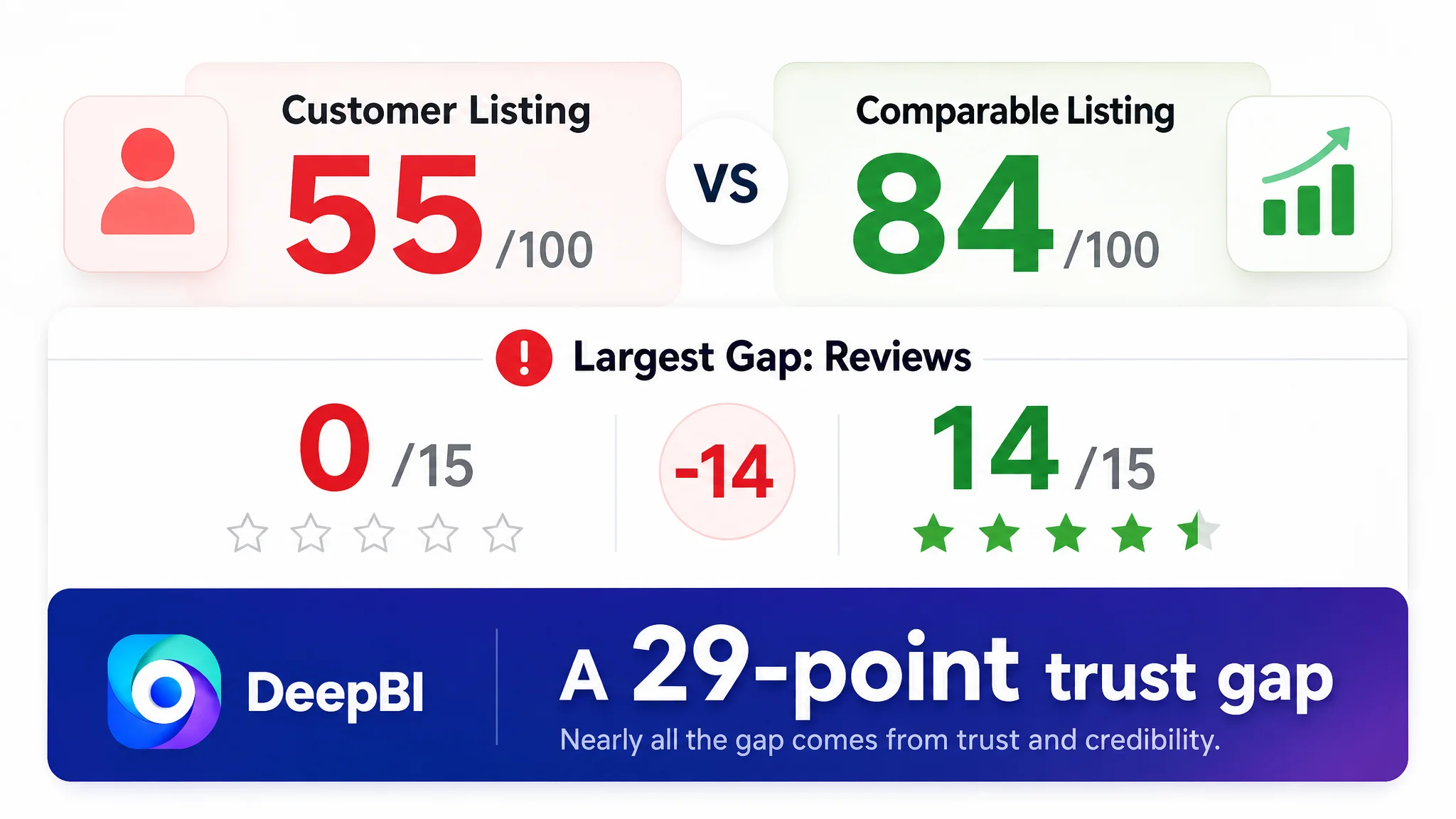
This distribution mattered more than the total score alone.
The bullet points were not the largest weakness. The most serious gaps appeared in areas that influence first impression and trust:
1. Reviews created almost no social proof.
2. A+ content did not provide enough scenario validation or evidence.
3. The main image sequence did not create a strong visual reason to continue.
4. The title covered the product category but not enough of the product’s high-value use cases.
The diagnosis was therefore not “rewrite everything.”
It was:
The Listing was losing persuasion at the moments when shoppers needed confidence most.
Zero Reviews Changed the Burden on Every Other Module
The review score was 0 out of 15. The comparable Listing showed a 4.7-star rating with 15,927 reviews, including visual reviews and detailed usage experiences.
This was not a small competitive difference.
A fishing tool is purchased partly on the basis of expected performance. Shoppers want confidence that the pliers will survive exposure to water, remain usable during a long trip, and perform when removing hooks or cutting line. Reviews normally help answer those concerns through evidence from other users.
The customer Listing had no equivalent social proof.
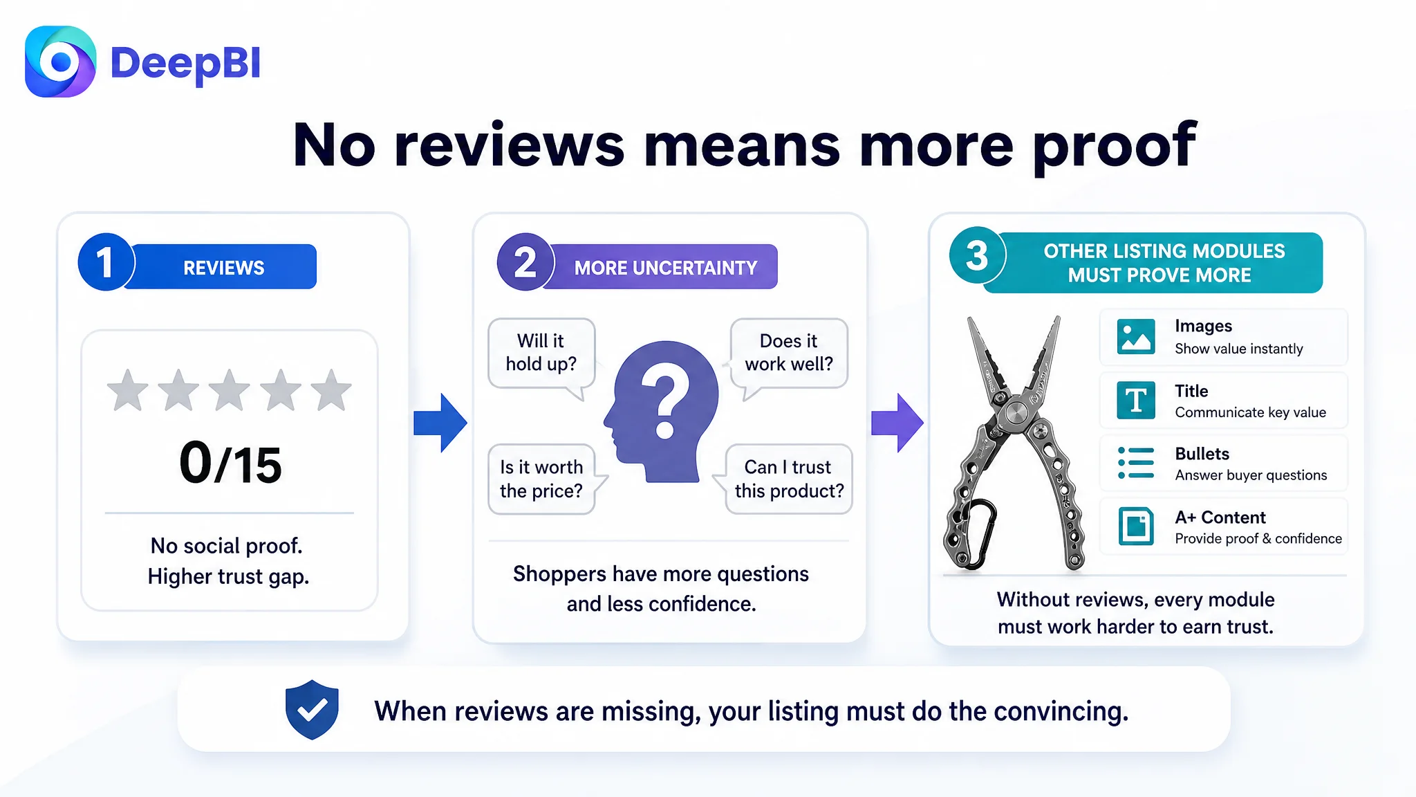
That meant the rest of the page had to carry more of the trust burden. The title, images, bullet points, and A+ content needed to be more precise because the page could not rely on a review history to fill in the gaps.
DeepBI did not treat the review gap as a reason to stop optimizing the Listing. It treated it as a reason to avoid making unsupported claims and to strengthen the forms of proof the page could control:
- Clear material explanation
- Accurate dimensions and weight where confirmed
- Realistic use scenarios
- Functional demonstrations
- More direct explanation of portability and safety
- Better alignment between product capability and intended fishing tasks
Reviews could not be replaced by visual design. But a weak page without reviews was even less able to withstand uncertainty.
The Title Was Searchable, but Not Decisive
The existing title placed the core phrase “locking aluminum fishing pliers” toward the middle or later part of the title. It identified the product, but its structure was relatively narrow:
- Brand and model
- Material
- Product name
- Color
The comparable Listing led with a more shopper-oriented product phrase and added functional and scenario terms such as fish lip gripper pliers, hook remover, split ring pliers, fly fishing, and ice fishing.
The issue was not simply keyword volume. It was the relationship between search visibility and click motivation.
A fishing shopper may be looking for a tool that performs a specific job:
- Removing hooks
- Cutting braid
- Opening split rings
- Handling fishing tasks in saltwater
- Supporting fly fishing or ice fishing
- Using one-handed during a tiring trip
The title needed to make more of those use cases visible without becoming an unstructured keyword list.
The recommended direction was to move the product’s strongest decision signals closer to the front:
- Locking aluminum fishing pliers
- Carbide line cutters
- Hook remover
- Split ring tool
- Fly, ice, and saltwater fishing
This made the title serve two purposes at once: improve search-term coverage and help the shopper understand why this particular tool deserved attention.
The title needed to answer more than “What is it?”
It needed to communicate:
- What kind of fishing tool this is
- What difficult tasks it supports
- Where it can be used
- Which functional details distinguish it from a basic pair of pliers
That is a stronger role for title optimization than simply inserting additional keywords.
The Main Image Sequence Showed the Product, but Not the Value
The main image analysis revealed a second major weakness.
The customer’s first image presented the product as a single item on a white background. That established product identity, but left uncertainty around scale, configuration, and immediate value. The comparable Listing used a stronger visual arrangement, clearer brand presentation, and more immediate context.
The difference became more important across the image sequence.
The first image needed to reduce uncertainty
The first image should quickly confirm:
- This is a 6.5-inch locking aluminum fishing pliers
- The buyer is viewing a single tool rather than an unclear kit configuration
- The product has a compact, professional form
- The primary use is immediately recognizable
The recommendation was not to add unsupported accessories or create a misleading package impression. It was to use composition and size context to make the product easier to understand at a glance.
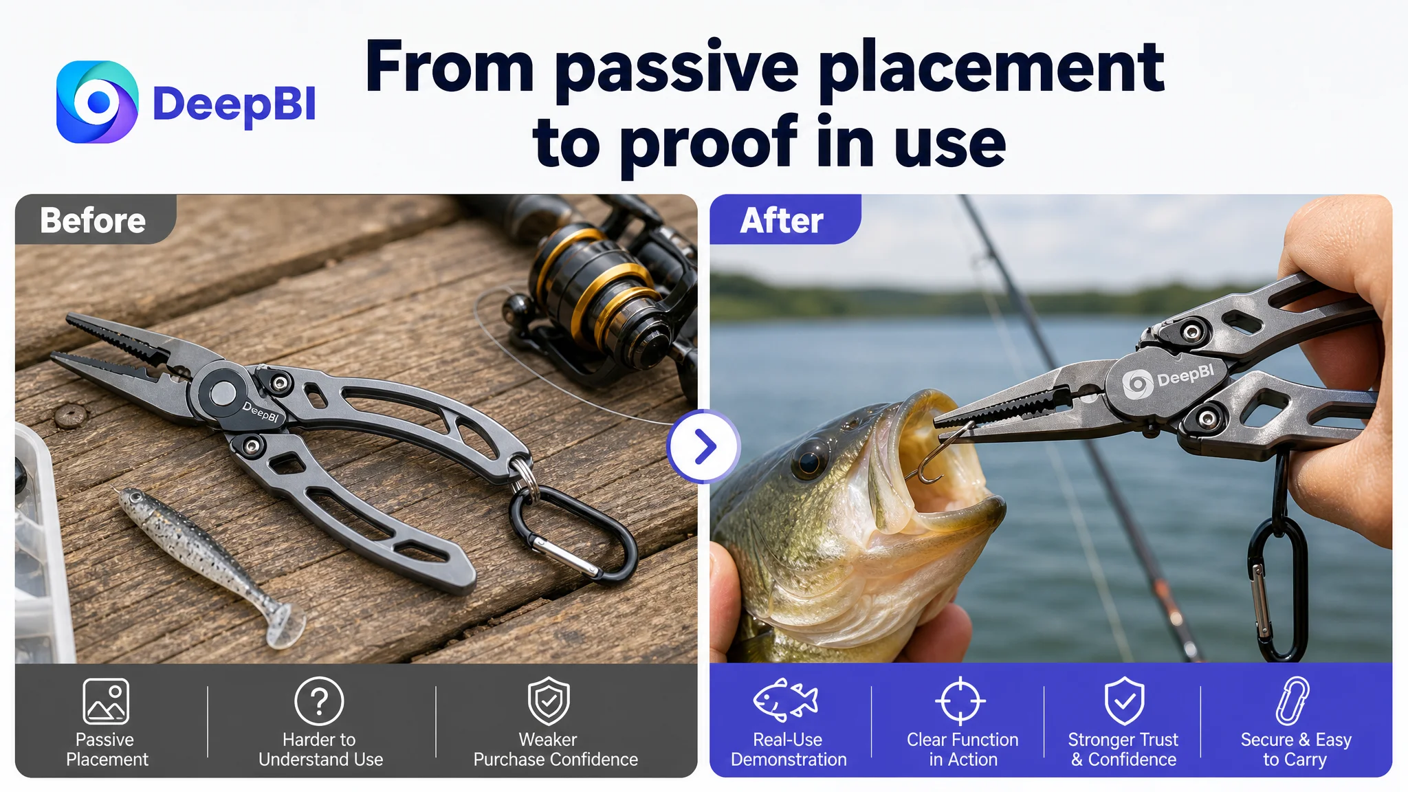
The second image needed to demonstrate use, not just placement
A passive fishing environment can establish category relevance, but it does not prove performance.
The stronger direction was to show the tool in an action-oriented saltwater or freshwater scenario, where the product’s real functions become clear:
- Corrosion resistance for marine use
- Needle-nose jaws for precise hook removal
- A tool being used rather than simply displayed
This shift matters because shoppers do not only evaluate whether a tool looks professional. They evaluate whether it appears ready for the moment when the tool is actually needed.
The third image needed to explain the tool as a system
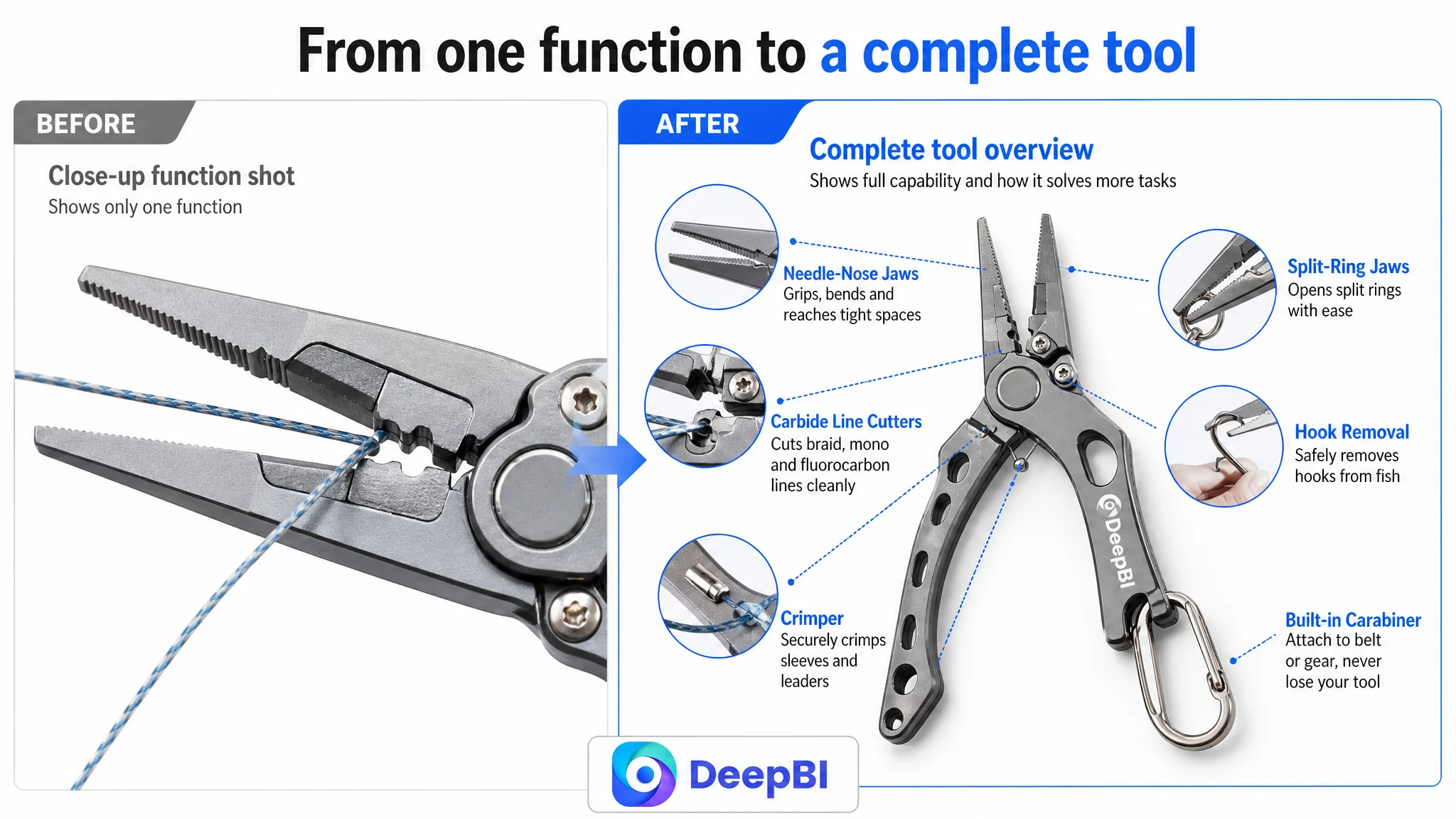
The customer’s close-up images showed individual functions, but the sequence did not form a comprehensive overview.
A more effective functional image could connect:
- Needle-nose jaws
- Carbide line cutters
- Split shot crimper
- Hook-removal capability
- Spring-loaded handles
- One-handed operation
The goal was not to place every claim into one crowded graphic. It was to show how the tool supports a series of fishing tasks.
Repetition weakened the persuasion path
One image repeated the crimping function already shown elsewhere. Another showed line cutting without clearly connecting the action to comfort, efficiency, or long-session use.
Those slots could work harder by addressing different objections:
- How the locking mechanism works
- Why one-handed operation matters
- How the spring-loaded handles reduce effort
- How the built-in carabiner keeps the tool accessible
- Why the product is suitable for particular fishing situations
A product image sequence should move the shopper forward. Repeating the same function leaves the decision in the same place.
The Bullet Points Had Structure, but Not Enough Buyer Logic
The customer’s bullet points were relatively organized. Each point addressed a distinct area such as material, design, functions, storage, or precision.
That was a strength.
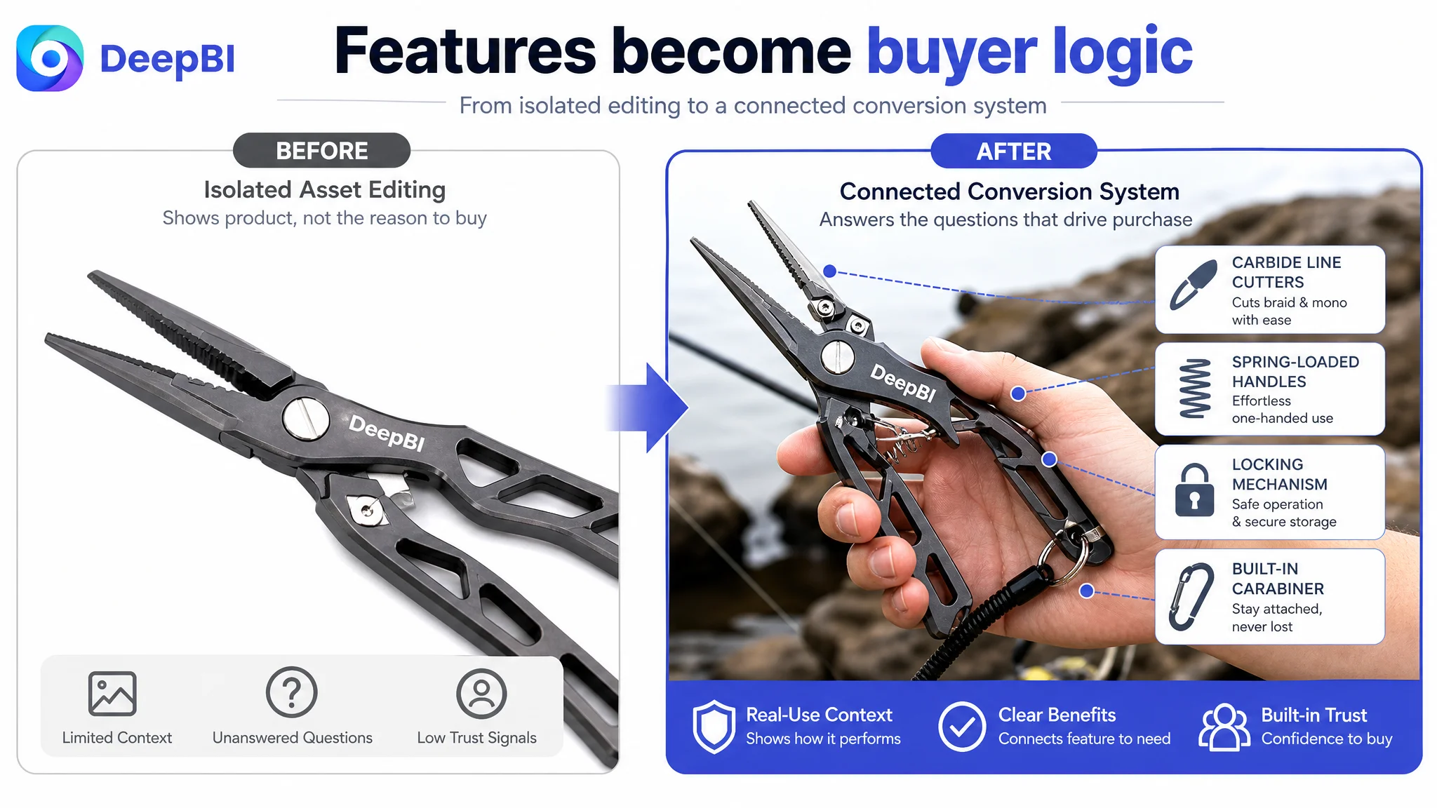
However, the wording leaned toward product-manual language. It described what the tool had, but did not consistently connect each feature to the problem an angler was trying to solve.
For example, a spring-loaded handle is not only a construction detail. Its commercial meaning is easier to understand when connected to:
- One-handed operation
- Reduced effort
- Less hand fatigue during long fishing sessions
Likewise, carbide cutters are not only a component. Their value becomes clearer when tied to:
- Cutting braid and mono lines
- Handling rigging tasks
- Reducing the need to carry multiple separate tools
The revised bullet-point logic followed a clearer sequence
The recommended structure was:
1. Durability in fishing environments
Explain anodized aluminum and suitability for saltwater and freshwater use without overstating performance.
2. Ergonomics and reduced fatigue
Connect the lightweight body and spring-loaded handles to one-handed operation during longer trips.
3. Multi-function utility
Clarify the role of needle-nose jaws, carbide line cutters, split shot crimper, and hook-removal functions.
4. Secure portability
Show how the built-in carabiner keeps the tool attached and within reach.
5. Locking and precision control
Position the locking mechanism as part of safer storage and controlled hook-removal work.
Each point then follows a more useful pattern:
Feature → fishing problem → practical result
This is more persuasive than adding adjectives to a list of specifications.
The A+ Page Was the Largest Controllable Content Gap
The A+ score was 16 out of 25, compared with 23 for the comparable Listing. The difference was not caused by a complete absence of content. The customer page included product photographs, close-ups, a logo section, comparison-style material, and different product colors.
The problem was how the content was being used.
The comparable Listing created a stronger trust chain:
1. High-impact fishing scene
2. Visualized specifications
3. Real user scenarios and review evidence
4. Packaging and product presentation
5. Video or demonstration entry point
The customer’s A+ content relied more heavily on static product presentation and general brand material. The brand-history content had limited connection to the specific fishing pliers being evaluated.
The page therefore spent valuable space showing what the product looked like, but not enough space proving why it could be trusted in use.
The A+ page was not missing decoration. It was missing a sequence of reassurance.
Why DeepBI Prioritized Listing Conversion Before Advertising Expansion
At this stage, continuing to tune advertising first would have created a measurement problem.
If an ad campaign generated more traffic while the page still lacked:
- A persuasive first impression
- Clear product scope
- Strong functional demonstrations
- Visible dimensions and weight
- Scenario-based validation
- Social proof
- A complete explanation of portability and safety
then the seller could not easily distinguish between a traffic problem and a page-conversion problem.
The risk was not simply wasted spend. It was amplifying a weak customer decision path and then blaming the campaigns for the outcome.
DeepBI’s judgment was to repair the page’s conversion capacity first, especially the controllable gaps in the title, image logic, and A+ content. The review gap remained a market reality, but the page could still become more precise, more credible, and more useful to shoppers.
The decision order was therefore:
1. Make the product and use cases immediately clear.
2. Strengthen the visual and textual explanation of core functions.
3. Add real-world fishing scenarios and technical confirmation.
4. Use the A+ page to answer durability, weight, performance, and portability concerns.
5. Only then evaluate how advertising traffic behaves against the revised page.
This was not a decision to ignore Amazon ads. It was a decision to stop using ads as the first response to a product-page constraint.
The A+ Rebuild Followed the Shopper’s Questions
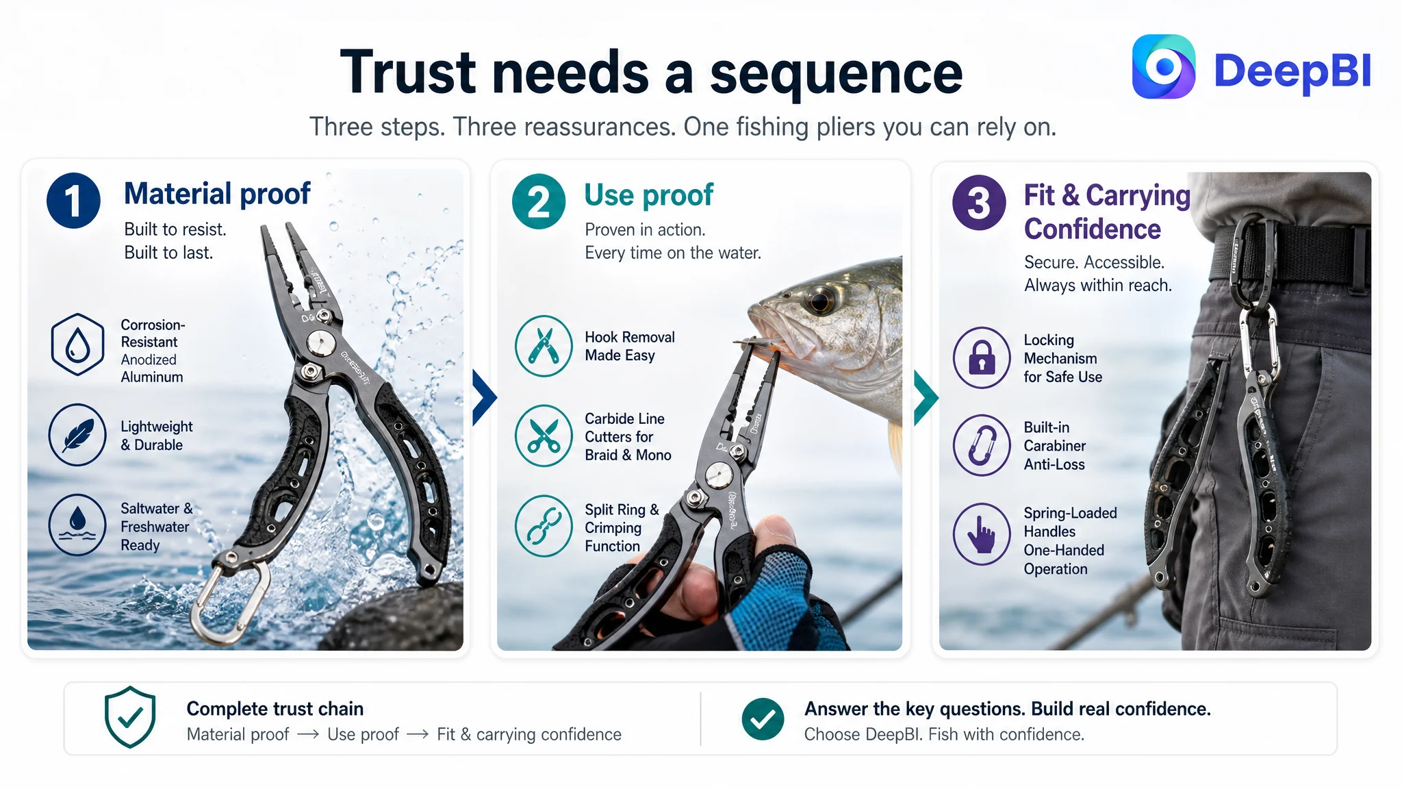
The recommended A+ structure was organized around the questions a buyer is likely to ask while considering fishing pliers.
Durability: Will it hold up in the environment where I fish?
The opening module needed to lead with anodized aluminum and corrosion resistance for saltwater and freshwater use.
A general lifestyle image was not enough. The first content block had to create rational confidence that the material choice was relevant to marine conditions.
Dimensions and weight: Will it feel cumbersome?
The next module needed to visualize compact dimensions and lightweight design using confirmed product specifications.
This would make the ergonomic claim more concrete and help the shopper judge whether the tool fits a belt, loop, or tackle setup.
Function: Can it handle the jobs I need?
A dedicated module should combine functional explanations with realistic demonstrations of:
- Carbide line cutting
- Precision hook removal
- Needle-nose control
- Split shot crimping
The goal was to prove practical usefulness rather than display a collection of disconnected close-ups.
Difficult situations: Does it work when the task is demanding?
The A+ page needed stronger operational validation, including realistic fishing scenarios and, where appropriate, use with larger catches or difficult hook-removal situations.
This should remain grounded in the product’s actual capabilities. The point was not to create dramatic but unsupported claims. It was to show the tool in conditions that resemble the buyer’s real concerns.
Portability: Will I be able to keep it with me?
The customer’s built-in carabiner was an underused differentiator.
Instead of treating it as a small accessory detail, the page could show the attachment method and explain its practical role:
- Quick access
- Secure carrying
- Reduced risk of accidental loss
- Better integration with a belt or fishing loop
Fit: Is this the right tool for my fishing tasks?
The final module needed to clarify intended uses and possible limitations.
This helps reduce a different type of conversion risk: a purchase made under the wrong expectation. A page that explains who the product is for can build more durable trust than one that presents every use case as universal.
DeepBI’s Advantage Was the Order of Judgment
The value in this case did not come from producing a longer title or suggesting more images. Those actions are easy to list.
The more important work was deciding which problem had to be addressed first.
DeepBI connected the score gaps to the shopper’s decision path:
- The title restricted search and click context.
- The main image sequence showed functions without enough progression.
- The bullet points contained features but did not consistently express feature-to-problem logic.
- The A+ page lacked strong scenario validation and measurable proof.
- The absence of reviews increased the trust burden on every controllable part of the Listing.
That created a more precise operating conclusion:
The Listing did not need more traffic before it had earned more confidence.
The resulting optimization recommendations were also constrained by what the product actually was. The direction was to improve composition, scenario, information hierarchy, and explanation without changing the tool’s physical design or inventing unsupported specifications.
That distinction matters in Amazon Listing optimization. A visually stronger page is not useful if it creates expectations the product cannot meet.
What the Revised Direction Was Designed to Change
The case material does not provide verified post-optimization CVR, CTR, ACOS, TACOS, or organic-order results. It would therefore be misleading to claim a specific performance lift.
The supported change is in the operating direction and the business risk being addressed.
The Listing was repositioned to:
- Put the core product phrase and use cases closer to the front of the title
- Make the 6.5-inch locking aluminum fishing pliers immediately understandable
- Show the product in realistic saltwater and freshwater contexts
- Present the tool’s functions as a connected set of fishing tasks
- Explain lightweight, spring-loaded, one-handed operation through buyer benefit
- Give the built-in carabiner a clear portability role
- Use A+ content to establish material, specification, function, scenario, and fit
- Replace repetitive or irrelevant content with modules that answer purchase objections
- Avoid relying on unsupported claims to compensate for the lack of reviews
The intended business effect was not simply a more attractive page. It was a more controllable conversion environment for future Amazon traffic.
When a page clearly communicates what the product does, why it matters, and where it fits, advertising data becomes easier to interpret. A weak page makes every campaign decision ambiguous. A clearer page creates a better basis for judging traffic quality and ad performance.
The Lesson for Amazon Sellers
This fishing pliers Listing looked like a typical optimization project: improve the title, refine the images, rewrite the bullets, and add stronger A+ content.
The deeper diagnosis was different.
The product page had not failed because it lacked every important feature. It struggled because those features were not assembled into a convincing path from search result to purchase decision. The zero-review situation made that weakness more severe, while the static A+ structure and passive image sequence left too much trust-building work unfinished.
For Amazon sellers, the practical lesson is to separate three questions:
1. Can shoppers find the product?
2. Will the main image and title earn attention?
3. Can the product page convert that attention into confidence?
Amazon ads can help answer the first question. They cannot independently solve the third.
Before scaling traffic, judge whether the Listing can carry the traffic.
That was the critical shift in this case: from treating Amazon performance as an advertising adjustment problem to recognizing that Listing conversion capacity was the more urgent constraint.