

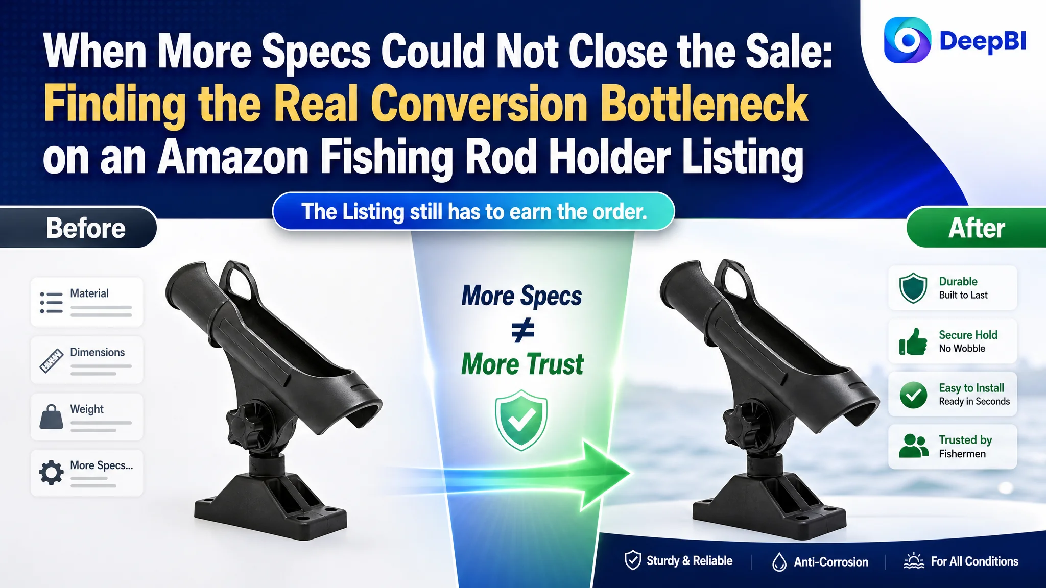
This case involved an Amazon seller in the boating and fishing accessories category whose fishing rod holder Listing was not competitive enough at the product-page level. The team initially focused on adding technical details, explaining dimensions, and presenting more product functions. Those changes addressed what the product was, but not why a shopper should trust it, click it, and buy it.
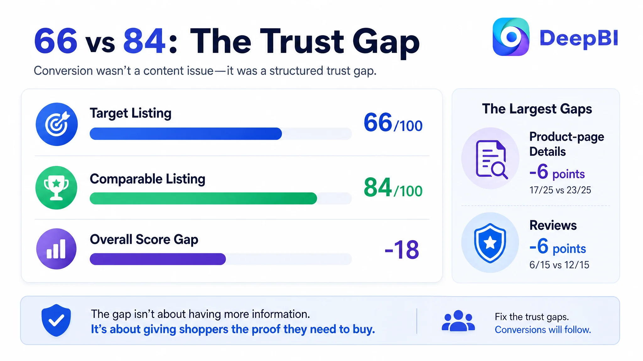
DeepBI’s diagnosis showed that the larger problem was not a lack of information. It was a lack of decision-making logic across the Amazon product page. The Listing scored 66 out of 100, compared with 84 for a comparable high-performing Listing. The most serious gaps appeared in the product-page detail experience and customer trust signals, while the title and main image also weakened search-page competitiveness.
The later optimization therefore focused on rebuilding the Listing around the buyer’s real concerns: corrosion resistance, four-rod capacity, mounting confidence, adjustability, protection for fishing rods, and credible use in real boat environments. The case offers a practical lesson for Amazon sellers: before pushing more traffic through Amazon ads, first determine whether the product page gives that traffic enough reason to convert.
The Amazon Listing Had a Traffic Problem on the Surface—and a Trust Problem Beneath It
The target Listing received a total score of 66 out of 100, while the comparable high-performing Listing scored 84.
The gap was not evenly distributed:
- Title: Target Listing: 13/20, Comparable Listing: 16/20, Gap: -3
- Main image: Target Listing: 24/30, Comparable Listing: 27/30, Gap: -3
- Bullet points: Target Listing: 6/10, Comparable Listing: 6/10, Gap: 0
- Product-page details: Target Listing: 17/25, Comparable Listing: 23/25, Gap: -6
- Reviews: Target Listing: 6/15, Comparable Listing: 12/15, Gap: -6
At first glance, the result could easily be interpreted as a content-volume problem. The product page already contained dimensions, feature close-ups, rotation illustrations, and a usage image. The bullet points included material, capacity, adjustment, installation, and application information.
But the page was still not answering the questions that determine conversion for a boat-mounted fishing accessory:
- Will it remain stable under pressure?
- Can it handle four rods at the same time?
- Will installation be difficult?
- Are the mounting parts included?
- Can it withstand saltwater exposure?
- Will the coating protect the rods from scratches?
- Can shoppers visualize the holder being used on a real boat?
The Listing did not lack specifications. It lacked proof in the order shoppers needed it.
That distinction mattered for Amazon ads as well. Paid traffic can bring a shopper to the product page, but it cannot repair missing trust, unclear product positioning, or weak usage proof. If those page-level issues remain unresolved, additional traffic can simply expose the same conversion leak at greater cost.
The Original Direction: Add More Function, Explain More Details
The customer’s existing Listing leaned heavily toward functional description.
The title emphasized installation hardware, rotation, and adjustable height, but placed the main search term “Fishing Rod Holder” too far back. The opening language described the product’s construction rather than immediately establishing the category and its strongest buying reason.
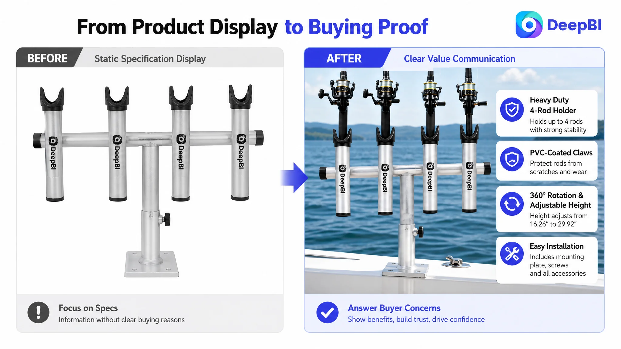
The main image set showed the product and its dimensions, but the visual sequence was relatively static:
- A simple product view
- Dimension information
- A contextual image with limited proof
- Repeated rotation or adjustment demonstrations
- Feature close-ups without a fully loaded usage scene
The bullet points also leaned toward parameter presentation. Dimensions, load capacity, installation, and materials were present, but the structure did not consistently connect each feature to a user concern.
The product page appeared to follow a reasonable internal logic:
1. Show the product.
2. Explain its dimensions.
3. Present its adjustment functions.
4. Describe the material.
5. Add a usage image.
The problem was that shoppers do not necessarily evaluate a marine accessory in that order.
They first need confidence in quality and suitability. Then they want to know whether it can carry the required load, whether it will remain stable, and whether it can be installed without unnecessary effort. Only after those concerns are reduced do adjustment details become persuasive.
This was the central misdiagnosis: the page treated technical completeness as if it were the same as buying confidence.
The Largest Gap Was Not the Bullet Points
The bullet-point score was the same as the comparable Listing: 6 out of 10.
That did not mean the bullet points were strong. It meant the largest competitive constraint was elsewhere.
The wording still contained several weaknesses:
- Functional details were presented as a list rather than as solutions to fishing-use problems.
- Installation and adjustment information overlapped.
- Capacity, protection, and durability were not arranged into a clear priority order.
- The closing language focused more on service assurance than purchase motivation.
- The bullets did not consistently turn a specification into a reason to choose the product.
For example, “360-degree rotation” is a feature. It becomes more meaningful when connected to positioning a rod for trolling, anchor fishing, or changing the angle on a boat.
“PVC-coated claws” is a material detail. It becomes more persuasive when connected to protecting rods from wear and scratches.
“A telescopic T-bar” is a structural feature. It becomes more useful when the shopper can understand its adjustment range and how that range affects installation and use.
DeepBI’s recommended structure moved the copy toward a feature-to-concern sequence:
- Heavy-duty aluminum and corrosion resistance
- Four-rod capacity with adjustable height and rotation
- Quick installation and space-saving removal
- Versatile use across boat, lake, river, and sea fishing
- Protection for rods through PVC-coated contact points
The goal was not to add more words. It was to make each bullet carry one clear commercial responsibility.
The title needed to win both search recognition and click attention
The target title placed “Fishing Rod Holder” later than the comparable Listing and spent valuable opening space on installation-related wording.
The recommended direction moved the core category term and material combination forward:
PVC Coated Aluminum Fishing Rod Holder with Mounting Plate, 360° Rotation & Adjustable Height for Boat, Yacht and Marine Use
The proposed structure gave the title a clearer order:
1. Core product category
2. Material and construction
3. Important mounting context
4. Main functional differentiators
5. Relevant marine use cases
The adjustment from “360 Degree” to “360°” also made the expression shorter and easier to scan. More importantly, the title stopped making the shopper work to identify what the product was.
On Amazon, title structure affects more than keyword coverage. It affects whether the shopper can quickly classify the product and understand why it deserves attention in a crowded search result.
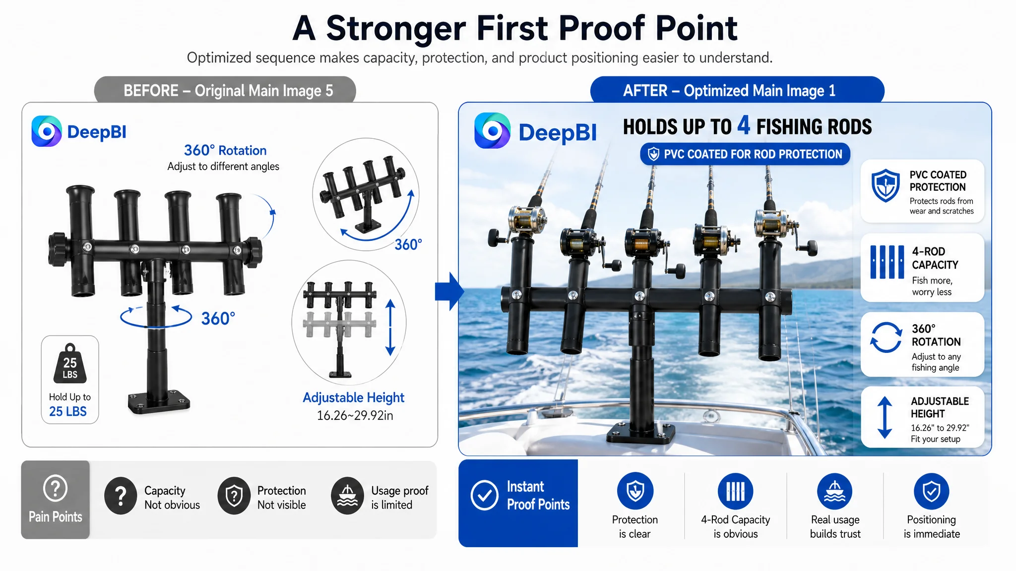
The main image did not create enough reason to click
The main-image score was 24 out of 30, only three points behind the comparable Listing. That relatively small numerical gap still represented an important search-page weakness.
The product was visible, but the image sequence did not communicate its strongest advantages early enough:
- Four-rod capacity was not demonstrated with a fully loaded setup.
- The PVC-coated contact points were not given enough visual importance.
- The installation hardware was not clearly introduced.
- The telescopic height range was not shown as a clear visual span.
- The product appeared in a limited real-use context.
- Rotation and adjustment information was repeated without adding enough new proof.
A shopper scanning Amazon search results does not study every technical diagram. The first visual impression must make the product’s use and value understandable almost immediately.
For this Listing, the stronger visual path was not “show another angle.” It was:
- Show the heavy-duty construction.
- Show the rod-protective coating.
- Show four rods held at once.
- Show the holder mounted securely.
- Show the adjustment range in a real boat setting.
- Show the included mounting components.
The main image problem was not simply visual quality. It was the absence of a strong first proof point.
The Detail Page Was Consuming the Traffic
The most significant content gap appeared in the product-page detail experience: 17 out of 25, compared with 23 out of 25 for the comparable Listing.
The difference was visible in the structure of the A+ and supporting images.
The target page relied mainly on:
- A product image
- A dimension diagram
- One contextual scene
- Feature close-ups
- A component breakdown
The comparable page used a broader conversion sequence:
- Brand and quality positioning
- Multiple real boat scenes
- Real-person usage images
- Installation and removal demonstrations
- Visual comparison panels
- Icon-based benefit modules
The issue was not that every Amazon seller must imitate a competitor’s exact layout. The issue was that the target page left too many decision questions unanswered.
The first modules needed to answer “Can I trust this product?”
The opening detail modules focused more on product identity and technical information than on quality reassurance.
For a marine accessory, the opening message should establish:
- Heavy-duty aluminum construction
- Corrosion resistance in saltwater and freshwater environments
- PVC-coated protection for the fishing rods
- A practical installation experience
- Stable support for demanding fishing use
These points should not remain buried in later text. They should appear early because they address the shopper’s highest perceived risks.
The recommended direction was to turn the opening module into a concise value summary rather than another isolated product shot.
Capacity needed to be demonstrated, not only stated
The Listing claimed capacity for up to four fishing rods, but the visual material did not consistently prove that capacity.
A single-rod or lightly populated scene creates ambiguity. Shoppers may understand the claim but still wonder whether the structure looks stable when fully loaded.
The proposed solution was to show the holder carrying four rods in a realistic boat environment. This would connect the capacity claim with a visible use case and make the structure easier to assess.
A capacity statement tells shoppers what the product can hold. A full-load scene helps them believe it.
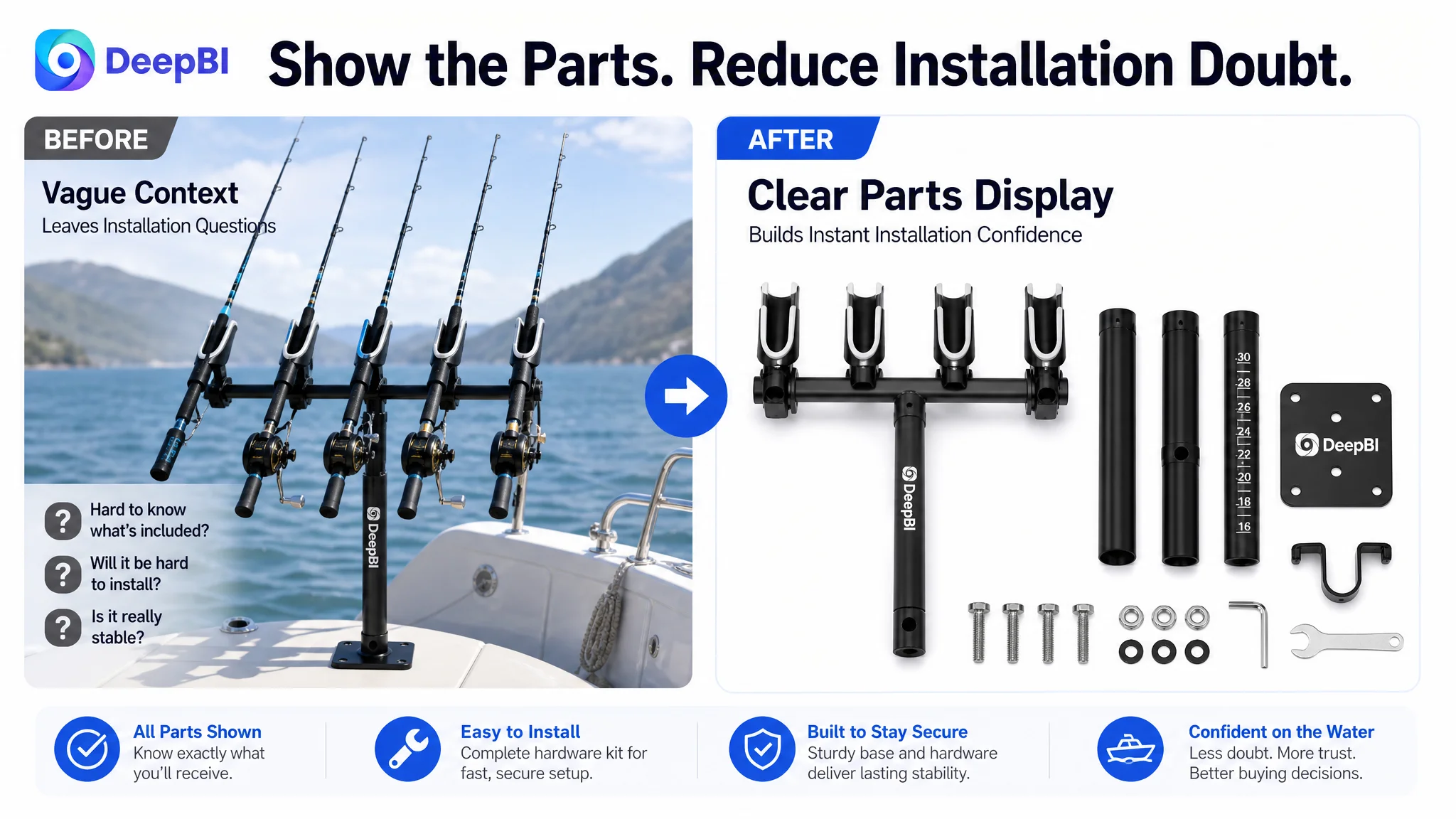
Installation anxiety needed its own visual answer
The existing content did not make the installation path sufficiently clear. This creates several forms of friction:
- Uncertainty about whether mounting hardware is included
- Concern about installation time
- Concern about stability at the base
- Concern about removing the holder when it is not in use
- Uncertainty about compatibility with boats, ships, or yachts
The recommended content therefore gave installation a dedicated role:
- Show the mounting bracket and bolts.
- Show the square base secured to a boat surface.
- Explain that the necessary hardware is included.
- Demonstrate removal and compact storage.
- Avoid leaving installation concerns to a generic contextual image.
This is an example of why page modules should have distinct jobs. A scene image may show that the product exists on a boat, but it does not necessarily prove that the mounting process is easy or secure.
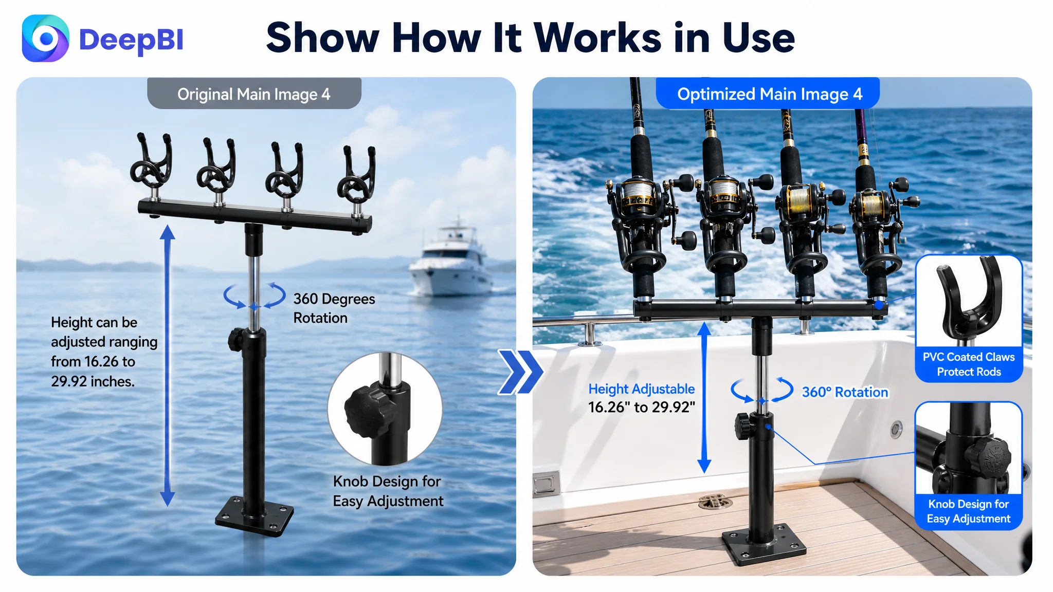
Adjustment content was repeated without enough functional context
The product page showed rotation and height adjustment in multiple places, but repetition did not automatically increase persuasion.
The better sequence was to assign each image a specific question:
- What is the height adjustment range?
- How does the telescopic T-bar work?
- How do the adjustable buttons or knobs control the position?
- How does the base rotate?
- How do the claws tilt?
- How does this flexibility help during actual fishing?
The goal was to move from abstract movement diagrams to functional proof. Instead of showing rotation again, the page needed to show why the adjustment matters when rods are positioned in different directions or when the angler is trolling or anchoring.
Reviews Turned a Content Gap Into a Trust Gap
The review dimension scored 6 out of 15, producing another six-point gap against the comparable Listing.
The target Listing had:
- 3.7 stars
- 21 total reviews
- 8 reviews visible on the first page
The comparable Listing had:
- 4.7 stars
- 10 total reviews
- 8 reviews visible on the first page
The target Listing had more reviews by volume, but its visible review quality was weaker. Three of the eight first-page reviews were one- or two-star reviews, representing 37.5% of the visible sample.
The negative feedback focused on serious product concerns, including:
- Welding that was not square
- Difficulty locking the holder securely
Those comments were especially damaging because they directly contradicted the trust questions the product page needed to answer. A shopper evaluating a boat-mounted holder is already sensitive to stability, durability, and secure installation. Negative reviews about those exact areas can override polished images or improved copy.
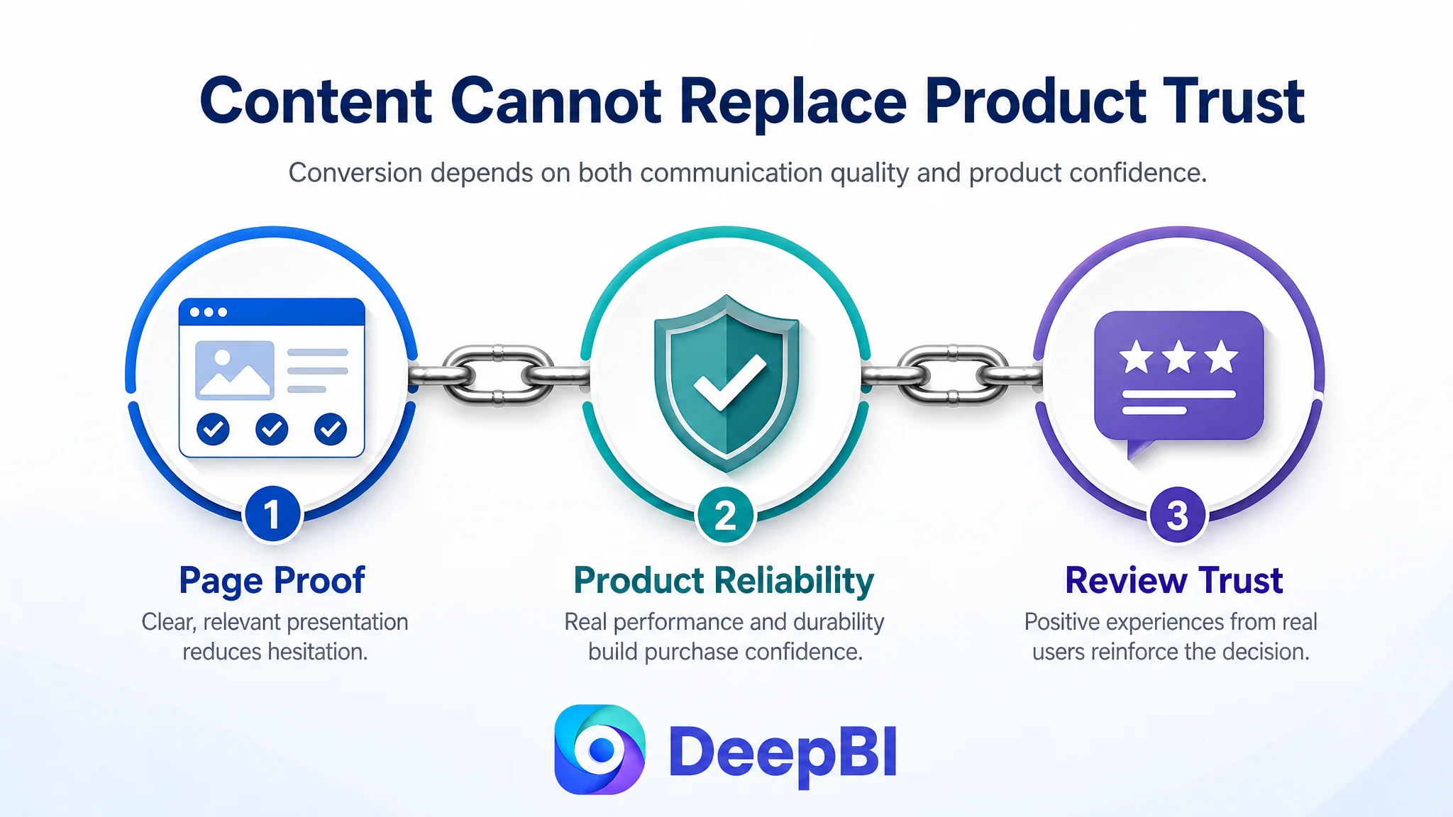
This also explained why adding more page detail alone would not be enough. The Listing had both a communication problem and a product-confidence problem.
The correct business response was not to hide the review gap behind more design work. It was to treat product quality and review experience as part of the conversion diagnosis:
- Investigate the reported structural and locking issues.
- Improve consistency in manufacturing and inspection.
- Make the installation and locking mechanism easier to understand.
- Build future positive feedback through a better product experience.
- Avoid treating review quantity as a substitute for review trust.
A product page can explain a feature. It cannot fully neutralize repeated evidence that the feature may fail in use.
Why DeepBI Did Not Recommend Tuning Ads First
The diagnosis pointed to a specific decision order.
If the team continued adjusting bids, keywords, or campaign structure before repairing the Listing, the ads would still be sending shoppers to a page with:
- A weaker search-result message
- Limited real-use proof
- Insufficient installation reassurance
- Repeated rather than sequenced feature communication
- A materially weaker review profile
That would make advertising performance harder to interpret. A low conversion rate could be caused by targeting, traffic quality, price, product-market fit, or the page itself. When the page has clear content and trust gaps, increasing ad precision does not remove the underlying uncertainty.
The more responsible path was:
1. Repair the Listing’s first impression.
2. Clarify the product’s core value and category relevance.
3. Demonstrate capacity, stability, installation, and protection.
4. Improve the page’s trust structure.
5. Address the product issues reflected in reviews.
6. Then evaluate how paid traffic responds.
This sequence prevents Amazon ads from amplifying a low-conversion product page.
It also makes later advertising analysis more useful. Once the page communicates the product more clearly, changes in CTR and CVR can be interpreted with greater confidence.
The New Page Logic: From Product Description to Purchase Reassurance
The recommended optimization did not attempt to make every image communicate every feature. It rebuilt the page around the concerns that most directly affected purchase confidence.
First: Establish marine-grade durability and protection
The opening content should position the holder through its heavy-duty aluminum construction, corrosion resistance, and PVC-coated contact points.
The shopper should understand quickly that the product is designed for boat use and that it is intended to withstand demanding freshwater or saltwater conditions.
The PVC coating should also be shown as a protection feature, not merely listed as a material detail. It helps address the concern that repeated contact could wear or scratch the fishing rods.
Second: Prove four-rod capacity in use
The page should use a full-load scene to show four rods held simultaneously.
That visual should communicate:
- Capacity
- Structural stability
- Practical spacing
- Relevance to actual fishing activity
This is more persuasive than presenting “four rods” as a standalone numerical claim.
Third: Remove installation uncertainty
A dedicated installation module should show the included mounting bracket and bolts, the base connection, and the removal process.
The objective is to reduce the shopper’s perceived effort and risk before purchase. “Easy installation” becomes credible when the page shows the parts and the steps that make it possible.
Fourth: Make adjustability useful
The page should explain the height range from 16.26 inches to 29.92 inches, the telescopic T-bar, and the rotation and angle adjustments.
But those details should be connected to actual use:
- Positioning rods at different heights
- Adjusting angles for trolling or anchor fishing
- Adapting to different boat layouts
- Removing the holder for storage when it is not needed
The visual sequence should help shoppers understand the product’s freedom of movement, not simply confirm that the product has moving parts.
Fifth: Use real scenes to build confidence
The existing scene content was limited and relied partly on a synthetic background. The stronger direction was to show authentic-looking boat environments with the holder actively in use.
Useful scenes would include:
- A holder mounted on a boat deck
- Several rods in position
- An angler operating nearby
- Trolling or anchor-fishing use
- Different boat or fishing contexts
The purpose is not decoration. It is to help shoppers see how the product behaves in the conditions where they intend to use it.
What This Case Changed About the Seller’s Decision
There was no confirmed post-optimization performance dataset in the case material, so it would be inappropriate to claim a specific improvement in CTR, CVR, ACOS, or organic orders.
The documented change was a change in operating logic.
The team moved away from asking:
“Which additional specification should we add?”
and toward asking:
“Which purchase concern is still unresolved at each point of the Amazon product page?”
That change produced a clearer priority order:
- Search visibility began with title recognition and a stronger first impression.
- Product-page conversion depended on capacity, stability, installation, and protection proof.
- A+ content needed to support the buying decision rather than repeat technical information.
- Reviews revealed a product-confidence issue that content alone could not solve.
- Amazon ads should be evaluated after the page was capable of receiving and converting traffic more effectively.
This is the commercial value of the diagnosis. DeepBI did not treat the 66-point score as a reason to optimize every element at once. It used the comparison to identify where the page was losing the most decision power.
The Broader Lesson for Amazon Sellers
An Amazon Listing can contain the right keywords, accurate dimensions, and multiple product images while still failing to convert efficiently.
The reason is that conversion does not come from information volume alone. It comes from whether the page resolves the shopper’s doubts in the right order.
For this fishing rod holder, the most important questions were not abstract:
- Is it durable enough for marine use?
- Can it hold four rods?
- Will the base stay secure?
- Is installation manageable?
- Will the holder protect the rods?
- Does the product look credible in a real boat environment?
- Do existing customers confirm the quality?
Once those questions became the organizing principle, the optimization direction became more disciplined.
Amazon ads can bring a shopper to the Listing. The Listing still has to earn the order.
For sellers in boating, automotive accessories, outdoor equipment, and other trust-sensitive categories, the same reasoning applies. Before increasing traffic or continuing to tune campaigns, assess whether the Amazon product page can convert the traffic it already attracts.
The strongest optimization is not always the one that adds the most content. It is the one that identifies the most expensive unresolved doubt—and fixes that doubt first.