

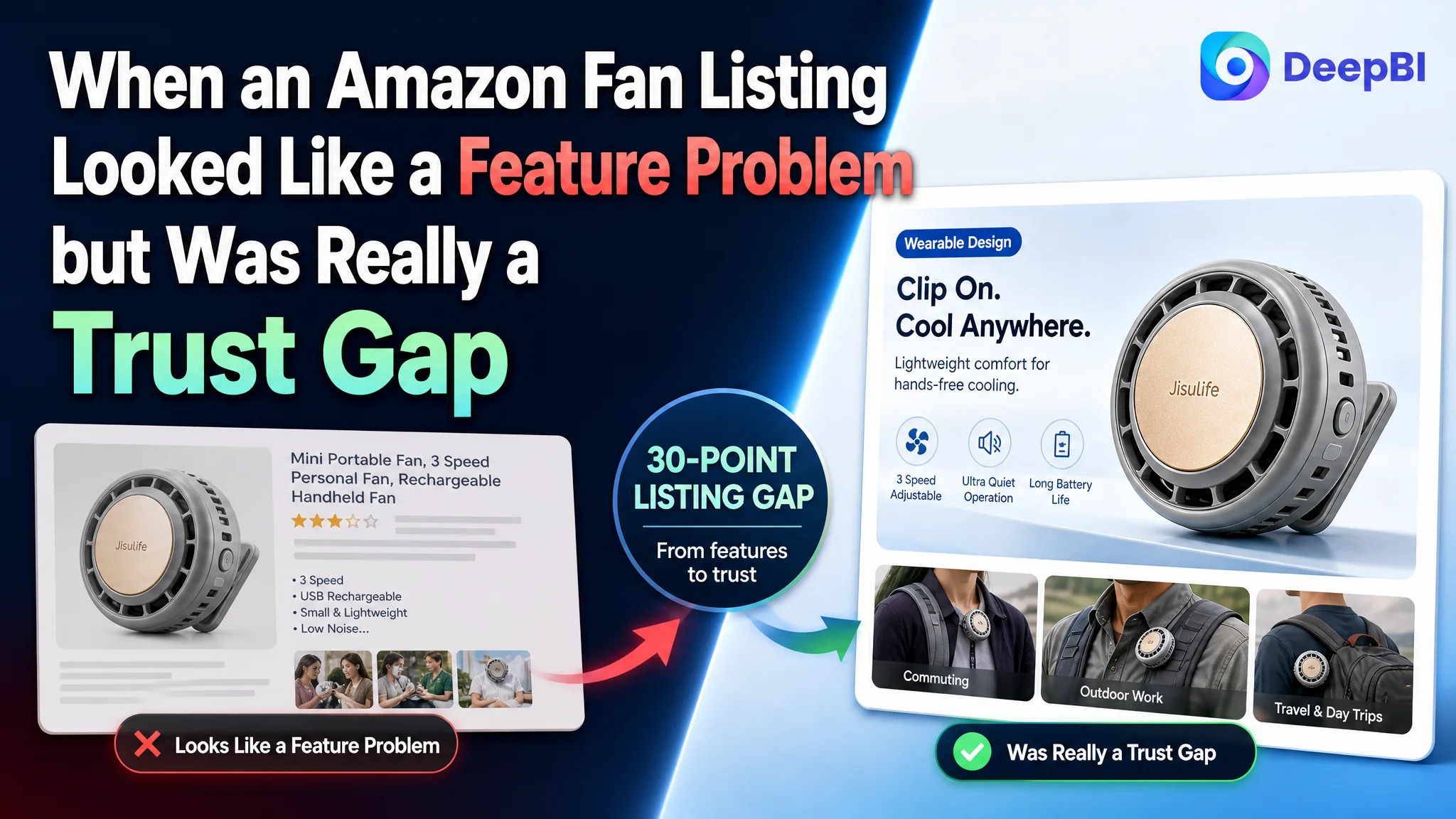
This case follows an Amazon seller of wearable clip-on mini fans whose product page was not converting its competitive potential into a convincing buying decision. The initial direction focused on adding keywords, emphasizing specifications, and refining individual images and bullet points. But the deeper issue was not a lack of product information. It was the absence of a complete Amazon Listing story.
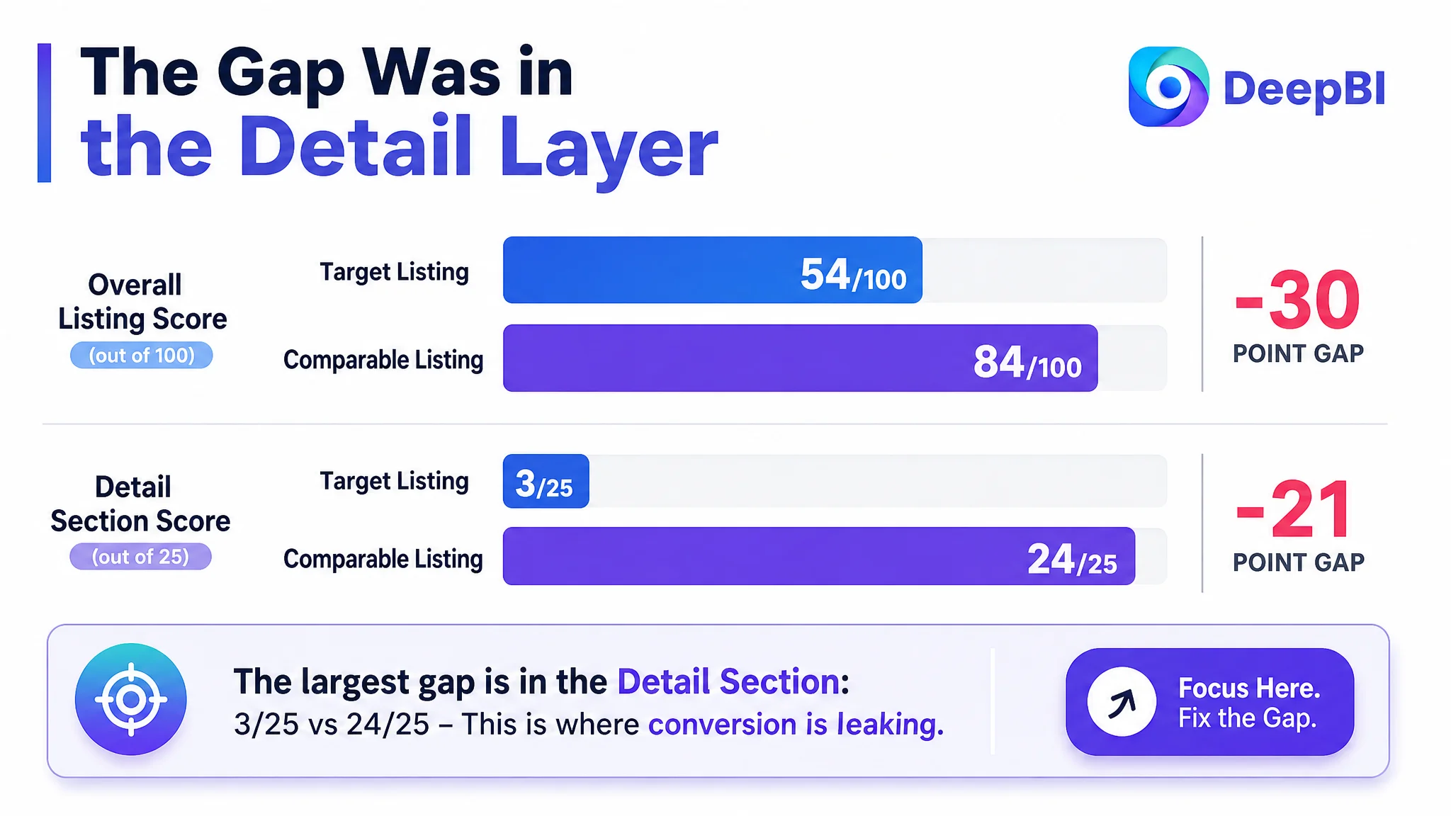
DeepBI’s comparison found a 30-point gap between the target Listing and a comparable high-performing listing: 54 out of 100 versus 84. The largest difference was not in the title, main image, or bullet points. It was in the detail section, where the target Listing scored 3 out of 25 while the benchmark scored 24.
That changed the order of optimization. Instead of continuing to treat the page as a keyword or advertising problem, the team focused on product-page conversion: clarifying the title, making the main images prove size and function, turning bullet points into usage logic, and building an A+ narrative around technical proof, wearing scenarios, safety, charging, and portability. For other Amazon sellers, the lesson is direct: before scaling traffic or refining bids, determine whether the product page gives shoppers enough reason to trust and buy.
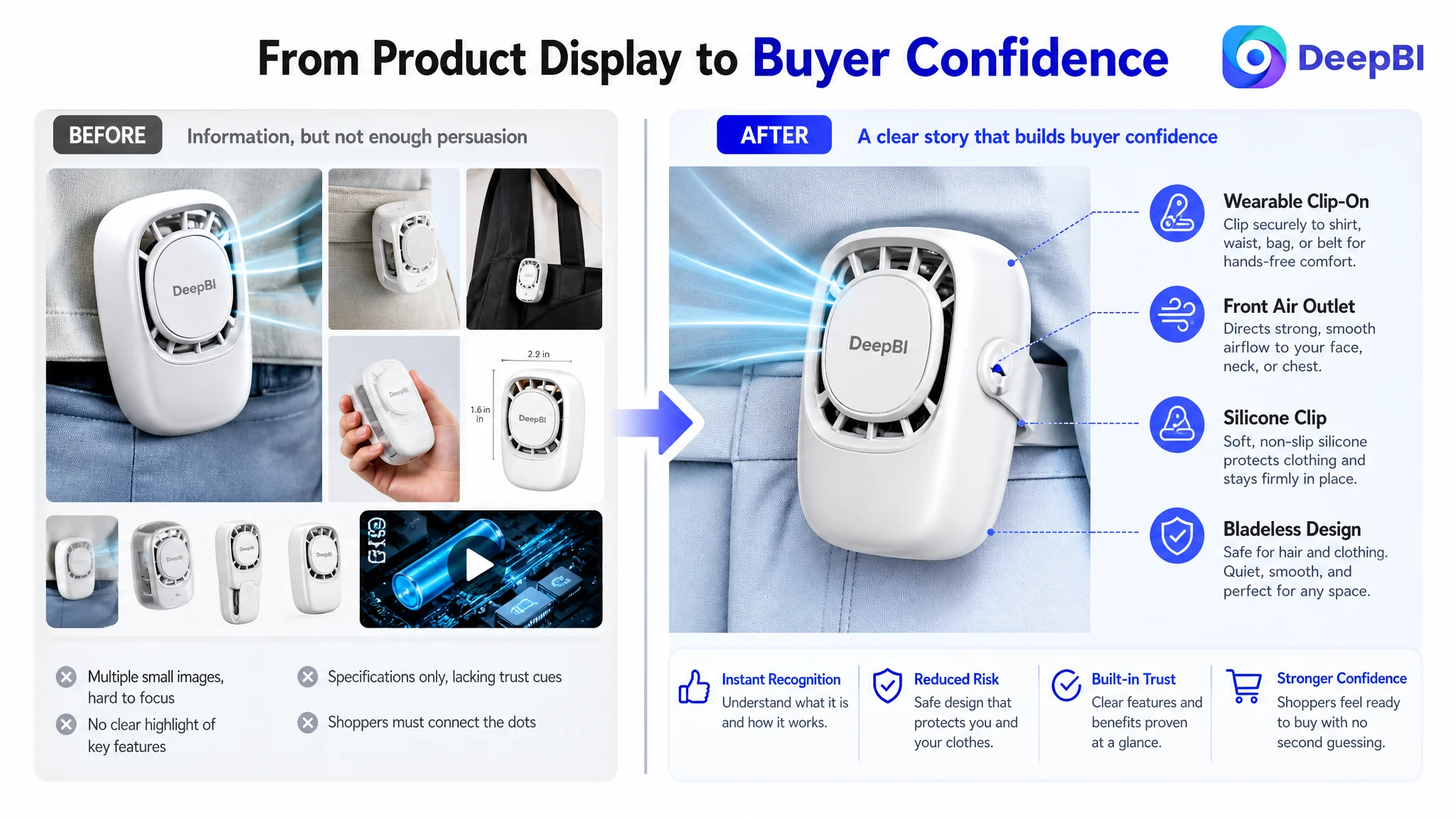
The Amazon Listing Had Information, but Not Enough Persuasion
The product was a wearable, bladeless mini fan designed to clip onto clothing, a waistband, a bag, or other surfaces. Its potential selling points were clear:
- Hands-free cooling
- A 360-degree adjustable design
- Multiple air outlets
- Three wind speeds
- Bladeless construction
- USB-C charging
- A compact form factor
- Use across commuting, travel, office, outdoor, and active scenarios
The problem was that these points were mostly presented as isolated specifications.
On Amazon, a shopper does not evaluate these claims one by one in a vacuum. The shopper moves through a sequence of questions:
1. What is this product, and why should I notice it?
2. Is it genuinely small and light enough to wear?
3. Does the airflow work in the direction I need?
4. Is it safe for hair, clothing, and shared spaces?
5. Can I understand how it works?
6. Will it last long enough for travel or daily use?
7. Does the product page feel trustworthy enough to justify the purchase?
The target Listing answered some of these questions, but not in a connected order.
The page did not lack product claims. It lacked a convincing path from recognition to confidence.
That distinction mattered because paid traffic, organic traffic, and Amazon search visibility all eventually lead shoppers to the same product page. If the page leaves important questions unresolved, additional traffic does not repair the problem. It only sends more shoppers into the same uncertainty.
The Working Assumption Was to Improve the Parts
The customer’s Listing was not empty. It had a title, product images, five bullet points, technical specifications, and customer reviews. That made the problem easy to misread.
The title could be improved through stronger keyword placement. The bullet points could include more scenarios. The images could be made more attractive. The product claims could be made more specific.
Those were reasonable observations, but they encouraged a fragmented optimization approach: improve the title, revise a bullet, replace an image, and continue testing. The page was being treated as a collection of assets rather than as one conversion system.
The original content leaned toward parameters and functions:
- Quiet operation
- Strong cooling
- 360-degree rotation
- Three speed settings
- Rechargeable battery
- Multi-scenario use
The comparable high-performing listing used a different structure. It began with user problems and moments of use:
- Cooling without holding a fan
- Directing airflow toward the face, neck, or chest
- Staying comfortable in outdoor and crowded environments
- Avoiding hair snagging
- Using the fan in an office, dorm, or shared space
- Carrying it during travel
The difference was not simply writing style. It was decision logic.
The benchmark made each feature answer a practical question. The target Listing often made the shopper interpret the feature independently.
The Scorecard Showed Where the Conversion Logic Was Breaking
DeepBI’s Listing comparison provided a more useful diagnosis than a general statement that the page needed to look better.
- Title: Target Listing: 13/20, Comparable listing: 16/20, Gap: -3
- Main image: Target Listing: 23/30, Comparable listing: 26/30, Gap: -3
- Bullet points: Target Listing: 7/10, Comparable listing: 8/10, Gap: -1
- Detail section: Target Listing: 3/25, Comparable listing: 24/25, Gap: -21
- Reviews: Target Listing: 8/15, Comparable listing: 10/15, Gap: -2
- Total: Target Listing: 54/100, Comparable listing: 84/100, Gap: -30
The most important finding was the concentration of the gap.
The title, main image, and bullet points were behind, but by relatively small margins. The detail section was not slightly weaker. It was almost absent as a persuasive visual layer.
The target Listing relied primarily on text. The comparable listing used a sequence of visual modules that covered:
- A scenario-led introduction
- Technical structure and performance explanation
- Multiple wearing scenarios
- Product details and material close-ups
- A hand-held scale reference
- Charging and battery information
- Practical usage guidance
This was the point at which the diagnosis moved away from “the Listing needs more polish” toward a more specific conclusion:
The product page lacked the visual evidence needed to convert interest into confidence.
The Biggest Leak Was Not the Title
The title still needed work, but it was not the first constraint.
The target title repeated terms such as “Portable” and did not place the most important product identity and functional terms in a clear order. It also mentioned rechargeable functionality without making the USB-C interface prominent, and its use cases were less focused.
The revised direction placed the core identity earlier:
Bladeless Clip On Rechargeable Mini Fan, Wearable Personal Fan for Shirt & Waist, 3 Speed USB C Quiet Portable Small Fan for Outdoor, Travel, Office
The change was not about inserting as many keywords as possible. It was about improving three types of clarity:
- Product identity: bladeless clip-on rechargeable mini fan
- Functional form: wearable personal fan for shirt and waist
- Relevant contexts: outdoor, travel, and office
The title became more search-friendly and easier to scan, but its role remained limited. A stronger title can help a shopper understand the product and find it. It cannot, by itself, prove that the product is comfortable to wear, quiet enough for an office, safe for hair, or powerful enough for hot-weather use.
That proof had to come from the rest of the page.
The Main Image Needed to Create a Reason to Continue
The main image scored only three points below the benchmark, but the detailed review showed why the gap still mattered.
The target image used multiple product views and communicated the clip-on form. However, it was visually busy and did not establish the bladeless safety impression as cleanly as the benchmark. The product was visible, but the first image did not create a strong visual anchor around its most important difference.
On Amazon search results, the main image has a narrow job: earn the next action. It does not need to explain the entire product. It needs to make the product recognizable, differentiated, and worth opening.
The image direction therefore shifted toward a more focused composition:
- Make the wearable clip-on form immediately clear
- Emphasize the integrated clip
- Show the concealed outlet structure
- Reduce competing visual elements
- Present the product more cleanly against the background
The next images then needed to answer rational questions in the order shoppers naturally ask them.
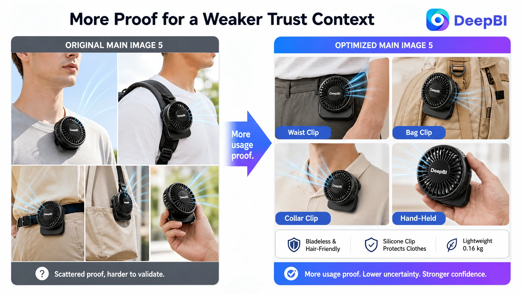
First, prove that “mini” and “lightweight” are real
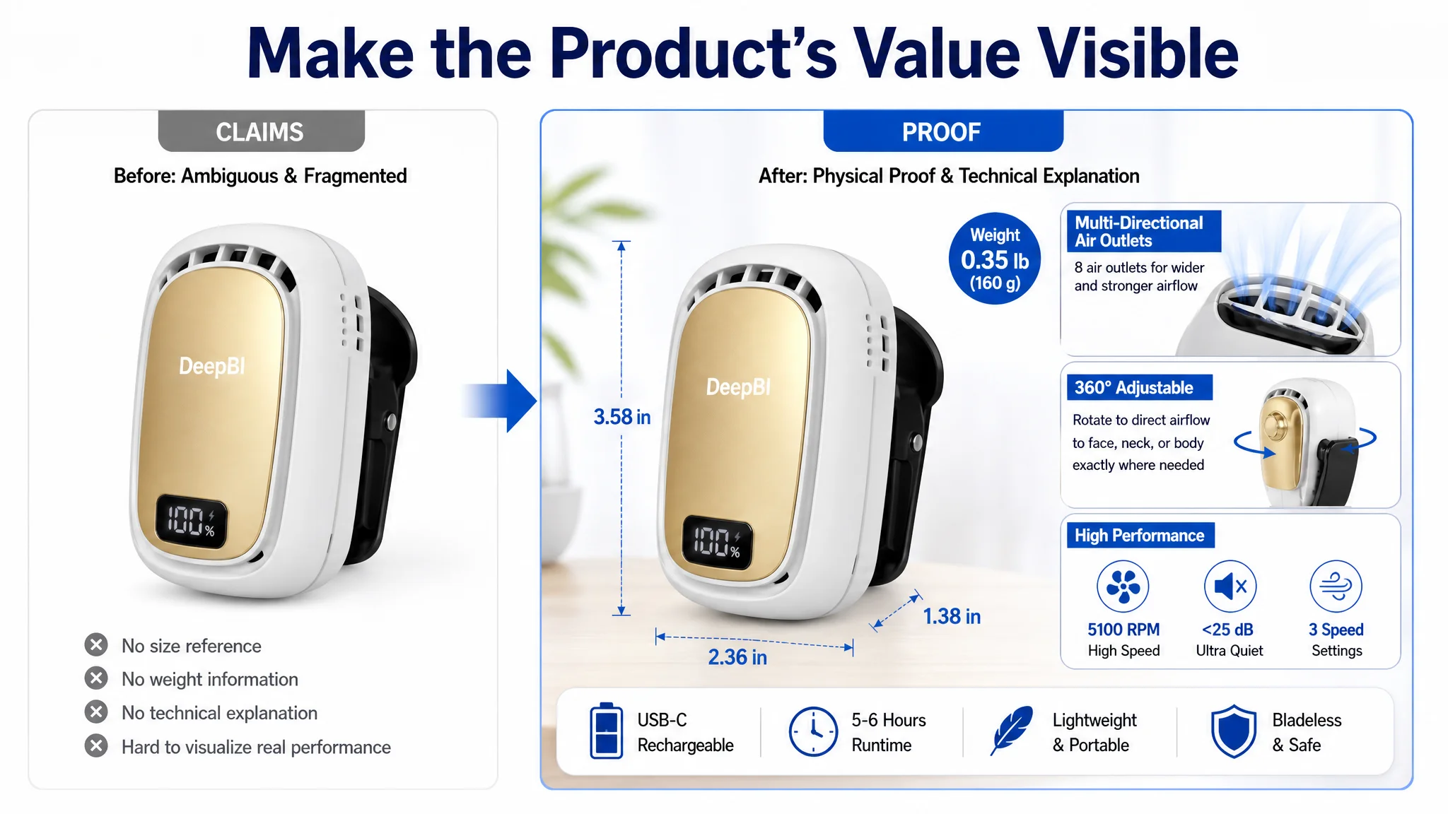
The original size image showed dimensions but did not include a meaningful reference object. That left shoppers to interpret what the numbers meant in daily use.
The revised direction called for:
- Actual dimension callouts
- A recognizable surface or adult hand for scale
- Weight information
- A clean composition that confirms portability
For a wearable fan, this is not a minor detail. The product’s value depends on being small and light enough to clip onto clothing or carry during travel. Size validation is therefore part of the product’s core promise.
Then, explain how the performance is possible
The original technical image relied too heavily on generic icons. The revised image direction aimed to show:
- The eight air outlets
- The airflow path
- The relationship between airflow concentration and the product’s structure
- The bladeless design
- The relationship between quiet operation and performance
The case material includes performance claims such as 5,100 RPM, less than 25 dB, and stronger airflow versus traditional portable fans. These claims should only be used in final creative assets where they are verified and supportable. The important diagnostic point is that technical claims need visual explanation, not simply larger typography.
A specification becomes persuasive when the shopper can see what it changes in use.
The Bullet Points Needed a Buying Logic
The target bullet points contained useful information, but their structure leaned toward parameter listing. The benchmark began with the customer’s situation and then introduced the feature as the answer.
That difference was visible in the first three bullets.
The target Listing described quiet operation, clip rotation, speed settings, charging, and scenarios. The benchmark more consistently connected each feature to a moment:
- Clip the fan to a shirt, waistband, belt, or bag strap
- Direct airflow toward the face, neck, or chest
- Use it in an office, dorm, commute, concert, hike, or other shared environment
- Select a lower speed for study and a higher speed for hotter conditions
- Charge it from a power bank, laptop, or wall adapter
The recommended bullet structure followed a simple but commercially important sequence:
Feature → supporting detail → user outcome
For example, the clip should not appear only as a design specification. It should explain where it can attach and what that enables: cooling without holding the fan.
The 360-degree adjustment should not appear only as a mechanical feature. It should explain where the airflow can be directed and how that improves comfort.
The quiet, bladeless design should not stop at “less than 25 dB.” It should address why the shopper cares: less distraction in shared spaces and lower concern about hair snagging.
The three speed settings should not be described as three abstract levels. They should be connected to study, errands, commuting, sports, or hot outdoor conditions.
This was not a request to make the copy longer for its own sake. It was a decision to reduce the amount of interpretation required from the shopper.
The Missing A+ Story Removed the Final Layer of Trust
The 3 out of 25 detail score was the clearest business signal in the case.
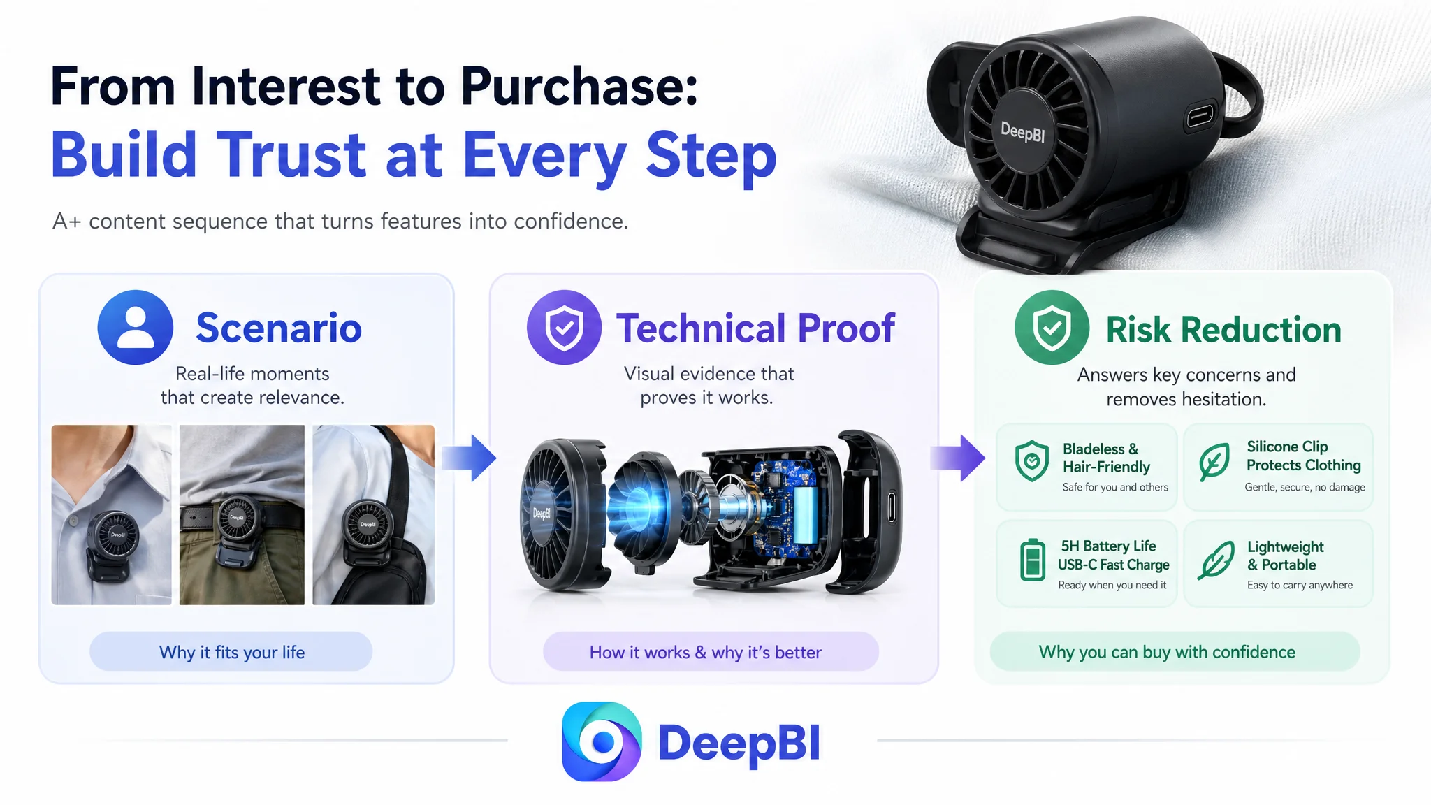
The target Listing used a text-based description without the visual modules needed to demonstrate how the product works. The comparable listing used a five-part A+ narrative that moved from problem to proof:
1. A real-life cooling scenario
2. A technical structure explanation
3. Multiple wearing and use scenarios
4. Close-up details and material reassurance
5. A portable, hand-held scale reference
The recommended A+ sequence for the target Listing followed the same principle without copying the competitor’s creative execution.
The opening module: establish the product’s role
The first module should quickly confirm:
- Wearable clip-on form
- Hands-free use
- Bladeless design
- Quiet operation
- Suitability for office, travel, outdoor, or hot-weather use
The shopper should understand the product’s role before being asked to process technical details.
The technical module: make performance believable
The second module should explain the product’s operating logic through visible structure and verified data:
- Air outlet arrangement
- Airflow direction
- Rotation mechanism
- Quiet bladeless construction
- Relevant speed or performance information
This is where the page can replace a vague promise with a reason to believe.
The scenario module: show how the product is worn
The product’s usefulness depends on attachment flexibility. The visual story should include wearing positions such as:
- Collar
- Waistband
- Bag strap
- Stroller
- Desk or other supported surfaces
It should also show how the 360-degree adjustment directs airflow toward the user without requiring the fan to be held.
The risk-reduction module: address clothing and durability concerns
The soft silicone clip is important because it responds to a practical objection: whether the clip may damage or mark fabric.
The same module can establish:
- Silicone contact protection
- Type-C charging
- Impact-resistant ABS construction
- Drop-resistance positioning, where supported by verified product information
These details may seem secondary, but they reduce hesitation at the moment when shoppers are deciding whether the product feels safe and durable enough.
The scale and portability module: make “compact” tangible
A product described as mini or lightweight still needs a physical reference. Showing the fan in an adult hand and connecting its size to pockets, bags, and travel makes portability concrete rather than promotional.
The battery module: answer the travel objection
The case material provides specific battery information:
- 900 mAh battery
- Full charging in 66 minutes through Type-C
- Five to six hours of operation depending on speed
- Compatibility with a power bank
These details belong after the product’s structure, wearing logic, and physical scale have been established. At that point, battery information becomes a practical confirmation rather than another disconnected specification.
The control module: map speed settings to real situations
The final module can explain how low, medium, and high settings correspond to different conditions, such as focused study, daily errands, outdoor travel, or more active use.
The purpose is not to add another feature block. It is to help shoppers see whether the product fits their own routine.
Why DeepBI Did Not Prioritize Advertising Adjustments First
The available case material does not provide post-optimization advertising results such as CTR, CVR, ACOS, TACOS, or organic-order growth. It would therefore be inappropriate to claim that ad efficiency improved after the Listing changes.
What the diagnosis does establish is the correct decision order.
When a product page has a 21-point gap in the detail section, continuing to push more traffic before repairing the page creates a clear business risk. Paid traffic may generate clicks, but the page still lacks the evidence needed to convert those clicks. Advertising then becomes an amplifier of a weak conversion experience.
This does not mean Amazon ads are unimportant. It means advertising should be interpreted together with the Listing’s ability to receive and convert traffic.
The seller still needed advertising data to determine whether the primary weakness was:
- Search-page click appeal
- Product-page conversion
- Traffic relevance
- Review trust
- Or a combination of these factors
But the Listing audit provided a strong reason not to assume that more bid tuning would solve the problem.
Ads can bring shoppers to the page. They cannot supply the missing product explanation once shoppers arrive.
DeepBI’s role in this case was not to recommend more changes everywhere. It was to identify the largest constraint and put it first.
The Review Gap Reinforced the Need for Better Page Evidence
Reviews were not the main source of the score gap, but they made the page-level trust problem more serious.
The target Listing had:
- A 3.6-star rating
- 68 total reviews
- Eight reviews visible on the first page
The comparable listing had:
- A 4.1-star rating
- 14 total reviews
- Eight reviews visible on the first page
The target Listing had more total reviews, but volume did not translate into stronger first-impression trust. Its visible review mix included two one-star reviews and one three-star review, representing a 25% share of the first-page sample. The comparable listing’s corresponding negative share was lower.
That meant the Listing could not rely on review quantity to overcome uncertainty. Product-page content had to work harder to explain:
- How the fan attaches
- Whether it is genuinely lightweight
- Whether the clip protects clothing
- How the airflow is directed
- Whether the fan is appropriate for shared spaces
- How long the battery lasts
A stronger A+ page cannot replace product quality or repair negative reviews. It can, however, make the product’s actual value easier to understand and reduce avoidable uncertainty before purchase.
The Optimization Direction Became More Sequential
The revised plan was not a long list of unrelated improvements. It followed a sequence based on shopper cognition.
1. Clarify what the product is
Use a cleaner title and a more focused main image to establish:
- Bladeless clip-on mini fan
- Wearable form
- USB-C rechargeable design
- Relevant use contexts
2. Confirm physical feasibility
Use dimensions, weight, hand scale, and attachment examples to prove that the fan is genuinely portable and wearable.
3. Prove the operating logic
Show airflow outlets, rotation, speed control, and bladeless construction through visual explanation and verified product facts.
4. Connect features to situations
Rewrite bullets and A+ modules around commuting, office use, travel, study, outdoor events, and active scenarios.
5. Remove practical objections
Address hair safety, shared-space noise, fabric protection, charging, durability, and battery duration.
6. Let advertising scale only after the page is ready
Once the product page can convert both paid and organic shoppers more effectively, advertising data becomes more useful for deciding where to scale, which keywords to prioritize, and which traffic sources deserve continued investment.
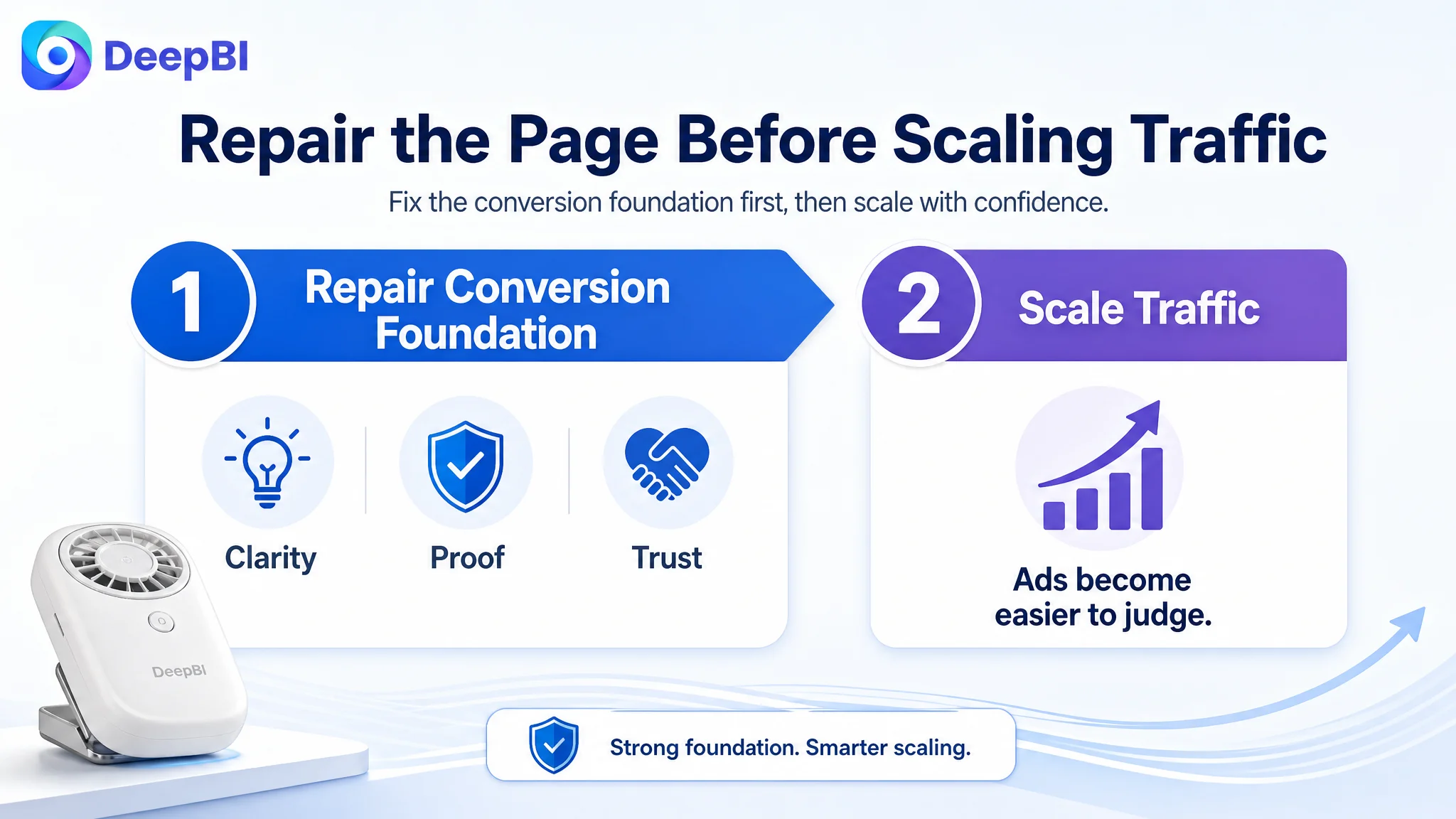
This order reflects the central business judgment: the page needed to earn the traffic before the team tried to increase the value of that traffic.
What Other Amazon Sellers Can Learn From This Case
The most important lesson is not that every wearable fan needs more A+ content. It is that Amazon Listing diagnosis should begin with the largest conversion constraint, not with the asset that is easiest to edit.
For this seller, the title and images were imperfect, but the 21-point detail-page gap was more consequential than the smaller gaps elsewhere. A title rewrite could improve search clarity. A main-image revision could improve attention. But neither change could fully replace the missing visual explanation of the product’s function, scenarios, and trust factors.
The case also shows why competitor comparison must be structured rather than aesthetic. The useful question was not “Which page looks better?” It was:
- Which shopper question does each module answer?
- Where does the benchmark provide proof that the target Listing only states?
- Which missing element is most likely to affect conversion?
- What should be repaired before more traffic is sent to the page?
For Amazon sellers, the operating principle is straightforward:
Before increasing traffic, verify that the product page can explain the product, prove its value, and reduce the shopper’s main concerns.
In this case, DeepBI reframed the problem from isolated content improvement to Listing conversion capacity. The later work focused on a clearer title, more purposeful main images, scenario-led bullet points, and an A+ sequence built around technical proof, wearing flexibility, material reassurance, scale, charging, and daily use.
The customer did not yet have a documented post-optimization performance result in the case material. The confirmed change was the business diagnosis itself: the Listing was no longer treated as a page that merely needed more features or more traffic. It was treated as the conversion foundation that had to be repaired before Amazon advertising could be judged fairly.