

This case involved an Amazon US seller whose handheld sewing machine Listing was carrying the basic ingredients of a functional product page: a portable machine, multiple accessories, fabric compatibility information, operating instructions, and a clear explanation of its two power options. Yet the page still struggled to create enough confidence for purchase.
The initial direction leaned toward explaining the product more thoroughly—adding technical details, showing more functions, and emphasizing DIY possibilities. DeepBI’s diagnosis pointed somewhere else. The main issue was not a lack of information. It was a lack of convincing proof that the product could solve an immediate household problem, such as hemming pants, repairing denim, or fixing a torn bag.
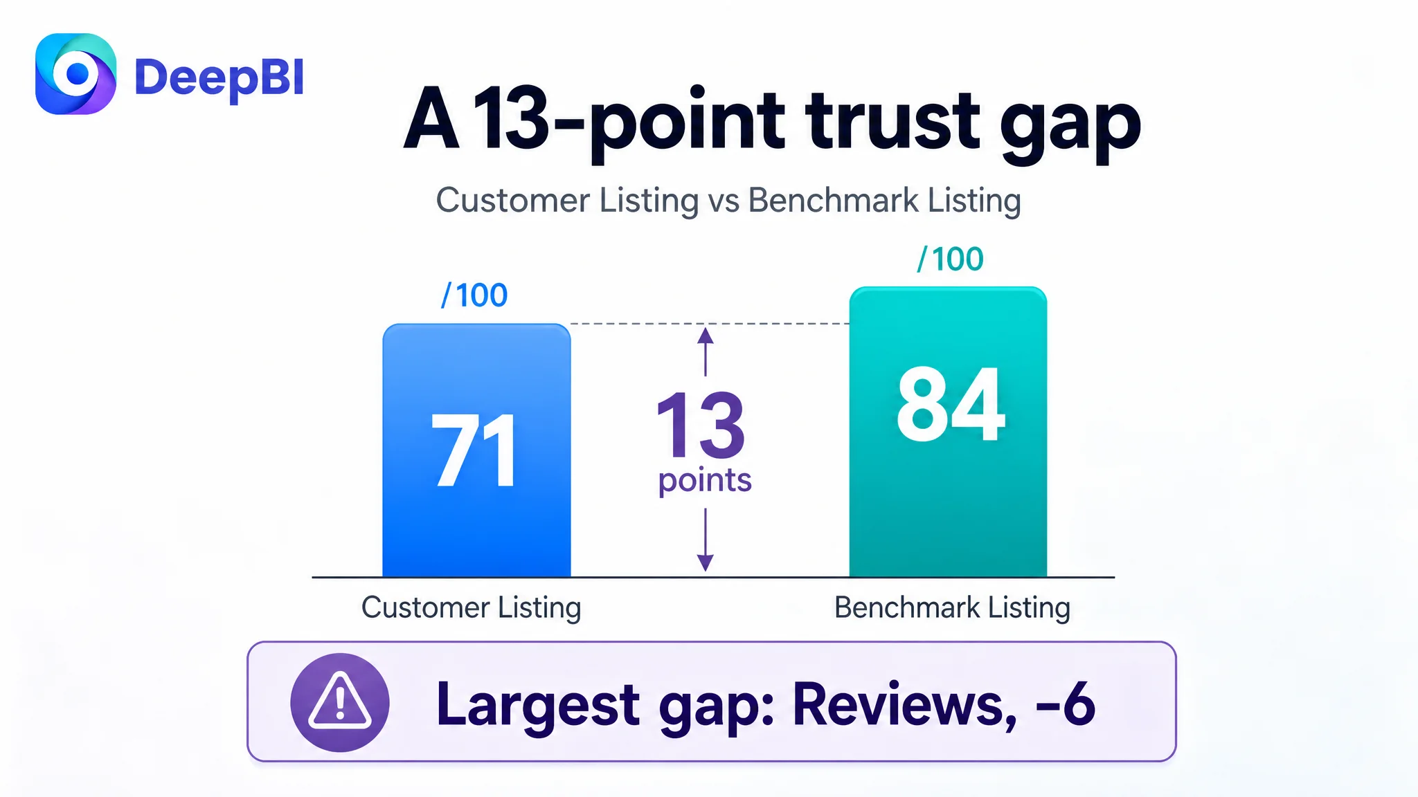
The Listing scored 71 out of 100, compared with 84 for a closely comparable high-performing listing. The largest gaps were not isolated to one image or one sentence. They appeared across the title, main-image communication, A+ content, and reviews. For Amazon sellers, the lesson is direct: before asking Amazon ads to bring more traffic, first determine whether the product page gives that traffic a clear reason to trust and buy.
The Amazon Listing Had Information. It Did Not Yet Have Enough Persuasion.
The product page was not empty or careless. Its five bullet points were, in several respects, stronger than the comparison listing.
The bullets started with recognizable user concerns: traditional sewing machines can be heavy and complicated, while a handheld machine should be easier to carry and use. They also described portability, multiple fabrics, quick repairs, and dual power options. Structurally, the copy followed a reasonable path:
Pain point → solution → use scenario → supporting benefit → operating flexibility
That structure was useful. But the broader Listing was not converting the product’s functional claims into a sufficiently credible buying story.
The page explained what the machine was capable of. It did not demonstrate early enough why a customer should believe it would work for a specific repair.
The page was not short of product information. It was short of immediate, visible proof.
This distinction mattered because a handheld sewing machine is a product customers may hesitate to buy. They may wonder:
- Can it handle denim?
- Is it genuinely easy to operate with one hand?
- Can the user see the needle and presser foot clearly?
- Will the machine create a stable stitch?
- Is the included kit complete and practical?
- Is this a useful repair tool or mainly a small DIY novelty?
These questions are not answered by specifications alone. They are answered through the order, realism, and credibility of the page’s visual and textual evidence.
The Original Direction Focused on Explanation Rather Than Conversion
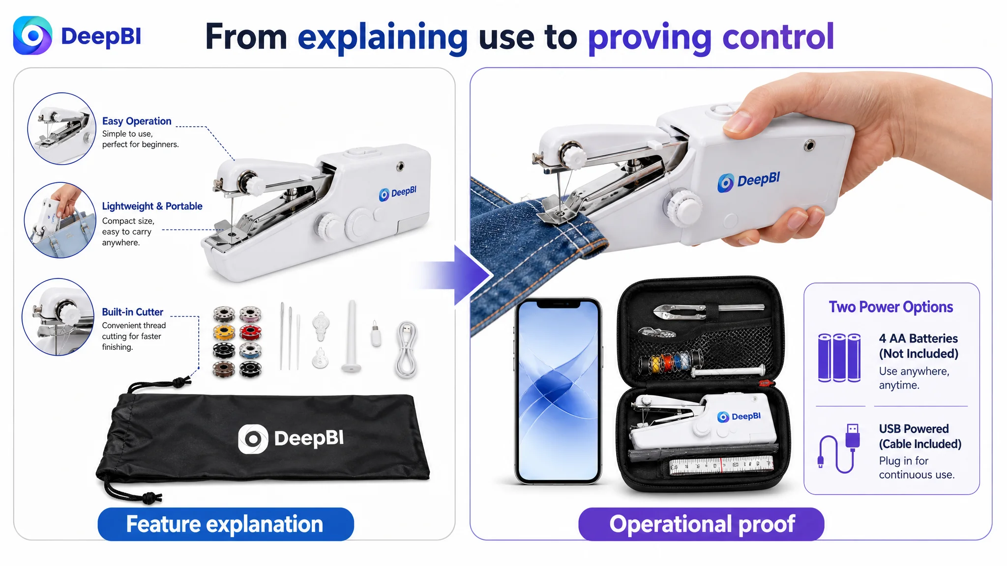
The Listing’s image sequence reflected a common Amazon optimization instinct: explain the product from multiple angles.
The page included:
- A product-and-accessory presentation
- Fabric compatibility information
- Threading instructions
- Operating steps
- Functional callouts
- Power-source details
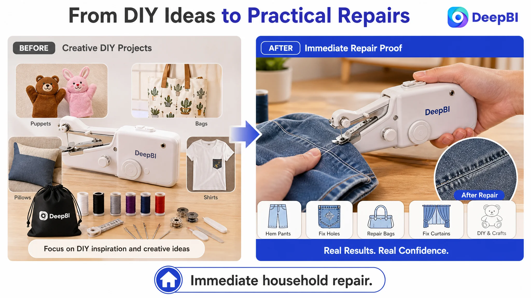
- Creative DIY examples
This approach is understandable. When a product is compact and unfamiliar, sellers often assume that more explanation will reduce hesitation. They add more diagrams, more feature labels, and more usage instructions.
But the result here was a page that behaved more like an instruction sheet than a purchase argument.
The content leaned toward technical decomposition:
- How the product is assembled
- How it is threaded
- How it is operated
- What fabrics it may support
- Which power sources it can use
The comparison listing used a different sequence. It brought the customer closer to a real-life outcome:
- Repairing torn clothing
- Working with denim
- Organizing the complete kit
- Showing hands-on operation
- Presenting the product as a practical household solution
- Creating a gifting context
The difference was not simply that the comparison listing looked warmer. It connected the product to a more urgent and familiar reason to buy.
For an Amazon seller, this is where a Listing can be misdiagnosed. The team may believe the page needs more features, more images, or better technical language. The deeper issue may be that the content does not answer the customer’s most immediate question:
“What problem will this help me solve today?”
The Score Gap Located the Constraint Across the Funnel
DeepBI’s comparison gave the Listing a total score of 71, compared with 84 for the benchmark listing. The score distribution made the diagnosis more precise.
- Title: Customer Listing: 13/20, Benchmark Listing: 16/20, Gap: -3
- Main image: Customer Listing: 23/30, Benchmark Listing: 26/30, Gap: -3
- Bullet points: Customer Listing: 8/10, Benchmark Listing: 7/10, Gap: +1
- Detail page: Customer Listing: 21/25, Benchmark Listing: 23/25, Gap: -2
- Reviews: Customer Listing: 6/15, Benchmark Listing: 12/15, Gap: -6
- Total: Customer Listing: 71/100, Benchmark Listing: 84/100, Gap: -13
The result challenged a simple “rewrite everything” response.
The bullet points were not the primary weakness. In fact, they scored one point higher than the benchmark because they expressed user pain points, portability, and use scenarios more clearly.
The largest gaps were found in four areas:
- Review credibility
- Main-image persuasion
- Title structure and search communication
- Detail-page proof and emotional context
That combination suggested a page-level conversion problem rather than a single copy defect.
The Listing could explain the product. It could not yet build the same level of confidence as a comparable offer.
The Review Gap Made Every Other Weakness More Expensive
The review difference was the most commercially important signal.
The customer Listing showed:
- 3.5 stars
- 24 total reviews
- 8 reviews visible on the first page
- Two 1–2 star reviews and two 3-star reviews among those visible reviews
The benchmark showed:
- 5.0 stars
- 30 total reviews
- 8 reviews visible on the first page
- No reviews below three stars among the visible reviews
The gap in review quantity was relatively small. The gap in perceived reliability was not.
A 3.5-star rating creates doubt before the customer studies the title, bullets, or A+ modules. It makes unclear images feel riskier. It makes technical claims harder to accept. It also increases the burden on the rest of the Listing: every visual must work harder to prove that the product is useful and manageable.
The reviews also lacked the image and video detail found in the comparison listing. That meant the customer had fewer forms of user-generated evidence to support claims about ease of use, fabric handling, and repair quality.
This did not mean that a better Listing could erase the review problem. It meant the opposite: because the review position was weak, the page needed especially strong product-use proof.
The page could not rely on reputation alone. It needed to compensate with visible evidence wherever possible.
The Main Image Was Not Just a Design Issue
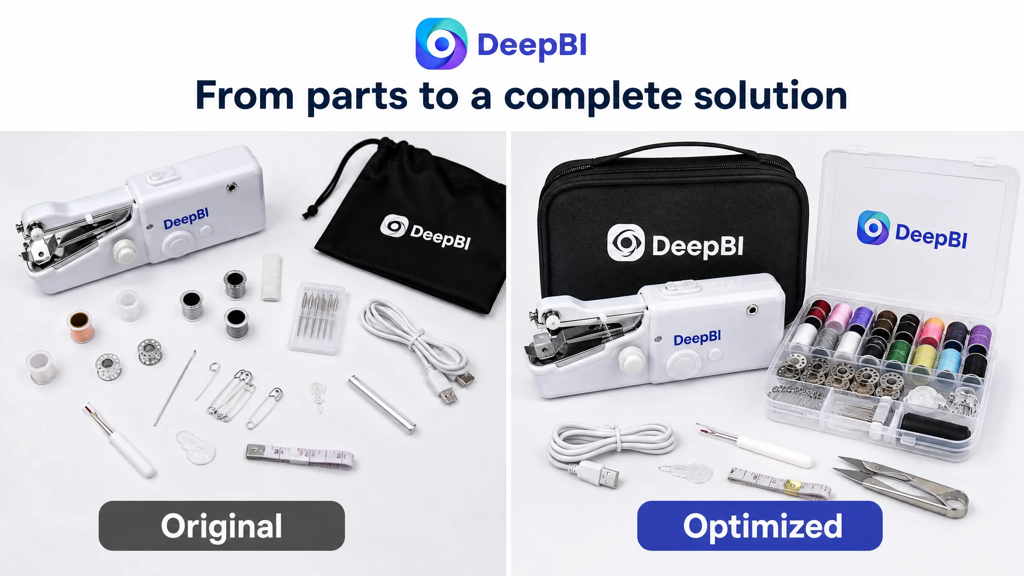
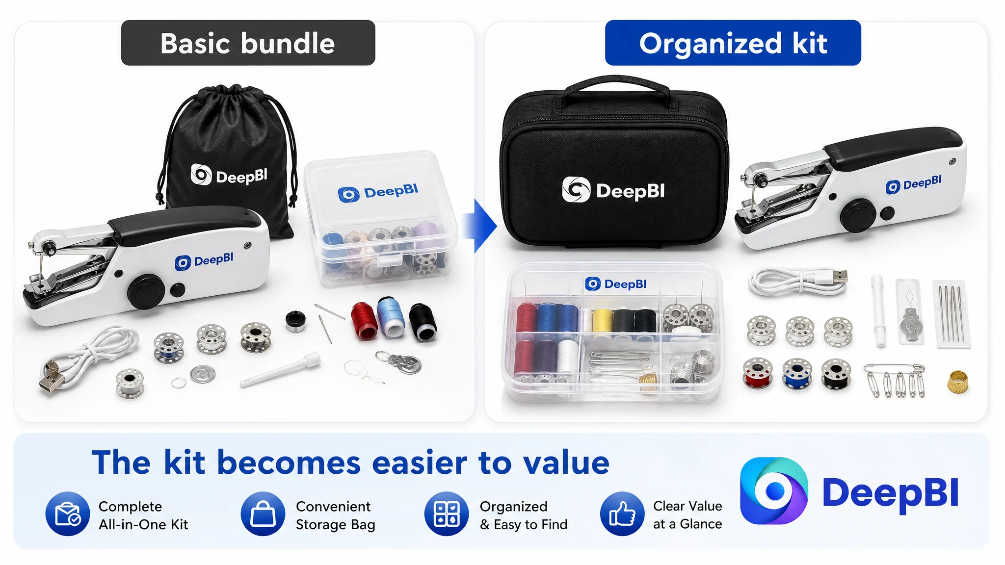
The main image showed the product and its accessories, but it did not create the same immediate visual focus as the comparison listing’s organized storage case and stronger accessory presentation.
The problem was not that the product itself was unusable or that the image was technically poor. The problem was that the image communicated “a collection of parts” more readily than “a complete, ready-to-use repair kit.”
That difference matters on Amazon search pages, where customers often make a quick judgment from a small thumbnail.
The comparison listing used:
- A higher-saturation storage case
- A more structured accessory arrangement
- More visually distinctive supporting tools
- A stronger sense of completeness
The customer Listing used a black drawstring bag and plastic accessories, creating a more basic overall value impression. That visual impression could limit perceived value even when the written offer contained useful functions.
DeepBI therefore reframed the image task from “make the product presentation more attractive” to:
Show the complete solution clearly, without changing the product or inventing a premium specification it does not have.
The main image direction became more focused on the organized kit, while the secondary images needed to carry the proof that the main image could not:
- One-handed operation
- Fabric compatibility
- Quick clothing repairs
- Practical use with denim and curtains
- Included storage and power options
The objective was not decorative enhancement. It was to make the product’s commercial meaning easier to understand at a glance.
The Title Was Losing Both Search Clarity and Click Context
The title score was 13 out of 20, three points below the benchmark.
The comparison title placed “Hand Held Sewing Machine” at the beginning, introduced “Adults & Beginners” earlier, and used concrete details such as “112 PCS,” “Orange,” and named accessories. The customer title placed the core product term in a less effective position and described the offer more generally.
The title also missed an opportunity to connect the product with a clear use case.
DeepBI’s recommended direction moved the title toward:
- The core product keyword at the beginning
- The included sewing kit and storage bag
- The two-speed feature
- Adults and beginners
- DIY, travel, and quick clothing repair
- The portable and heavy-duty positioning supported by the case material
The important change was not keyword volume by itself. It was the sequence of meaning.
A customer scanning the title on a mobile screen should quickly understand:
1. What the product is
2. Who it is for
3. What comes with it
4. Why it is useful
The title had to function as both a search entrance and a conversion preface.
The Bullet Points Were a Relative Strength, but They Needed Better Evidence
The bullet points did not need to be rebuilt from zero. They already had a stronger user-centered structure than the benchmark in several areas.
Their main opportunity was to connect claims with more concrete purchase logic.
For example, “easy to use” is weaker than a clear explanation of one-handed operation and control. “Portable” is weaker than showing the complete kit organized in the included bag. “Suitable for multiple fabrics” is weaker than visually demonstrating practical work with denim, silk, linen, curtains, or other supported materials.
The recommended direction strengthened five areas:
A complete kit
Replace a general accessories statement with a clearer account of what the customer receives and how the items are organized.
One-handed operation
Explain the ergonomic benefit in terms of control, visibility, and easier handling rather than using a broad phrase such as “simple to use.”
Portability
Position the machine and its accessories as a compact repair solution for home, travel, and unexpected mending needs.
Practical fabric and repair scenarios
Move beyond abstract DIY language toward hemming pants, mending holes, repairing bags, and handling supported fabrics up to the stated thickness limit.
Dual power options
Retain the battery and USB options, while connecting them to a real operating choice: cordless repairs away from home or stable power at home.
The purpose of the rewrite was to make the bullet points support the page’s visual argument, not to create five isolated blocks of product copy.
The Detail Page Explained Operation Before It Proved Results
The detail-page score was 21 out of 25, only two points below the benchmark. That relatively narrow gap could have been misleading.
The customer’s A+ and secondary images contained useful information, including fabric guidance, threading steps, operating steps, and feature labels. The content was informative, but the order of persuasion was not optimal.
The most important proof appeared too late or remained indirect.
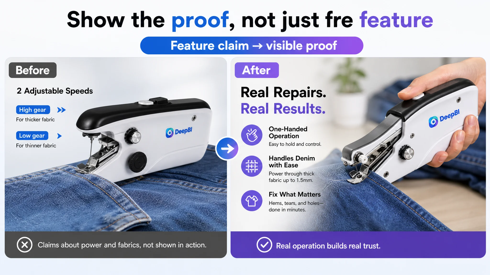
The page showed fabric textures, but fabric texture is not the same as repair proof. It showed operating diagrams, but diagrams do not fully resolve concerns about real handling. It presented creative projects, but creative projects were less urgent than everyday clothing repairs.
DeepBI’s diagnosis was that the detail page needed to shift from technical explanation to problem-solving evidence.
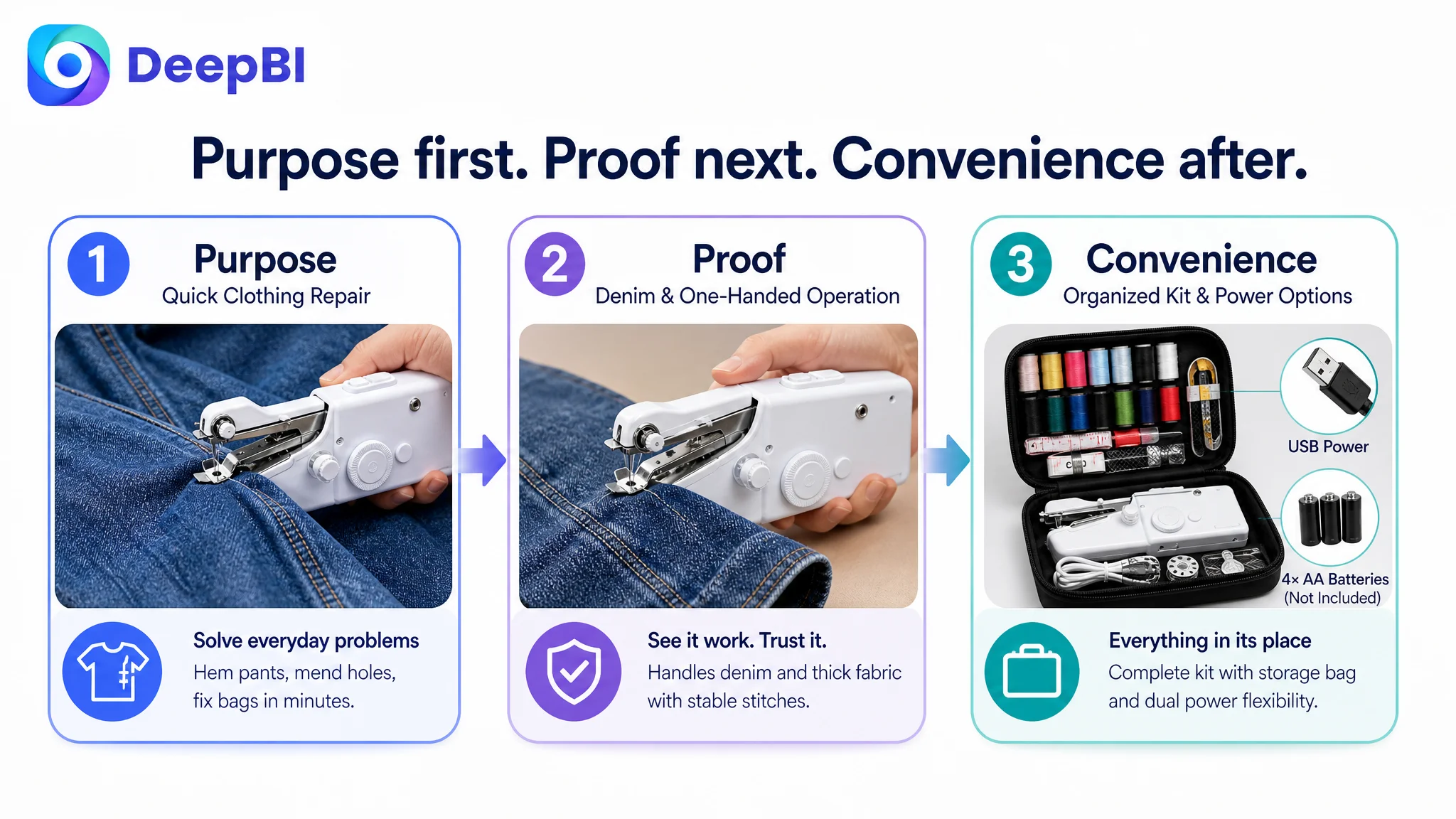
The first visual question: Can this become a real repair kit?
The opening module should establish the product, storage bag, and key accessories in a realistic working context. It should feel ready to use, not merely arranged for inspection.
The second question: What can I repair?
The page should show practical tasks such as hemming pants, mending holes, repairing denim, and working with curtains. These scenes connect the product to recognizable household problems.
The third question: Can it handle the material?
Visual proof of sewing thicker fabric, including denim within the supported limit, should appear earlier. This directly addresses skepticism about the “heavy duty” claim.
The fourth question: Will I be able to control it?
A closer operational view should make the presser foot, fabric path, and hand position easier to understand. The customer needs to see how the handheld form works, not only read that it is easy.
The fifth question: Where do all the pieces go?
The storage bag should be shown organizing the kit. This reduces the concern that a large accessory set will become difficult to manage.
The final question: Is it suitable as a gift?
The gifting message can appear later, after practical value and usability have been established. It should support perceived completeness rather than replace proof of function.
This sequence follows how a customer makes a decision: purpose first, evidence next, convenience after confidence.
Why DeepBI Did Not Recommend Tuning Ads First
For Amazon sellers, the most important decision was not which image to replace first. It was deciding which business constraint deserved priority.
If Amazon ads send traffic to a page with:
- A weak rating
- An unclear value impression
- Limited usage proof
- A technical rather than problem-solving narrative
- Insufficient evidence of real operation
then additional traffic does not automatically create additional orders. It may instead expose more shoppers to the same hesitation.
Advertising can amplify a product page’s strengths, but it can also amplify the page’s existing conversion defects.
That does not mean ads are irrelevant. Amazon ads remain essential for discovering search demand, collecting traffic signals, and supporting the Listing once its sales logic is credible.
But in this case, the page needed to become more capable of converting both paid and organic traffic before traffic expansion could be judged fairly.
The decision order was therefore:
Repair the Listing’s trust and proof structure first. Then use advertising to test and scale the improved page.
This protected the seller from confusing a page-conversion problem with a bidding, keyword, or campaign-structure problem.
The Reframed Optimization Path
The final direction was not “make the Listing look more premium” in a general sense. It was a coordinated change in how the product was presented.
The page needed to move:
- From creative DIY toward quick household repair
- From technical explanation toward visible results
- From isolated accessories toward a complete sewing solution
- From passive fabric swatches toward active sewing proof
- From generic portability toward one-handed, on-the-go utility
- From scattered image styles toward a more consistent visual system
- From late-stage gifting language toward a practical value story first
The title, main images, bullets, and A+ content had to reinforce one another.
The title would establish the product, audience, kit, and repair scenarios. The main image would clarify the complete offer. Secondary images would prove fabrics, operation, portability, and power options. The A+ content would show the product solving real problems and organize the kit in a credible way. The bullets would connect those visuals to the customer’s concerns.
That is the difference between a collection of Listing assets and a sales logic.
What Changed in the Business Understanding
The case material does not provide a confirmed post-optimization CTR, CVR, ACOS, or organic-order result. Those outcomes should not be invented.
What can be established is the change in operating judgment.
The seller no longer had to treat the problem as a general need for more information or more creative content. The Listing’s core risk became clearer:
- The page was asking customers to believe performance without showing enough practical proof.
- The weak review profile increased the importance of visual trust.
- The main image presented a basic kit rather than a complete repair solution.
- The A+ content explained operation before proving usefulness.
- The title needed to communicate search relevance and buyer context more efficiently.
- Advertising should not be used to scale a page before its conversion capacity is repaired.
This reframing also made future testing more controllable. Instead of changing the entire Listing according to subjective preference, the team could evaluate specific business questions:
- Does a more organized kit presentation improve the value impression?
- Does visible denim repair reduce performance skepticism?
- Does a clearer repair scenario improve the page’s relevance?
- Does an earlier one-handed operation demonstration reduce usability concerns?
- Does more consistent A+ storytelling help the product convert traffic beyond paid placements?
These are more useful questions than whether a new image is simply “better looking.”
The Lesson for Amazon Sellers
A handheld sewing machine is a small product, but the diagnosis applies across many Amazon categories.
When a Listing receives attention but does not convert efficiently, sellers often start with the most visible explanation:
- The ads need more tuning.
- The bids are too high.
- The keywords are not precise enough.
- The images should look more attractive.
- The title needs more terms.
- The page needs more features.
Sometimes those explanations are correct. But they should not be accepted before the Listing’s conversion capacity has been examined.
In this case, the deeper issue was that the Amazon product page did not make the product’s usefulness sufficiently believable. The strongest path was not to add more technical material. It was to show the product solving the customer’s immediate problem, in a sequence that built confidence from search result to purchase decision.
Before scaling Amazon ads, ask whether the Listing deserves more traffic.
If the answer is not yet clear, the priority may be the product page—not the campaign.