

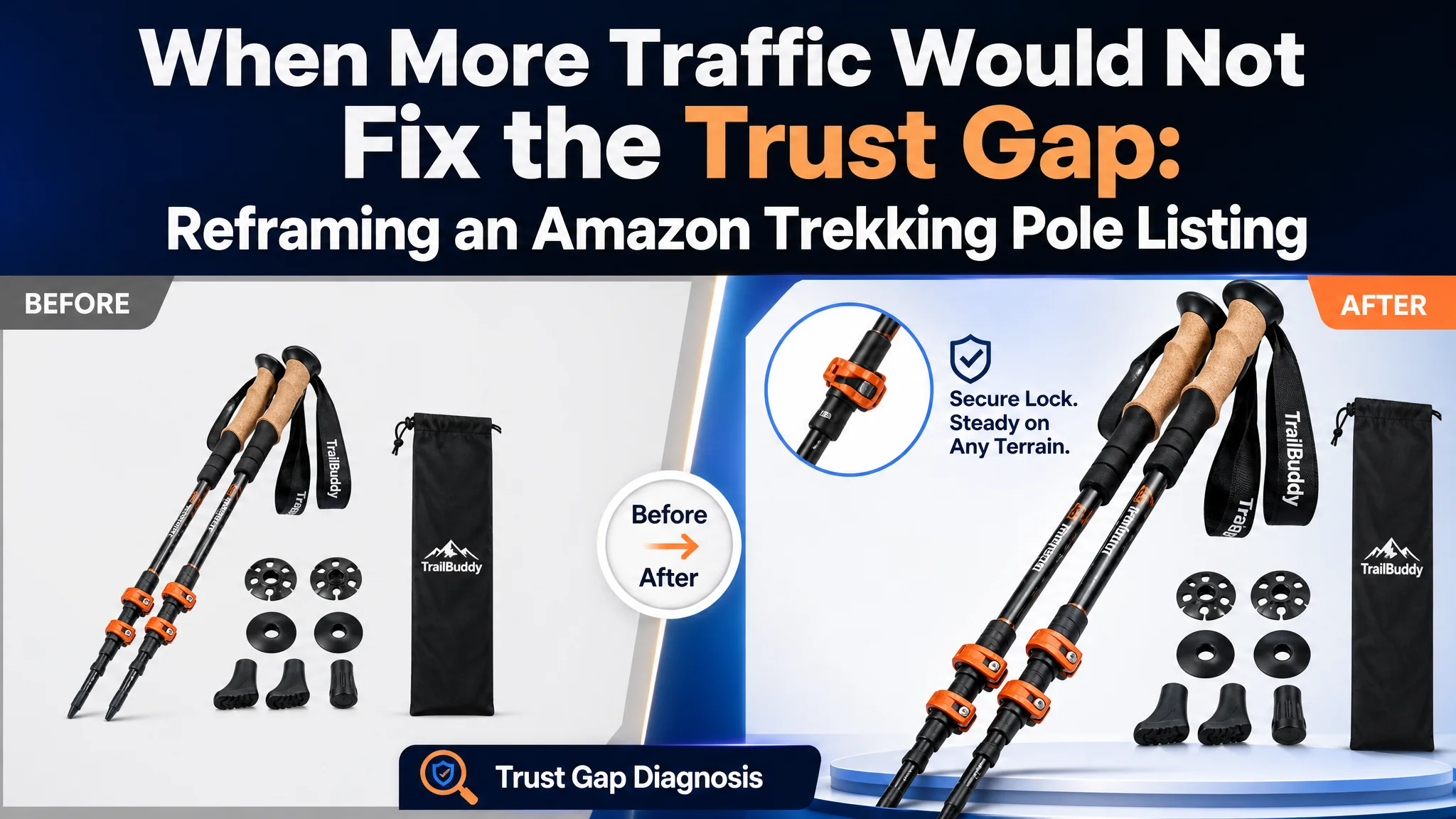
An Amazon seller in the outdoor accessories category was facing a familiar product-page problem: the Listing had the basic ingredients of a trekking pole offer, but it was not building enough confidence before purchase. The team initially focused on functional wording and product presentation, assuming that better feature coverage would be enough to strengthen the Amazon product page.
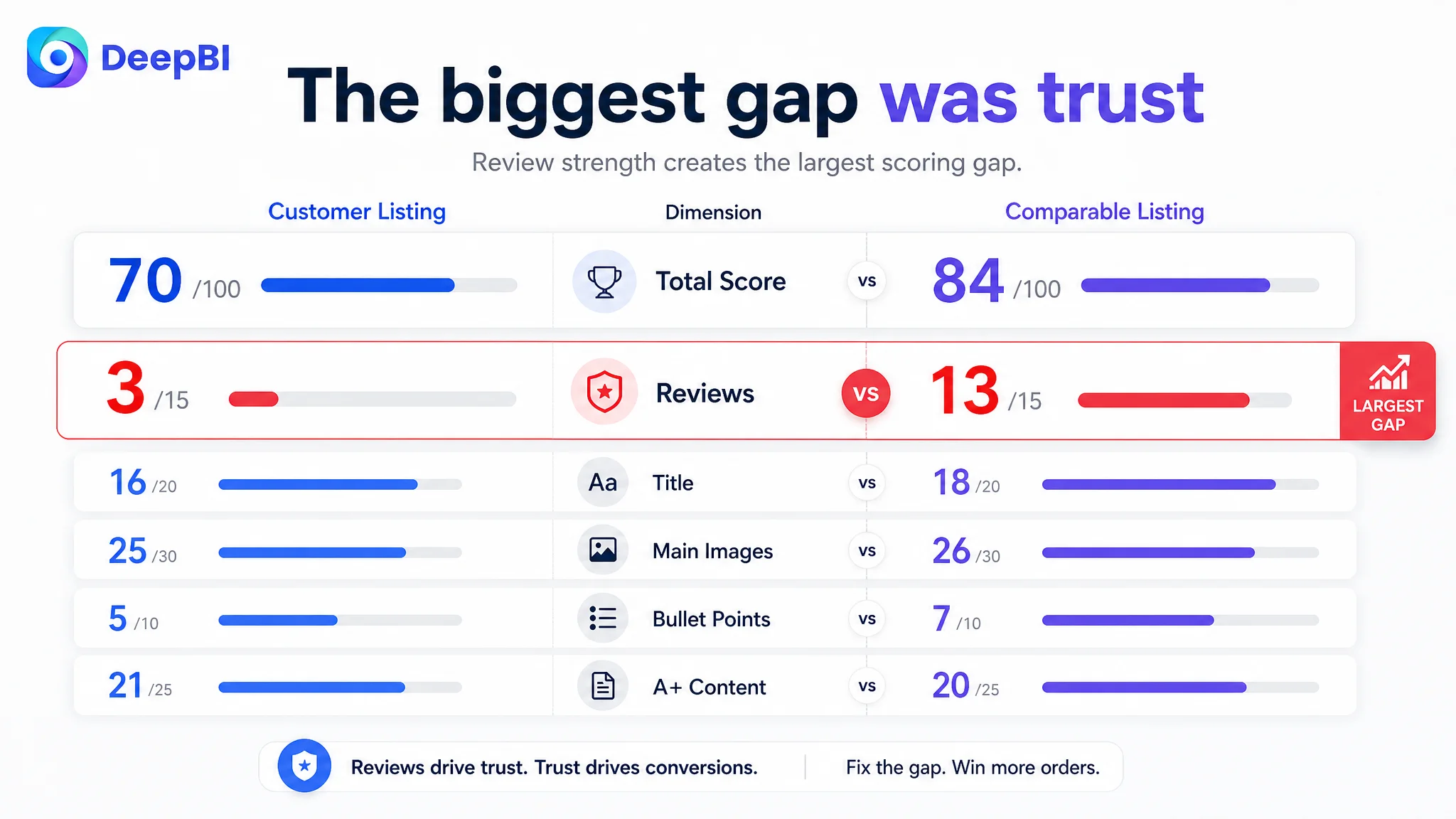
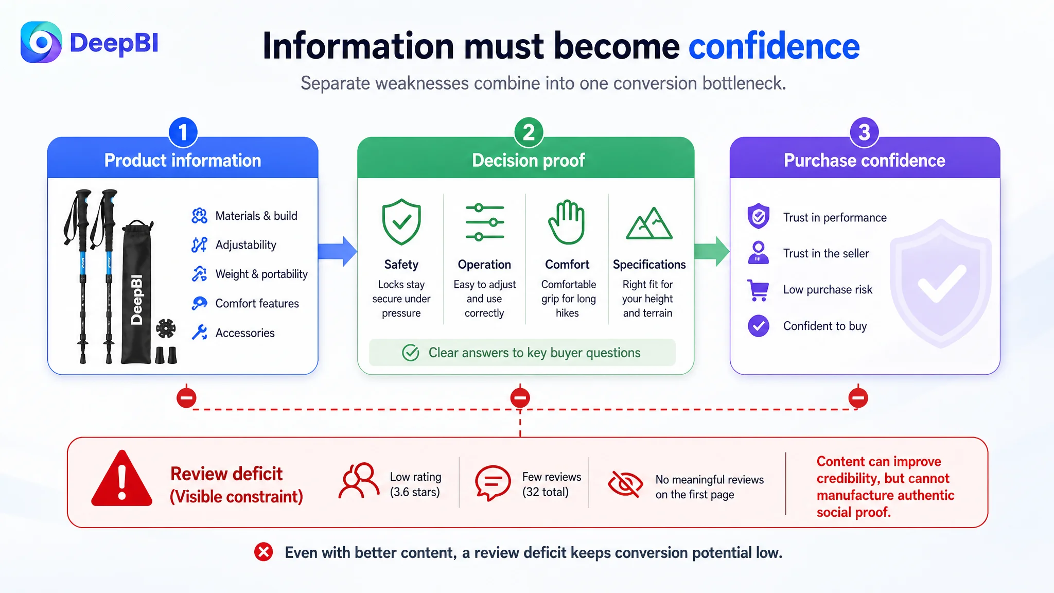
DeepBI’s diagnosis pointed to a different constraint. The Listing scored 70 out of 100 against 84 for a comparable high-performing Amazon Listing, but the most important gap was not simply in the title or images. The page was carrying a major trust deficit: a 3.6-star rating, only 32 total reviews, and no meaningful review content visible on the first page, compared with the benchmark’s 4.6 stars and 988 reviews.
That changed the optimization direction. Instead of treating the problem as a matter of adding more specifications or repeatedly adjusting advertising, the team needed to rebuild the page’s sales logic around safety, stability, ease of use, terrain adaptability, and credible reassurance. For other Amazon sellers, the case shows why Listing conversion cannot be diagnosed from one creative element alone—and why more traffic can amplify a trust gap when the product page is not ready to receive it.
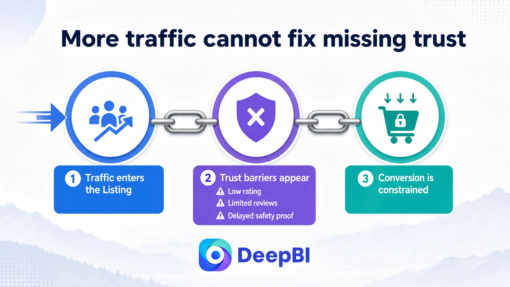
The Amazon Listing Did Not Have a Traffic Problem Alone
The product was an adjustable, collapsible trekking pole set designed for hiking and outdoor use. Its Listing already included several useful elements:
- A title with the main trekking-pole keyword
- Product images showing the poles and accessories
- Lightweight and adjustable-use messaging
- Ergonomic handle and wrist-strap details
- Height-adaptation information
- Family hiking and outdoor-use scenarios
- A structured A+ page with product details and application scenes
On the surface, the Listing did not look empty or unfinished.
That was part of the difficulty.
The page contained information, but the information was not arranged around the questions that typically determine whether a shopper trusts a trekking pole enough to buy it:
- Will the locking mechanism stay secure under pressure?
- Can the poles be adjusted correctly and safely?
- Will they work across different terrain conditions?
- Are they comfortable during extended use?
- Is the product durable enough for repeated outdoor use?
- What happens if the product does not meet expectations?
- Can the seller be trusted despite the limited review history?
The customer’s initial direction leaned toward improving feature expression: lightweight construction, durable materials, ergonomic grip, and adjustment convenience. Those points were relevant, but they did not fully address the buyer’s risk calculation.
For trekking poles, “lightweight” is useful. “Will the pole remain stable when I rely on it?” is usually more decisive.
The page was not short of product information. It was short of a clear reason for the shopper to believe the product would perform safely in real use.
The Original Diagnosis Stopped at Feature Coverage
The customer’s Listing emphasized functions such as shock absorption, wrist straps, lightweight construction, durable materials, and easy adjustment. The title also placed a core keyword early and included the set quantity and color information.
The problem was not that these claims were irrelevant. The problem was that they were presented mainly as a list of attributes.
A product page can mention a locking system without explaining why it matters. It can mention a comfortable handle without showing how that comfort affects long-distance use. It can state that the product is durable without providing a clear visual or textual reason to believe the structure will withstand repeated outdoor pressure.
The benchmark Listing used a more direct decision sequence:
1. Establish material and development credibility
2. Address locking security and safety
3. Explain comfort and proper use
4. Clarify specifications and suitable users
5. Reduce purchase risk through service reassurance
The customer’s page followed a less persuasive sequence:
1. Emphasize lightweight design
2. Describe durability
3. Introduce ergonomic handling
4. Explain adjustment
5. Repeat durability-related information
This distinction mattered because the Amazon product page was asking shoppers to accept comfort and portability before fully resolving the more serious concerns around stability and risk.
Traditional Amazon optimization often treats each part as an isolated task:
- Add more keywords to the title
- Improve the image quality
- Rewrite the bullet points
- Adjust bids
- Add more traffic
- Wait for conversion to recover
But the case showed why isolated adjustments can fail. If the page does not establish confidence in the product’s core use case, improving one feature at a time may leave the central objection untouched.
The Scorecard Exposed the Real Constraint
DeepBI’s comparison gave the customer a more precise view of where the Listing was losing competitiveness.
- Title: Customer Listing: 16/20, Comparable Listing: 18/20, Gap: -2
- Main images: Customer Listing: 25/30, Comparable Listing: 26/30, Gap: -1
- Bullet points: Customer Listing: 5/10, Comparable Listing: 7/10, Gap: -2
- A+ content: Customer Listing: 21/25, Comparable Listing: 20/25, Gap: +1
- Reviews: Customer Listing: 3/15, Comparable Listing: 13/15, Gap: -10
- Total: Customer Listing: 70/100, Comparable Listing: 84/100, Gap: -14
The result was revealing.
The customer’s A+ content actually scored slightly higher than the benchmark. The main-image gap was also relatively small. If the team had relied on visual preference alone, it might have concluded that the Listing needed a complete image redesign.
The scorecard pointed elsewhere: the largest weakness was the review dimension, followed by the way the title and bullet points translated product capabilities into purchase confidence.
The review difference was substantial:
- Customer Listing: 3.6 stars and 32 total reviews
- Comparable Listing: 4.6 stars and 988 total reviews
- Customer Listing: no meaningful review content visible on the first page
- Comparable Listing: 11 high-quality review entries visible on the first page
This did not mean that content optimization was unnecessary. It meant that content had to perform a different job.
With limited social proof, the title, images, bullet points, and A+ content needed to carry more of the trust-building burden. The page could not rely on review volume to answer basic questions for the shopper.
The Biggest Gap Was Not “Better-Looking Images”
The main-image comparison showed several weaknesses, but not in the simplistic sense of the images being unattractive.
The customer’s images communicated product composition and everyday hiking use. The benchmark Listing communicated more of the product’s complete utility and professional use logic.
The difference appeared in three areas.
The first image did not establish the complete solution
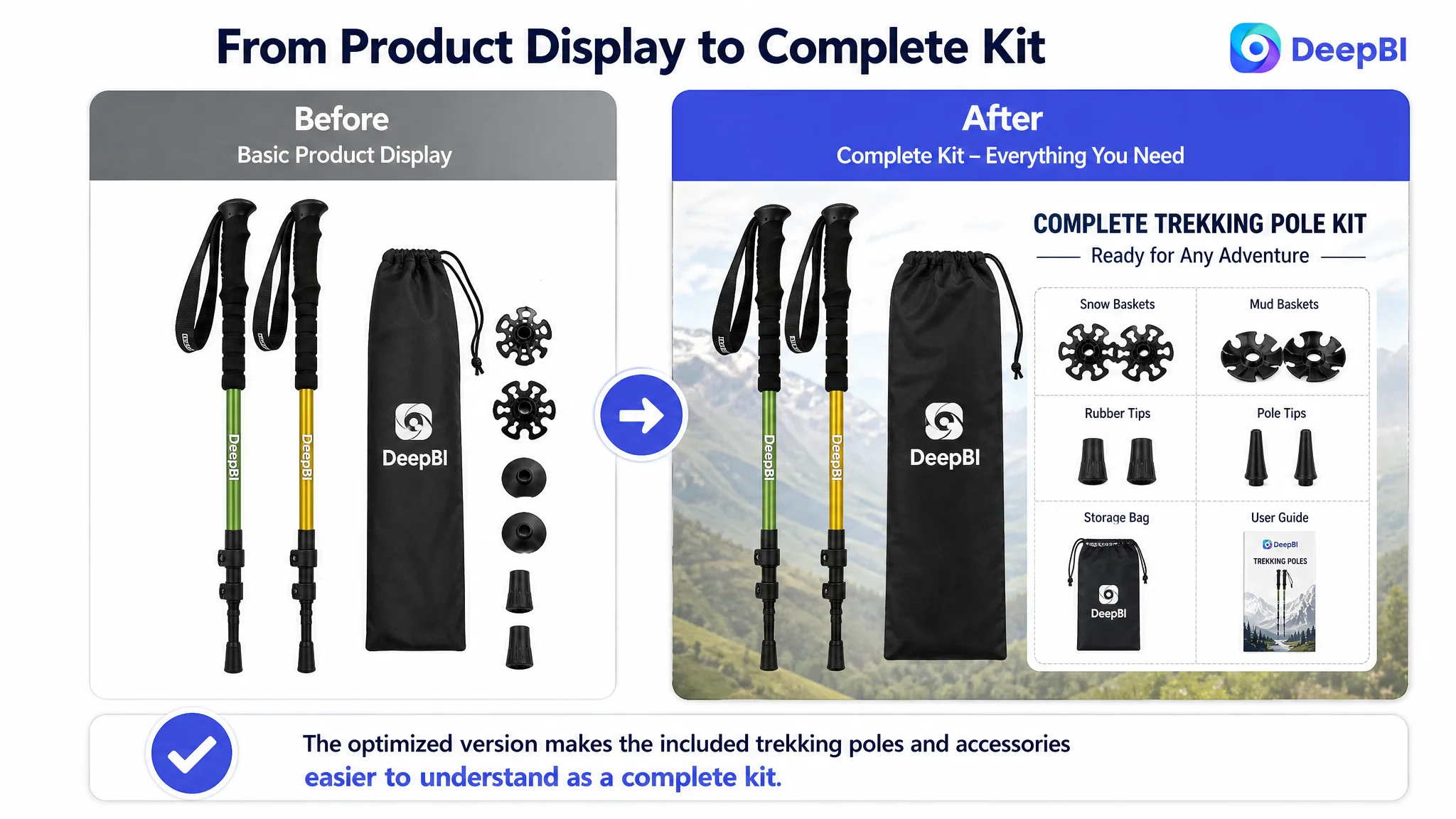
The customer’s opening product presentation showed the poles and accessories, but the relationship between the accessories and different terrain conditions was not immediately clear.
The recommended direction was to present the product as a complete all-terrain kit without inventing accessories or functions. The purpose was not to make the product look more dramatic. It was to help shoppers understand what they were receiving and why the included components mattered.
The stability message arrived too late
The customer’s second image focused on lightweight design and adjustable length in a lifestyle setting. That image supported portability, but it did not resolve the more important concern about stability.
A core safety feature such as the locking mechanism needed to appear earlier in the visual sequence. The page should show how the lock works, why correct adjustment matters, and how the mechanism supports reliable use—using only verified product attributes and available specifications.
Comfort was introduced before basic trust was established
The handle and wristband image contained useful detail, including the ergonomic grip and sweat-absorbing, non-slip EVA foam claims. But comfort is more persuasive after the shopper has already understood that the product is stable, durable, and suitable for the intended terrain.
The visual story needed to move from:
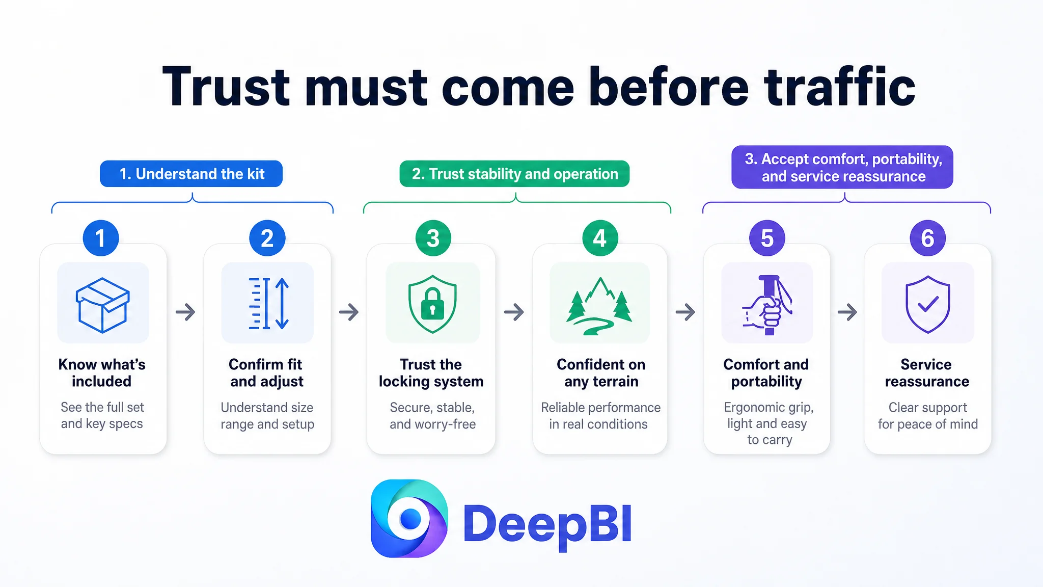
What is included → Will it stay secure? → How does it work? → Will it remain comfortable? → How easy is it to carry?
That order follows the buyer’s risk reduction process more closely than presenting the lightest or most comfortable feature first.
A main image is not merely a product display. Each image has a job in the shopper’s decision sequence.
Why DeepBI Did Not Start With More Ad Adjustments
The case material did not provide a post-optimization advertising dataset, so no claim can be made about a confirmed ACOS decline, CVR increase, or organic-order recovery. But the Listing diagnosis still established why advertising should not be treated as the first lever.
Ads can create impressions and clicks. They cannot independently provide the product-page proof needed to close the purchase.
When a shopper arrives through an Amazon ad and encounters:
- Limited social proof
- A modest rating
- Weak safety framing
- Generalized durability language
- No clear service reassurance
- A page sequence that postpones the most important concern
the advertising spend may be doing more than generating traffic. It may be directing additional shoppers toward the same unresolved conversion barrier.
This is the central business risk:
Advertising does not only amplify a Listing’s strengths. It can also amplify the consequences of a Listing that has not earned enough trust.
That is why DeepBI’s decision was to repair the Listing’s conversion capacity before treating additional ad optimization as the primary solution. The page first needed to become better at converting both paid and organic traffic.
The Title Needed a Clearer Search-to-Decision Path
The original title placed the brand name first and included the core trekking-pole keyword, but it used valuable space on color and quantity details while leaving some high-intent attributes less clearly structured.
The revised direction placed the product form and core search language closer to the front:
Naturehike Collapsible Aluminum Trekking Poles Set of 2, Lightweight Adjustable Hiking Poles with Shock Absorption, Quick Locks and Comfort Wrist Straps, Walking Sticks for Hiking and Trekking
In the final article, the client brand is omitted; the important point is the structure rather than the wording itself.
The recommended title logic did four things:
- Combined “collapsible,” “aluminum,” and “trekking poles”
- Kept the set quantity visible
- Added relevant search language such as “walking sticks”
- Connected features such as quick locks and comfort wrist straps to the product form
It also removed weaker or less useful wording, reduced repetition, and corrected the title’s spelling issue.
This was not intended as keyword accumulation for its own sake. The objective was to make the title answer three questions quickly:
1. What is the product?
2. What important features does it have?
3. Where and how is it intended to be used?
A stronger title could improve search relevance and click clarity, but it could not compensate for weak trust on its own. That is why title work remained part of a broader page-level repair rather than being treated as the complete solution.
The Bullet Points Needed to Sell Outcomes, Not Just Components
The customer’s bullet points contained several valid features, but the structure was repetitive and mainly descriptive. DeepBI’s recommended rewrite shifted the emphasis from specification listing to risk reduction.
Material and weight needed a practical meaning
Instead of saying only that the poles were lightweight and durable, the first bullet was directed toward a balance between portability and dependable support, using the verified 235-gram weight figure.
The point was not to claim more strength than the product could substantiate. It was to connect the weight to a real use benefit: easier carrying without abandoning the need for durable outdoor support.
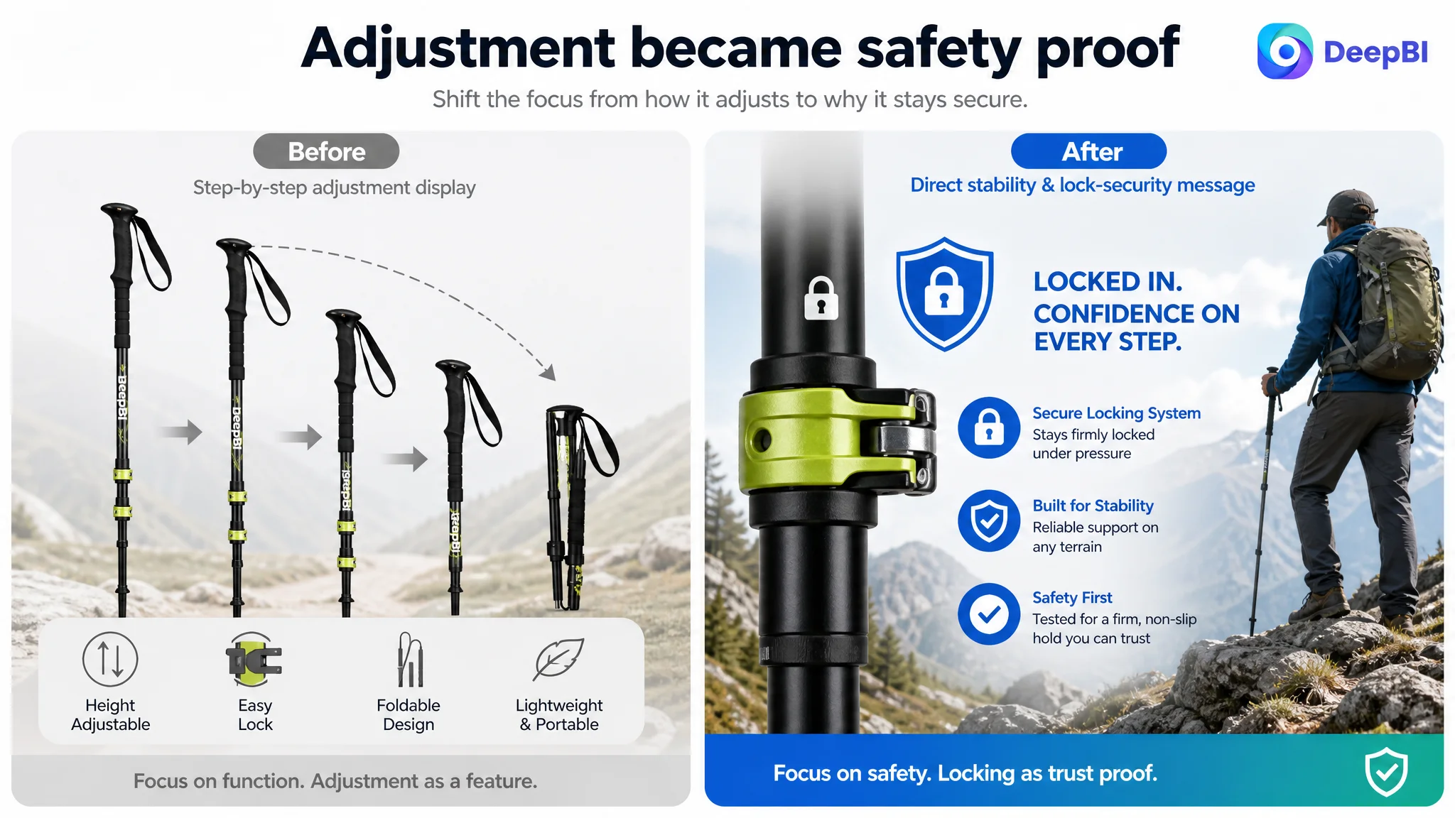
The locking system needed to be framed as a safety issue
The original content described adjustment functionality. The revised direction made the locking mechanism central to the safety discussion and added operational guidance to check and tighten the lock correctly.
This changed the message from:
The poles are easy to adjust.
to:
The poles are easy to adjust, and correct locking is important to keeping them secure during use.
That distinction is commercially important for a product used on steep, uneven, muddy, or rocky terrain.
Comfort needed to be connected to extended use
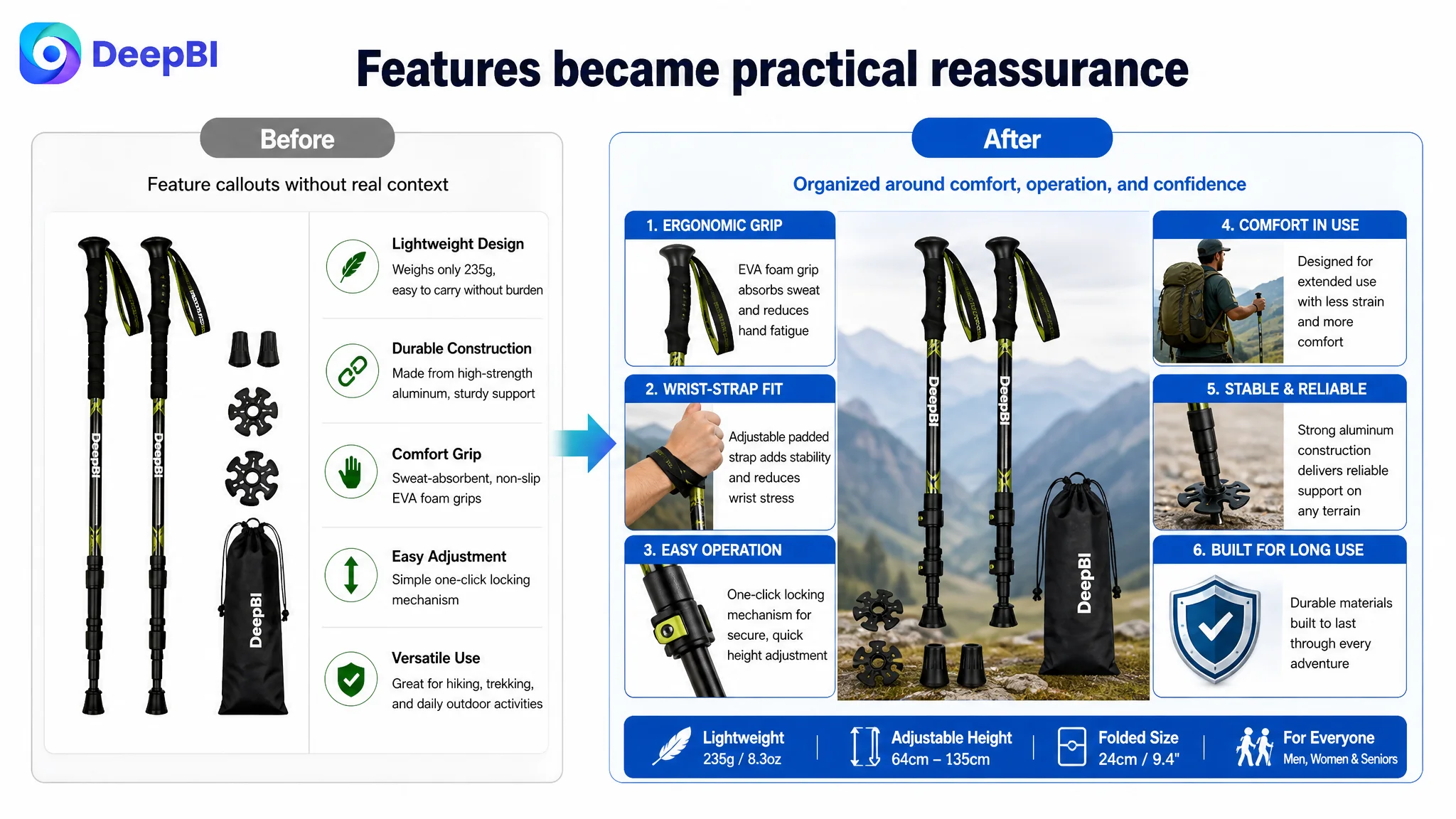
The ergonomic handle and wrist strap were not removed. They were given a clearer role: reducing discomfort and hand fatigue during longer walks, while explaining the grip and moisture-management properties that were already supported by the product material.
Specifications needed to reduce fit-related uncertainty
The Listing already included useful height information in its visual content, but the text should make the product’s adjustment range, folded size, and intended user range easy to understand.
For family-oriented or multi-user products, clearer fit information can help reduce hesitation and prevent expectations from being set incorrectly.
The final bullet point needed to reduce purchase risk
The original fifth point repeated durability messaging. The recommended direction used that space to address all-terrain use and responsive customer support without inventing an unsupported warranty period.
That was a deliberate choice. When review volume is low, a clear service position can help reduce the perceived risk of buying from a less-established Listing.
The A+ Page Had Strong Visual Assets but an Incomplete Persuasion Role
The customer’s A+ content was not the weakest part of the Listing. It covered several important decision factors:
- Material
- Weight
- Grip
- Adjustment mechanism
- Height suitability
- Family and multi-terrain use
Its opening family hiking imagery also fit the intended audience better than a purely extreme outdoor setting.
The problem was that the A+ page often presented information as a collection of modules rather than as a progression of reassurance.
The recommended sequence was to strengthen the page in seven directions.
Keep the emotional entry, then add performance context
The family hiking imagery could remain, but the surrounding text should connect everyday use with more demanding terrain. The goal was to retain warmth while making the product’s functional range clearer.
Turn parameter presentation into proof of sturdiness
Rather than simply displaying material specifications, the page should explain what the construction means for support, durability, and use. A parameter becomes more persuasive when the shopper understands the problem it helps address.
Make lightweight and comfort evidence easier to process
The product’s 235-gram weight and EVA foam grip should be expressed through intuitive comparisons and clear visual hierarchy, not buried in a dense specifications collage.
Add a practical quick-lock tutorial
The height chart was already useful. It could become more valuable when paired with a concise adjustment and locking guide, especially for shoppers buying poles for different family members.
Replace generic versatility with use-case reassurance
The multi-scenario module should show how the product relates to different slopes and terrain conditions. The purpose is not to claim universal performance without evidence, but to make the intended use cases more concrete.
Add a wrist-strap and grip guide
The customer’s page lacked a dedicated explanation of how to adjust the wrist strap and hold the handle correctly. This was an opportunity to turn comfort from a vague claim into a practical use instruction.
End with rational reassurance
The final module needed to give the shopper a clear reason to feel comfortable proceeding. That could include a concise quality commitment or a supported service statement, without adding certifications, warranty terms, or performance claims that were not present in the source material.
The Review Gap Changed What the Content Had to Do
The 10-point review score gap was too large to solve through copywriting alone.
A 3.6-star rating and 32 reviews create a different buying environment from a 4.6-star rating and 988 reviews. The customer’s Listing lacked the accumulated social proof that allows a shopper to outsource part of the decision to previous buyers.
That meant the product page needed to be especially disciplined about trust.
It could not afford to:
- Lead with secondary comfort claims while delaying safety
- Repeat generic durability language
- Leave the locking mechanism unexplained
- Treat customer service as an afterthought
- Use lifestyle imagery without clarifying product performance
- Present specifications without showing why they matter
At the same time, content could not manufacture social proof. No image redesign or AI-generated scene could replace authentic customer experience.
The correct response was to make the page more credible within the evidence it actually had, while recognizing that review development remained a separate long-term business need.
The Business Decision Was About Sequence, Not Volume
The most important conclusion from the case was not that every image needed to be replaced or that every bullet point needed to be rewritten at once.
It was that the optimization sequence needed to change.
The customer’s page already had enough material to support a stronger Listing. The constraint was the order and weight of the messages:
1. Establish the product’s core use and complete kit
2. Address lock security and stability
3. Explain correct adjustment and operation
4. Prove comfort for extended use
5. Clarify dimensions, weight, and portability
6. Reinforce terrain relevance and service confidence
7. Continue building authentic review support
This sequence allows the Listing to address the highest-risk questions before moving into secondary benefits.
It also keeps advertising in its proper role. Ads should bring qualified shoppers to a page that has a credible chance of converting them—not compensate for a page that has not resolved its central trust barrier.
What DeepBI Saw That the Team Had Missed
DeepBI’s value in this case was not a larger list of edits. It was the ability to distinguish between several different types of weakness:
- A title relevance gap
- A bullet-point logic gap
- A visual sequencing gap
- A practical-use explanation gap
- A social-proof deficit
- A broader trust problem
The page did not need to be judged simply as “good” or “bad.” It needed to be located against a comparable Amazon Listing and examined dimension by dimension.
That comparison showed why the A+ page could score well while the overall Listing still remained commercially vulnerable. It also showed why improving the main image alone would not remove the largest obstacle: the trust deficit created by review quality, rating, and incomplete safety communication.
The real bottleneck was not a single weak image. It was the Listing’s limited ability to turn product information into purchase confidence.
The Lesson for Amazon Sellers
For Amazon sellers, this case offers a practical diagnostic principle:
Before increasing traffic or making broad creative changes, determine whether the product page is strong enough to convert the traffic it already receives.
That requires looking beyond isolated metrics or subjective design opinions.
A product page may have:
- A reasonable keyword structure
- Attractive lifestyle images
- Detailed specifications
- A complete A+ page
- Several legitimate product benefits
and still underperform because the sales logic is not aligned with the shopper’s biggest concern.
For this trekking pole Listing, that concern was not simply portability or comfort. It was confidence in stability, safe adjustment, durability, and purchase risk—made more important by the limited and unfavorable review base.
The later optimization direction therefore focused on rebuilding the page around trust and practical decision support. It did not promise that content changes alone could erase the review gap. It did establish a more commercially sound foundation for future organic and paid traffic.
The customer’s understanding changed from:
“We need to add more features and improve the presentation.”
to:
“We need to decide whether the page has earned the right to receive more traffic.”
That is the deeper Amazon Listing lesson: ads can create opportunity, but product-page conversion determines whether that opportunity becomes an order.