

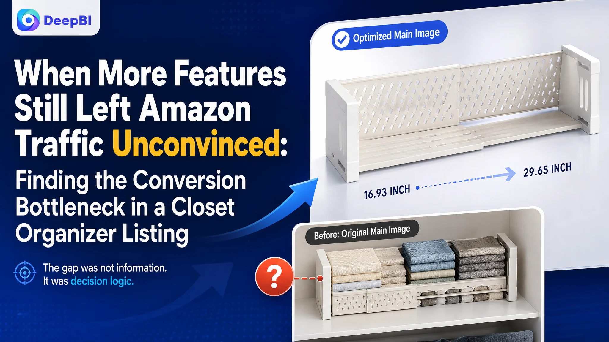
An Amazon seller of expandable metal closet organizers was not facing a simple lack-of-information problem. The product page already described its telescoping design, 44-pound load capacity, stackable structure, and multiple use cases. Yet the Listing still trailed a comparable high-performing product, with a total score of 67/100 versus 84/100.
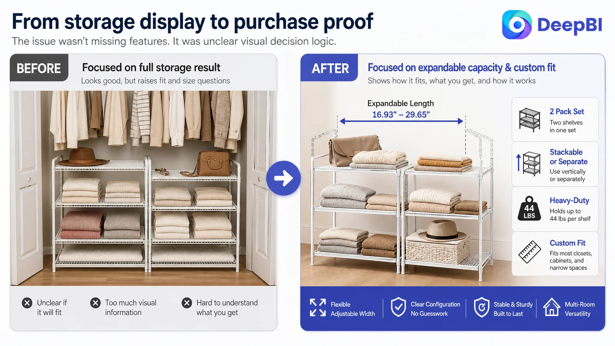
The initial optimization instinct was to make the product's functional advantages more visible: emphasize expandable storage, add dimensions, show stacking configurations, and explain the materials more clearly. Those points were valid, but they did not address the deeper issue. DeepBI found that the Amazon product page was asking shoppers to connect too many details on their own: whether the organizer would fit, how the two-pack worked, why the structure was stable, and how it solved an everyday storage problem.
The later direction focused on rebuilding the page's decision logic. The main image needed to communicate flexible capacity without creating sizing anxiety. The supporting images needed to verify the two-pack configuration, dimensions, and separable modes. The A+ content needed to move from attractive closet scenes toward fit validation, technical proof, multi-room use cases, and Before/After problem resolution.
For other Amazon sellers, the case offers a practical reminder: when paid traffic does not convert efficiently, the issue may not be targeting or bids alone. The Listing may be receiving visitors without giving them enough confidence to purchase.
The Amazon Listing Had Useful Information. It Did Not Yet Form a Complete Buying Argument.
The product was an expandable, stackable metal storage solution designed for closets and other spaces around the home. Its stated advantages were concrete:
- Telescoping length from 16.93 to 29.65 inches
- Two metal shelves in one set
- Separate or vertically stacked use
- Load capacity of up to 44 pounds per shelf
- Applications across closets, bedrooms, kitchens, bathrooms, laundry rooms, and offices
On paper, the Listing had several strengths. Its bullet points used specific dimensions and weight data. It described the expandable design, multiple scenarios, installation support, and interlocking structure. The product itself had meaningful functional differentiation.
But Amazon shoppers do not evaluate these points as an inventory of facts. They make a sequence of decisions:
1. Will this fit my space?
2. What exactly will I receive?
3. Can I use it in the way I need?
4. Will it remain stable under load?
5. Does the product look trustworthy enough to justify the purchase?
The page did not guide shoppers through that sequence clearly enough.
The problem was not an absence of selling points. It was the lack of a clear path from shopper concern to product proof.
The Competitive Gap Was Larger Than the Product Difference
DeepBI's comparison showed a 17-point overall gap between the target Listing and the benchmark:
- Title: Target Listing: 14/20, Benchmark: 17/20, Gap: -3
- Main image: Target Listing: 24/30, Benchmark: 27/30, Gap: -3
- Bullet points: Target Listing: 8/10, Benchmark: 7/10, Gap: +1
- Detail page: Target Listing: 19/25, Benchmark: 23/25, Gap: -4
- Reviews: Target Listing: 2/15, Benchmark: 10/15, Gap: -8
- Total: Target Listing: 67/100, Benchmark: 84/100, Gap: -17
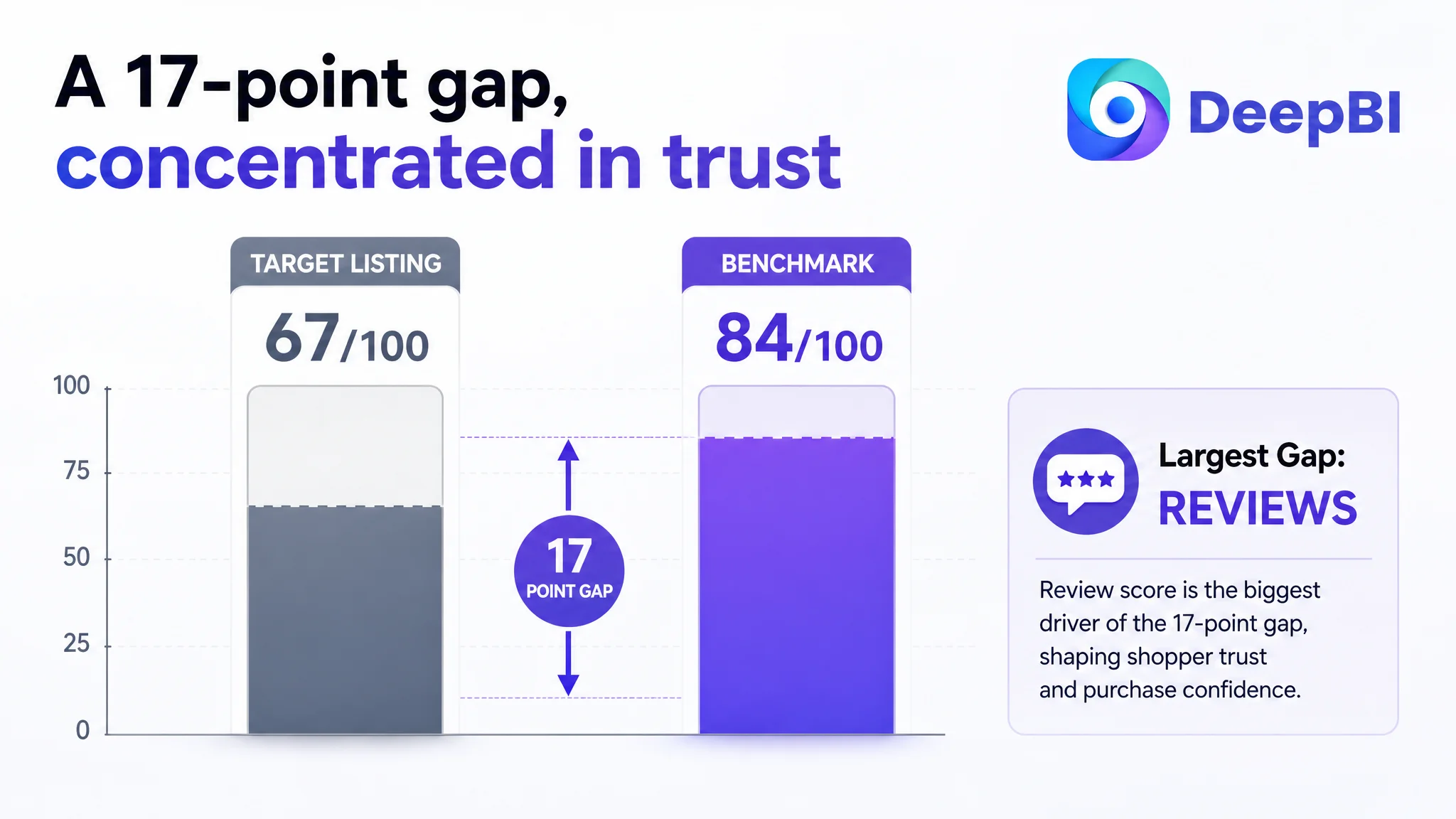
This distribution mattered.
The target Listing was not weaker in every area. Its bullet points actually scored slightly higher because they communicated the product's expandable structure, load capacity, scenarios, installation, and support more thoroughly.
The larger losses appeared in the title, main image, A+ content, and reviews. That meant the Listing's main challenge was not simply “write better copy.” It was the ability to establish relevance, reduce uncertainty, and build trust across the full Amazon product-page experience.
The Original Direction Focused on Features. DeepBI Reframed the Issue as Conversion Capacity.
The seller's functional claims were not wrong. In fact, the expandable design was a genuine advantage. The problem was how that advantage entered the customer's decision process.
The Listing led with “Expandable,” while the benchmark led with a more immediately recognizable capacity signal: “4-Tier,” followed by the core category phrase “Stackable Closet Organizers.” The benchmark's structure helped shoppers understand the product type and storage value at a glance.
The target title contained relevant keywords, but its order was more descriptive than decisive. Terms such as “Metal Clothes Sweater Shelf Organizer” added information without creating the same immediate picture of capacity, use, and fit.
DeepBI therefore did not treat the title as a keyword-density exercise. The issue was the relationship between search visibility and shopper comprehension.
A stronger structure brought the product's key category and function forward:
“Expandable Closet Organizer 2 Pack Stackable Metal Shelves…”
It also preserved relevant use cases such as wardrobes, cupboards, kitchens, bathrooms, and bedrooms. The objective was not to imitate the benchmark's wording. It was to make the target product's own advantages easier to recognize within the first few seconds of an Amazon search and product-page visit.
The Main Image Created Interest, but Also Created a Fit Question
The original visual path showed a large, layered storage arrangement inside a closet. This communicated capacity, but it also introduced a concern before the Listing had answered it:
Will this organizer actually fit my space?
For an expandable product, that is a critical tension. The more storage the image appears to show, the more the shopper may wonder whether the product is too large, too fixed, or difficult to configure.
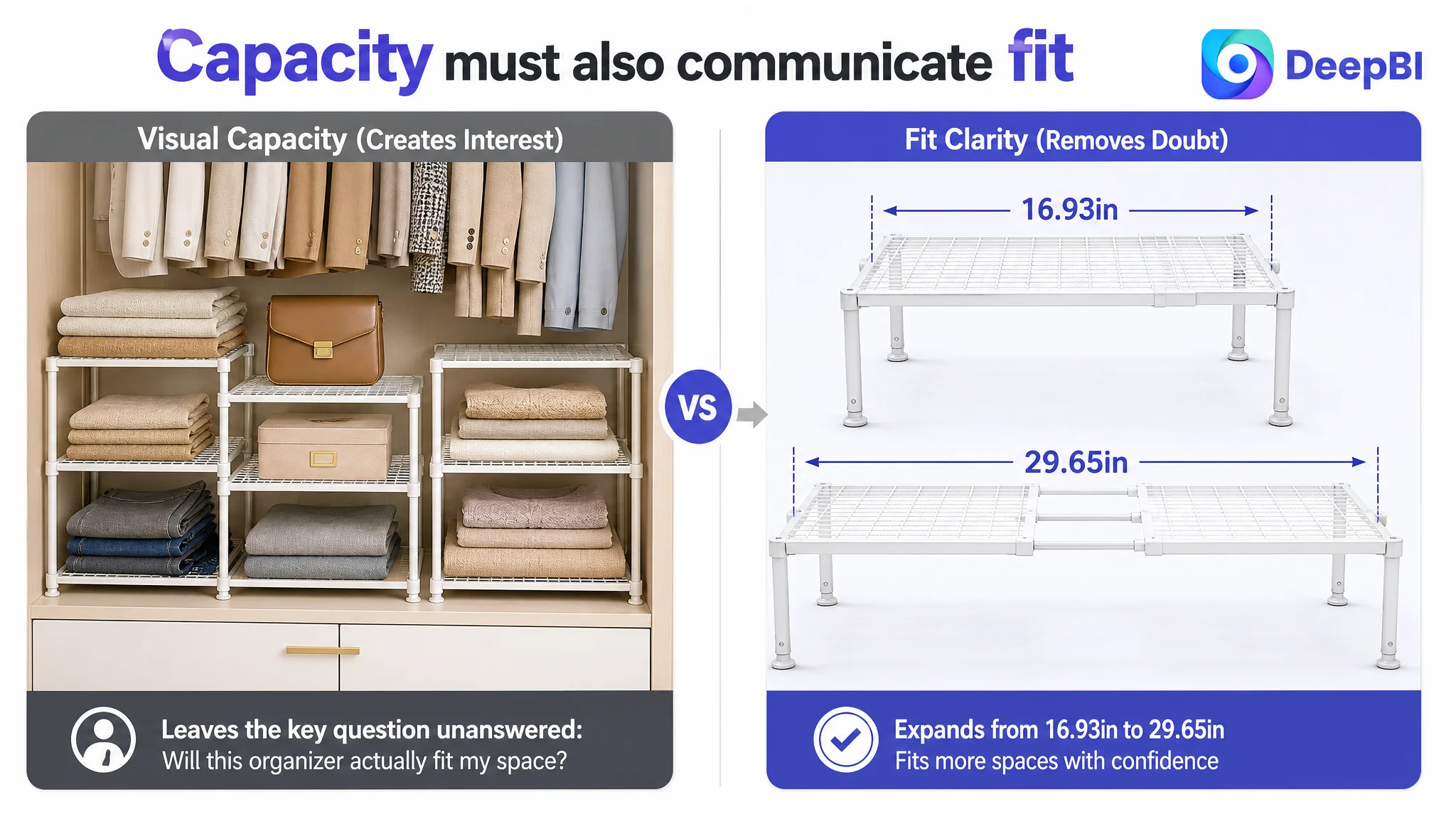
The main image therefore needed to do more than show an impressive result. It needed to communicate adaptability.
DeepBI's priority was to reposition the visual role of the image around three ideas:
- The product can adjust from 16.93 to 29.65 inches
- The storage capacity can be configured for different spaces
- The expandable design helps use narrow gaps and overlooked areas
This was not a recommendation to add more visual decoration. It was a recommendation to remove the first conversion obstacle created by the image itself.
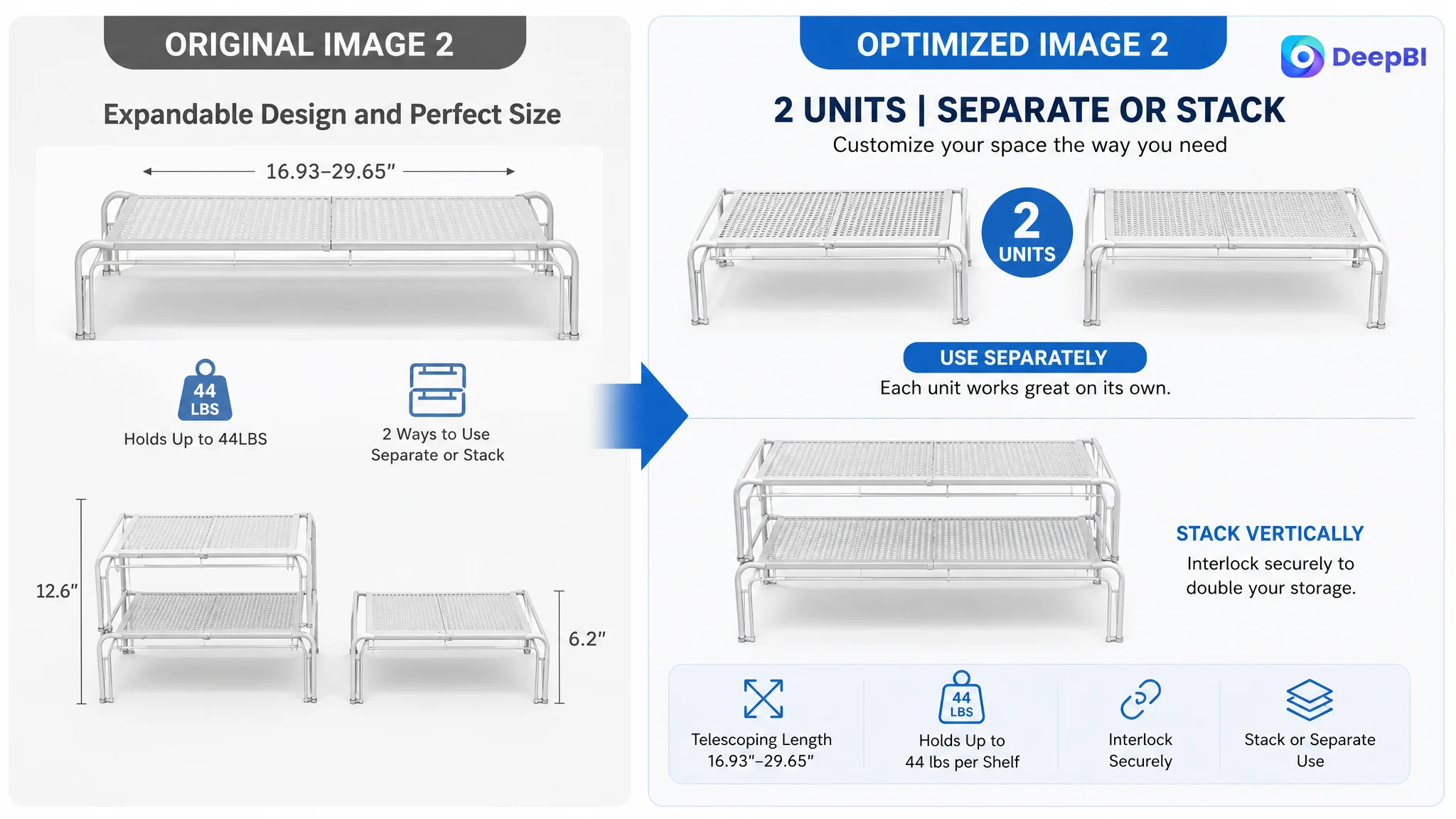
The second image then needed to confirm what the shopper would receive. The two-pack configuration was not sufficiently clear through a stacked presentation alone. Separating the units visually, while retaining dimensions and the 44-pound load indicator, would make the value and configuration easier to verify.
The third image needed to show the difference between using the two shelves separately and stacking them vertically. That distinction was central to the product's value, but it needed to be seen rather than left to interpretation.
The Product Page Was Showing the Result Without Fully Showing the Problem
The A+ content scored 19/25 against the benchmark's 23/25. The gap was not primarily image sharpness. It was the logic connecting the shopper's storage problem to the product's solution.
The target page relied heavily on closet scenes, feature icons, structural details, and product views. These assets were clear, but the presentation remained largely functional and repetitive.
The benchmark used a broader persuasion sequence:
- Multiple room settings
- Before/After comparison
- More lifestyle-oriented presentation
- A stronger brand atmosphere
- Clearer demonstrations of how the product changes the space
The difference was important. A product page can show a neat closet without proving why the shopper's current storage problem requires this particular product.
Fit validation had to come first
The first A+ module needed to answer the most immediate question: where and how can this organizer be used?
A comprehensive closet scene showing different expansion and stacking configurations would help shoppers compare the product with their available space. Dimensions and configuration logic should appear before decorative lifestyle imagery.
Structure needed visible proof
The page described a thickened metal frame, reinforced mesh, rust-resistant coating, rear protective mast, and 44-pound capacity. But these points needed stronger visual evidence.
A structure-focused module could identify the frame, mesh, protective elements, and interlocking points directly. The goal was to convert “sturdy” from a claim into something a shopper could inspect.
The Before/After story needed to move forward
The Before/After module was not merely an aesthetic upgrade. It was the missing problem-solution link.
A useful comparison would show:
- Wasted vertical space or disorganized storage before
- A stable, expandable arrangement after
- Clear use of the available width and height
- Folded clothes, bags, or other supported items organized without overloading the visual scene
This gives the product a job to perform. It shows not only what the organizer looks like, but what changes after it is used.
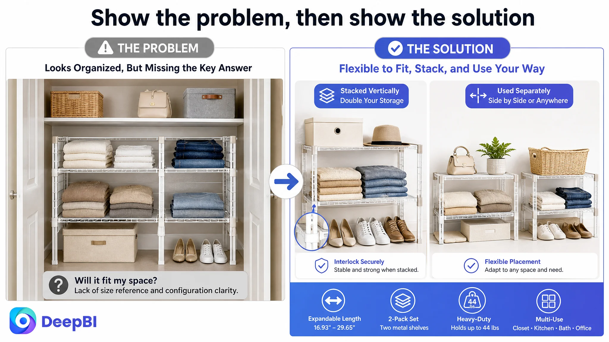
A+ content should not only display a better-looking room. It should make the shopper recognize the problem the product is designed to resolve.
More Scenarios Increased the Product's Perceived Value
The target Listing's visual story stayed close to the closet. That limited the perceived value of an expandable, multifunctional organizer.
The product's stated use cases supported a broader story:
- Bedroom storage for clothing, accessories, or cosmetics
- Kitchen organization for spice bottles and supplies
- Bathroom storage for toiletries
- Laundry-room organization
- Office use for printers and stationery
- Entryway or study-area storage
These scenarios were not intended to make the product appear suitable for everything. They were meant to verify the “multifunctional” claim with specific, believable applications.
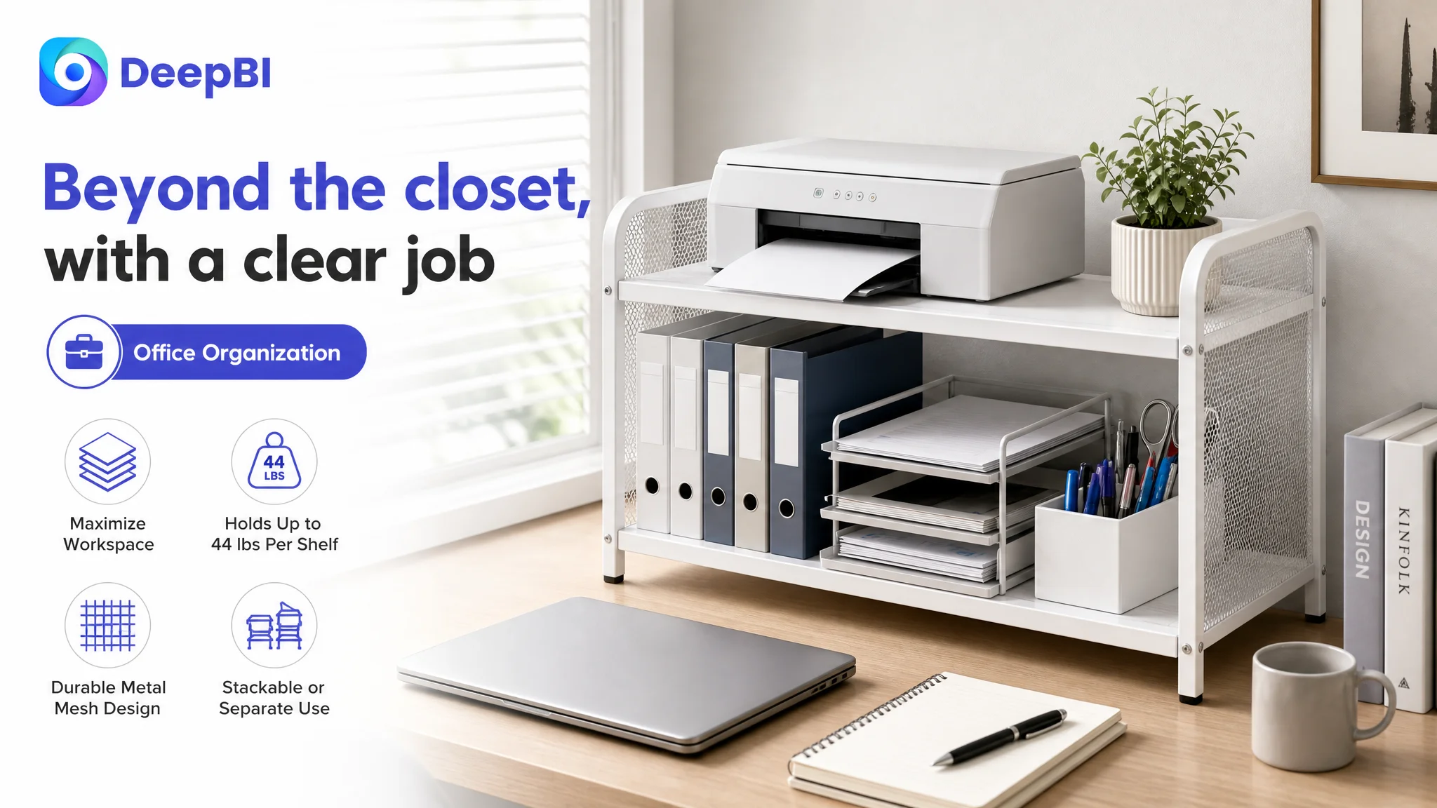
The sequence mattered. The page should first prove the product's core closet fit, then demonstrate how the same structural logic extends to other areas of the home.
That order prevents scenario expansion from becoming a distraction. It makes the additional use cases feel like added value rather than an attempt to compensate for an unclear primary use.
Reviews Were a Trust Constraint, Not a Copywriting Problem
The review gap was the largest numerical weakness:
- Target Listing: 3.8 stars, 5 total reviews, no visible homepage comments
- Benchmark: 4.1 stars, 15 total reviews, 8 visible homepage comments
The target Listing also lacked the image and video review presence visible on the benchmark page.
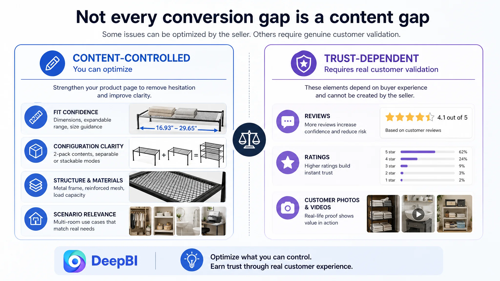
This difference could not be repaired through title changes or image generation. It represented a separate trust constraint. A shopper comparing two similar storage products may interpret the larger review base as lower purchase risk, even when the target product has stronger functional specifications.
DeepBI's role was to distinguish this structural weakness from the areas the team could address immediately.
The Listing could improve the way it explained fit, capacity, durability, configuration, and use cases. It could not manufacture customer validation. Treating the review gap as a visual problem would have produced the wrong priority.
This separation is important in Amazon operations: some conversion constraints are content problems, while others require time, product experience, and legitimate customer feedback.
Why DeepBI Did Not Start With More Advertising Adjustments
When a product page has traffic but leaves basic questions unresolved, increasing traffic can increase the amount of wasted traffic rather than solve the business problem.
For this Listing, the most urgent unresolved questions were visible in the page structure:
- Does the organizer fit different wardrobe widths?
- Is the set two separate racks or one fixed unit?
- Can the shelves be used separately?
- How does vertical stacking remain stable?
- What does the 44-pound capacity refer to?
- Can the product work beyond a closet?
- What problem does it solve in an actual home?
These are product-page conversion questions. They affect how effectively both paid and organic visitors can become buyers.
That is why the decision order changed:
1. Clarify the product's primary value in the title and main image.
2. Verify fit, dimensions, and two-pack contents.
3. Demonstrate separate and stacked configurations.
4. Add visible structural proof.
5. Expand the use-case story with credible scenarios.
6. Make the Before/After problem-solution logic explicit.
7. Treat the review gap as a separate trust limitation rather than trying to hide it.
Only after the page could carry these questions more effectively would further traffic optimization have a stronger foundation.
Advertising can bring a shopper to the page. It cannot decide whether the page has earned the shopper's confidence.
The Optimization Was About Reordering Proof
The final direction did not require the product to become something else. It required the Listing to present the existing product truth in a more useful order.
The proposed content logic was:
- First: show flexible capacity and reduce fit anxiety
- Next: clarify the two-pack configuration and dimensions
- Then: demonstrate separate and vertically stacked use
- After that: prove structure, load capacity, and stability
- Finally: broaden the product's role across rooms and show the storage problem being resolved
This sequence aligned the Listing with the shopper's decision path rather than the seller's internal feature list.
The same principle applied to the bullet points. The product already had strong factual material, but the information needed to move from feature to consequence:
- Expandable design → adapts to different wardrobe widths
- Stackable construction → creates vertical storage while saving space
- Metal frame and reinforced mesh → supports heavier items without bending
- Multiple use cases → solves storage needs across several rooms
- Installation and measurement guidance → reduces fit and assembly uncertainty
The page became easier to evaluate because each claim answered a practical question.
What This Amazon Case Reveals About Listing Optimization
The case did not provide a post-optimization performance dataset, so the business impact should not be overstated. The value of the diagnosis lies in clarifying what needed to change before traffic could be judged fairly.
The customer team had a product with meaningful functional advantages, but those advantages were not fully connected to the shopper's buying logic. The Listing's 67/100 score, compared with the benchmark's 84/100, showed that the issue was not one isolated image or one missing keyword. It was a coordination problem across title, visuals, A+, and trust.
The main lesson for Amazon sellers is straightforward:
Before trying to scale ads, determine whether the product page can convert the traffic it already receives.
A stronger Listing does not come from adding every possible claim. It comes from identifying the most important hesitation, answering it at the right point in the page, and ensuring that the title, images, bullets, A+ content, and reviews support the same decision.
For this closet organizer, the central hesitation was not whether the product had features. It was whether the shopper could confidently understand the fit, configuration, stability, and real-life value.
That was the conversion bottleneck DeepBI surfaced.