

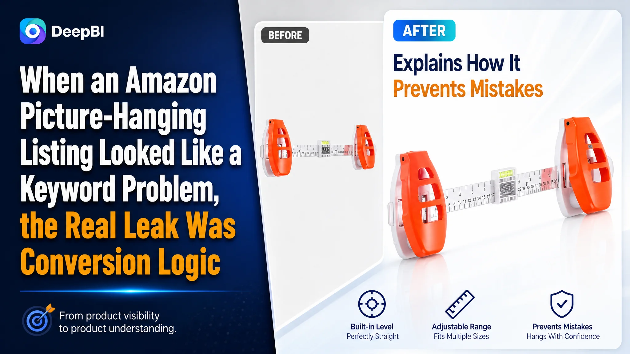
This case involves an Amazon seller in the US marketplace whose picture-hanging tool Listing was losing ground to a comparable high-performing listing. The initial concern appeared to be straightforward: the title lacked some high-value search terms, while the images and bullet points did not communicate the product strongly enough.
That diagnosis was only partly correct. DeepBI’s review found a broader product-page problem. The Listing was not merely missing keywords or visual polish; it was failing to explain the product’s value in the order buyers needed to understand it. The page showed a tool, but did not consistently show how it solved inaccurate marking, unnecessary wall damage, difficult alignment, and uncertainty about different hanging hardware.
The later optimization therefore focused on rebuilding the Amazon Listing’s sales logic: make the title more search-relevant, turn the main images into functional proof, restructure the bullet points around buyer pain points, and use A+ content to explain the process and build trust. Other Amazon sellers can take away a practical lesson from this case: before pushing more traffic through Amazon ads, confirm that the product page can convert that traffic with a clear reason to click, trust, and buy.
The Listing Was Not Far Behind in One Area. It Was Behind Across the Decision Path.
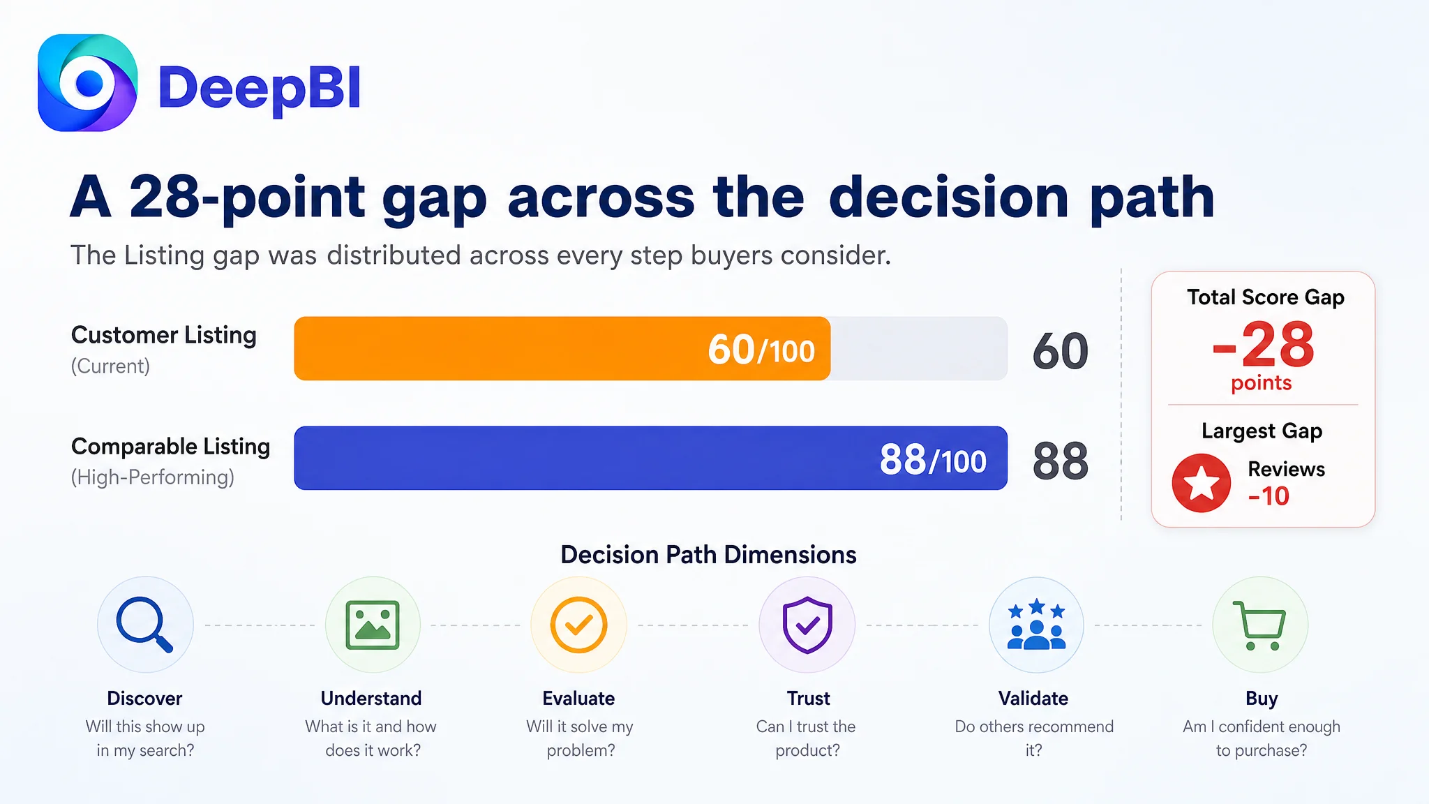
The customer’s Listing received an overall score of 60 out of 100, compared with 88 for a comparable high-performing listing. The 28-point gap was not concentrated in a single isolated defect.
- Title: Customer Listing: 13/20, Comparable Listing: 16/20, Gap: -3
- Main image: Customer Listing: 21/30, Comparable Listing: 27/30, Gap: -6
- Bullet points: Customer Listing: 5/10, Comparable Listing: 9/10, Gap: -4
- Detail page and A+ content: Customer Listing: 19/25, Comparable Listing: 24/25, Gap: -5
- Reviews: Customer Listing: 2/15, Comparable Listing: 12/15, Gap: -10
- Total: Customer Listing: 60/100, Comparable Listing: 88/100, Gap: -28
The pattern mattered more than the total score.
The title was weaker, but not unusable. The main images contained the product, but did not make its function immediately clear. The bullet points described capabilities, but did not create a strong problem-to-solution sequence. The A+ content showed usage outcomes, but did not explain enough of the operating process. And the review section contained an unusually serious trust issue.
The Listing therefore had several points where a buyer could hesitate:
- What exactly does this tool do before the frame is hung?
- How does it help mark the correct nail position?
- Can it work with different picture-hanging hardware?
- Will it help avoid unnecessary holes or wall damage?
- Can a buyer understand the process without already knowing how the tool works?
- Is there enough real customer feedback to support the purchase decision?
This was not a page that lacked information. It was a page that did not arrange information into a convincing buying path.
The Customer First Looked Toward Keywords and Creative Execution
The original direction naturally centered on visible Listing elements.
The title contained a relevant core term, “Picture Hanging Tool,” but the brand name appeared before it. The title also used fewer long-tail variations related to kits, hangers, and specific hardware types. Compared with the benchmark, it lacked stronger outcome-oriented phrases such as fast positioning and precise alignment.
That made keyword coverage an obvious area to improve.
The images also appeared to need work. Several visuals relied on lifestyle composites or explanatory English text. One image included drilling and shelving elements that were not aligned with the product’s actual use case or the Listing copy. Other images repeated the act of holding or hanging a frame without showing the critical positioning and marking step.
From an operating perspective, it would have been easy to treat these as separate execution tasks:
- Add more keywords to the title.
- Replace weak images.
- Rewrite the bullet points.
- Add more A+ modules.
- Improve the review situation.
But that approach would still leave the central question unanswered:
What does a buyer need to believe before this picture-hanging tool becomes worth purchasing?
DeepBI’s diagnosis moved from isolated content defects to the Listing’s conversion capacity.
The Real Constraint Was Not Product Visibility. It Was Product Understanding.
The product’s core value was not simply that it helped hang pictures. Most buyers already understand that a picture-hanging tool should be involved in the hanging process.
The stronger value was more specific:
- Marking the correct hook or nail position
- Keeping the frame level
- Supporting different hanging hardware
- Reducing guesswork
- Avoiding unnecessary holes and wall damage
- Making a multi-frame arrangement easier to align
The customer’s Listing mentioned several of these benefits, but the content did not consistently demonstrate the mechanism behind them.
The main images showed the result more often than the process. The bullet points described features more often than buyer problems. The A+ content reassured buyers that the task could be easy, but did not fully explain how the tool handled different types of frames and hangers.
That distinction is important for Amazon product-page conversion.
A buyer does not only need to see that the final frame looks straight. They need to understand why this tool can help produce that result, whether the process fits their situation, and whether the product is credible enough to trust.
“The page did not lack a hanging outcome. It lacked a clear explanation of how the product created that outcome.”
The Main Image Was Not Just a Visual Issue
The main image and image sequence had a direct effect on how quickly the product’s value could be understood.
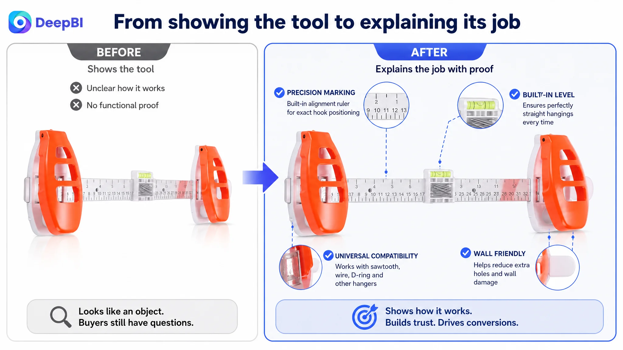
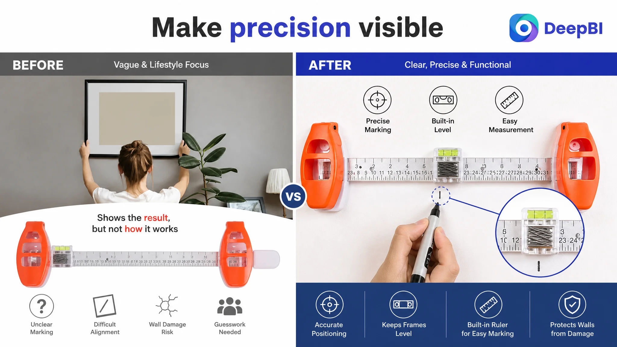
The first image presented a clean view of the product, but did not immediately communicate its most useful functions. A buyer could identify the object, yet still have to infer what made it different from an ordinary ruler, level, or picture-hanging accessory.
The recommended direction was to make the physical features work harder without changing the product itself:
- Give greater visual priority to the built-in level.
- Show the marking and alignment function more directly.
- Make the ruler structure and material easier to recognize.
- Remove repeated frame-holding compositions.
- Eliminate misleading elements such as a drill or shelf installation.
- Use the image sequence to move from recognition to proof, not repeat the same scene.
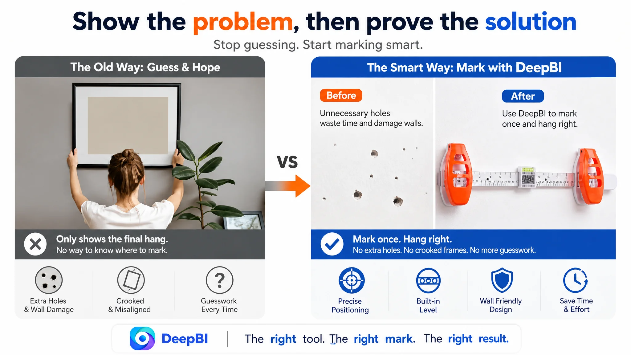
The second image had another problem. A person holding a frame illustrated the final hanging step, but not the positioning and marking step that made the tool valuable. This used image space to show an outcome without reducing the buyer’s uncertainty about how the outcome was achieved.
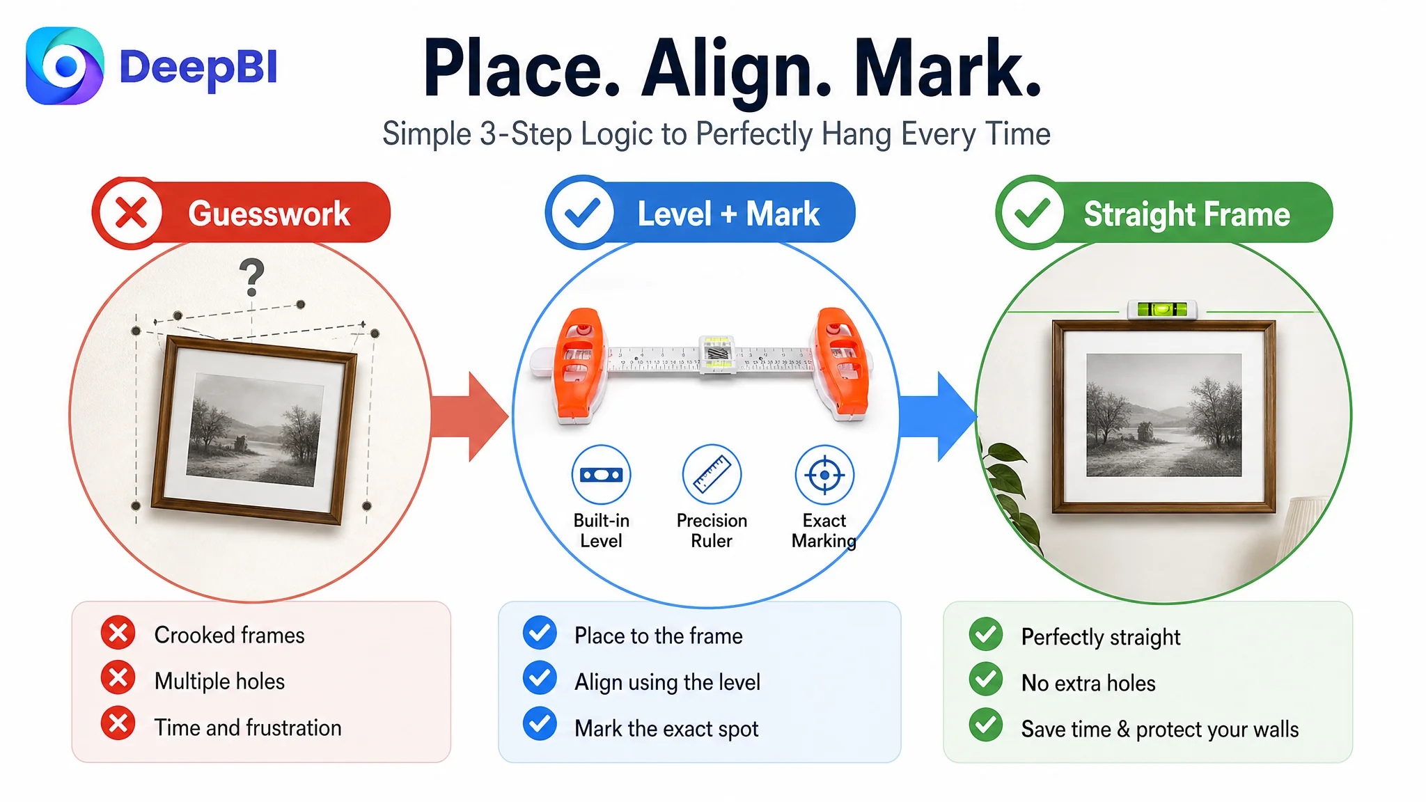
A more persuasive sequence would contrast the familiar failure with the intended solution: crooked frames, unnecessary holes, or repeated adjustments on one side; accurate positioning and level alignment on the other.
The point was not to create dramatic advertising. It was to make the product’s job legible.
The third image also repeated a general use scene instead of proving precision. DeepBI recommended shifting attention toward the built-in level and the marking mechanism, using the visible product attributes available in the original materials.
For the fourth and fifth positions, the issue was information allocation. The page had limited opportunities to explain compatibility, wire-hanger use, material, portability, and repeated DIY use. Repeated lifestyle compositions consumed that space without advancing the buyer’s understanding.
A better image sequence would answer a buyer’s questions in order: What is it? What problem does it prevent? How does it work? What hardware does it support? Why should I trust its construction?
The Bullet Points Had Features, but Not Enough Buying Logic
The customer’s bullet points were primarily functional descriptions. They explained what the product could do, but did not guide the buyer from a problem to a solution.
The benchmark listing used a more deliberate progression:
1. Start with inaccurate marking and the need for a quick solution.
2. Explain compatibility with sawtooth hangers, D-rings, and other common hardware.
3. Address wire-hanger use and wall protection.
4. Establish the role of the level and measuring guides.
5. Add material, portability, storage, and broader household value.
That structure followed the buyer’s decision process more closely.
For the customer Listing, the suggested rewrite began with the result rather than the category label: precise marking and perfect alignment. The next point clarified compatibility with different hanging hardware. Another connected wire-hanger support with soft wall-friendly pads. Later points established the built-in level, measuring guides, ABS construction, and compact storage.
The important change was not simply using more persuasive wording. It was giving each bullet a distinct role.
The first bullet needed to create a clear reason to care
Instead of beginning with a general product description, it should connect the built-in level and marking mechanism to the buyer’s desired result: accurate nail placement and a straight frame without guesswork.
The proposed logic was simple:
Place, align, mark.
That sequence makes the product’s operation easier to imagine and gives the buyer a concrete reason to choose it.
The second bullet needed to remove compatibility uncertainty
Picture frames do not all use the same hardware. The Listing needed to name relevant types such as sawtooth hangers, D-rings, and traditional hooks rather than leave compatibility as a general promise.
Specific compatibility information helps a buyer decide whether the product applies to their own frame, rather than merely appearing versatile in the abstract.
The third bullet needed to connect wall protection with a real use case
“Wall-friendly” was too broad on its own. The page needed to show how soft pads and wire-hanger support relate to the risk of scuffs, scratches, and unnecessary holes.
This is a trust issue, not just a feature issue.
The fourth bullet needed to make precision visible
A built-in level is more convincing when the buyer can understand its visibility, stability, and relationship to alignment. Measuring guides also become more valuable when connected to evenly spaced frames and gallery-wall arrangements.
The objective was to move from “this tool has a level” to “this tool helps create an intentional, balanced display.”
The fifth bullet needed to support repeated household use
ABS construction, lightweight handling, compact storage, and suitability for repeated DIY projects gave the product a longer-term role in the home. This helped the Listing move beyond a one-time task and establish the tool as a practical addition to a home-improvement kit.
The A+ Content Was Reassuring, but Not Yet Persuasive Enough
The existing A+ content covered several positive outcomes:
- Precision hanging
- Wall-friendly design
- Easy DIY use
- Versatile decoration support
- Durable construction
The problem was that these modules often stated the benefit without showing the reasoning behind it. The page repeatedly reassured the customer that hanging could be easier, but did not fully explain how the product handled the moments where buyers usually hesitate.
DeepBI identified three missing layers.
1. The page needed to create the problem before presenting the solution
The A+ content should make common failures visible:
- A frame hanging unevenly because the position was guessed
- Multiple unnecessary holes created during adjustment
- A wire-hung frame requiring repeated repositioning
- A multi-frame arrangement looking uneven because spacing was inconsistent
These situations give the product a concrete role. Without them, “easy and precise” remains a general claim.
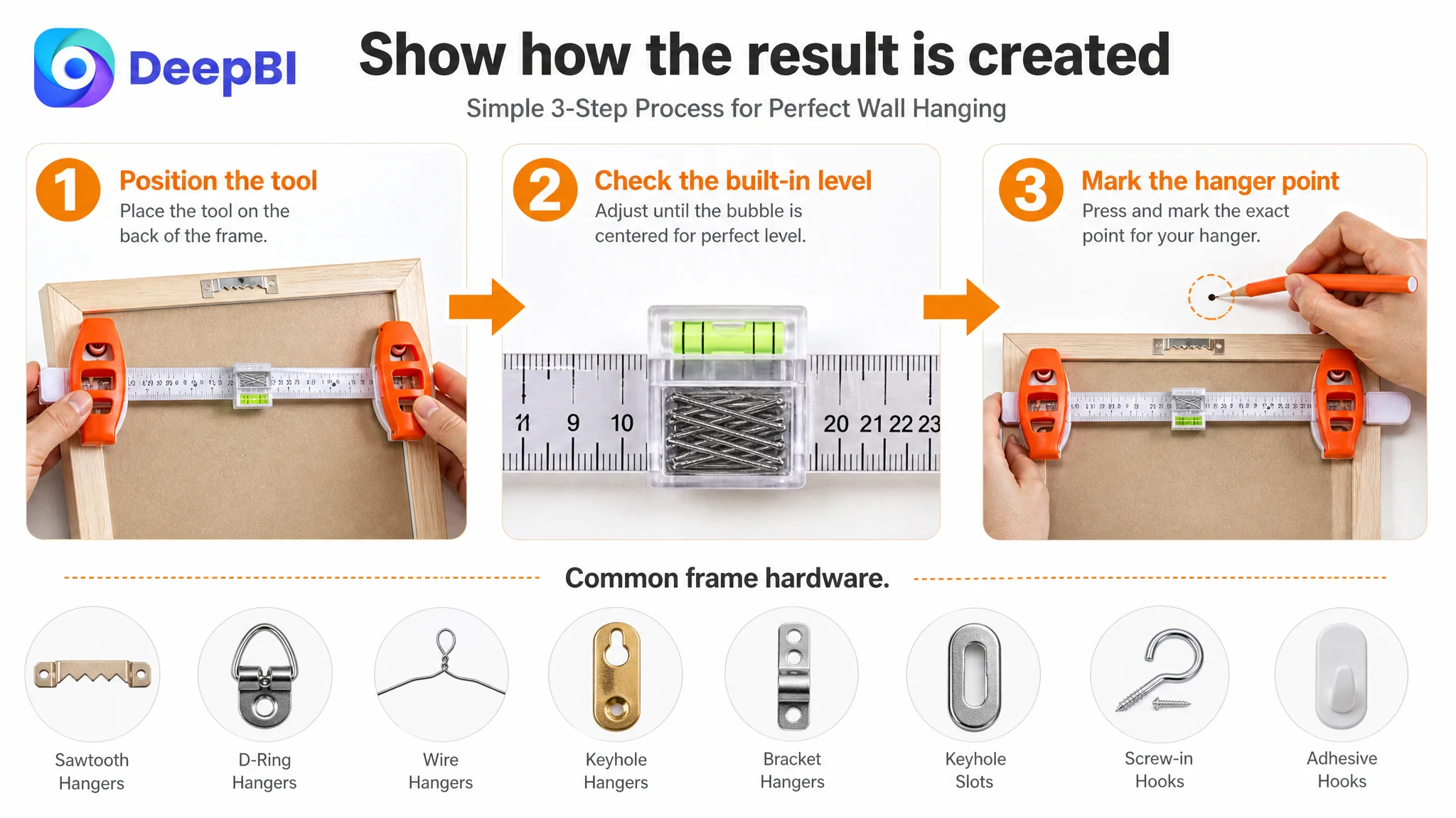
2. The page needed to disclose the operating process
The product supported different hanging situations, but the existing page did not systematically explain the path for each one.
A stronger A+ sequence would show:
- How the tool is positioned
- How the magnetic marking mechanism is used
- How the built-in level supports alignment
- How different hanger types are handled
- How the mark is transferred to the wall
- How the frame is then installed
This kind of process transparency is especially important for a practical tool. Buyers may not be worried that the product looks unattractive; they may be worried that they will not know how to use it correctly.
3. The page needed evidence rather than repeated atmosphere
Repeated lifestyle imagery did not provide enough proof of material quality, precision, or component function. DeepBI recommended using visible product details instead:
- ABS construction
- The level and marking mechanism
- Measuring guides
- Wall-contact pads
- Compatible hardware positions
- Compact, closed-state storage design
The available source materials did not support inventing internal mechanisms or unsupported specifications. That boundary mattered. The goal was to provide more evidence while keeping every visual claim tied to what the product actually showed.
Why DeepBI Did Not Recommend Tuning Ads First
There was no reason to treat every performance concern as an advertising problem.
Amazon ads can create exposure and clicks, but they cannot repair a product page that fails to explain its value after the click. If the main image attracts attention without establishing a clear reason to continue, or if the page cannot answer basic questions about operation and compatibility, additional traffic can simply increase the number of uncertain visits.
That creates an important operating risk:
Advertising does not only amplify strengths. It can also amplify Listing defects.
For this product page, the priority was therefore not to add more traffic before clarifying the page’s ability to receive it. The title, images, bullet points, A+ content, and review presentation had to work together as one conversion system.
The decision order was:
1. Clarify the product’s core value and search relevance.
2. Make the main image sequence communicate the actual use mechanism.
3. Rebuild bullet points around pain points, proof, and decision progression.
4. Use A+ content to explain scenarios, compatibility, and process.
5. Review the page’s trust signals, especially the abnormal review display.
6. Only then assess whether advertising traffic is being converted efficiently.
This does not mean advertising optimization is unimportant. It means advertising should not be used as a substitute for product-page diagnosis.
The Review Section Created a Separate Trust Risk
The review dimension had the largest numerical gap.
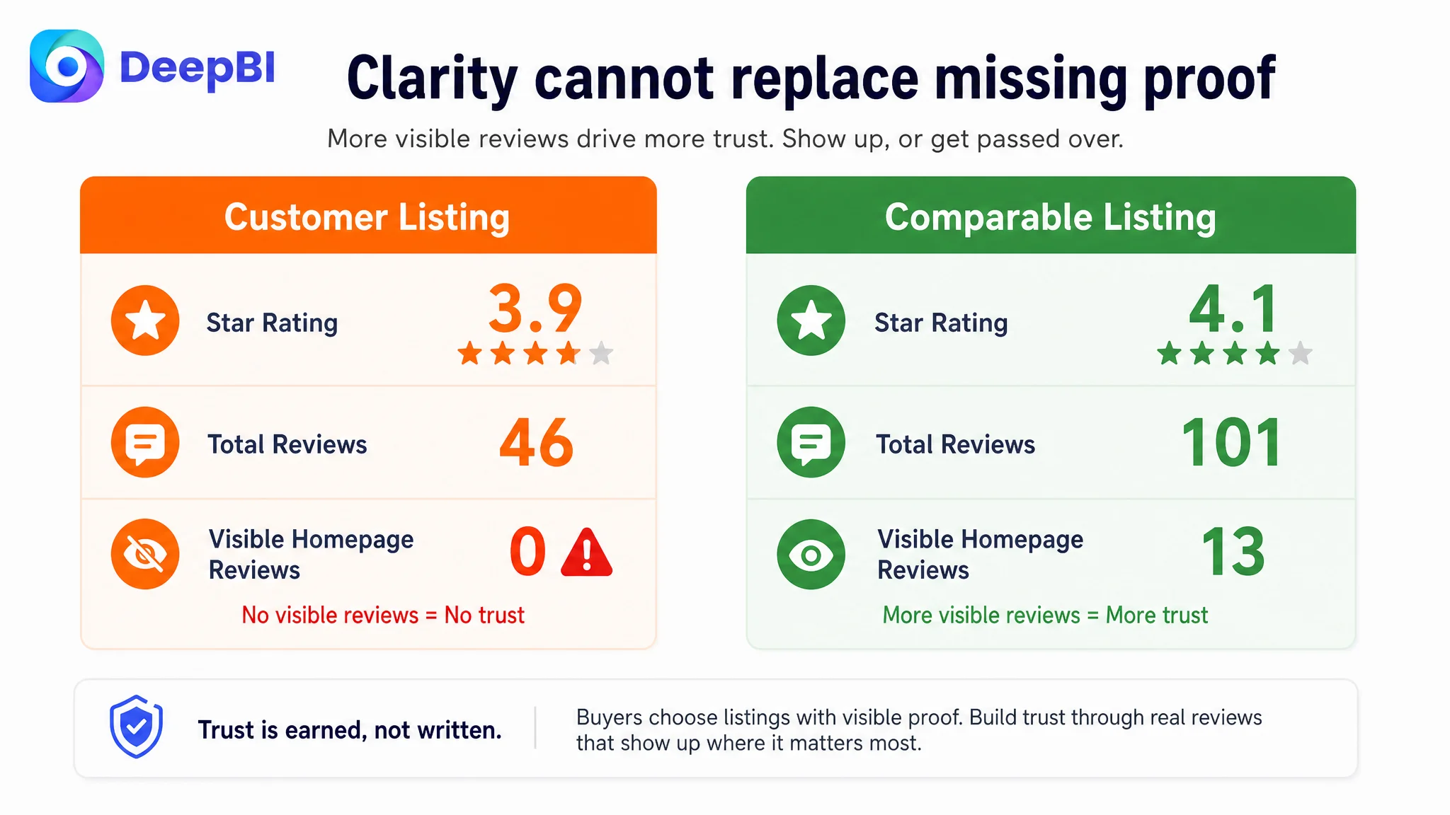
The customer Listing showed:
- 3.9 stars
- 46 total reviews
- No valid customer review content visible on the homepage
The comparable listing showed:
- 4.1 stars
- 101 total reviews
- 13 reviews visible on the homepage
The issue was not only that the customer had fewer reviews or a slightly lower star rating. The homepage review area reportedly displayed page code or product information instead of usable customer feedback. That left the Listing without the social proof buyers normally rely on when evaluating a practical household tool.
The competing page also benefited from richer review content, including detailed user experiences and image or video feedback. Those elements help buyers visualize whether the product works in real homes and with real frames.
This created a limit to what copy and imagery alone could solve. A stronger Listing could improve clarity and confidence, but it could not manufacture authentic customer evidence. The review problem had to be recognized as a separate trust constraint rather than hidden inside a general “content quality” recommendation.
That distinction is part of sound Amazon diagnosis: not every gap can be fixed by rewriting the page.
The Revised Direction Connected Search, Click, and Conversion
The suggested title retained the product’s category relevance while bringing core functional terms closer to the front:
Picture Hanging Tool with Built-in Level, ABS Ruler for Precision Marking and Alignment, Wall Hanging Kit for Photo Frames, Mirrors, Art, Painting, Sawtooth and Wire Hangers DIY Tool
The purpose was not to copy the benchmark title. It was to improve the relationship between search language and product value.
The revised direction aimed to:
- Put “Picture Hanging Tool” and the built-in level closer to the opening position.
- Add “ABS Ruler” to communicate a concrete product attribute.
- Include “Precision Marking” and “Alignment” as outcome-oriented functions.
- Clarify use cases such as photo frames, mirrors, and artwork.
- Name sawtooth and wire hangers to improve compatibility clarity.
- Remove awkward punctuation and improve mobile readability.
This is where title optimization became more than keyword insertion. Search relevance helps the product enter consideration, but the wording also needs to tell buyers why the product is useful.
The same logic applied to the visual direction. The images should not merely look more polished; they should make the title’s promises visible.
If the title says “precision marking,” the images should show marking. If it says “built-in level,” the images should prove the level’s role. If it says “wire hangers,” the page should explain that use case rather than leave the buyer to assume compatibility.
The Business Change Was a Change in Diagnosis
The case material does not include verified post-optimization CVR, ACOS, CTR, or organic-order results. It would therefore be inappropriate to claim that the revised Listing had already produced a specific numerical improvement.
The documented change was the operating direction.
Before the diagnosis, the page could be treated as a collection of isolated assets needing improvement. After the diagnosis, the Listing was understood as a conversion system with a specific weakness: it did not consistently move the buyer from recognizing the product to trusting the process.
That reframing changed the questions the customer needed to ask:
- Is the title only indexing the category, or also communicating the product’s core outcome?
- Does the first image explain why this tool is different?
- Do the images show positioning and marking, or only the final hanging scene?
- Do the bullet points respond to real buyer concerns?
- Does the A+ content explain how the tool works with different hardware?
- Are the trust signals strong enough to support a purchase decision?
- Would additional Amazon ad traffic be useful, or would it simply expose the same page-level weaknesses to more shoppers?
These questions create a more controllable optimization path than continuing to adjust individual words or images without a shared business objective.
“Before scaling traffic, the seller had to determine whether the page deserved more traffic.”
What Other Amazon Sellers Can Learn From This Listing
A picture-hanging tool may appear simple, but simple products often require especially clear decision logic. Buyers need to understand the task, the possible failure, the product mechanism, and the expected result in a short browsing session.
This case offers several practical lessons for Amazon sellers:
- A lower Listing score is not always caused by one bad asset. The real constraint may be the relationship between title, images, bullets, A+, and reviews.
- A product page can contain accurate information and still fail to convert because the information is not sequenced around buyer concerns.
- Main images should communicate the product’s function, not only its appearance.
- Bullet points become stronger when each one closes a different uncertainty.
- A+ content should show why the product works, not only state that it is easy to use.
- Review presentation can create a trust gap that copy optimization cannot solve alone.
- Amazon ads should be evaluated together with Listing conversion capacity.
- Competitor comparison is most useful when it reveals a difference in decision logic, not when it encourages surface-level imitation.
- Visual optimization must remain faithful to the actual product’s structure, materials, and capabilities.
The central lesson is straightforward: Amazon Listing optimization is not a contest to add more content. It is the work of making the product’s value, operation, and credibility easier to understand than the alternatives.
For this seller, the next step was not to make the page louder. It was to make the page more logical—so that search visibility, visual attention, product understanding, and purchase confidence could finally support one another.