

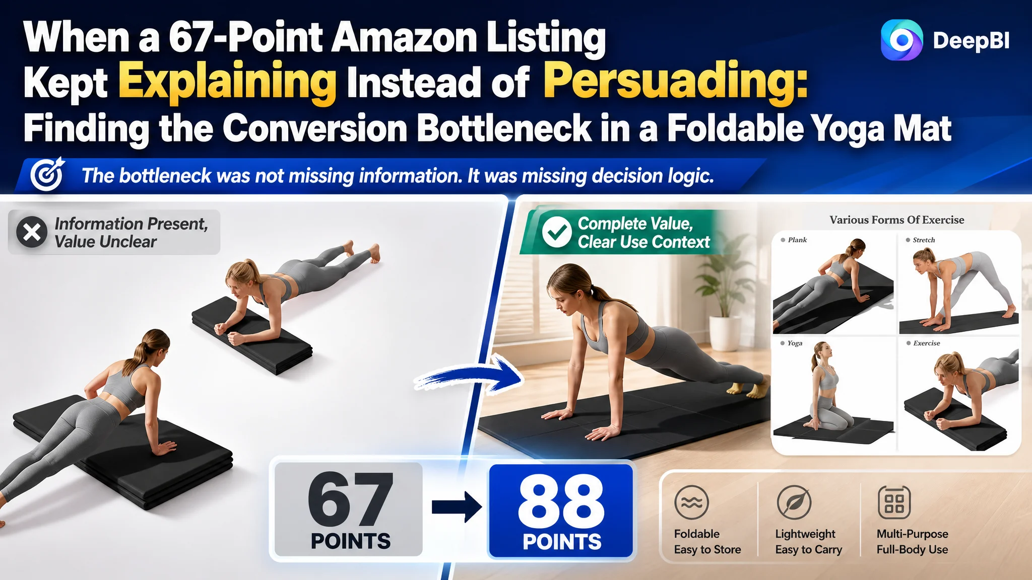
An Amazon seller came to a difficult product-page problem: the Listing contained the expected specifications, usage images, and material information, yet its conversion foundation remained weak. The page was not empty, and the product was not without differentiators. But the way those differentiators were presented did not give shoppers a clear reason to click, trust, and buy.
The customer team initially treated the issue as a matter of adding or refining individual Listing elements—more specifications, more exercise scenarios, clearer feature descriptions, and stronger product claims. That direction improved the amount of information on the page, but it did not resolve the deeper problem.
DeepBI’s comparison showed that the real constraint was the Listing’s sales logic. The page did not make the foldable design feel meaningfully better than a conventional rolled mat, did not establish trust through visual proof, and did not guide shoppers from product facts to real-life use. The later optimization therefore focused on rebuilding the sequence across the Amazon title, main image, bullet points, and A+ content rather than continuing to adjust isolated elements.
For other Amazon sellers, the lesson is straightforward but easy to miss: a Listing can contain plenty of information and still lack conversion capacity. Before sending more Amazon ads to a product page, sellers need to know whether the page can turn that traffic into confidence and orders.
The Listing Had Information. It Did Not Yet Have a Persuasive Path.
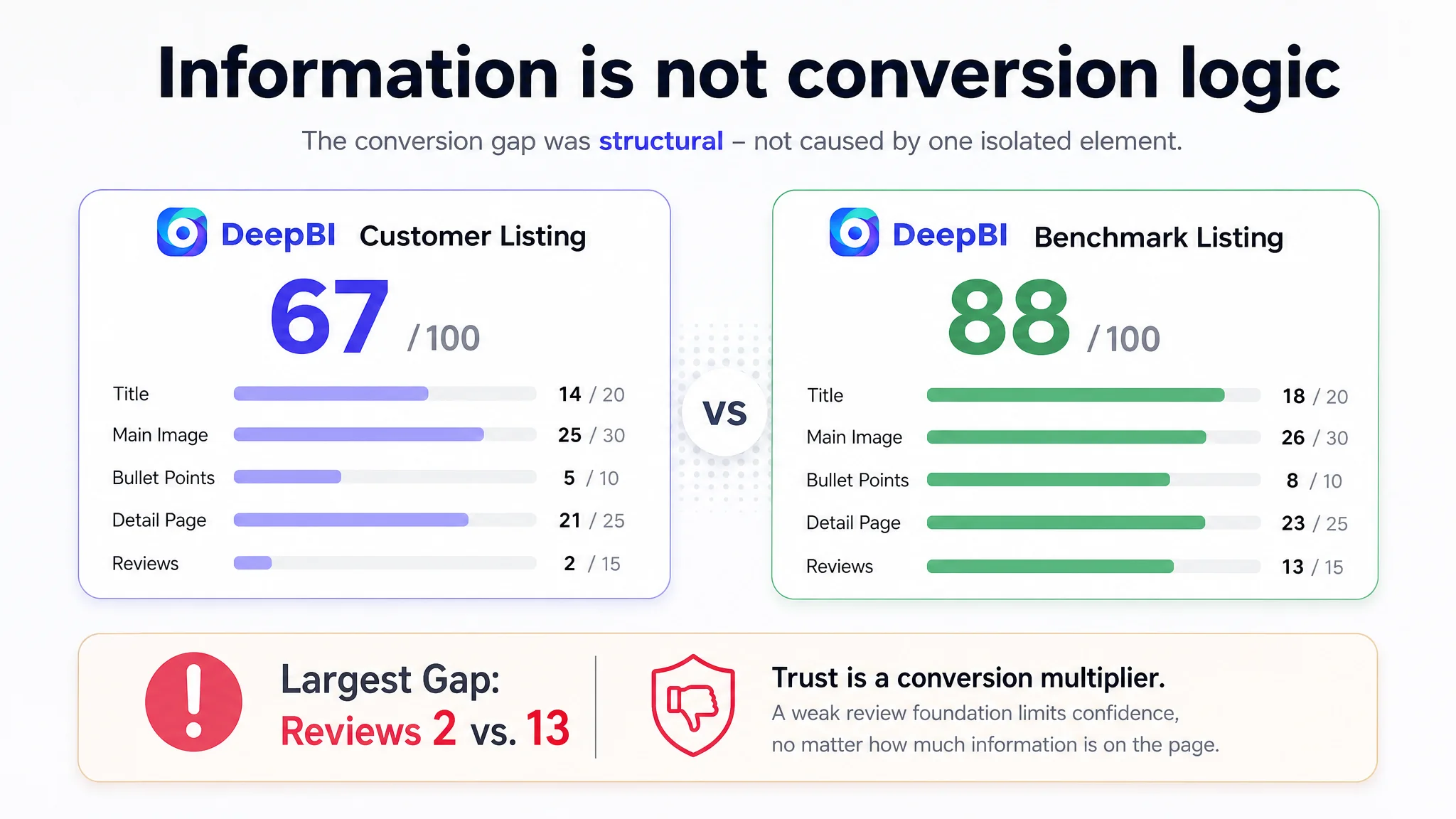
The customer’s foldable yoga mat Listing received a total score of 67 out of 100, compared with 88 out of 100 for a comparable high-performing Listing in the same category.
The 21-point gap did not come from one cosmetic flaw. It came from a pattern:
- Title: 14 vs. 18
- Main image: 25 vs. 26
- Bullet points: 5 vs. 8
- Detail page: 21 vs. 23
- Reviews: 2 vs. 13
The first impression was not that the Listing had failed everywhere. In fact, the main-image gap was only one point. The more important finding was that the Listing was weaker in the places responsible for moving a shopper through the buying decision.
The product page described the mat’s material, non-slip design, folding structure, size, thickness, and use cases. But those elements appeared more like a collection of attributes than a connected answer to the shopper’s questions:
- Why choose a folding mat instead of a rolled mat?
- Will it fit into a suitcase or closet?
- Will it lie flat after unfolding?
- Will it stay stable during sweaty workouts?
- Does the thickness provide meaningful cushioning?
- Can it work at home, in a studio, outdoors, and while traveling?
A shopper does not evaluate these questions independently. They form a chain of confidence. When that chain is weak, additional traffic does not necessarily create additional orders.
The page was not missing product information. It was missing a clear route from product difference to buyer confidence.
The Original Diagnosis Stopped at “Add More Product Information”
The customer team’s working direction was understandable. The product had several practical advantages, so the Listing emphasized them:
- Foldable design
- Extra width
- Thick cushioning
- Anti-tear material
- Double-sided texture
- Environmental attributes
- Multiple exercise types
- Portability
The problem was not that these claims were irrelevant. The problem was that they were not ranked according to the shopper’s decision process.
The title began with “Foldable Yoga Mat,” included several keyword phrases, and ended with usage environments such as yoga studios, gyms, and home workouts. The bullet points primarily explained functions and specifications. The detail page presented static attributes such as dimensions, colors, material, and storage.
This created a familiar Amazon Listing trap: the team was improving the amount of information without first deciding which doubt had to be removed first.
The customer was not necessarily making a single wrong change. The misdiagnosis was more structural. The team treated the page as a set of separate content modules, while shoppers experienced it as one continuous decision.
That distinction matters for Amazon ads as well. If an ad earns a click but the product page does not quickly explain why the product is worth considering, advertising can amplify the page’s weaknesses. The issue is no longer simply whether the campaign found relevant traffic. It is whether the Listing gave that traffic a convincing next step.
DeepBI Found That the Core Problem Was Listing Conversion Capacity
DeepBI did not begin by asking which sentence sounded more polished or which image looked more attractive. It compared the customer’s Listing with a closely matched category benchmark across the title, main images, bullet points, A+ content, and review signals.
The resulting pattern pointed to one central problem:
The Listing did not convert the product’s foldable design into a complete value proposition.
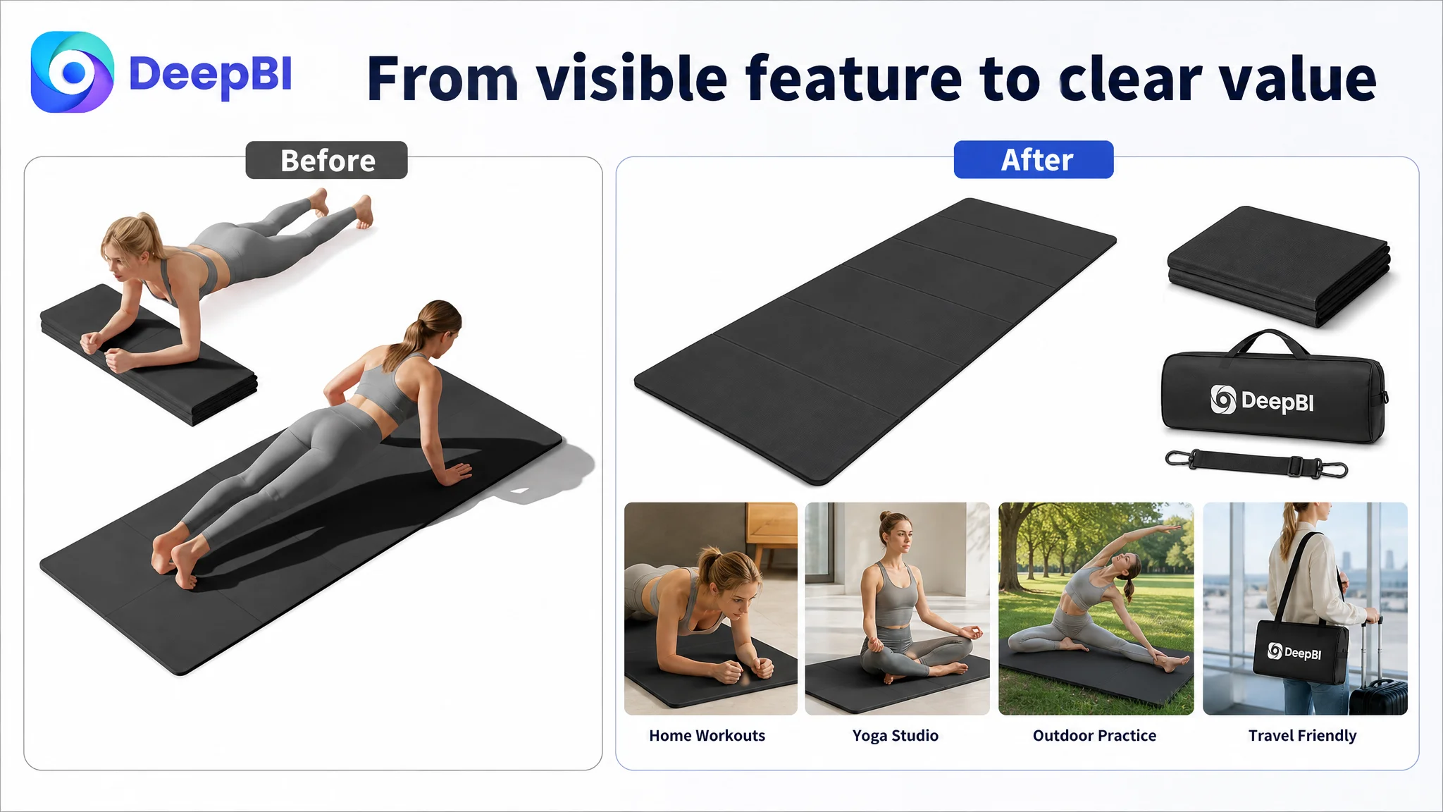
The folding structure was visible, but its commercial meaning was not fully demonstrated. The page needed to answer what folding changed in the user’s life—not merely that the mat could fold.
The benchmark Listing made that value easier to understand through several connected signals:
- Full-size dimensions and folded dimensions
- A clear space-saving comparison
- Product states shown as fully unfolded, partially folded, and fully folded
- Carrying and storage scenes
- Real people using the product
- Usage environments such as home, studio, outdoor practice, and travel
- Visual proof of thickness and dual-sided grip
The customer’s Listing had some related content, but the pieces were not arranged into the same trust-building sequence.
The title contained keywords but lacked precision
The customer’s title used core terms such as “Foldable Yoga Mat,” but it relied on broad descriptions including “Extra Width & Thick” and “Anti-Tear.” It did not communicate the exact material and dimensions with the same clarity as the benchmark.
The benchmark title made several facts immediately legible:
- TPE material
- 72 by 24 inches
- 0.24 inch or 6mm thickness
- Non-slip use
- Travel suitability
- Carry bag included
The recommended direction was not to add every possible keyword. It was to make the title more mature and easier to scan:
- Put the core product phrase near the beginning
- Add the TPE material
- Replace vague thickness language with a confirmed measurement
- Remove repeated keyword patterns
- Retain the carrying strap, bag, home workout, studio, gym, and travel context
This is an important distinction. Amazon title optimization is not just a search-term exercise. The title also establishes whether the product appears precise, credible, and easy to evaluate.
The Main Image Did Not Fail Visually. It Failed Strategically.
The main-image score was 25 out of 30, only one point below the benchmark. That small gap could easily lead a team to deprioritize the image set.
DeepBI’s analysis showed why that would be a mistake.
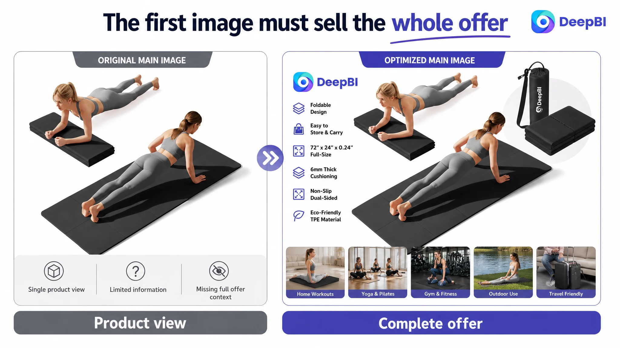
The customer’s first image created initial visual interest, but it did not function as a complete overview of the product offer. It was relatively static, included duplicated content elsewhere, and did not immediately show the full kit of mat, carrying strap, and storage bag.
The benchmark used a denser visual composition that brought together:
- The product
- Its accessories
- A human-use context
- The foldable product concept
This helped shoppers understand the total value earlier, particularly on the smaller mobile search display.
The problem was therefore not simply “the image was unattractive.” It was that the first image did not perform enough decision work.
The first image needed to answer the first question
A shopper seeing a foldable yoga mat may immediately wonder whether it behaves like a normal full-size mat once unfolded. If the first image only shows the product in a static presentation, that concern remains unresolved.
The recommended direction was to rebuild the image sequence rather than merely replace one frame:
1. Use the first image as a complete product overview.
2. Move dimensions, folded size, and thickness into earlier positions.
3. Show material and texture details before later lifestyle images.
4. Follow the factual foundation with partial-fold and multi-use demonstrations.
5. Place portability and carrying scenes after the shopper understands the product’s scale.
6. End with a consolidated performance and use-case summary.
This order follows a simple principle:
Establish what the product is before asking the shopper to imagine how it fits into life.
The current sequence introduced portability and performance before fully establishing the product’s foundational facts. It also placed important dimensional information too late. That increased basic usage uncertainty at the exact stage when the shopper was deciding whether the product was suitable at all.
The Bullet Points Listed Features Instead of Resolving Pain Points
The bullet-point score was 5 out of 10, one of the clearer content gaps in the comparison.
The customer’s bullet points covered the product’s material, non-slip function, folding structure, dimensions, thickness, and use cases. However, the structure was largely parallel: one feature followed another without creating a progression.
The benchmark Listing used a more persuasive pattern:
Problem → solution → evidence → use situation
For example, the folding feature was not presented only as “easy to store.” It connected:
- Full unfolded size
- Compact folded size
- Space saved compared with a rolled mat
- Suitcase, backpack, and closet storage
- A specific travel benefit
That structure turns a specification into a reason to buy.
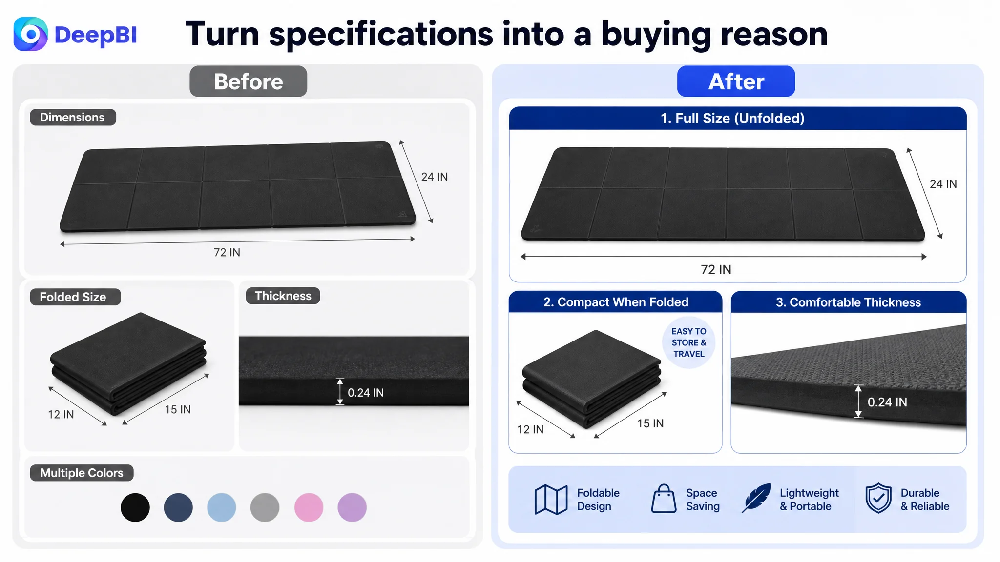
Folding design needed to become a space-saving argument
The customer’s page said the mat folded and was easy to store. The stronger direction was to show the difference between a full-size workout surface and its compact folded form, using confirmed dimensions and practical storage contexts.
The customer material supported a folded-size comparison and a claim that the folded mat could be approximately 70% smaller than traditional rolled mats. These facts could make the product’s primary difference concrete rather than abstract.
Non-slip performance needed a real setting
“Double-sided non-slip” is a useful feature, but it becomes more convincing when connected to hardwood floors, tile, gym floors, and sweaty sessions.
The recommended bullet structure therefore moved from the technical feature to the actual moment of concern: whether the mat remains stable when the user is exercising, stretching, or perspiring.
Thickness needed consistent, credible language
The source Listing contained an inconsistency between 0.24 inches, approximately 6mm, and a separate 10mm reference. That is not a minor copy issue. Conflicting measurements can create hesitation, increase return risk, and weaken trust in every other specification.
The optimization direction was to verify and standardize the thickness claim before publishing. The suggested copy used 0.24 inches or 6mm, because those values correspond mathematically. No Listing should present a measurement that the page cannot explain consistently.
Easy cleaning and durability were underused conversion points
The benchmark connected a waterproof, sweat-resistant surface with quick cleaning and long-term shape and grip retention.
The customer’s Listing had enough room to make these benefits more practical. A brief cleaning claim, paired with home, studio, and outdoor use, could address a common post-workout concern more effectively than a general durability statement.
The A+ Content Was Descriptive, but Not Yet Demonstrative
The detail-page score was 21 out of 25. Again, this was not a sign of an empty A+ experience. The customer had modules for:
- Exercise scenes
- Eco-friendly material
- Various exercise forms
- Dimensions
- Color selection
- Portability and storage
- Double-sided texture
The deeper issue was how those modules were used.
The benchmark organized the product through changing states and real environments:
- Fully unfolded
- Half folded
- Fully folded
- Feature close-ups
- Material explanation
- Storage
- Home, outdoor, studio, and travel scenarios
- Color options
This made the folding feature visible as a system of use, not a static product attribute.
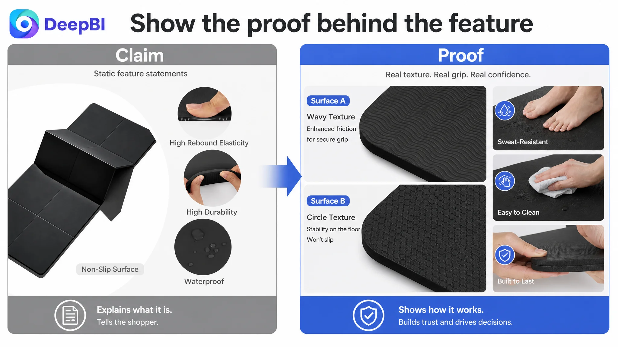
The opening needed to solve the folding problem first
The customer’s opening module showed standard yoga poses on a smooth surface. That created an appropriate fitness association, but it delayed the most important differentiation.
A shopper comparing this product with a traditional rolled mat needs to see the folding advantage early:
- Easier storage
- Less space consumed
- A full-size surface when opened
- A practical form for travel
The first A+ module should therefore establish the problem the foldable design solves before moving into material or aesthetic content.
The page needed to prove that the mat lies flat
A foldable mat can trigger a practical concern: will visible folds interfere with a workout?
The customer’s exercise imagery showed use, but it did not directly eliminate uncertainty about seamless unfolding and flatness. A stronger module would show the mat fully unfolded, with clear visual evidence that it can support a complete yoga or floor-workout session.
This is the kind of doubt that a specification alone cannot remove.
Technical features needed visual proof
The double-sided design was mentioned, but its functional logic remained abstract. The revised direction called for close-up views of:
- The mat’s thickness
- The dual-textured surfaces
- The grip pattern
- Cushioning and rebound
The goal was not to make the page more technical for its own sake. It was to translate technical claims into something a shopper could inspect.
Lifestyle versatility needed environments, not only exercise poses
The customer’s “various forms of exercise” content focused on actions such as yoga, stretching, and other movements. The benchmark used a broader environment matrix:
- Indoor practice
- Outdoor use
- Gym or studio sessions
- Travel
This distinction expands the shopper’s mental model. The product is not only for a particular exercise. It is also a portable surface that can move between different parts of the user’s routine.
Portability needed visible proof of the complete kit
The page discussed portability, but the carrying strap and storage bag were not shown clearly enough. When the text promises convenient transport, the image should confirm the accessory that makes that promise credible.
A visible bag and strap would complete the path from “foldable” to “easy to carry.”
Reviews Were the Largest Trust Gap, and Content Could Not Pretend Otherwise
The review dimension received the weakest score:
- Customer Listing: 2 out of 15
- Benchmark Listing: 13 out of 15
The customer product had 2.9 stars from 29 reviews, while the benchmark had 4.7 stars from 59 reviews. The customer Listing also showed no valid review content on the first page, whereas the benchmark displayed eight high-quality reviews, including verified-purchase signals.
The gap was not merely a difference in review count. It affected the basic trust conditions of the Amazon product page:
- A 1.8-star rating difference
- A much weaker first impression
- A high share of one- and two-star feedback
- No meaningful customer-use narratives visible on the first page
- A competitor review section that described situations, strengths, and weaknesses in detail
This is where diagnosis must remain commercially honest. Better title copy, stronger images, and improved A+ content can make the product easier to understand, but they cannot replace a damaged review profile.
The content work had to address what the team could control:
- Make the product’s real benefits clearer.
- Avoid unsupported performance language.
- Resolve contradictory specifications.
- Show realistic use situations.
- Reduce uncertainty before purchase.
At the same time, the review gap had to be treated as a separate business risk rather than hidden inside a creative optimization project.
A stronger Listing can improve the page’s ability to explain the product. It cannot manufacture trust that the review history has not earned.
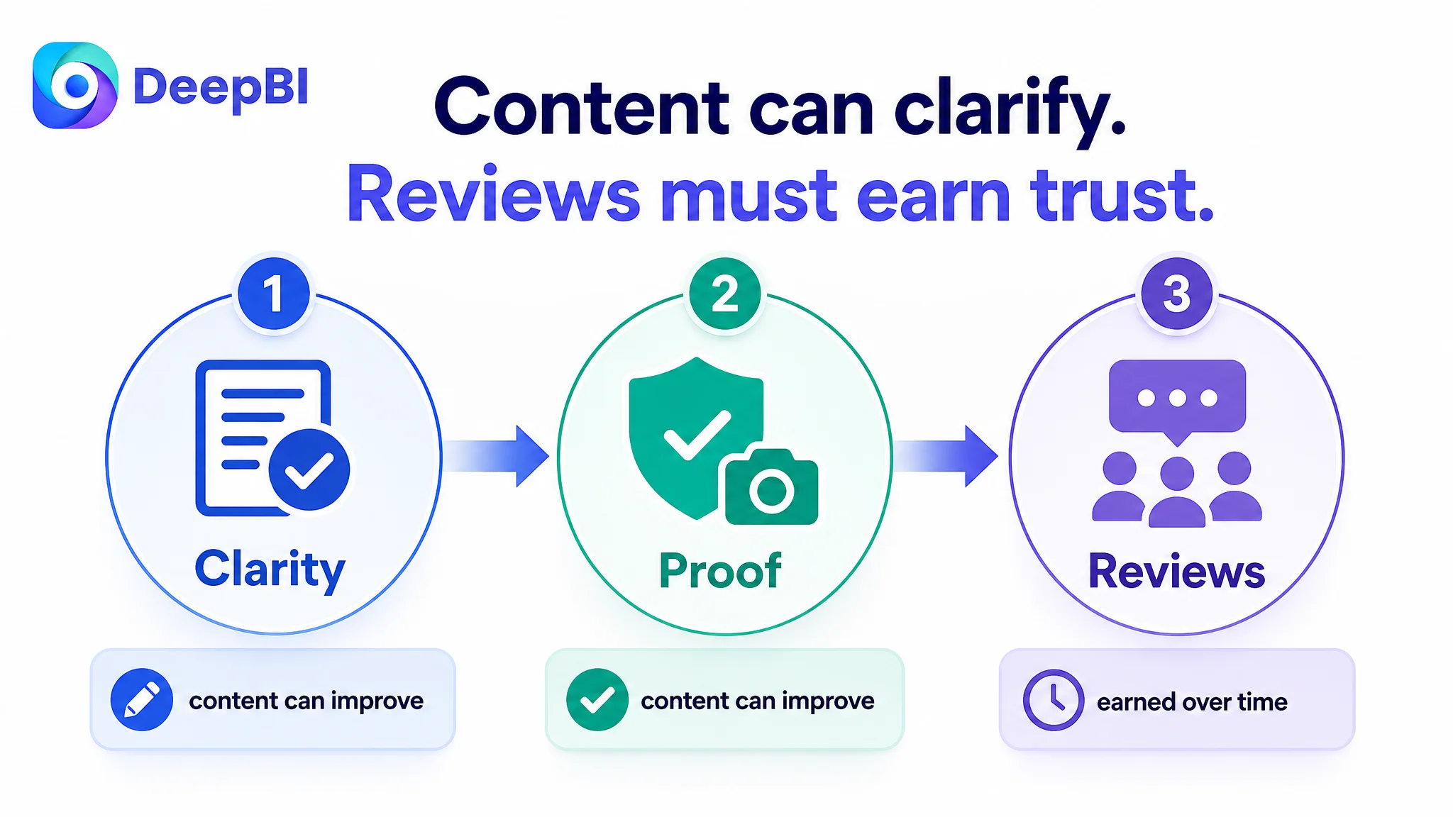
Why DeepBI Did Not Recommend Tuning Ads First
The case material does not provide a post-optimization advertising data set, so it would be inaccurate to claim a specific ACOS decline, CVR increase, or organic-order recovery.
The decision logic is still clear.
When the page scores materially below a relevant benchmark and the largest gaps sit in the title structure, bullet-point persuasion, A+ storytelling, and review trust, increasing traffic is not the first question. The first question is whether the page is ready to receive more traffic.
For this Listing, continued ad optimization before page repair would carry several risks:
- Paid clicks could arrive on a page that did not explain the main differentiation quickly enough.
- Traffic could reach a product with unresolved specification inconsistency.
- The foldable design could remain less valuable in the shopper’s mind than it was in the product strategy.
- The weak review profile could stop shoppers even after the images and copy earned attention.
- Ad performance could be judged unfairly because page-level conversion defects were being mistaken for targeting or bidding problems.
This does not mean Amazon ads were irrelevant. Ads may provide valuable traffic and search signals. But they should not be used to compensate for a Listing that has not yet established its basic sales logic.
The correct order was:
1. Clarify the product’s core difference.
2. Establish factual credibility.
3. Build visual and textual proof.
4. Expose the product to realistic usage contexts.
5. Then evaluate how paid traffic responds.
The Listing had to become more capable of converting traffic before traffic could become a reliable measure of advertising quality.
The Revised Optimization Direction Rebuilt the Page in Decision Order
The recommendations did not amount to a random list of copy and image changes. They followed a new sequence for the shopper’s decision.
First: make the folding benefit unmistakable
The title, first image, and opening A+ module all needed to communicate the same commercial idea:
A full-size yoga mat that folds into a more manageable form for storage and travel.
That message was supported through confirmed dimensions, folded-state visuals, the carrying bag, and practical storage scenes.
Second: remove basic usage doubts
Before introducing broader lifestyle benefits, the page needed to establish:
- Full unfolded size
- Folded dimensions
- Thickness
- Flatness after unfolding
- Surface stability
- Texture and cushioning
This factual foundation gives shoppers a reason to believe the product can perform as expected.
Third: convert features into use outcomes
The bullet points and A+ modules were reorganized around practical concerns:
- Limited storage space
- Carrying a mat while traveling
- Slipping on smooth floors
- Pressure on knees, elbows, or the spine
- Cleaning sweat after exercise
- Using one mat in multiple environments
This approach kept the content grounded in the product’s actual attributes while making those attributes easier to evaluate.
Fourth: use lifestyle scenes to expand the product’s role
Once the product facts were established, the page could show the mat in:
- Home workouts
- Studios and gyms
- Outdoor practice
- Travel situations
The purpose was not to add decorative variety. It was to help shoppers see where the product belongs in their own routines.
Fifth: keep every claim inside the product’s real boundaries
The recommended changes retained a strict distinction between visual enhancement and product alteration.
The page could improve composition, sequencing, lighting, close-up detail, and context. It could not invent new accessories, change the mat’s physical structure, or introduce unverified specifications.
That boundary is especially important when AI-generated creative assets are involved. A more attractive image that misrepresents the product can create returns and negative reviews—the exact trust problem this Listing already needed to manage.
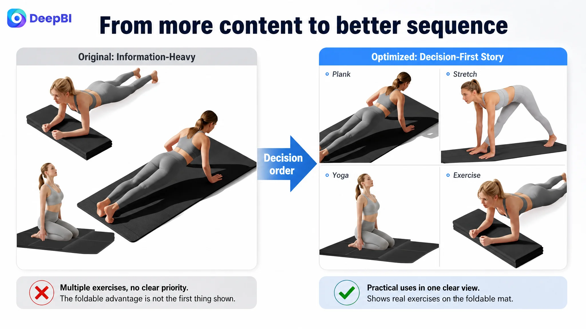
The Business Change Was a Change in Operating Judgment
Because the source material does not include verified post-implementation performance data, the case should not be presented as a numerical success story.
The meaningful change was the shift in diagnosis.
Before the review, the Listing could be treated as a page that needed more information and more polished execution. After the review, it was understood as a page whose conversion logic was not sufficiently ordered.
That changed the operating priorities:
- The title became a precision and credibility asset, not only a keyword container.
- The main image became an overview of the complete product value, not only a product display.
- The bullet points became a sequence of pain-point solutions, not a specification list.
- A+ content became a trust and use-case system, not a collection of static modules.
- Reviews became a separate trust constraint that could not be solved through design alone.
- Advertising became something to evaluate after the page had a stronger chance of converting the traffic it received.
This is the more durable result of the diagnosis. The team gained a clearer way to decide what should be fixed first.
The Real Lesson for Amazon Sellers
A Listing can have a reasonable main-image score, a complete set of specifications, and multiple lifestyle images while still losing conversion opportunities.
The issue may be the relationship between those elements:
- Does the title make the product easy to understand?
- Does the main image reveal the complete value quickly?
- Do the bullet points answer real buyer concerns?
- Does the A+ page prove the product’s differences?
- Do the reviews support or undermine the claims?
- Does the entire page move from attention to trust to action?
For this foldable yoga mat, the largest opportunity was not to make the page louder. It was to make the page more coherent.
Amazon ads can bring a shopper to the Listing. The Listing still has to make the shopper believe the product is worth buying.
That is why DeepBI’s role in this case was not to produce a feature checklist or recommend more traffic. It was to compare the page against a credible category benchmark, locate where the decision logic broke, and establish the order in which the page needed to be repaired.
The central business judgment was simple:
Before scaling the traffic, make sure the Amazon product page can explain why the product deserves it.