

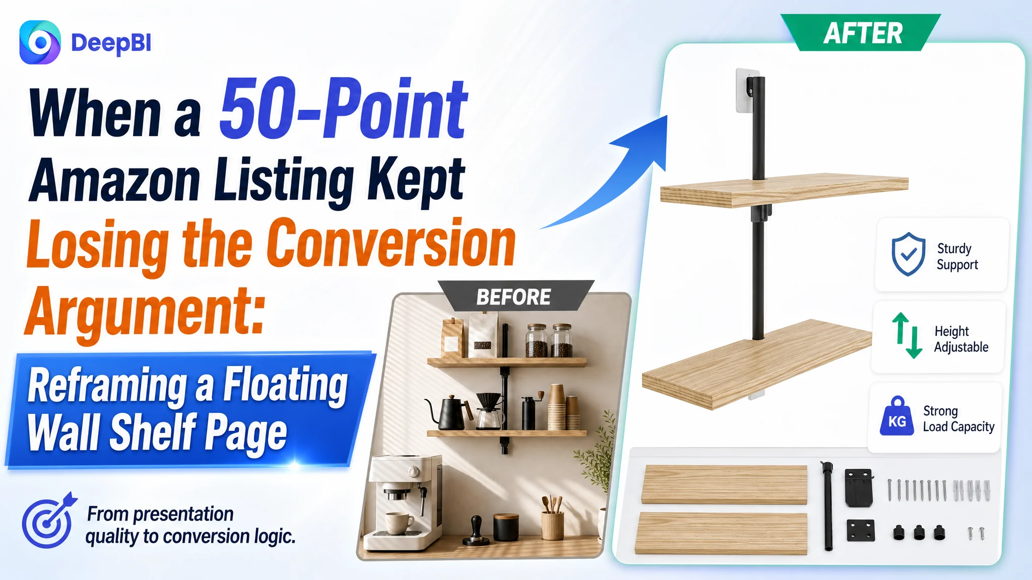
The customer was an Amazon seller in the US home organization category. Its two-tier floating wall shelf Listing had a product with clear functional differences, but the page was not turning those differences into enough buyer confidence. The problem was not simply a lack of traffic or a weak decorative style. The Amazon product page was asking shoppers to understand too much on their own.
The original direction focused on making the Listing look more attractive and describing its specifications more completely. But a decorated scene, scattered dimensions, and general statements about storage did not resolve the buyer's central questions: What exactly is the product? How does the adjustable structure work? What can it hold? Where does it fit in a real home? Why should a shopper trust a Listing with no review history?
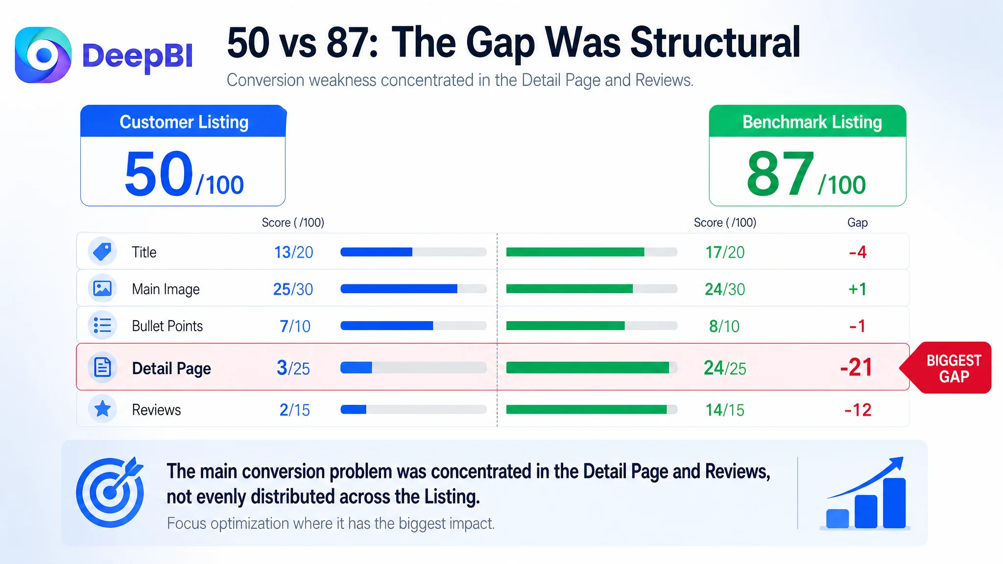
DeepBI ultimately located the larger constraint in the Listing's conversion capacity. The page scored 50 out of 100 against a comparable high-performing Amazon Listing at 87, with the largest gaps concentrated in the detail page and reviews. The later optimization therefore focused on rebuilding the product page's sales logic: clarify the product structure earlier, move the adjustable design and installation options forward, make capacity and materials visible, and use A+ content to connect features with real household scenarios.
For other Amazon sellers, the case is a reminder that better-looking images or more advertising are not always the first answer. Before sending more paid traffic to an Amazon Listing, the team has to judge whether the page can explain the product, reduce uncertainty, and earn the purchase decision.
The Listing Did Not Lack Features. It Lacked a Clear Buying Argument.
At first glance, this floating wall shelf appeared to have several usable selling points:
- A two-tier storage structure
- Adjustable spacing between the shelves
- Two installation methods
- Bamboo-style wood construction
- Reinforced metal support rods
- A stated weight capacity of up to 20 pounds
- Applications in bathrooms, bedrooms, kitchens, living rooms, and offices
The problem was that these points did not work together as a persuasive sequence.
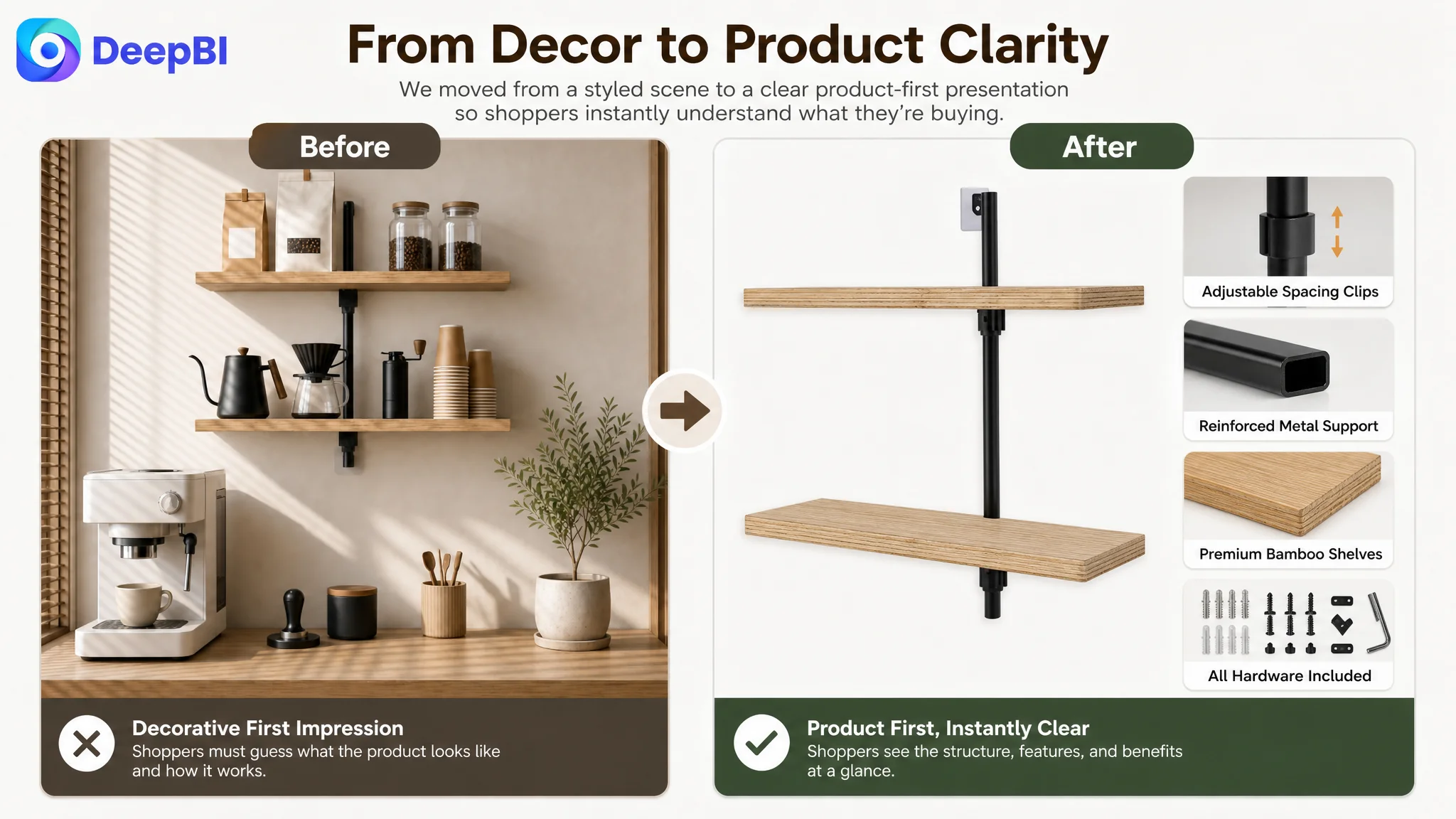
The title placed the brand name before the core product keywords. The main image emphasized a decorated living-room setting instead of immediately confirming the shelf's structure. The bullet points opened with dimensions and specifications, but did not establish the household problem the product solved. The detail page relied on text rather than visual modules. The Listing also had no review data, while the benchmark Listing had a large, established review base.
This created a familiar Amazon conversion pattern: the product had information, but the page did not provide enough reasons to believe that the information mattered.
The Listing was not empty of content. It was empty of decision logic.
That distinction changed the optimization priority.
The Customer Had Been Treating the Problem as Presentation Quality
The initial page direction was not irrational. A rustic floating shelf is a visual home-decor product, so showing it in a warm room scene made sense. The Listing also included dimensions, storage functions, room applications, material information, and installation details.
But those choices answered secondary questions before resolving the primary ones.
A shopper searching for a floating wall shelf needs to recognize the product category quickly. They also need to understand its physical arrangement, how much space it occupies, whether the shelves can accommodate different items, and whether installation will be difficult. For a new Listing with no review history, these questions become even more important because the page has fewer external trust signals to support the purchase.
The customer had effectively been trying to improve the page through more description and more aesthetic context. The deeper issue was that the page had not established a reliable order of persuasion:
1. Confirm what the product is.
2. Explain why its structure is useful.
3. Prove that the construction supports the intended use.
4. Show where it fits into daily life.
5. Reduce installation and maintenance concerns.
6. Close the trust gap as far as the content could.
Traditional Amazon optimization often moves in the opposite direction. Teams adjust keywords, refine individual bullet points, replace a background, or add another room scene. Each action may be reasonable in isolation, but the page can still fail if the content does not form a coherent path from recognition to confidence.
The Score Gap Showed Where the Conversion Argument Was Breaking
DeepBI's comparison did not treat every weakness as equally important. It scored the Listing across five dimensions and compared it with a relevant benchmark rather than with an unrelated category leader.
- Title: Customer Listing: 13/20, Benchmark Listing: 17/20, Gap: -4
- Main image: Customer Listing: 25/30, Benchmark Listing: 24/30, Gap: +1
- Bullet points: Customer Listing: 7/10, Benchmark Listing: 8/10, Gap: -1
- Detail page: Customer Listing: 3/25, Benchmark Listing: 24/25, Gap: -21
- Reviews: Customer Listing: 2/15, Benchmark Listing: 14/15, Gap: -12
- Total: Customer Listing: 50/100, Benchmark Listing: 87/100, Gap: -37
The first important judgment was that the page did not have one isolated image problem. The most severe gap was the detail page, followed by the absence of review support.
The main image and bullet points were not perfect, but they were not the primary constraint. Their scores suggested that the Listing had enough basic product communication to be improved. The detail page, however, lacked the visual and structural support needed to turn that communication into trust.
This prevented a common misdiagnosis: replacing every image or endlessly rewriting every bullet point while leaving the largest conversion gap untouched.
The detail page was the largest controllable weakness
The customer Listing used a text-focused detail section with no meaningful visual modules. The benchmark Listing used a fuller A+ structure that included:
- A brand-led opening visual
- Multiple household application scenes
- Installation steps
- A closing brand message
- Visual explanations that helped buyers imagine the product in use
The difference was not merely a matter of visual polish.
A+ content gives a product page room to answer questions that a title and bullet points cannot fully resolve. For this shelf, those questions included:
- How does the two-tier structure work?
- How does adjustable spacing help with different item heights?
- What does the shelf look like in a bathroom, kitchen, bedroom, or entryway?
- How much can it hold?
- What does installation involve?
- How does the product remain neat and maintainable after installation?
The customer's detail page left these questions scattered across text, or left them unanswered.
Reviews created a separate trust limitation
The customer Listing had no rating data and no review count. The benchmark had a 4.6-star average and more than 12,000 reviews, including a visible set of reviews on the first page.
This gap could not be solved through copywriting alone. It had to be treated as a trust condition surrounding the Listing.
DeepBI did not interpret the review difference as proof that the product itself was inferior. It showed that the customer page had to compensate through stronger factual communication and visual reassurance wherever it could. Clear capacity information, realistic usage scenes, installation guidance, and visible structural explanations could not replace customer reviews, but they could reduce the amount of uncertainty the missing reviews left behind.
That distinction matters for Amazon sellers. Some conversion barriers are content problems. Others are evidence problems. A page diagnosis has to separate the two rather than assuming every gap can be repaired with better wording.
The Main Image Was Attractive, but It Started in the Wrong Place
The main-image set was not the weakest scoring dimension, yet its role in the conversion sequence needed to change.
The first image used a decorated living-room scene to create aesthetic interest. That approach supported the product's rustic home-decor positioning, but it delayed the most basic product education. A shopper searching for “floating shelf” needed to recognize the wall-mounted, two-tier structure immediately.
The recommended change was not to remove the product's visual appeal. It was to move functional recognition earlier.
First, establish the product configuration
The opening visual needed to make the following elements easy to understand:
- Two-tier floating wall shelf
- Adjustable spacing
- Light wood or bamboo appearance
- Reinforced metal support rods
- The overall front-facing structure
A product that requires visual interpretation should not begin with a scene that hides its construction. The buyer should not have to infer whether the shelf is fixed, adjustable, single-layer, or multi-layer.
Then connect specifications to proof
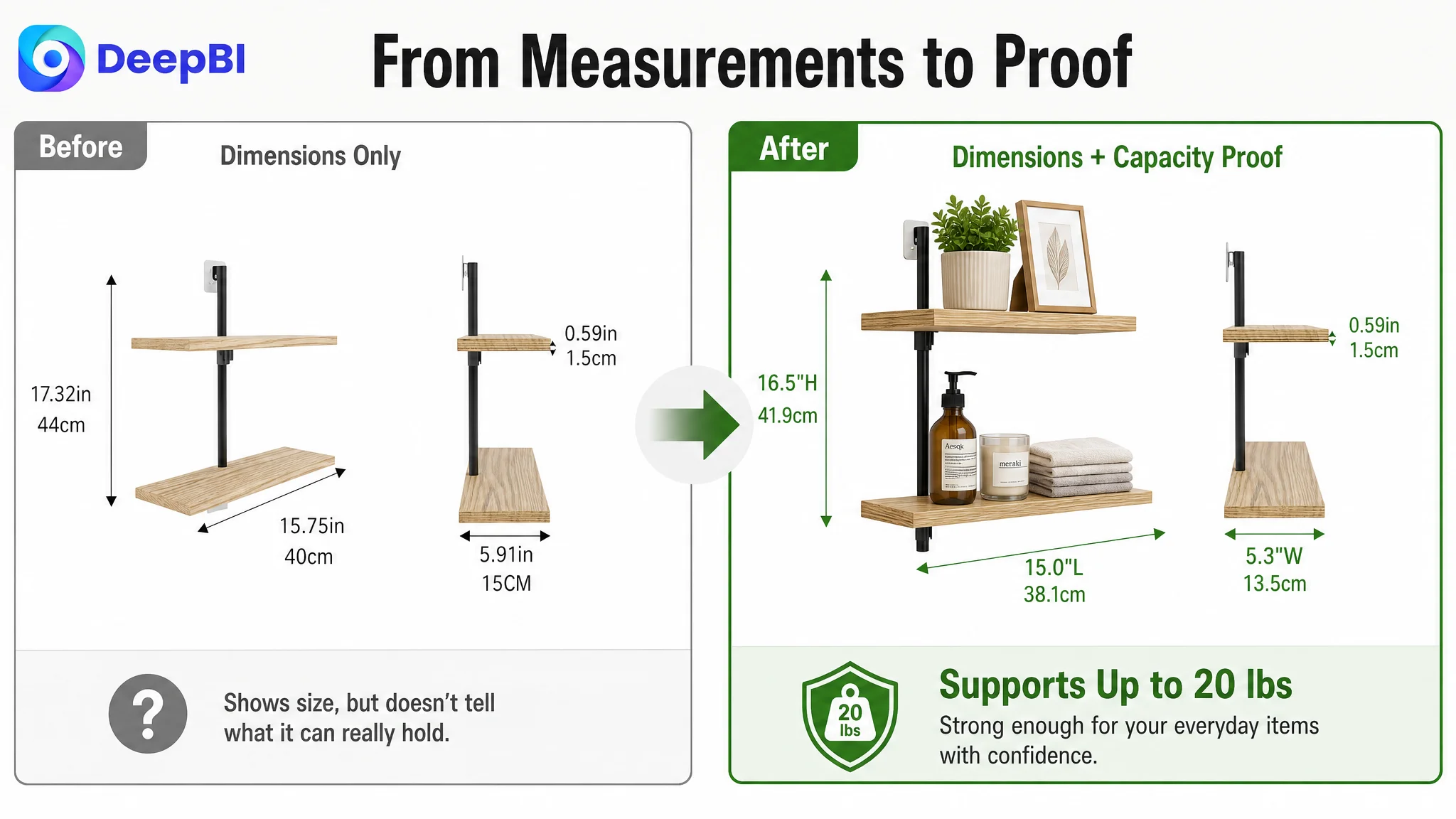
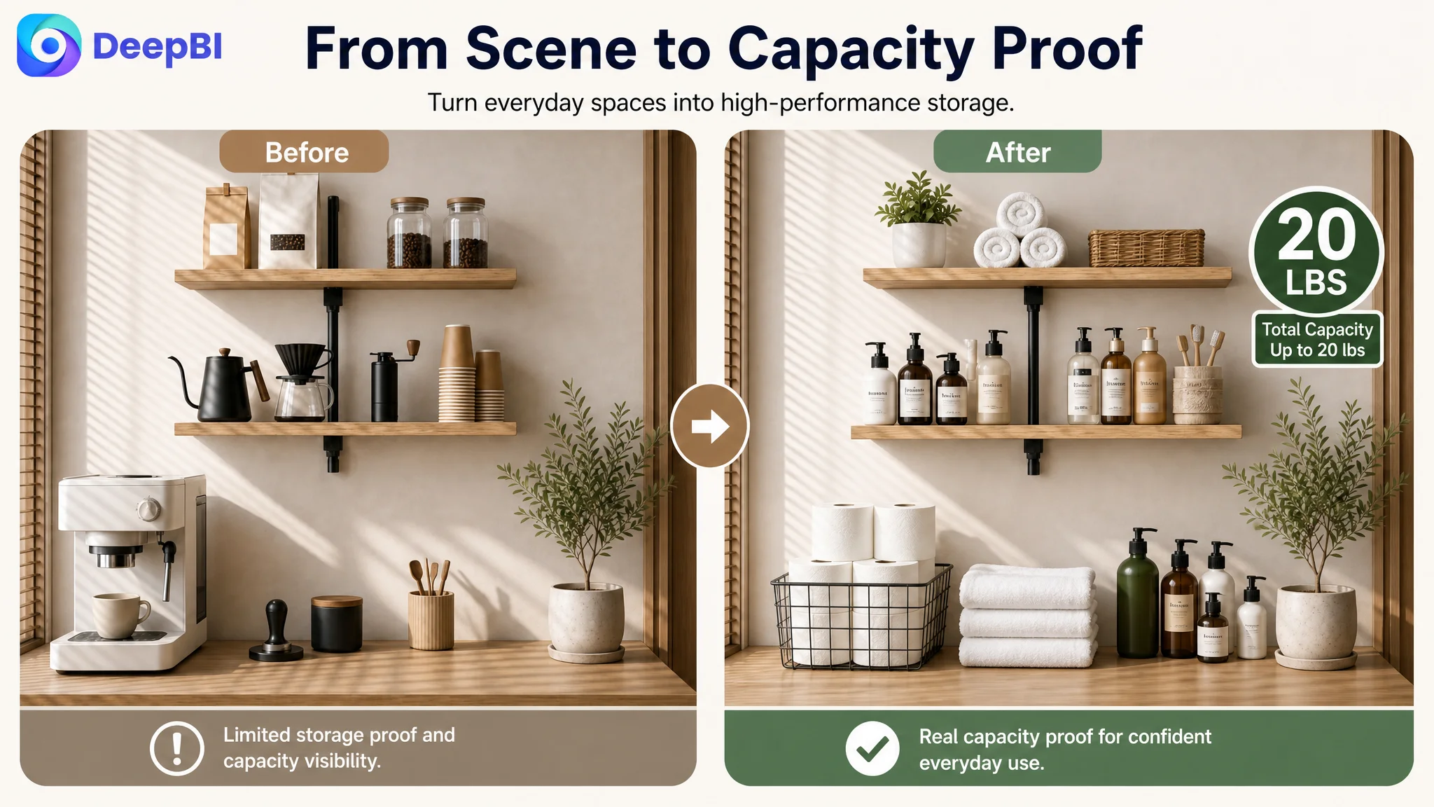
The next image needed to present dimensions together with the stated capacity:
- 15.0 inches long
- 5.3 inches wide
- 16.5 inches high
- Supports up to 20 pounds
- Built with a sturdy metal frame
The issue was not a lack of numbers. It was that the numbers were not connected to a clear performance message. Dimensions answer whether the shelf fits. Capacity and structural presentation help answer whether it can be trusted after installation.
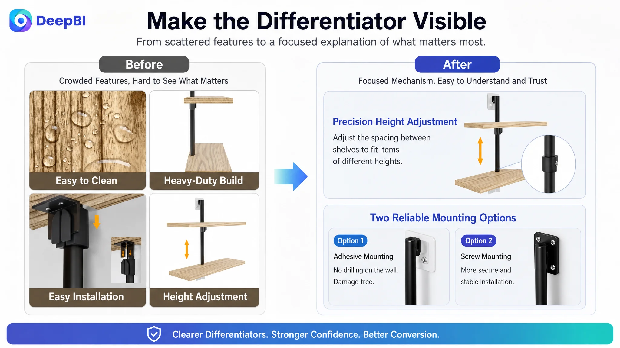
Make the differentiator visible
The height-adjustable design was one of the product's strongest differences from fixed-spacing alternatives. But the original presentation introduced it late and within a crowded image.
The revised visual logic placed adjustable spacing and the two installation methods in a focused explanation. The goal was to show how the structure works, not merely state that it is adjustable.
This is where DeepBI's diagnosis moved beyond aesthetic preference. It translated a score gap into a specific visual role: the image should remove uncertainty about the product's unique mechanism.
A feature becomes a selling point only when the buyer can see what problem it solves.
The Title Needed to Win Recognition Before Decoration
The title scored 13 out of 20, four points below the benchmark. The gap came from structure rather than from a complete absence of relevant terms.
The benchmark title led with the core category phrase, included a specific size and pack quantity, stated the invisible-bracket feature, and connected the product to home and wall decor applications. The customer's title placed the brand name first, pushed important keywords later, and used more abstract wording such as “rustic finish” without making the product's functional difference equally clear.
The recommended title direction placed the product identity and core search language earlier:
2-Tier Floating Wall Shelf Bamboo, 16 Inch Wall Mounted Shelves for Bathroom, Living Room, Bedroom, Kitchen, Rustic Finish Home Decor & Organization, Space Saving Design
The commercial reasoning was straightforward:
- Lead with the product category and structure.
- Include the size so buyers can judge fit quickly.
- Preserve the major room-use terms.
- Connect storage with home decor.
- Express the space-saving outcome rather than only listing materials or appearance.
This was not keyword stuffing. It was a reordering of the information buyers need first.
The Bullet Points Had Specifications, but Not a Persuasive Sequence
The bullet points scored 7 out of 10, only one point behind the benchmark. That relatively small score gap was useful: it suggested refinement rather than a total rewrite of the Listing's content strategy.
The customer's bullets generally followed a specification-first structure:
- Dimensions
- Storage function
- Adjustable height
- Material and weight capacity
- Installation and maintenance
The benchmark Listing used a more deliberate progression:
1. What the shelf helps display or store
2. How it reduces clutter and uses vertical space
3. How it fits different decorative styles and rooms
4. Where it can be used in everyday life
5. What supports installation and durability
The recommended bullet structure retained the product's facts but connected them to buyer outcomes.
The first point: turn dimensions into a space solution
Instead of opening with measurements alone, the first bullet connected the two-tier structure with vertical storage and zero floor-space consumption. That gave the dimensions a reason to matter.
The second point: make scenarios specific
“Suitable for many rooms” is weaker than showing how the shelf functions in those rooms:
- Toiletries in a bathroom
- Spices in a kitchen
- Photos and trophies in a bedroom
- Storage in an entryway or laundry room
- Items above a toilet where additional vertical space is useful
Specific scenes reduce the mental work required to imagine the product.
The third point: explain adjustable height through use
The adjustable design was not merely a mechanical feature. It helped accommodate tall bottles, books, and decorative objects of different sizes.
The revised message therefore focused on the user's storage problem: fixed spacing forces buyers to work around the shelf, while adjustable spacing allows the shelf to fit the items.
The fourth point: put stability into a clear claim
The customer already had a 20-pound capacity statement, but it was not presented with enough structural context. Pairing the capacity with the particleboard surface and metal frame made the claim easier to evaluate.
The fifth point: reduce installation hesitation
Installation hardware, instructions, hidden supports, and a wipe-clean surface were combined into a more practical closing point. This gave the buyer a clear expectation of what happens after purchase.
The lesson was not that every bullet must be longer. It was that each point should do one job in the buying argument.
Why DeepBI Did Not Prioritize More Advertising First
The case material does not provide post-optimization advertising results or a verified ACOS or CVR trend. It would therefore be misleading to claim that advertising costs fell or that orders increased after the Listing changes.
The decision logic is still clear.
When a page scores only 3 out of 25 in its detail-page dimension and has no review support, sending more traffic to it carries a basic operational risk: the store may pay to expose weaknesses that the page has not yet addressed.
Advertising can generate impressions and clicks. It cannot, by itself, explain an adjustable shelf structure, prove installation simplicity, supply missing A+ content, or create a review history. If the product page fails to answer those questions, additional traffic may produce more expensive evidence of the same conversion problem.
That is why Listing repair had to come before aggressive traffic expansion in the decision sequence.
The priority order was based on controllability
The review gap was real but not immediately controllable through page editing. The detail-page gap, however, was directly addressable. The title and bullets could also be reorganized around the product's actual strengths.
The practical order was therefore:
1. Repair the page's explanation and trust structure.
2. Make the product's differentiators visible.
3. Improve the title and bullet-point information path.
4. Use advertising data later to evaluate whether the improved page can convert more effectively.
This prevents ads from becoming a substitute for Listing diagnosis.
The A+ Page Had to Become the Missing Trust Layer
The A+ recommendation was not to add decorative modules simply because competitors had more images. Each module was assigned a role in the buyer's decision process.
Module 1: Confirm product identity
The opening should reassure shoppers that they are viewing the correct product: a light-wood, two-tier floating wall shelf designed for wall-mounted storage and home organization.
Module 2: Validate capacity and construction
The page should present the up-to-20-pound capacity together with the particleboard surface and metal frame. This gives the buyer a rational basis for judging stability.
Module 3: Map the product to living spaces
Living rooms and bedrooms can show the shelf holding photos, books, plants, or decorative objects. The aim is to connect storage with visual organization rather than presenting the product as a bare fixture.
Module 4: Address kitchen and bathroom utility
Kitchen spices and bathroom toiletries make the vertical-storage benefit concrete. These scenes also support the product's role in keeping surfaces and walls more organized.
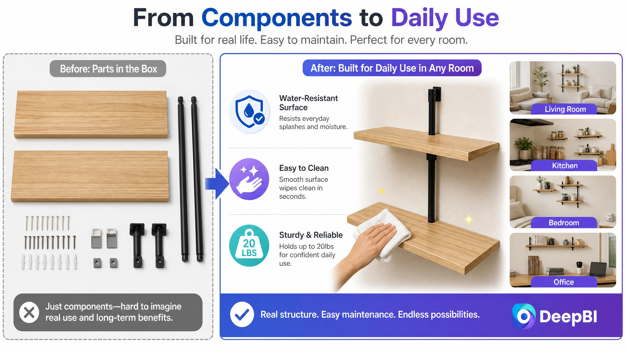
Module 5: Demonstrate customization
The height-adjustable structure needed its own visual explanation. This was the most important opportunity to turn a product detail into a competitive reason to choose the Listing.
Module 6: Reduce installation friction
Clear instructions and included hardware should appear before the final purchase decision, not as an afterthought. Installation anxiety is often a small concern that becomes decisive when trust is already limited.
Module 7: Close with function, trust, and ease
The final module should summarize the actual persuasion chain: sturdy construction, flexible storage, simple maintenance, and a clean mounted appearance.
This structure was deliberately different from the customer's original text-heavy presentation. It moved the page from “here are the features” to “here is how the product works in your home, why it is suitable, and what happens after purchase.”
The Optimization Stayed Within the Product's Real Boundaries
A critical part of the diagnosis was knowing what not to change.
The product's color options were limited, so the solution was not to invent visual variety that the product could not support. The stronger path was to use the light wood or bamboo appearance consistently while emphasizing:
- Adjustable spacing
- Two-tier storage
- Wall-mounted, space-saving use
- Up-to-20-pound capacity
- Metal-frame support
- Multiple household applications
- Easy installation and cleaning
Likewise, the Listing could not claim a feature simply because a competitor used it. The benchmark's invisible brackets, larger review base, and established customer proof could inform the comparison, but they could not be presented as features of the customer's product.
This constraint is important in AI-assisted Listing work. A stronger image is not useful if it changes the product's actual structure or creates a promise the product cannot fulfill. The improvement must come from clearer composition, more accurate information hierarchy, and better use of real product advantages.
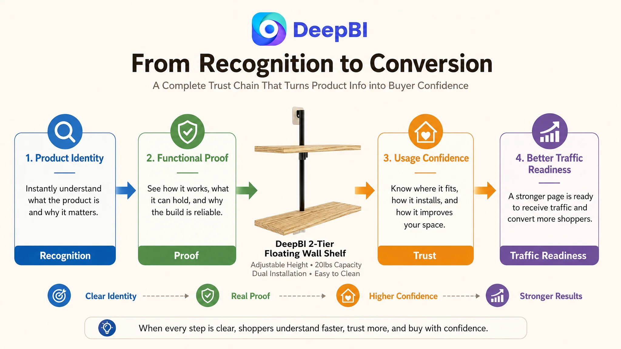
From “Make It Look Better” to “Make the Product Easier to Trust”
The most important change in understanding was not a single title, image, or A+ module.
It was the recognition that the Amazon product page had to do more work because the Listing lacked the external validation enjoyed by the benchmark. Aesthetic scenes could support the rustic positioning, but they could not carry the entire conversion burden. Specifications could establish accuracy, but they could not create a reason to care. Feature statements could describe adjustability, but they could not prove its practical value without a visual explanation.
The revised direction brought these elements into one system:
- The title establishes product identity and search relevance.
- The main images clarify structure, size, capacity, and differentiators.
- The bullets connect functions to clutter reduction and room-specific use.
- The A+ page builds a visual journey from identity to proof to reassurance.
- The review gap remains visible as a trust risk rather than being mistaken for a copy problem.
- Advertising can be evaluated after the page has a stronger ability to receive and convert traffic.
Before asking Amazon ads to scale the Listing, the seller had to give the Listing a stronger reason to convert.
No post-optimization performance figures are provided in this case, so the outcome should not be described as a confirmed ACOS decline, CVR increase, or organic-ranking recovery. The supported result is a clearer operating decision: the team identified that the largest controllable bottleneck was not the absence of another decorative image, but the absence of a complete product-page argument.
For Amazon sellers, that is the broader lesson. A Listing can contain the right product and still lose the decision if its content appears in the wrong order. Diagnose the largest conversion gap first, distinguish controllable content weaknesses from structural trust limitations, and only then decide whether the next dollar should go into more traffic or into making the existing traffic more valuable.