

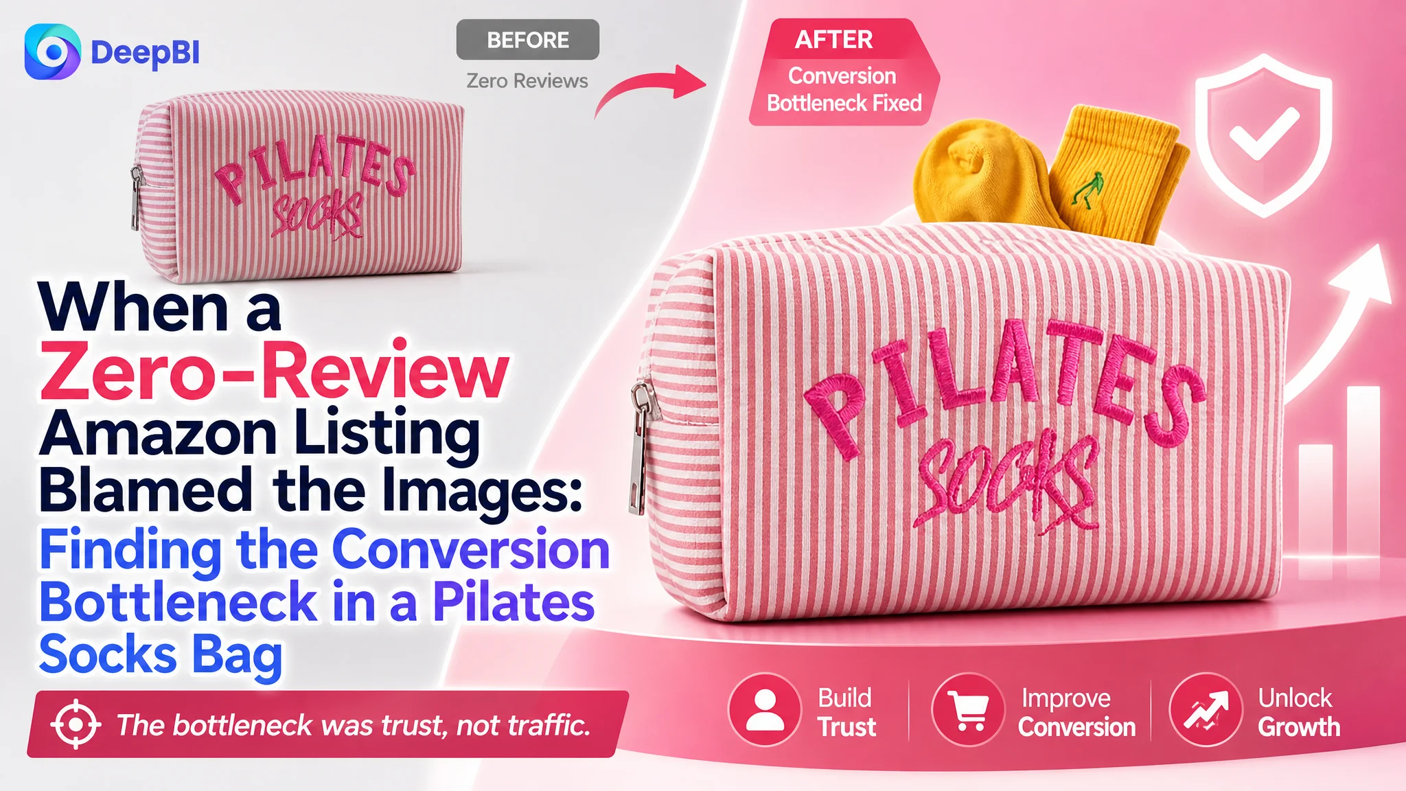
This case involved an Amazon seller whose Pilates socks pouch was being evaluated as a product-page conversion problem. The initial direction centered on making the Listing more searchable and improving the visual presentation, reflecting a common assumption that better keywords and more attractive images would be enough to recover performance.
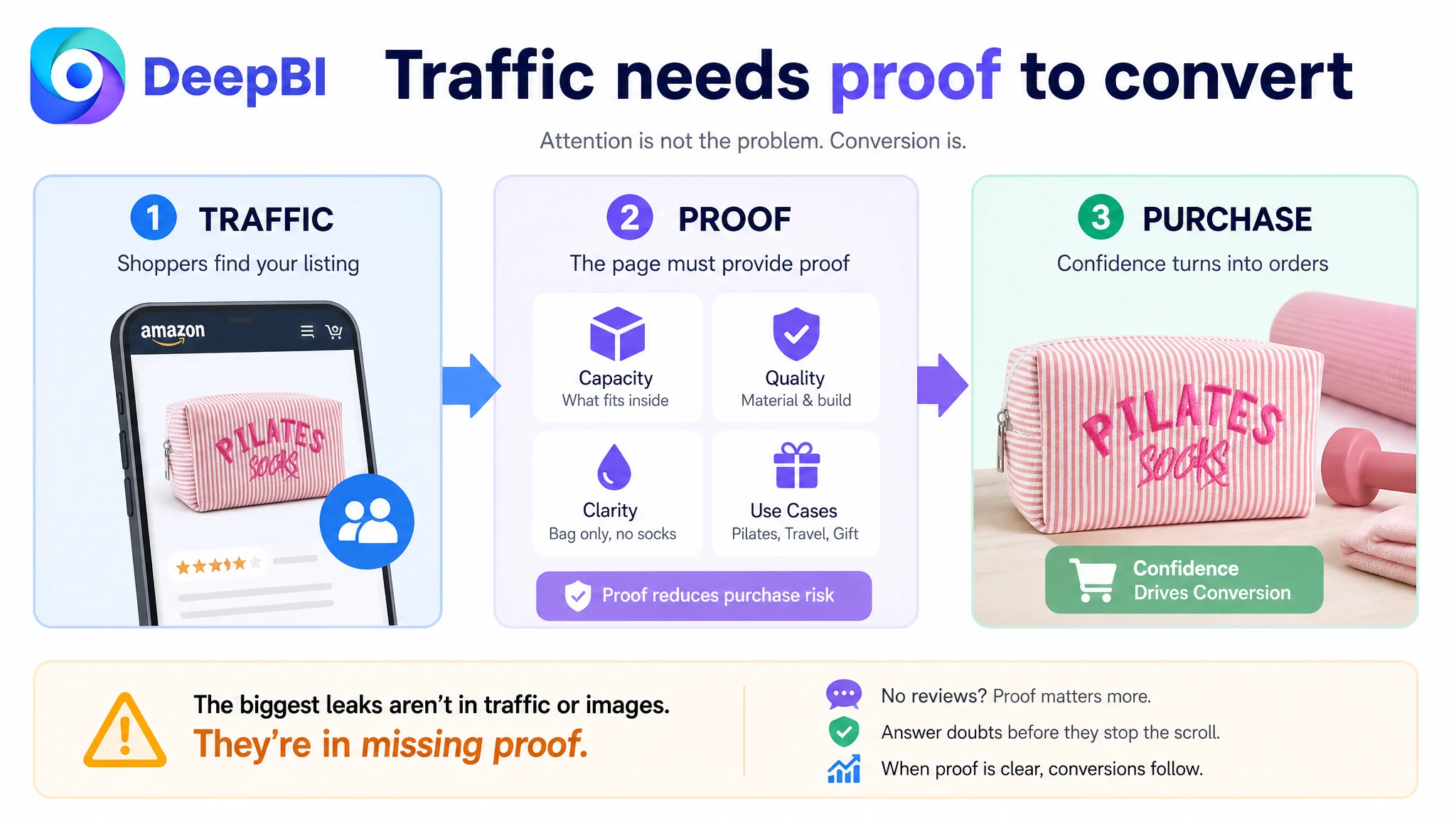
DeepBI found a more fundamental constraint. The Listing was not merely missing visual polish; it was missing the trust and explanation layers needed to convert shoppers. The product page relied on text, had no customer reviews, and did not clearly demonstrate capacity or resolve the “bag only, no socks” concern without creating additional visual friction.
The later optimization therefore focused on rebuilding the page’s sales logic: clarify what the pouch holds, prove its material and construction, reduce purchase-risk confusion, and use A+ content to connect hygiene, organization, Pilates use, travel, and gifting. For other Amazon sellers, the case is a reminder that before increasing ad traffic or repeatedly revising keywords, it is worth asking whether the product page gives that traffic enough reason to buy.
The Amazon Listing Looked Like a Small Accessory. The Conversion Problem Was Not Small.
The product was a specialized pouch for Pilates grip socks, positioned around organization, hygiene, seersucker fabric, embroidery, and use in Pilates, Barre, Yoga, and Reformer settings.
At first glance, it was easy to treat the Listing as a relatively simple accessories page. The product itself was compact, the use case was specific, and the title already contained the primary category terms. That can lead sellers toward surface-level optimization:
- Add or rearrange keywords
- Make the product photos more attractive
- Emphasize the pouch’s aesthetic
- Adjust bids if Amazon ads are not producing enough orders
But the DeepBI comparison showed that the product page was operating with a much weaker conversion foundation than the seller’s initial optimization direction suggested.
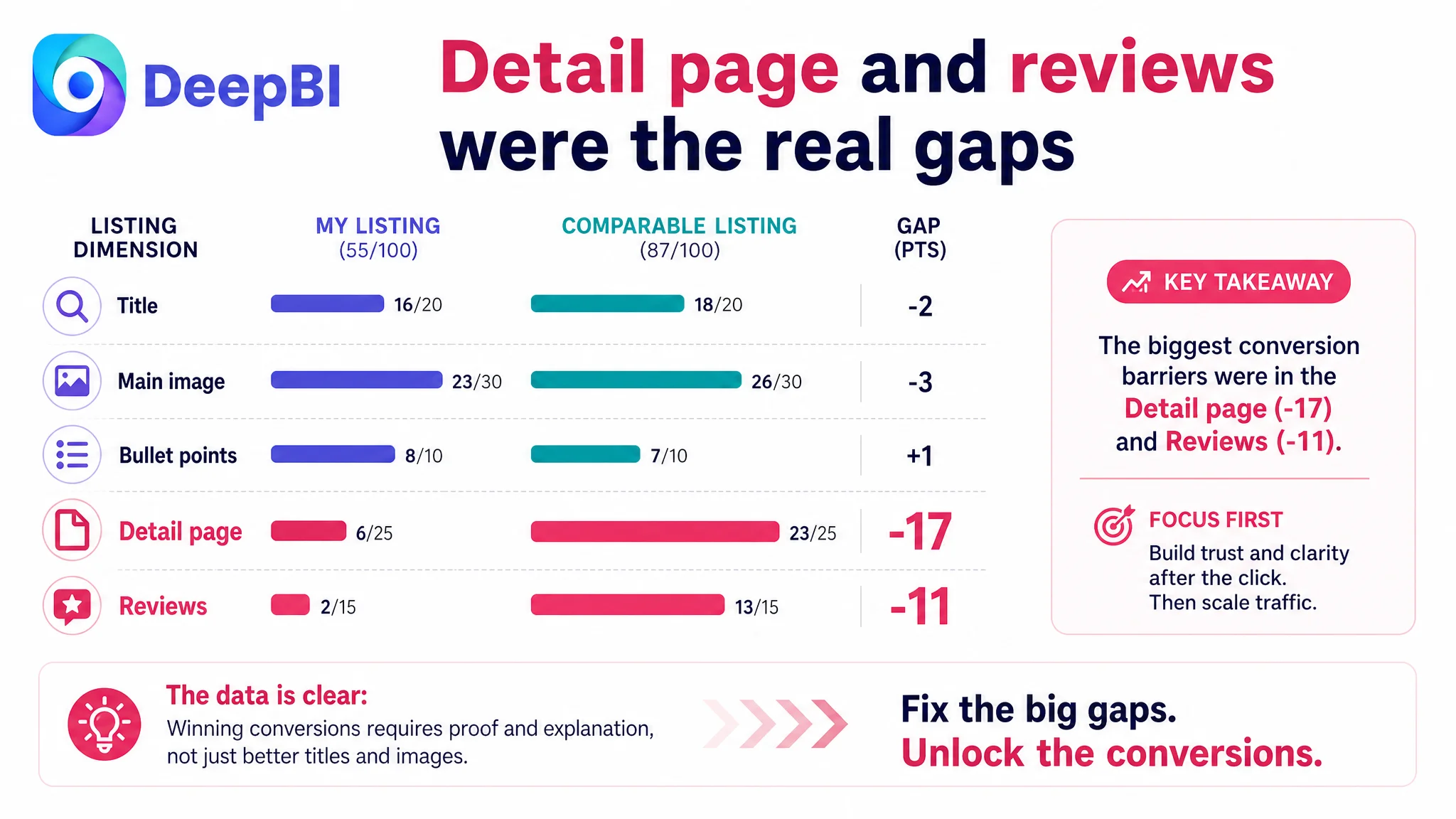
The customer Listing scored 55 out of 100, while a comparable high-performing Amazon Listing scored 87.
The gap was not distributed evenly:
- Title: Customer Listing: 16/20, Comparable Listing: 18/20, Gap: -2
- Main image: Customer Listing: 23/30, Comparable Listing: 26/30, Gap: -3
- Bullet points: Customer Listing: 8/10, Comparable Listing: 7/10, Gap: +1
- Detail page: Customer Listing: 6/25, Comparable Listing: 23/25, Gap: -17
- Reviews: Customer Listing: 2/15, Comparable Listing: 13/15, Gap: -11
That distribution changed the business question.
The title and main image had room for improvement, but they were not the largest constraints. The greatest losses were in the detail page and review foundation. The page was not simply failing to attract attention. It was failing to provide enough evidence after the click.
The problem was not only whether shoppers would notice the pouch. It was whether the Listing could make the purchase feel clear, safe, and worthwhile.
The Initial Direction Was Too Close to a Search-and-Creative Problem
The customer’s optimization direction naturally leaned toward title structure and image presentation.
The title did contain the core phrase “Pilates Socks Bag,” which gave it a reasonable search foundation. The main image also showed the product and its intended context. Yet the working assumption was that stronger keyword positioning and more polished creative treatment could close most of the gap.
That assumption was incomplete.
The title gap was real, but limited. The comparable Listing used a more precise opening phrase, “Pilates Grip Socks Bag,” bringing the functional search intent closer to the front. It also structured its benefits more clearly around an embroidered seersucker pouch, cosmetic organization, gym use, and specific studio settings.
The customer’s title contained many of these ideas, but they were more densely stacked. The use cases and gifting angle appeared, yet the hierarchy was less direct.
This was a search relevance and readability issue—not the main reason the Listing was 32 points behind.
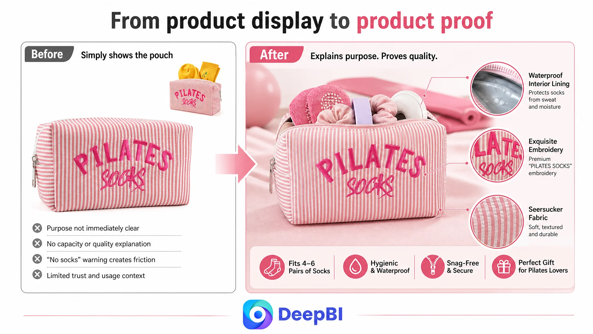
The main image also had identifiable weaknesses:
- The product’s dedicated purpose was not immediately obvious.
- The socks shown in supporting imagery were not prominent enough to communicate capacity.
- The open-bag image included items that could distract from the primary socks-storage question.
- The large red “Only Bag, No Socks” notice interrupted the visual persuasion path.
- The images did not clearly connect the pouch to the problem of separating clean grip socks from sweaty clothing or a dirty gym bag.
- Travel, wardrobe, and broader fitness use cases were not strongly visualized.
These issues could affect clicks and trust. But they still pointed to a broader diagnosis: the Listing lacked a coordinated explanation system.
The Real Constraint Was Listing Conversion Capacity
DeepBI’s most important judgment came from the uneven score pattern.
The bullet points were not the weak link. In fact, the customer’s bullet points scored slightly higher than the comparable Listing. They described the waterproof lining, seersucker fabric, embroidery, capacity, snag protection, and gifting use case with meaningful detail.
That mattered because it ruled out a simplistic conclusion that the entire Listing needed to be rewritten from scratch.
The page already had useful sales arguments. The problem was that many of them were trapped in text.
The customer Listing used a pure text detail section with no visual modules. The comparable Listing used a structured A+ experience that included:
- Lifestyle imagery
- Feature close-ups
- A multi-benefit grid
- Gift scenarios
- Problem-and-solution comparisons
- Size and capacity confirmation
- Pilates, Ballet, Travel, and Wardrobe use cases
The difference was not just aesthetic. It changed how quickly shoppers could understand the product and how confidently they could evaluate it.
The customer page could say that the pouch had a waterproof lining, premium seersucker fabric, embroidery, and sufficient capacity. But without visual evidence, these claims competed with one another inside repeated text.
A shopper considering a small accessory usually does not need more claims in isolation. They need quick answers to practical questions:
- What exactly is included?
- How many pairs of socks can it hold?
- Is it large enough for the intended use?
- Does the interior protect delicate fabrics?
- Is the pouch genuinely different from a standard cosmetic bag?
- Does the material and embroidery justify the price?
- Can it be used beyond the Pilates studio?
The Listing did not answer these questions with enough structure.
The page had product information, but not enough decision support
The suggested title improved keyword order by bringing “Pilates Socks Bag” and “Waterproof Lining” closer to the front, while retaining the embroidered seersucker material and relevant studio scenarios.
That was useful, but secondary.
The more important shift was to turn the product page into a sequence of proof:
1. Introduce the pouch as a dedicated Pilates accessory.
2. Show the material, embroidery, lining, zipper, and construction.
3. Clarify that the purchase includes the bag only.
4. Demonstrate hygiene and snag-free storage.
5. Confirm the dimensions and realistic capacity.
6. Expand the use case to cosmetics, toiletries, travel, and accessories.
7. Reinforce the identity and gifting value of the “Pilates Princess” positioning.
This sequence addressed both emotional and rational hesitation without asking the title or bullet points to carry the entire conversion burden.
The Zero-Review Problem Made Every Page Weakness More Expensive
The review dimension created a second trust gap.
The customer Listing had:
- No star rating
- No review count
- No comments on the first page
- No customer images or videos
The comparable Listing had a 4.4-star rating, 32 reviews, and visible review content on the first page.
Thirty-two reviews do not create an insurmountable market advantage by themselves. But they provide a basic layer of reassurance, especially for a product whose value depends on fabric quality, embroidery, capacity, and practical use.
Without reviews, the product page had to compensate with stronger visual proof and clearer expectation management. Instead, the page relied heavily on text and used a visually intrusive disclaimer to communicate that socks were not included.
This created a difficult combination:
- The Listing had limited third-party trust.
- The detail page had limited visual proof.
- The main image contained a prominent warning that could distract from the product.
- Capacity was not communicated with enough clarity.
- The difference between premium embroidery and ordinary printing was not shown strongly enough.
The absence of reviews was not something a title rewrite could solve. It increased the importance of every other trust signal.
When review history is still empty, the Listing has to work harder to prove what the shopper will receive.
Why DeepBI Did Not Keep Treating the Problem as an Advertising Issue
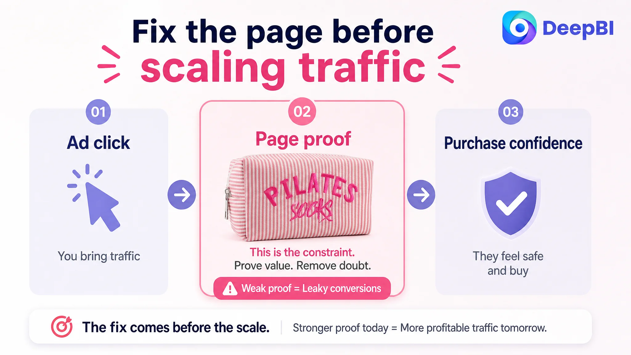
Amazon ads can generate impressions and clicks, but they cannot repair an unclear product page.
If shoppers click an ad and then hesitate because the product’s capacity, contents, quality, or use case remain uncertain, additional traffic only increases the number of people encountering the same conversion friction.
For this Listing, the priority was therefore not to keep pushing traffic toward an unchanged page. The page first needed to become more capable of receiving that traffic.
The decision order was based on the size and nature of the gaps:
- A moderate title gap did not justify making keywords the central project.
- A smaller main-image gap called for clearer product communication, not a complete creative reinvention.
- Bullet points were already a relative strength and should support the new page rather than be discarded.
- The detail-page gap was severe and directly affected trust, comprehension, and perceived value.
- The review gap increased the need for visual evidence and precise expectation setting.
This is where the distinction between advertising efficiency and Listing conversion becomes important.
A high ACOS diagnosis might lead a team to adjust bids, search terms, campaign structure, or budgets. Those actions can be appropriate when traffic quality or campaign control is the main issue. But when the page cannot convert relevant traffic, advertising optimization treats the symptom while leaving the constraint in place.
For this Amazon seller, the better question was:
Does the product page deserve more traffic yet?
The answer was not fully yes. The Listing first needed to clarify and prove its offer.
The Main Image Needed to Explain Use, Not Just Show the Product
The recommended main-image direction did not focus on making the pouch more decorative. It focused on making its function more legible.
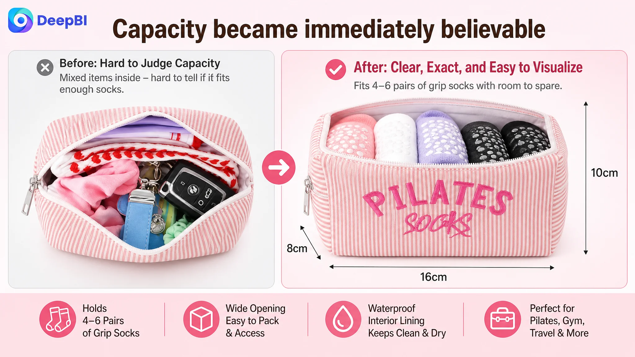
The first visual priority was capacity.
The pouch was intended to hold approximately 4–6 pairs of fluffy grip socks, with listed dimensions of approximately 6.3 by 3.1 by 3.9 inches. Yet the current open view did not make the sock-storage use case sufficiently obvious. Other items competed for attention, while the buyer’s most important question remained unanswered: how much can this bag actually hold?
The revised visual logic centered on:
- Showing socks more prominently
- Using clear measurement lines
- Providing a realistic sense of scale
- Presenting the pouch as a dedicated organizer
- Demonstrating separation from sweaty clothing and dirty gym-bag contents
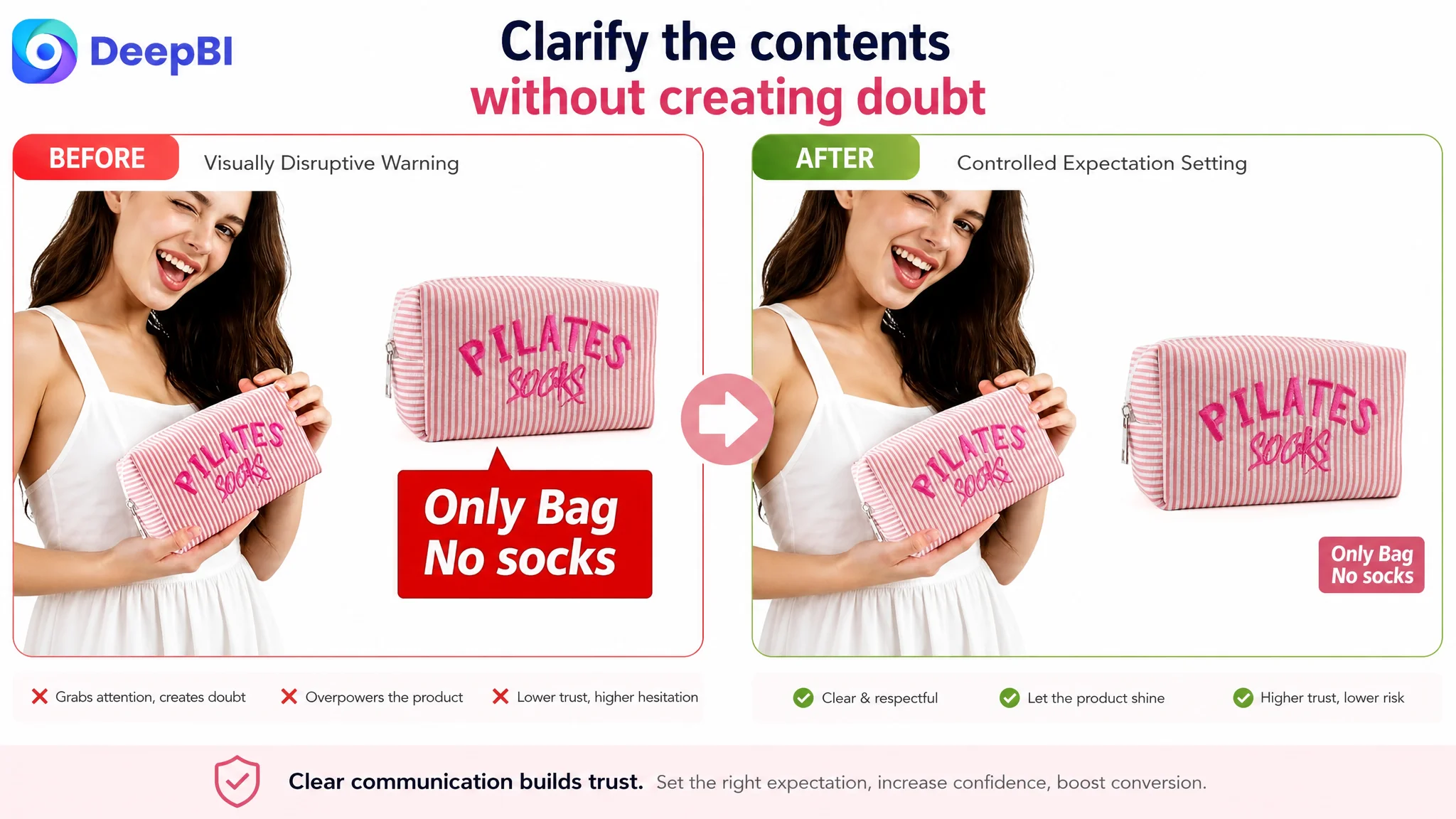
- Replacing the oversized red disclaimer with smaller, less disruptive wording
The “Only Bag, No Socks” clarification was still necessary. It served an important risk-reduction role. But its placement and visual weight mattered.
A warning that dominates the image can create suspicion before the shopper understands the product. A clear, restrained clarification can prevent misunderstanding without damaging the first impression.
The same principle applied to the lifestyle imagery. The suggested direction was to move away from a model-centered presentation and focus more closely on the pouch in a studio or organized fitness setting. The purpose was not to remove lifestyle context, but to make the product and its use easier to read.
The A+ Page Had to Carry the Missing Trust Layer
The most important change was the move from a text-only detail section toward a structured visual story.
Quality needed to be shown before it was claimed
The pouch’s strongest differentiators were not abstract:
- Soft striped seersucker fabric
- High-quality pink “PILATES SOCKS” embroidery
- Waterproof interior lining
- Smooth-lined interior
- Premium zipper closure
- Structured, boxy form
These details should appear early through close-up imagery and clear information hierarchy. The goal was to let shoppers verify the difference between embroidery and a cheap vinyl print, see the fabric texture, and understand how the lining supports the intended use.
The purchase contents needed to be unmistakable
The “bag only, no socks” clarification belonged in a prominent but controlled section of the A+ content.
This was not merely a compliance detail. It addressed the most serious expectation-management risk identified in the case. If a shopper interpreted the socks shown in the imagery as included, the result could be dissatisfaction, returns, or negative feedback.
DeepBI placed this clarification before the gifting message because risk reduction had to come before emotional persuasion.
The pain point needed to become visual
The product’s value was not simply that it was cute.
It was designed to help shoppers:
- Keep grip socks separate from sweaty gym clothes
- Avoid losing socks at the bottom of a tote
- Reduce exposure to dirt and moisture
- Protect delicate lace or specialty fabrics from rough zippers and Velcro
- Find studio essentials quickly
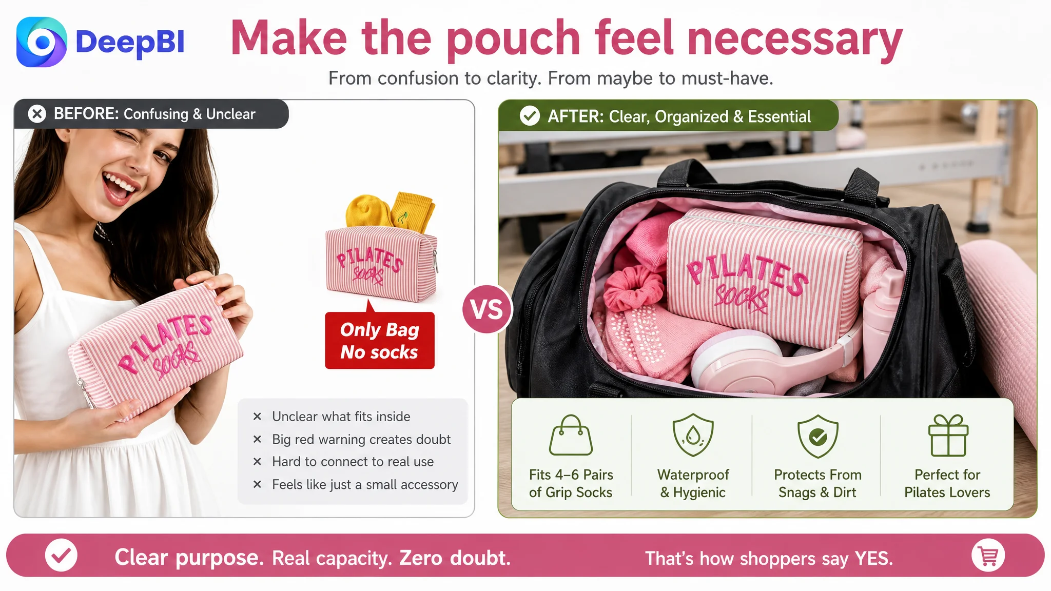
A direct problem-and-solution comparison could communicate this faster than another paragraph of product description. One side could show an unorganized gym bag; the other could show the pouch keeping the relevant items together and easy to find.
The visual story needed to make the pouch feel necessary, not merely attractive.
Capacity and versatility needed concrete proof
The page also needed rational confirmation.
Dimensions and capacity should appear alongside realistic examples:
- Four to six pairs of fluffy grip socks
- Hair scrunchies
- Claw clips
- Headphones
- Jewelry
- Cosmetics
- Toiletries
This expanded the product’s relevance without abandoning its primary Pilates purpose. It also supported the price story by showing that the pouch could function as a studio organizer, cosmetic bag, toiletry pouch, or travel accessory.
The Optimization Was a Reordering of Business Priorities
The case did not call for changing every element equally.
It called for putting the highest-risk conversion problems first.
The recommended priority was:
1. Repair the detail-page trust gap with visual A+ modules.
2. Clarify capacity and realistic product scale.
3. State “bag only, no socks” clearly without allowing the disclaimer to dominate.
4. Show material, embroidery, lining, zipper, and snag protection through close-up evidence.
5. Improve the main-image sequence around product purpose and organization.
6. Refine the title for clearer keyword and scenario structure.
7. Use the already-strong bullet points as the written support for the new visual story.
8. Treat reviews as an ongoing trust-building need rather than something a creative rewrite can replace.
This order mattered because it prevented the team from spending its main effort on the smallest gaps.
DeepBI’s role was not to recommend more changes simply because more changes were possible. It was to identify which change removed the greatest business constraint at the current stage.
The page did not need more selling language before it had enough proof.
What the Seller Could Learn From the Diagnosis
The case did not include confirmed post-optimization advertising or sales results, so it would be inappropriate to claim a specific CVR increase, ACOS reduction, or organic-order recovery.
The meaningful change documented here was the operating diagnosis.
The Listing moved from a broad “improve the images and keywords” direction toward a more specific conversion strategy:
- Make the product’s purpose obvious.
- Make its capacity believable.
- Make its contents unambiguous.
- Make its quality visible.
- Make its use cases concrete.
- Make its value understandable without relying on reviews alone.
That diagnosis also changed how Amazon ads should be viewed.
Ads were not necessarily the original failure point. They were part of the traffic system, but the product page was not yet prepared to convert that traffic consistently. Until the page could explain and prove the offer, scaling traffic risked amplifying uncertainty.
The broader lesson for Amazon sellers is straightforward:
Before increasing ad pressure, determine whether the Listing can convert the traffic it already earns.
For this Pilates accessory pouch, the answer was found not in a larger keyword list or a more decorative image, but in the relationship between page structure, trust, clarity, and purchase risk. Once those elements were treated as one conversion system, the optimization direction became more disciplined—and the seller had a clearer basis for deciding what should happen next.