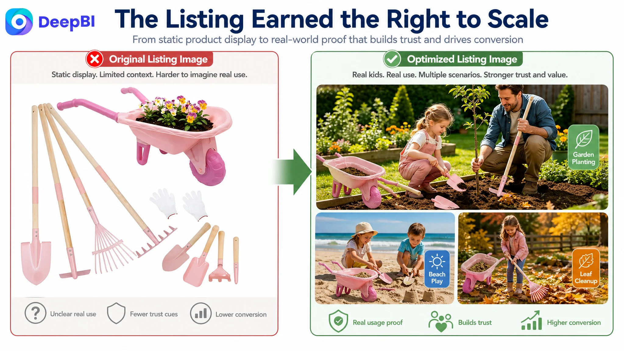
An Amazon seller of kids’ gardening tools was facing a familiar problem: traffic was reaching the Listing, but the product page was not giving parents enough reasons to trust the purchase. The initial assumption was that the issue belonged mainly to Amazon ads—keywords, bids, or campaign structure needed further adjustment.
DeepBI’s diagnosis pointed in a different direction. The Listing was not fundamentally short of traffic; it was short of conversion capacity. The largest gap was not the headline image or bullet points alone, but the product-page experience after the click: the A+ section contained no images or video, the usage logic was weak, and the page did not clearly prove what children could do with the set.
The later optimization therefore focused on rebuilding the Amazon product page around trust and decision sequence: clarify the set contents, bring real gardening use forward in the image order, explain material and durability evidence, and use A+ content to connect functions with family activities, outdoor learning, and gifting. For other Amazon sellers, the case offers a practical warning: before scaling ads, confirm that the Listing is ready to convert the traffic those ads create.
The Amazon Listing looked like an advertising problem
The customer’s pressure was easy to interpret as an Amazon ads issue.
When paid traffic does not produce enough orders, sellers commonly look first at:
- Search-term quality
- Keyword targeting
- Bids and placement
- Campaign structure
- ACOS and TACOS
- Budget allocation
Those are important operating levers. But they cannot repair a product page that leaves buyers uncertain about the product, its quality, or its practical value.
For this kids’ gardening tools Listing, the page was competing in a category where parents were not simply buying a collection of small tools. They were evaluating a broader promise:
- Can a child actually use these tools?
- Are the materials durable enough for real outdoor activity?
- Is the set complete?
- Is the size appropriate?
- Will it create meaningful family time, or is it only a toy?
- Does the product justify its price?
The customer’s existing page answered some of these questions in scattered text. It did not guide the buyer through them in a convincing order.
Advertising does not only amplify a Listing’s strengths. It can also amplify the uncertainty already present on the product page.
The score gap showed where the conversion leak was concentrated
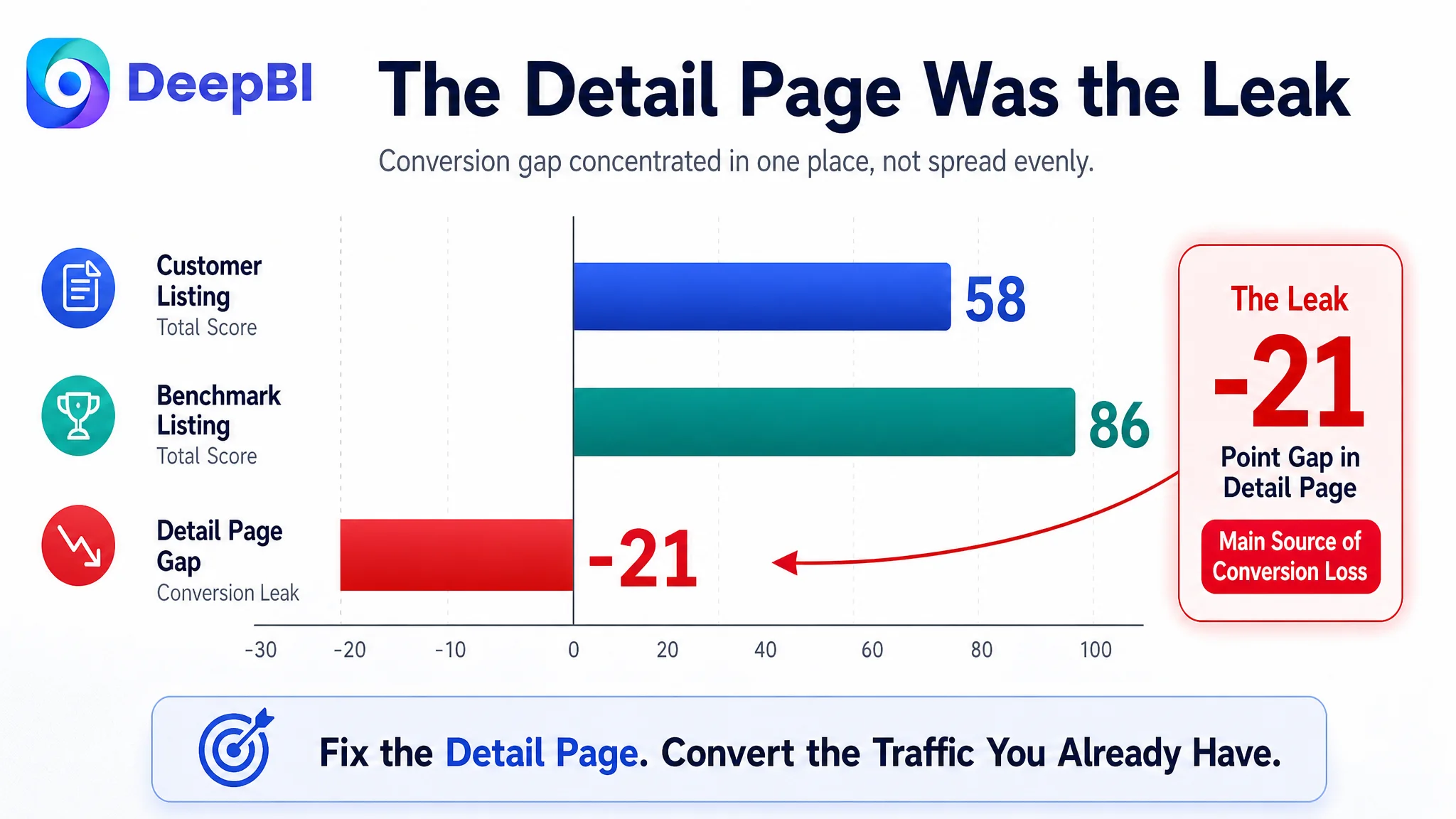
DeepBI’s comparison with a relevant high-performing Amazon Listing produced a total score of 58 out of 100, compared with 86 for the benchmark Listing.
The difference was not evenly distributed.
- Title: Customer Listing: 15/20, Benchmark Listing: 18/20, Gap: -3
- Main image: Customer Listing: 26/30, Benchmark Listing: 24/30, Gap: +2
- Bullet points: Customer Listing: 7/10, Benchmark Listing: 7/10, Gap: 0
- Detail page: Customer Listing: 3/25, Benchmark Listing: 24/25, Gap: -21
- Reviews: Customer Listing: 7/15, Benchmark Listing: 13/15, Gap: -6
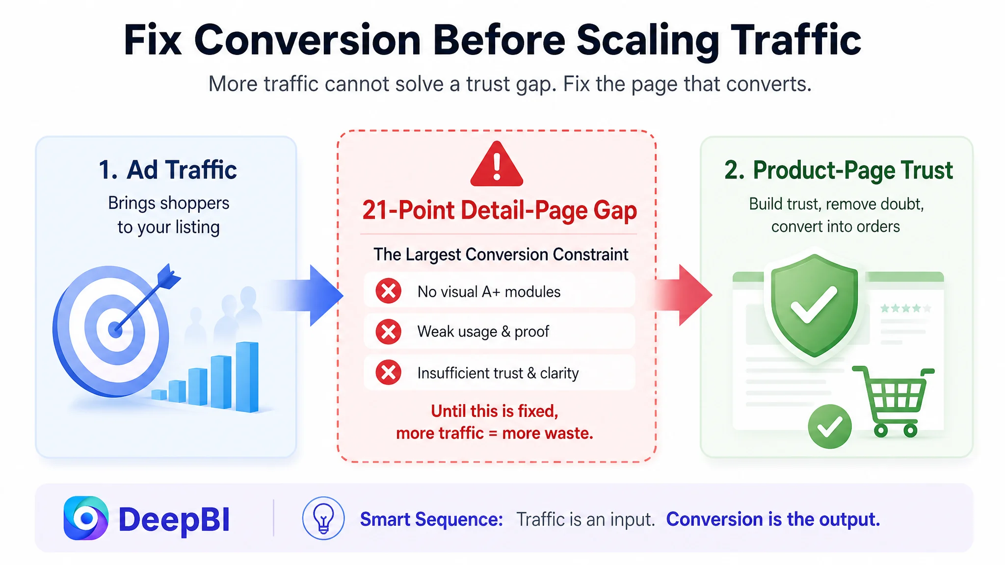
The most important finding was the 21-point detail-page gap.
That changed the operating question. Instead of asking, “How can the ads generate more efficient traffic?” the team needed to ask:
Can this Amazon product page convert the traffic it is already receiving?
The answer was not yet strong enough.
The Listing had no visual A+ modules and no embedded video. Its detail section relied largely on repeated text, leaving buyers without a clear view of the product’s form, scale, usage, materials, and practical context. By contrast, the benchmark Listing used a sequence built around family gardening, multiple outdoor environments, product components, and video.
This was not a cosmetic difference. It was a difference in how much purchase uncertainty each page removed.
The title was usable, but it did not make the buying decision easy
The title gap was smaller than the detail-page gap, but it still weakened both search matching and first-impression clarity.
The benchmark title placed the core phrase near the beginning and added:
- The number of pieces
- A clear tool list
- The target age range
- Boys and girls as the intended audience
- Outdoor and gifting contexts
- A color identifier
The customer’s title included the main category phrase, but its structure was more general. It did not communicate the product’s specific configuration or audience as efficiently.
For a parent scanning Amazon search results, “kids gardening set” is only the beginning of the decision. The title also needs to answer what is included, who it is for, and what kind of use it supports.
The proposed direction was therefore not to stuff the title with more words. It was to improve the order of information:
Core product phrase → wheelbarrow and tool configuration → outdoor use → audience and age → gifting context
That structure helps both sides of the funnel. It gives Amazon clearer relevance signals while helping shoppers decide whether the Listing matches their needs before they click.
The main image was not the weakest score—but its sequence was underperforming
The main-image dimension scored 26/30, slightly above the benchmark’s 24/30. That made the diagnosis more nuanced.
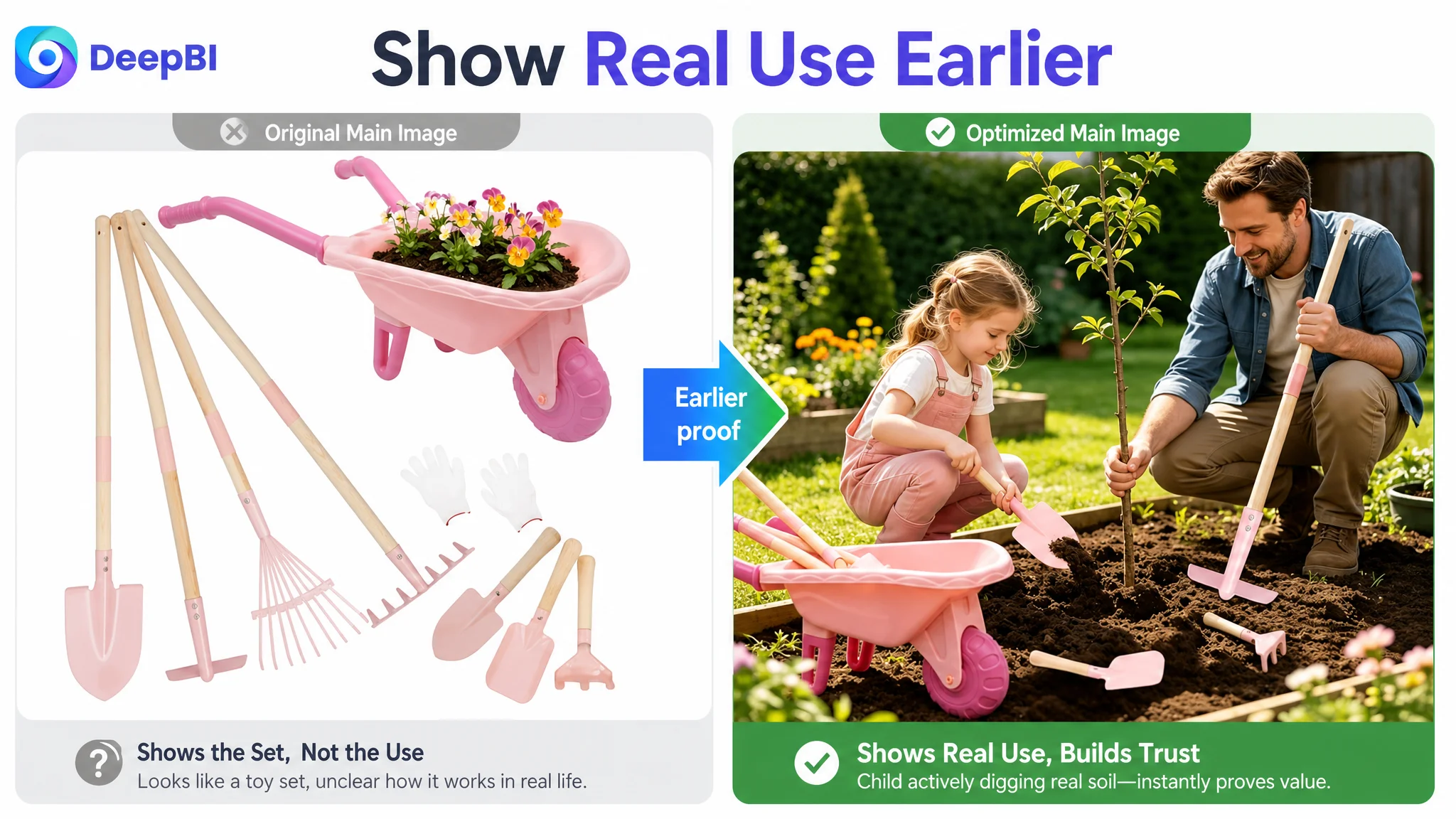
The issue was not that the product had no usable imagery. The issue was that the image sequence did not present the strongest proof early enough.
The first image mainly communicated a complete set and its color. It did not strongly signal real gardening activity. At thumbnail size, that could make the product feel closer to an ordinary toy set than a hands-on outdoor tool kit.
Other valuable images were also positioned too late:
- A child actively using the tools in realistic soil
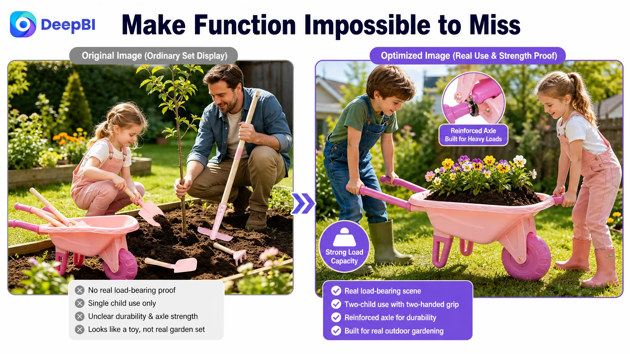
- Children using the wheelbarrow with real soil
- Multi-environment use
- Material and construction details
- The practical scale of the tools
DeepBI’s recommendation was to change the order of proof, not simply produce more pictures.
First, establish what the buyer receives
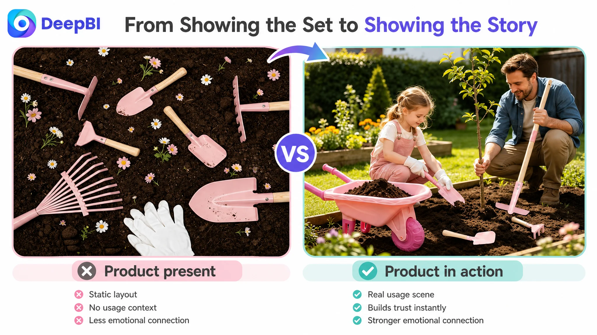
The opening product image should make the set feel complete and credible. The tools, wheelbarrow, and protective gloves should be clearly arranged, with the long-handle tools and their construction visually easy to recognize.
Then, prove that the product can be used
A realistic soil or planting scene should appear earlier. This addresses the parent’s immediate doubt: Can my child actually use these tools?
Next, show functional strength
The image showing a loaded wheelbarrow and children using the product contains important proof of practical capability. It should not be buried near the end of the sequence.
Finally, broaden the use case carefully
Beach play, sand digging, leaf cleanup, and other outdoor activities can expand perceived value. But the page should avoid making unsupported claims about high-risk environments. In this case, the recommendation specifically moved away from presenting snow as a core use scenario because that could create a mismatch between the promise and the product’s actual suitable use.
This was a sequencing decision. The Listing already had some of the necessary assets; it was not using them in the order buyers needed.
The bullet points contained information, but not enough decision logic
The customer’s bullet points and the benchmark Listing both scored 7/10, so the problem was not a complete lack of content.
The difference was in how the information was framed.
The customer’s bullets leaned toward:
- Product functions
- General use settings
- Educational value
- Gift positioning
The stronger Listing translated similar information into more specific purchase reassurance:
- What exactly is included
- What the tools are made of
- How the design fits children
- How the product can be stored
- Which age range it suits
- How parents and children can use it together
That distinction matters because parents do not read bullet points as a catalog alone. They use them to assess risk.
A stronger bullet structure for this Listing would connect each product attribute to a buyer concern:
- Complete set: What will arrive in the box?
- Metal heads and reinforced handles: Is it durable enough for real soil?
- Child-friendly size and storage details: Is it practical to use and put away?
- Gardening and outdoor skills: What does the child gain from the activity?
- Age and gifting context: Is it appropriate for the intended child?
The goal was not to make the copy louder. It was to make the path from feature to reassurance more direct.
The missing A+ story was the real conversion bottleneck
The most serious weakness was the detail page.
With no meaningful image-based A+ content, the Listing lost the opportunity to demonstrate the product rather than merely describe it. This was especially costly for a product that depends on physical scale, outdoor use, family interaction, and perceived durability.
A stronger A+ structure would follow the buyer’s questions in sequence.
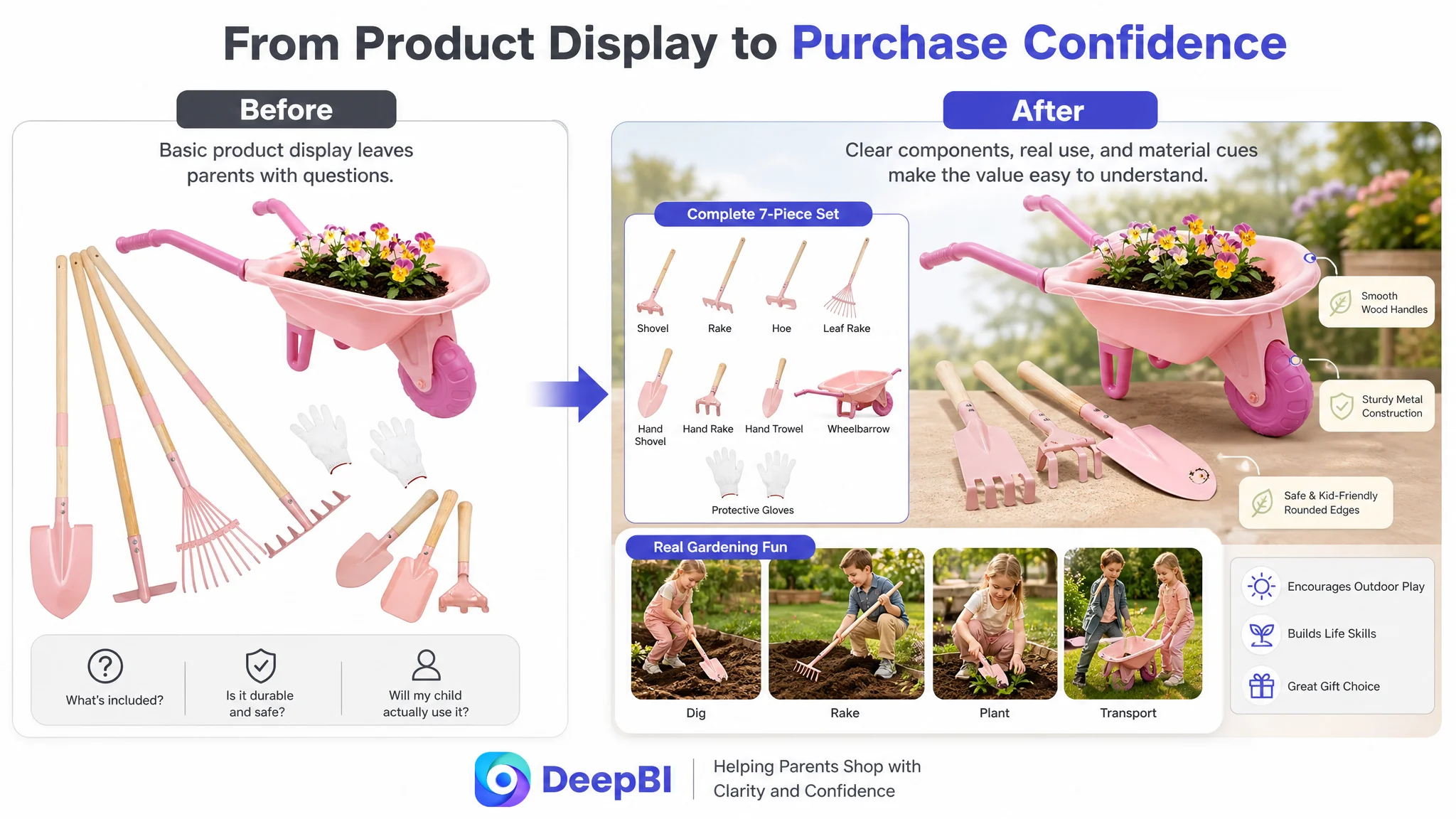
The set must be made concrete
The first module should clearly enumerate the main components in an organized layout. This reduces uncertainty created by a long title and helps buyers understand what they are actually purchasing.
The tools must be shown in action
The next section should demonstrate digging, raking, planting, and exploring nature. A progression from preparing soil to completing an outdoor task is more persuasive than a static lifestyle image because it shows what the product enables.
Materials need visual evidence
General claims about quality are weak without visible support. Close-ups of the metal tool heads, handles, connection points, and child-friendly grip can make durability more understandable without inventing specifications.
Family use should validate the product’s role
A scene of children helping adults clear leaves or work in the yard positions the set as a practical assistant rather than a disposable toy. It also supports the screen-free and family-time benefits already present in the product messaging.
Alternate outdoor use should expand value
Beach play and sand digging can show that the tools are useful beyond a garden, while remaining within realistic and supportable use cases.
The final modules should connect activity with outcome
The page can then show coordination, motor skills, responsibility, curiosity about nature, and a sense of accomplishment. These benefits matter to the parent buyer, but they become more credible when shown through actual activity.
Gifting should close the decision
Birthday, holiday, summer-play, and family-gardening contexts can provide the final purchase trigger. The emotional message should come after the product has already established completeness, usability, and trust.
A+ content was not an accessory for this Listing. It was the missing layer that connected product facts to purchase confidence.
Reviews added another layer of hesitation
The review profile made the page-level trust problem more difficult to overcome.
At diagnosis, the customer Listing had:
- 3.8 stars
- 5 total reviews
- 4 reviews visible on the first page
- A high share of negative feedback on the first page
- Reviews originating from the Vine program rather than a broader base of natural verified purchases
The benchmark Listing had:
- 4.4 stars
- 1,688 total reviews
- A much lower proportion of negative reviews
- A stronger volume signal from verified purchases
The difference was not something that title editing or ad bidding could immediately erase. It meant the Listing needed to compensate through clarity and evidence wherever possible.
When review volume is limited, the rest of the page has to work harder. Product completeness, material explanation, realistic use, and accurate expectations become especially important because buyers have fewer external signals to rely on.
This also explains why the recommendation avoided overstating the product. If the page promises more than the product can reliably deliver, the resulting mismatch can create additional negative feedback and return risk.
Why DeepBI did not keep tuning ads first
The decision to prioritize Listing conversion was based on the concentration of evidence:
1. The overall score trailed the benchmark by 28 points.
2. The detail-page gap accounted for 21 of those points.
3. Reviews created an additional trust disadvantage.
4. The main image and bullet points had usable foundations but weak sequencing and specificity.
5. The page lacked visual proof of completeness, durability, and real use.
Continuing to increase or refine ad traffic before addressing these constraints would have created a difficult measurement problem. More clicks could produce more sessions, but not necessarily more efficient orders. The ads might appear to underperform when the larger issue was that the product page was not ready to receive the traffic.
This is the operating principle DeepBI applied:
Fix the largest conversion constraint before scaling the traffic that feeds it.
The diagnosis was not based on a generic preference for better images. It connected the Listing score, competitor gap, page structure, review profile, and buyer decision sequence into one business judgment.
The optimization direction changed from “more traffic” to “better traffic absorption”
The recommended changes were therefore coordinated across the Listing rather than treated as separate copy and design tasks.
Title
Clarify the core product phrase, wheelbarrow configuration, tool count, audience, age range, outdoor use, and gifting context in a cleaner order.
Main image sequence
Move real use, material cues, child scale, and wheelbarrow functionality closer to the beginning of the browsing path. Remove repetitive product-array views where they do not add new information.
Bullet points
Replace broad feature listing with a more explicit connection between product attributes, parent concerns, usability, safety, storage, learning, and gifting.
A+ content
Build a visual narrative around:
- What is included
- What children can do
- Why the tools are durable and practical
- How families can use them together
- Where else they can be used
- What skills the activity supports
- Why the set works as a gift
The direction also maintained an important boundary: the page should not claim unsupported materials, certifications, capacities, or environments. For Amazon sellers, accuracy is part of conversion strategy because misleading expectations can convert into returns and negative reviews later.
What changed in the business understanding
The source case does not provide post-optimization CVR, ACOS, TACOS, or organic-order results, so it would be premature to claim a quantified performance improvement.
What did change was the team’s understanding of the problem and the order of operations.
The Listing was no longer treated as a passive destination for ad traffic. It became the central conversion asset that determined whether paid and organic traffic could produce stable business value.
The case clarified several operating risks:
- Ads can amplify a low-conversion page.
- A complete product set is not self-evident without visual organization.
- A strong image asset can lose value if it appears too late.
- Bullet points need to resolve buyer concerns, not only list functions.
- A+ content is especially important when reviews are limited.
- Realistic use scenarios are more persuasive than generic lifestyle decoration.
- Overstating use environments can create downstream service and return risk.
- Listing quality and advertising efficiency cannot be managed independently.
For this Amazon seller, the priority was not to keep pushing traffic into the same page. It was to make the page more capable of receiving that traffic.
The broader lesson for Amazon sellers
Many Amazon sellers respond to weak ACOS or low order volume by adjusting the visible traffic levers first. Sometimes that is correct. But when the Listing has a severe product-page trust gap, advertising optimization can become an expensive way to postpone the real decision.
The more useful diagnostic sequence is:
Look at the traffic problem. Then inspect whether the Listing can convert it.
In this case, the strongest clue was not that every Listing element was weak. Several parts were usable. The decisive clue was that the page lacked the central narrative needed to turn a child-oriented gardening tool set into a credible purchase:
- A complete set
- Real outdoor utility
- Durable and child-friendly construction
- Family participation
- Skill-building value
- Clear gifting relevance
Once that logic was visible, the optimization direction became clearer.
The customer had not simply needed more Amazon ads. The Listing first needed to earn the right to receive more traffic.