

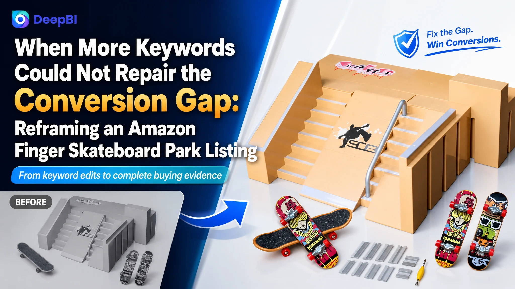
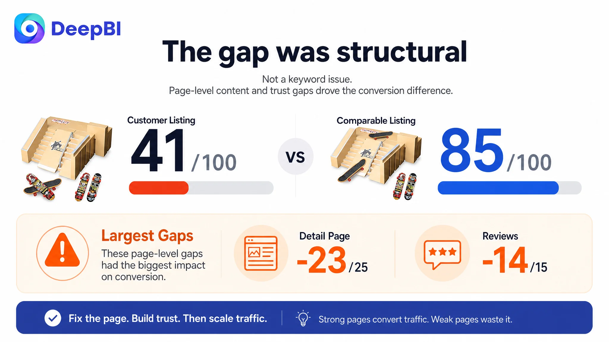
This case concerns an Amazon US seller of a DIY finger skateboard park kit for children and gift buyers. The Listing was not short of product features: it had a DIY concept, modular ramps, portability, age positioning, and gift potential. Yet its competitive position remained weak, with a total Listing score of 41/100 compared with 85/100 for a comparable high-performing listing.
The initial optimization direction naturally focused on the visible elements: move core keywords earlier in the title, make the product set look fuller, improve the main images, and reorganize the bullet points. Those changes were useful, but they did not explain the entire conversion problem.
DeepBI identified a deeper constraint. The product page was missing the content that helps parents and gift buyers understand how the kit works, what is included, how flexible the layouts are, and why it is worth buying. The largest gap was not a single keyword or isolated image. It was the absence of a complete sales story across the Amazon product page, especially in A+ content and trust-building material.
The later optimization therefore focused on restoring Listing conversion capacity: clearer product value in the title, stronger visual evidence in the images, a more persuasive bullet-point sequence, modular DIY demonstrations, family-use scenarios, assembly guidance, and a complete A+ content structure. Other Amazon sellers can take away a practical lesson: before using Amazon ads to scale traffic, first determine whether the Listing gives that traffic enough reasons to click, trust, and buy.
The Listing Had Product Information, but Not Enough Buying Evidence
At first glance, the Listing appeared to have several workable foundations.
The product was positioned as an 8-in-1 finger skateboard ramp set with two mini fingerboards, DIY assembly, a 5+ age recommendation, and gift use for boys and girls. The bullet points covered:
- DIY play
- Material safety
- Portability
- Gift and family-use scenarios
- A complete set concept
The Listing also included a satisfaction guarantee in the bullet points, which could help reduce purchase hesitation.
But Amazon shoppers do not evaluate these elements independently. They form a judgment from the entire page:
- Does the main image make the set look substantial?
- Does the title communicate the product type quickly?
- Can the shopper understand how many layouts are possible?
- Does the page show the product being used by real people?
- Is assembly likely to be easy?
- Are all pieces and dimensions clearly explained?
- Does the Listing provide any review history or social proof?
On these questions, the page was not providing enough evidence.
That distinction matters because a product can have legitimate selling points and still fail to convert. The problem is not always the absence of value. Sometimes the problem is that the page does not make the value visible soon enough or convincingly enough.
The Listing did not lack features. It lacked a connected reason for the shopper to believe those features mattered.
The First Diagnosis Stopped at the Visible Layer
The available optimization direction shows why this type of Listing can be misread.
The title had keywords and product attributes, but its structure leaned toward listing functions and components. The comparable high-performing listing placed the core phrase “Finger Skateboard Park Kits” earlier, added specific quantity information, and covered more related search terms such as finger bikes and skatepark ramps.
That made title restructuring an obvious priority.
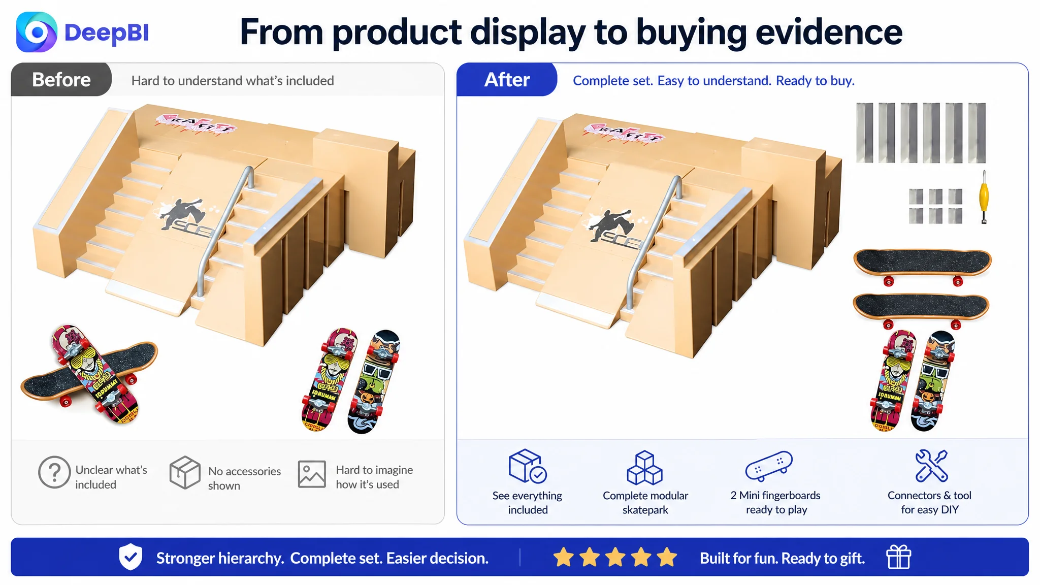
The main images also presented clear opportunities. The visual center was not strong enough, the accessory presentation lacked order, the dynamic use angle was too flat, and the assembly image included distracting hand details. These weaknesses could affect both click appeal and product understanding.
The bullet points were less problematic than the other dimensions. In fact, the customer Listing had several structural advantages:
- It opened with the DIY play concept.
- It included a direct satisfaction guarantee.
- It followed a clearer sequence from product, to safety, to portability, to use case, to assurance.
- It avoided some of the repetition found in the comparable listing.
This is important because it prevents the diagnosis from becoming a generic recommendation to rewrite everything. The bullet points were not the largest commercial leak. The bigger issue was that the page lacked the visual and informational depth needed to support the product's value.
A seller looking only at keywords or individual images might conclude that the page needed more polish. DeepBI's comparison showed that the issue was more structural: the Listing was asking shoppers to infer too much.
The Largest Gap Was Not in the Title
The five-dimension comparison made the priority clearer:
- Title: Customer Listing: 12/20, Comparable high-performing Listing: 16/20, Gap: -4
- Main image: Customer Listing: 23/30, Comparable high-performing Listing: 27/30, Gap: -4
- Bullet points: Customer Listing: 6/10, Comparable high-performing Listing: 5/10, Gap: +1
- Detail page: Customer Listing: 0/25, Comparable high-performing Listing: 23/25, Gap: -23
- Reviews: Customer Listing: 0/15, Comparable high-performing Listing: 14/15, Gap: -14
- Total: Customer Listing: 41/100, Comparable high-performing Listing: 85/100, Gap: -44
The page-level difference was much larger than the title or main-image difference.
The customer Listing had no A+ content. The comparable listing used a broad visual sequence covering:
- A complete product overview
- A scenario-based unboxing presentation
- Modular combination demonstrations
- Assembly details
- Core selling points
- Close-up operation scenes
- An accessory checklist
- Multiple family-use environments
The absence of this layer meant that the product page could introduce the kit, but could not fully sell the experience.
The review dimension created another major trust gap. The customer Listing had no review history or homepage reviews, while the comparable listing had a 4.6-star rating and 292 total reviews. This is not a content defect that can be solved through copywriting alone. It is a market-validation gap that affects how confidently a shopper interprets every other claim on the page.
That is why the central diagnosis had to move beyond “improve the title” or “make the images more attractive.”
The Real Constraint Was Listing Conversion Capacity
For this product category, the decision maker may be a parent, while the user may be a child or a young fingerboard enthusiast. The page therefore needs to satisfy more than one kind of question.
A child may care about:
- How many ramps are included
- Whether different layouts are possible
- Whether the product looks exciting to use
- Whether fingerboards and accessories are included
A parent or gift buyer may care about:
- Whether the product is safe and complete
- Whether assembly is manageable
- Whether it offers meaningful play beyond a single use
- Whether it can support family interaction
- Whether the product will match the expectations created by the images
The customer Listing did not consistently connect these questions to visual proof.
The title communicated the product category and some value, but not with the clearest search structure. The main images displayed the product, but did not create enough visual impact around the full set, the layouts, or the play experience. The bullet points contained useful information, but the rest of the page did not reinforce it. The detail section was empty, leaving no space for a deeper explanation. The review section offered no external reassurance.
This combination created a conversion bottleneck:
The Listing received an opportunity to be considered, but it did not provide enough evidence for a confident purchase decision.
That is a different problem from insufficient traffic.
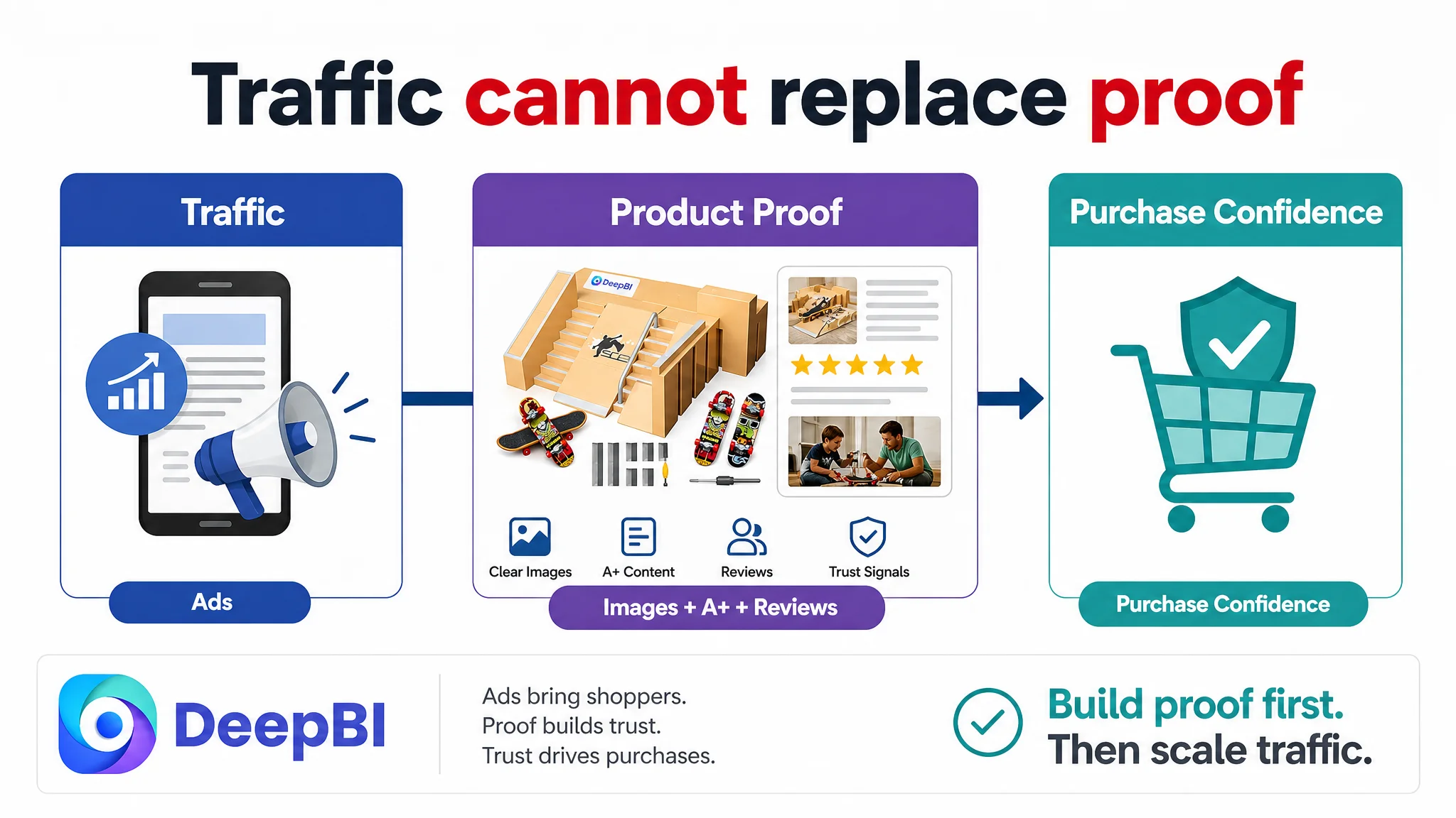
Advertising can bring a shopper to an Amazon product page. It cannot, by itself, explain a missing A+ story, demonstrate modularity, establish assembly confidence, or replace review history. If the page is weak at that stage, additional traffic may expose the weakness more often without resolving it.
Amazon advertising can amplify a Listing's reach. It cannot substitute for the Listing's missing proof.
Why DeepBI Did Not Treat Every Gap as Equal
A useful diagnosis does not simply identify every difference between two pages. It determines which difference is most likely to constrain the business outcome first.
In this case, the title gap was real but limited. A revised title could improve search clarity by moving “finger skateboard ramp set” closer to the front, adding the DIY skate park concept, preserving the 5+ age positioning, and incorporating the gift context.
The main-image gap was also actionable. A stronger product-centered composition could make the set appear more complete and easier to understand. A more organized accessory image could clarify what the customer receives. A low-angle action image could communicate the experience more effectively.
But even strong images would leave a major problem unresolved if the product page still had no A+ content.
The largest opportunity was therefore to create the missing layer that connects:
- Product components
- Layout flexibility
- Assembly
- Skill development
- Family interaction
- Gift value
- Portability
- Product completeness
This prioritization reflects a business judgment: the page needed to become more persuasive before further traffic expansion could be evaluated properly.
The Title Needed Better Search and Value Logic
The recommended title was:
8-in-1 Finger Skateboard Ramp Set with 2 Mini Fingerboards, DIY Fingerboard Skate Park Kit for Kids Ages 5+, Finger Toy Gift for Boys and Girls, Mini Fingerboards Skatepark Accessories Set
The value of this direction was not simply adding more keywords.
It improved the order in which the shopper receives information:
1. Product type
2. Set quantity
3. Included fingerboards
4. DIY use
5. Age positioning
6. Gift audience
7. Related category language
This structure gives the title a clearer commercial role. It supports search relevance while also helping a shopper quickly understand what the product is and who it is for.
The original title contained keywords and selling points, but the information was less tightly organized. The revised direction treated the title as an entry point into the product story rather than a container for disconnected attributes.
The Main Images Needed to Answer Questions Earlier
The main-image recommendations were designed around specific decision problems rather than general visual improvement.
The product needed to look like a complete set
A centered ramp module occupying most of the frame, surrounded by the relevant fingerboards and components, would create a stronger first impression of completeness. The goal was to show the set as a coherent product rather than a scattered group of toy parts.
The accessories needed to be countable and understandable
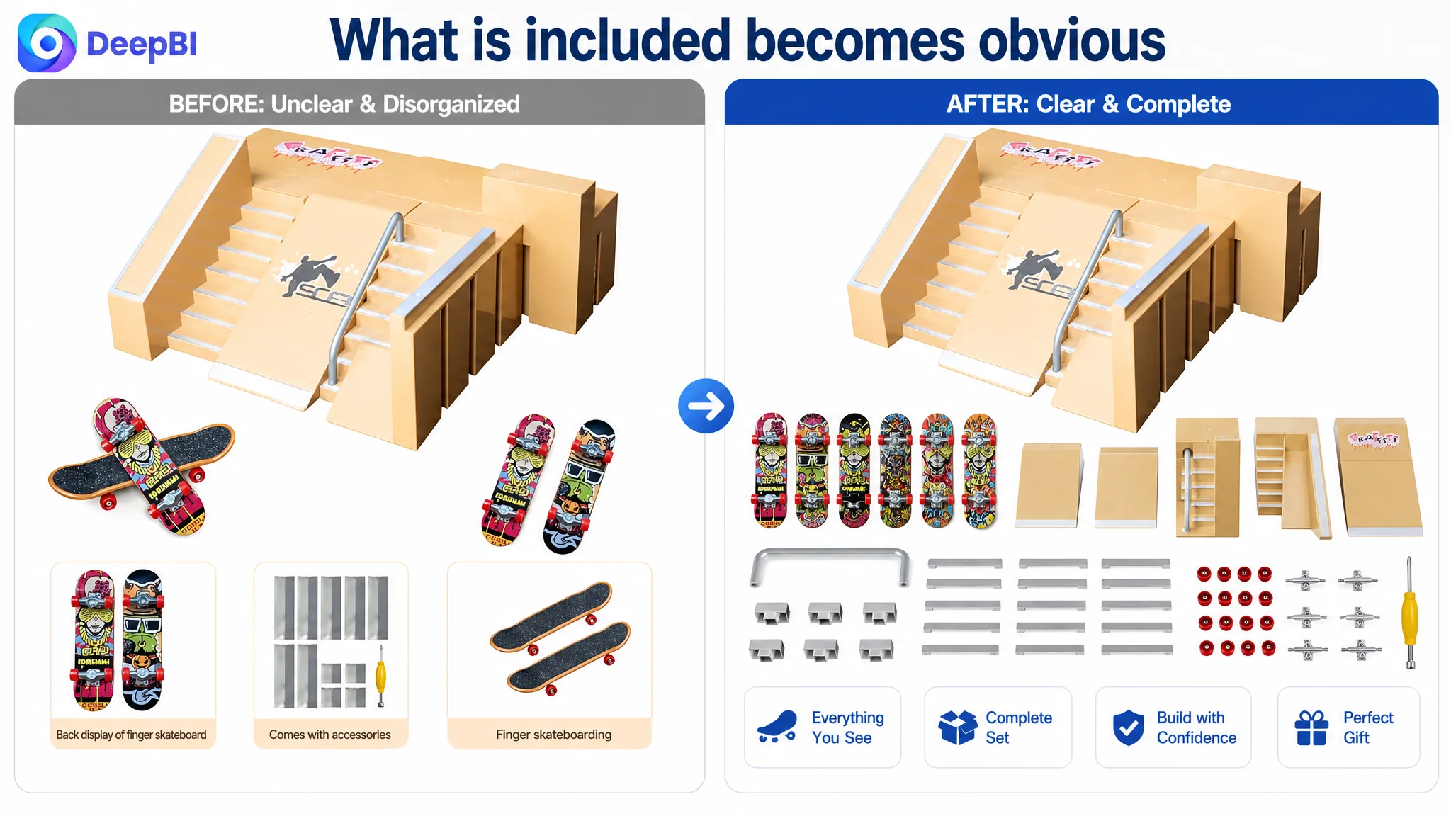
A grid-style arrangement of ramps, fingerboards, connectors, tools, and other included pieces could reduce uncertainty about what is in the box. A clear inventory-style composition is especially important for a modular kit, because perceived value depends partly on the number and variety of usable components.
The action needed to look playable
A low-angle image showing a fingerboard moving along a rail or ramp could communicate the product's intended interaction more effectively than a static display. The point was not to make the product appear larger than it is, but to make its play logic visible.
The dimensions needed to look professional
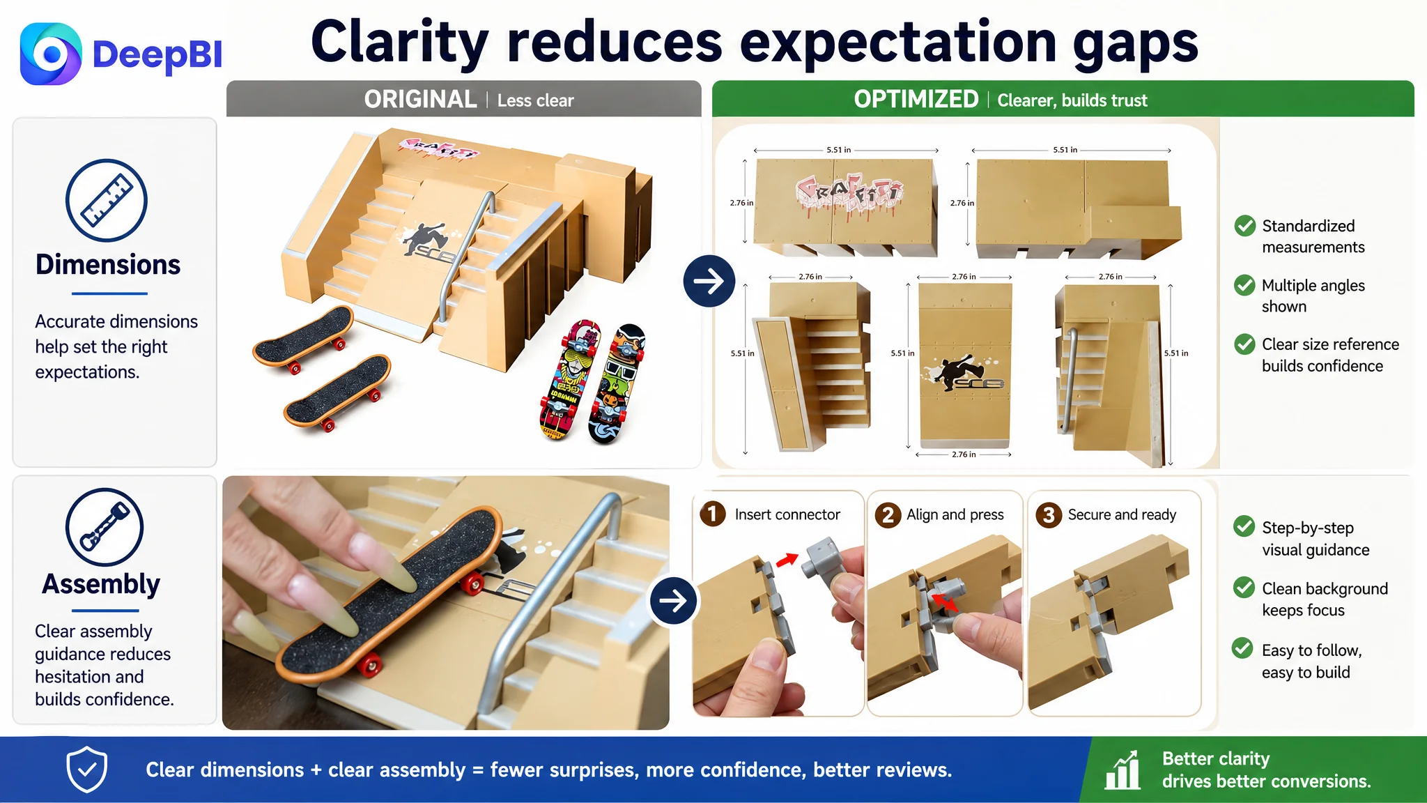
A consistent three-view presentation with clean measurement labels could help customers understand the product's physical scale. For a miniature toy, this is not a minor detail. It helps prevent mismatched expectations about size and supports more informed purchasing.
The assembly process needed to feel approachable
The existing hand-focused assembly image could be replaced with a cleaner step-by-step presentation. Clear connection points, uncluttered backgrounds, and simple English instructions would help reduce the perceived difficulty of DIY assembly.
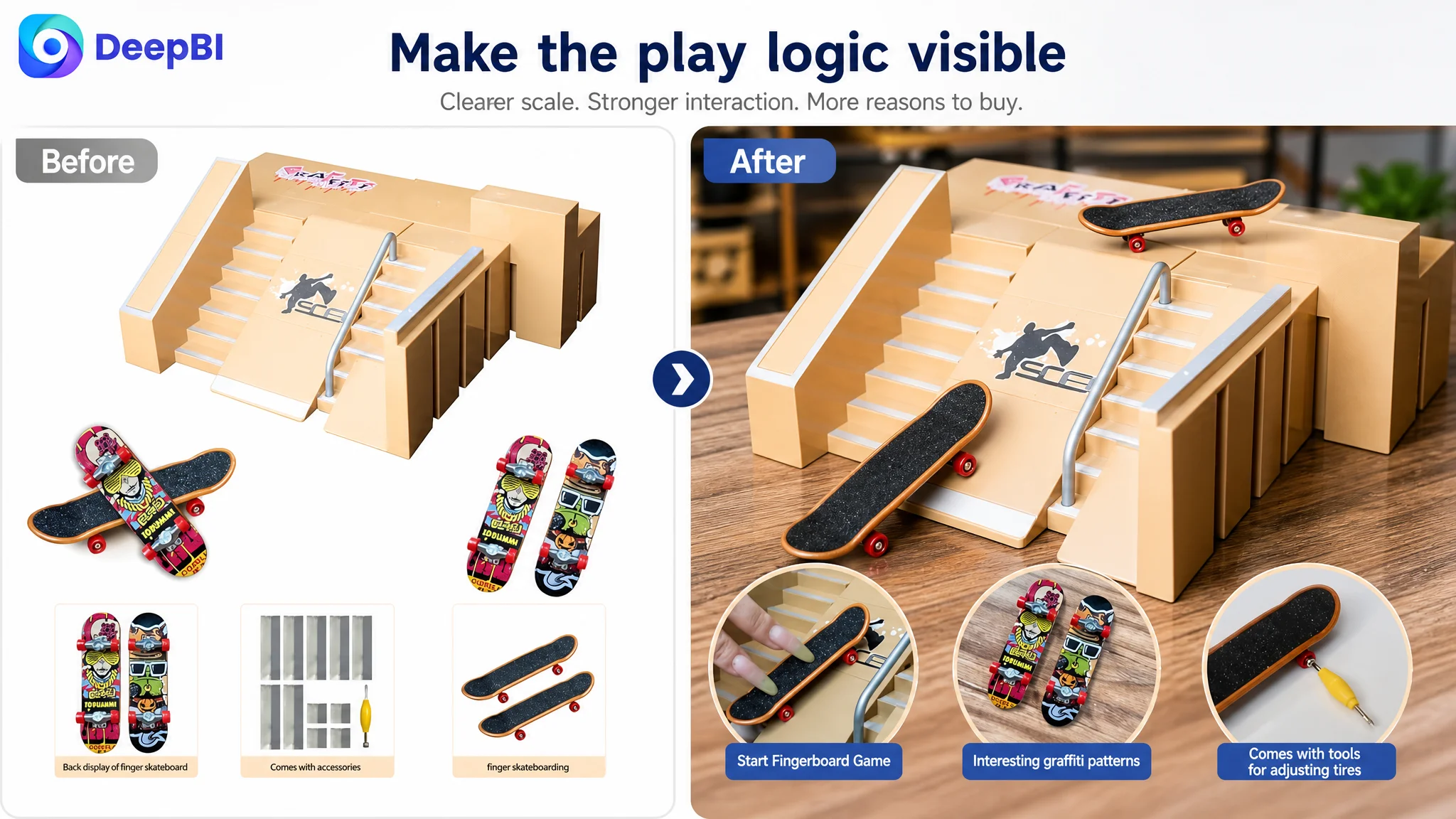
These recommendations were constrained by the actual product. They changed composition, perspective, lighting, information order, and context without changing the product's physical design or inventing unsupported specifications.
The Bullet Points Were Rebuilt Around a Buying Sequence
Because the bullet points already had some strengths, the goal was not to overwrite them with generic claims. The recommended structure made each point answer a different concern.
1. Show the play system
The first point positioned the product as a DIY skatepark builder with interchangeable ramp pieces, connectors, and fingerboards. This gave the kit a stronger sense of active creation and repeat play.
2. Connect safety with development
The second point combined the stated material positioning with coordination, dexterity, focus, and reduced screen-time messaging. This allowed the product to speak to both play value and the parent's interest in meaningful activity.
3. Reduce assembly and portability concerns
The third point explained the snap-fit design, included screwdriver, portable size, and use across home, school, and travel settings. It converted “easy to assemble” into a more concrete product experience.
4. Make the gift use case specific
The fourth point connected the kit with birthdays, Christmas, school rewards, desk decoration, and shared play. This supported the gift-oriented shopping context without relying on vague “perfect gift” language alone.
5. Reinforce completeness and shared use
The fifth point focused on the set as a ready-to-use activity with stress-relief and social value. It also avoided relying on a return-policy statement that could create Amazon Listing compliance concerns in the bullet points.
The improvement here was not greater information density for its own sake. It was clearer division of labor. Each bullet point had a role in the purchase decision.
A+ Content Had to Restore the Missing Sales Story
The largest recommended change was the creation of a complete A+ content sequence.
Start with the product as a giftable experience
A full product view paired with a child holding the gift box would establish the product's emotional and practical context. The kit would no longer appear as a collection of small plastic components; it would appear as an activity that can be given, opened, assembled, and enjoyed.
Show multiple layouts side by side
A circular comparison of four different configurations would make the modular concept immediately visible. For a product marketed around DIY play, “multiple layouts” should not remain a text claim. It needs visual evidence.
Demonstrate the connection points
A close-up assembly module could address concerns about loose or difficult connections. The objective is to show how the parts fit together, not merely to say that assembly is simple.
Connect play with family interaction
A home-use scene featuring a parent and child could add context for the educational and social value of the product. The page would communicate that this is not only a solitary desktop toy but also an opportunity for shared activity.
Show the operating scale
Close-up images of fingers performing jumps, ramps, and other actions would help experienced users judge whether the product looks genuinely playable. Scale and interaction are critical for miniature sports toys.
Clarify the accessory list
A structured component chart with dimensions and quantity information could reduce uncertainty and prevent expectation gaps. If accessory colors are random, that information should also be stated accurately and visibly.
Show portability across environments
Indoor flooring, outdoor grass, and a tabletop scene would reinforce that the kit can be used in different settings. The visual message is simple: the product is compact enough to move, but substantial enough to support different play configurations.
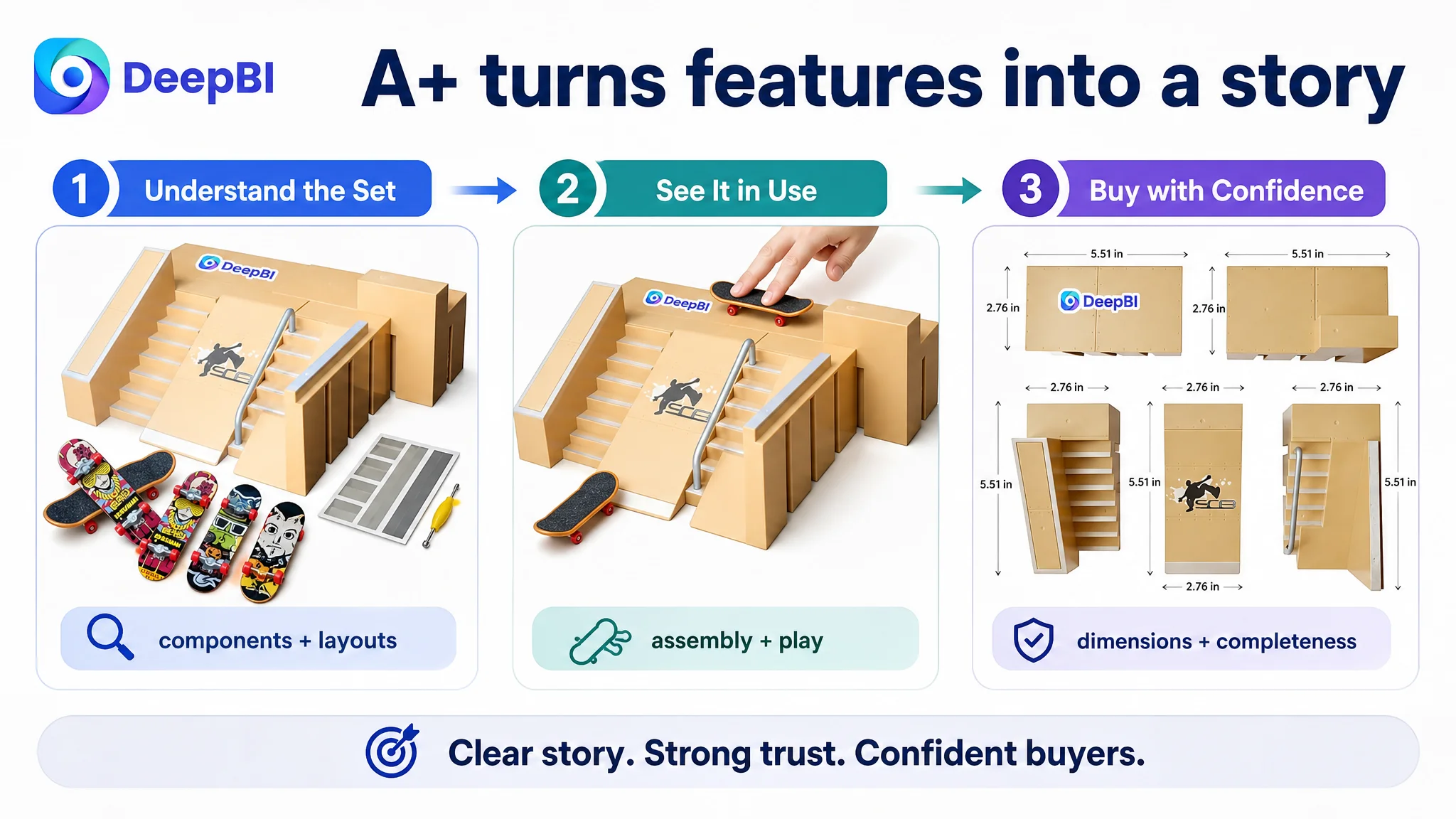
Together, these modules would turn the page from a product display into a guided decision path.
The Review Gap Required a Different Kind of Patience
The comparison also showed a 14-point gap in reviews. This matters because review history serves a different function from images and copy.
Images can explain the product. Bullet points can organize its value. A+ content can deepen trust. Reviews show that other customers have already taken the risk of buying and using it.
A new Listing with no review data cannot manufacture that confidence through design. It must instead avoid making the page's trust gap worse by ensuring that:
- Product contents are clearly stated
- Dimensions are accurate
- Assembly expectations are realistic
- Product images match the item received
- Accessory color variation is disclosed where relevant
- The product experience is represented honestly
This is also where DeepBI's product-accuracy constraints matter commercially. Visual optimization should not alter the product's structure, add nonexistent accessories, exaggerate proportions, or create a play scene that the actual kit cannot support.
Better presentation can improve understanding. It cannot replace authentic customer validation.
What Other Amazon Sellers Should Examine Before Scaling Traffic
This case does not provide post-optimization advertising or sales results, so no claim can be made about a later CVR increase, ACOS decline, or organic-order recovery.
What it does show is how to choose the right operating sequence.
Before increasing Amazon ads or judging ad efficiency, sellers should ask:
- Is the main image strong enough to earn attention in search results?
- Does the title identify the product and its primary value quickly?
- Do the bullet points follow a buying logic rather than repeat specifications?
- Does the product page show how the product works?
- Are assembly, dimensions, contents, and use scenarios clear?
- Is A+ content carrying the deeper explanation?
- Does the page have any review history to support its claims?
- Are ads being used to scale a credible Listing or to compensate for a weak one?
For this finger skateboard park Listing, the most important answer was not “add more keywords.” It was “build the missing conversion structure.”
Before asking Amazon ads to bring more shoppers, ask whether the product page has earned the right to receive them.
The Business Lesson Was a Change in Diagnosis
The customer case began with a Listing that had identifiable surface weaknesses: an under-structured title, less competitive main-image presentation, and limited visual proof.
But the score comparison showed that these were not the full story. The defining constraint was the absence of a complete product-page narrative, reinforced by a missing review foundation.
DeepBI's role in this diagnosis was not to recommend more changes indiscriminately. It was to separate the smaller gaps from the one that most affected the page's ability to convert:
- The title needed clearer search and value ordering.
- The main images needed stronger product hierarchy and use evidence.
- The bullet points needed a more deliberate decision sequence.
- The A+ page needed to be created rather than refined.
- The review gap needed to be managed through accurate expectations and time, not disguised through design.
That reframing changed the optimization order.
The Listing should first become easier to understand, more credible, and more persuasive. Only then can Amazon ads provide a clean test of traffic quality and advertising efficiency.
The broader lesson is straightforward: Amazon Listing optimization is not a collection of isolated edits. It is the construction of a page that allows paid and organic traffic to make a confident decision.