

This case involved an Amazon US seller whose watering can Listing was receiving attention but lacked the page strength needed to turn that attention into confident purchases. The customer initially viewed the problem mainly as an advertising and traffic issue: perhaps the keywords, bids, or campaign structure needed further adjustment.
The deeper diagnosis pointed elsewhere. DeepBI found a 49/100 Listing score against 85/100 for a comparable high-performing watering can Listing, with the largest gaps concentrated in the product-detail experience and review trust. The page had usable product information, but it did not give shoppers enough visual proof, context, or reassurance after the click.
The later optimization therefore focused less on continuing to tune Amazon ads first and more on rebuilding the Amazon product page: clarifying the title, strengthening the main-image logic, turning the long spout into a precision-watering advantage, and creating a structured A+ story around capacity, ease of use, durability, and indoor-and-outdoor applications. For other Amazon sellers, the case is a reminder that rising ad pressure can sometimes be a symptom of weak Listing conversion rather than a standalone campaign problem.
The Amazon seller saw a traffic problem. The page showed a conversion problem.
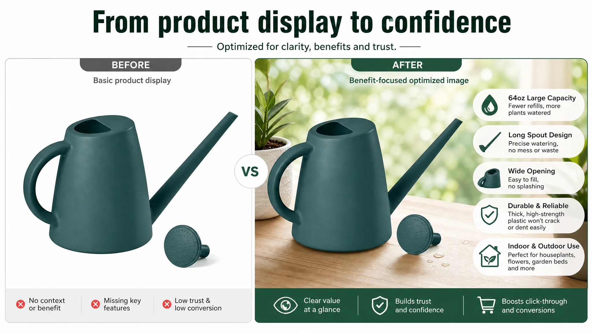
The product was a 64-ounce watering can positioned for indoor and outdoor plants. Its Amazon Listing already contained several commercially useful points:
- A relatively large half-gallon capacity
- A long spout for targeted watering
- Indoor and outdoor use
- A wide opening intended to make filling easier
- Thick, high-strength plastic positioning
- A compact form and modern appearance
The customer’s five bullet points were not empty. In several areas, they were more commercially structured than the comparable Listing. They connected capacity with fewer refills, described targeted watering, and covered durability, filling convenience, and usage scenarios.
Yet the overall Listing was still weak.
That distinction mattered. A product page can contain the right facts and still fail to create a convincing buying path. On Amazon, paid traffic does not stop at the click. It has to move through the title, images, bullet points, A+ content, and reviews before it becomes an order.
The issue was not simply whether the product had selling points. It was whether the page made those selling points easy to believe and easy to use in a purchase decision.
The original diagnosis stayed too close to Amazon ads
When ACOS becomes difficult to control, Amazon sellers commonly look first at the advertising layer:
- Are the bids too high?
- Are the keywords too broad?
- Is campaign structure wasting spend?
- Should search terms be refined?
- Should budget be shifted between campaigns?
Those questions are valid, but they are not always the first questions to answer.
If the product page does not convert the traffic that advertising generates, better traffic management can only improve the efficiency of a weak system at the margins. Ads may bring more relevant shoppers, but the page still has to explain why the product is worth choosing.
In this case, the customer had been inclined to treat the pressure as an Amazon advertising optimization problem. DeepBI reframed it as a Listing conversion-capacity problem.
That change in judgment altered the order of operations. Instead of continuing to send more traffic toward an underdeveloped page, the team first needed to determine where the page was losing confidence.
The score gap was not evenly distributed
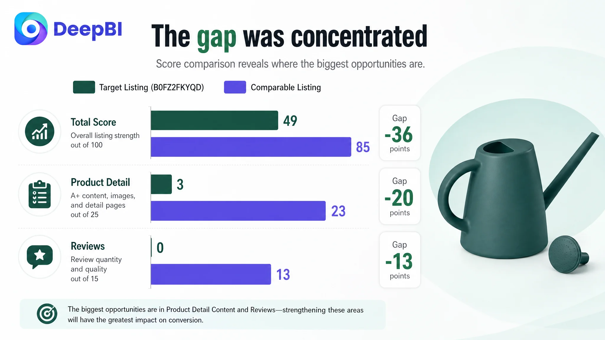
DeepBI’s comparison produced a total Listing score of 49/100, compared with 85/100 for a comparable high-performing Listing.
The difference was not spread equally across every component:
- Title: Target Listing: 14/20, Comparable Listing: 17/20, Gap: -3
- Main image: Target Listing: 24/30, Comparable Listing: 25/30, Gap: -1
- Bullet points: Target Listing: 8/10, Comparable Listing: 7/10, Gap: +1
- Product detail content: Target Listing: 3/25, Comparable Listing: 23/25, Gap: -20
- Reviews: Target Listing: 0/15, Comparable Listing: 13/15, Gap: -13
This distribution changed the diagnosis immediately.
The title had room for improvement. The main images were not as competitive in visual communication. But neither was the primary constraint. The largest deficit was in the product-detail experience, followed by the absence of review proof.
That meant the page did not mainly suffer from a keyword problem or a single unattractive image. It suffered from a missing persuasion layer.
The largest leak was the missing A+ story
The target Listing had no A+ content structure beyond basic text. The comparable Listing used multiple visual modules to guide shoppers through a fuller decision process:
- A contextual hero image
- Functional close-ups
- Filling and handling details
- Product-use comparisons
- Multiple application scenarios
- A more emotionally engaging household setting
This difference was commercially important because a watering can is not always an urgent purchase. It is a practical, relatively low-involvement product where visual context can influence whether a shopper feels the product is convenient, reliable, and suitable for their plants.
The target Listing gave shoppers specifications. The comparable Listing gave shoppers a use case.
That is the difference between saying:
“This watering can holds 64 ounces.”
and showing what that capacity means:
“You can water more plants with fewer interruptions and fewer trips to the tap.”
The product detail section should have carried the page from basic recognition to purchase confidence. Instead, shoppers had to infer too much for themselves.
The page did not show how the product fits into a routine
The missing A+ structure left several practical questions unanswered:
- How easy is it to fill?
- What does the long spout help with in real use?
- How does the product work around dense foliage?
- Is the capacity large enough to reduce repeated refills?
- Does the plastic construction appear durable enough for regular use?
- Does it fit indoor plants as well as outdoor garden beds?
- Why choose this watering can over another similar option?
These questions are not all solved by adding more copy. They require an organized visual sequence.
DeepBI therefore treated the detail-page gap as a business constraint, not a design preference. The page needed to build a complete journey from product identity to functional understanding, risk reduction, and final purchase reassurance.
The title had keywords, but not enough reasons to click
The existing title placed “Watering Can” toward the front and followed a generally compliant structure. That gave it a basic level of search relevance.
But its commercial communication remained limited.
It did not clearly emphasize:
- The long-spout design
- Indoor and outdoor plant use
- House plants and garden flowers
- The product’s plastic construction
- The relationship between its capacity and daily watering efficiency
It also used “1/2 Gallon (64oz)” without the approximate metric conversion included in the comparable title. That could reduce coverage among shoppers who search or evaluate products using different measurement habits.
The recommended direction reorganized the title around:
Brand or product identity → core product type → material and key attribute → use scenario → capacity → long-spout application → color
The objective was not to fill the title with more words. It was to make the first visible portion of the Amazon product page answer three questions quickly:
1. What is the product?
2. Who is it for?
3. What practical advantage does it offer?
The title also needed to support long-tail relevance through terms such as indoor plants, house plants, and garden flowers without relying on promotional or exaggerated language.
The main image was not the biggest score gap, but it still slowed understanding
The main-image score was only one point behind the comparable Listing. That was a useful finding because it prevented the team from overreacting.
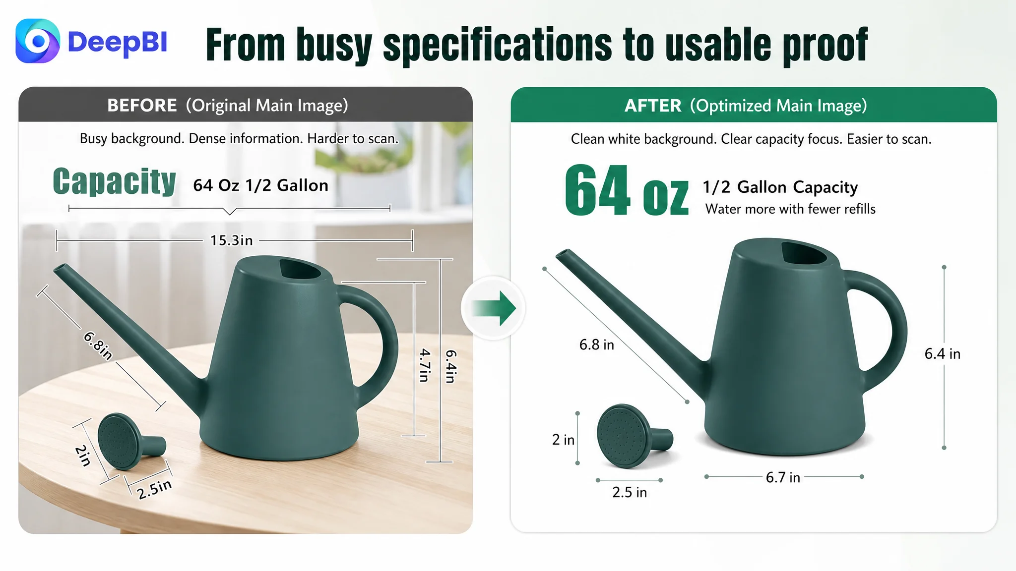
The main image was not fundamentally unusable. Its weakness was that it did not communicate the product’s strongest advantages quickly enough, especially in the search-result environment.
The recommended visual direction focused on making existing product attributes easier to understand:
Capacity should become a user benefit
The 64-ounce capacity needed to be shown as more than a number. A cleaner dimension and capacity presentation could connect the specification to fewer refills and more efficient watering.
The image should avoid a busy background and excessive measurement lines. Function-oriented shoppers should be able to identify the relevant information immediately.
The long spout needed a clear job
A long spout is not automatically persuasive. The shopper needs to see what it enables.
The stronger message was targeted watering: reaching through dense foliage, directing water toward soil and roots, and reducing unnecessary splashing or waste. This reframed the feature from a basic shape difference into a practical control advantage.
Assembly and filling convenience needed a sequence
The existing detail collage showed product parts but did not create a clear progression. It presented components without fully explaining how they supported use.
A more effective visual sequence would show:
- The main body
- The filling opening
- The long-spout configuration
- Any confirmed attachment or component
- How the product is handled during use
The recommendation was to highlight only features that the product actually includes. DeepBI’s visual logic is not to add attractive but unverified functions; it is to make confirmed functions more legible.
Functional modes should not be implied without proof
The case material identified a competitive gap around the comparable Listing’s water-flow presentation. If the product configuration supports a confirmed attachment or flow option, that difference can be shown directly. If not, the page should remain focused on the verified long-spout precision advantage rather than imitate a feature the product does not have.
That boundary matters. A stronger image is useful only when it remains consistent with the product buyers receive.
The bullet points were a relative strength
The five bullet points scored 8/10, slightly ahead of the comparable Listing’s 7/10. This was one of the most important counter-signals in the diagnosis.
It showed that the customer had not failed across the entire Listing. The bullet-point logic already had several strong foundations:
- Capacity was linked to fewer trips and less interruption
- The long spout was associated with targeted watering
- Indoor and outdoor use was clearly represented
- Each point generally focused on a single benefit
- The structure connected product attributes with practical use
This is why DeepBI did not recommend treating every content element as equally urgent.
The problem was not that the bullet points had no value. The problem was that the page around them did not provide enough visual and trust support to make those claims persuasive.
From feature listing to decision sequence
The revised bullet-point direction strengthened the progression:
1. 64-ounce capacity — fewer refills and more efficient watering
2. Precision long spout — reaches difficult areas and directs water toward soil
3. Durability — thick, high-strength plastic positioned for regular use
4. Easy filling — a wide opening that simplifies the routine
5. Indoor and outdoor versatility — one tool for houseplants, flowers, garden beds, and related use cases
The goal was a complete attribute-to-outcome loop:
Product feature → practical benefit → specific user situation
That structure is more useful than simply adding more adjectives or repeating category keywords.
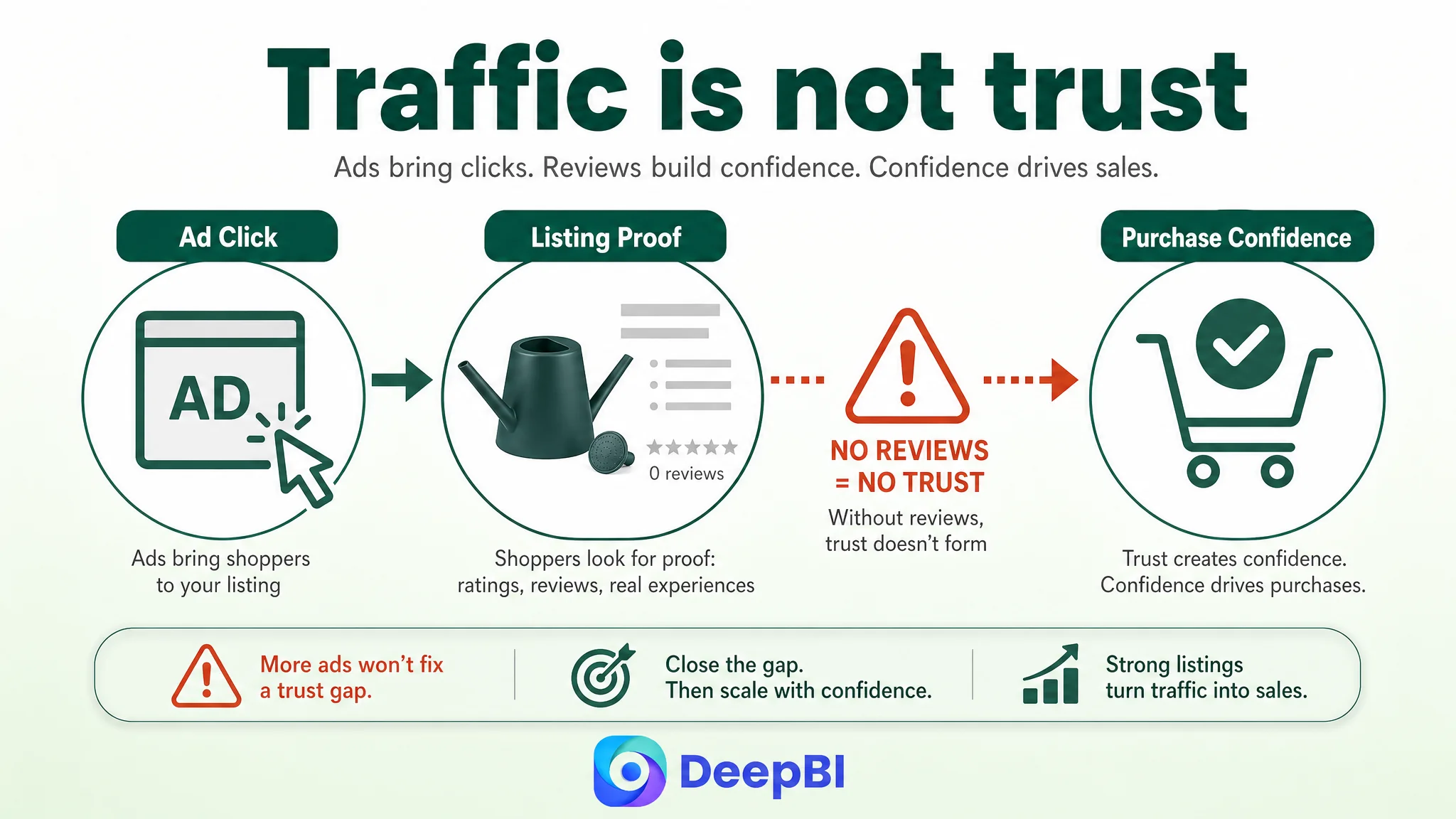
The review gap created a trust problem ads could not solve
The target Listing had no review count and no visible rating. The comparable Listing had a 4.3-star rating and more than 12,000 reviews, including detailed reviews with images or video.
This was not a minor disadvantage. It affected the entire decision environment.
When a shopper arrives through an Amazon ad, the page must overcome uncertainty quickly. Without reviews, the shopper has fewer external signals confirming:
- Whether the product matches its description
- Whether the plastic feels durable in practice
- Whether the spout is convenient
- Whether the capacity is manageable
- Whether the product works as expected indoors and outdoors
A stronger A+ page can improve clarity and confidence, but it cannot manufacture review history. That made the review gap a structural risk rather than a copywriting issue.
DeepBI’s role here was not to promise an immediate solution to the review deficit. It was to separate what could be improved through Listing optimization from what represented a longer-term trust disadvantage.
That distinction prevented the team from expecting a new image or revised title to erase the effect of zero reviews.
Advertising can create the visit. It cannot create the customer’s prior confidence in a product that has no review evidence.
Why DeepBI did not keep tuning ads first
The decision to prioritize the Listing was based on the size and location of the gaps.
The title and main image had moderate opportunities. The bullet points were already comparatively strong. But product-detail content was 20 points behind the benchmark, and reviews were 13 points behind.
Continuing to optimize Amazon ads first would have increased the risk of amplifying a page that was not ready to convert efficiently.
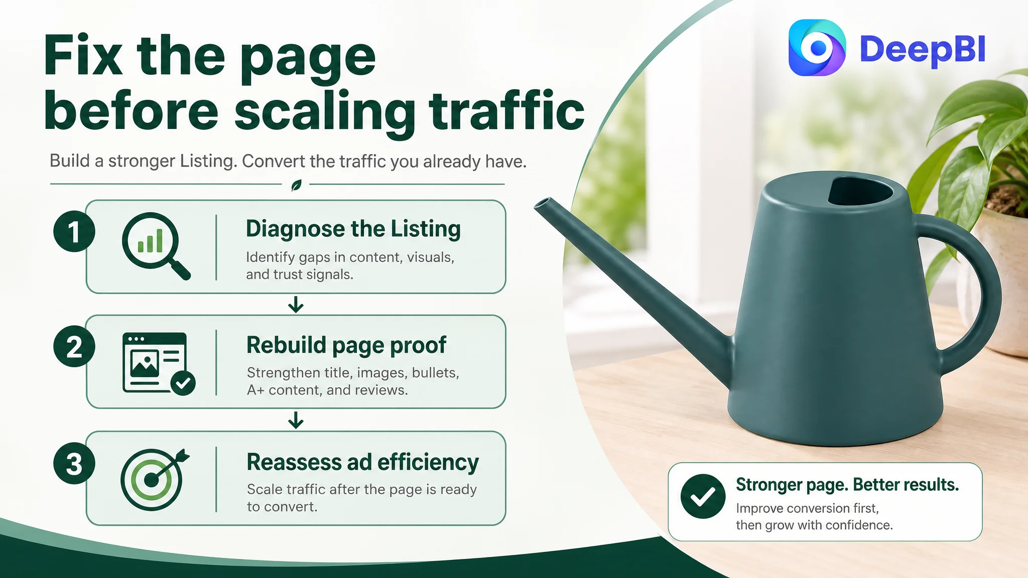
The better sequence was:
1. Clarify the Listing’s core promise.
2. Improve the page’s visual explanation of real product attributes.
3. Build a structured A+ journey around use, convenience, capacity, durability, and context.
4. Preserve the relative strength of the bullet points while tightening their decision logic.
5. Treat review generation and trust development as a separate, longer-term operating priority.
6. Reassess advertising efficiency after the product page has a stronger chance of converting the traffic it receives.
This was not a decision to abandon ads. It was a decision to stop asking ads to compensate for a page-level conversion deficit.
The A+ direction followed the shopper’s doubts
The proposed A+ structure was designed around the questions a shopper is likely to ask, rather than around a list of product specifications.
Start with product identity
The first module should establish the product as an indoor-and-outdoor watering can with a long spout. The shopper should understand the category, use context, and defining feature immediately.
Show easy filling before making efficiency claims
Before emphasizing watering efficiency, the page should demonstrate how the product is filled. A wide opening and a straightforward filling process reduce friction in the daily routine.
Explain targeted watering
The long spout should be shown reaching through dense plant arrangements and directing water toward the soil. This gives the feature a specific purpose and helps reposition the absence of a broader flow story as a specialized precision advantage.
Translate 64 ounces into fewer interruptions
The page should connect half-gallon capacity to a real task: watering multiple plants with fewer trips to the tap. The number matters because of what it changes in the routine.
Address material uncertainty
Plastic watering tools can trigger concerns about cracking, denting, or aging. The page therefore needed to communicate the confirmed thick, high-strength construction carefully, without inventing unsupported performance specifications.
The purpose was not to claim that the product is indestructible. It was to reduce the shopper’s concern that the tool may feel disposable or unreliable.
Validate indoor and outdoor use
The product needed to appear in both home and garden contexts. This would help shoppers understand that it is not limited to one narrow use case and would support the title and bullet-point positioning.
End with a complete purchase reminder
The final module should summarize the actual value proposition: targeted watering, practical capacity, convenient handling, and use across indoor and outdoor plant care.
The optimization was designed as a controlled reconstruction, not a cosmetic redesign
The case did not call for making the product look like a different product. It called for improving how the existing product was understood.
That meant keeping strict boundaries around the optimization:
- Do not add functions the watering can does not have.
- Do not invent durability measurements or test results.
- Do not alter the product’s physical structure.
- Do not imply a detachable component unless it is confirmed.
- Do not copy a comparable Listing’s product design.
- Do not use decorative visuals that obscure the product’s actual use.
DeepBI’s analysis and visual recommendations were useful because they connected each change to a diagnosed gap. The proposed main-image work addressed clarity and functional communication. The title work addressed search coverage and click relevance. The A+ work addressed missing trust and usage explanation.
The objective was not simply to produce more assets. It was to ensure that each asset had a defined role in the conversion path.
The real business change was a change in operating judgment
The case material does not provide confirmed post-optimization CVR, ACOS, CTR, or organic-order results. Those figures should not be invented.
What can be established is the change in operating direction.
The seller no longer had to treat every efficiency problem as an advertising-setting problem. The diagnosis showed that:
- A low-conversion Listing can make Amazon ads appear less efficient than they should be.
- A product page may contain valid features without explaining their practical value.
- A+ content is part of the conversion system, not an optional decorative layer.
- A strong bullet-point structure cannot fully compensate for missing visual proof.
- Zero reviews create a trust deficit that page optimization alone cannot erase.
- The right benchmark is not merely the most visible competitor, but a comparable high-performing Listing with a similar product and usage logic.
- Ads should be scaled with awareness of whether the page is ready to convert the traffic.
The most important optimization was not a bid adjustment. It was recognizing that the page had to become more convincing before additional traffic could become more valuable.
For Amazon sellers, that is the lasting lesson from this watering can case. When ACOS remains difficult and orders do not follow traffic, the first question should not always be, “How should we tune the campaign?”
It may be more useful to ask:
Does the Amazon product page give shoppers enough reasons to click, trust, understand, and buy?
If the answer is no, the next improvement may need to happen in the Listing before it happens in the ads.